MULTIPLE CHOICE
Although the intact building seemed almost ready to use, at second glance the programme revealed a large number of competing requirements. The existing building was an introverted space for meditation and service to society, housed in a pure neo-gothic architecture with a strong religious character.
How to transform this building into a visible, open and modern university office that is present in the city? How to change a very specific function into a flexible one?
There was a wide range of needs and new functions: polyvalent offices, receptions, concerts, lectures, ceremonies, etc. What was most important? Create a spectacular atrium? Make a strong appearance in the street? Enhance the chapel? Extend the building? What was de best choice? We decided not to make one single extreme choice but to maximize all the capabilities of the existing building with a number of discrete and carefully chosen interventions: MULTIPLE CHOICE. This implies that we answered ‘yes’ to all alternative choices. The chapel is at the same time better integrated and able to function separately. The chapel is the ideal ceremonial space; the atrium is perfect for bigger events and walking dinners. None of these spaces provided ideal acoustics for lectures so in the basement, under the atrium, a new auditory with foyer was created. Moreover the building is transformed in such a way that all these spaces can function simultaneously.
ATRIUM
The existing inner garden was lacking a bit of ‘warmth’. A glass canopy was insufficient to turn this place into the heart of the building; and constructive stunts in the canopy structure would not have done the job. So the focal point was shifted towards the relation between the atrium and the adjacent spaces. The circulation on the first floor was moved towards the atrium; all windows between the building and the atrium were removed; the axis of the entrance was prolonged through the atrium into the second garden.
FACADE
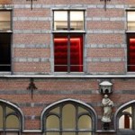
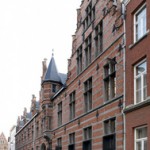
The existing facade left no doubt: steel bars, a heavy wooden gate, rather dark neo-gothic architecture. The problem was not the facade itself; it was all about the way it relates to the public space. All the glass in the stained windows was replaced by clear double glazing in the existing wooden frames. The heavy wooden gate was doubled with a glass entrance box in order to be able to leave it open during the day. Between the chapel and the street a foyer was inserted and its windows were enlarged to become street doors. The ‘porosity’ of the building was enhanced.
BASEMENT
The vaulted spaces of the basement were breathing a fresh vigour that was not present elsewhere in the existing building. These spaces were perceived as a potential stock of intriguing multifunctional spaces providing a strong and sober background for various activities (exhibitions, events, meetings, etc.) The corridors of the basement are used as an interesting circulation space, linking this vaulted world to the atrium.
AUDITORIUM
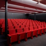
The addition of an underground auditorium was a key issue in this design. Whatever you do with the existing spaces, none of them could become a good auditorium. As we were recycling the basements, the choice became evident to create an auditory under the former inner garden and link it to the vaulted basement.
CHAPEL
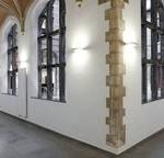
It was the spiritual centre of this formerly religious building. It is a space with a high symbolic density and a very consistent neo-gothic style. However functionally it does not have a central location, it is more located in the margin of the complex. The transformation tries to solve this paradox. The spatial appearance of the chapel is left intact, but the functional relation with the building is combined with an additional relation with the city. The foyer connects the chapel to the street and breaks its isolation. In the same time its religiously stigmatising effect on the building is downscaled to a more universal dimension.
OFFICES
In a narrow interpretation the programme only asked for a transformation of this monastery to a functional office building. These office functions are located on different floors. Reception, secretaries, meeting rooms, etc. are mainly on the ground floor. The individual cell rooms of the first floor provided the right kind of rhythm and size for individual offices. In the corridors on the first floor functional boxes were added. They are clad with red acoustic velvet, not only to reduce echo but also to add a touch of theatrical decadence to the severe atmosphere of the monastery. They are used as small corners for meeting, printing, sitting, etc. In the attics of the second floor we found an ideal space for a landscape office. The woodwork of the carpentry is left apparent in its full glory.
MATERIALS
All materials are carefully chosen to reinforce the architectural concept. All new insertions are coloured with a touch of red tissue (acoustic boxes, curtains, seating in the auditorium, etc.). The corridors have a dark grey floor in carpet tiles. New hard floors and stairs are covered with concrete tiles. All new windows are made of dark grey steel frames. On places where historic walls are cut or perforated, the section plane is finished with dark grey steel plates.
ART
The intervention of artist Guy Van Bossche consists of two parts. First, between the chapel and its entrance foyer, a painting is applied to the glass wall: a lying silhouette of person (sleeping? dead?). From a specific viewpoint in the entrance the silhouette coincides with the altar of the chapel. The second part of his intervention is from a totally different nature. In the honorary meeting room of the monastery we found a number of historical paintings of interesting-but-not-top quality. Guy Van Bossche recuperated the back of these paintings in transparent backlit photos that were put flush in the wall surfaces on crossing points in the corridors. Both interventions relate in a meaningful way to the architectural concept and in a clever way make use of spatial interaction and spatial displacement.
GARDEN
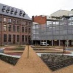
The existent rear garden has a quite unpredictable relation to its urban surroundings or is submitted to conditions that are beyond the control of the user of the building (rear neighbours, service entrances, adjacent functions, an office tower, etc.). To limit the impact of future changes a buffer is inserted between the garden and its surroundings. A high screen in semi-transparent metal mesh closes the square garden and marks the space for car and bicycle parking.
The garden design itself is a palimpsest, a superposition of layers, patterns, meanings and functions. The basis layer is an organic pattern of undulation lines and colours. On top of this comes a pattern generated by the connection of all logical walking lines. In this way spontaneous use and concept of this garden coincide. On top comes a grid of mid-rise trees referring to the archetype of a monastery orchard. Thus the monastery is given back the garden that was stolen from it through the creation of the atrium.
Photo: Toon Grobet
Traducere: Magda Teodorescu

