Project, text: Constantin Goagea, Adrian Dobre, Ștefan Ghenciulescu.
Photo: Cosmin Dragomir
We flirted with rock culture in our youth, considering it’s smart, sophisticated, and wild enough to satisfy our young egos full of crazy ideas. We started this adventure to design Fire Club in the best possible way, we allowed ourselves to drink more beers than usual during work hours, truly for professional reasons. Fire is an oldie but goldie, from back when Lipscani wasn’t the place full of cliché and excessive crowds it is now. Fire managed to create a devoted clientele. One which helped the club reach its 15th anniversary successfully. As I was saying, because of solely professional reasons we had to spend a lot of time in the bar drinking beer in order to get the feel of the … Fire. It’s not just a place for teenagers, not just for rebels, not just a goth bar and not heavy metal either. You will find emo kids alongside emo adults even… It’s the perfect solitary place among friends, and if you want to be left to your own device or to start new ideas, this is the place. Rock, burgers, beer, black T-shirts and posters.
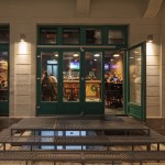
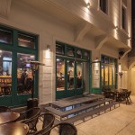
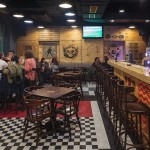
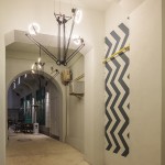
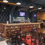
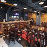
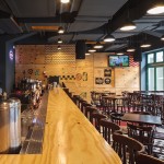
The new Fire is a 120sqm room located in the alley between Covaci street and Gabroveni street. Located on the ground floor of an eclectic building from 1925, the space is a mix of Art Deco and neoclassical architectural elements, former student accommodation, former cheap midcentury hotel.The building is not placed on the main street so it’s not considered to be of great importance, but it certainly carries an emotional and aesthetic value in the historic context of Bucharest’s old town. It seems an architecture that has been materialized by dabsters, non-rational and incoherent reconstructions and changes, nothing matches perfectly, all spaces are narrow, lack of alignments, modules and repetitive elements dominate the space. Most of the neoclassical architecture in the south of Romania has an exotic flair to it, because of this mix between classical symmetry, proportions and narrow lots, co-ownership and other constraints. In this confusing mishmash we actually found lots of things which inspirited us: three huge show-windows, unequal of course and placed randomly in relation to the upper windows, and in uneven relation to the decorative brackets (fake ones) which support the upper floors, a tall room of almost 4m and concrete beams with haunches from a consolidation done in the 70s. Everything was valuable and as a result integrated in the concept.
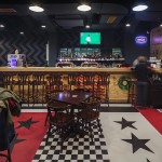
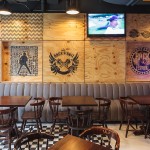
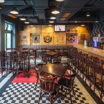
We wanted a bar that will function during the day and also be used as a breakfast spot for the hotel which will be built subsequently in the courtyard. Although the 2 themes addressed – rock pub and breakfast friendly space seemed divergent, we managed to bring them together as you will see. We chose not to use the found object collage idea (or fake found) to impregnate the vintage atmosphere, instead we did a research on rock pubs, which we reinterpreted in a contemporary note. We mixed jukebox imaging (stars and stripes) with industrial stencils done on wood crates that are used to carry concert equipment and even done on barrels and cases used for holding the beverages. Using the screen printing method we managed to embody every little detail on the industrial plywood hanged on the walls, on the floor, using polyurethane resin and a scrupulousness method we succeeded to transpose all the stripes and stars we wanted and needed.
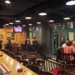
The furniture used is that of a classic pub, and image everybody is familiar with from the old Fire Pub. We realized that this representation of space is part of the charm, confortable and well establish in the minds of the daily costumers and therefore we found no reason to change this. Taking into account the research we undertook at the beginning of the article we came to the conclusion that this is not a place of nimiety. Inspired from the American diner imagery we added only one new couch, grey leather cover with beige stiches, which go very well with the entire chromatic of the place. Since we were talking about the vast height of the space, we chose to leave the beams visible and in the in between space left to place the ventilation system. What you see is what you get, dark-grey industrial ceiling with melon-yellow highlights from the ventilation grilles and funky lamps that have a motorcycle pharos look to them.

