Piet Gerards is something more than a prestigious graphic designer. He sees design as a form of cultural, but also social or political action; it is developing the spirit, not just the language of the historical avant-garde. This interview will reveal both the strictly professional aspects and his responsible and challenging personality.
Interview by Stefan Ghenciulescu & Constantin Goagea
Arhitectura: Do you think, Piet, that there really is today something like a local design culture?
Piet Gerards: You are influenced by everyday things: architecture, town-planning, posters, bookshop windows, television. Holland is a very regulated and ordered country and this has a lot of influence on design. But because of this you also see a reaction to all this order in designs that try to express the opposite. An exponent of this is the work of Droog Design: everyday objects become design by placing them in a different context.
I saw and was surprised by a lot during my short visits to Romania in 2007. I did not immediately recognize a design culture, but that was mainly because of the lack of time and that I don’t have enough knowledge of the design history of the region. I believe the Romanians are mainly trying to redefine themselves. This was very poignantly put by Catalina Zlotea, a participant of the ‘Atelier Tipografic’ in Bucharest: ‘We all understood that good design has sometimes nothing to do with industry, infrastructure or economy and that it mainly depends on your brain and heart. It is first of all a matter of talent, thinking, sensibility and sensitivity.’
A: Do you in any way relate to a Dutch tradition? Let’s talk about your relationship to the classical modern one (Bauhaus, De Stijl, the 60s or the 70s).
PG: When I started my design studio in the seventies I found inspiration from the avant-garde of the first half of the previous century. Herbert Spencer’s Pioneers of modern typography (Lund Humphries,1969) really shaped me as a designer. I was also introduced to the work of Jan Tschichold, Max Bill, Piet Zwart, Herbert Bayer and many others. The masters of classic typography: Jan van Krimpen, Herman Zapf, latter work of Tschichold and Harry Sierman I got to know later on. The cover of the Huis Clos publication 10 frequent occurring blunders in book production (second edition, 1996) shows this inspiration of both sides by setting the authors name and the title in both Tschicholds modern uncial (1929) and in his classic Sabon (1964).
My current work is characterized by a sober approach. At least that is how I experience it. I do not usually work from a preconceived idea. The theme that I have to design will force itself upon me. In my profession, organization and order are the basics, but it is important to be able to let coincidences and unexpected opportunities that form, to take place. But after so many years of experience you also try to enforce this. And then the question is how much of it remains coincidence.
A: You have been designing a huge variety of books – art, architecture, literature. PG: Do you think they rather express a personal style or do you try to adapt to the topic?
P.G.: I was approached by an architect last year to design a book for him. He had noticed in my work that I get close to the subject. In his eyes a book about Ben van Berkel had a Ben van Berkel like quality, a book about Herman Hertzberger could have been designed by Hertzberger himself. Apparently I seem to have the ability to place myself strongly in the subject matter. But people who follow my work also tell me that it is very recognizable in itself.
But I also try to place myself in the readers place. I will look for solutions for the structure of the material, within the page, instead of trying to remind of the shape of the object itself. A client or a printer will seldom get an unexpected surprise: size, choice of materials or binding are not usually up for discussion. A book must be functional, reprintable, fit in your bookcase and handled without gloves. I will generally look for boundaries within the possibilities that the client has set me. A book for me is not an autonomous object. I am not an artist. As the recently deceased Dutch book designer Harry Siermans once said: ‘I am not an artist. If I am not given a commission, I won’t do anything.’
A: Does the subject determine the design before everything else? More in to detail – did you feel that a book about Alvaro Siza should be from scratch different from on Jo Coenen?
PG: Those are two interesting examples. The book about the Siza tower in Maastricht was the first in a series of books published by Vesteda, a high standard project developer, which leaves a pretty heavy mark on such a project. They use these books for their business relations and prospective tenants of their projects. These publications become a calling card for the company.
The presentation date was set before we had even started on the book and the production time was about two months, which also included the writing of the material. Therefore Siza was hardly involved with the book.
It was totally different in the case of the book about Jo Coenen (formally government architect). Seven years before the book Jo Coenen. From urban design to architectural detail (NAi Uitgevers, 2005) was published, we had already had the first meetings. I have seldom worked on a book that has known so many different concepts. It had to be a intimate diary, a sketch and ideas book that would show the virtuosity of the architect, but it also had to be a typical architecture publication that would show a cross-section of Coenen’s projects during the last 30 years in a transparent way.
I thought I had found the solution by designing a thick, but relatively small book. The small size of the pages could accomodate all the varied material and sections. But in the end it was decided, mainly because of pressure by the sponsor, that it would become a large coffee table book. Which poses a certain amount of problems on a page level, because how are you to combine all elements of very varied quality and meaning on one page? By making the book accessible from different angles and being able to mix the projects with substantive contributions from Jo Coenen, other architects, writers and artists, the book has become more than just a standard monograph.
A: Do you look at magazines and books? Is there something in the design culture of today that could inspire you? What about web design?
PG: Mostly I get my inspiration from concerts, films, literature, sculpture, architecture. I am very lucky that nearly all my commissions are cultural or very strongly culturally related. Therefore all the baggage I have accumulated over the years turned out to be worth a lot. During an orientating interview with a client we usually end up discussing mutual inspirations. Years ago I was asked to advertise in the yearbook of the Art Academy in Maastricht. I posted an advertisement with the following text: ‘Leave your college education. Burn your Neville Brody and David Carson books! Immerse yourself in the type page of Gerard Reve’s Nader tot U, Chapel Road by Louis Paul Boon, A Portrait of the Artist as a Young Man by James Joyce, Under the volcano by Malcolm Lowry, Nieuwe gedichten by Martinus Nijhoff and Journey to the End of the Night by Louis-Ferdinand Céline. Study the subtitles of Andrei Roebljov and Stalker by Andrei Tarkovski, Belle de jour by Luis Buñuel, Wild strawberries by Ingmar Bergman, L’argent by Robert Bresson and A bout de souf?e by Jean-Luc Godard. Listen to the graphical beauty of the score of Igor Stravinski’s Le Sacre du Printemps, Three Places in New England by Charles Ives and Sinfonia by Luciano Berio. Use your inspiration on any assignment and be amazed by yourself.’
It is fine to view the work of great typographers and designers as an inspiration, but I think it becomes more dangerous if you get your inspiration from too close by. That is very true for web-design – which is a relatively young discipline.
A: What would be more provocative for you: working on a corporate project with people that already have a quite clear picture on what they want or with a client that doesn’t know anything about graphic design?
PG: Usually it is a lot more pleasant working with someone who understands the profession and has a pretty clear idea of what he wants. Mostly people will work with me because they already know of my work. The trick is to be able to keep your own space to design within the financial limits and the justifiable expectations of the client. If the client knows the ins and outs he will give you the space and will want to be surprised by the result. A good example of this is The Theatres of Herman Hertzberger (010 Publishers, 2005). Initially the book was to be an enumeration of the realised and unrealised theatres, preceded by an introduction. But with my input the book became more thematic – city, auditorium, foyer – which where illustrated with examples of work of the architect. Because of this the publication achieved a more general, nearly theoretical character.
A: What would be the most difficult context you have worked and the most comfortable one?
PG: To this question I can’t give an univocal answer. The most complex commissions are the ones in which the information is very dissimilar and has to be integrated into a single publication.
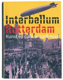
The book Interbellum Rotterdam. Art and Culture 1918-1940 (NAi Publishers, 2001) was a good example. In my monograph Working title. Piet Gerards, graphic designer (010 Publishers, 2003) I say the following about it: ‘[…] This present hefty tome on Rotterdam’s inter-war years was to bring together three distinct contents: ten long and lavishly illustrated essays, a hundred short biographies and as many art works and artefacts from those years. But it was not enough just to think up a clear structure. Everything had to gel in an inspired setting, one that would continue to surprise without lapsing into trendy gimmicks. The book is the epitome of refinement. There is a protracted entrance by way of printed flyleaves and a title page that extends to six, a strict division between black and white (the documentary part) and colour (the catalogue), a flexible page layout with a varying use of space round text and images, and a great difference in type size to accommodate multiple informative layers in a single spread (main text with footnotes, captions, biographies and literature references). A flexible full binding makes the book eminently accessible in the physical sense as well.’
A very simple looking book like Portrait of a landscape, a selection of poems by Leo Herberghs is complex in its simplicity: the inside is set one typeface (Bembo) and in one type size. I deliberately chose a non-centred page layout even though the book emanates something classic.
A lot of time and effort goes into certain projects, like ‘i10 traces of the avant garde’ or ‘The Portrait Firm S.I. Witkiewiczí’, which involve dozens of participants. They make an appeal to all the facets of you craftmanship. That of course was also the case for ‘Atelier Tipografic’, which included a workshop, excursions, lectures, a symposium and an exhibition. We also designed the website and printed matter.
Each commission requires the same approach: an analysis of the material and of the ideas and wishes of the client, searching for a context, not excluding coincidences that might occur.
A: Can you tell us about the relation between design and teaching ?
PG: I don’t teach and I also haven’t been educated in design. I
come across education because of the interns that we have at my studio. I have noticed for years that the gap between schooling and the professional practice is quite large. There is an absence of knowledge about the technical side of layout and print, typeface, paper and other materials. The students are being taught to think ‘conceptually’ but aren’t able to translate this to a practical way of working. The graphic designer has become – besides being a designer – type-setter, lithographer and lay-outer. Surely it must be possible to teach a minimum of professional skill and to put this to the test? Furthermore I cannot express enough that students should not only learn about design and popular culture, but also about art. The example I give is in the quoted advertisement text.
A: What about heading a team of very young designers? One can notice that your office today is called Piet Gerards Ontwerpers [Designers].
PG: Piet Gerards Ontwerpers consists of three designers and myself. The team at the moment has worked together for a while, which means they have learnt to anticipate each other. The idea for a new production is always done together with me, but subsequently the designer will work on the commission quite independently. This way we work efficient and fast and have – for outsiders – an inconceivably high production rate. You see the designers really growing in their role, understanding things quicker, making new discoveries that will enhance the design. That’s part of the fun in this profession.