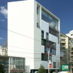
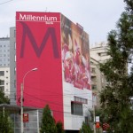
The office building at no 85, Buzesti Street
This office building was done in 2006. It was designed by Office Design and published in the 54 issue, May 2007, of “Arhitectura”. As you can see, the side blind wall was painted pink, while the touching banner covers three thirds of the facade. In case you can’t understand or refuse to believe, it is the very same building. Let us find the differences!
I got it! Banner-ism is trendy and became a power symbol. It underlies a tacky logic that is intended to silence the enemies, and this is why they place such big banners. We can get it and can afford it as well. Because the advertising agency is interested in visual things and charges much. Moreover, the bank director is a well-connected person and wants to help and transform the city. It is not that expensive and the city hall guys loved it, and people are happy as the text reads: it’s about emotions.
Or the technical report, written by one of those architects carrying a stamp, reads: on beneficiary’s demand an outdoor advertising work was proposed. They wished to show the logo and the identity of the firm. Thus, we chose an optimistic range of colors on the blind wall and a pierced polychromatic printed poly-plane.
PS: It is said a board will be set up to protect banners because they are elements of national urban identity. We’ve got to preserve such urban palimpsest! The banners restorers are on the watch. We can’t pull them down because they’re done by some famous agents, real artists. I heard that in case you have graffiti on a facade, you can’t.
BANNIERISM
Text: Justin Baroncea
The last generation of inhabitable advertising
In mid 1990s the people of Bucharest first laid their eyes on a mesh, or by its popular name, “the dotted self sticky ribbon”. The new buses of 300 line represented its first territory. Thus, it entered the urban folklore. The “Soap boxes” on the vehicle wheels reconfigured Bucharest’s image. From the outside, it all seemed a little joke. The real challenge you had in the interior if you tried to see the coming stop. It was then that the dots showed their real size and you understood the pixel idea.
Thus, the people got used to the new visual dimension and prepared themselves for the next step: living behind a mesh. It is not the window that matters but the way it is pixeled. When traveling by bus you have a short-lived visual experience; what about having it 24 hours out of 24. So, if I can’t see those dots, it means something strange is going on in my city.
Now, many people in Bucharest inhabit an advertisement. They can’t feel at home without dots. And the facades without a mesh are so boring! In Bucharest, the advertisement is not “the soul of commerce”, as it were, but genius loci. The apartment buildings have no longer a name or place, but borrowed a “brand” name.
Some live behind an advertisement, while all of us inhabit an advertising space…
Photo: Constantin Goagea, Stefan Tuchila


