When the distorted image of a straight beam is not an issue. Extension and reorganization of the Catholic University of Louvain
How to propose a contemporary intervention in a historical context? How to highlight an old building without reproducing it and without hiding the new construction? The answer
is maybe what we call “Escher architecture” (we are thinking about his work Print gallery): an outside space that becomes an inside space.
How to treat a banal programme such as “vertical circulation and evacuation” on a very small site in a ceremonial way? The answer is maybe again “Escher architecture” (this time we are thinking at his work Relativity): an architectural promenade along the former outside walls of the old construction.
The answers to these questions have been given by VBM architects while making a feasibility study for the Rectorate of the Catholic University of Louvain in Belgium, a former Linen Hall composed of fragments and layers dating from the 13th till first half of 20th century.
The programmatic use of the complex, which houses the University’s main reception spaces, has increased over time. As a consequence, the lack of vertical circulation, storage space and evacuation capacity became an issue that needed to be contended with. The Museum Room, the Jubilee Room, the Promotion Room and the Rectorate offices, all located on different levels, were not well connected and suffered from a lack of evacuation capacity. After an extensive collaboration with the Heritage Authorities and many different proposals spread over several years (the study started in 2000), the optimal one proved to be an extension – a structure to include an entrance used for ceremonies, a large vestibule and the by law required circulation and evacuation.
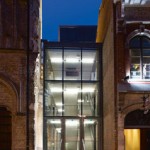
In the proposal, completed in 2007, the façades of the Linen Hall and of the other neighbouring buildings become inner walls. The edges between inside and outside are blurred, as you look from the inside of the old buildings through the old façades to a new inside space – a transparency implied by the simultaneous perception of different spatial locations. Further transparency towards the city fabric is created not only with glass but also with an open structure.
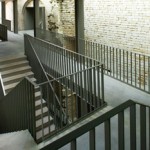
Instead of hiding the required vertical and horizontal circulation, we have designed it as a “promenade architecturale” along the former historical façades, a space that fluctuates in a continuous activity and culminates in a panoramic view of the city. A banal programme is transfigured through architecture, becoming on of the “representation” spaces of the complex.
The elevator tower of the extension is present on the skyline of Leuven, but the same extension is almost absent on the street level, leaving the “primadona” role to the protected buildings. The finishing, except for the fire retardant paint, is missing as well – a conscious choice of a materiality that is contrasting with the natural stone and the brick of the existing buildings, without competing with them. The extension is revealing everything in terms of structure, but is hiding the technical installations in exactly the structure that is being revealed.
To us, architecture means, amongst others, the continuous search for a way to represent our ideas. When representing architecture, each media has its own qualities – plans are not always necessary and sometimes plans and sections are not sufficient. One of the questions on our minds since we started a new office (Bogdan & Van Broeck Architects) is how to photograph and represent connectors and interstitial spaces. The extension of the Rectorate is such a space, folded in between existing buildings and in a way “folded inwards”. Its condensed and complex interweaving of loadbearing structures and flights of stairs results in an Escher like space that does not reveal its qualities on standard wide angle photographs.
When, next to the Architectural Award of the City of Louvain for 2008 (The Prize of the Professional Jury and The Prize of the City Officials), the project has received the comment for not being easy to photograph (the jury members did not take the project in consideration for an award after the evaluation of the submitted classical professional pictures, but the compulsory visit to the nominated projects has convinced them that it deserves the highest distinction), we decided to ask the artist Marin Kasimir to try to capture the essence of our intervention. The technique of this artist generates panoramic pictures that can cover 360° or even more with the help of a rotating digital camera and digital postprocessing. The way Marin Kazimir has chosen to represent our project shows that in order to reveal complex spatial qualities one sometimes has to accept the deformed representation of architecture. The curving of the very straight structure did not disturb us at all, as the connections between old and the new, the different views on the city and the whole spatial experience were literally brought into picture. Architecture is not just a composition of architectonic elements, but also the materiality, the atmosphere, the spatial experience. If one is searching for a way to represent all these, then the distortion of a straight beam is not an issue.
In our approach we focus not on the architecture itself, but on the added value it can create; not so much on the realism of the representation of our projects but on their relevance. The goal is not to show the form but the core of the project and the approach.
We choose a specific photographer for every project, one that fits to it. That might make the photography of our portfolio’s look more eclectic, but we want to be sure that the essence of each project is being revealed.
Photo: Toon Grobet, Marin Kasimir


