Text: Ștefan Ghenciulescu
Photo: Georgiana Ghenciulescu, Ștefan Ghenciulescu
No, I did not cry at the exhibition. Well, I teared up a bit, at the end, when, after a “silent disco” tour, when each visitor was practically alone with the exhibits and the music and talks coming from the wireless headsets, we arrived in a large round room where you could see on a circular screen a loop with the end ofone of their last concerts, including David Gilmour – the one from back then and the only one – thanking the audience. There were dozens of people sitting on the floor, aged 15 to 75, alone or embraced, stunned or swaying, just like at a concert. At the end, many started to applaud, then realised, a little embarrassed, that they applauded a past event, screened in a museum hall.
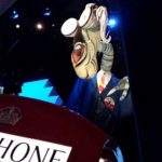
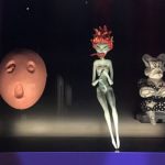
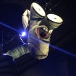
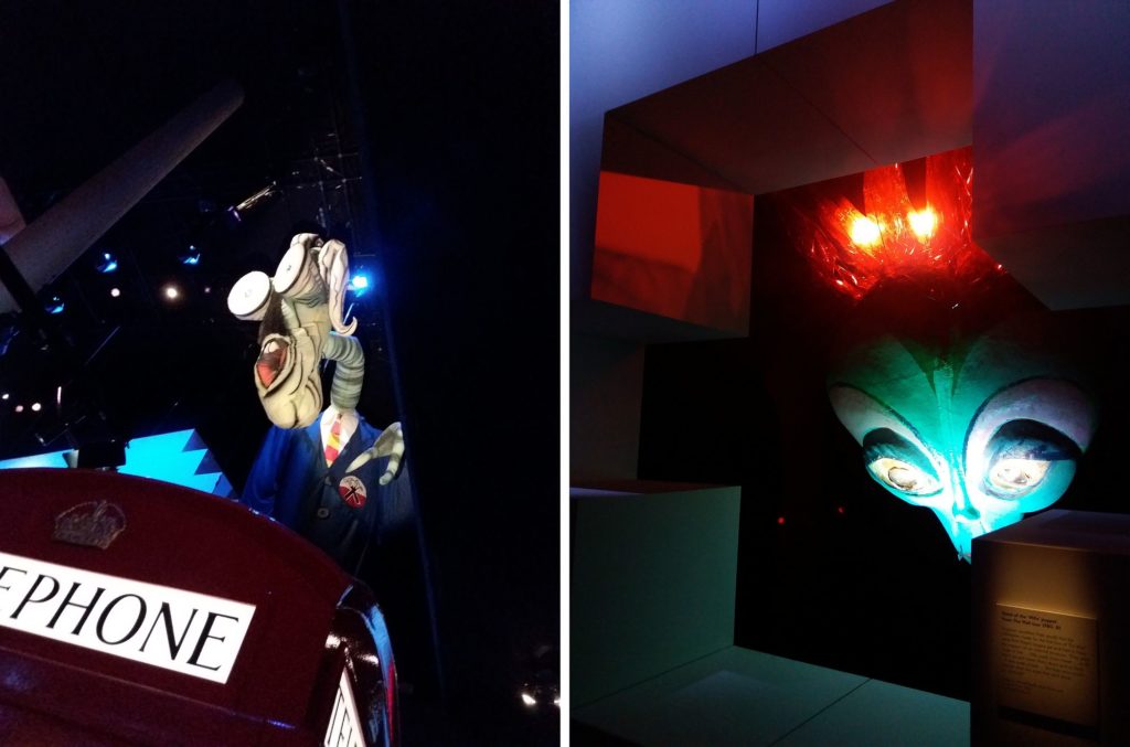
The idea of this article is not to bore you with die-hard fan nostalgia, nor to talk too much about the “Pink Floyd. Their Mortal Remains” exhibition from last year, produced by the Victoria & Albert Museum, which is now itinerant through Europe and which is indeed to die for. But the exhibition at a mainly design-related museum is really important for the relationship between Pink Floyd and architecture. An already mythical relationship, about which, coincidentally, Mihai Dutescu also speaks in his article from the same Dossier (The Other Architects) in Zeppelin #150, where he tells how the passion for the band has led him to becoming an architect. By the way, this exhibition truly succeeds in being an integrated media project: you see a bunch of objects and images (sketches and a survey plan made by Waters as a first year student, posters, photos, pieces of film, instruments, the huge dolls from The Wall, the remains of the flying pig from “Animals”, technical plans for stage design, covers and much more).
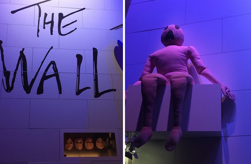
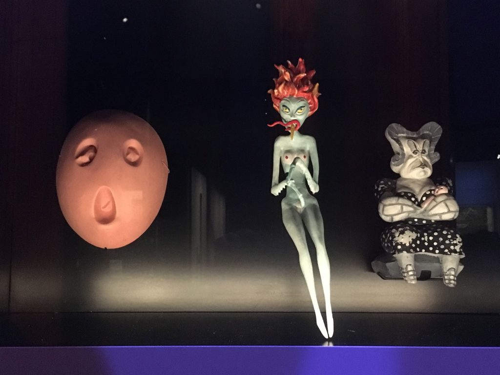 *Very large and very small dolls for The Wall
All this had to match the music, the movies and the interviews, and not turn the exhibition into a repetition of “sit down, put on headphones, watch the video, listen to music, take off headphones, stand up, repeat”, and also not become a sinister cacophony. So, in the super-technological spirit of the band, at the entrance you received a gadget with headphones and you entered the responsive exhibition. Closing to the screen or the respective audio material, the gadget received the signal and you could hear the sounds. The areas of interference were weak, and, actually, at some point, they sounded quite interesting with the overlapping sounds.
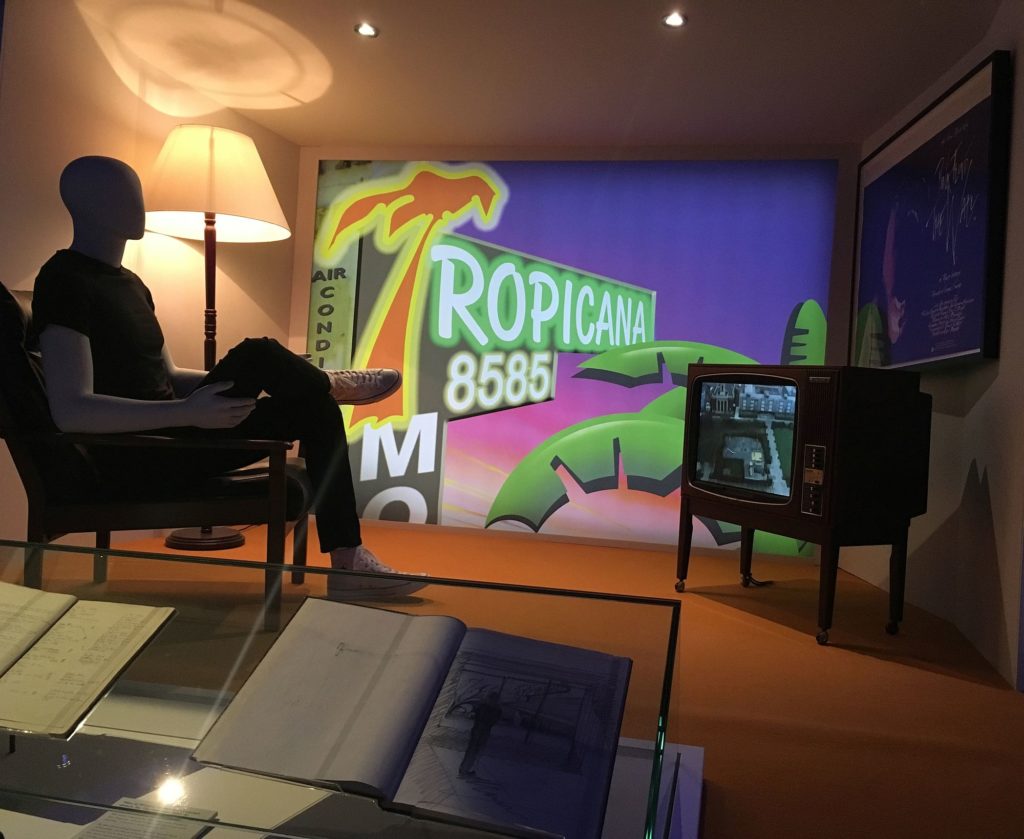 *Reconstruction of a decor from The Wall
Back to architecture and design.
It must be noted that Roger Waters, Nick Mason and Richard Wright were indeed students of architecture (Syd Barret was an art student and a childhood friend of Waters’), but they never finished their studies. However, it’s also true that their visual education, the structure obsession and spatial thinking have never left them.
Achitectural in spirit is, first and foremost, the music. I will refrain from commenting an area where I am really quite weak, so I propose a quotation, and, in it, another quote: „Early Pink Floyd was all freedom and adventure; the Roger Waters and David Gilmour Floyds were more about structure. As Syd once said, his old mates ‘thought as architecture students’. They took some of Syd’s chord progressions and the sound textures they’d explored with him and set them in organized, concrete shapes, a triumph, perhaps, of form over freedom, but what a triumph!” (Joe Boyd, ”’Lift off’. Syd Barrett, Pink Floyd and the London Underground”, from the exhibition catalogue of Pink Floyd. Their Mortal Remains, V & A Publishing, London, 2017 )
The most concrete connection with architecture has undoubtedly been the constant concern and amazing creativeness in creating the environment for their concerts. When you say rock concerts, even today, you think, first of all, of Pink Floyd. Their relationship with the public was a very special one: the band never compromisesd (or almost never) in their music to attract a wider audience; also, they did not really promote themselves as individuals or characters, being so restrained about it that undoubtfully many people would not even recognize them in individual photos; instead, at concerts, the show was total and smashing. And it’s not just about scenography, in the narrow sense of the word, but about building a whole architectural environment for, and actually within the concert. A dream space created by music.
At the begining of their careers, during the early no-budget concerts in underground clubs, this environment was achieved through light effects produced by blending oils, chemicals, inks and water on a slide projector. With increasing popularity and budgets, the projects have become more and more complex, the famous circular screen appeared at some point and the scale of things exploded.
One of the key contributors was Mark Fisher. Student in the workshop of Archigram’s Peter Cook’s at the Architectural Association (where else, indeed) then a professor at the same school, Fisher specialized in pneumatic architecture (all the rage back in the day) and in temporary structures. Pneumatic and Floyd you say? In 1976, Fisher and his partner, engineer Jonathan Parker, were invited by Andres Sanders to collaborate on the “Animals / In the Flesh” tour. The flying pig on the cover of the album is the work of these three, used extensively in concerts too, alongside an American upper-class family with a very porcine appearance. And maybe you already know, the cover of The Animals album is an artwork by Waters and Mason.
Fisher and the architect members of the band spoke the same language and collaborated perfectly to create a dream world on stage. Thus, The Wall was not just an album adapted for stage, and later in a film, etc.; even if the album came first, it was just the main element in a global project that included a kind of musical on stage and the film. I don’t believe anyone can forget the images from the show, the assembled wall, then destroyed on stage or the huge dolls created after the animations of Gerald Scarfe: The Teacher, the Mother, the Wife; a musical, maybe, but an insane, giant, bombastic one, and a theme that pushed technical skills and innovation to their full potential.
Closer to our days, Mark Fisher also worked on the “The Division Bell” tour, designing for a hemispheric stage, never before built, with a detachable structure, which was later succeeded by the gigantic claw in U2’s “360°” tour.
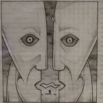
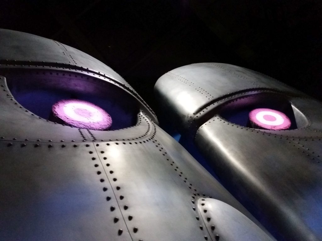
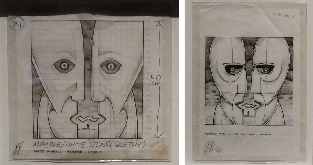 *sketches for thehuge statues for the The Division Bell cover (design: Keith Breeden, artwork: Storm Thorgerson)
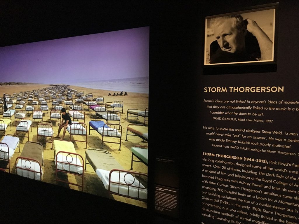
Finally, you can not forget the graphics in this whole story. That fundamental icon that is a prism on black background, the cow on the cover of Atom Heart Mother, and the covers of their early albums, A Saucerful of Secrets, Ummagumma or the late ones – Momentary Lapse of Reason, Delicate Sound of Thunder and Division Bell – all belong to the team from Hipgnosis, the graphic design office run by the brilliant Storm Thorgerson.
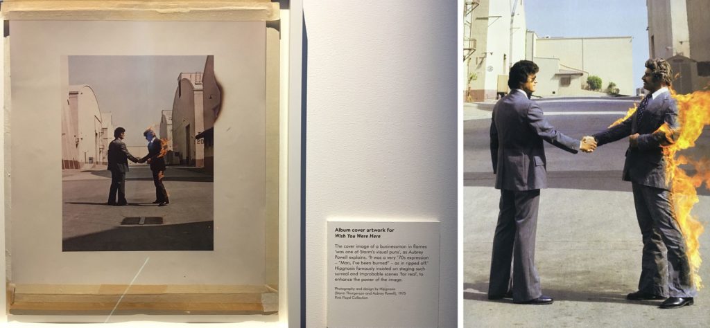
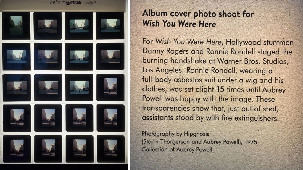
“Storm realized that in his role as a renegade designer he could be a man without boundaries. And Pink Floyd made music without boundaries […]: Storm would listen to Pink Floyd’s music, read the lyrics and cast himself as translator. He saw his job in turning an audio event into a video event” writes in the catalogue Aubrey Powell, Thorgerson’s partner at Hipgnosis2. And they were doing so with the same obsessive care for authenticity and detail. The man who burns on the cover of Wish You Were Here is actually burning, it’s not a collage.
In the exhibition there was a series of photographs showing the moments immediately after the desired shot had been obtained, when the flames engulfed the stuntman and the technical staff come running with fire extinguishers. He finally got away safe.
Pink Floyd’s “architects” have not been able to make architecture, per se. But they generated architecture, innovation and technology, and defined a space of dream architecture. Their importance for visual and space culture is, I think, (and you can laugh at a fan boy’s exaggerations), more significant than that of many architects and designers. And who was the curator of the V&A exhibition? Not a music critic, not a museologist. But a person who assumed his role as creative director: the same Aubrey Powell mentioned before, a designer with lifelong ties to the band.


