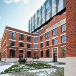
Metropolis Center articulates the concrete curtain of Bucharest’s inner city ring and the historical fabric behind it and defines a genuine public space.
This project is far more than a mere rehabilitation and extension of an historical ensemble. In this strictly private development project, urban surgery combines with the creation of a public space.
Viewed against the backdrop of explosive individualism and the incapacity of public authorities to define genuine strategies that is so typical of contemporary Romania, this project’s injection of urbanity provides an example of good practice as much as an alternative to the catastrophic effects of insensitive interventions and developers’ urbanism.
The site in question is highly representative of the collisions that characterize Bucharest’s urban fabric: it is on the city’s central ring, bordered by both the central historical area and modern era extensions.
In the 1970s and 1980s, the Ceausescu regime’s totalitarian interventions demolished many areas along the boulevard to make room for solid walls of apartment blocks. Once the curtain was completed here, the operation was to have continued deeper into the city’s fabric. The 1989 revolution put a stop to that, leaving a concrete wall tens of kilometres long behind which lay both residual spaces and the wounded historical city. Rapid gentrification and rampant development hit the area after 1990.
Erected at the end of the 19th century, the printing house complex, including the owner’s residence, was in one of the few areas where the old city still opened towards the ring. The site is accessed from two side: the boulevard and a street in the central area. The brief required the building of a relatively dense, mixed-use ensemble (offices, an apartment hotel and commercial spaces), while the Historical Monuments Commission stipulated that the owner’s house and the printing hall façade had to be maintained. The split of functions is logical and in keeping with the context: facing north and overlooking the wide noisy boulevard, the office building rises up behind the preserved façade, responding to the scale of the apartment blocks; facing south, the apartment building is significantly lower as it faces the fragmented domestic architecture of the residential district, comprising low-rise blocks and villas. The ensemble’s open and accessible ground floor is given over to entrance halls, hallways and commercial functions.
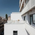
The Romanian-Bulgarian team of architects managed to convince the developers to accept two proposals with considerable urban implications. The first was the total elimination of fencing around the front courtyard, thereby turning this private space into a totally accessible urban square along the boulevard. Once the ground floor has been fully occupied by public functions (the restaurant in one of the wings is not yet ready), the open space will certainly come alive. The second proposal was the creation of a public passage flowing through the complex, articulating the two urban worlds (boulevard and historical centre) with a real trail – a genuine break in the totalitarian barrier and one with a high activation potential for this central area of the city. Moreover, this is not just a passageway since it also provides access to the shops and the hotel reception. The architectural expression is a simple and honest response to function and context. The office building (containing flexible, neutral spaces) takes the form of a glass curtain-wall slab. The taut transparent volume honours the brick façade and contributes to the dynamic of the wide urban boulevard. At night in particular it offers a pleasant counterpoint to the monotony of the endless housing slabs. The apartments are housed in a complex white
volume with vertical and horizontal setbacks, loggias and balconies, in a successful reinterpretation of Bucharest’s porous urban tissue. The two parts of the ensemble are linked by the common ground floor and articulated from the first floor upwards through an interior courtyard. The structure (concrete columns and slabs) ensures almost total flexibility for the partition walls. The structural axes adopt the rhythm of the old structure’s windows. The old brick façade is now supported by a concrete beam because of the big underground car park which runs under the entire plot. The building has not yet reached its full potential: the apartment balconies and the terraces overlooking the boulevard have not been planted with greenery as planned and the architects are not particularly happy with the design of the forecourt (due to budget cuts, the planned benches and part of the planting are still missing). But this is nothing that could not be fixed with simple means. On the other hand, the development’s effect on the boulevard is already apparent: it looks different and people walk through the ensemble in the most natural way. Urban activation is already under way.


