Project, photo: Mircea Vasvari
Text: Cosmin O. Gălățianu
My colleague, Vasvari
I met Mircea Vasvari ten years ago, as we were both getting ready for admission to the university. I was coming, as many others were, as provincials (some absurdly coming from hundreds of km away), every Saturday and Sunday, to Bucharest, and we were attending five hours of drawing and descriptive geometry with Professor Alexandru Bercan who was (and still is, as I have heard) a kind of universal donor of students for architecture schools, be they Mincu University, where most of us were going, or other schools abroad, England being the most talked of and most exotic at that time. But those planning to go away were getting ready accordingly, pretty much like athletes in recovery or those facing the termination of their contract: outside the lot.
And yet, Mircea was at the forefront most of the time and I learned only later that he would go to school in London, as he did not have this trajectory of a lateral preparation, nor the showing-off of the fact that he was awaited in fact by something higher, more complex, better, etc. One thing I remember very well happened on our very first ‘correction’: our homework, from one week to the next, was to make a volley of one hundred line drawings, A4 format, with random objects in our home, of which we were supposed to choose one, the best, which would be graded. I scored a superb four points – a D, as I have always been a slow starter, but also because, in that instance, I had only drawn stuff in touches, on contour, a bit like the tattoos you regret having the day after; he scored a seven – because he had drawn, as it was, the construction; more precisely, beyond the final shape, one could also distinguish the generating axes and the simple axes-the root for complex objects. A seven in eleventh grade was some kind of a 10, or A in training (a D was still a D). Mircea Bercan would sometimes make forecasts, devoid of pedagogical subtleties, some may say; but I always liked him for not being politically correct and for telling things as he saw them, that someone or another is precocious and would be an architect. That’s what he said about Mircea, right then, on the second week of our training.
Two years later, we both sat the exam for Mincu, we both nailed it, but he had already been admitted to the London Metropolitan University, and our paths have not crossed since then.
This introduction is not meant to nostalgically flatter an old friend. But, regardless of how it sounds, the fact that an architect born in the early ‘90s (therefore right after the Revolution), trained abroad, apprenticed in offices such as Caruso St John, Stephen Taylor, Duggan Morris or Robert Barnes, should come back and open his own studio in Romania, and (pay attention!) not in Bucharest, but in the provinces, in Constanța, is worth mentioning.
Longhouse
Crucea is a village close to Constanța, typical of the rural settlements in Southern Romania but, as the authors of the presented project describe it, it also has something of the English suburbs, from which still differs in two aspects: at the front, houses do not have a fancy image and are not declaratively showcasing to the street, and at the back, we do not discover the famous articulated gardens, but mainly some agriculture or simply pastures.
 *situation plan
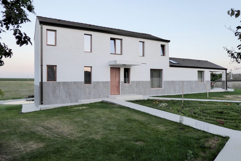
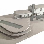
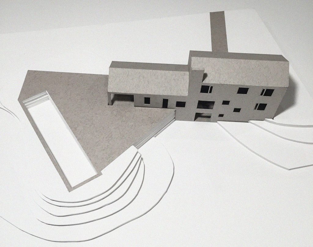
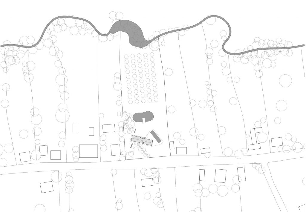
The house at Crucea is made by Mircea for his parents, together with the architects Diana Bucur and Alex Bucur, and it lies on a long plot, with neighbours on both sides, street access and the natural limit of the stream at the back.
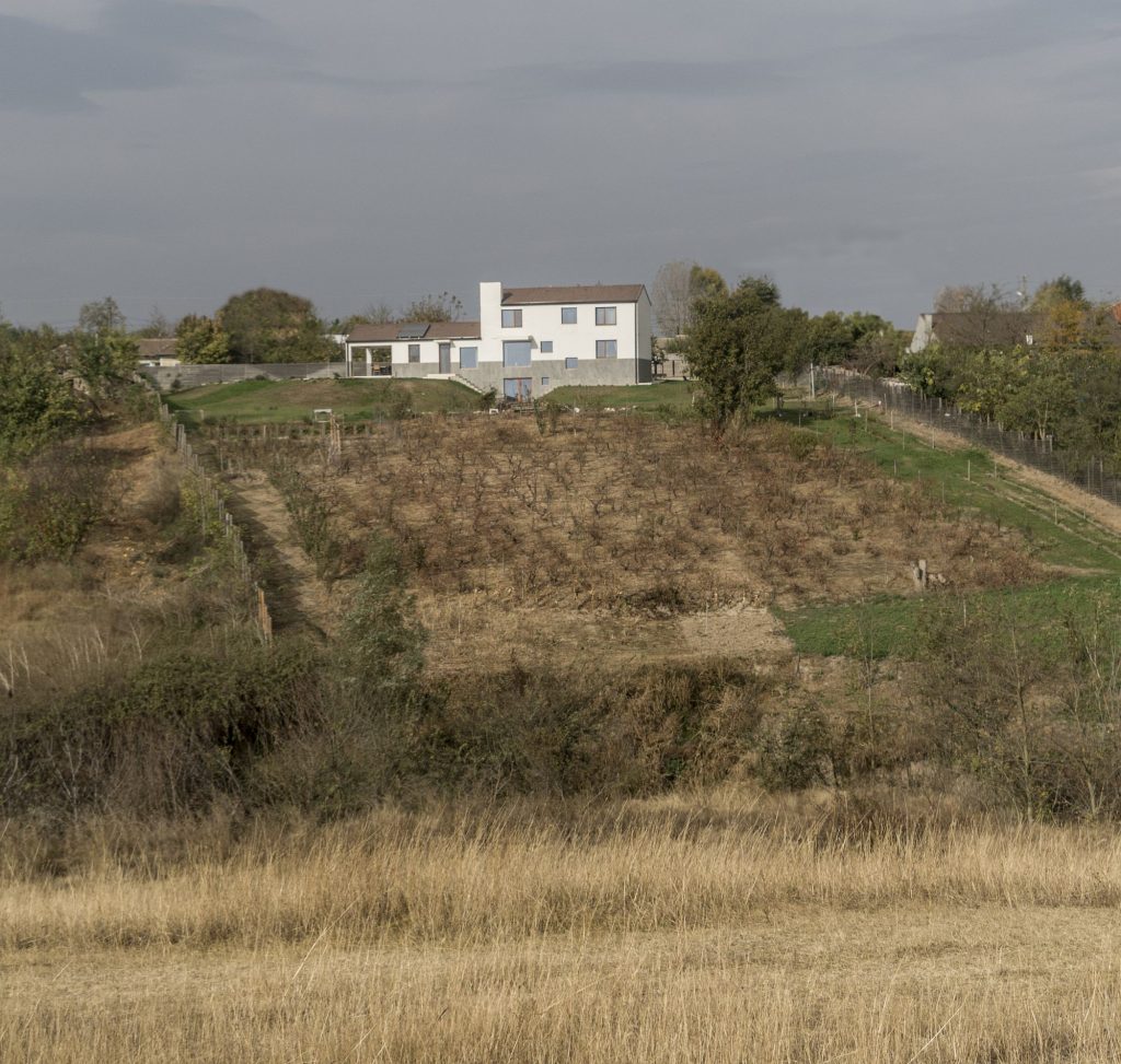
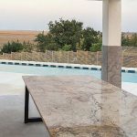
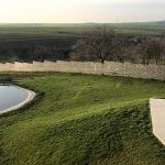
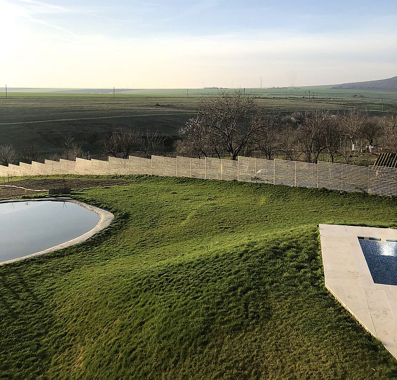
On this strip of land, things are placed devoid of any alignment or cartesian arrangements, grids of any kind, but, as I confess I like it lately, they are just right (now I am making a staggered, back-and forth gesture with my palms down). Besides, before you enter the bowels of the house, the orchard seems the most orderly thing on the plot, and that makes the limits disappear, and the narrow long house, and the narrow long swimming pool, and the ‘pond’ define a space and some relations that no longer take into account the pre-existing order of the parcel structure, but an interiorized one, specific to living.
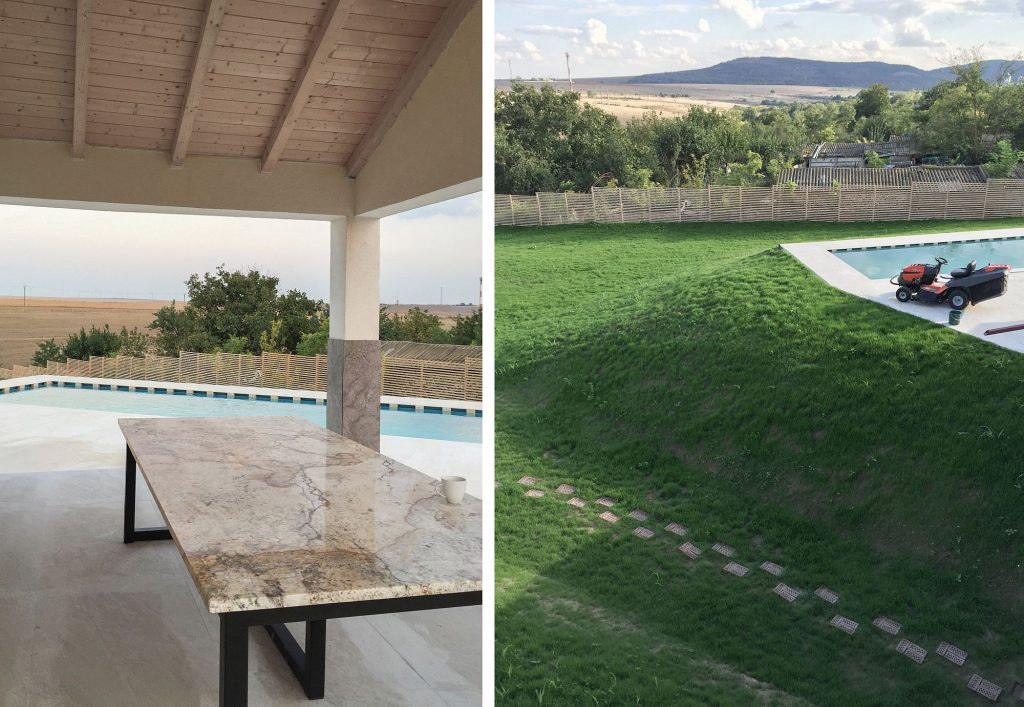
On the inside you find rooms: an enfilade of rooms dictated by the transversal walls which sub-divide, reasonably and simply, the hyper-known spaces of a house.
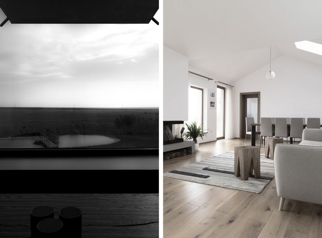
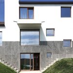
In cross-section, however, there is movement, as the ground floor, with its main connections to the land (the access or the exit to the terrace) is caught between two similar formulas of in-rooming, yet which alter or influence something around them: in the basement, in order to gain exterior access and natural light, the topography of the place changes, and there is a compensatory dig-out with free stairs on either side, linked to the house; on the upper floor the two bedrooms cannot occupy the entire length of the building, so there is a reduction in the footprint, and, implicitly, the dining space on the ground floor is no longer under the rooms, but under the roof truss which breaks and comes down over half the house.
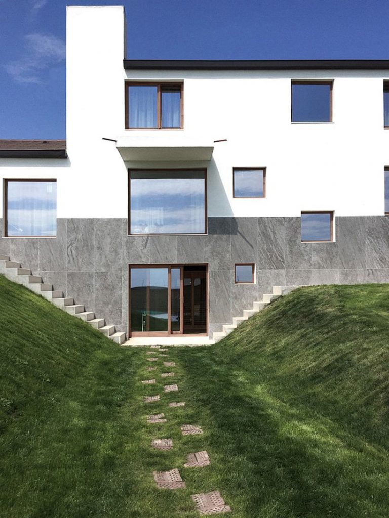
This reminds me of the old houses in Bucharest, where most times such disparities meant an internal hierarchization, and the ‘small’ house was the servants’ house, therefore secondary and serving, while the ‘grand’ house would host the good rooms. Of course, we are not talking of the same thing here, and there would be no reason to do so; but it is very interesting, at least for myself, that the break, the discrepancy, is not made along the axis of any transversal wall, but right down the middle of the living room In other words, were we to eliminate one half, the other one could not hold it, either.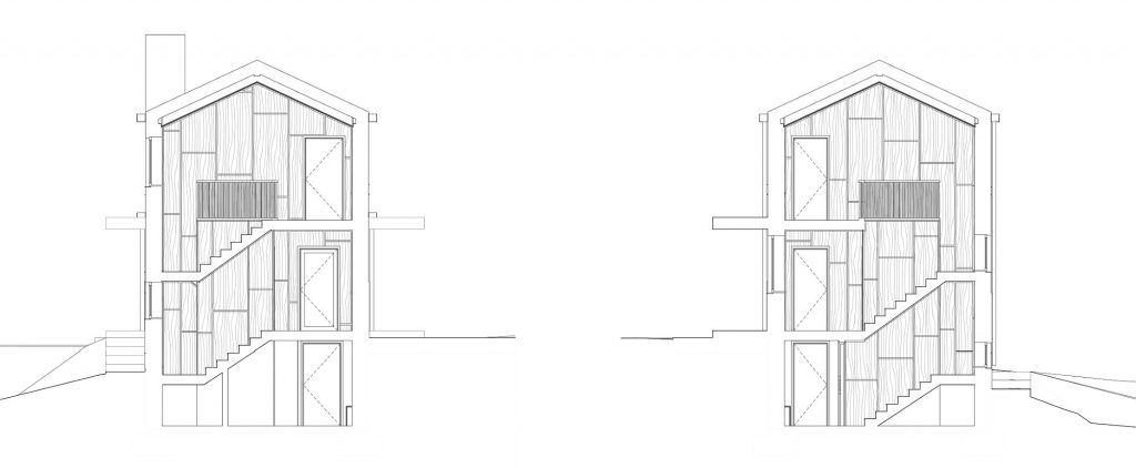
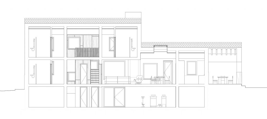
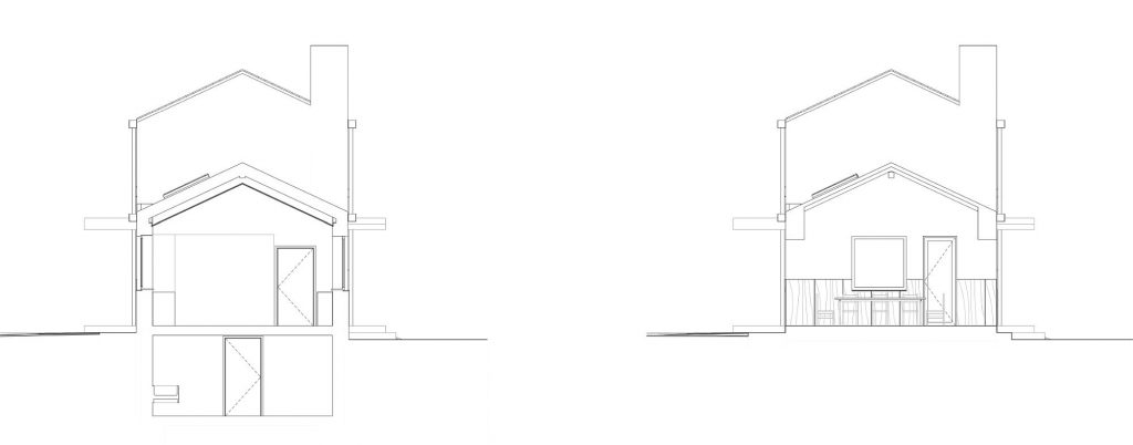 *sections
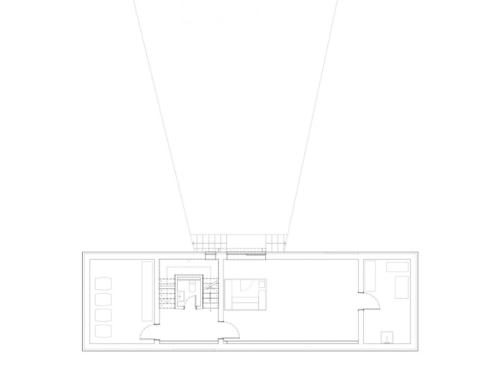 *semi-basement plan
 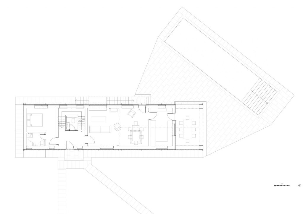 *ground floor plan
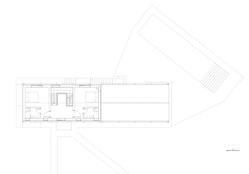 *1st floor plan
These deviations from that which seems natural, on a first glance, as is the case of the staircase rotating around the bathroom, need, in my opinion, to be rapidly taken out of the area of ‘clumsiness’ where we would be tempted to place them; not because they were proudly stated to be deliberate – I believe would even more safely guarantee their position in the above-mentioned category;, but because in such a house, these incidents and clashes of elements are precisely what it’s beautiful, perhaps even more than the wood panelled rooms or the windows cut out from the house’s belt.
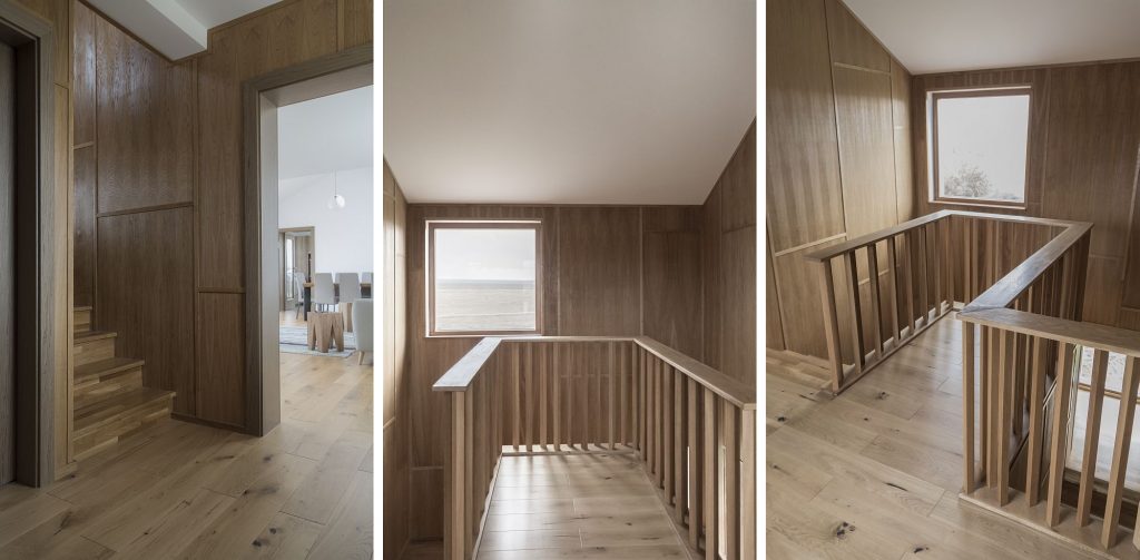
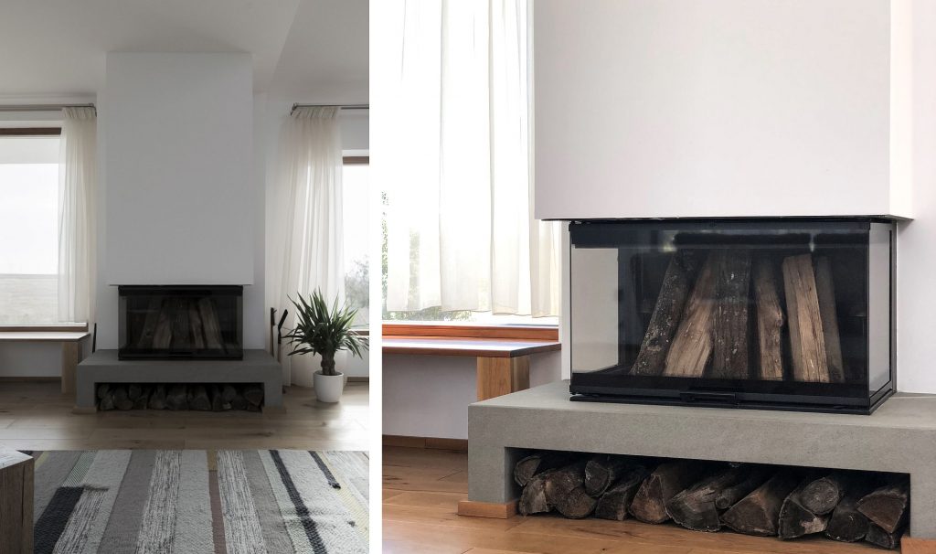
I will conclude by confessing that this is one of my favourite houses seen lately in our parts, and I am glad that, from all of my generation, Mircea Vasvari, as the painter put it, is the first to “reveal”.
