


Project: Brandlhuber+ Emde, Burlon; Muck Petzet Architekten
Text: Ștefan Ghenciulescu
Photo: Laurian Ghinițoiu
Project listed as finalist at EU Mies van der Rohe Awards, 2019
“Every user of the ateliers is entitled to own a chicken that will live in the community garden, in a coop designed by Brandlhuber.” To be honest, I have no idea if this excerpt from the building’s manual of presentation still applies. I do however remember the community garden and Olivia Reynolds, who manages the project together with Elke Falat, proudly showing us her favorite chicken.
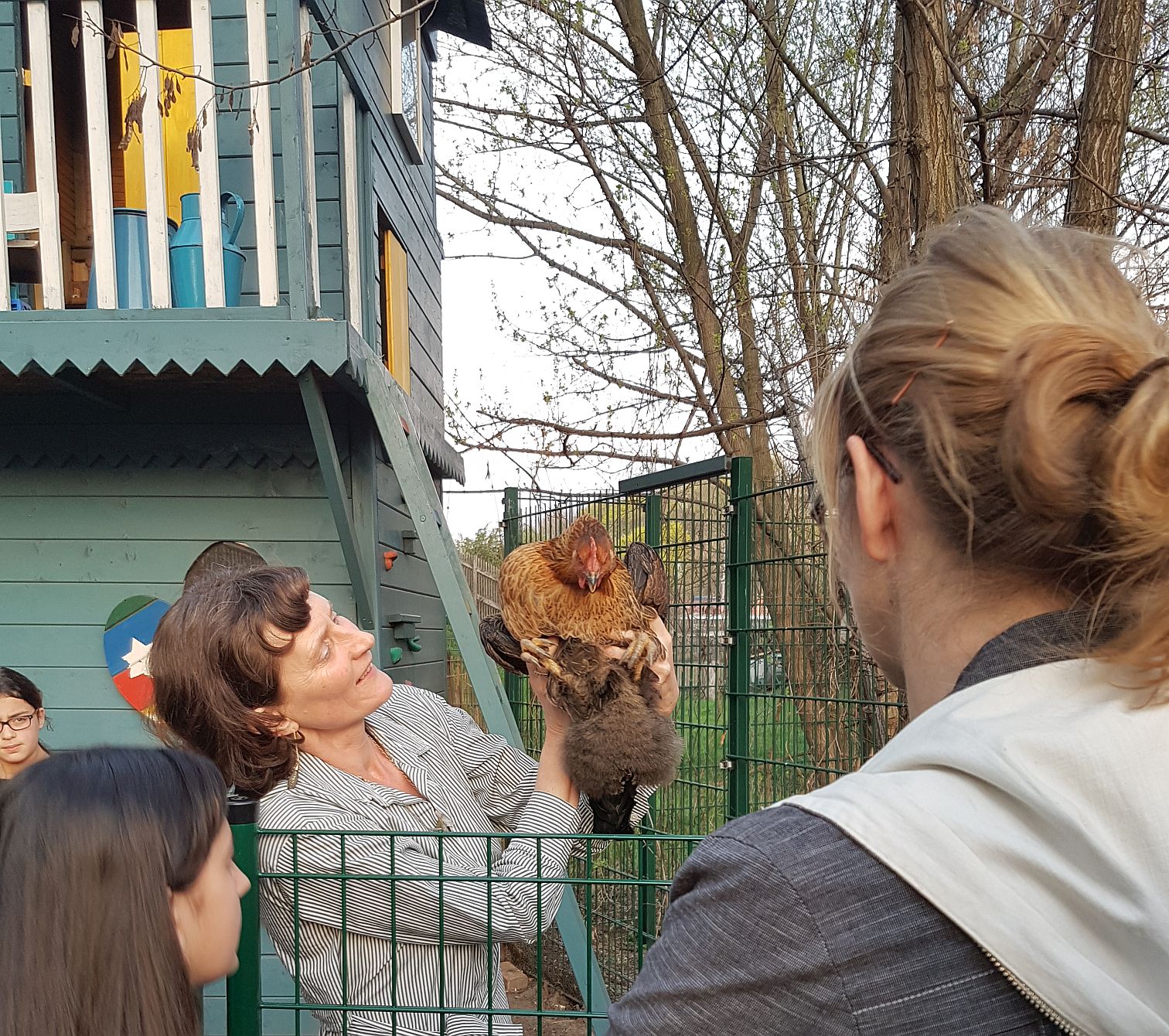 *photo: :tefan Ghenciulescu
Of the six works (five finalists and the school selected as the Emerging Architect Winner), this is the only private initiative. Yet this is no ordinary private project: instead of trying to monetize every square meter, the developers asked the architects explicitly to preserve as much exterior space as possible and to make it accessible for the users and the neighborhood residents. Density and shared spaces: the architects’ proposal interprets existing models, terrace housing comes first to mind, while in fact reinventing the relationship between the public and the private.
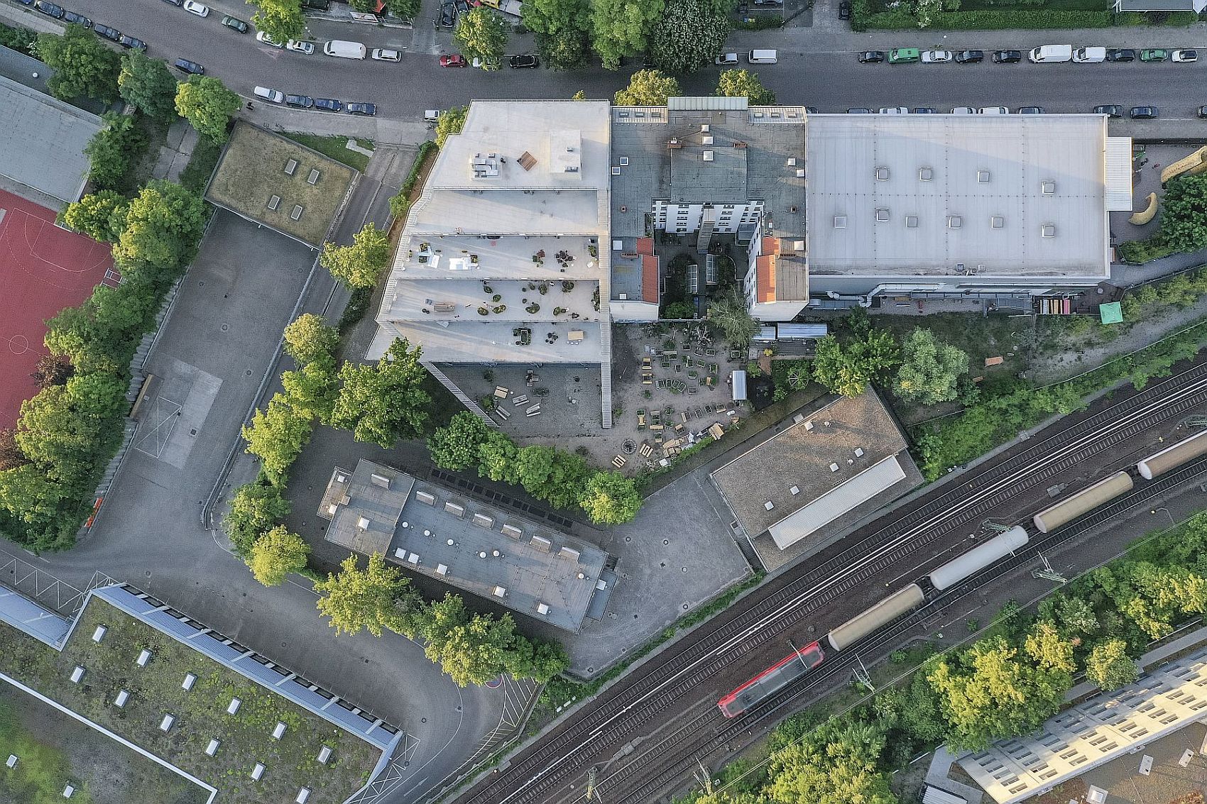
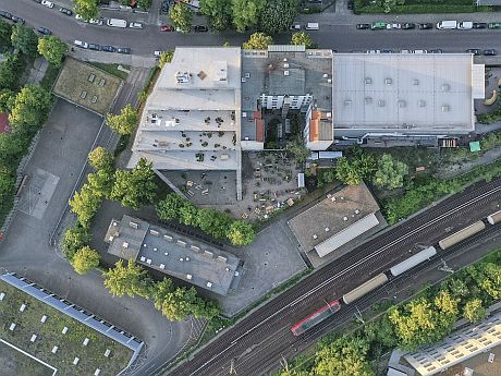
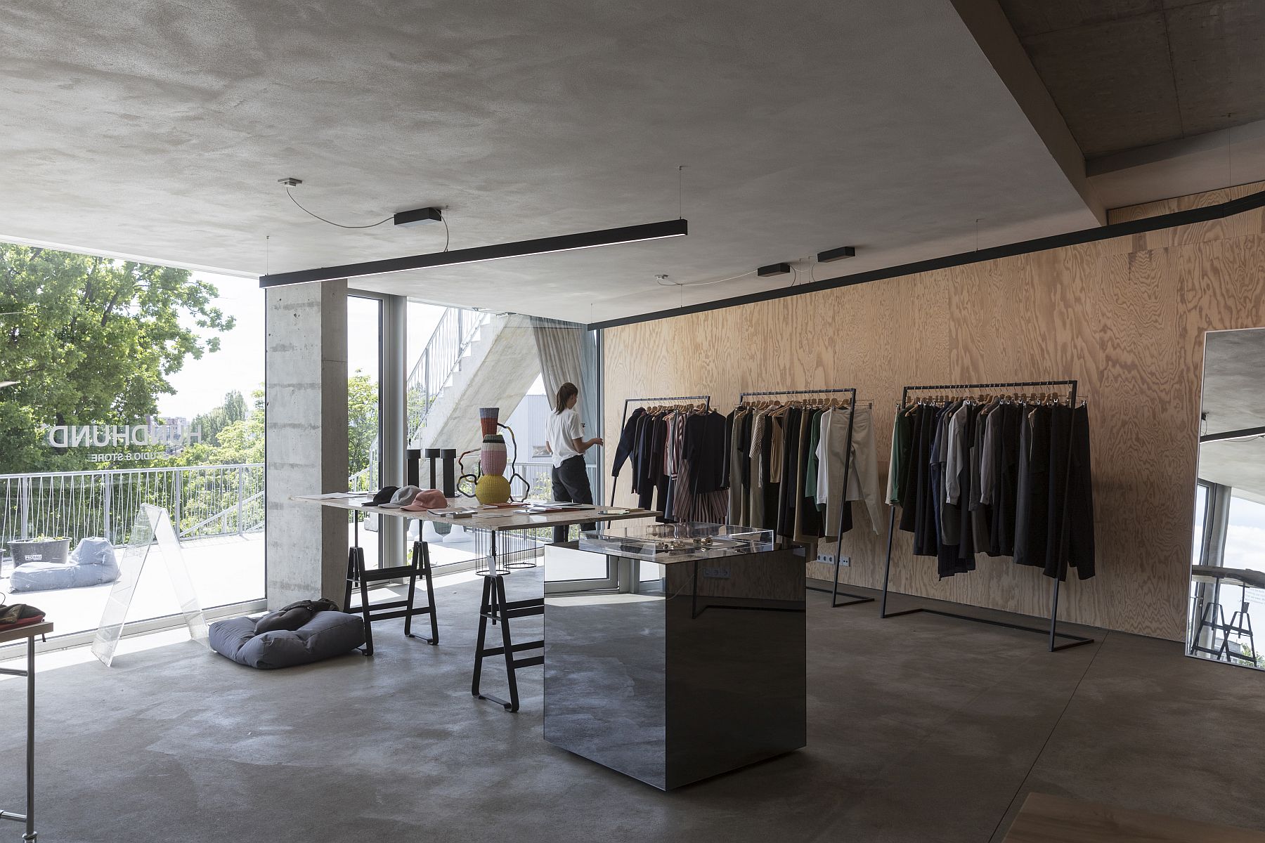
The site is a former scrapyard, located in a neighborhood at the periphery, which is undergoing an urban renewal process and, consequently, gentrification. This is a mixed-use building—ateliers (including an architecture and one graphic design office), an art gallery, responsible fashion stores, a coffee shop and restaurant, and, to a smaller extent, living quarters. The current zoning regulations do not permit permanent housing, with the exception of the manager’s housing unit, i.e., Olivia Reynolds’ apartment, which I will discuss later. The client and the architects wish however that the share of housing should increase in the future, when it will become legally possible.
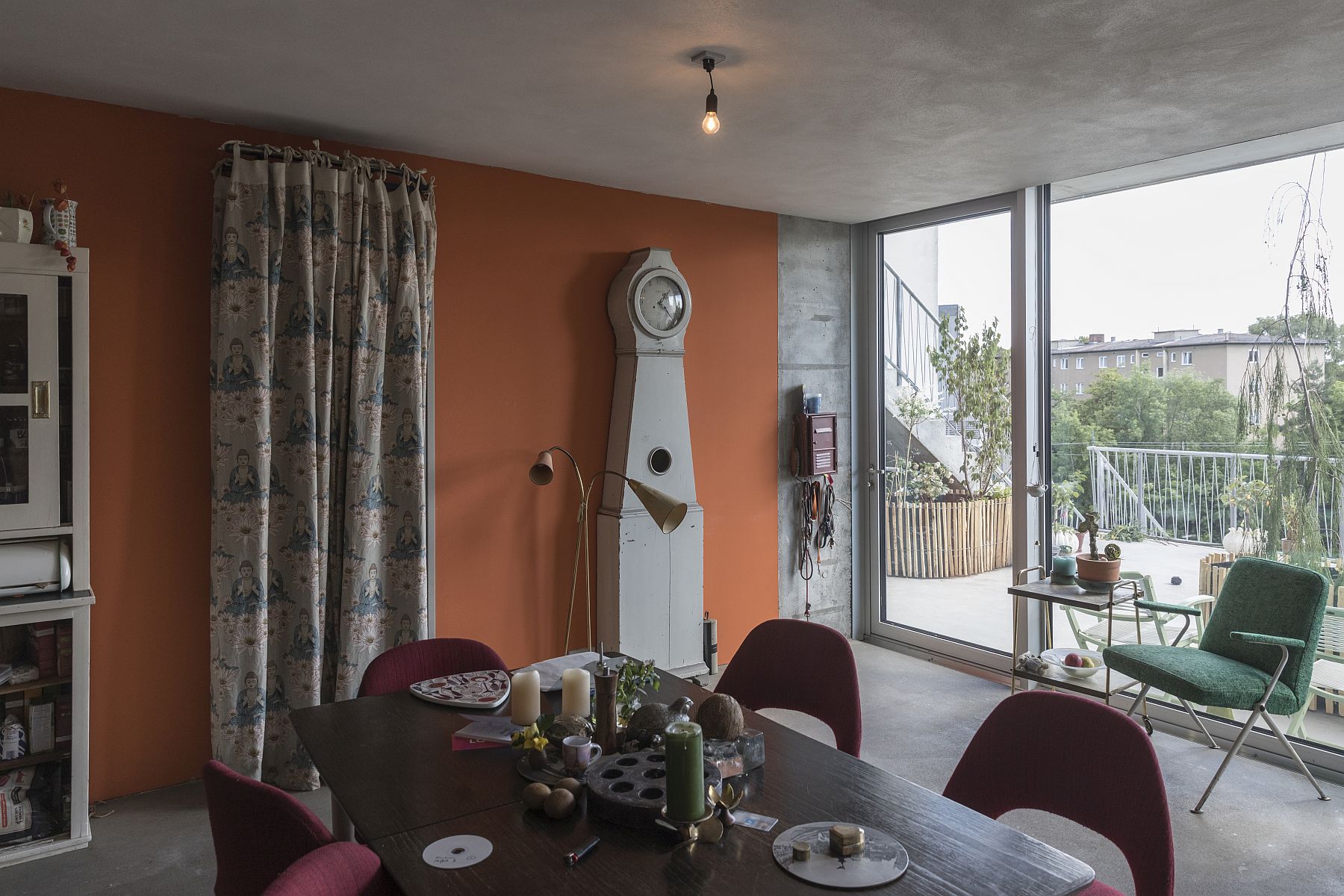
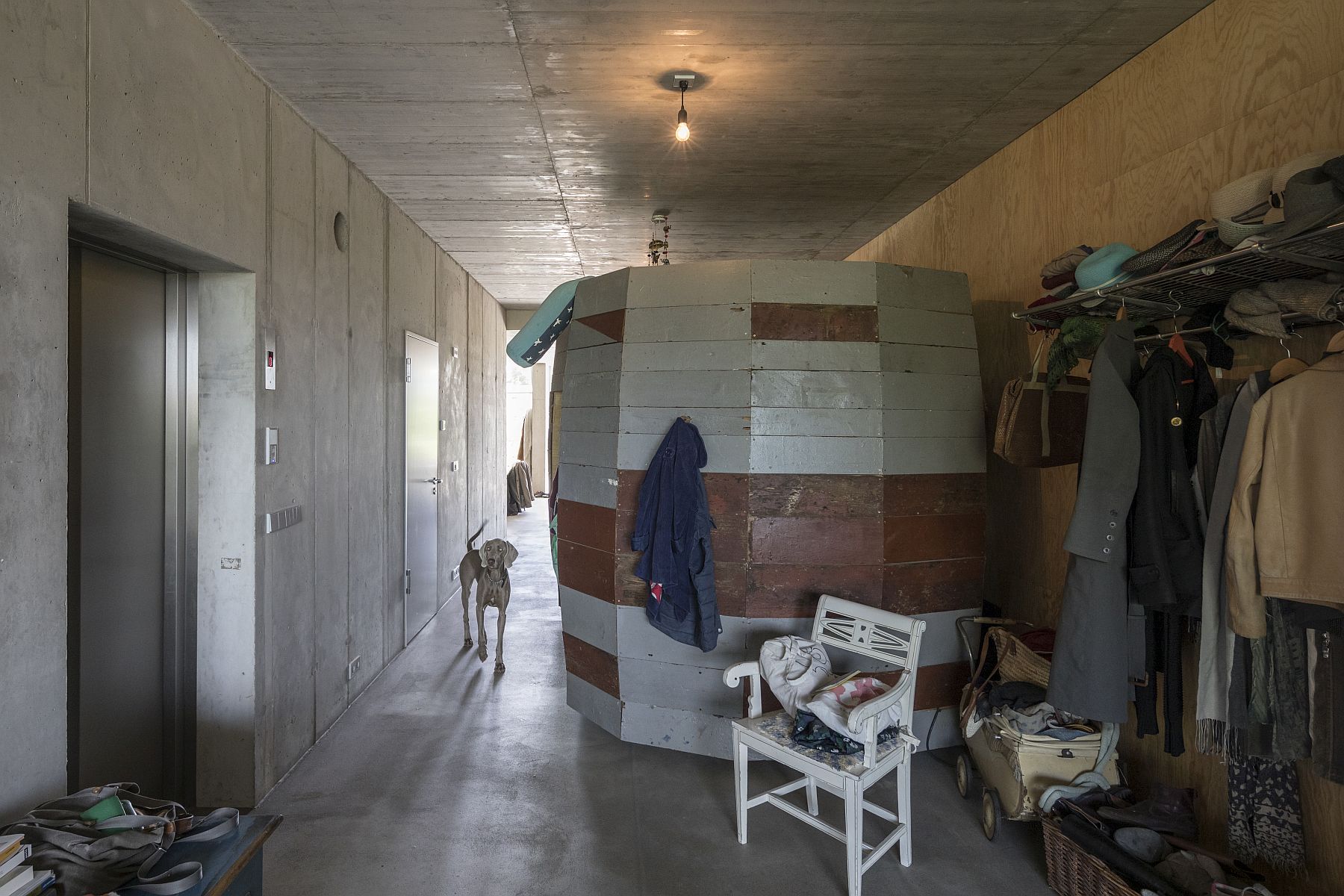
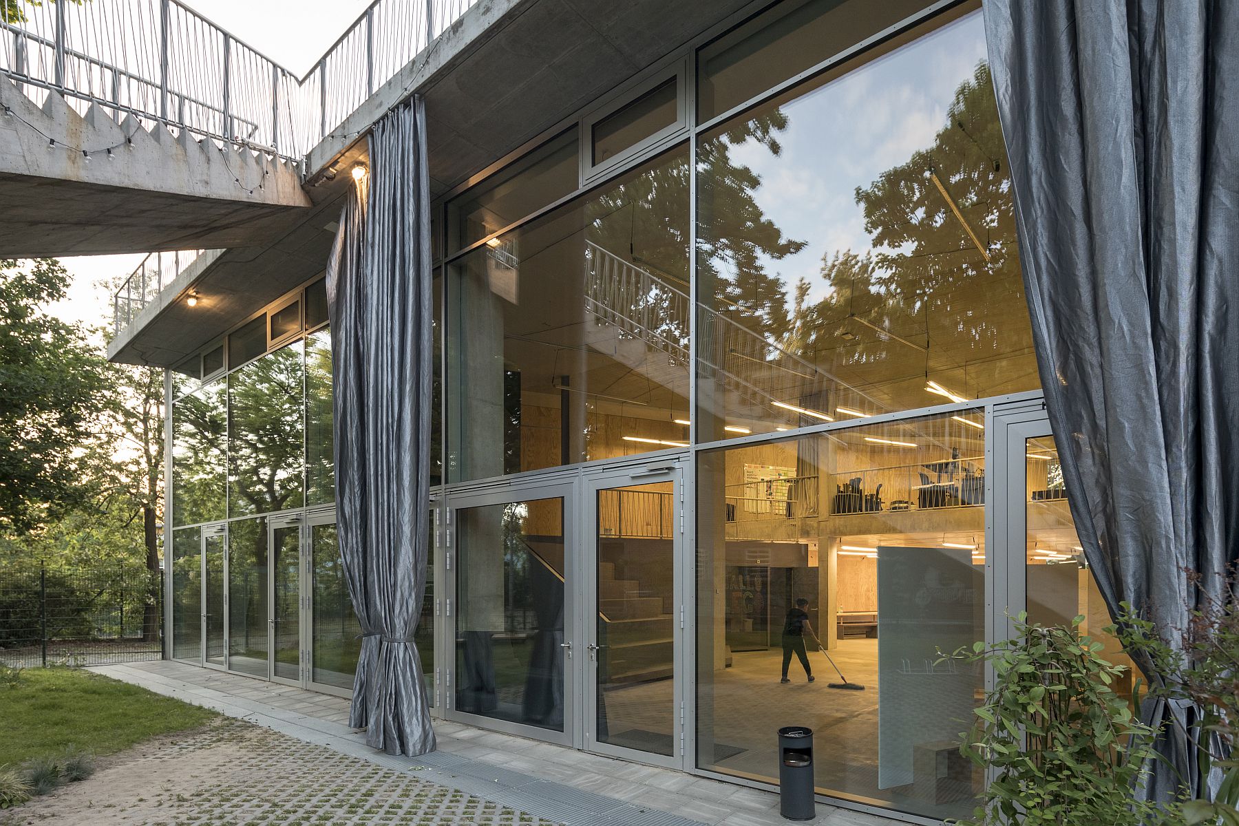
And there is indeed room for that. The project celebrates flexibility as it is built roughly in concrete, with large, open platforms, fully glazed or closed off façades, and cores for the technical services, while the rest is up to the users to design.
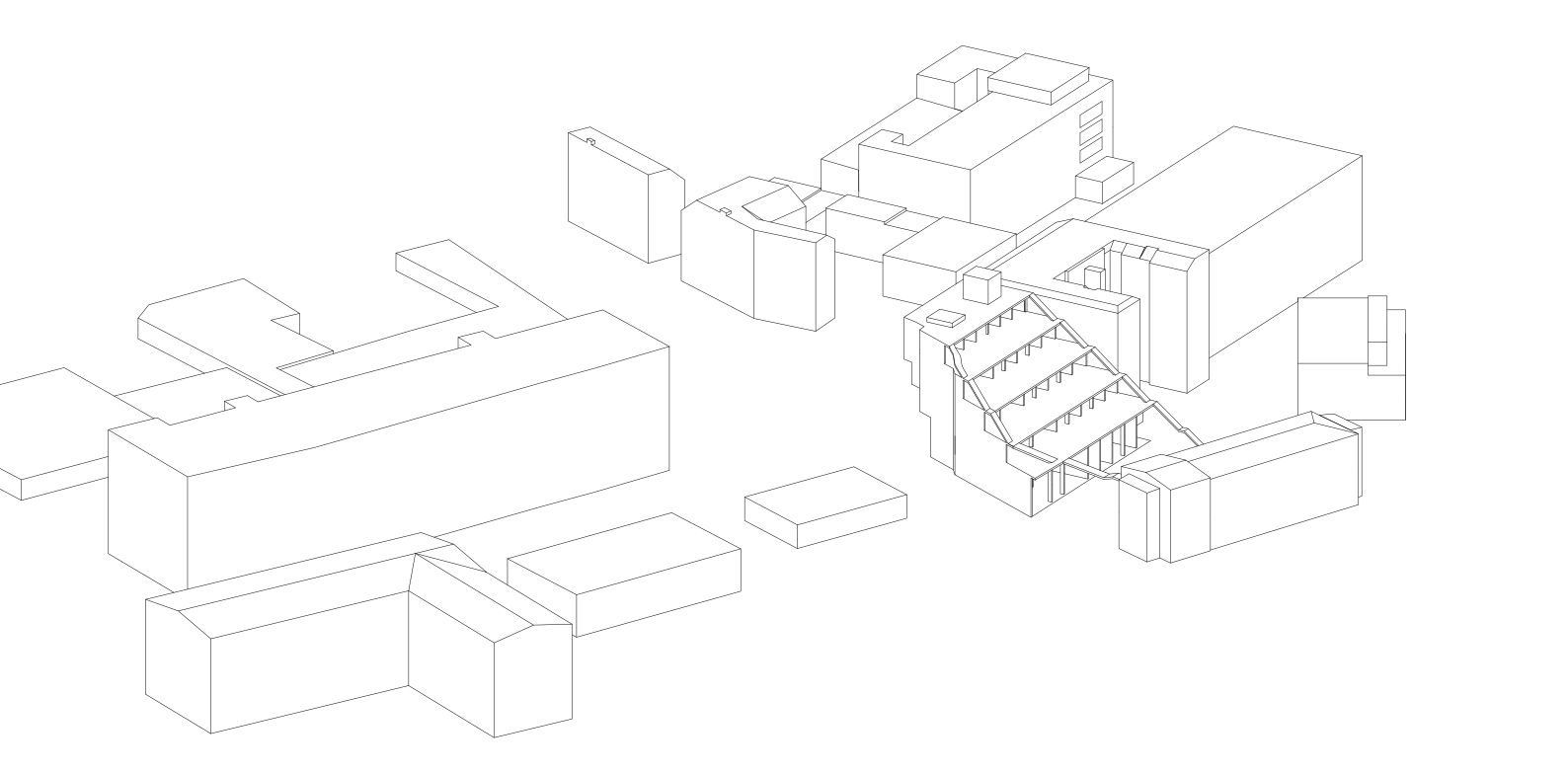
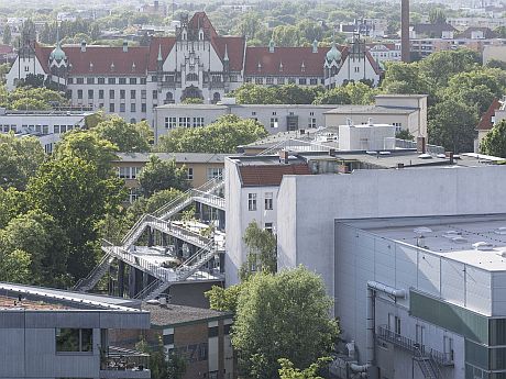
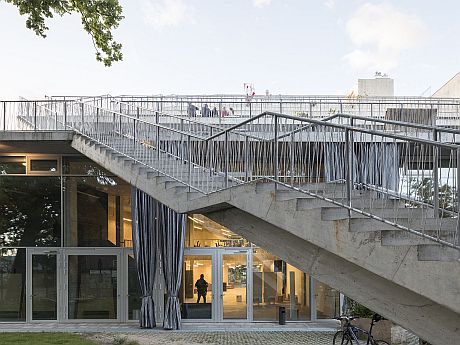
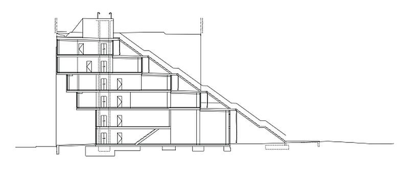
The section defines the building: 6 staggered levels. Although it is aligned with the other buildings on the street, the overhang creates a niche, a covered semi-public space. Since the ground floor is anyway mostly destined for public use, this sheltered space in front of the building works really well.
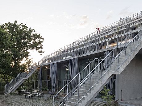
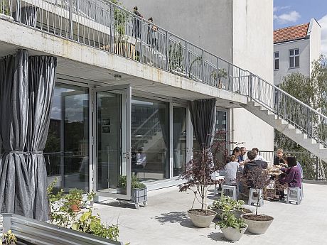
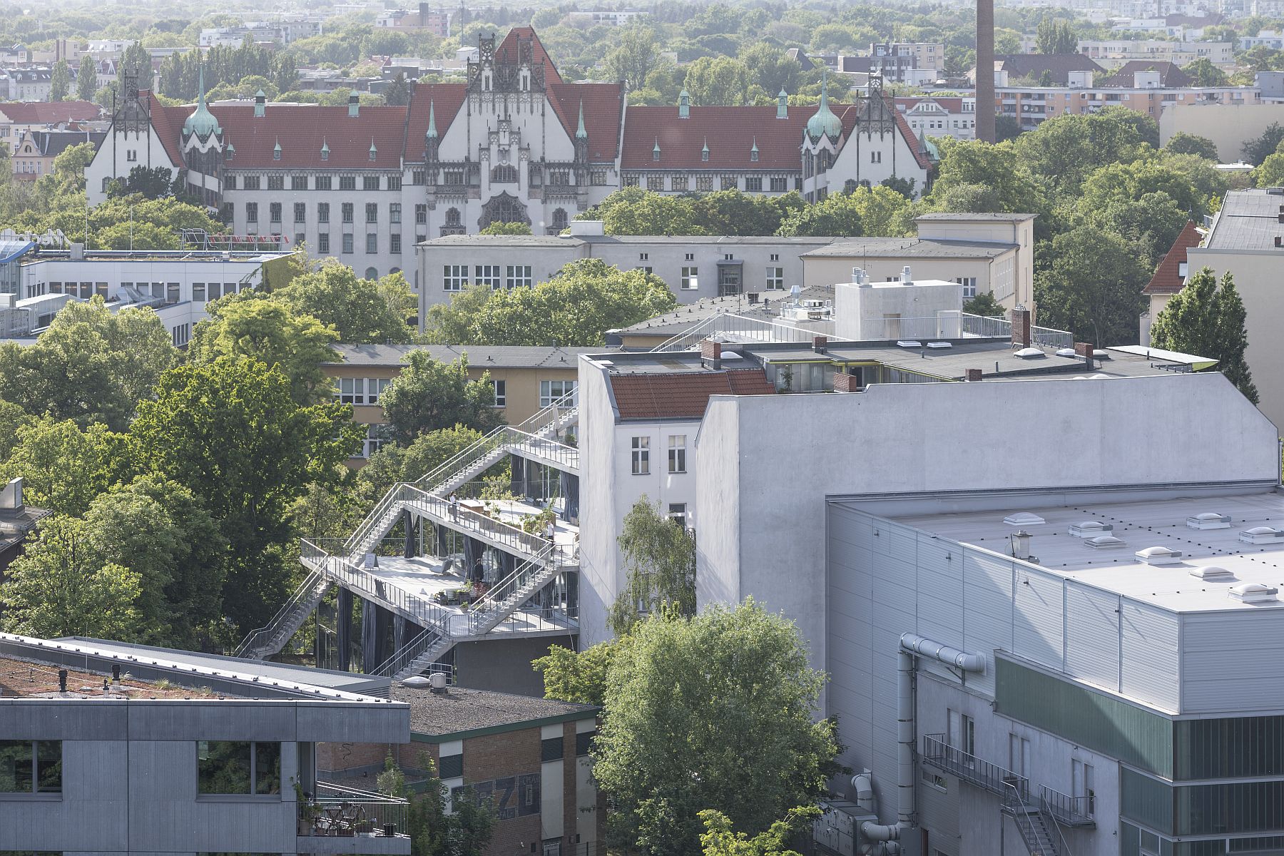
On the other hand, towards the back, and the south, generous, 5.6-meter wide terraces are created.
 *section
The gesture is not as simplistic as it might seem as the platforms’ depths vary: on the ground floor, they are 26-meter wide, making these spaces suitable for very public functions—the café and the art gallery—and this is achieved with the help of double-height voids which bring the light all the way to the back of the units.
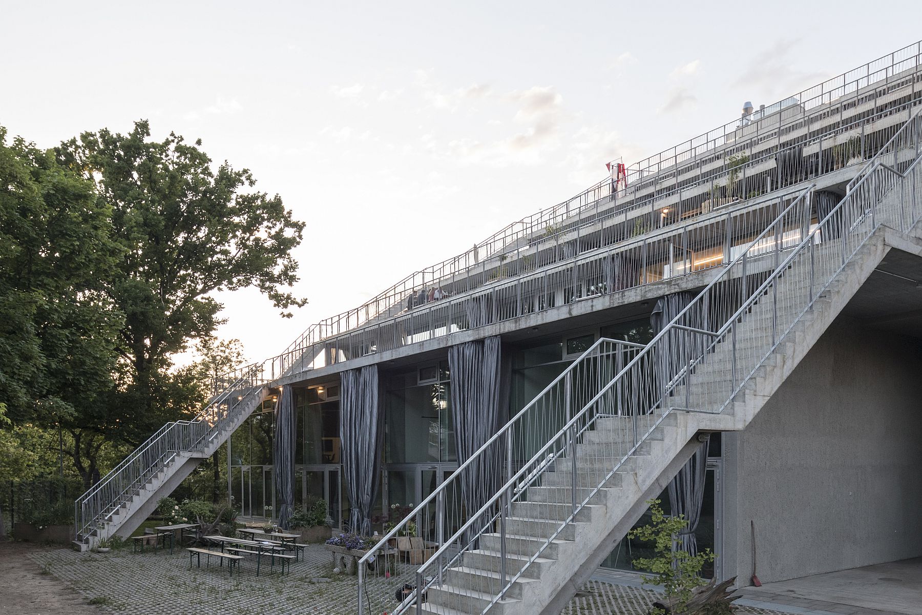
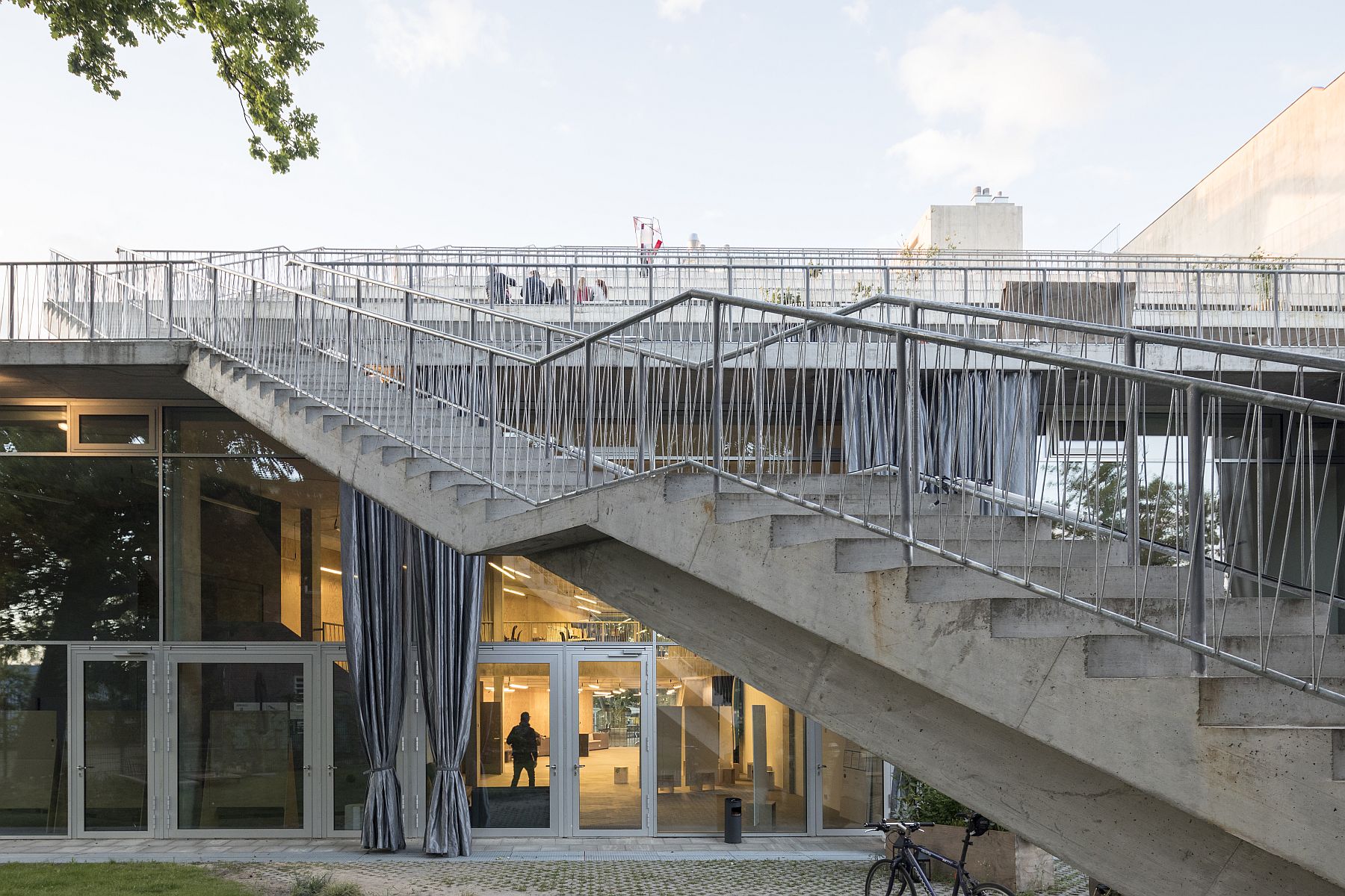
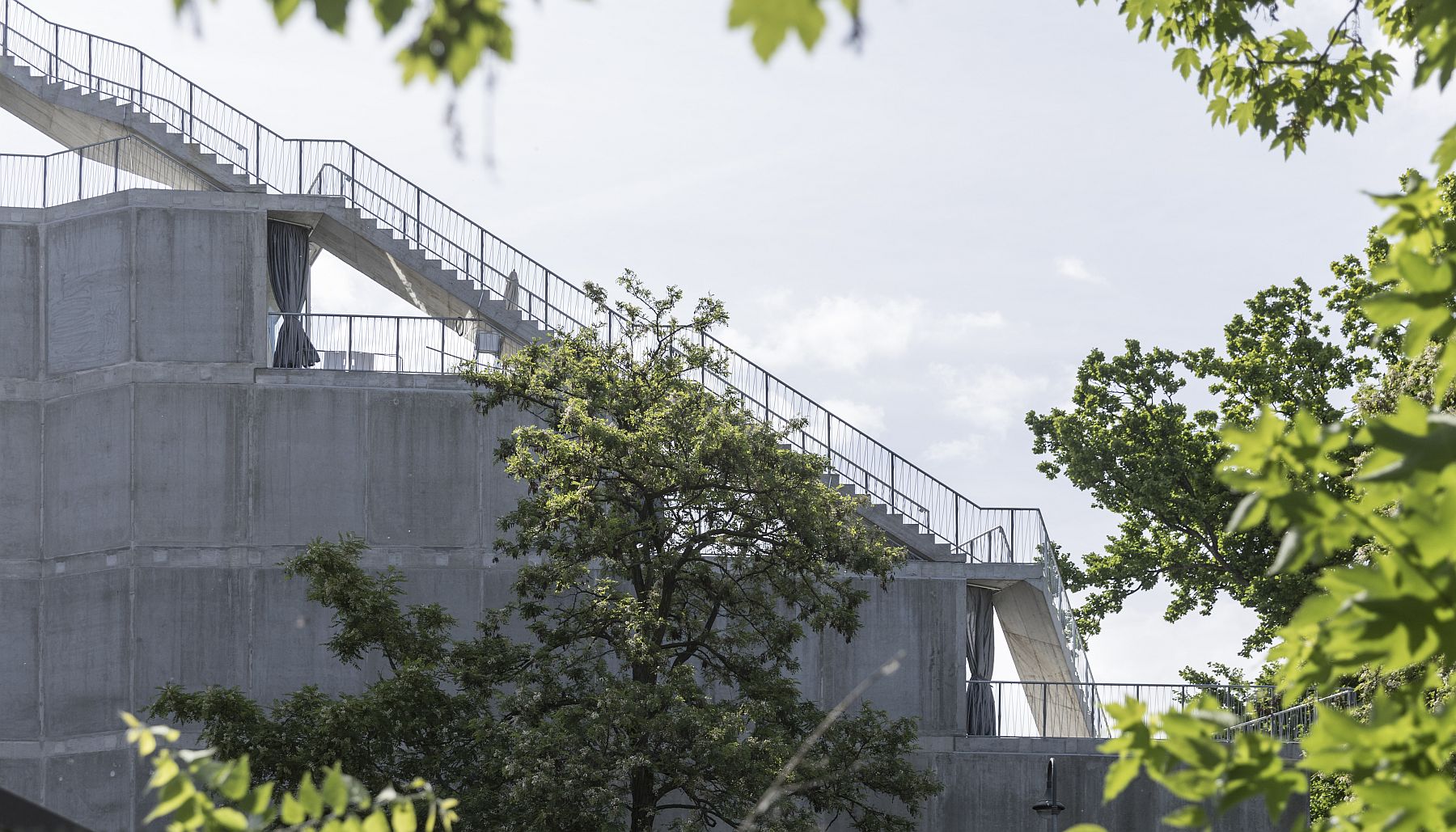
The depth gradually decreases, reaching 11 meters on the top floor, making these spaces more suitable for other functions, housing included. There is no functional diagram, the space-depth indicates the use. This subtle differentiation is one of the details that set this project apart from more famous examples like the Mountain Dwellings by BIG; another detail is that the core covered with successive recessed slices is not a parking lot but a semi-public space. Above all, there is the circulation diagram: the elevators are hosted by two central, vertical cores, while the two staircases were deliberately built on the exterior, following each stepped terrace. In this way, they become an integral part of the artificial landscape and a meeting place for the users.
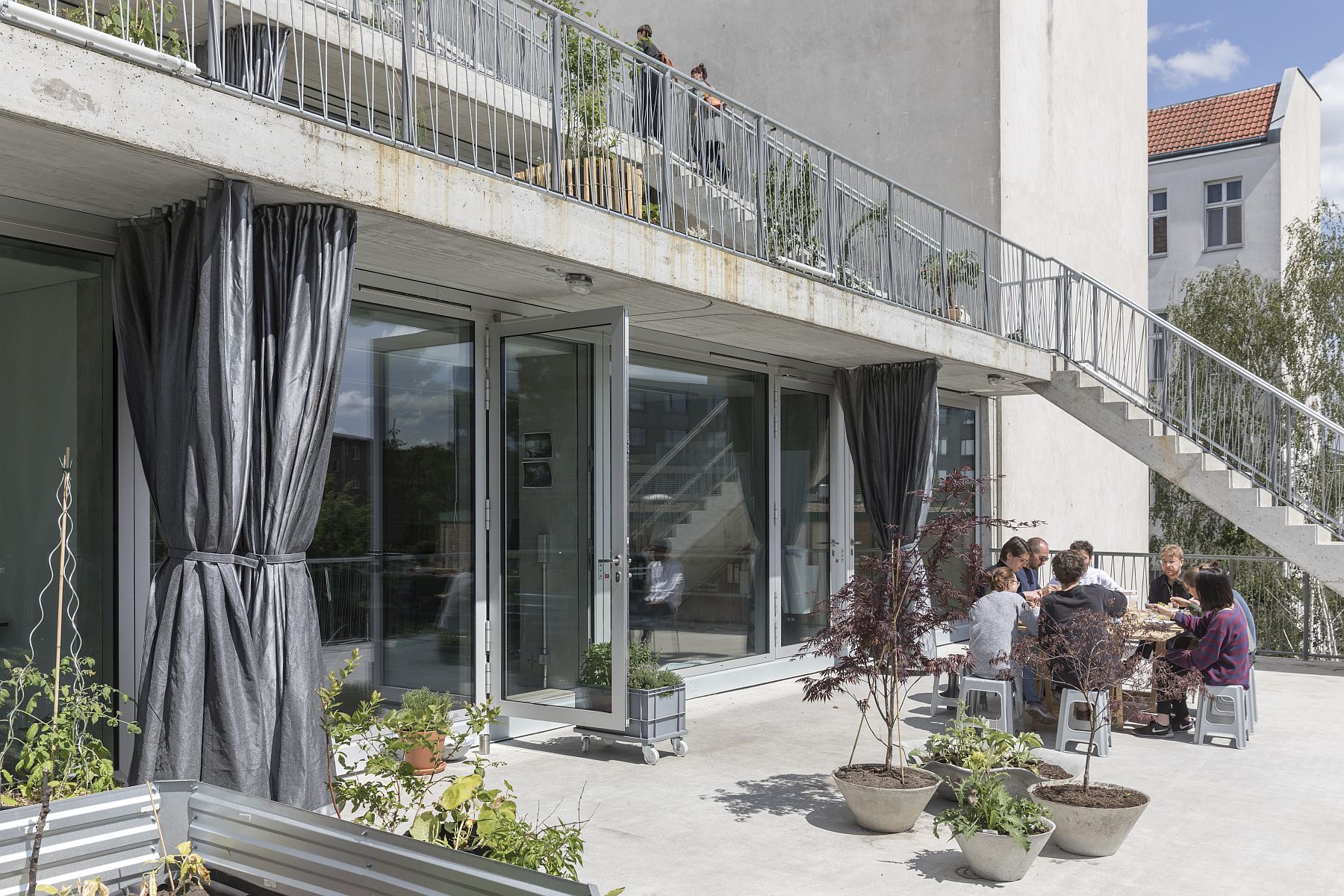
By placing the stairs at each end of the building, the architects fulfilled the evacuation requirements and increased the privacy of each unit. The exterior edge of the terrace remains vacant, while the occupants are free to furnish their front gardens according to their needs. The negotiation between the public and the private is not only allowed, it becomes a must.
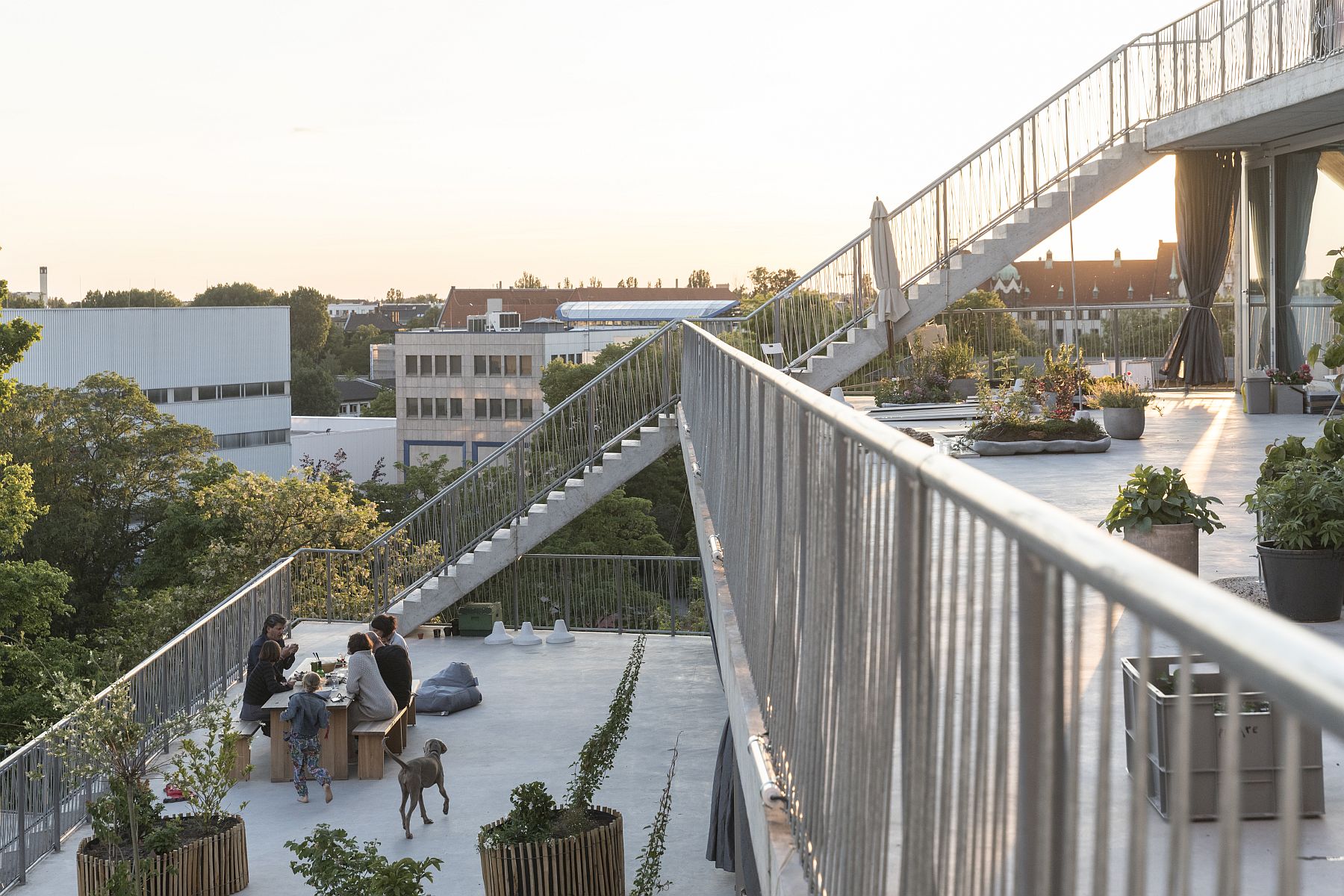
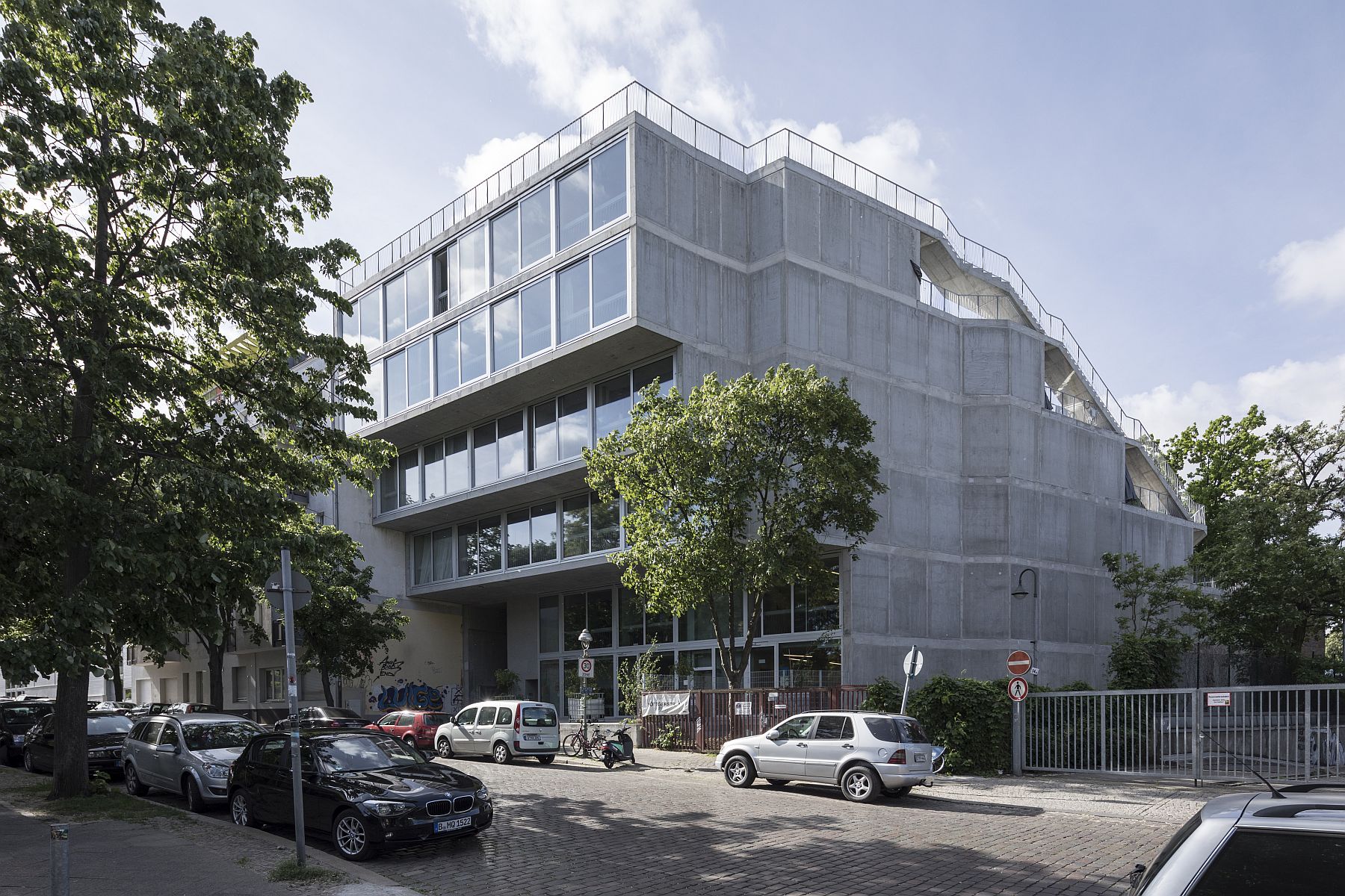
Lobe Block stands in a way for zero degree architecture. A far cry from glossy minimalism, which actually hides a host of useless sophistications behind the claim of purity, Lobe Block is not a classic example of Brutalism either, with its obsession for textures, articulations, and complexity. It is brute, in the proper sense of the word, as it reduces everything to the bare necessities: concrete, thermal insulation (mounted on the interior), railings where they are needed, general glazed surfaces, curtains for solar protection and privacy. Many of the common details are missing; there are no eaves or guttering on the terraces. They were built tilted, so the water from one terrace drains on the one below.
This is by no means a building that suits all tastes. And it is certainly not for very territorial people, obsessed with safety and privacy. Indeed, we liked it better on-site than in the photographs. First, it is really big, and this grants it a sort of fierce monumentality, not to mention the vastness of the spaces, more akin to infrastructure works or a well designed and built factory.
Then there are the things that do not stand out in the shots, namely the beautiful proportions, the execution, the quality of light that gives the austere interiors and surfaces a dignified look. Very importantly, the typological innovation and negotiation truly work. The building is neutral enough to support very different scenarios and strong enough to define a clear, healthy frame, in the absence of which freedom could easily dissolve into chaos and conflict.
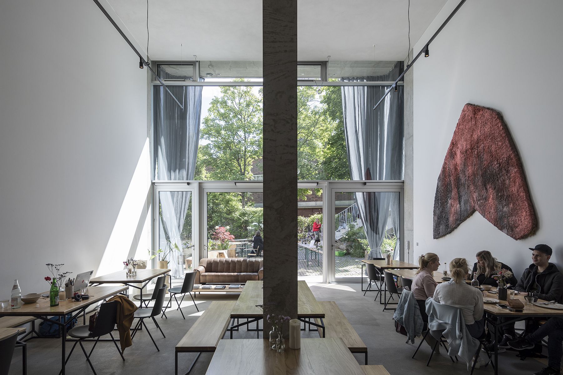 *cafeteria
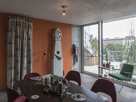
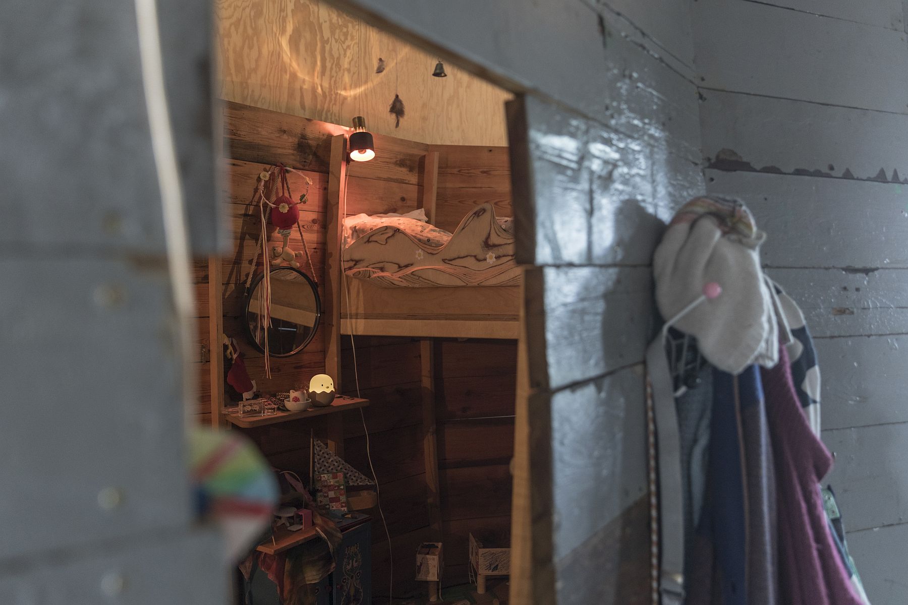
We visited the art gallery and the café, the architecture atelier, as well as the most private space so far: Olivia’s apartment which was full of things, full in a good way, an undeniable proof that concrete and domesticity go together. Olivia designed her daughter’s room herself according to the girl’s wishes: a cocoon or a nest or a berth, if you’d like, made entirely of wood—a safe, private space in the middle of the apartment.
 *Olivia Reynold’s apartment
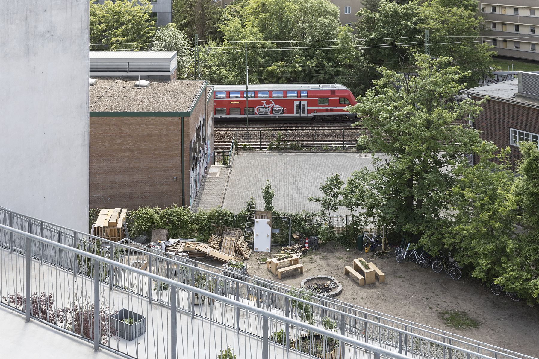
Outside, the artists and the other occupants have started filling their terraces with plants, making the scenario of the concrete disappearing under the vegetation depicted in the presentation rendering seem quite realistic. The ambiance on these generous terraces is already quite nice, even if I felt personally a bit embarrassed to pass by the people’s windows or the people themselves sitting in their gardens. They, on the contrary, didn’t seem mind at all. On the ground floor, the community garden I mentioned earlier works as a counterbalance to the radicalness of the building. For now, it looks like the slow passage from the city to the individual unit and the absence of strict boundaries was a successful gamble.
One reason why this is so is because the circulation route was integrated with the stacking solution: the further you go, the more intimate the spaces become, while, obviously the number of people passing-by get lowe. Accesibility decreases and safety increases naturally. The transition actually starts on the street level: to reach the staircases, you need to go through a passageway, the only space locked at night, and then the shared back garden.
Olivia told us that once the loan is paid off (in a couple of decades), she wants to transfer the building to a foundation, which would allow various degrees of accessibility to the tenants, according to their needs, their means, the evolution of the community. However, I plan to go back to Lobe Block before that to see how things will turn out.
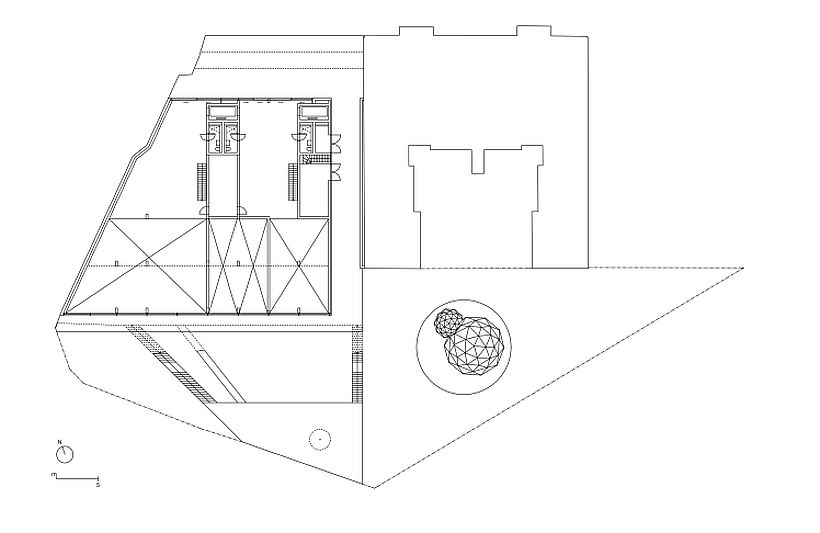
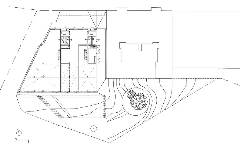
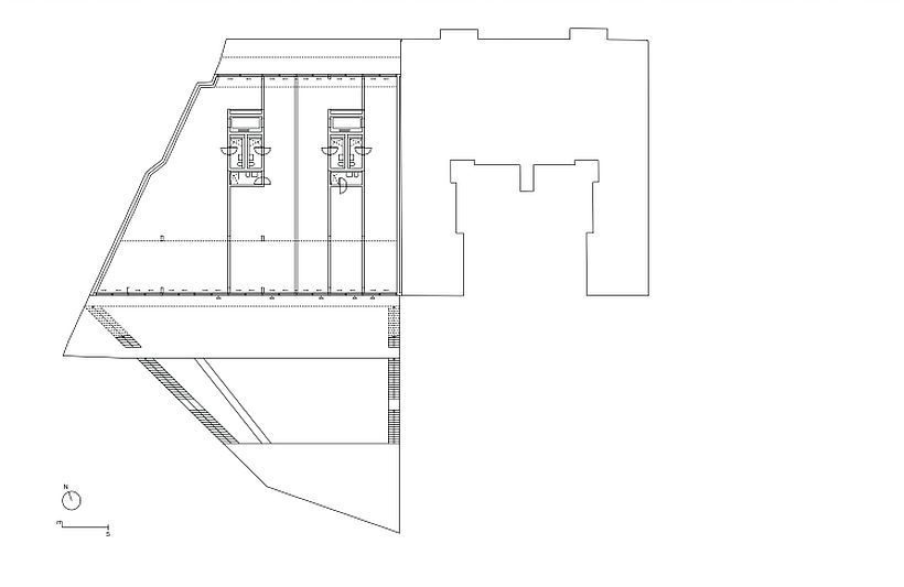
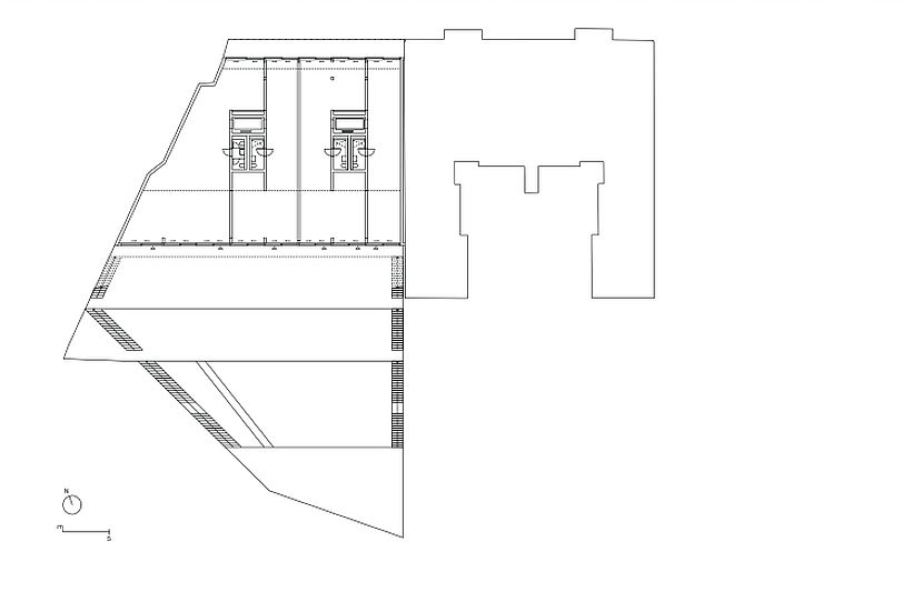
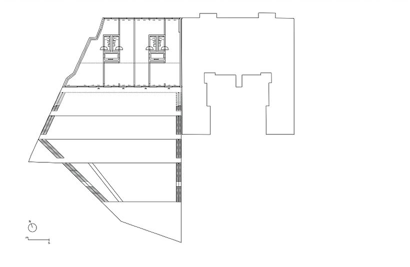
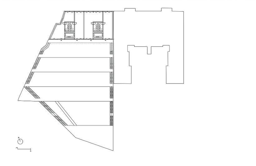
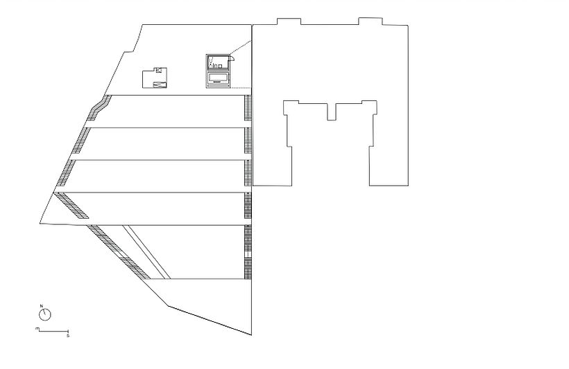 *Plans: 0 level; 0,5 leve;l; 1; 2; 3; 4; 5
Info, credits:
Project name: Terrassenhaus Berlin / Lobe Block, Berlin
Year completed: 2018 (Year began: 2016)
Offices: Brandlhuber+ Emde, Burlon; Muck Petzet Architekten
Authors: Arno Brandlhuber; Thomas Burlon; Markus Emde ; Muck Petzet
Total area: 2086 sqm
Client: Lobe Block / Olivia Reynolds & Elke Falat