Project: BOGDAN & VAN BROECK
Text: Ştefan Ghenciulescu
Photo: Jeroen Verrecht, BOGDAN & VAN BROECK, Luca Beel, memymom
We are taking back our city.
Houses in downtown European cities (and not only) are rapidly turning into offices, Airbnbs, hotels, etc. The Cosmopolitan project follows the exact reverse path: a former office building becomes a block of flats, with public functions on its first two levels. Nowadays, when, to the largest part of the building sector, sustainability translates into materials, systems, gadgets, this operation targets first and foremost another type of sustainability: re‑use instead of tearing down, densification and land saving, bringing dwelling back to the heart of the city (therefore, reducing metropolitan traffic, and increasing urban and social activation as well as safety).
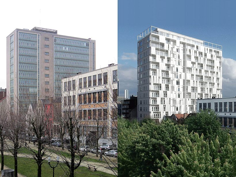
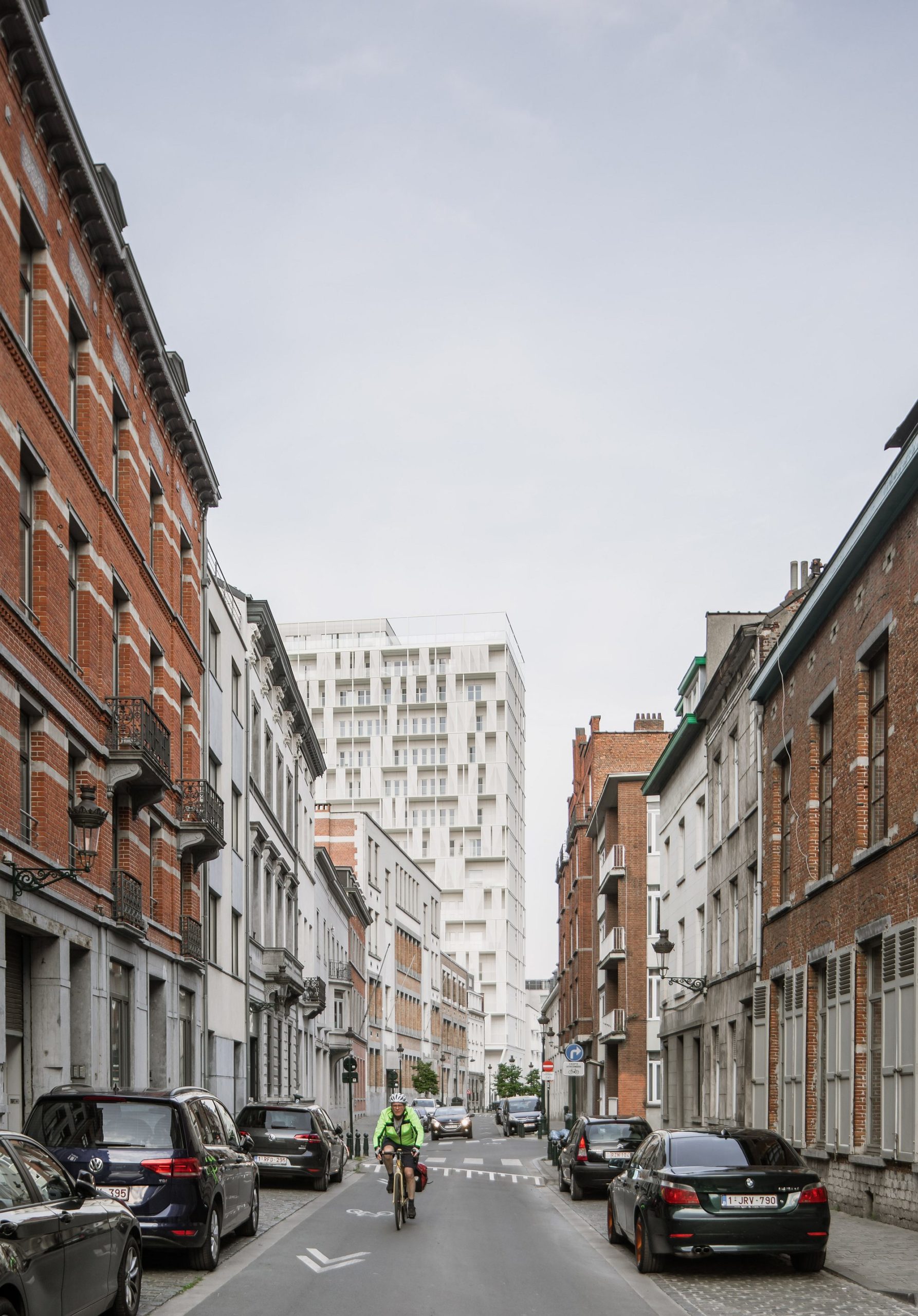
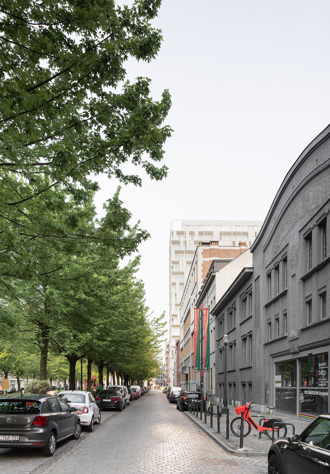
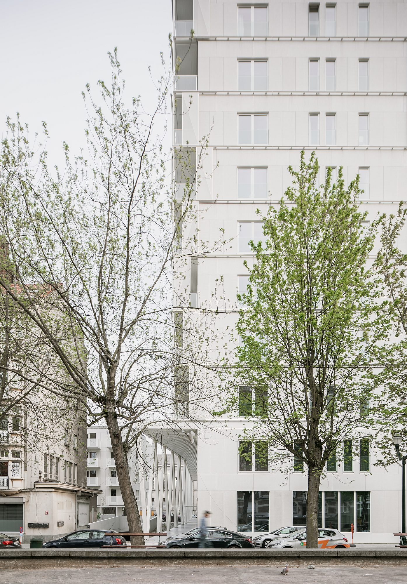
I have walked the square a few times (the name of Quai aux Pierres de Taille—“The Quay with stone blocks”— reminds of the port that was once there) and I confess that I cannot remember the old slab. Heavy inserts are to be seen everywhere in the historic fabric of Brussels—by the way, some are, in themselves, quite decent architectural objects. This building also clashed with the scale of the neighborhood, but its placement—perpendicular to the street, and the commonplace, yet quiet, architecture, were somehow pushing it in the background, from a pedestrian’s point of view. Actually, as it is now, sparkling white, and a bit wider and taller than before, it is quickly noticed.
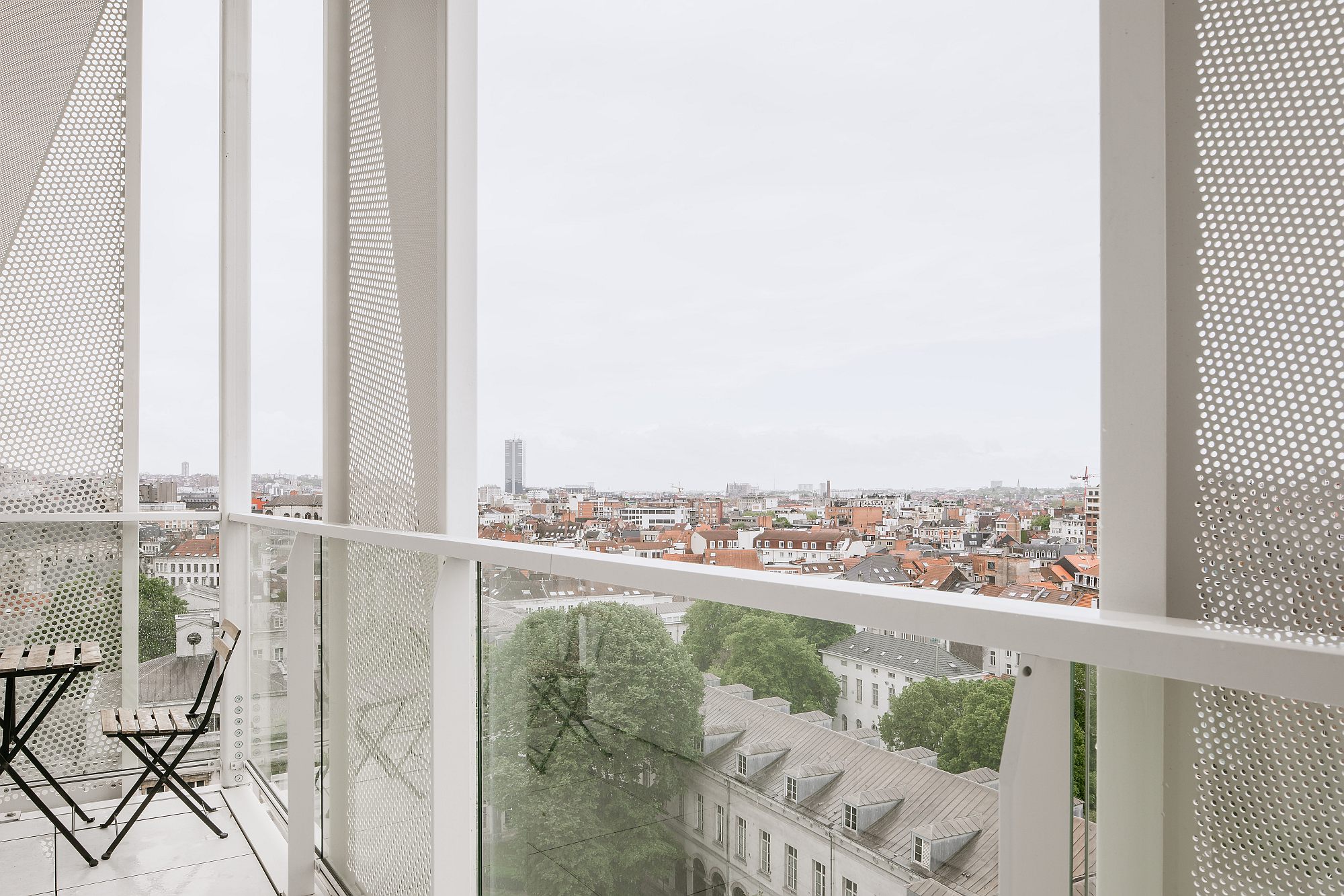
But I would say that, in an apparent paradox, its presence in the neighbourhood is much friendlier—from the recessed and protected ground floor, to the delicate skin that makes the volume vibrate under the light, giving it transparency, complexity, and a human scale.
How do you turn a closed box of offices into a housing that is open towards the city? What were the actions that were absolutely necessary in this instance?
STEP 0.
Smart Business
The investor had guts and vision: instead of calling on the average commercial office, they held an invitation‑based architecture competition, and BOGDAN & VAN BROECK were the winners.
STEP 1.
Cleaning, Consolidation, Elevation
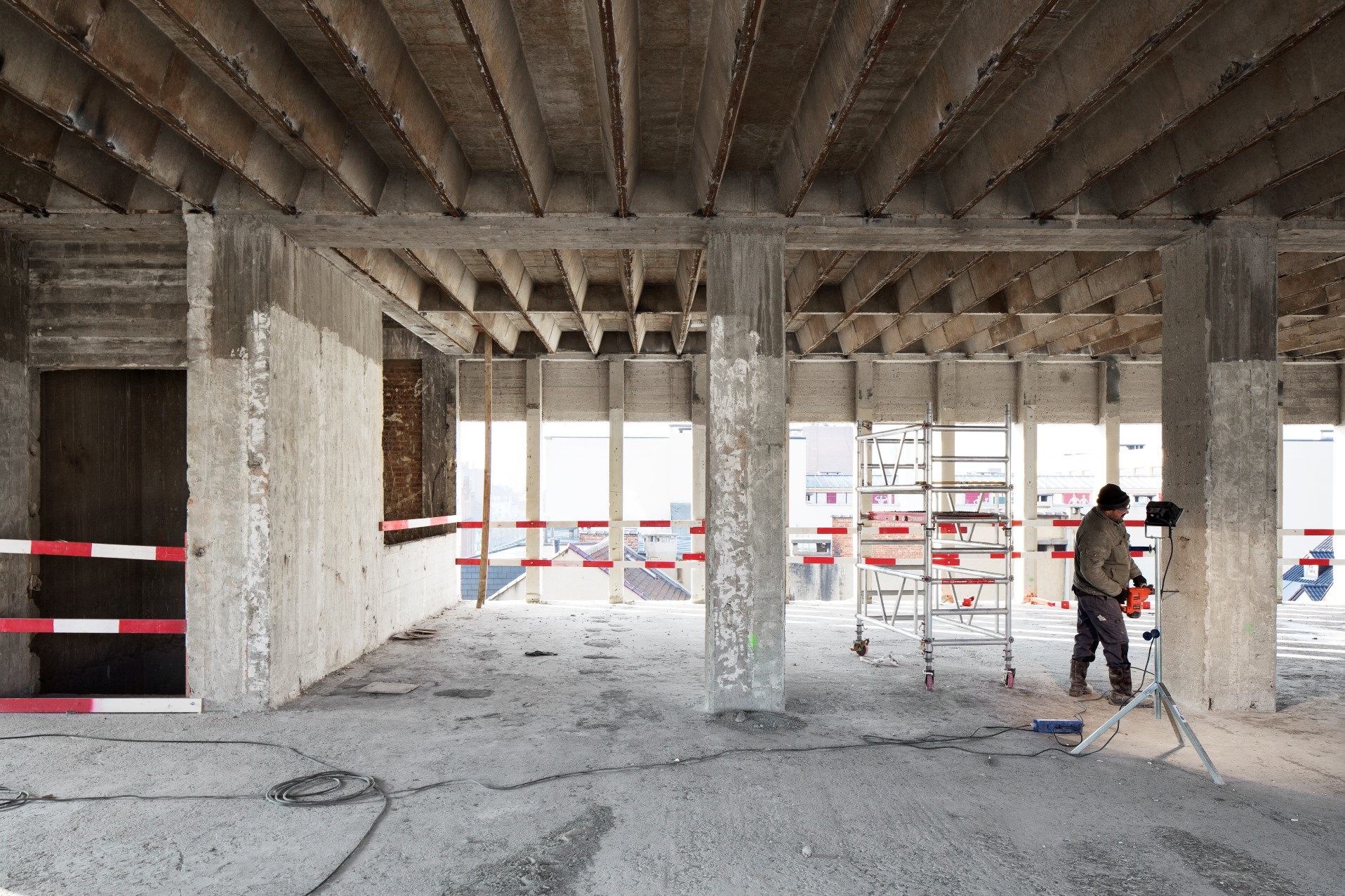
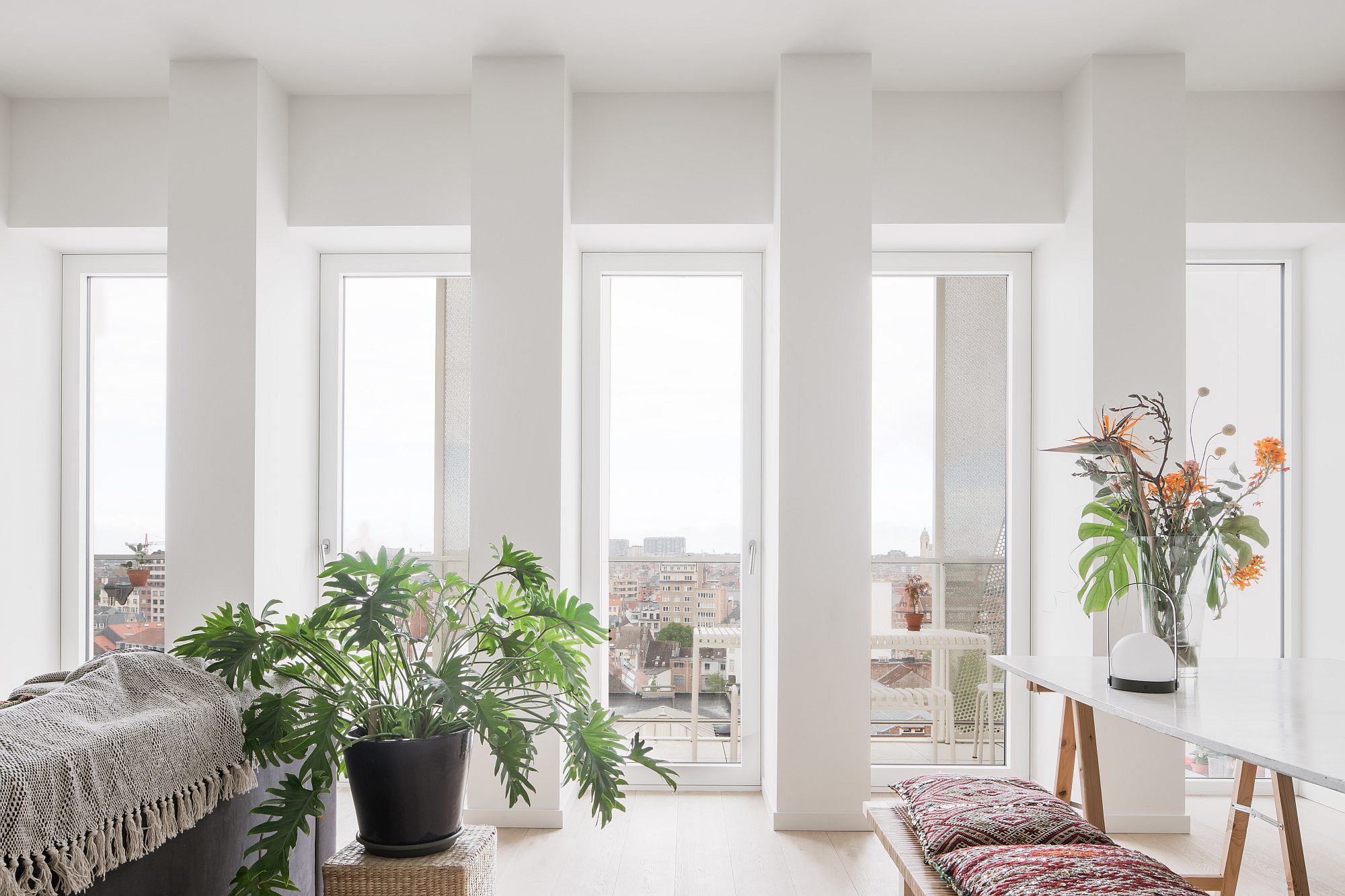
The only things preserved from the building were the concrete frame and floors as well as the main and the secondary circulation nodes. Negotiations with the administration led to the approval of elevating the building by three floors (the last one recessed). Besides the lower ecological impact— eliminating a concrete building raises great issues in terms of pollution, transport of waste, storage, etc.—the apartments thus benefit from a luxurious height: the more than 3 meters are the norm when it comes to office buildings, but nearly impossible in today’s homes.
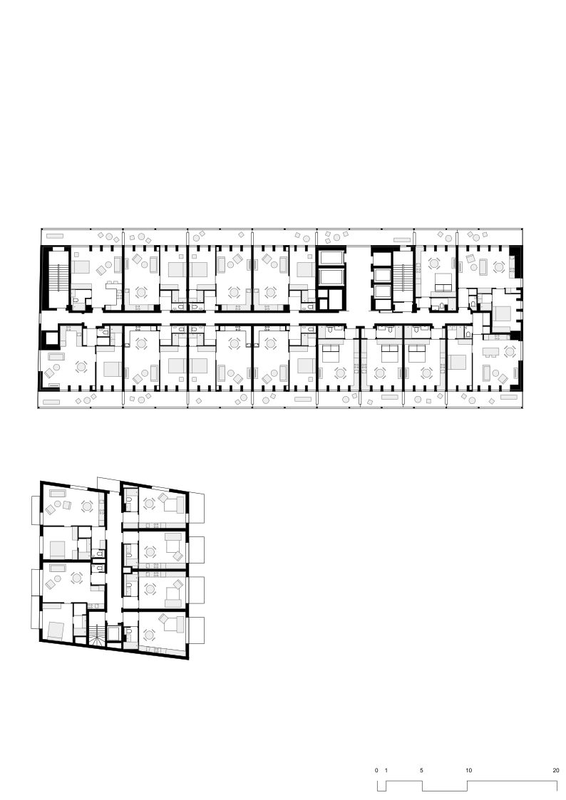
As for the rest, the task was an essentially architectural one, almost an architectural school exercise in real life: placing extremely varied dwellings (from studios to 3‑bedroom units) in a structural network with dense façade pillars and even denser horizontal ribs; Therefore, the structure still defines the space, albeit with some small adjustments. A new façade, made of pre‑cast panels, covers the entire building.
STEP 2.
Private‑Common‑Public Layer, a New Pavilion
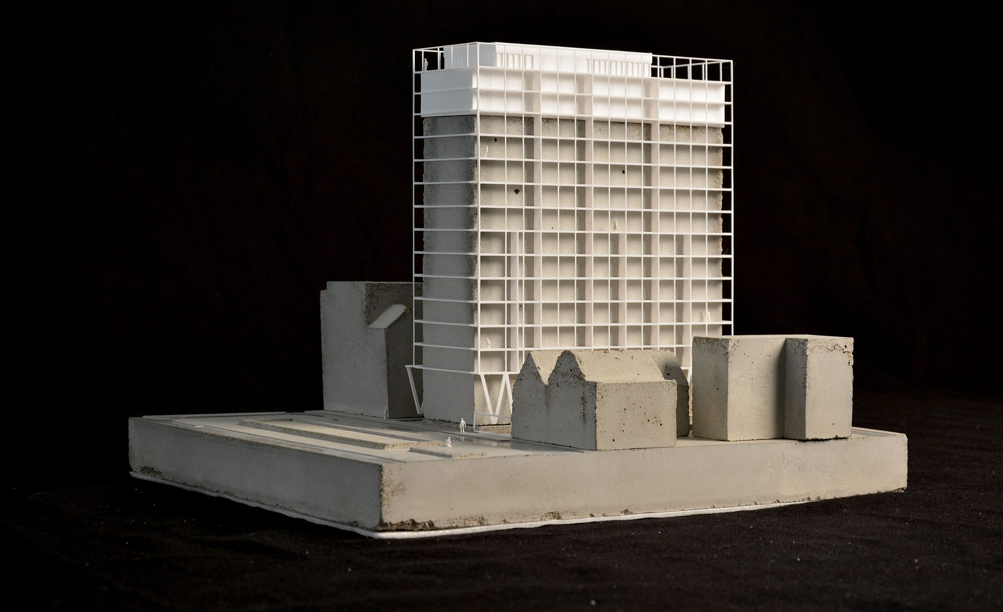
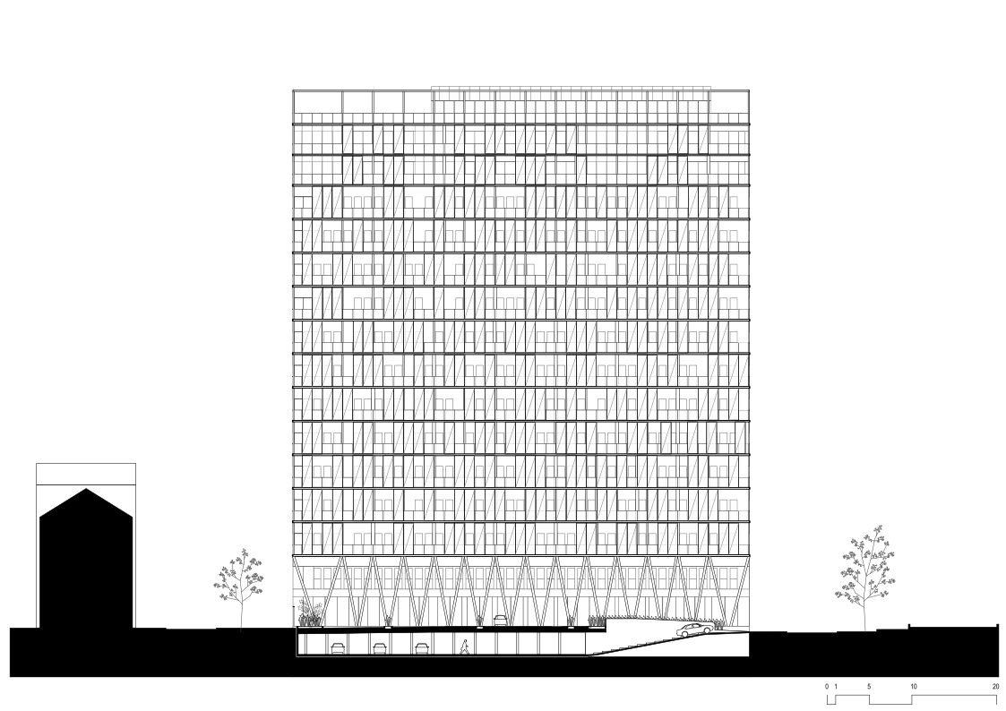
A secondary metal structure attaches to each of the two long façades. From the second floor on, the structure is composed of a grid, containing individual balconies, separations and sliding perforated panels.
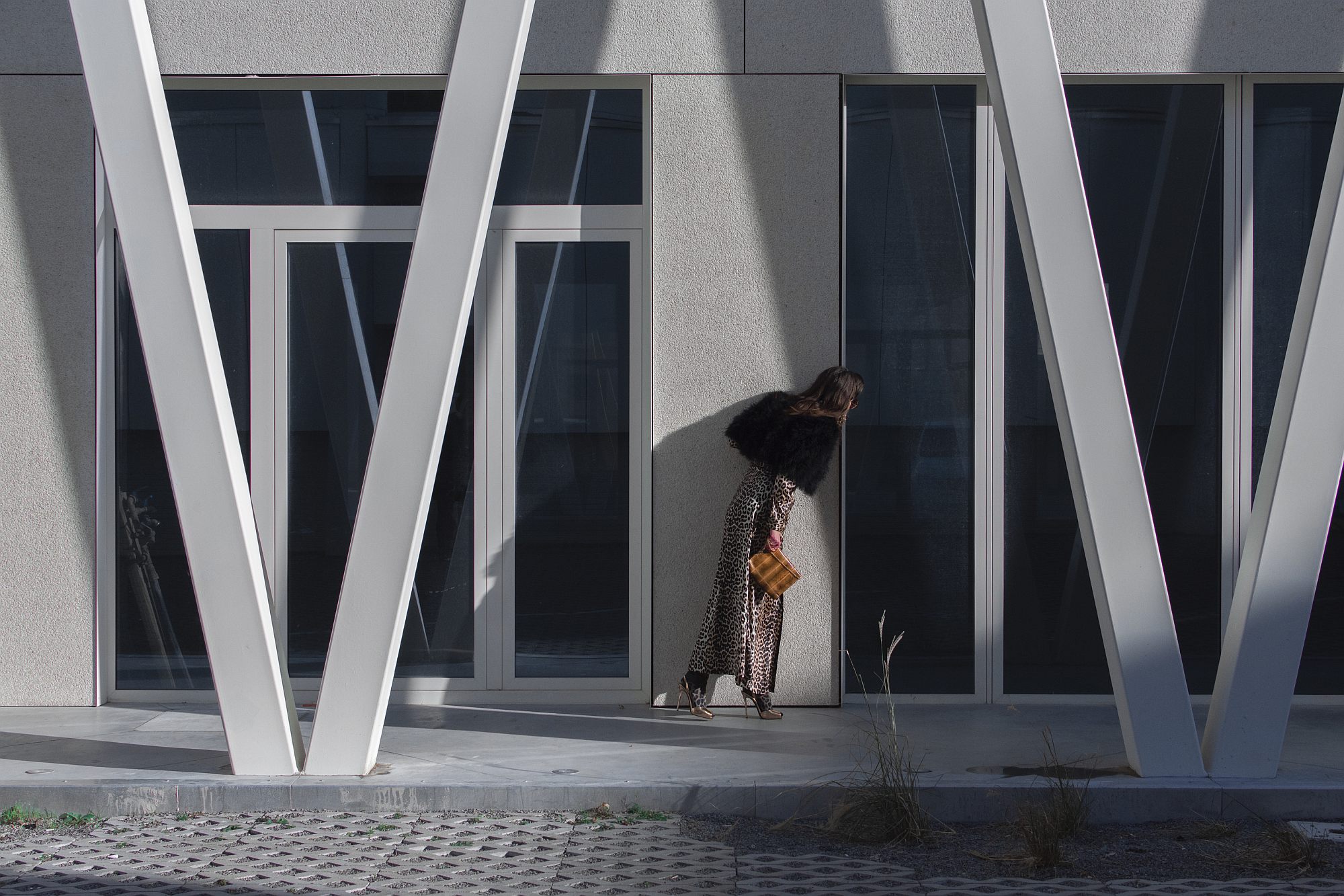
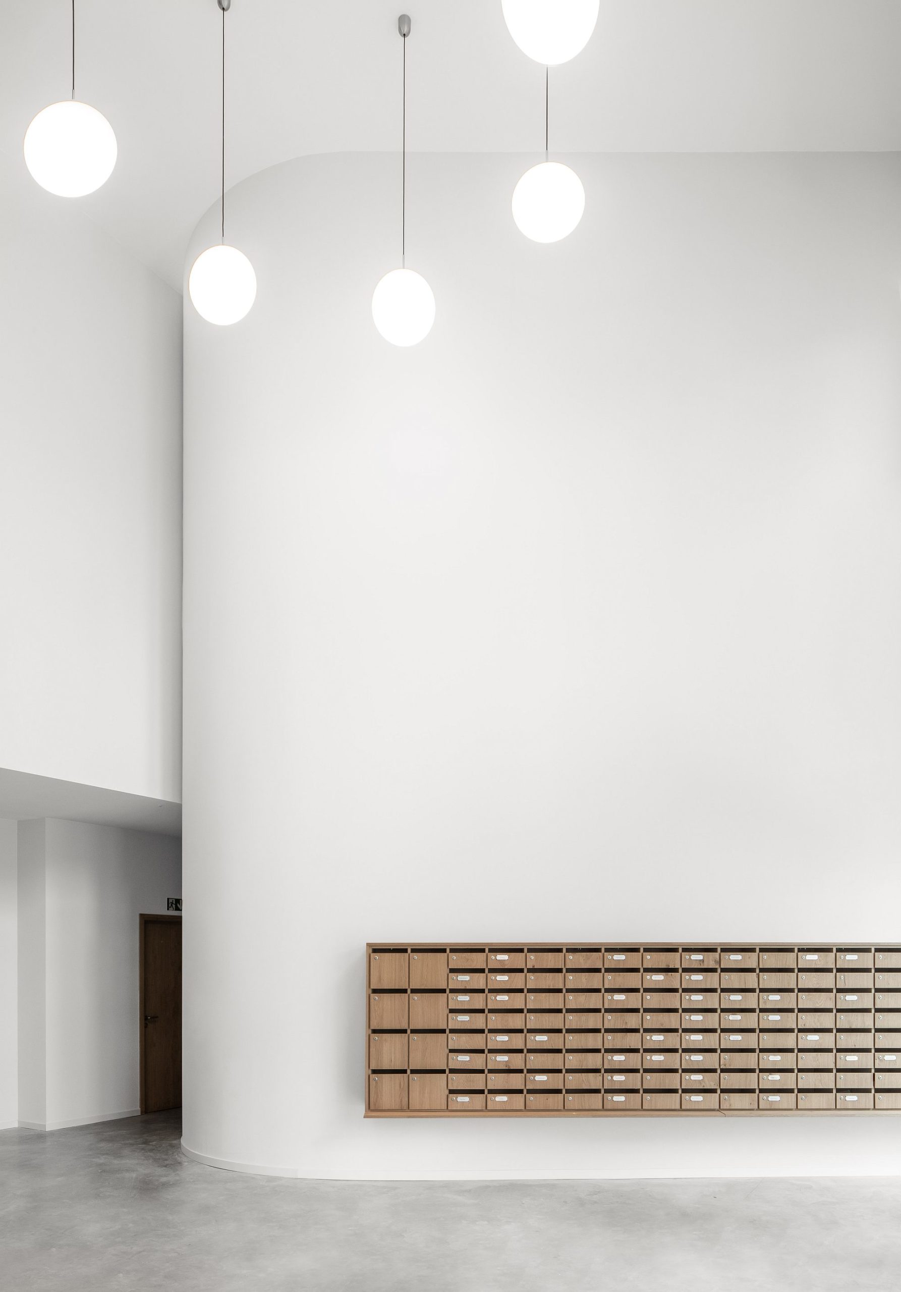
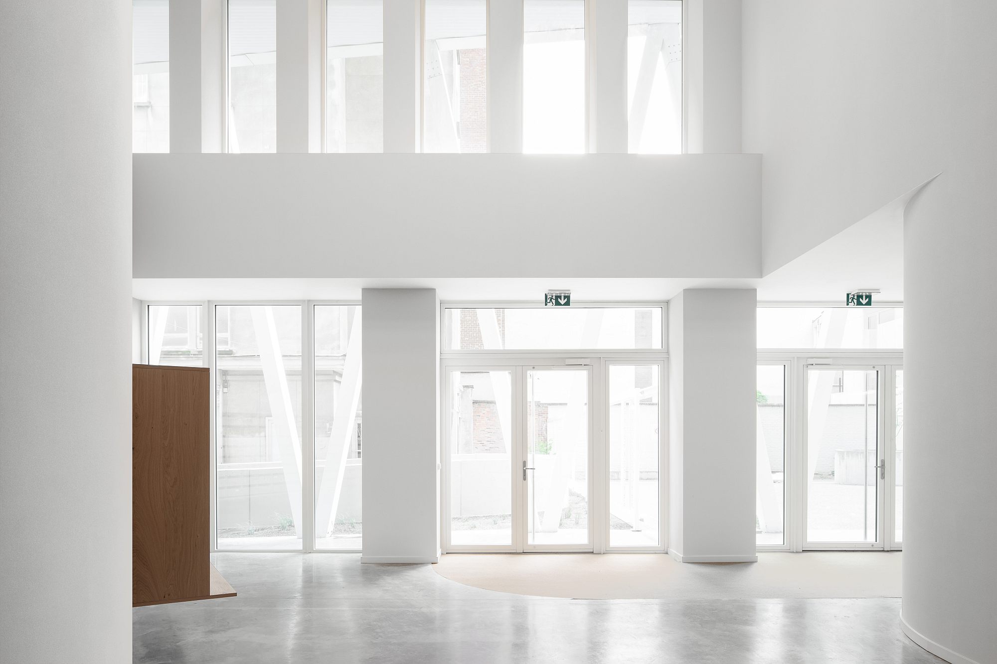
The grids are supported, on the first two levels, by a colonnade of diagonal pillars. The gallery thus created asserts the more public character of the base of the building, enhancing the urban character and porosity of the site. The gallery also connects the former freestanding modernist slab to the street; it gives it a natural entrance and a clear address. The double‑height access hall provides a visual extension to the exterior space.
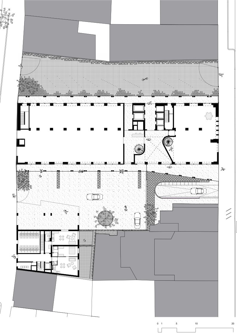
Across the slab, in the plot’s extruding corner, a new, low‑rise volume, also containg apartments was constructed. It closes up the street front, covers a blind wall, and helps define the open space within the new complex. The careful landscaping of this common space, with pavements and green areas, the trees, low plantations, transparent fences, completes the general architectural principle. However, I must say that I was a bit frustrated by this part of the project, not because of any design issues, but because of the limitations imposed upon it; I would say that the ground floor, and especially the outside space, represent rather a remarkable potential, than a permanent solution. The architects and the promoter wanted to open the courtyard to the city (the architecture and lay‑out are perfectly fit for an urban passage). The administration asked for fencing and additional parking spots at the ground level.
The transformation of the yard in a passage will maybe emerge from a play between mutual influences: vivid functions on the first two levels and a reduction of the automobile obsession. The project is futureproof for these evolutions.
Looking at the Project.
An Art Report by memymom
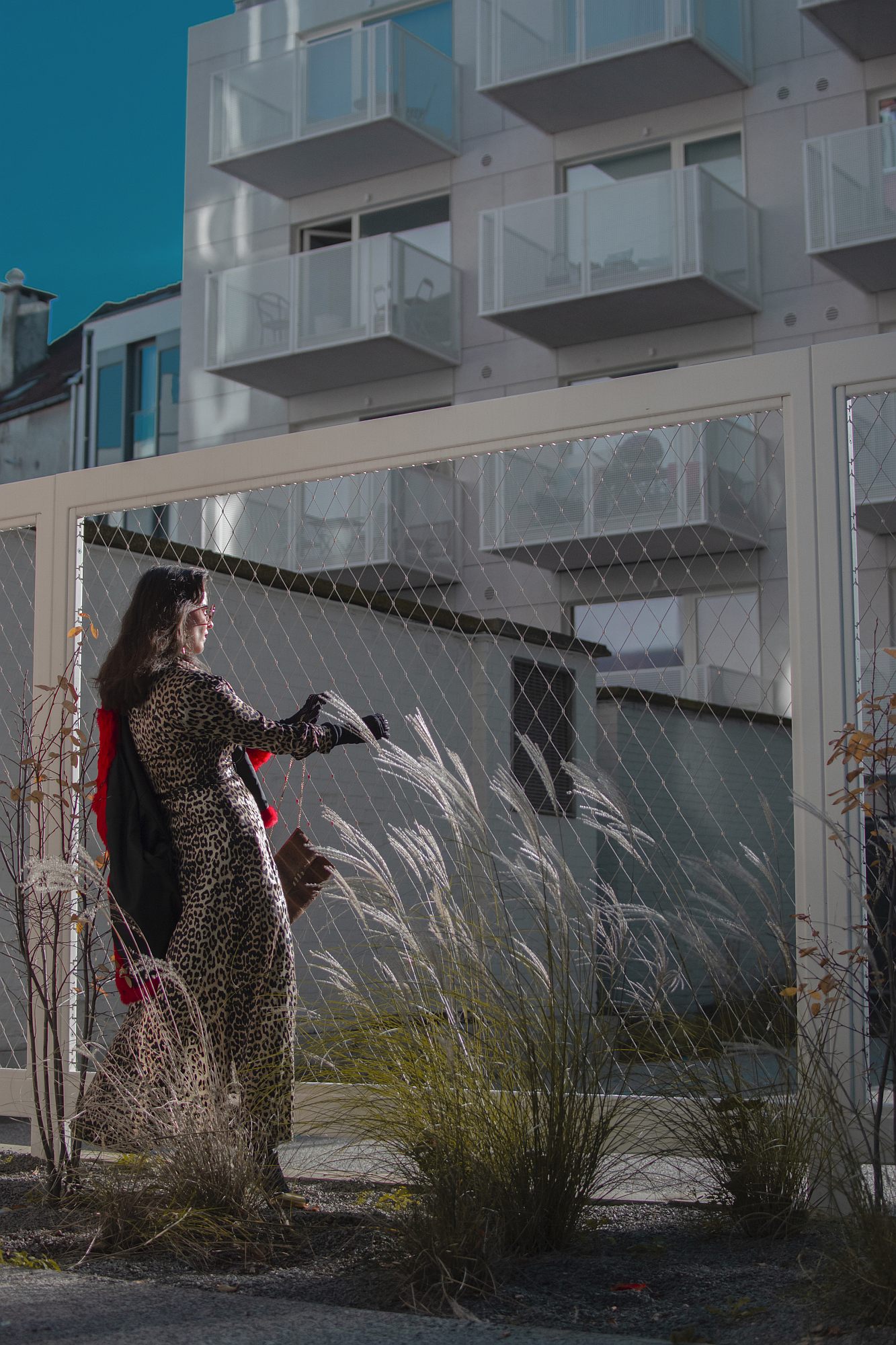
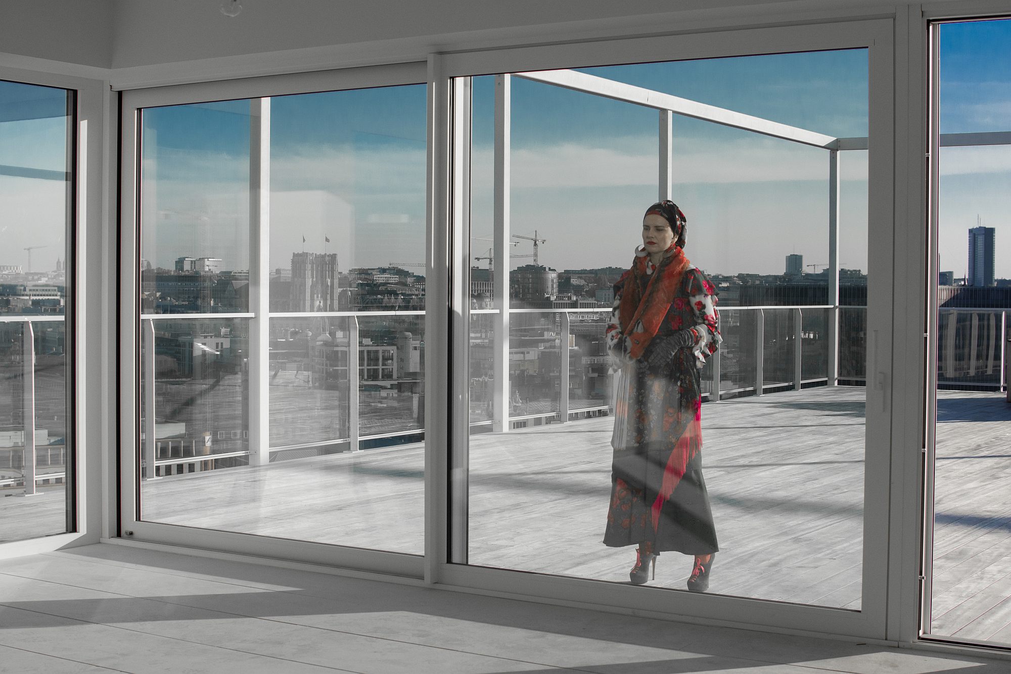
BOGDAN & VAN BROECK have a long history of working with artists. Architecture seen from outside the profession becomes a way of speaking about and in fact thinking about architecture differently. Over the last years, projects have also had the purpose of supporting independent creation, of contributing to building a solidarity within a cultural community that was set aside by the authorities. This article includes both classic architecture photos, and a visual story by memymom, an artist duo consisting of Lisa De Boeck and her mother, Marilène Coolens.
“As we love to reflect upon the city through the eyes of artists, we invited memymom to make a personal interpretation of our projects and reveal unseen layers. Our work recedes into the background to become a stage for storytelling. This is how we see architecture anyway: a canvas for life.
BOGDAN & VAN BROECK design in favour of collective living in an inclusive city. Inclusivity is a primary attribute of the public space around (and, when we can, in) the buildings we design. Specifically in the context of The Cosmopolitan, the sociocultural diversity is very high. Student housing is mixed with street prostitution, two theatres, lots of restaurants, immigrants and refugees, incubators for startups, art galleries, a new museum, all kinds of housing from affordable to upperclass. In that setting, memymom and Oana Bogdan stage the diversity of the neighbourhood by evoking or suggesting different characters. The images show The Cosmopolitan as part of an urban context in which different people lead totally different lives, only a few buildings apart. An inclusive city.”
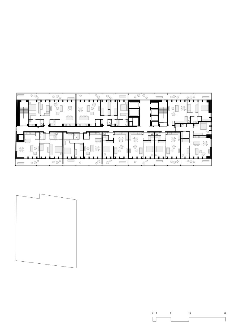
*plans> ground floor, 2nd floor, 8th floor, 13th floor
Info & credits
Site: Quai aux Pierres de Taille 16 & Rue du Canal 28, 1000 Brussels, BE
Client: Besix RED
Architects: BOGDAN & VAN BROECK
Team: L. Croegaert, M. Czvek, M. Lefeber, M. Pocuch, S. Poot, T. Rigby, D. Ştefănescu, L. Van Innis, T. Willemse
Structure: UTIL Struktuurstudies
Installations: Concept Control
Acoustics: Asm Acoustics
Project manager: Cetim
Total built area: 15.075 m2
Completion: 2019

