In what follows we will talk about a example of reconditioning and re-use of an existing dwelling space. The importance of such a project cannot be stressed enough, no matter how much is written about the subject. We live in a highly built world which constantly presents us with the opportunity to reinvest buildings with the facilities necessary to contemporary generations, thus salvaging energy, resources, and a dash of memory.
This is not just about respectfully restoring precious old buildings, now we must think about the re-making of a stock comprising millions of buildings of different ages and architectural qualities. The debate on reinvesting existent buildings presently has reached transnational proportions for some time now. This project gives the opportunity of discussing the added responsibility of today’s architect: that of imagining on already painted canvases, requestioning their role, reinventing their profession, on the lines we have been already debating for a while.
Text: Cătălina Frâncu
Foto: George Postelnicu, Bogdan Popescu
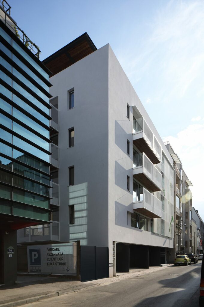
The building on Puțul lui Zamfir Street is in Dorobanți, one of the prestige neighbourhoods of Bucharest. It is still home to interwar garden city schemes and beautiful houses, while split by the Șoseaua Ștefan cel Mare, the backbone of urban changes in the socialist era. After 1990 came the chaotic ultra-liberal development, also represented by the building we are talking about.
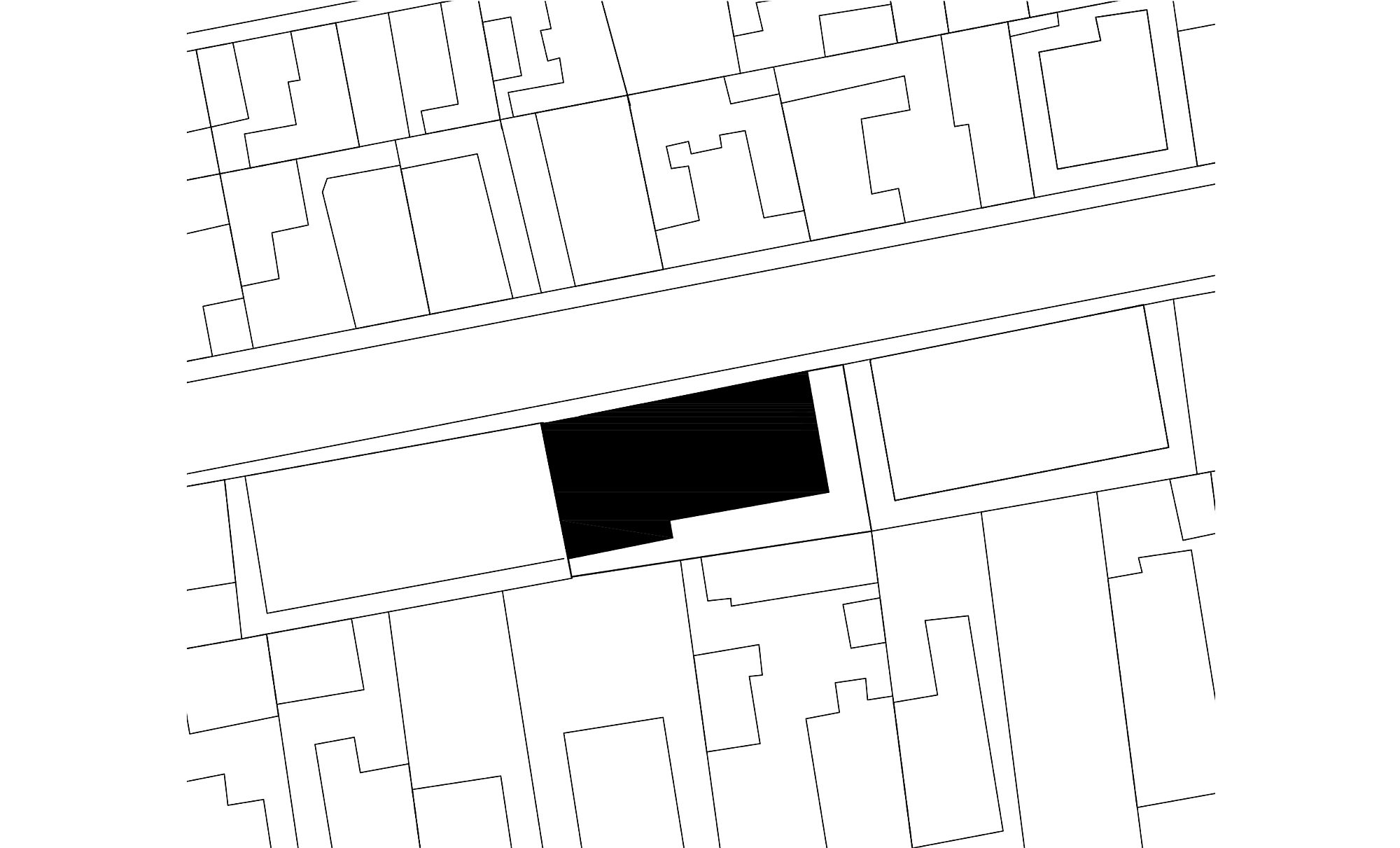
*situation plan
The story of this block of flats from the early 2000s is one of transformation and change but also of a more modest form of perpetuity easily evoking a possible human trajectory – from misfit to purposefulness.
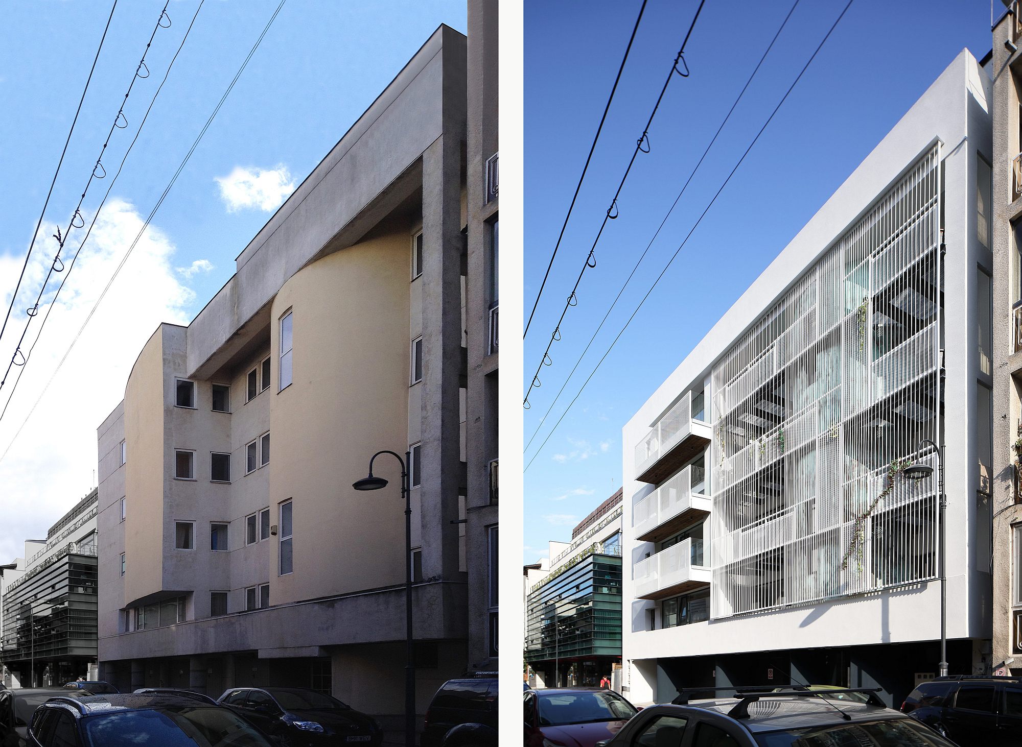
The initial façade was complicated, constituted of postmodernist elements meant to disrupt the monotony of the depersonalized array of windows perforated in a heavy and opaque frame. In spite of this intention, the original façade was in itself a disharmonic element interrupting the rhythm and darkening the street.
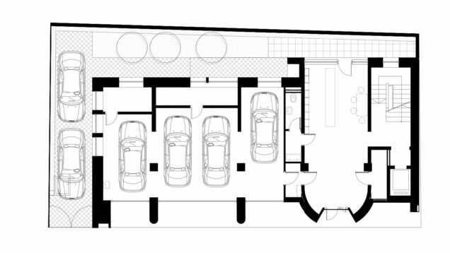
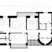
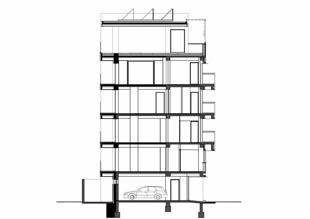
The plot has the advantage of being rather wide than deep. This make sit possible to invite light in despite the narrowness of the street, an oportunity that the initial building was not taking advantage of. According to Melon Studio, the narrow openings visible in the old photographs belonged rather to storage spaces and bathrooms, option probably motivated by this façade facing north. Moreover, the space was not efficiently used: the apartments were uncertainly spreading on two floors in a functional chaos, under an attic that was impossible to use. All of the above informed the brief for the intervention: opening the façade, bringing light in, reorganizing the space according to contemporary needs (among which rendering spaces energy efficient); the structural analysis added the need to consolidate the existing structure, while practicality imposed the insertion of an elevator.
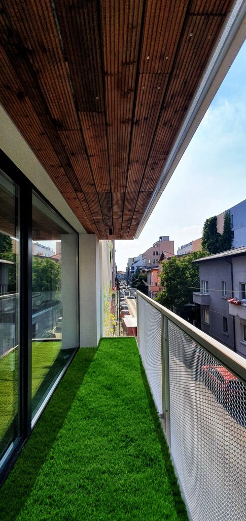
Designing these changes of utmost importance led to the conversion of a small block into a home for four apartments and a studio with a covered terrace.
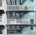
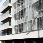
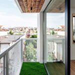
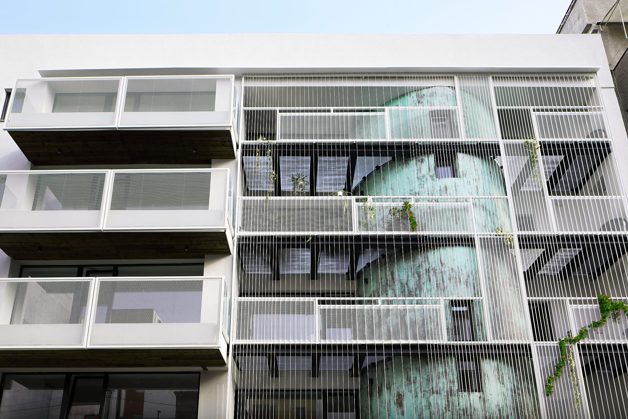
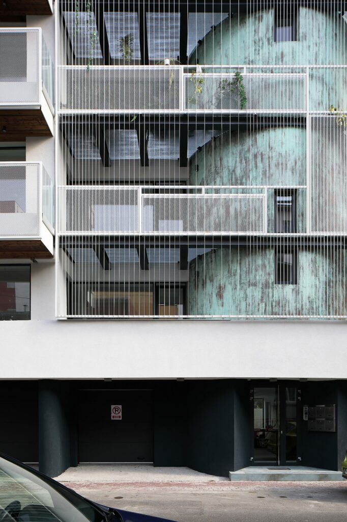
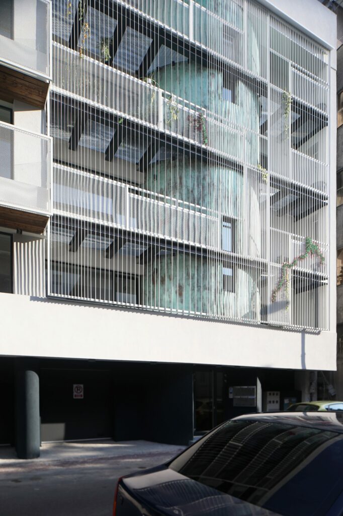
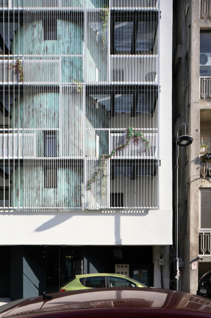
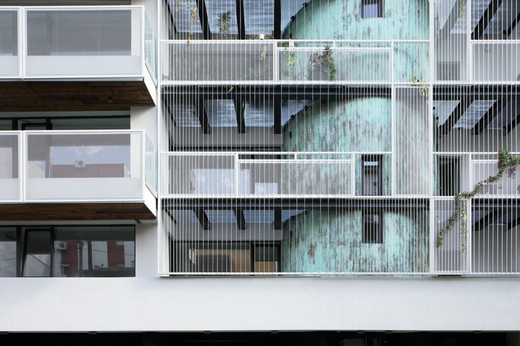
The façade facing the street was completely reimagined. One of the initial round elements was completely re-made, the other was integrated in an ensemble of exterior individual spaces. A diaphanous and light screen made of a series of vertical white metal rods the whole height of the four levels. The climbing vegetation will benefit the living environment, while refreshing an extremely mineral street, host only to the accidental vegetation occasionally flowing from courtyards in between cars.
The choice to use vegetal elements in such a mineral environment evokes an old characteristic of Bucharest: the juxtaposition of the built element with a luscious green yard, often ivy.
The transparency of the façade works horizontally as well: the white metal grid for the balcony floor expresses lightness and floating, in a total opposition to the former situation.
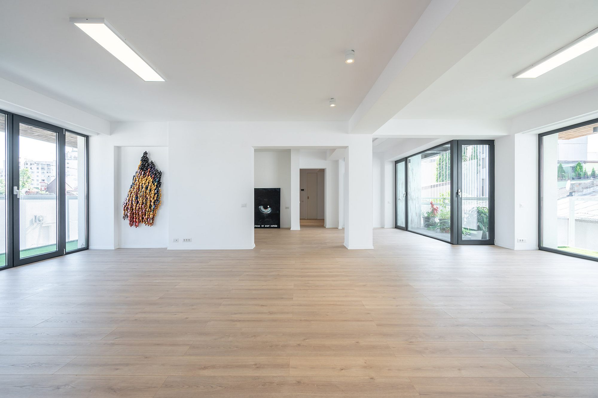
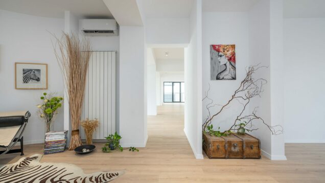
The result is a characterful living space, yet one that also leaves room for the dweller’s imagination; this good balance is proven by the fact that, as the authors told us, immediately after the end of works, three of the floors were immediately rented; not as living, but as work spaces for liberal professions. This was allowed by the efficient and flexible new layout.
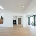
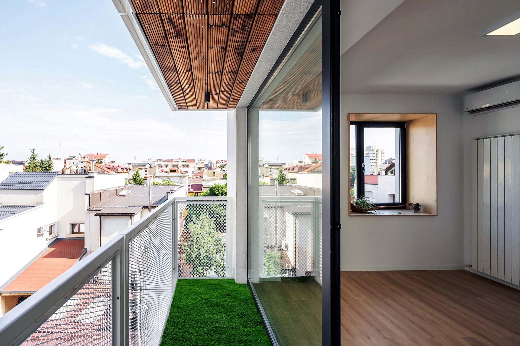
The light that shines throughout the apartments, the pleasant combination of wood, metal and the white walls, all of them shape a good place to support very different individual lives.
Info & credits
Client: Privat
Adress: str. Puțul lui Zamfir, 32-34
Architecture: Melon Design Studio –George Postelnicu, Oana Postelnicu; Colaborator/Collaborator: Sergiu Leuca
Structure: Popp & Asociații
Sanitary installations: Pacic
Total built area (sqm): 1240
Period: 2017-19
Partner: BAUDER

