Text & Photo: Laurian Ghiniţoiu
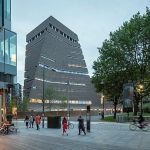
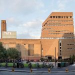
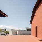
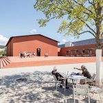
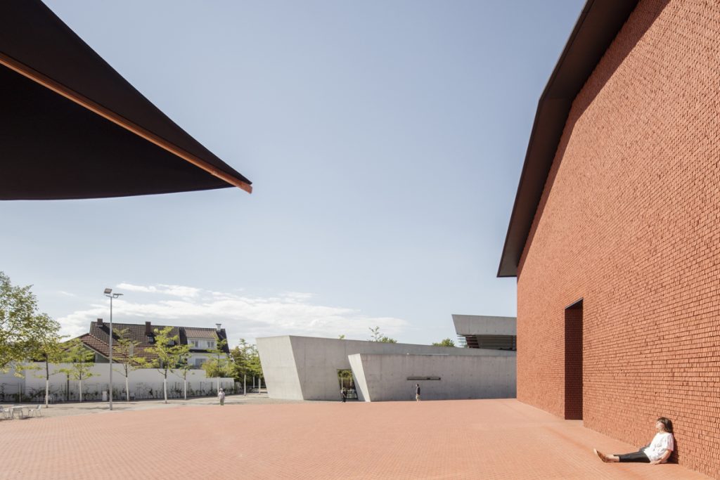
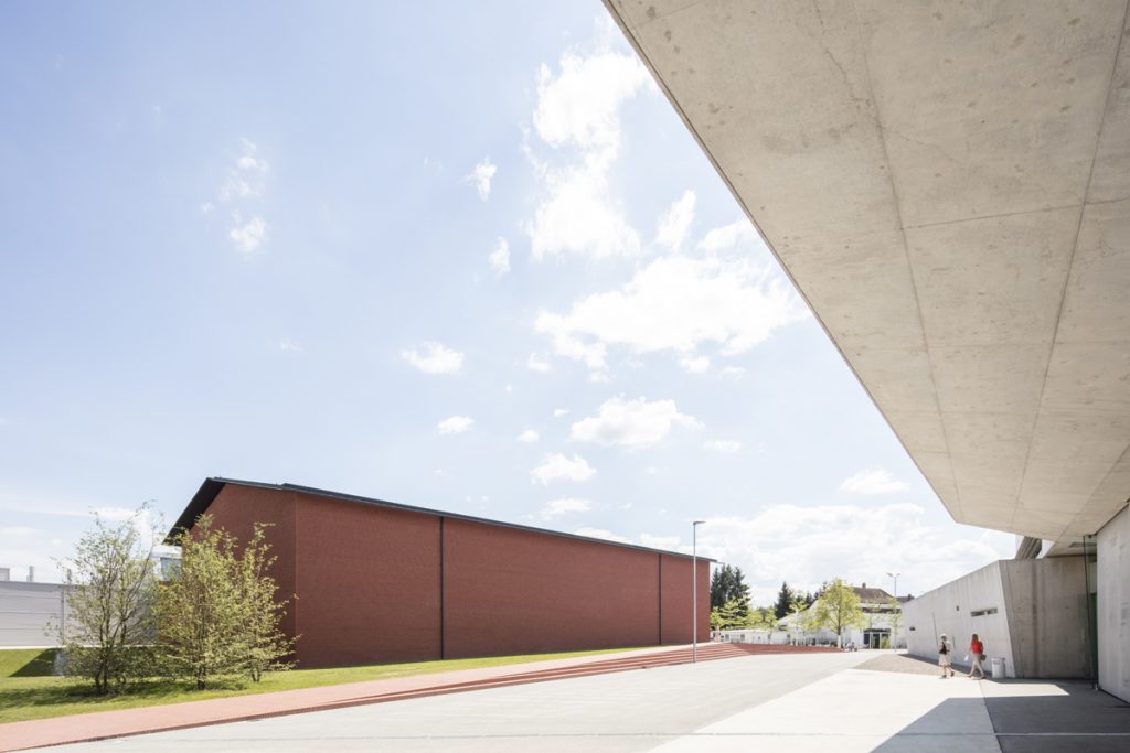
The beginning of June 2016 was marked by the opening to the public of two buildings by Herzog & de Meuron: Switch House—an extension of The Tate Modern, and the Schaudepot at Vitra Campus, a new exhibition space for the Vitra furniture collection.
The opportunity to document the New Tate was a good reason for me to be revived by the noisy London, and Very shortly after, more by chance than for a precise purpose, I happened to visit Vitra, 2 years since my last time there. At first sight the two works are very different in terms of scale, context, time line, budgets. They share the same façade material—brick, and some less apparent similarities.
Social/Financial
London’s spectacular shift from an industry city to a multicultural scene is quite well expressed by Tate Modern’s rebirth from a disused industrial building to a cultural Cathedral, right in the heart of the city.
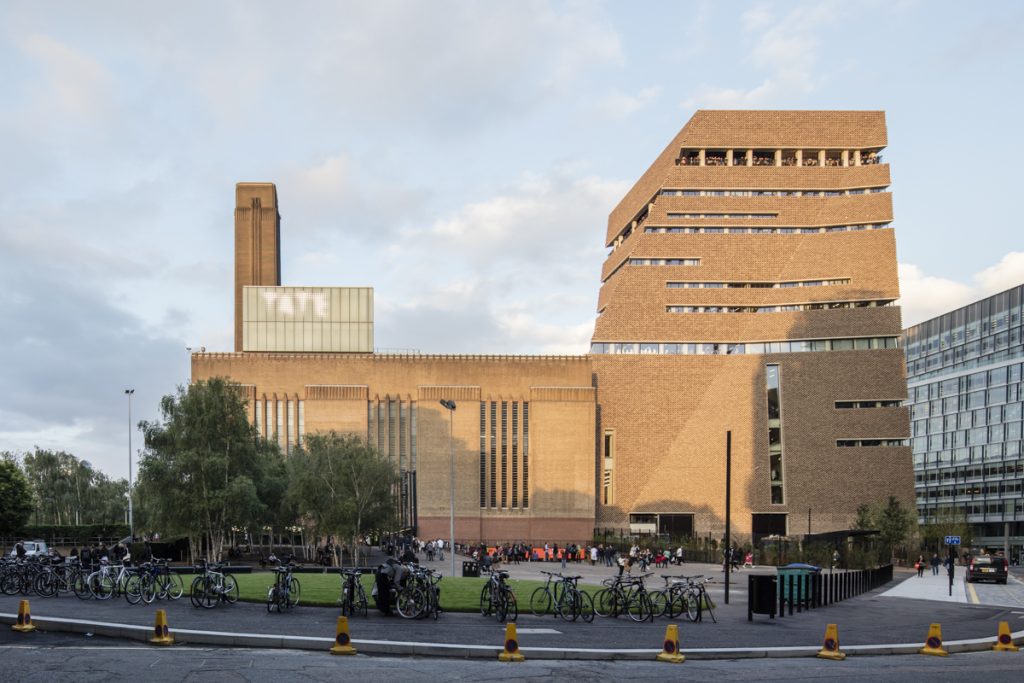
Due to the unexpected success of the Tate Modern, the new extension was already designed in 2004 but has been affected by the financial crisis, being delayed by almost 4 years. Like the first intervention in 2000, the new project becomes a very imposing and iconic structure for London, reinforcing Tate’s importance for the community.
Vitra Campus is a family business with a history of over 80 years. The campus was rebuilt after a loss of 60 percent of the whole factory during a fire. The first major design was, understandably, a fire station by the architect Zaha Hadid, then an avant‑garde outsider without a built work.
Now, at the junction of 3 countries, Switzerland, Germany and France, the Vitra Campus has become a Mecca for architects, with its showcase of works by Alvaro Siza, Tadao Ando, Sanaa, Frank O. Gehry, Grimshaw, Herzog &de Meuron.
Compared with the previous buildings, the owner, influenced by the financial crisis had calmed down the design of the Schaudepot. The second intervention of H&deM has a very sensitive and quiet approach, worlds away from the iconic Vitra House.
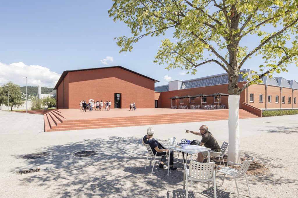
Facing the fire station, and connected with a factory building dated from 1963, the volume is replacing an old industrial shed.
Context
As an architect, I use the context as a first input in my design, as a photographer I am using the context to analyse the design of others.
From an urban point of view, both additions are changing completely the way the buildings/complexes are connected with the surroundings. And they directly respond to the
urban fabric.
At Tate, the new public plaza from Southwark neighbourhood is marking a new entrance which is highlighting the connection of the building with its surroundings. From the South, a long perspective centers on the new tower. Through its shape and its precise lines, it is responding perfectly to its context so as, that when you approach it from that direction, to not make you lose the sight of the iconic old chimney.
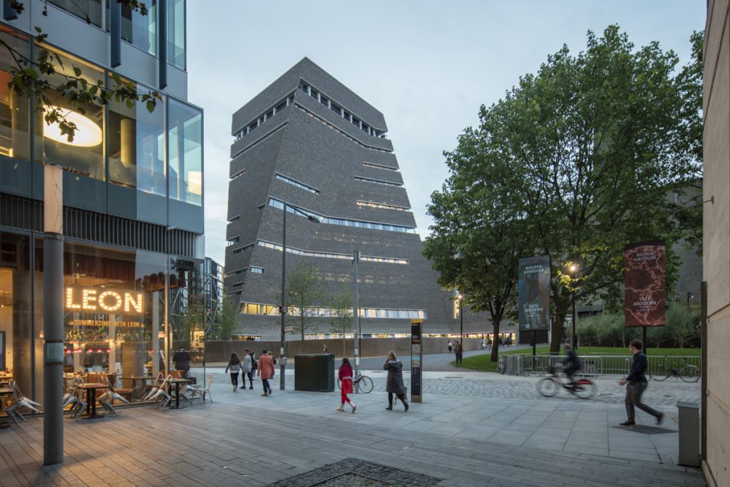
On the other side, from the North, by its height and position, it is very well integrated into the skyline, as a stand‑alone object, without competing, or being hidden behind the Chimney.
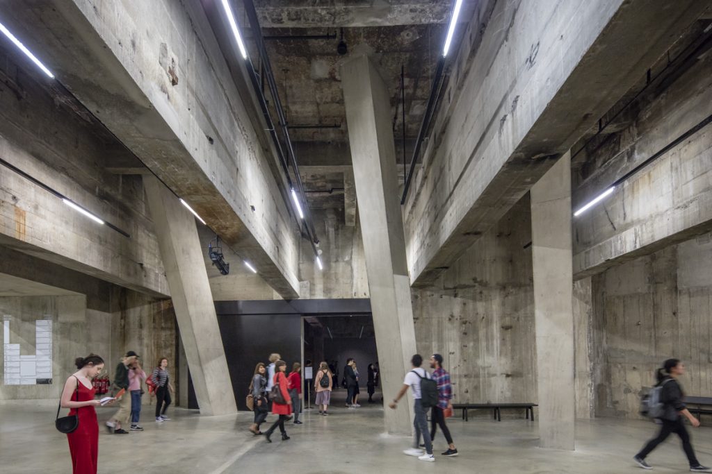
The distance between them is translated at the ground floor as a connection from the River Thames to the South. It can be crossed easily trough the Turbine Hall, by passing the bridge towards the other side. It’s always busy and alive, a dynamic public space, a clear extension of the city inside the building.
At Vitra Campus, the new Schaudepot, the new café, and its new slightly raised plaza are in direct connection with the access from the public transport. Now both the Fire Station and the depot are creating a public space, outside the closed perimeter, making them more friendly to visitors and more connected to the context. You can clearly see the respect and importance given to Zaha Hadid’s old intervention.
Skin. Volume
The extensions match the colour and the materiality of the existing structures, the skin becomes an instrument for continuity.
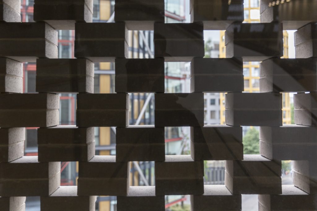
At The Switch House, the spaces are arranged into a unique pyramid‑shaped tower, covered by a radical reinterpreted ceramic skin—a perforated pattern of 336,000 bricks. During the day, it is filtering the light, transforming the interior into a playful game of light and shadow.
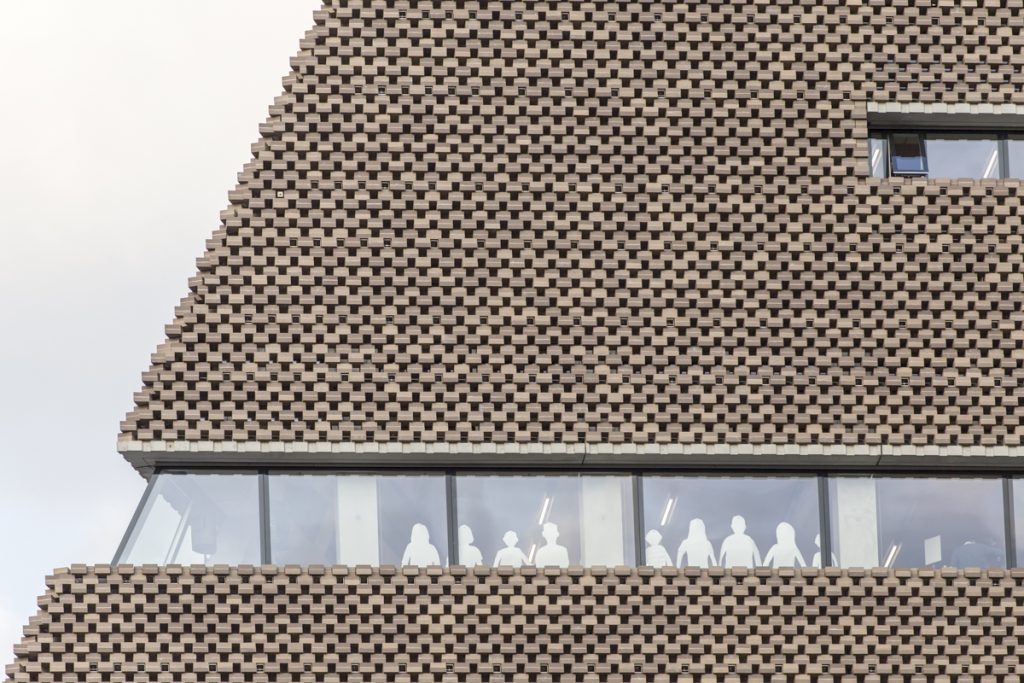
During the night, it starts to glow towards the city, transforming a massive volume into a friendly transparent veil which covers the concrete skeleton.
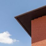
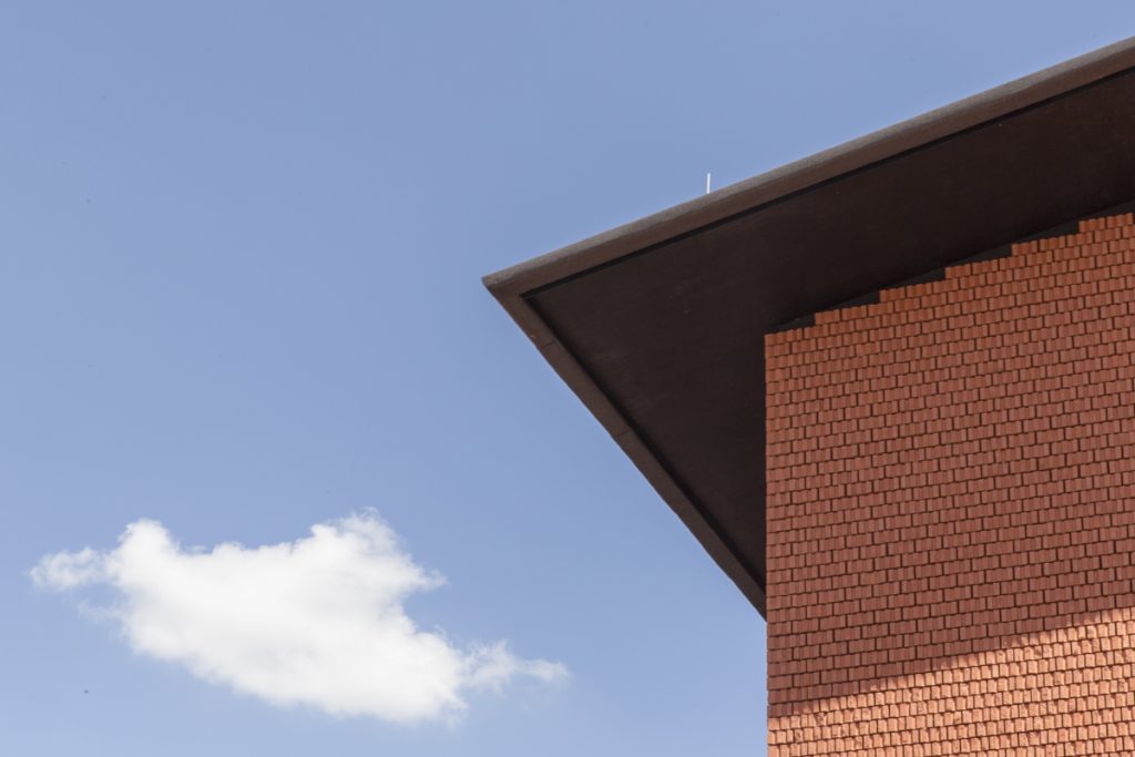
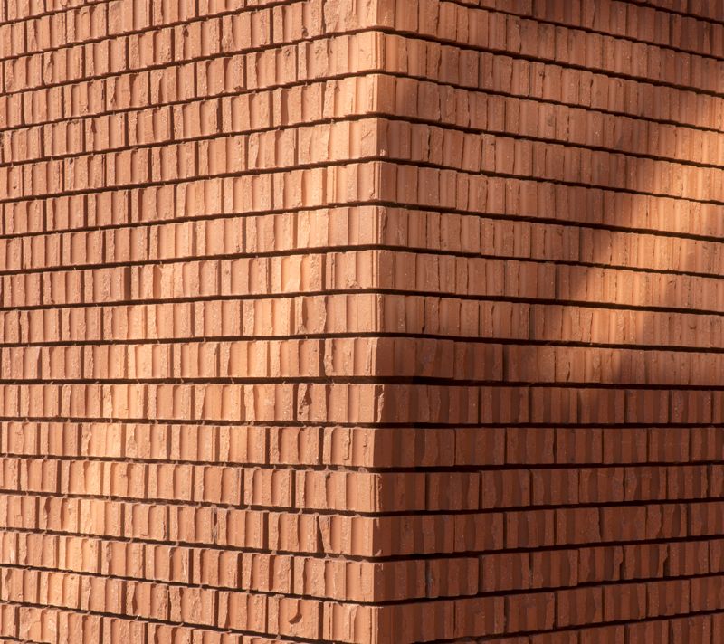
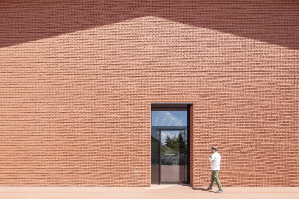
At Vitra, in order to distinguish the new small and sketched shed volume from the existent brick buildings, the only feature is the vibrant skin.
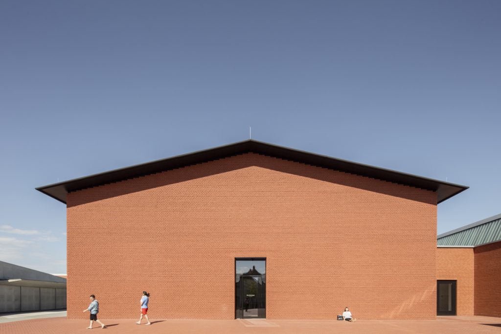
It is composed from unique hand‑broken bricks, each of them displaying a different fractured pattern.
Fluidity. Flexibility. Complexity
In both cases the interior space is not reflecting the outside massive look.
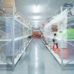
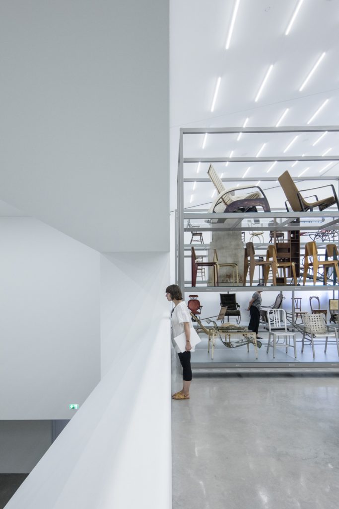
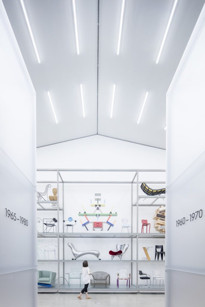
Designed as a total and flexible space, the Schaudepot can be reorganised easily in order to experiment different layouts to store or exhibit. The furniture displayed counts around 400 pieces—just a brief selection of the all collection.
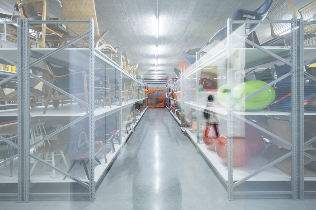
To suggest its continuation, by a simple architectural gesture, a visual connection is created with the existent basement level, a foretelling of a future physical connection.
The spaces of the new Tate extension (22,492 m2 gross internal area—15 times bigger than the Shaudepot) are split into display and exhibition or performance spaces, education facilities, offices, and most importantly, a lively civic space containing mini‑streets and plazas as an extension of the city.
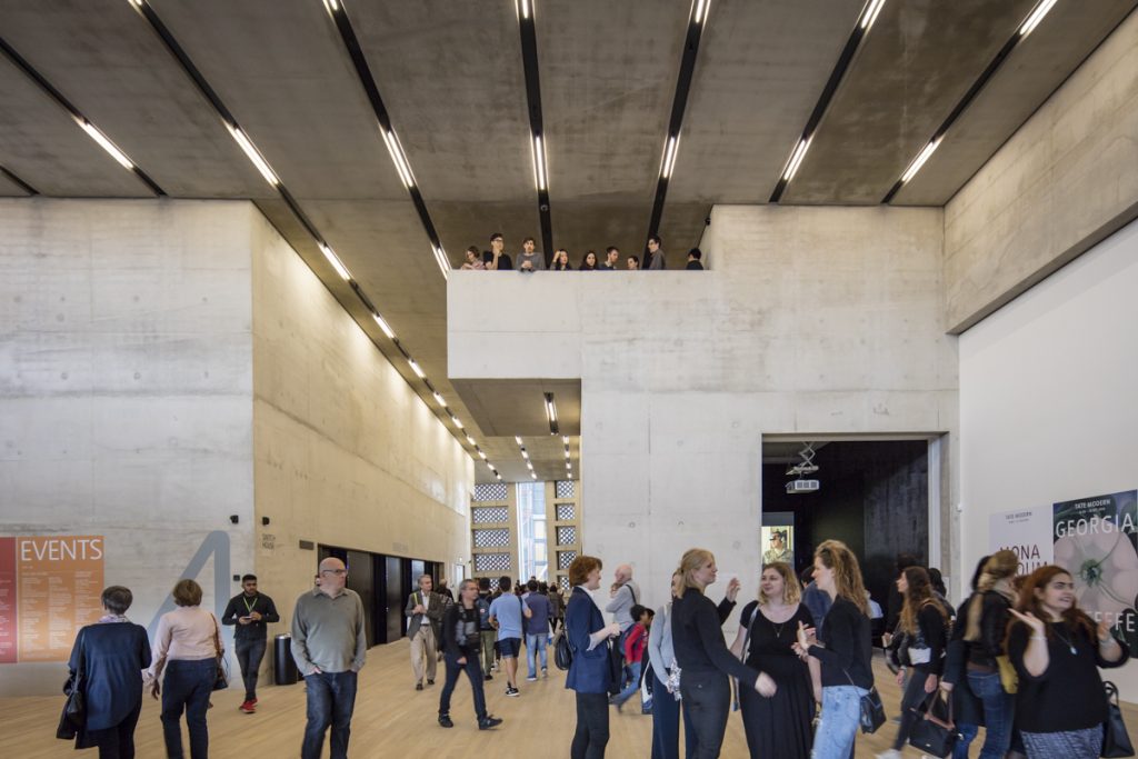
At first I felt a bit lost due to its complexity. After spending a day there, the interior spaces seemed much lighter, a fluid collection of public areas, very clear linked.
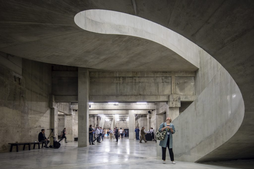
The materiality (oak and concrete), the generous corridors dedicated for relaxation and reflection, the spiral staircases, the high ceiling, the horizontal cuts, are all elements which are guiding the visitor around the building, without disorienting him.
Compared with the Schaudepot, which lacks any visual connection to the outside, the new Tate accepts many vertical and horizontal incisions.
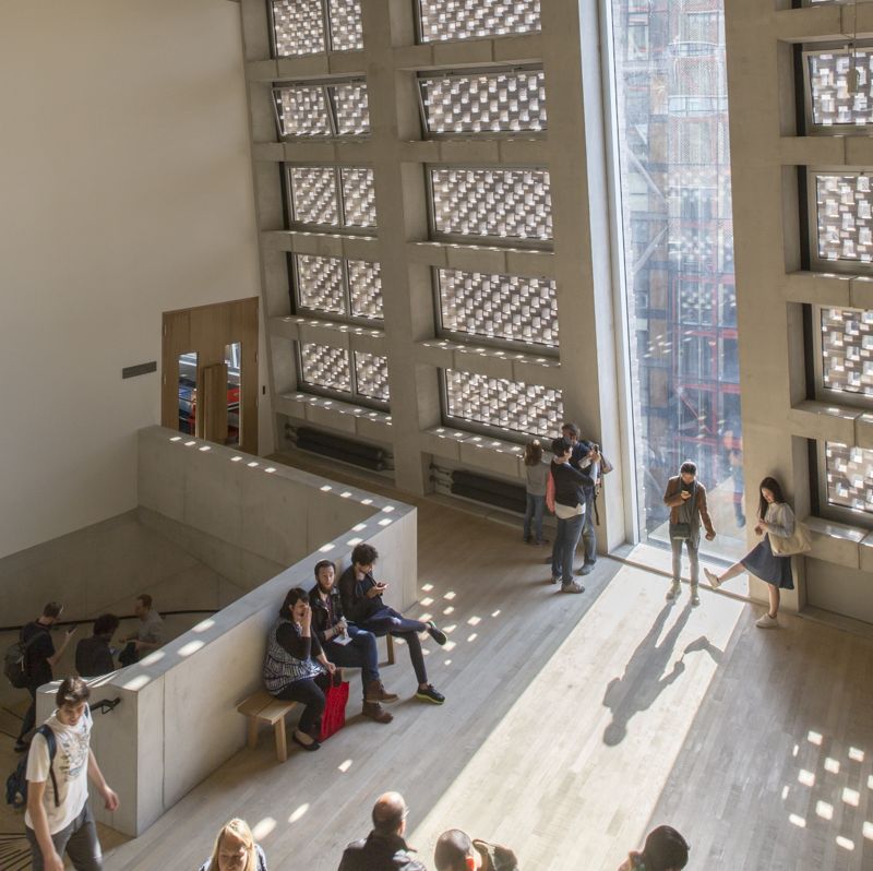
Even if your view is limited during the journey, the connection with the city is rebuilt as a gift to the viewer at the latest level.
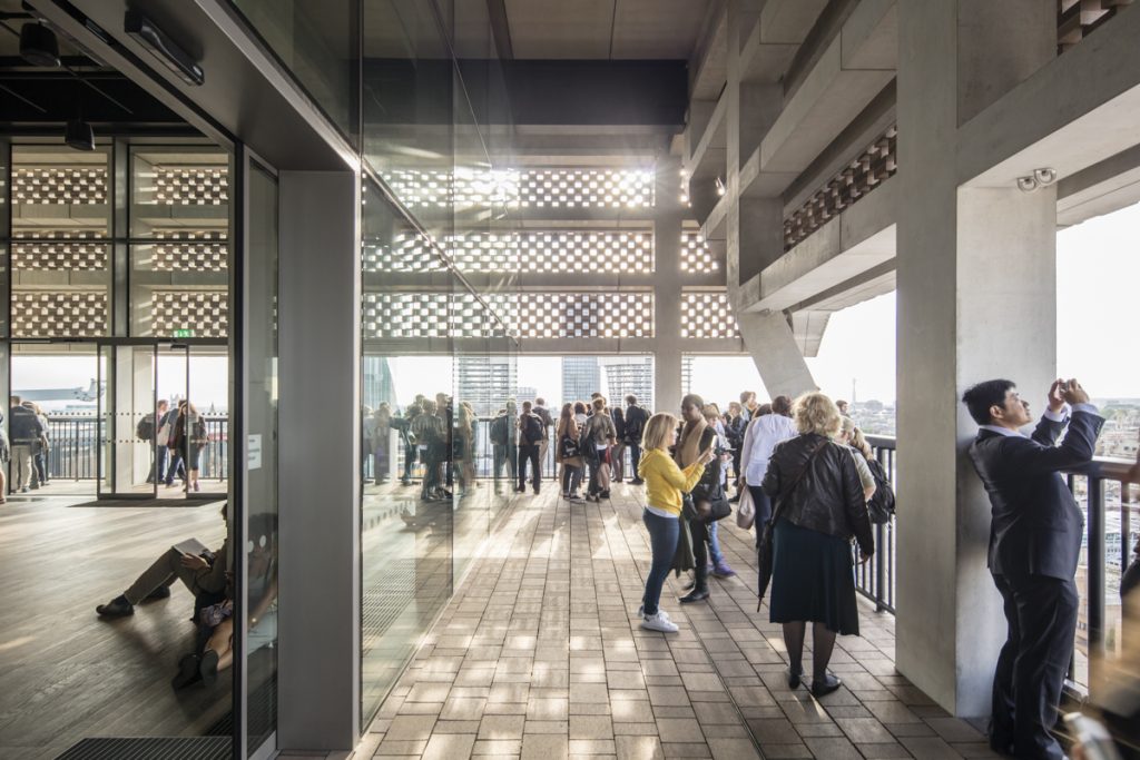
The viewing gallery and the 360‑degree terrace with a panoramic view, give the new Tate one of the best observatory decks in London. This feature was considered for the chimney at the previous design, without being concluded then.
Exhibits
At Vitra, a selection of around 500 objects are carefully selected and displayed. It is a clear enumeration, starting with very old furniture pieces from 1800 till nowadays.
The new galleries at Tate are not just about quantity. Beside doubling the exhibition space, they are addressing contemporary questions like the gender balance, reaching a 50% of female artists shown to the public, compared with only 17% at Tate Modern’ opening back in 2000. Most of the spaces are for the visitors and are meant to be used for performances and other activities, making it alive and interactive.
Conclusion
As an architect, and especially as a photographer, it is definitely worth a daytrip to Vitra once every few years, due to their regular updates.
But Tate is different, it could easy become a weekly routine due to its complexity. Only after 3 days I’ve managed to understand just a bit of its impressive urban and social impact.
Due the public spaces which are guiding you trough all the entire building you feel welcomed. Tate opens the door for everybody, and gives you the opportunity to be part of it, connoisseur or not.

