Proiect: Starh
Text: Ştefan Ghenciulescu
Foto: Radu Malașincu
A little context. Good practices, openness and modest heritage
When the Romanian Order of Architects (OAR) was (re)founded in 2001, it was obvious that both the central organization, and its branches would need premises. As the totalitarian destruction of heritage was still fresh in everybody’s mind, and the post-totalitarian destruction was in full bloom, the Order’s then-management, as well as the subsequent ones, decided that the priority was not to build new offices, but to purchase or otherwise take over old precious buildings and to restore them. And that is not because OAR was ever against new architecture (that would be absurd), but because it was considered to be the organization’s moral duty to show that the heritage could be reinvented and used. Like how you can do it in a smart, creative, and visionary way. Another aspect, which was not so strongly or clearly expressed in the beginning, but which became increasingly more important, was the fact that the Order’s offices should also be cultural places in those cities: that they should not only host offices and meeting rooms, but also exhibition spaces, conferences, and that they should be open to their respective communities.
So far, three such projects have been completed: The Mincu House – the Order’s headquarters and a beacon project of post-1990 architecture in Romania, the Suceava Water Plant, which is not just a branch, but a centre of urban culture, created together with the Union of Architects and recipient of several prizes, and, at last, the OAR House – the headquarters of the Bucharest Branch.
Two major things set apart the project’s start from the first two. First, the building created in the ‘20s by Architect Florea Stanculescu is not a historical monument; the branch’s decision becomes even more important – as it is concerned with minor heritage and shows that it, too, deserves to be recovered and inserted into today’s urban life. As there are so many unlisted old houses, and as, due to reduced or non-existent protection, they are more aggressively damaged, the project’s value as a model is the more important. Secondly, the way of awarding the commission was exemplary – via a competition (the most correct and most fertile procedure), and so was the way how this competition was organized.
The competition was won in 2014 by the Starh office, having Iulia Stanciu and Florian Stanciu as heads of project. We shall speak below of the project’s philosophy and of how it evolved.
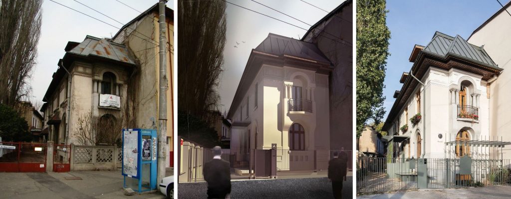 *left to right: 1. Initial state 2. Perpsective from the competiton design 3. Now
Almost nothing
Four years ago, we were writing in Zeppelin that the choice of buying the house followed several years of attempts, under limited opportunities and budget, and that “there were heated discussions because, let’s face it, the building has a charm specific to its age and to the great wagon-house family, but a rather modest architectural value. It is also not very large, it seems to have rather crowded spaces and few possibilities for subsequent expansion”.
These were certainly also the reasons why many of the participants to the competition chose to preserve the facades, but to partially or completely replace the interior. The Starh team undertook to do almost nothing – in respect of space or image, that is, because otherwise the operation proved not to be a minor one at all.
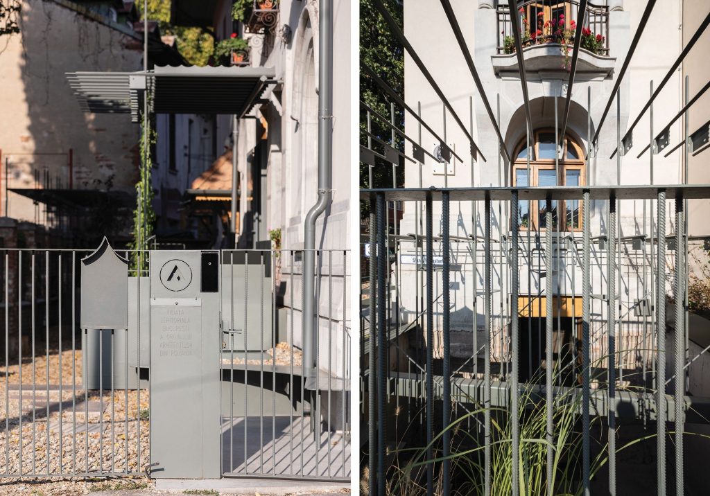
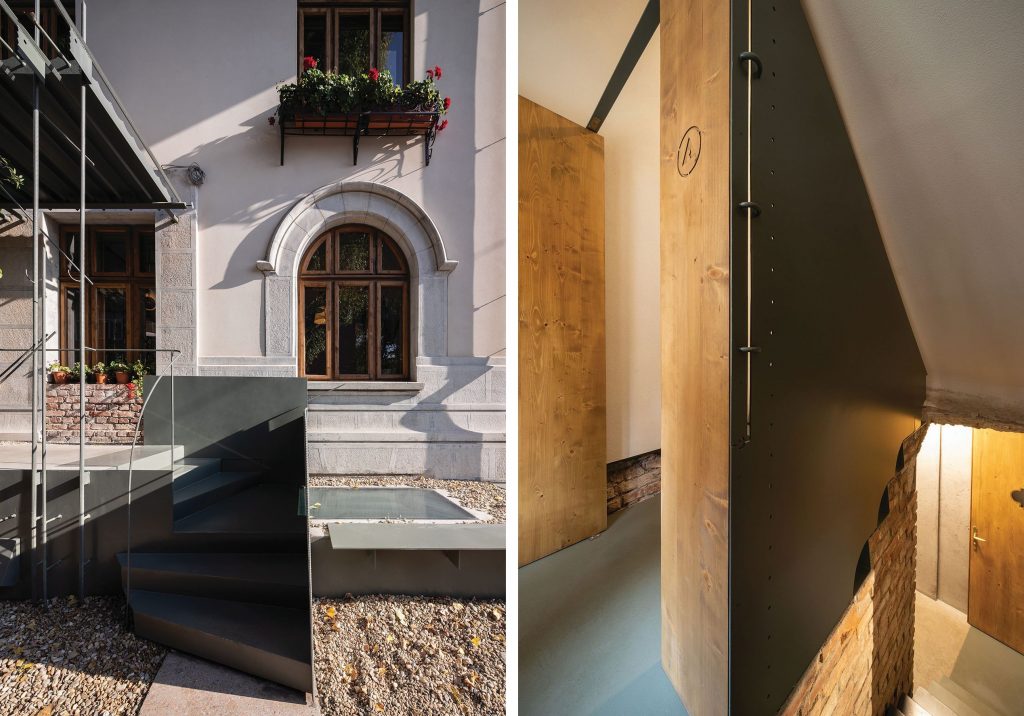 *(left) Entrance detail / (right) Secondary entrance and stairs to the first floor and the basement
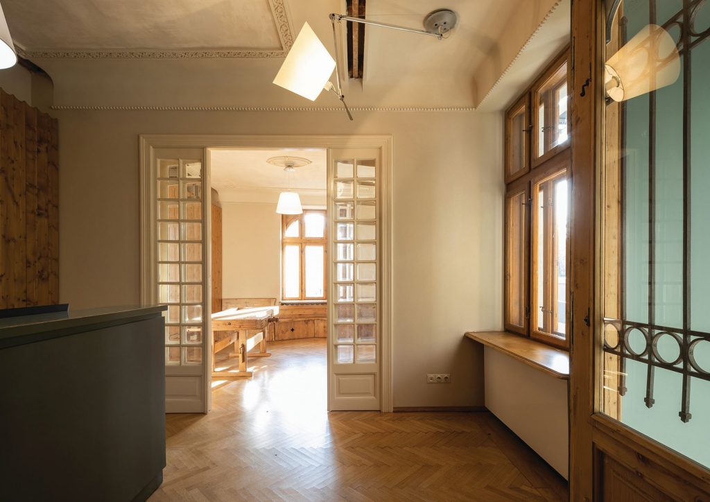 *Reception at the ground floor
The walls and the spaces were almost completely preserved, and the new functions found a place with a minimum of adjustments. There are a few new openings, the basement was extended both horizontally through a few niches, but also vertically, to gain more height and, finally through a a sunken courtyard towards the street, all together enabling it to become a multipurpose hall connected to the city. In essence, this is an adaptation and a densification, not a remake; sufficient for the building to be able to host an entirely new life, preserving at the same time the character of spaces and a domestic scale.
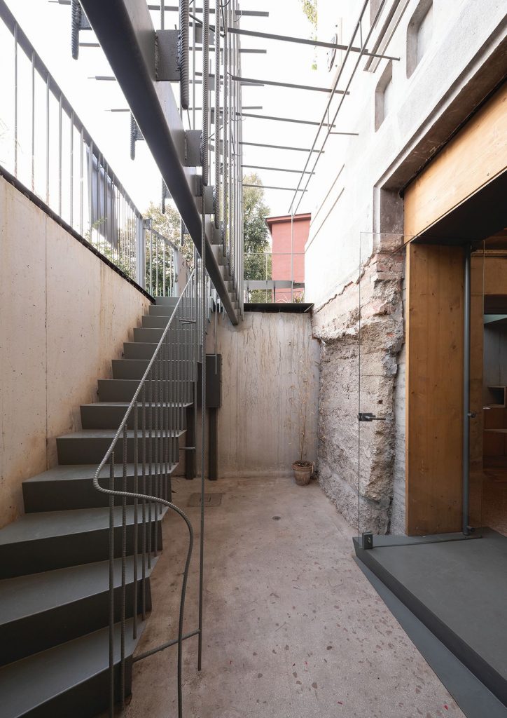 *The sunken courtyard that gives light and access to the public basement. The rough concrete wall of the house basement is the original one, that was pured into the ground without any other formwok.
One of the most powerful gestures is, paradoxically, also the least visible. Naturally, the attic needed to be converted, to accomodate new functions, among others, the council room. Here would have also been the occasion to express the contemporary intervention, through a light, open, expressive structure. Yet the winning proposal simply envisaged the slight horizontal offset of the cornice, coupled with a very light increase, almost invisible from the outside, of the roof’s slope. This solves the issue but remains almost invisible intervention, one that expresses the general logic of discrete adaptation.
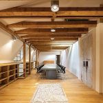
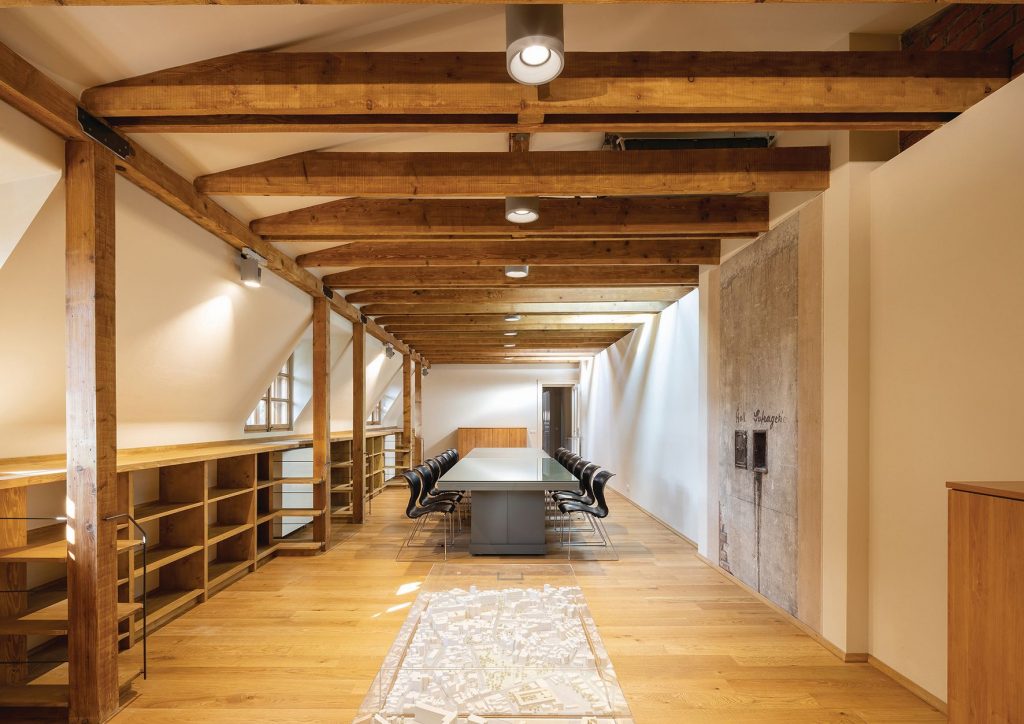 *The council room in the attic. A few simple gestures created a completely usable space
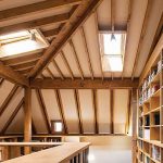
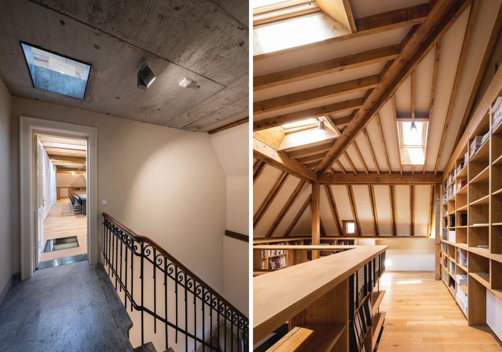 *(left) The attic and the original stairs / (right)Library and studio in the attic
The resulted roof was also extended over the back of the building. Everything that was not an adjustment, but a true new intervention, was expressed schematically, yet rather clearly in the project – for instance, the new entrance device, with a light canopy and a glazed vestibule attached to the old facade.
The completed project…
…is extremely close, in its essential character, to the competition one. That includes the structural rehabilitation solution, heavier in the basement and on the first floor, and lighter on the upper levels, except for some wooden elements which could no longer be structurally used. The house still feels a bit small, there’s no denying of this. Yet all the devices provided for in the project are working: the underground space is now a public space easily accommodating 60 people, and can function autonomously, the former attic really is a light-filled, fully usable place.
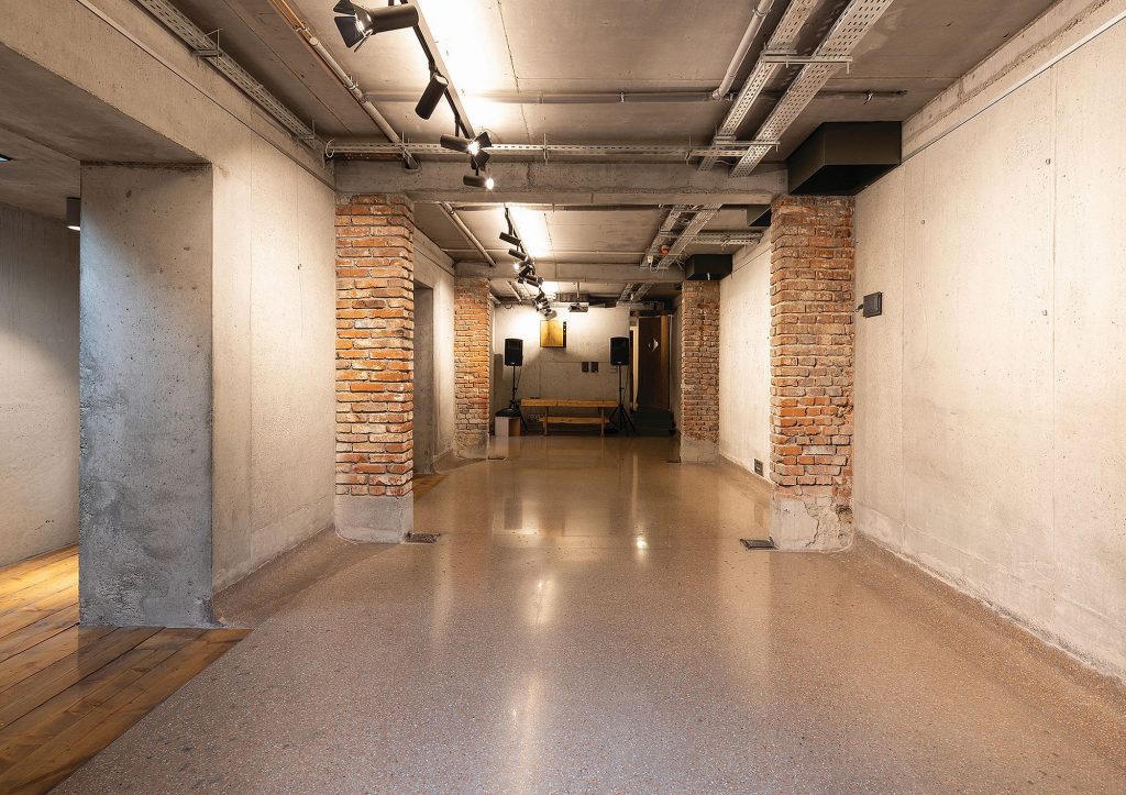 *The heaviest structural intervention took place in the basement
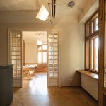
Even the well-known quality of the classical partition, with its connecting rooms and several circuits, to host very different activities and scenarios, is checked.
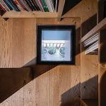
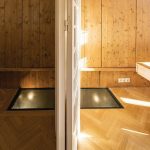
One of the changes inserted along the way is the multiplication of vertical connections, visuals mainly (and, in some, cases, stairs). The light wells from the yard to the basement were already there when the competition took place, but they were multiplied, and the cross-section of the entire house is now energized by perforations.
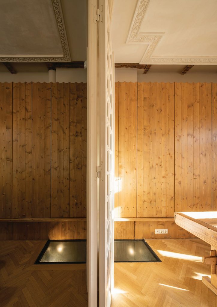
Iulia Stanciu was telling me that the idea of these new openings occurred to her when pouring the concrete slabs, in fact at the moment when certain portions had not been encased yet: the quality of the light and of the crossing interior views made her provide for these incisions in a controlled manner.
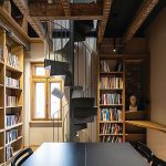
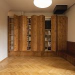
The library’s void was already indicated, as a possibility, during the competition. Now it has been accomplished, and the Order’s guest studio has become a loft inside the library. Shelves turn into lattice walls, which are otherwise also supported by the old beams, whose structural role stops here.
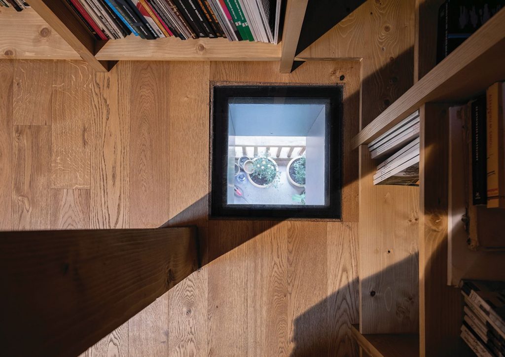 *View from the attic part of the library towards thje 1st floor loggia
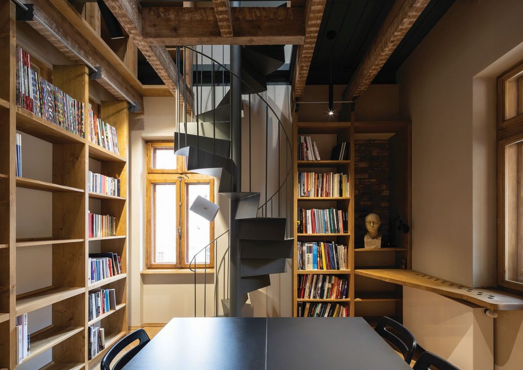 *1st floor library. The old beams now support the library shelves
The most visible transformation and, despite some fierce criticism, one of the most felicitous ones, in my opinion, is that of the entrance device on the ground floor. While working on the house, the architect became less and less comfortable with the solution in the competition. The entrance canopy would have become too high to be felt as a shelter or, once lowered, it would have intersected with the entrance ornaments. This crisis led to a radical rethinking of the whole area, which is now not so much part of the house, but of the garden: the vestibule has gone way, the canopy is just a slim plate. There’s now an assembly of plates and linear elements, a sort of pergola-lattice-vine arbour-platform-stairs-bench landscape. Practically, a new spatial layer is interposed between the courtyard and the house, becoming part of both, in the best tradition of a Bucharest wagon-house.
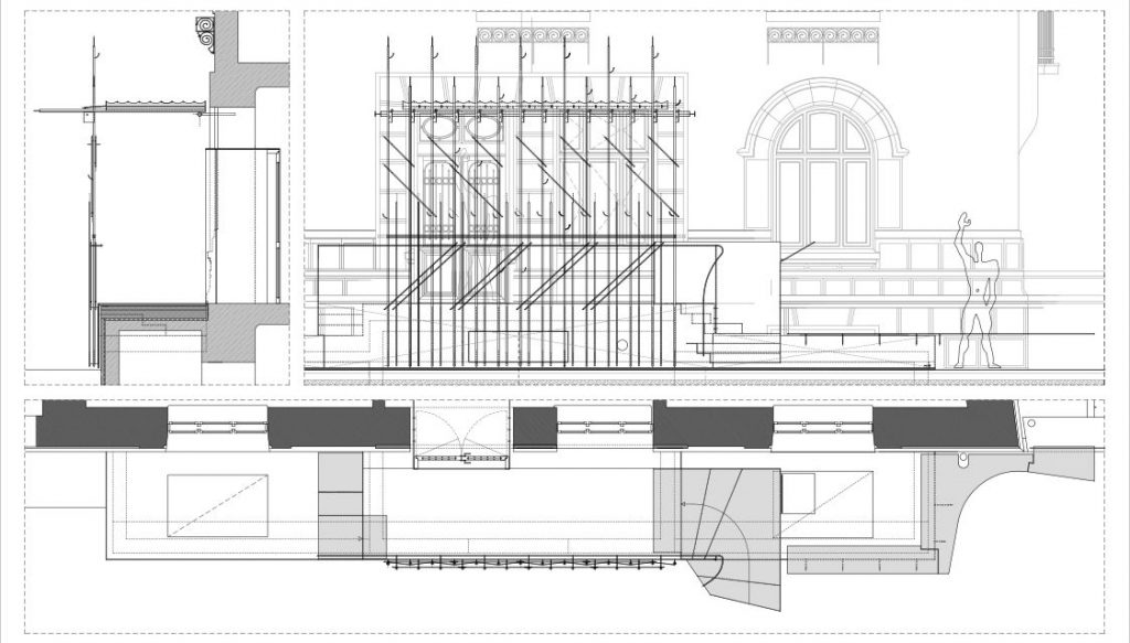 *Main entrance detail
Opening-up
Besides the fact it is small, the house is also recessed from the street, behind the neighbouring dead wall, and is not parallel to the street. The reasons for this quirkiness is typical for the layers of unfinished projects that are making up Bucharest: a widening of the intersection between the Sf. Constantin Street, Berzei street and Calea Plevnei was being considered in the ‘20s, which led to an alignment regime, but that was pretty much all, as the project was never carried out. Yet it resulted in the recess I was speaking of, and also in the emergence of an empty space; although, disputed by cars and other developments, this is actually a place for people to rest, including the students of the nearby Cervantes High School. The house is hidden but, paradoxically, is also open towards the city.
 *Detaliu intrarea principală
Deschidere
După ce că e micuță, casa mai este și neparalelă și retrasă față de aceasta, în spatele calcanului învecinat, și așezată. Motivul acestei ciudățenii este tipic pentru suprapunerea de proiecte neterminate a Bucureștiul: în anii ’20 se prevedea o lărgire a intersecției dintre străzile Sf. Constantin, Berzei și Calea Plevnei, ceea ce a dus la un regim de aliniere, însă cam atât, proiectul nefiind realizat vreodată. A avut însă ca rezultate retragerea despre care vorbeam, dar și apariția unui spațiu liber; deși, disputat între mașini și alte amenajări, acesta chiar este un loc în care oamenii mai stau, inclusiv elevii de la Liceul Cervantes din apropiere. Casa este ascunsă, dar, în mod paradoxal, și deschisă către oraș.
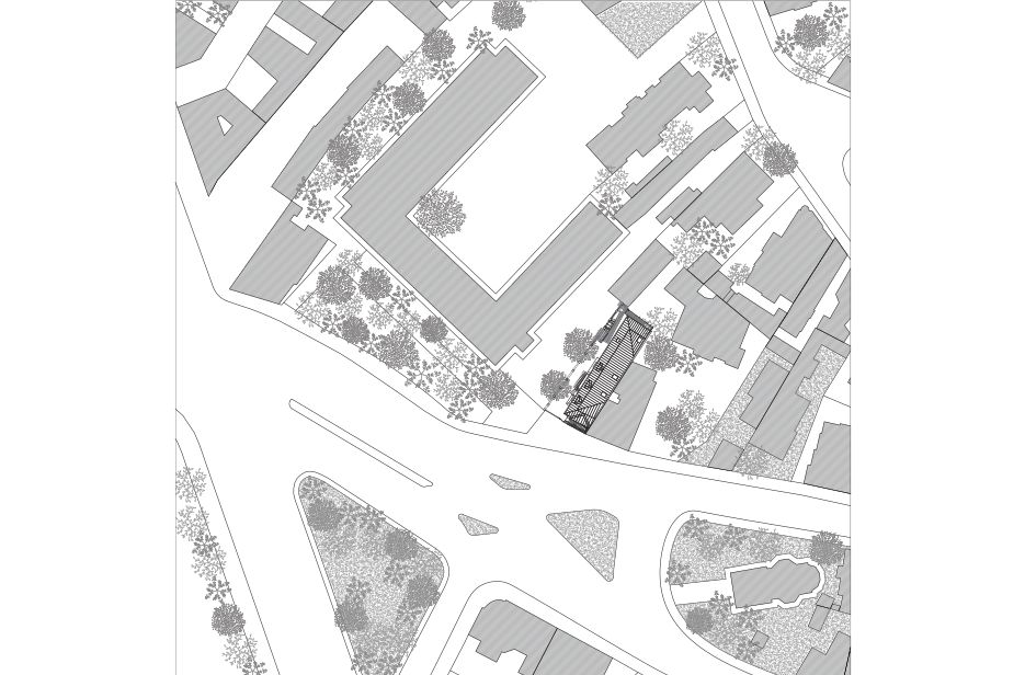 *Situation plan
There is an embryo of public space here, answered by the metal fence, which can be completely folded to open the courtyard during public events; but also a potential of a relationship between the school and the high school, which the Order and the authors have exploited: a special relationship was created among neighbours during the construction works. This led, among others, to the organization of the main exhibition and the award ceremony of the 2017 Bucharest Architecture Annual in the high school yard, but also to an almost invisible, yet essential, physical change: creating a gate in the fence between the school and the Order.
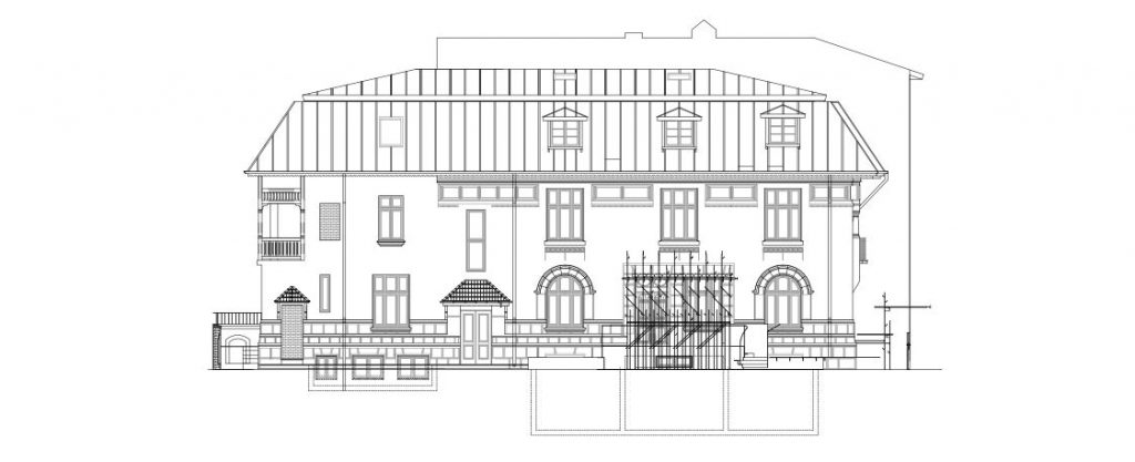 *West façade, towards Cervantes Highschool
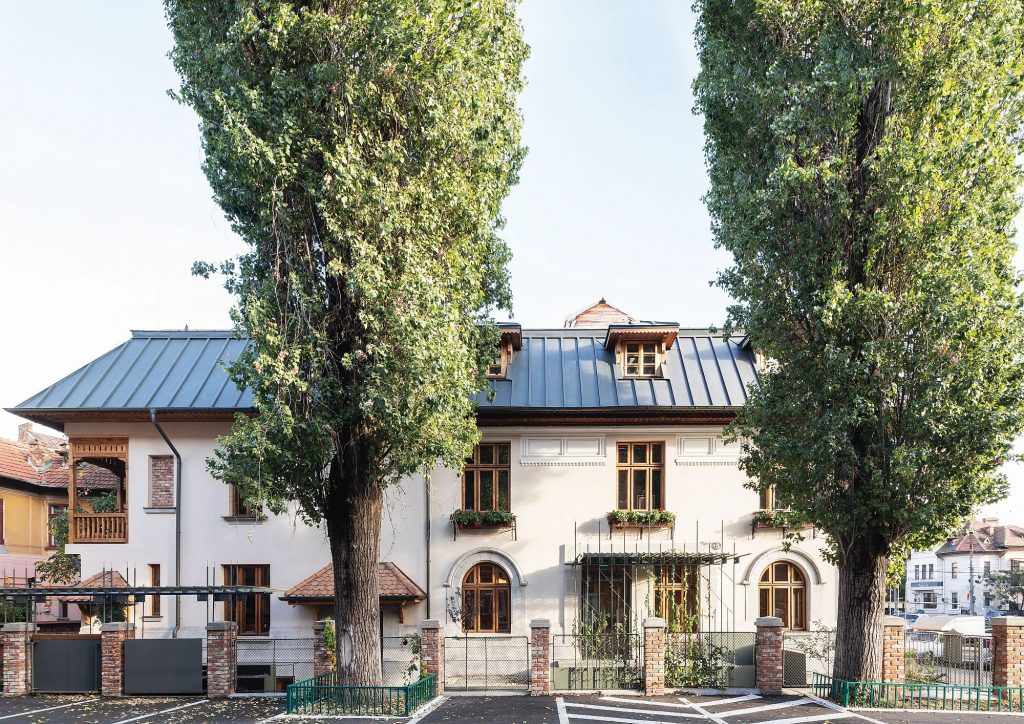 *The house seen form Cervantes High School. The fence is now mostly transparent and the gate that appeared during the building process connects the two neighbours
This is a sign and also an important step towards achieving the character I was speaking of in the introduction, that of the OAR House being part of the neighbourhood, and also of a Bucharest cultural circuit. And it’s a success for the idea of a “living building yard”, that is, the organization of events right during the construction, in the places where and at the moments when it was possible, so that the house should start living before it was completed.
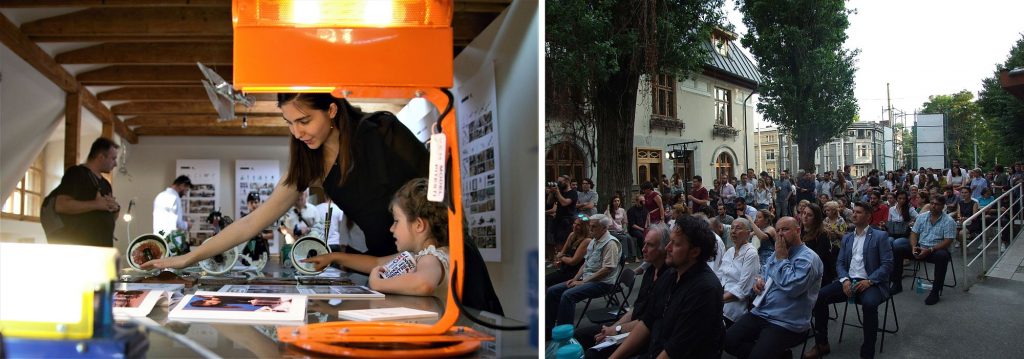 *„Living building site”. 2017 Bucharest Architecture Annual: I’M UAU student exhibition in the attic and awards ceremony in the courtyard of Cervantes Museum.
Integrity, gentleness and play
If you were to take apart the materiality and the expression of this very complex place, you could maybe define some four main layers. The first is the historical one, that of the saved and repaired house. Most everything possible was preserved, sometimes even obsessively so, and the components of a typical bourgeois house in the neo-Romanian style are showcased as something very precious. Even strictly technical inscriptions in the attic were maintained, as they became part of the memory; in one spot, you can spot the traces of the initial roof on the chimney wall. Then would be that which I’d call “the strong new part”. There is a remarkable sincerity in the new interventions: the concrete is visible, it is powerful and heavy; so is the flooring mosaic on the ground floor; the cuts are also visible, and are even celebrated through metal collars or other articulations; the additions and the stripped areas are also visible, the new wood is distinct from the old, ventilation is also seen in the attic etc.
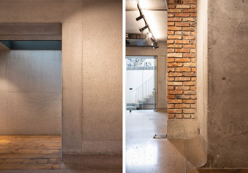 *basement details
But the athletic effort is also accompanied by a milder, ethereal layer: from the already-described canopy to the new interior and exterior staircases or to the wooden panelling, which sometimes turns into wall cabinets; various benches, ledges, rails, all taking place in an exuberant dance, saying a lot of the team’s pleasure to work on this project.
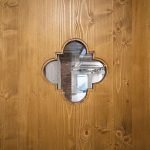
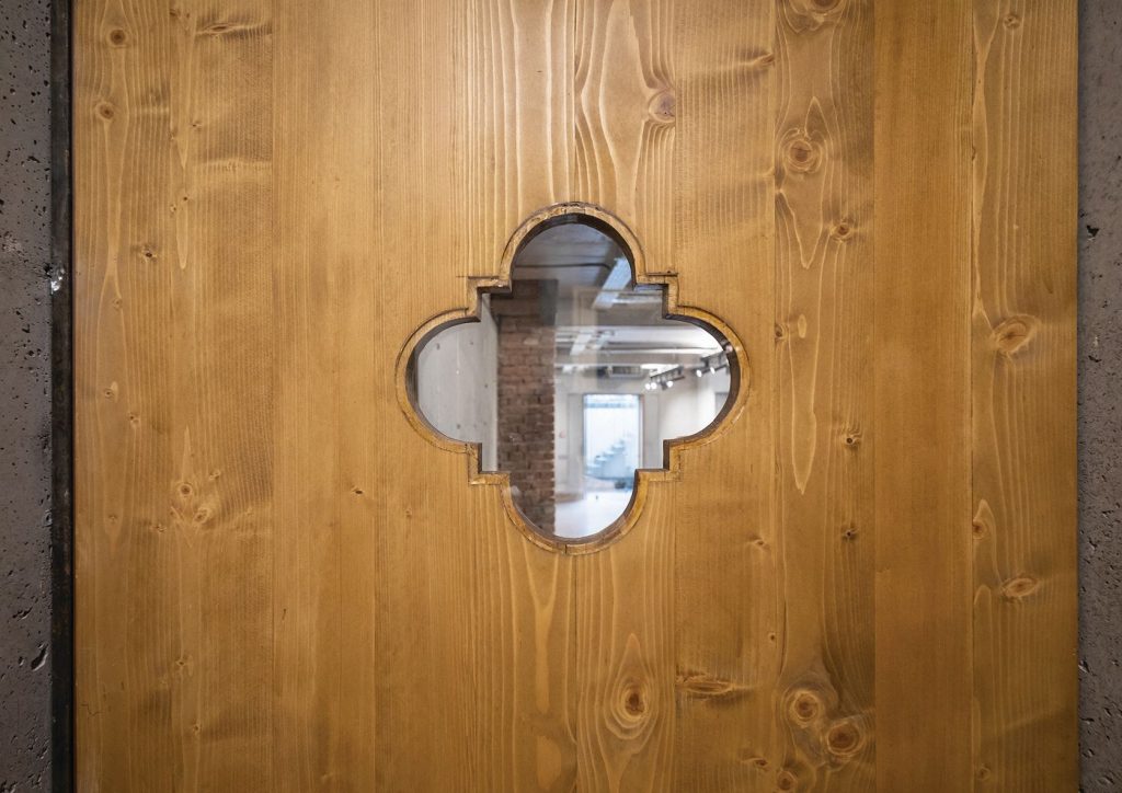 *Detail of the interior door in the basement
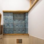
The fourth layer, that of a recomposed history: much of what could not be preserved on site was adjusted and re-inserted in the house: windows now facing the interior; an old entrance window-turned mirror in one of the toilets; but elements from elsewhere have also appeared, adding their history to that of the house. It is, for instance, the case of the ceramic tiles coming from the stoves in a demolished house, also placed in one of the bathrooms.
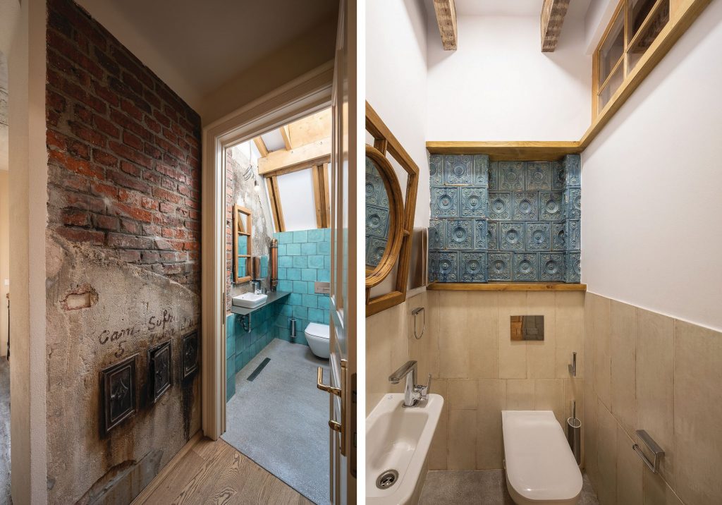 *(left) The bathroom in the attic. On the chimney wall on the left the trace of the old roof is left visible / (right) 1st floor restroom. The blue tiles were recovered from a demolished old house. The windoe over the main entrance was replaced with a new one was transformed in a mirror
There would be other components as well, which escape analysis, such as the subtle degrees of shade punctuated by the sudden occurrence of very bright areas. There really is a lot of poetry in this house. There are, of course, also shortcomings in the performance, as well as the need to introduce tables and chairs to match the house’s level of prestige. The initially-agreed budget for construction was observed (but has to be completed for fixed furnishing, for instance), even if the building site took longer than anticipated, and was accompanied by sometimes very differing opinions, and, besides the development discussed, also by unresolved scenarios.
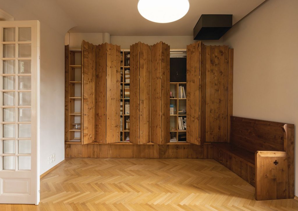 *Built-in furniture in one of the offices
Many of the aesthetic notes fall under the category of private opinions and taste, which I will not comment on here; but there are also things worth discussing. There is for instance the (uncompleted) proposal of inserting an elevator: an important need, whose unfulfillment Iulia Stanciu assumes, as a choice to not sacrifice at least one of the house’s important spaces.
Now, at the end, if I were to mention two traits that I find somehow symbolic of the architectural attitude, I would choose two of the metal elements: one, the notice board which suggests a small home: a playful allusion to the house’s function and to the archetypes of building; second, part of the canopy bars, which are in fact standard reinforcements bars for concrete: I quite like how hese strictly functional elements, which usually do their job without ever being seen, become here part of a precious lacery.
Plans
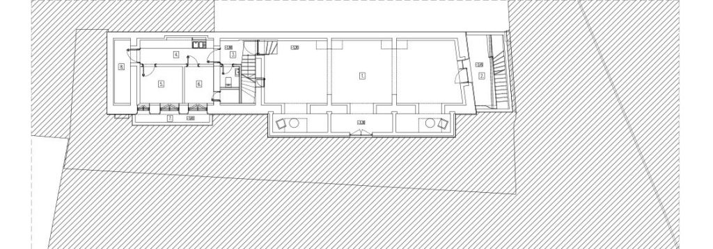 Basement plan: 1. Exhibition space. 2. Sunken courtyard. 3. Hall. 4. Pantry. 5. Storage. 6. Technical. 7. Sunken courtyard. 8. Archive
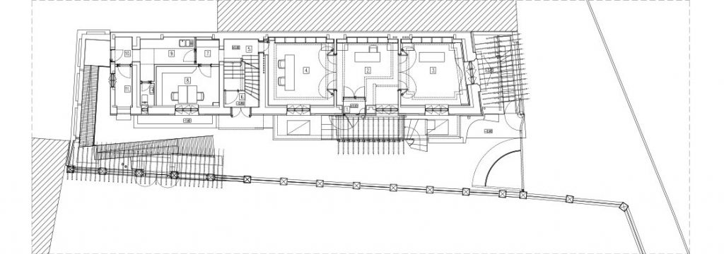 *Ground floor plan: 1. Entrance. 2. Desk. 3-4. Office. 5. Corridor. 6. Stairway. 7. Sas. 8. Office. 9. Pantry. 10. Corridor. 11. Server
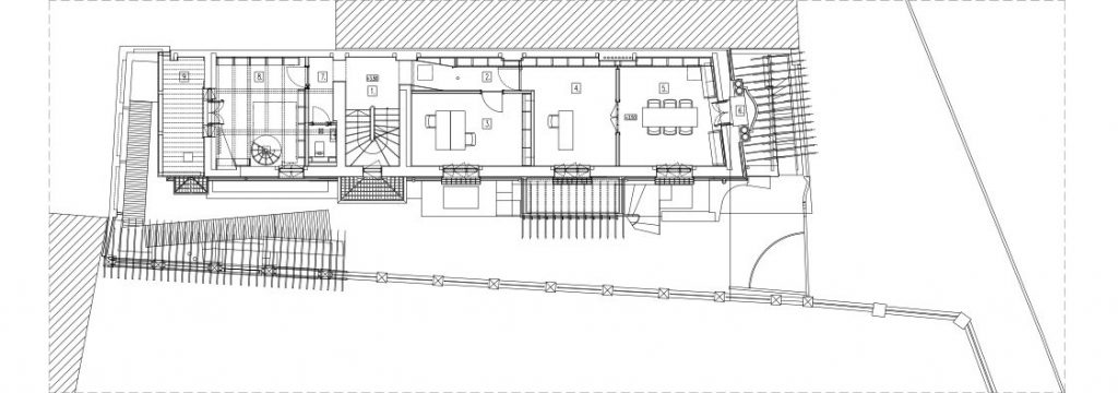 *1st Floor plan: 1. Stairway. 2. Hall. 3-5. BOffice. 6. Balcony. 7. Corridor. 8. Library. 9. Loggia
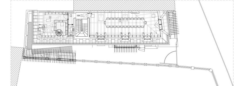 *Attic: 1. Hall. 2. Multipurpose room. 3 Corridor. 4. Library + studio
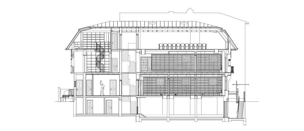 *Longitudinal section
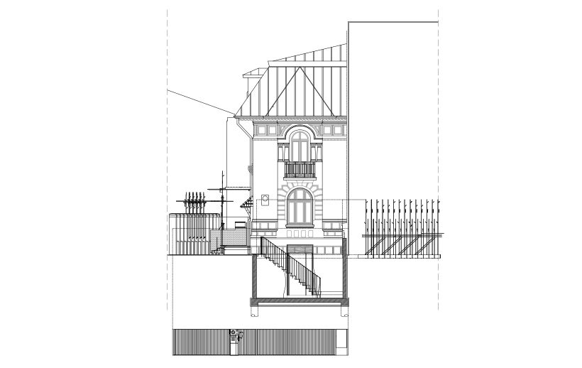 *Façade towards Sf. Constatin street
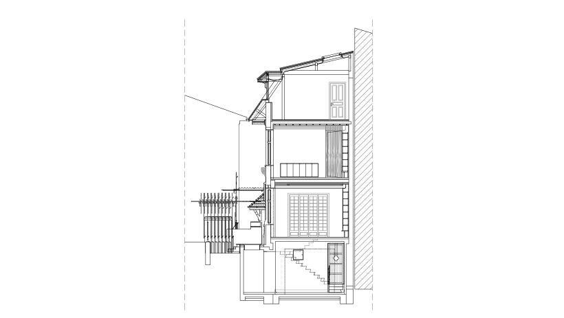 *Cross section
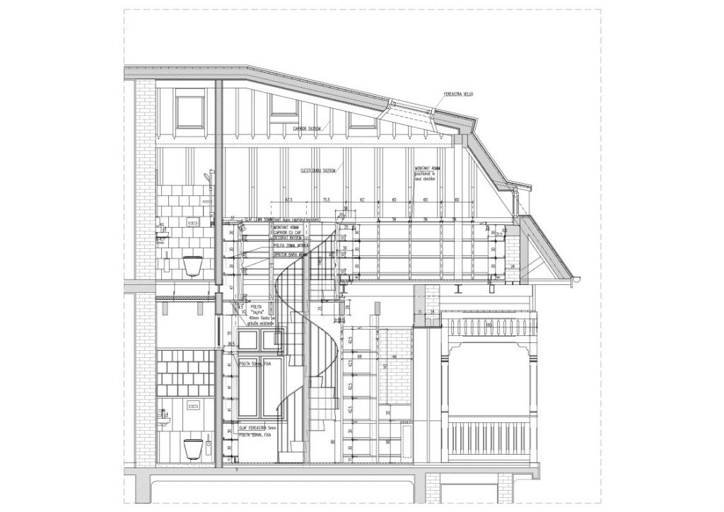 *Detail section through the library
Info & credits
Authors: STARH – Maria-Iulia Stanciu, Florian Stanciu
Team: Cosmin Gălățianu, Cosmin Georgescu, Cristian Beșliu, Horia Munteanu, Octavian Bîrsan
Structure: MIRO GROUP- Adrian Stănescu, Mircea Mironescu (expert)
VDB INSTAL Bogdan Ioniță, Eugen Badea
Constructor: CELLA COSIMEX – Viorel Iordan
Building superviser: Marius Burilă
Bentonici injections and special foundations: STIZO SA – Liviu Udrea
Stucco restauration: Ștefan Neacșu
Built-in furniture: MCO – Cristi Zielinschi
Medalion of Florea Stănculescu: Virgil Scripcariu

