From a recent ruin to a house: recovering and repairing ask for an architectural action, that differs both from restoring and creating a new work.
The project of this house is a rather unusual type of intervention. This is not the continuation of a project or the adjustment to a context. We called it repair works. The repair works of a recent ruin is something else than the intervention on an old house. An old space has a couple of sensitive elements, a spirit, perhaps good proportions or well-aged finishings.
However, nothing romantic in this case and almost no logic, as in a novel where characters attempt to escape the narration. Despite that, we tried to work out the signs taking us to a coherent search of the result.
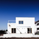
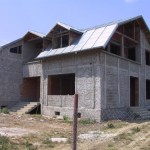
We started with a structure left abandoned for over 8 years. A house as many others in the 90s, with a typical configuration for the grotesque Romanian suburb. As one can notice immediately, the construction started from a large basement for two cars, yet with a 40 degrees inclination access, and with small openings. Further up, a confuse structure, all types of stairs in the interior, and vast, unused spaces at first floor. The height between the concrete slabs at the ground floor and the first floor was only 2,5 m. Then, other details provided by the architect such as the strip window at the front terrace (a clearly refined contribution, as well as the semi-circular chic staircase). Instead, the attic of a huge volume, and its many triangular windows expressed the pragmatism and creativity of the old client, in agreement with the builders.
As in many cases of that time, this abandon was probably a combination between the vision of an energetic and authoritarian beneficiary, and the lack of reasoning and determination of an architect undergoing the building and design crisis of those years. Not too many young people today know that the salary of architects in that time were about 50-100 dollars a month. I remember that getting a project in Pipera could be the test and the long-waited moment of a career. That is why submitting a few drawings for a few hundred dollars seemed a bargain; let’s hope that that era is finally gone.
How to make such a house inhabitable for a family of three?
The demolition of so many cube metres of concrete, mainly in the basement (not to mention the masonry) and the reconstruction from 0 did not look a financially well-thought option. Therefore, we suggested to cut some of the existing structure and mainly to correct it. Another point we agreed on with the new owner was to try and repair the ground floor and to reduce to half, if possible, the surface at the first floor. It may seem odd to suggest cuts from one’s project, yet for us it was clearly important to decide on how much space was actually needed and leave place for the budget of furniture, lights and high quality finishings; so, as few square metres as possible, and, instead, the best possible materials and equipment. The first interventions implied taking care of the badly poured concrete: cleaning the reinforcement and applying carbon fibres to reinforce cracked bars. A structure with many faults: vertical and horizontal deviation finally pushed us to rather very thick walls both at exterior, and interior. We sometimes had to recover even 20 cm of vertical deviation.
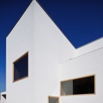
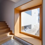
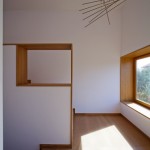
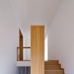
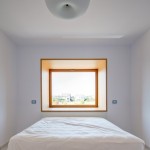
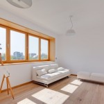
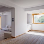
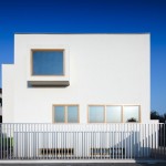
Hence the idea to make use of such large thickness and somehow recover the hidden surfaces in the wall. We then placed the windows on a metallic frame right at the exterior of the building and made several wooden boxes in the interior where one could sit on. The logic of the openings turned into spaces and the simple geometry offered us a syntax of the project which we took as further as the existing structured allowed.
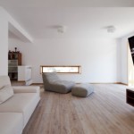
I want to keep the phrase repair works since this somehow indicates a double identity. Low heights and uncontrolled openings introduced a rather bizarre note in the existing structure. The initial stairs clearly took one to a space too low for a living room. Giving up on the semi-circular corner and moving the entrance to the front of the house, we managed to deviate the subject, and balanced the feeling of a low space with a huge window to the yard.
The initial structural confusion was seen as changeable, and we used it for the lower area in various types of furnishing. Finally, the slightly deviated winding provides the space with a certain complexity and overlaps of elements with their own charm.
This project provided a special contentment. It is not the pride of a new house or that of saving and taking further an old building, but rather the joy of managing with one had at hand, of making housing truly manageable, of improving instead of erasing and taking over again. Perhaps that in condition of crisis, this may be the one appropriate field for architects in the coming years.
Photo: Cosmin Dragomir
Credits:
Single family dwelling, Voluntari
Rehabilitation project: 2004, 2010 – 2011
Construction: 2011
Authors: Zeppelin – Constantin Goagea, Ştefan Ghenciulescu, Adrian Dobre
Structure: Gheorghe Popescu
Constructor: Habitual
Furniture: Huelsta Studio
Rehabilitation of the concrete structure: Sika
Wooden carpentry: Acant Design


