In 1989, while the entire East was enthusiastically reforming, two (neo)Stalinist countries were still left in the area. In the meantime, one of them became a EU member, the other one is struggling a bit more. One has just finished, the other one is still busily working on a grand national project, built in the centre of their respective capitals. One of these projects is a huge cathedral, also inspired from and in direct competition with the country’s main totalitarian edifice. The other preferred to turn an empty totalitarian space into a public and democratic one.
Project: 51N4E; Anri Sala; Plant en Houtgoed; iRI
Text: Ștefan Ghenciulescu
Photo: Laurian Ghinițoiu
I know, it is perhaps just too much like our national spirit in Romania, radically oscillating between self-sufficiency and self-flagellation, to connect the People’s Salvation Cathedral to the lay-out of downtown Tirana’s Skanderbeg Square. But the comparison is simply too much at hand, because we have: 2 post-totalitarian contexts: two cities in full ultra-liberal expansion – although, honestly, today’s Bucharest seems almost settled and quiet when compared to what is going on with the constructions, demolitions, and the hoarding of Tirana’s public space; a symbolic, troubled, space; a relationship that is beyond difficult and complex with the recent past (and not only); projects that was explicitly stated as a national one, assumed by the central and local administration.
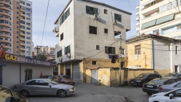
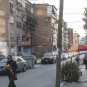
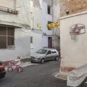
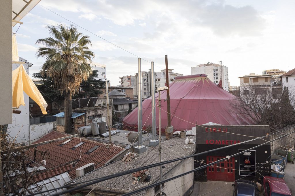
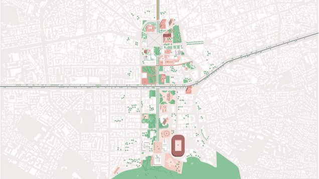
*Center area Tirana : ultra-liberal development and the fight for every square meter of free space
Let us, nevertheless, put aside the Cathedral, with all its related frustrations, worries, and clichés, and let’s talk about an absolutely remarkable public space, not only for the East-European context.
A complicated place
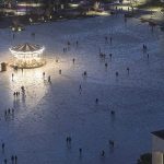
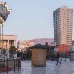
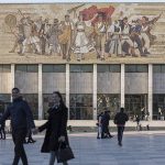
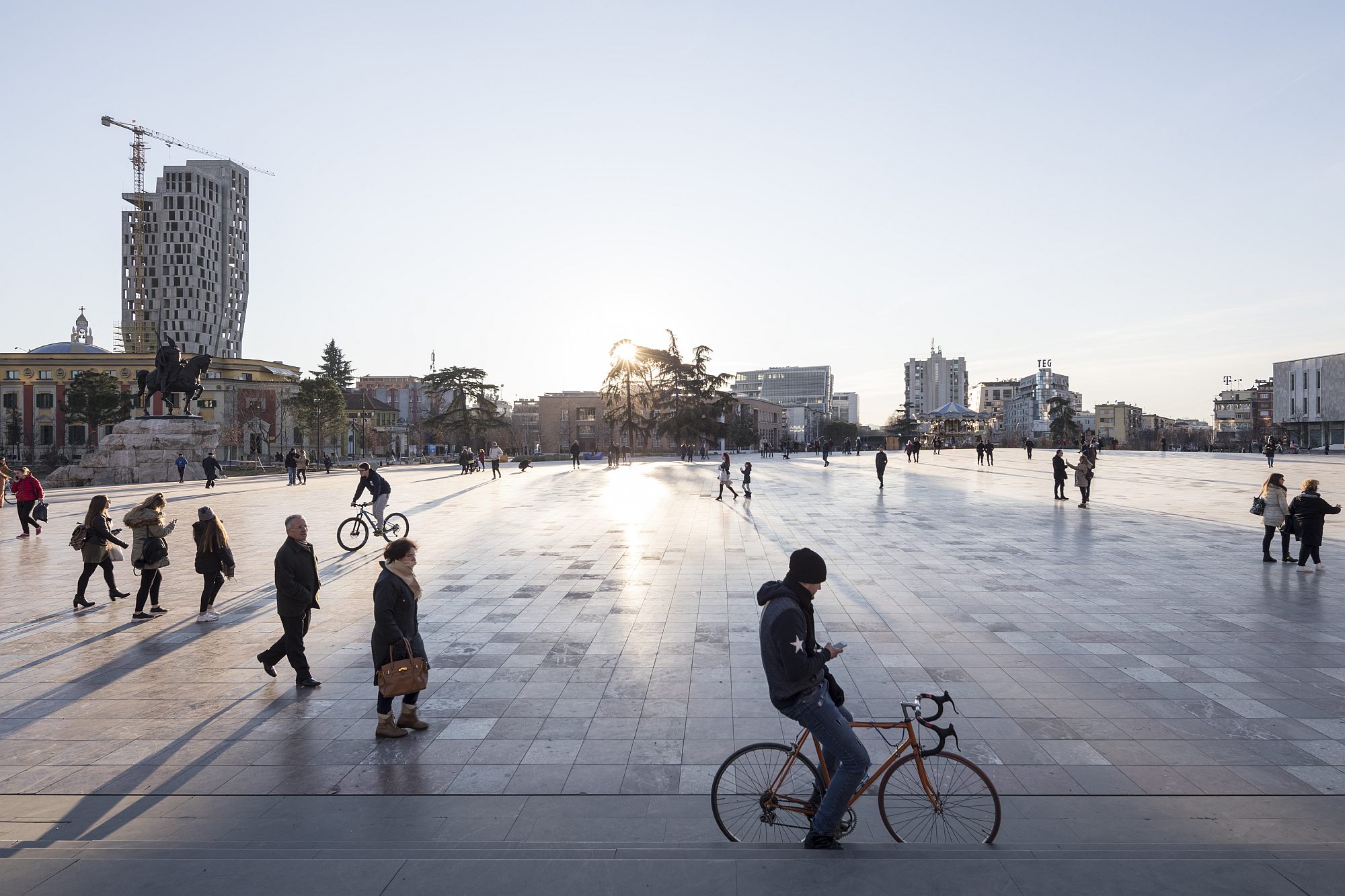
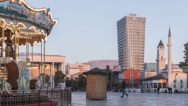
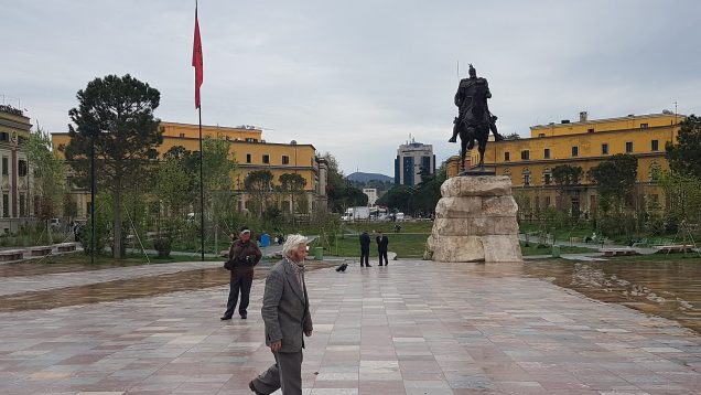
Skanderbeg Square is Tirana’s main public space. It bears the name of the national Albanian hero, and it is a huge open area, overlooking the landscape of the surrounding mountains, collecting buildings from the city’s entire history: a historical mosque, an Italian Rationalist-style bank, and political and cultural buildings (the Opera House, for instance, but also the Party’s former hotel), built under the dictatorship. Then, all around, there are delirious post-socialist buildings, and the newest layer – the more recent office high-rises, made by international offices. The square used to be the place of official Communist events (back in the time when private cars were prohibited), it then became the main stage of anti-regime demonstrations, it still is a political hotspot. After 1990, with the post-totalitarian surge, it became one of the main traffic junctions.
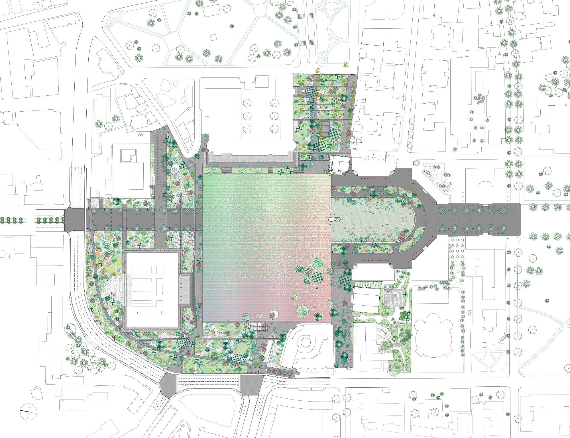
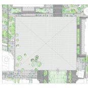
*General plan
Unavoidably, at some point, the Government and the City Hall turned their attention here. In the beginning, and quite like in the neighbouring countries, it seems that intentions were especially concerned with the transformation of surrounding buildings, in an effort of upgrade but aaslo to settle accounts with the hated recent past. Fortunately, they succeeded in articulating a topic that is less concerned with buildings, than with the open space and the transformation in a veritable public space. I do not wish to insist on the context too much, but it is nevertheless important: in Tirana, the great majority of operations still take place in the typical post-Socialist context, where individual interests are stronger than the common one, where profit-making and hoarding rule, and where architectural quality is (or was) less intrusive. At the same time, however, there are also huge efforts to order and smooth things: from the bottom up (in Albania, there is a very interesting movement of community urbanism), but especially from the top down. Former mayor Edi Rama’s program of painting the facades of the socialist blocks of flats is famous. But that which is perhaps more important is the consistent political program of involving reputed architects in the main projects. MVRDV are working hard in Tirana, so is the Belgian office 51N4E, the main authors of the lay-out we are discussing here, Stefano Boeri coordinated the General Urban Plan, and so on. And that is while, even in the most architecturally reformative and strong countries in the former East, foreign colleagues are rather scarce.
The democratic pyramid and the gardens on the edge
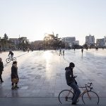
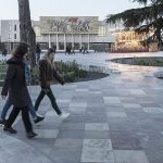
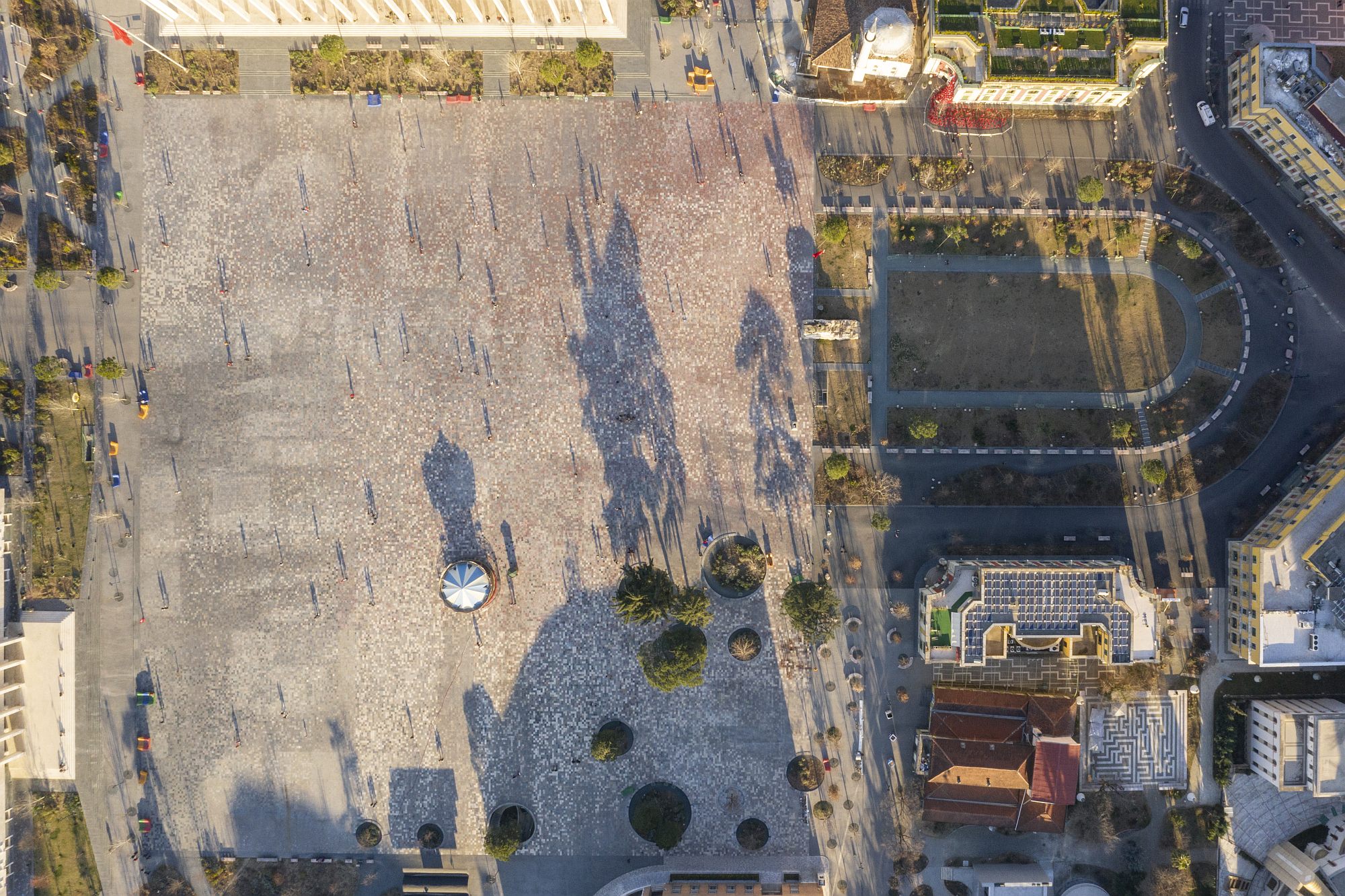
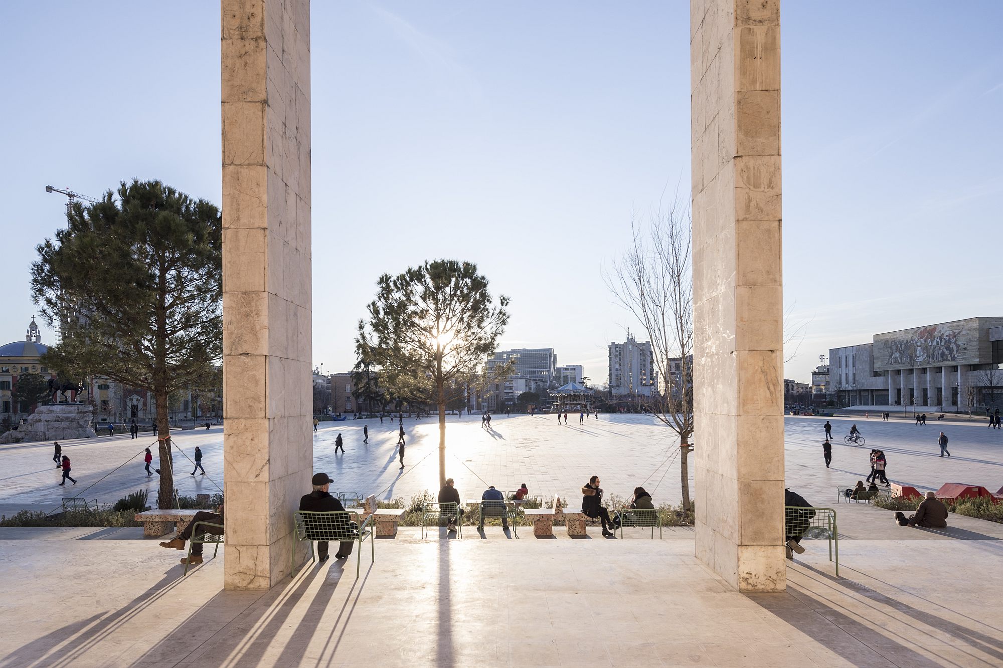
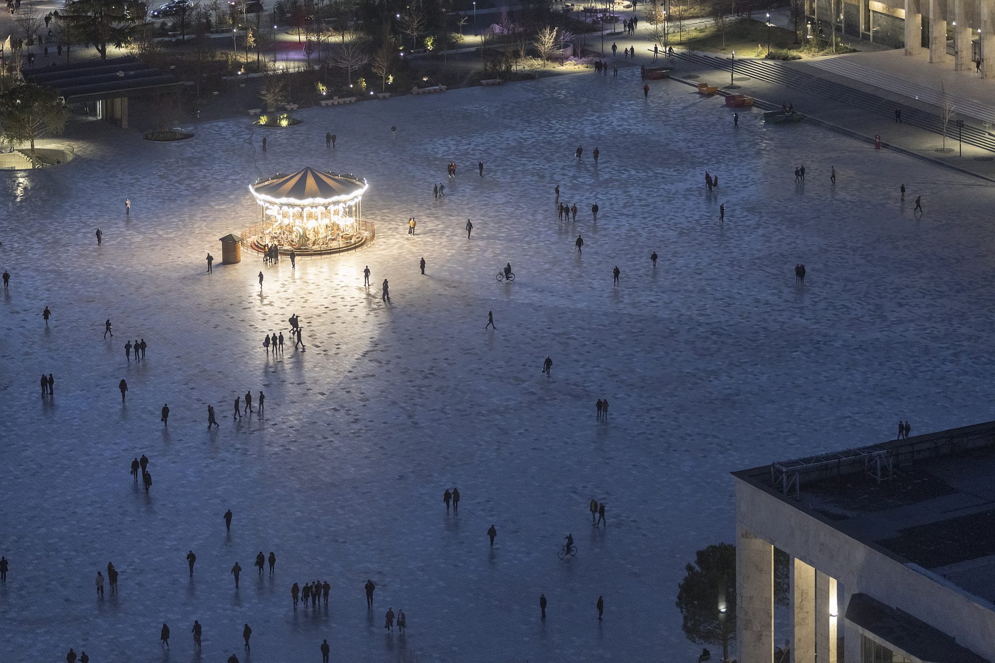
The main gesture is clear and radical: first, cars completely disappear from the square (they partially find their way underneath). Then, the entire huge space is left empty and uniform.
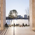
A large, orderly, nearly square platform becomes a place for all, gathering and connecting the heteroclite neighbouring areas, providing a major gesture as response to the magnificent backdrop.
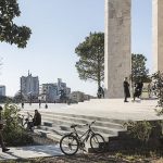
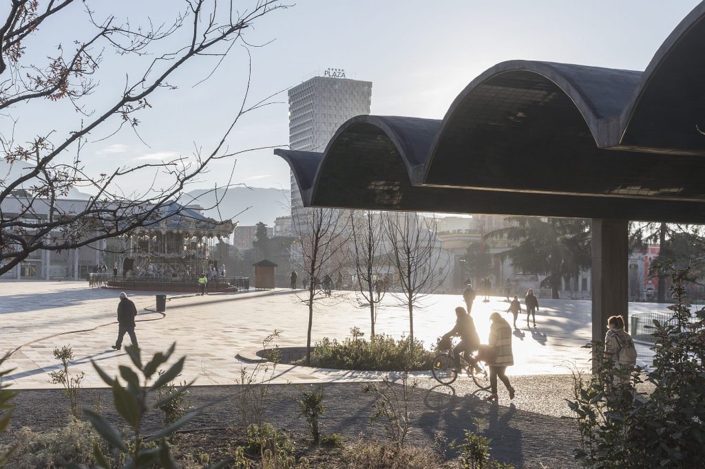
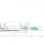
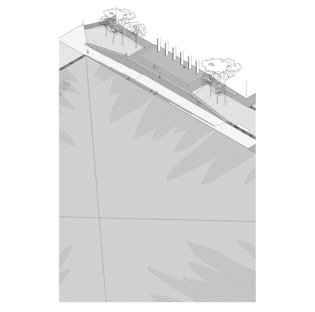
The square bears an extremely flattened pyramid, with the sides of 177m x 157m and with a height of approximately 2 metres. The small slope, quite similar to that of a walk-through terrace, is really felt on the spot. The pyramid subtly overturns hierarchies: at the top, you are practically eye level with the totalitarian buildings, in a position of equality, instead of the clear prior dominance.
Besides it there is, of course, the empty, but not quite neutral, place, which is perfect for community events, its slope also improving visibility for shows.
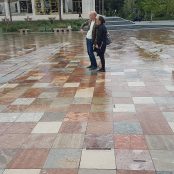
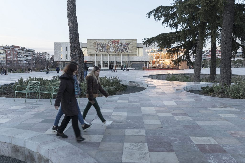
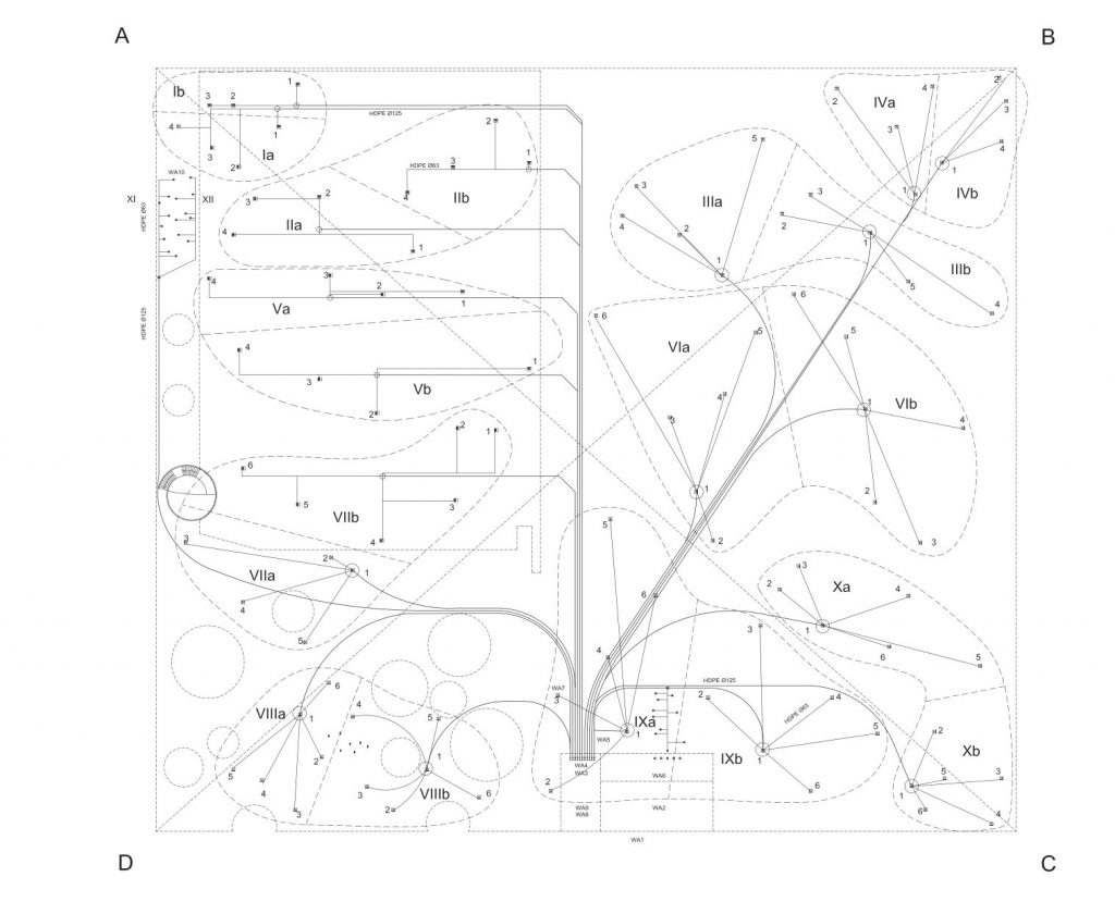
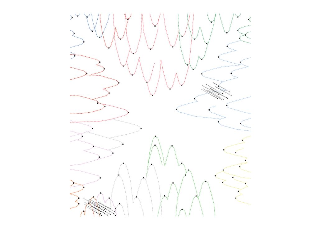
Good. But we know that very large and completely empty spaces have two huge issues: first the sun which, in summertime, turns them into deserts, then the lack of more human-scaled areas, protected and supportive for informal contact. The solution to the first issue comes from water: taking advantage of the slope, a system of slots in the pavement allows water to flow towards the edges, where a network of drains and pumps collects it and then redistributes it to the nozzles. The water films created in the summer days create, especially in windy weather, extremly different and rapidly changing spots and paths.
*Plan of the placing of the stone paving. Areas and controlled diffusion.
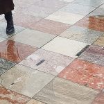
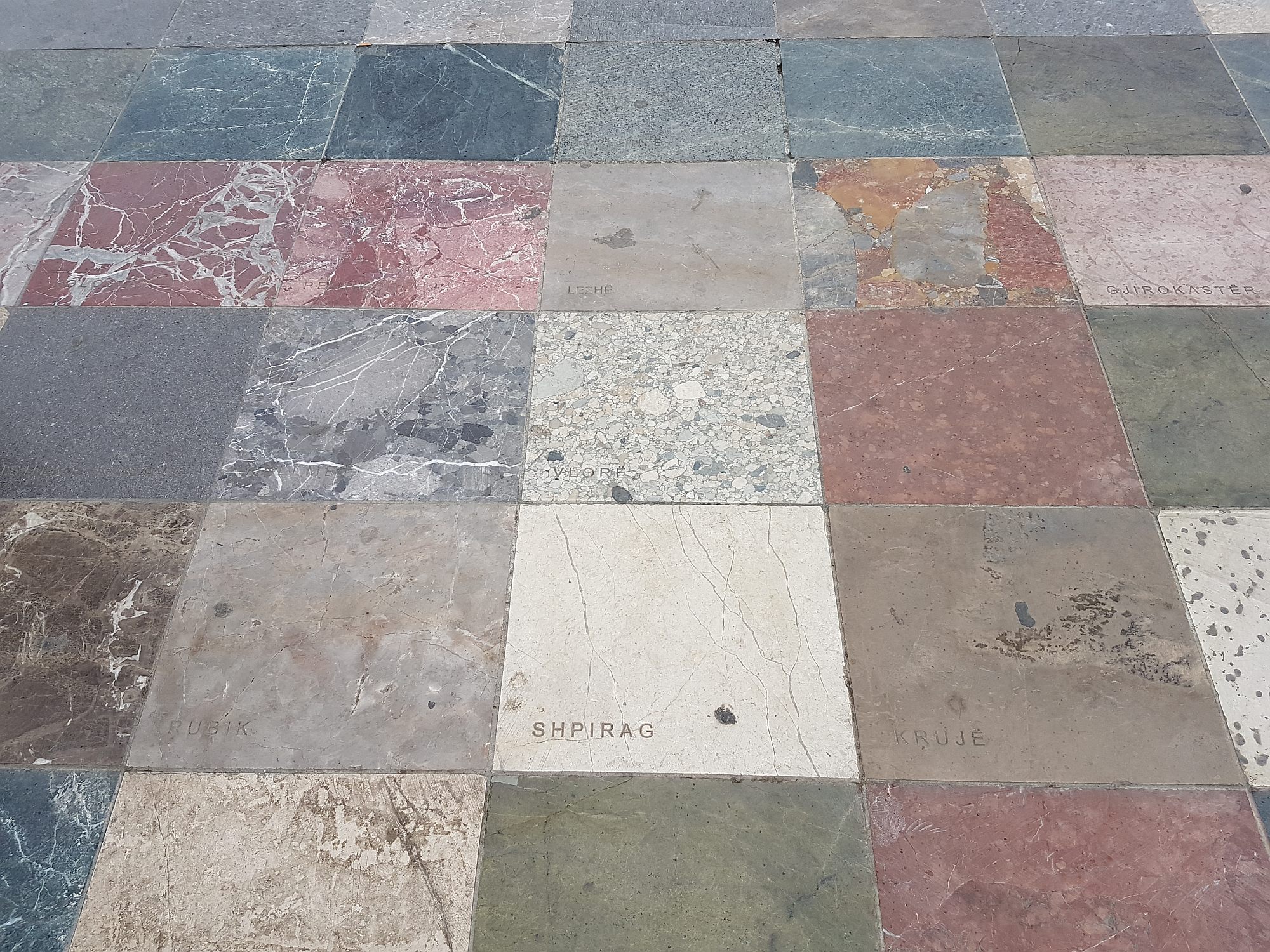
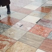
*The planes are in different colours and come from practically all regions of Albania. Some of them have their origin engraved. The great quadrangle symbolically brings together the different part of the country. While some may find this a slightly populist gesture, its identity and inclusion values are beyond doubt.
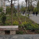
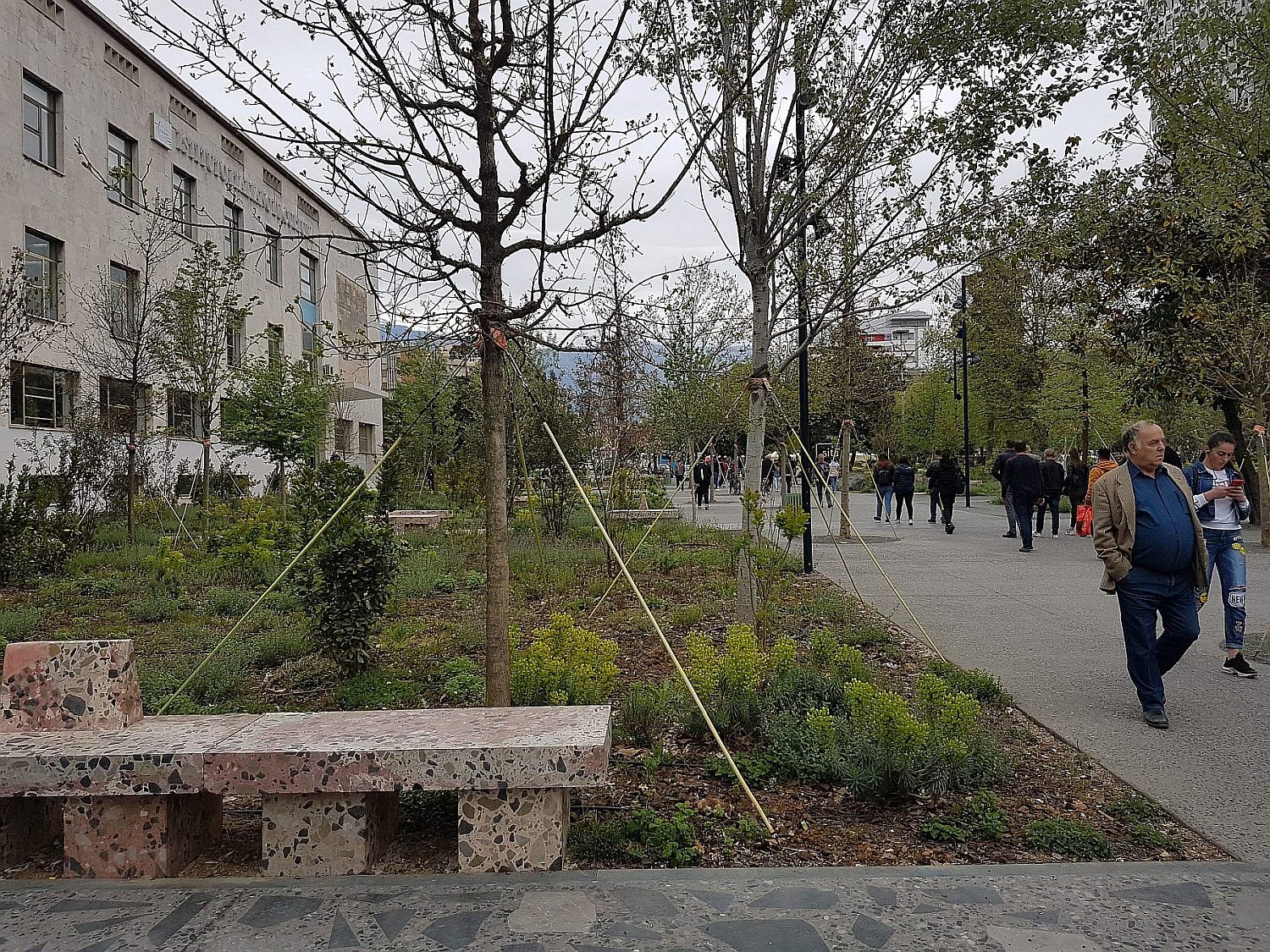
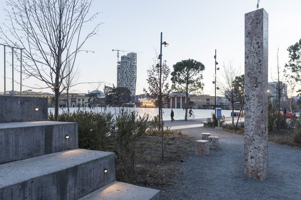
*Fountain and waterways, stone, a peripheric garden. The terrazzo for the benches and sume surface uses piects form broken plates; foto: Ștefan Ghenciulescu
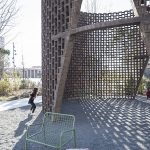
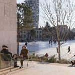
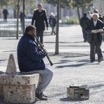
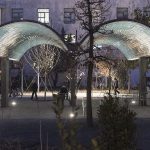
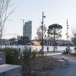
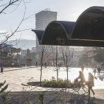
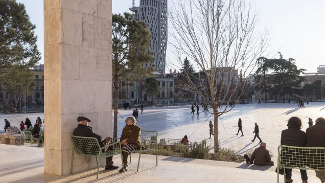
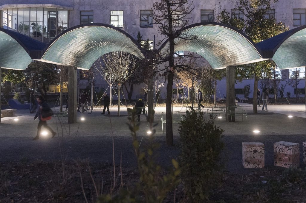
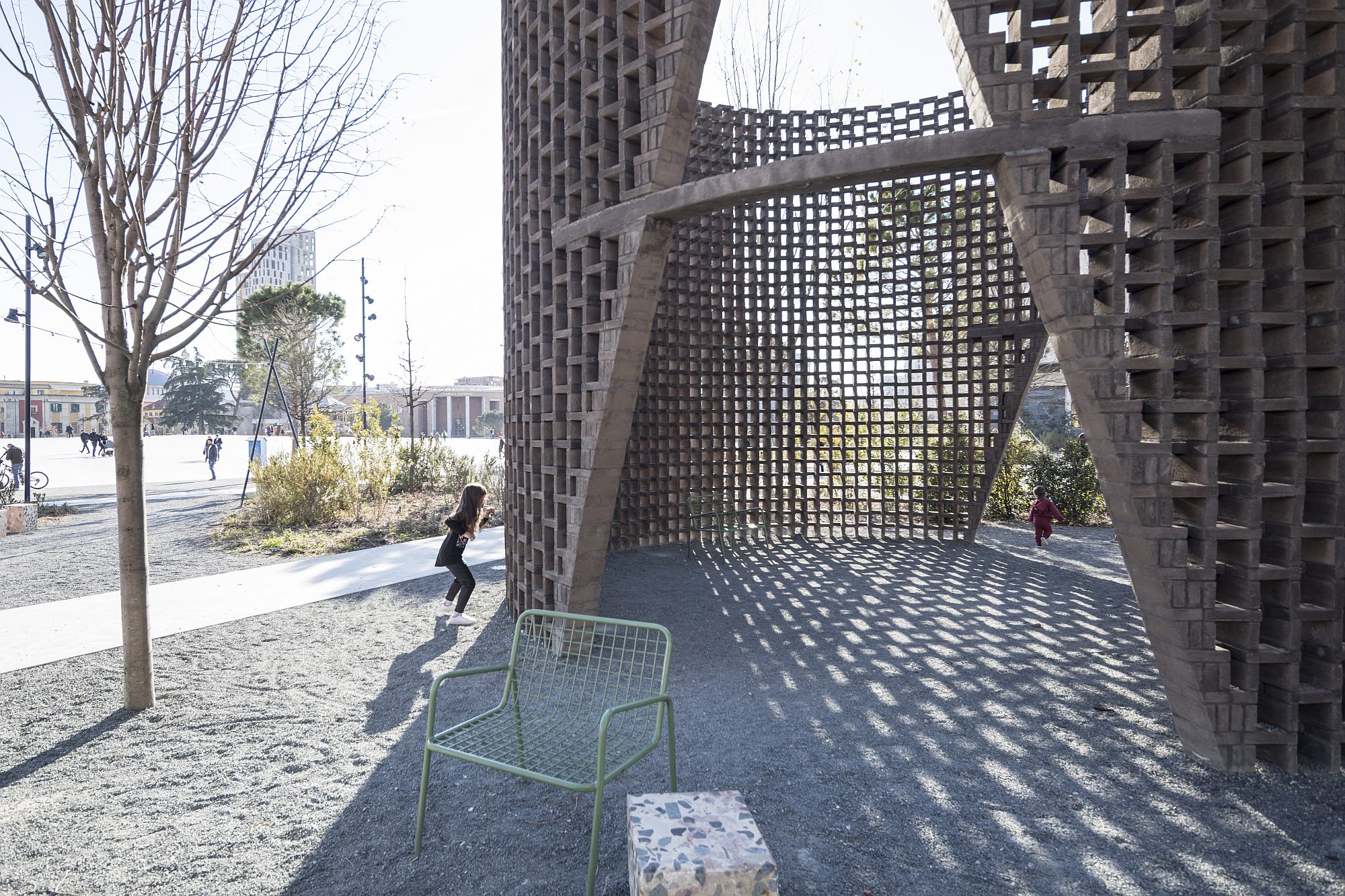
The pendant of the great mineral space are the 12 tree-filled gardens on the sides, , with lush soil vegetation (especially local species): mini-parks providing shadow and sheltering the square’s more sedate life, also serving for the articulation of the pure geometric surface with extremely varied edges. It is here that benches, arbours, accesses to underground parking show up, an entire mincing that is not otherwise present. It is still the edge that is the favourite location of the wide seats – furniture that was created specifically for this space, somewhat narrower than a regular bench, but wider than a chair. A seat for one or for two.
As for the rest. And on
The operation does not lack its critics. Some refer to the relatively marginal position of Skanderbeg’s statue; others, to the fact that, despite the water, during summer days, the square is still too large and hot. I genuinely hope that the usual cliché about the lack of reliability in our corner of Europe will not come to happen here, and that the water installation installation will remain functional from now on. You could also ask yourself about the maintenance costs, and about the space’s long-term sustainability. However, most materials and details seem solid.
There are also the complaints related to the operation’s large budget, which took up a huge chunk of the city’s resources. And, for many visitors (especially Westerners), the discrepancy between this place and what happens even in full historical city centre, especially beyond the boulevards, is simply incomprehensible. I agree. At the same time, however, I do not think we can look at the situation solely from the point of view of a (neutral) public spaces policy. Skanderbeg Square is part of the very special category of prestigious projects, of intense national pride. Not only in Bucharest, but also in Belgrade and Moscow, such national pride monuments were recently achieved through cathedrals or other pharaonic constructions, of an uncertain identity value – yet not an inclusive one, and of questionable public utility. In this league, the Albanian square is the big exception: it does not introduce a new and conflictual landmark, but brings together identities and historical layers; and is open to all.
I am very curious how this space will evolve. And about what happens around it and in the city. For now, unfortunately, the operation seems not to have had a beneficial effect on the accelerated demolition of old buildings (a huge issue in the area and in this city). Maybe the area’s gentrification is somewhat unavoidable, however, for now, the principle which both architects, and the administration, have undertaken, namely that of providing a place where consumption should be absent, is rather strictly complied with.
As for the rest, less prestigious, but with wider proximity, public spaces in the city, I hope that the much-hailed green urban strategies will actually happen. And I also believe, as I have seen this in cities such as Cluj, that, at some point, the good practice example will work and will lead to imitation in the good sense of the word, and not only as design, but especially as usage and closeness. A small symbolic gesture in this respect: the wide seats I was talking about earlier are mobile. They are free of fixed anchors, free of chains and yet, despite all the clichés about the East and the Easterners, they do not disappear.
Is there some kind of surveillance involved here? Perhaps there is, but it may also be about no longer being tempted to steal away something that you feel belongs to you, anyway.
Info & credits
Year completed: 2010-2018
Studios: 51N4E; Anri Sala; Plant en Houtgoed; iRI
Authors: Persyn Freek, Anrys Johan, Sala Anri, Vandenplas Nicolas, Hollants Pieter, Agolli Gent, Peter Swinnen, Sotiria Kornaropoulou, Gust Selhorst
Collaborators: Koçi Valbona, Kuppens Griet, Baelus Tom, Filhol Marc-Achille, Nathan Philippe, Debroise Emmanuel, Babini Alice, Pons Guillem, Schmidt Charlotte, Pujol Martin, Bergers Jolein, Persyn Freek, Anrys Johan, Agolli Gent, Hoxha Ajmona, Rapo Ardian, Pere Olsi, Shkurti Xhorxh, Franzel Ulrike
Landscape architects: Deseyn Jeroen, Luscomb Vincent, Vandenplas Nicolas, Hollants Pieter
Total area: 97 344 m2
Cost: 13 000 000€ (excl. VAT) €
Client: Municipality of Tirana

