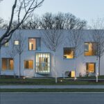
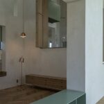
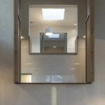
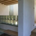
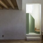
From some points of view, this house is close to a student project – that is, when you imagine a plucky and smart student project, without an actual customer, but in a very real context, which really needs to be done, and which needs to be done well.
Text: Ştefan Ghenciulescu
Photo: Laurian Ghiniţoiu
Back to Origins
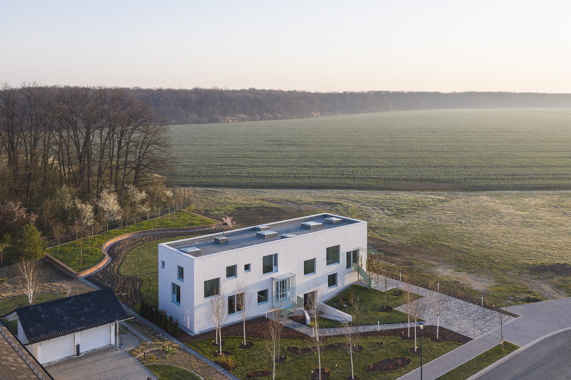
The Dumbrava Vlăsiei residential complex is being built along a forest in the northern outskirts of Bucharest. The investor really wanted to stimulate the quality of living and the architectural one, and ordered house projects from several prestigious offices. Once completed, they will be sold (some are already off the market), and, besides, they are meant to set a high architectural standard and to become models for future ones. A few plots have been allocated, a basic area (around 300 square meters) and a set of simple rules, valid for the entire settlement. Among them, the detached house type, no fence separating it from the public space and low hedges between neighbours.
This is not, therefore, about serial houses, as is the case in millions other complexes, with certain characteristics for a certain type of clients, yet generic enough to fit very different families; these are unique projects, unencumbered by the limits imposed by someone who orders a house from an architect.
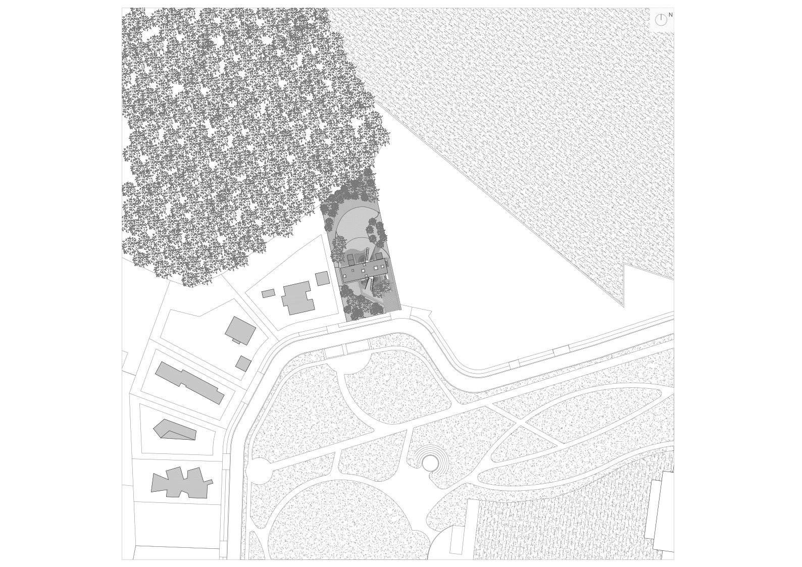
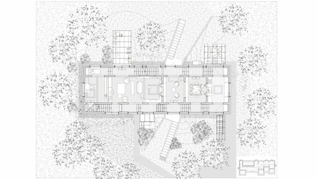
*situation plan
This situation can lead you anywhere between two extremes: a super-spectacular, vain house that will “blow your mind”, as marketable and instagrammable as possible, or, on the contrary, you could think of what an “ideal house” is to you, and of a model of living, concerning the intimacy and the exposure, the relationship with the place and with the neighbours, the beauty of spaces and of the building, the strong character, which should, nevertheless, allow its future inhabitants to turn it into “home”.
Andrei Șerbescu, one of the main authors, is also a teacher for the “Ion Mincu” University’s 1st year design workshop. When I myself was in the same position some years ago, I was warned that tutoring juniors would change how I see and practice architecture. The scale and complexity of themes is, evidently, very low: you are working with students on simple-function, small-surface projects. Nevertheless, together, you have to explore the bases of architecture, therefore you also need to focus on the essentials: structure as a determinant of architecture, then, the light, the proportions, the sills and the connections, the main and secondary spaces, the coherence, the truth, the meaning of the profession’s vocabulary, not mimicry, deep understanding, not just the aesthetics of tradition… Together, you are searching for the foundations of good building, which would also leave some room for poetry. You need all these in practice, even more so if you have to rethink the primordial architectural program – the house.
Andrei acknowledges that this is a house that has much of the junior year spirit in it. He also says that it was not the stylistic aspects that mattered, but the exploration of themes and values. He wanted a today’s, yet somehow atemporal project, and he assumes the non-mimetic integration of references – from the vernacular house and ancient houses to Adolf Loos’ or Louis Kahn’s temperate Modernism, as well as to contemporary works, impressive by their rigour, spatial searches and materiality. He also includes Florian and Iulia Stanciu’s “tower house”, published in Zeppelin 112/March 2013, in this category.
Raumplan and structure-plan
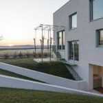
The plot has a privileged position: in front of it, there is the access path and the settlement’s park, behind it, there’s the forest. And it’s facing South. The house’s layout corresponds to this primal duality: a thin, long transversal band defines two courtyards, the slightly larger one by the forest.
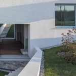
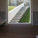
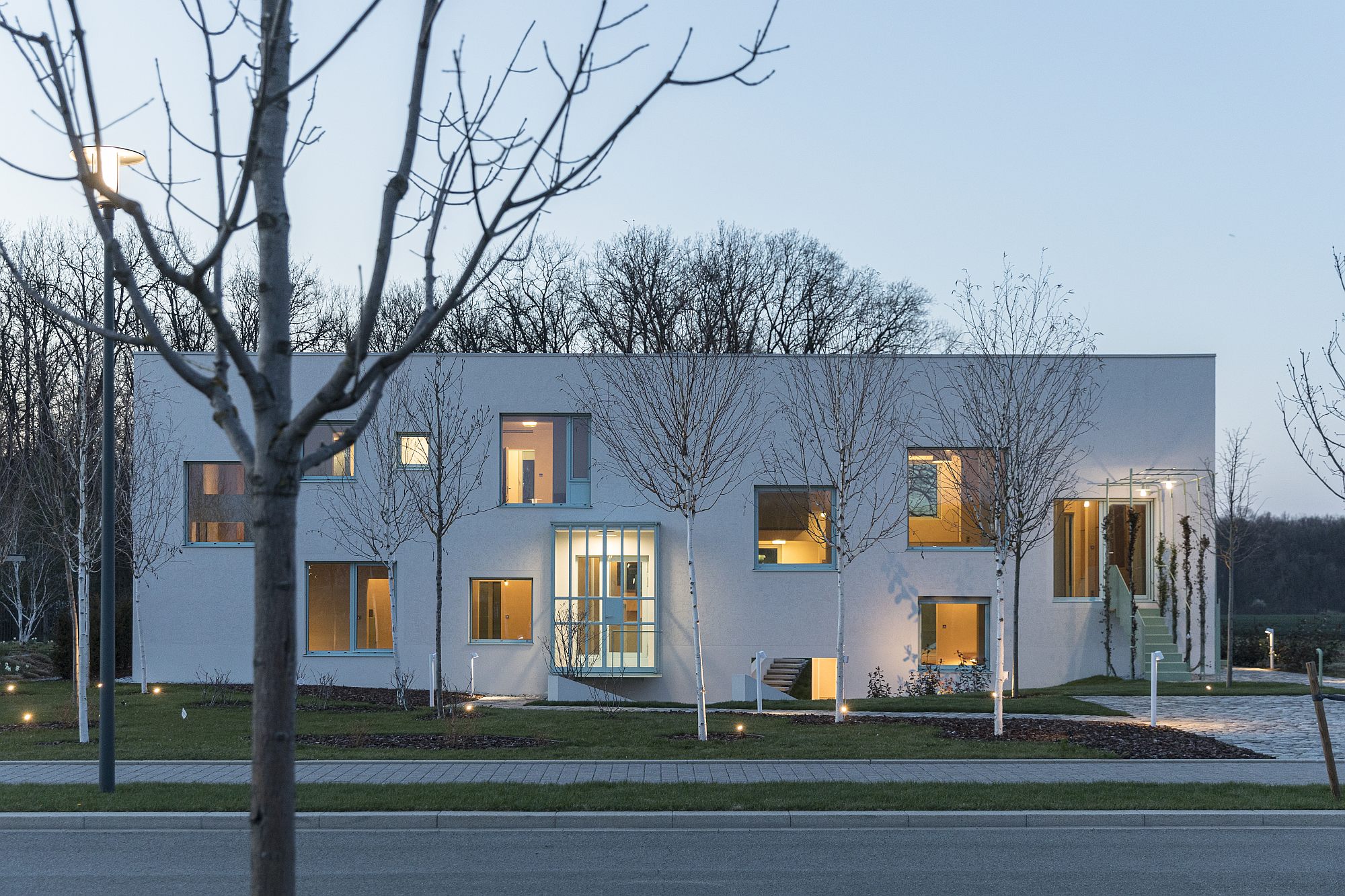
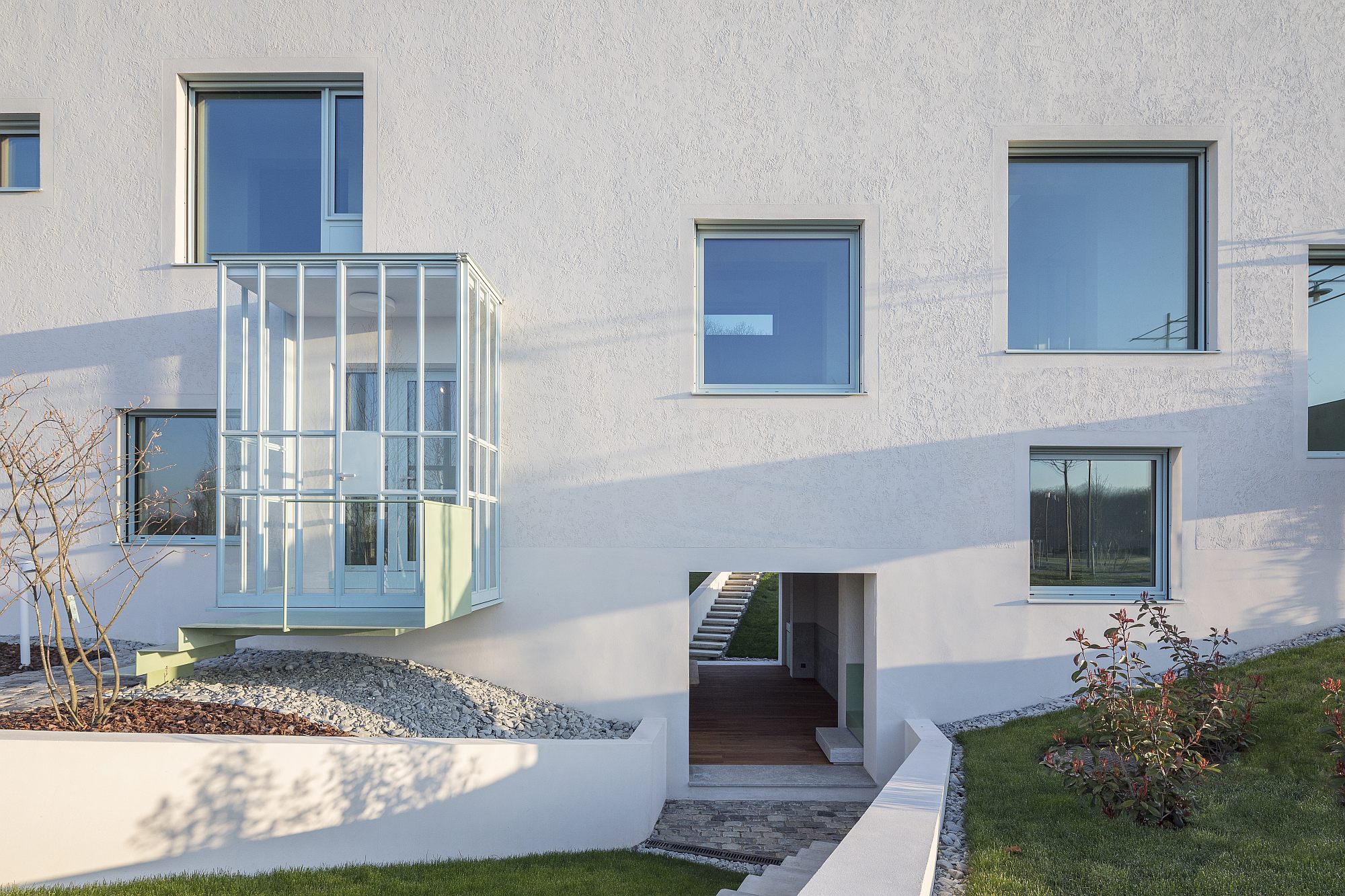
There are no less than four access ways to the front garden: a main entrance, with a very transparent awning, then a secondary entrance, higher up, an exit through a lateral lightwell and, finally, some sort of tunnel, connected to the plot, bringing forth light and a pretext for new entrances to the house’s basement.
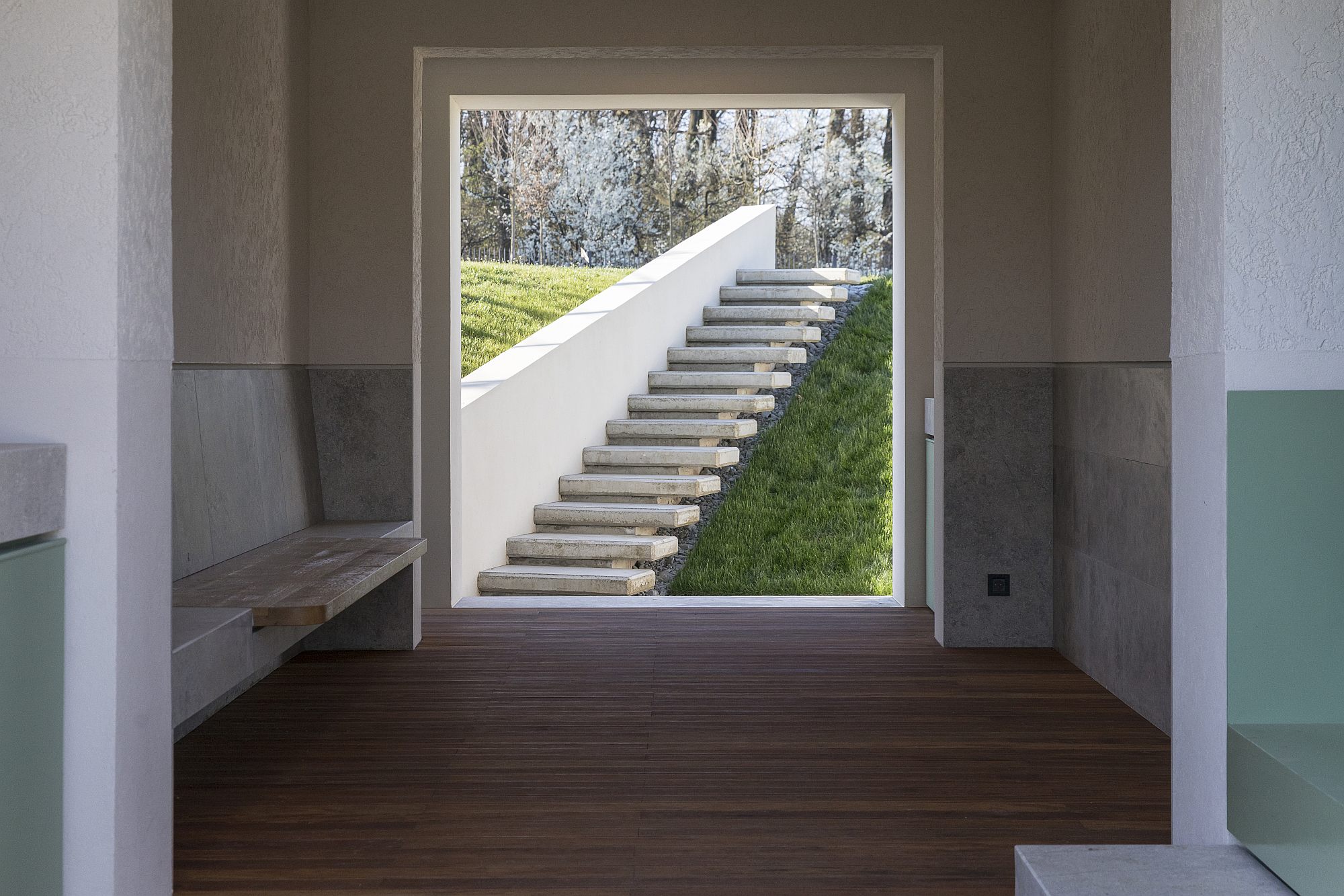 *Exterion rooom in the semi-basement.
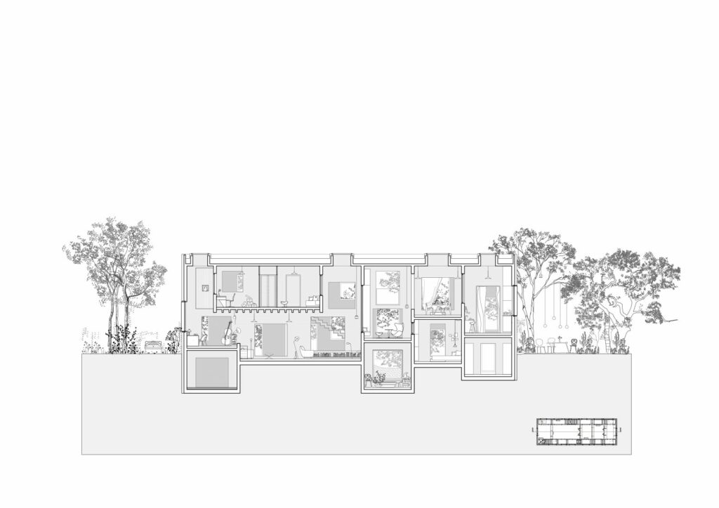
On the inside, the house is a sort of combination between two essential ways of creating spaces: the structure-plan and the Raumplan, otherwise two very dear terms to junior year teaching. Structure-plan, as all the walls are bearing walls, and they are made of only one material – concrete; structure generates architecture. Raumplan (space plan), because, just as with Adolf Loos, this model’s main parent, spaces are not defined (and cannot be understood) from the plan alone. Basically, each has a different height, and, although shaped as clearly delimited rooms – the Raumplan is very much about rooms – the relationships between them are very complex. Sometimes, smaller rooms become alcoves of main ones, there are sometimes surprising visual connections, and one can always choose between several terraces. Living does not happen on clearly defined and global floors, but on interstratified levels. The gaps are of multiple types as well, with heights and sizes corresponding to each space’s needs and character.
A friendly labyrinth
The house in Dumbrava Vlăsiei is basically working with four types of instruments: walls and boards, staircases and perforations – doors, windows, and horizontal gaps penetrating the walls, but also the ceilings, and, finally, the light elements hanging onto the massive body.
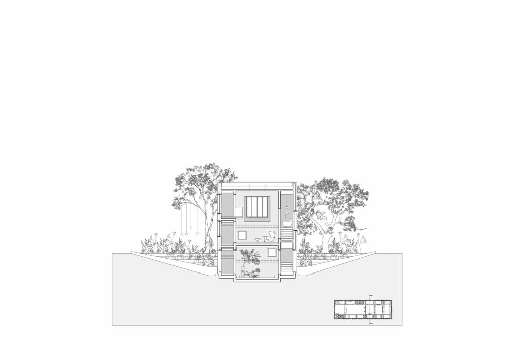
A first split defines three strips – a large central one and two narrow lateral ones. The central one is split in a series of rooms through transversal walls. The vertical and horizontal circulations – hallways and sets of staircase of varying heights – find their place inside the narrow strips, as do a part of the service spaces.
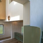
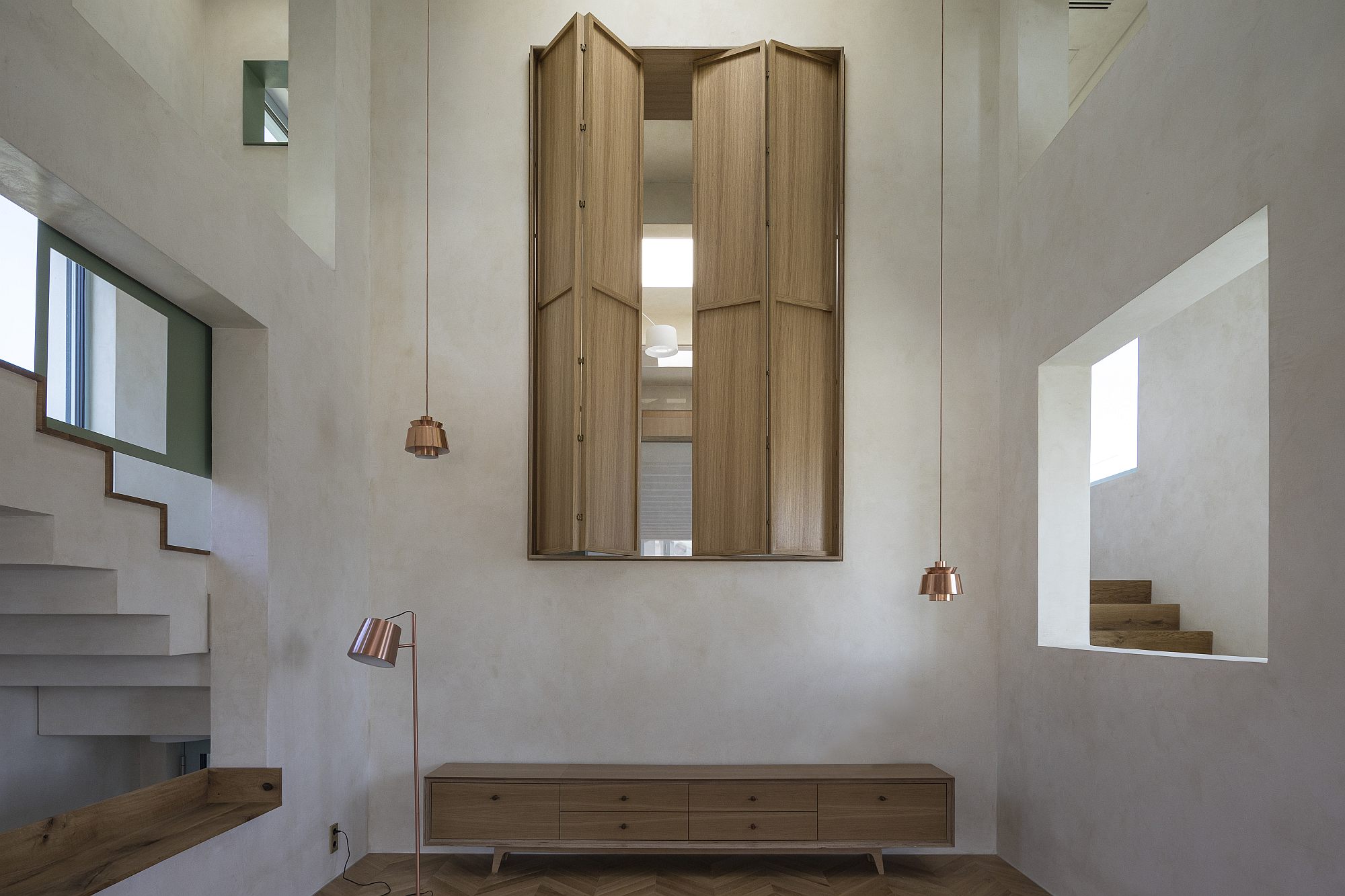
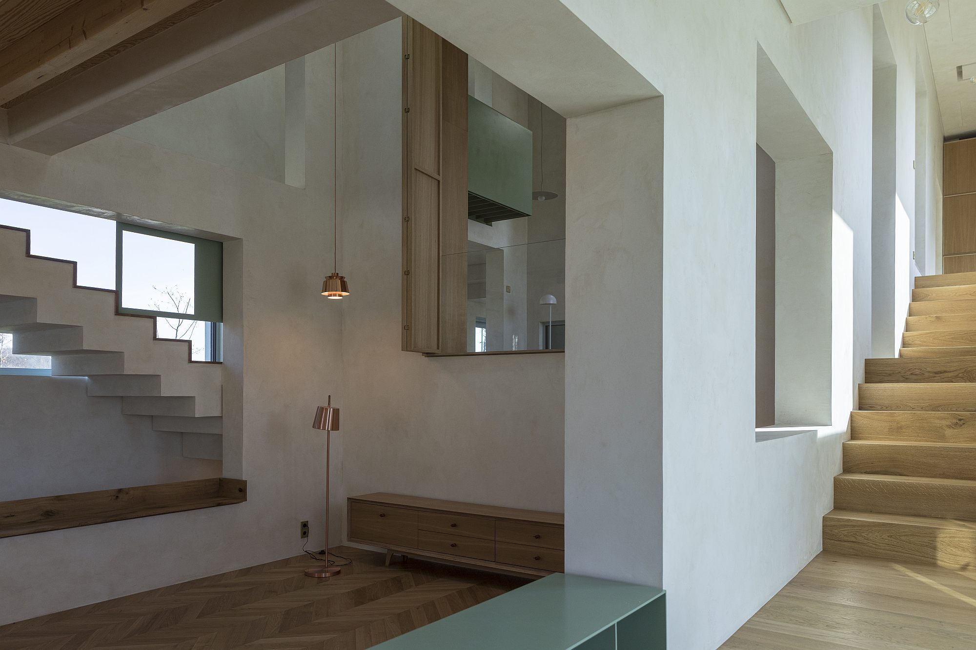 *The living room, seen from the main entrance area (the lateral strip towards the front garden)
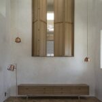
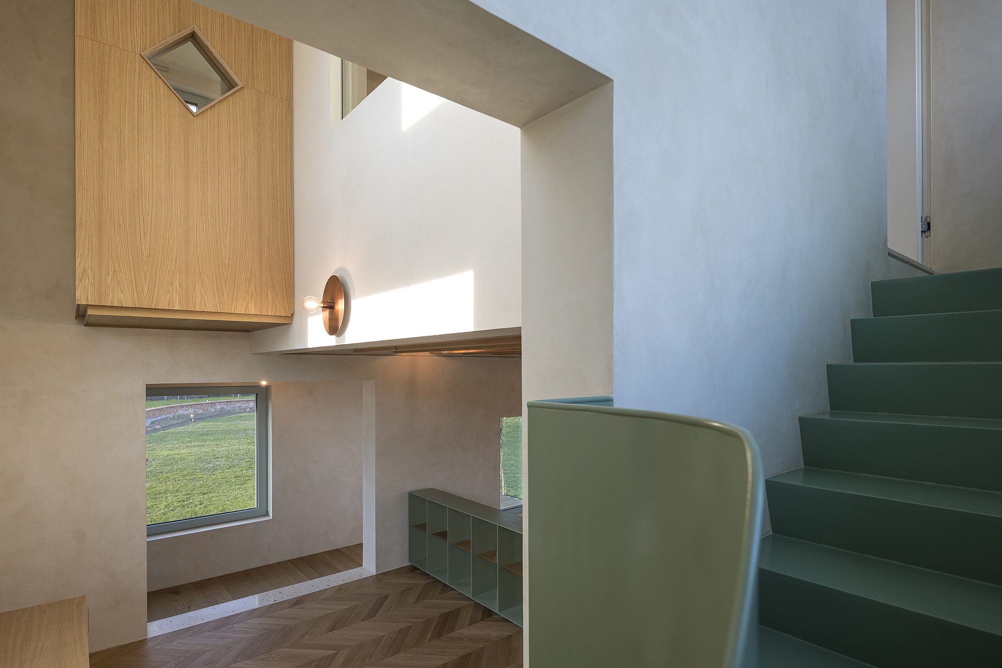
This near-absolute rigor, which follows the logic of the structure very strictly is then contradicted and enriched. Within a volume which would normally house an underground level, a ground floor and another level, there are no less than nine (or twelve, if you count some additional landings) different stepping levels. The rooms start jumping up and down. Thus, the living room has a height of approximately one and a half levels on one side, and then turns into a majestic space of some two and a half levels. A platform at an intermediary height cuts out the large space to make room for a study.
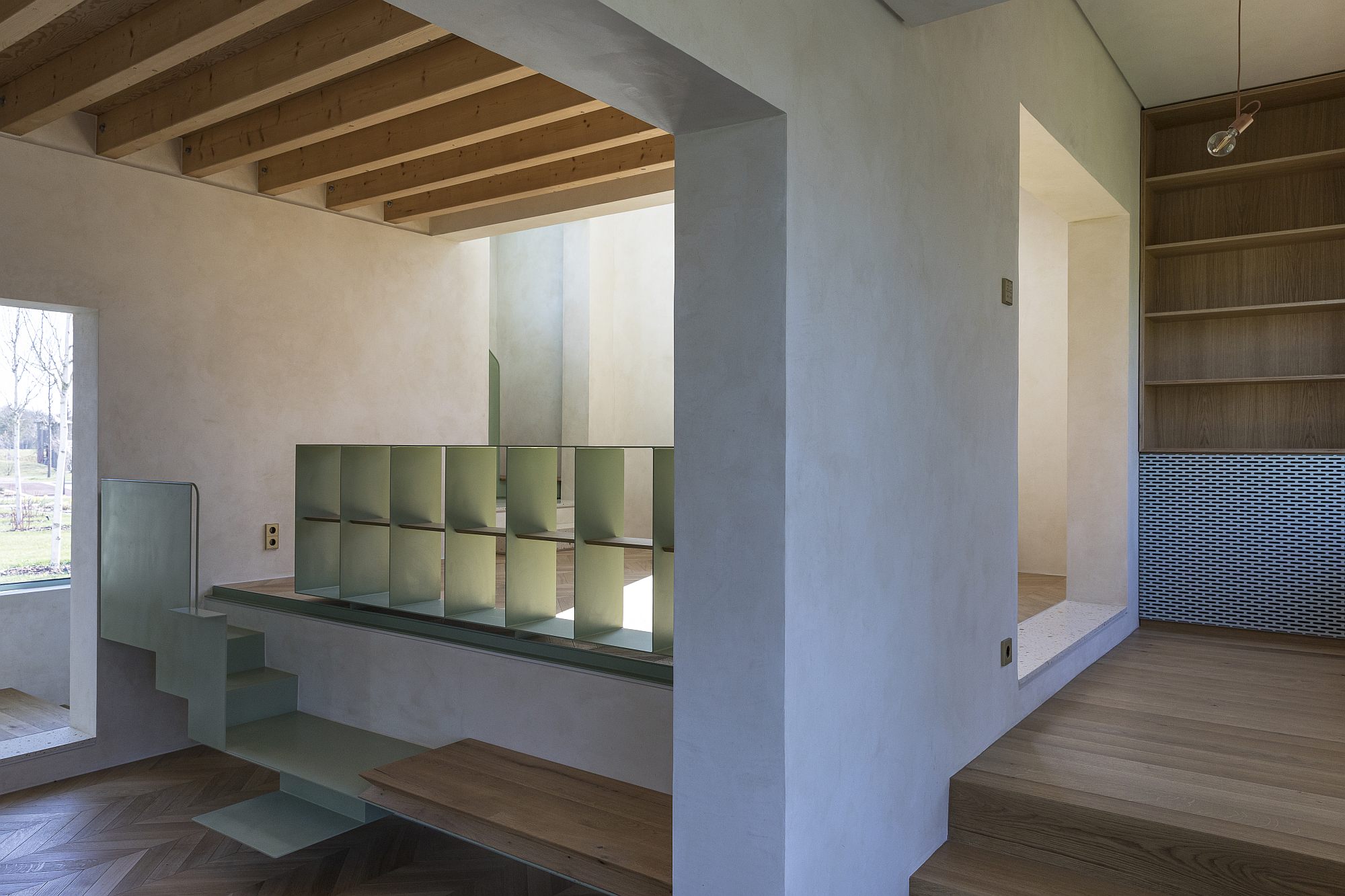 *The study area, at a higher level than the living room
In turn, this one gains in height on its lateral side. Over the living room, there floats a space housing two bedrooms, each with a skylight and its own bathroom (located, of course, on a lateral strip each). On the other side of the living room, there is a cascade of spaces, positioned diagonally inside the building: a library and then a dining room, and then a tall kitchen, on a slightly lower level.
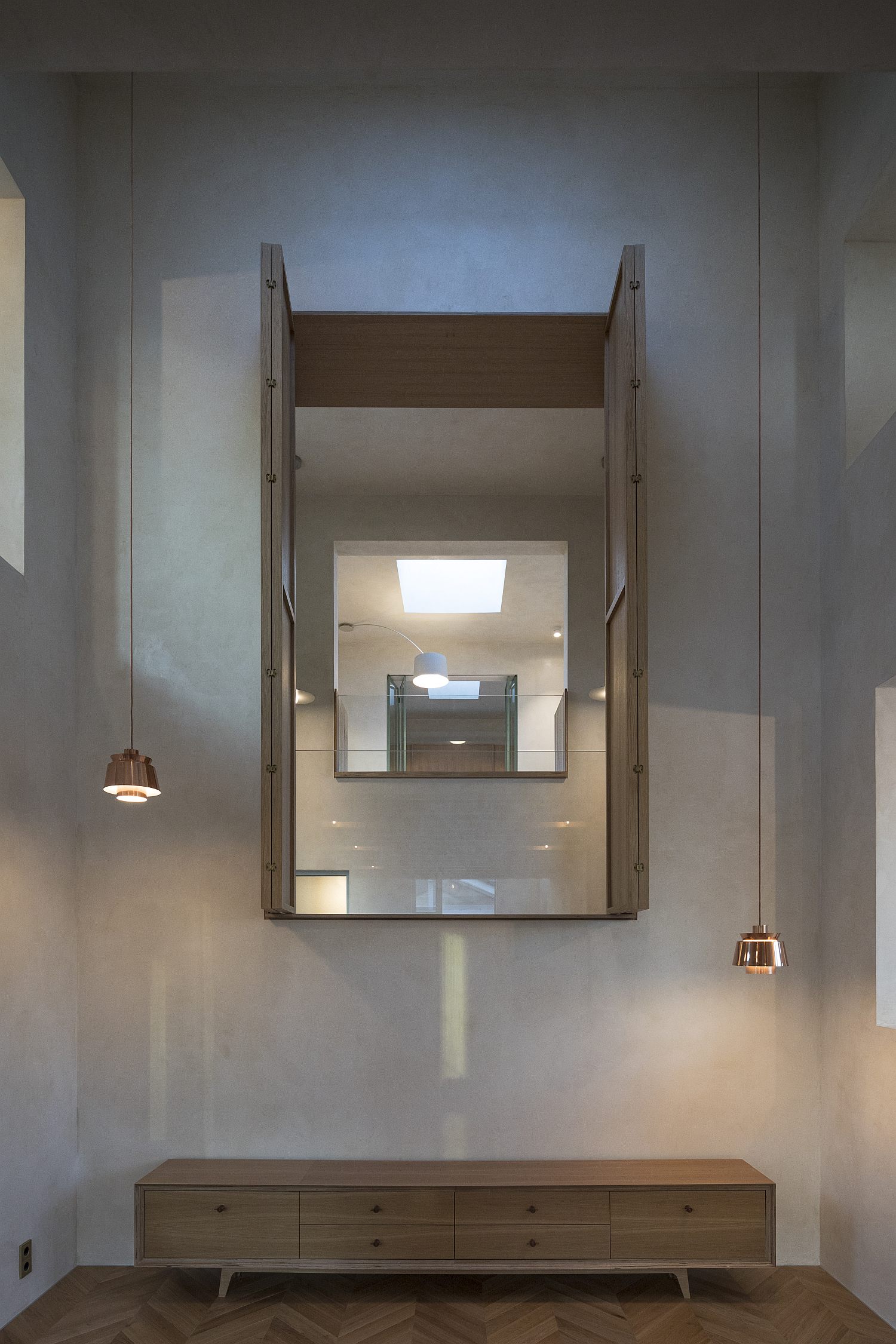 *The main diagonal in the house – view from the living room toward the library, then the dining room and, in the back, the kitchen
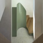
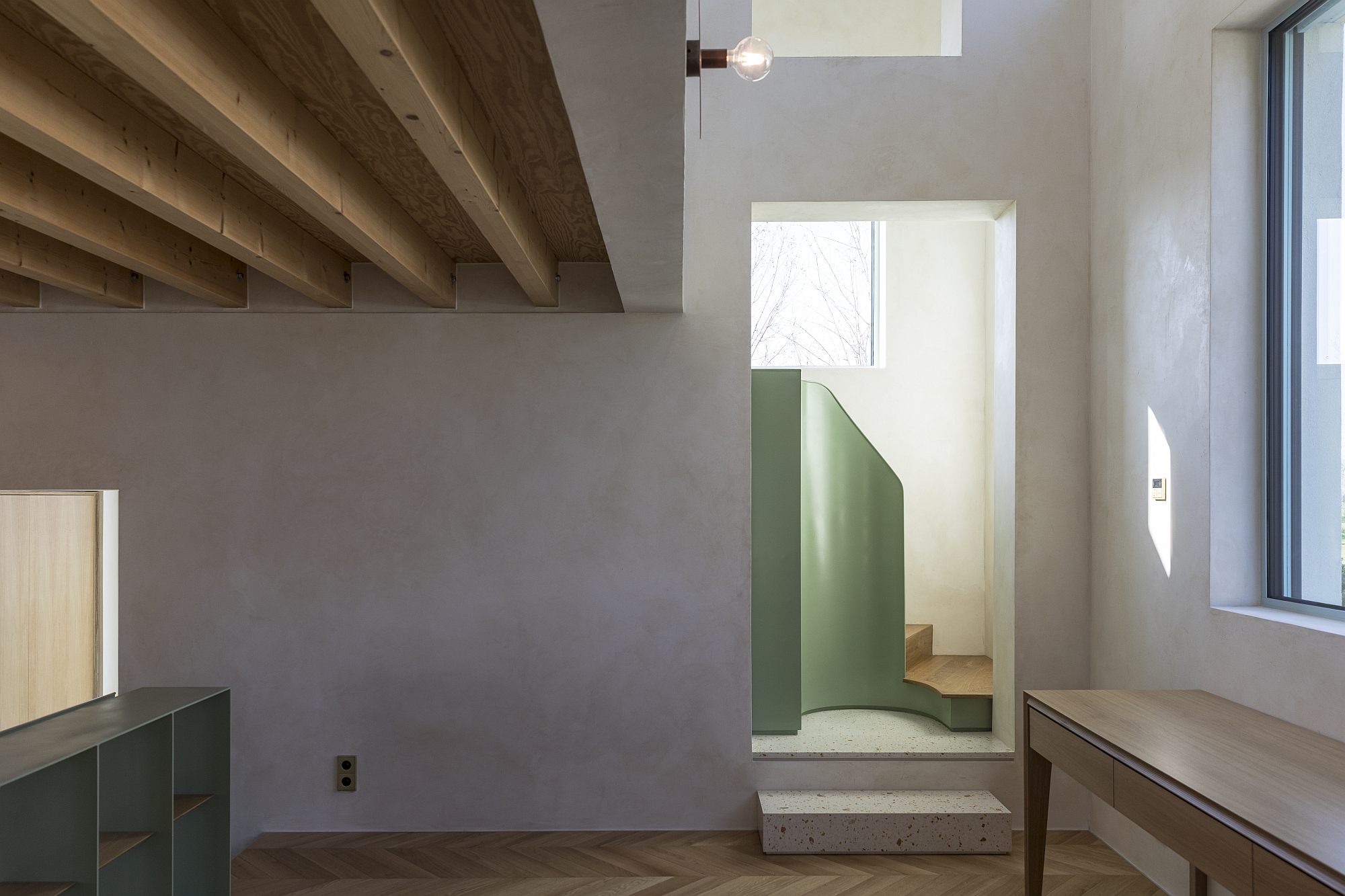 *In the study, looking toward the stairs leading to one of the elevated bedrooms
*On the stairs, looking back at the study. The wooden cube is an interior baywindow, accessible from the bedroom. At its right, we glimpse a fragment of the interior bedroom window
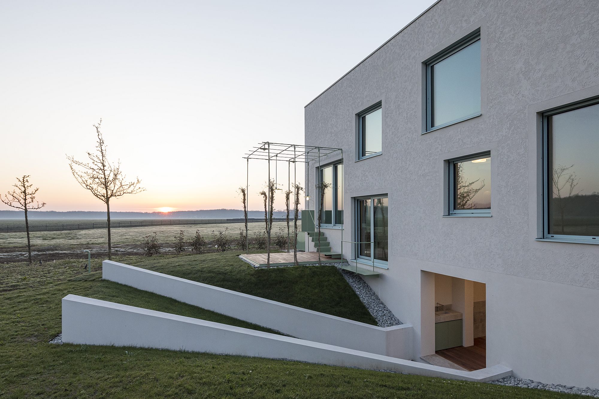
Under the library there is the tunnel we were mentioning earlier. This is not only a crossing, but an outside room. It replaces a loggia which had to go at some point, for lack of space on the upper levels. It somehow still is a sort of loggia, but a semi-buried one, opened through slopes and smooth stairs towards the yards and towards the light. Higher than the loggia, but connected to it, there is the master bedroom, with a dressing and a bathroom. The bathroom opens, in turn, onto a lightwell, connected to the garden through a staircase.
Dizzy yet? Then imagine that, on top of all this weaving, there is the system of interior windows, doors and skylights, which pierce the house in all directions and connect each space to its immediate neighbours. By adding up on some directions, 5 or more different spaces are frequently chained together, connected at the same time to the outside. These openings sometimes have firmer closings – doors, shutters, interior windows, other times they communicate freely. In any case, they transform the house in a complex system, with an inside and porous facades. You can still read the basic volume, as well as the various rooms, but at the same time they dissolve into each other and against the garden.
The richness of places is incredible for a house that is in fact rather small. All the rooms are small, far from our regular customer’s standard dream. Due to the multiple connections, the feeling of claustrophobia is not there at all. Due to the omnipresent communication, compact spaces seem larger.
This opening is very remote from what could be achieved through an excess of glazed surfaces. The ADN BA house is half-open,it does not give itself away all at once. The type of achieved transparency allows you to glimpse, to discover as you go. You cross through a series of filters, starting from the small and delicate structures which intermediate the main spaces’ relationship to the outside – the entrance awning and the pergolas at the back, which enter a system of physical or visual connections between the house, gardens, and forest. Thus, that which at first may seem a barrier is in fact a permeable and friendly limit, but one which at the same time provides the necessary intimacy for a family, also compensating for the missing front fence. When I visited it, I got lost inside at various times, but my getting lost (which would otherwise quickly disappear once you started living here) was a pleasant one, precisely because I sort of knew at all times your whereabouts, and I could always see the sky and at least one of the gardens.
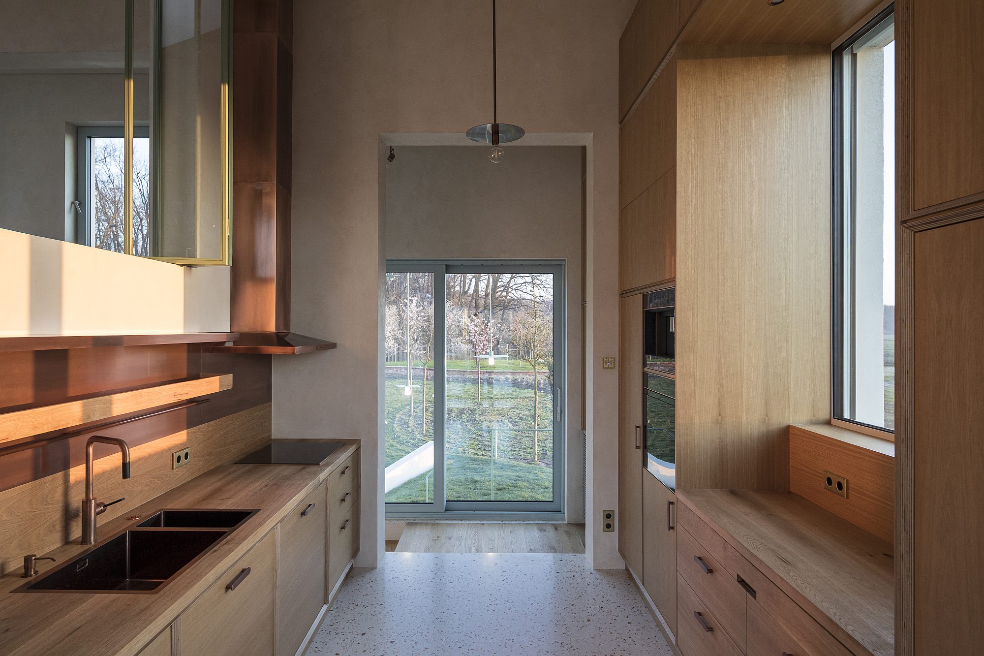 *The kitchen, with a direct acces to a pegola and then the back garden
Rigor, voluptuousness, a model
It should be said that such a house is not cheap at all. But the money does not go into
decorations and opulence here, but in the quality of materials and of the equipment and in how they are worked. The wood in the floorboards, in the shutters and in the built-in furniture is in harmony with the special plastering on the inside and on the outside, and with the precision and delicacy of the joinery, of the hardware, of the bannisters. Each detail was drawn and explored, sometimes obsessively so.
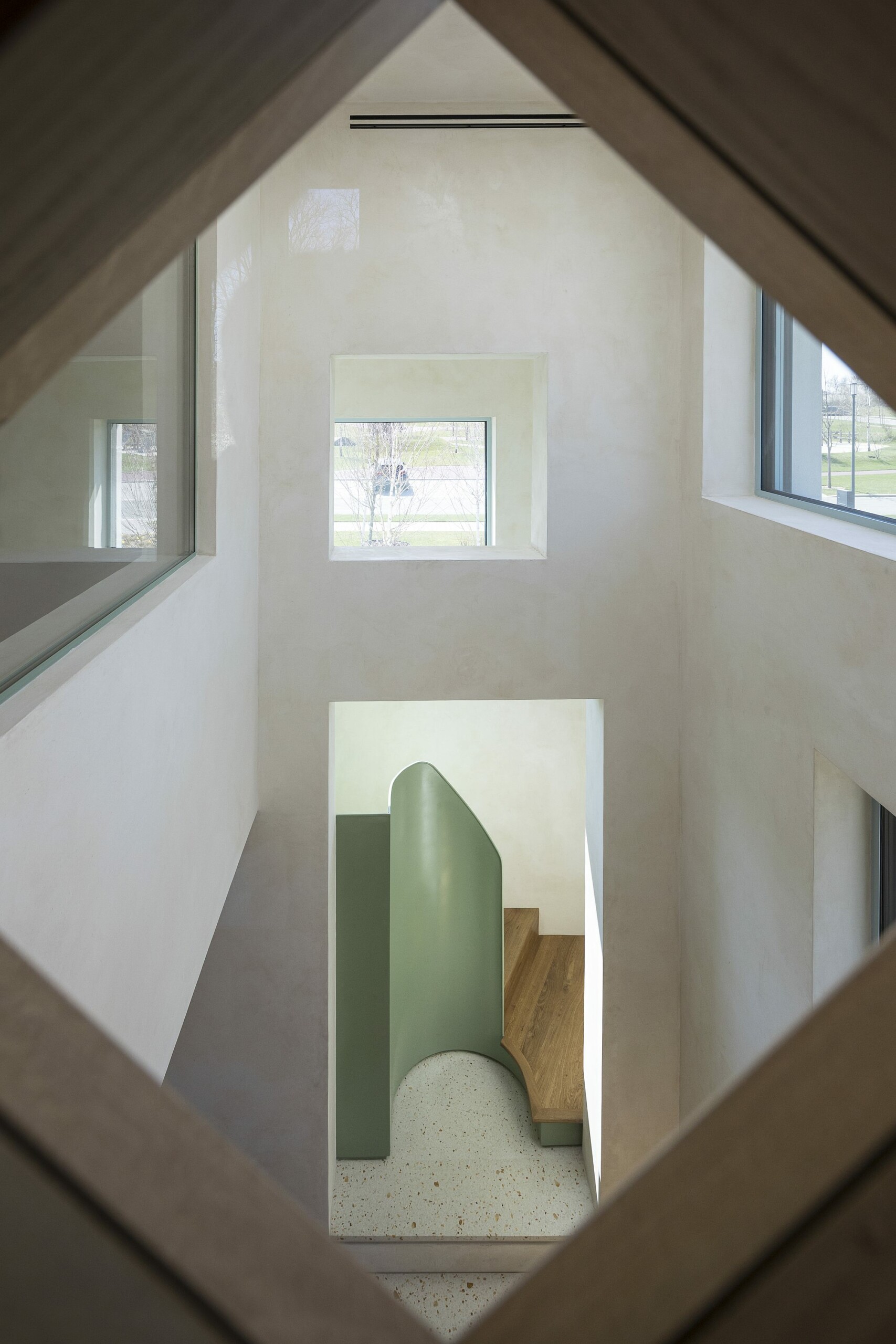 *Looking from the bedroom’s baywindow towards the study and the stairs
Most bathrooms enjoy natural light and the image of living spaces, and the fixed furniture becomes an architectural element. The house has a remarkable tactile character, a combination of pleasant textures which cannot be described in pictures alone. And the luxury that becomes evident in places (among others, this is a smart house, with state-of-the-art technology, but doing its job very discreetly) balances the general austerity of expression. You feel good here: it is a house, not just an architectural achievement.
Perhaps the final result could have been a bit more restrained, calmer – say, one-two less differences in level and one-two less interior windows. This would perhaps also allow some flexibility in the main spaces. Obviously, the joy of living here comes with taking on radical gestures. I can hardly wait to see what will happen when someone buys the building and moves in it. Until then, I believe there should be a regular and natural visitation of this place, by architects, students, and interested people. It is a model house, which deserves to be explored, understood, and, why not, criticized, contradicted, interpreted.
Plans
Info & credits
ADN BA House, Dumbrava Vlăsiei, Balotești
Construction: 2016-2021
Plot area (sqm): 1852
Total built area (sqm): 319.5
Architecture: ADNBA – Andrei Șerbescu, Adrian Untaru, Bogdan Brădățeanu, Alexandra Aramă, Alexandru Apostol, Mihail Filipenco, Cristina Budan, Romina Pasculovici
Structure: INCONA – Mircea Neacșu, Alina Tudorică
Installations: ALMA INSTAL PRO
Sanitary : Adrian Sandu, Luana Sandu
Heating, HVAC : Adrian Sandu; Cristian Pârvulescu
Electrical: Adrian Sandu, Radu DinuGeorge State
Landscaping: BAA – Christian Beros
PARTNERS:
IR COLOURS: Intonachino, Marmorino Epoca
Alukönigstahl
Natural Wood Floor

