Zeppelin Design & more @ Romanian Design Week 2020
Text: Constantin Goagea
Photos: Andrei Mărgulescu
Curatorial concept: Romanian Design Week and Zeppelin Design
Exhibition design: Zeppelin Design+Ping Pong winners+
Graphic design : Radu Manelici + Sebastian Pren
About a festival and about design
Between myself personally and sports – that is, actually doing sports – there come a lot of things, some apparently very bulky and solid, such as my convictions that baggy T-shirts will always be fashionable, others are always starting with maybe tomorrow, or on Monday, and are related to an universal order, on which I will write a book. Someday.
Nevertheless, in times of pandemic and lockdown, times I have fully lived in Barcelona, if there was anything I really wanted to do, that was escaping my house and being able to jog down Diagonal, heading to the University area. Just thinking about jogging, I would feel the wind against me, my body tense, internally counting the sequence of steps to match my heart rate and interior zen against. On the day when the escape and the jogging plan seemed very, very close to happening, just as close and in true Hollywood style, my phone rang: pre-noon happy-end. This is how our colleagues at RDW asked us how this year’s courtyard at Combinatul Fondului Plastic (Arts and Crafts Enterprise) should look like, what would it mean to mark the physical distancing, but also to stay together, to feel close to the world of design. So I took down my outfit, I left the jogging for Monday, and, as the theme of the 10 days the public had to spend in the enterprise’s courtyard for the RDW was the perfect argument for me not to go out jogging, I just got out on the terrace for a coffee and I planned this project, together with Justin and Cosmina.
The wakening, the re-energising, the burst of activity everyone needed, the joy that one could live differently in the times of the pandemic and post-isolation, led us to simply think of a holiday field, one of sports and group games, where distance, as well as the focused energy, could be preserved.
The Open Air project is about all these things we missed, about the need to make the victory gesture, about the feeling of winning, about stories that go on and stay with us.
Besides the playing, the stakes we suggested were actually an example of transforming the Arts and Crafts Enterprise’s space. A courtyard which could be alive, a place that could be functional and civilized at the same time, without randomly parked cars (even at the entrance of any of the galleries). The current broken and almost decommissioned pavement could be solved with a few concrete dumps. Just as well, repairs or alterations to the buildings, to the general architecture, could start by a simple cleaning and old-fashioned wash, prior to any sophisticated project. On the courtyard art installations, or those affecting the common spaces on a larger scale, one could say they could be managed and curated responsibly, respecting all the permanent activities and independent projects hosted here. There is also space for trees, there is also space to bring down some benches, and it would be something different altogether. It is not the money which holds us from making this place a significant pole for a great addition in Bucharest’s cultural quality. A bit of order and energy, a little organization and voilà, we could have a space that is friendly to people, to ideas, and to art.
From this point of view, everything we proposed for this open air format for the current RDW edition was a manifesto showing that it could be something different than a one-night varnishing space, and that it could become a permanent place of the city. For a different RDW, to speak of permanence and of how a place is cultivated, we also suggested a new type of design and branding insertion. As the entire city is flopping with plastic billboards covering up historical buildings, old facades or fences surrounding gardens that might still be beautiful, we intended to do the exact opposite in this secluded, industrial place. We removed the polluting materials: no banners, no polyplanes, no adhesive tape and glue, no empty communication. With the help of all RDW partners, brand communication became, this time, a real content in space, as it can be easily seen in Unicredit’s Unigolf, the Absolute Blueminton, or the lamps created with Electrica.
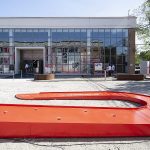
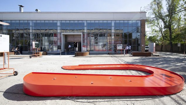
1 – Unigolf – Enough holes to end up winning, with a little patience and observation spirit. The trajectory of the white ball on the red U should be slow and smooth. A Forest Tiger may reside in each of us. © Zeppelin Design
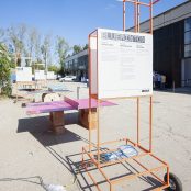
2 – Orange LED cranes. (it’s optional- it depends on how it comes out in design – if it doesn’t fit, use the legend to picture 15 – the lamps from Electrica, a versatile system of trolleys, branding, signage and lighting, integrated in a mobile object. © Zeppelin Design
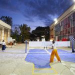
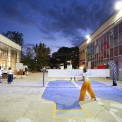
3 – Blueminton- is a badminton game in 4 Absolut Vodka shaped blue bottles. © Zeppelin Design
Ping-Pong+
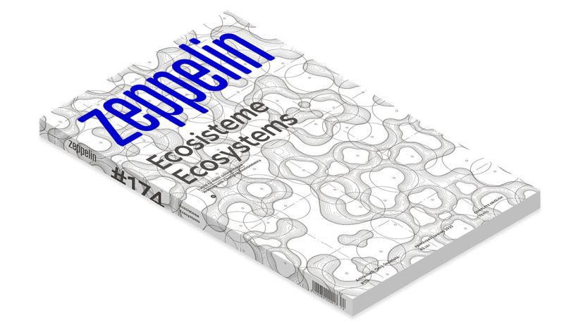
One of the highlights of the Open Air project were the table tennis tables. The 4 tables were selected through a design competition, organized by The Institute and Lidl Romania, through the ASAP program, alongside the Zeppelin magazine.
The contest proposes rethinking the table tennis game, both at creative concept level (even proposing new rules), and in terms of used materials and actual performance. Senior students of architecture, arts and design faculties, as well as graduates of the same faculties, were asked to think of a mobile or removable table tennis table, made of recycled materials, dedicated to table tennis or to a reinvented version of the game.
Each of the 4 selected ideas received a prize and resources to be put into practice. In fact, any element which seemed immutable, starting from the shape of the table, its materiality, the number of players and balls, to the smooth table surface, could be the subject of a story. Those who played felt the inherent humour and the new spirit imprinted by these visions.
After the event, the four tables will be replaced in the open year, in areas within educational buildings in Bucharest.
Mondrian Brick Table
Author: Sebastian – Andrei Conțu
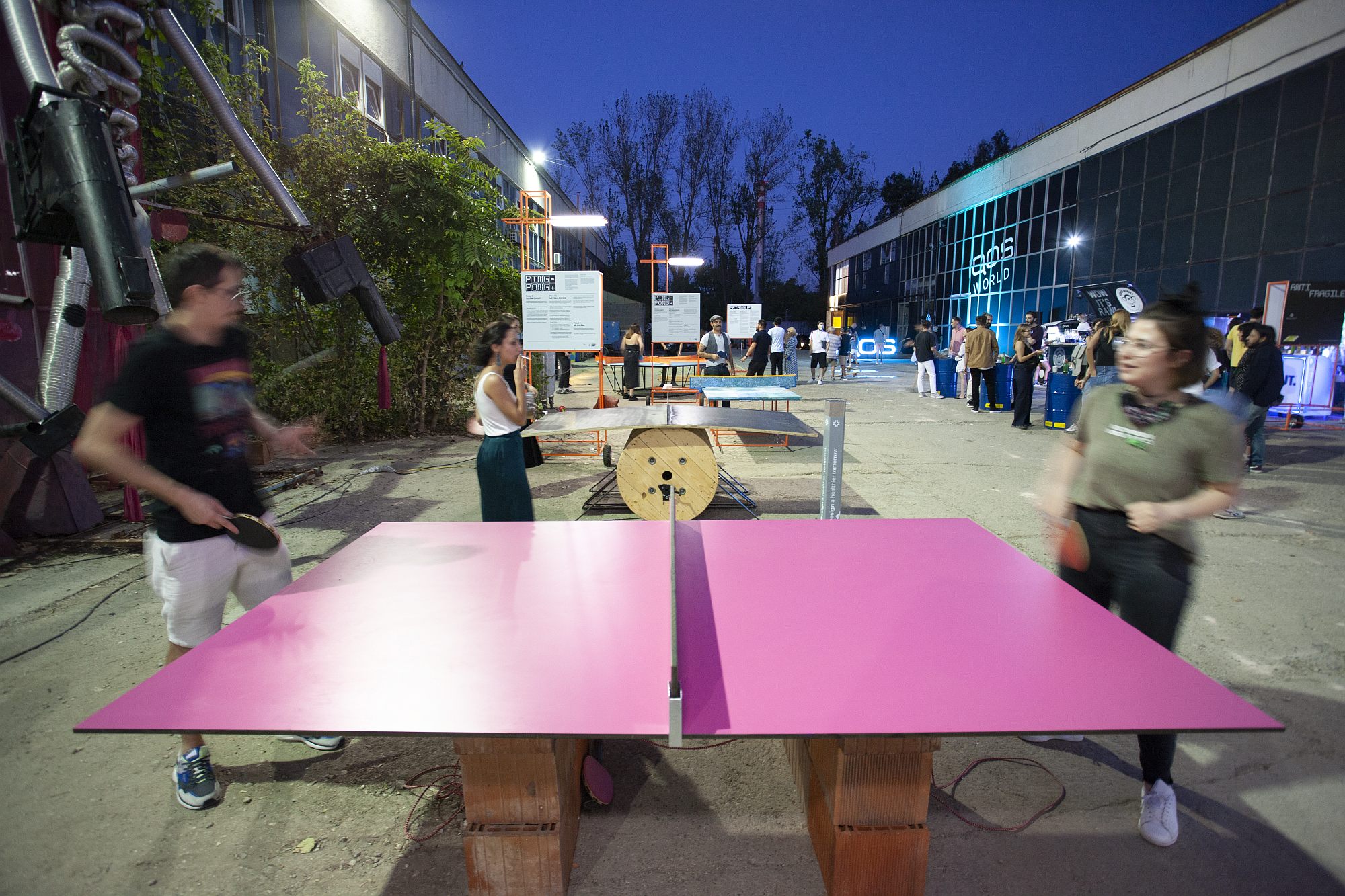 *Mondrian Brick Table – a HPL plate, on top of bricks found in a construction yard. The rackets are connected to each other.
One of the competition’s challenges was using at least 80% recycled materials. Starting from this, I looked at the construction area, where approximately 30% of materials are lost, being considered waste. Building brick is one of the most common materials, as well as one of the most wasted ones. The idea struck me after repeating to myself over and over the competition’s distancing topic. Starting from this, I wanted to somehow bring some sort of closeness between the 2 players, both physically and mentally, with the elastic rope dissolving any skill gap between the 2.
“The jury was impressed by the game idea. It speaks of co-dependence, collaboration, and not just competition; it responds to the current context, and will be interesting and fun to play at the same time, and can be developed in a variety of ways, for example, in doubles’ game versions.” (Jury report)
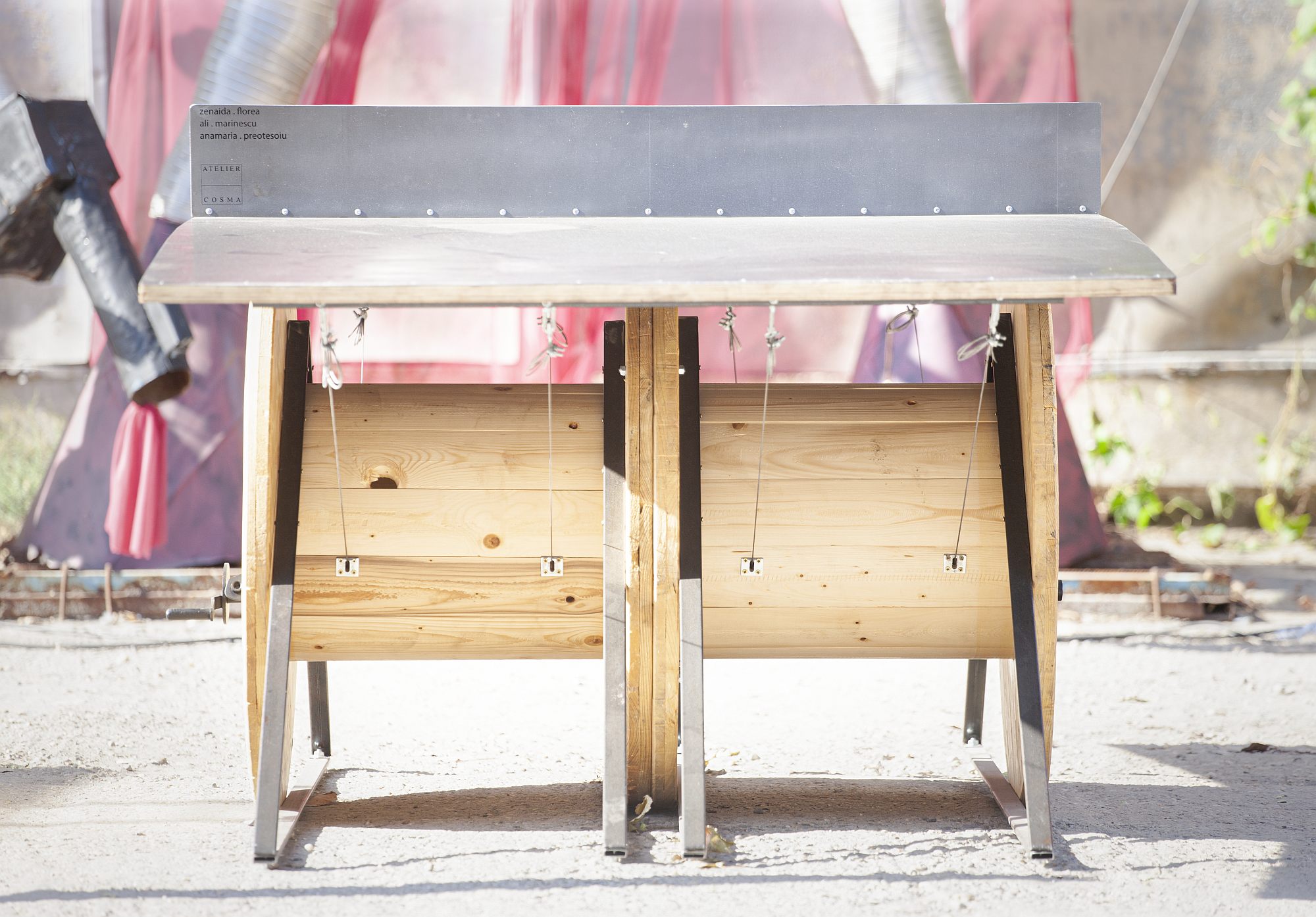
(ping + x [m] + pong)^crank
Authors: Zenaida-Elena Florea, Alexandra Marinescu, Anamaria Cristina Preotesoiu. Ștefan Stanca,
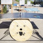
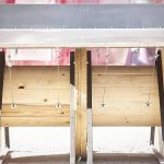
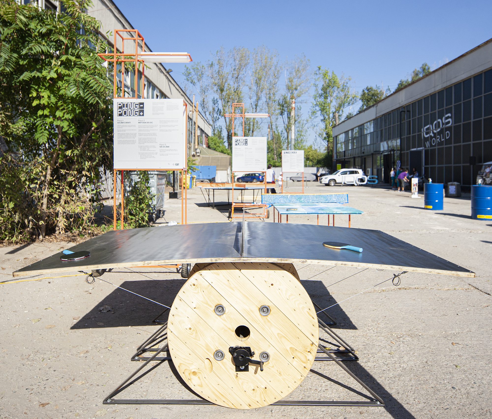
*(ping + x [m] + pong)^crank a wooden reel for electrical power cables, found on an abandoned construction site, curved, cable-tensioned table surface.
Physical distancing resumes the discussion of the table as a pretext for getting together, that of the game as a pretext for collaboration, in short, that of a table tennis table as the subtle mix of the two. The object proposes changing the flat gaming area by a convex one, which allows the maximal distancing of the players, by altering the ball’s in-depth trajectory. Meant to be used for play, the characteristic trait of the table is that of being subordinated to the deforming capacity of the mechanism that determines its shape. Its aesthetic qualities reside in a sort of DIY technique, by adding a mixture of objects that compose it and which, thus, gain a second life. The reel and the wooden plywood are taken from their latent state, that of leaving behind their first, construction site life, and are repositioned under a novel cabled form, with retro-industrial decorations and a, hopefully, valuable or at least resonating finishing touch to the iron table.
“The solution is reminiscent of the teqball table. Nevertheless, it uses other materials and adds the variable geometry, through an ingenious mechanism. The result is elegant and allows different games.” (Jury report)
Ping-pong+6
Authors: Didier Chifan, Ancuța Ilie
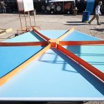
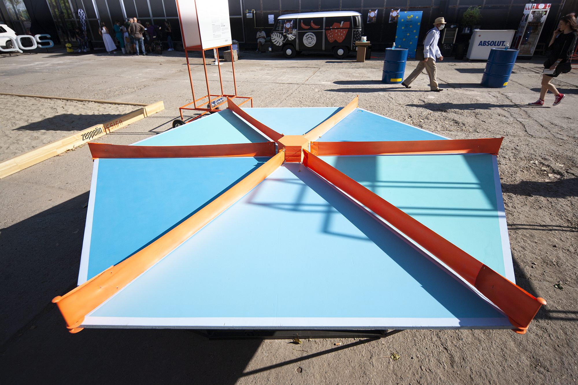 *Not necessarily rectangular, the table tennis table can also be a hexagon
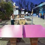
Pingpong+6 is a hexagonal game area table, delivered as a pack of 6 triangular plates, made of recycled materials. The game area is made of cleaned and painted encasing Tego plates, and the net is made of cut and painted banner. The hexagonal shape allows countless play scenarios for the 2-6 players, with balls simultaneously bouncing in 6+ directions.
Or upcycling materials for table tennis tables for outdoor use: recycled, chopped and melted plastic, poured into moulds and mounted in a decorative pattern.
Table tennis can be played by 2, 4, 6 players, or even in odd numbers. Or by several players with several balls at the same time.
Pet Pong –
Authors: Iulia Marta Ștefănescu, Ioana Alexandra Georgescu
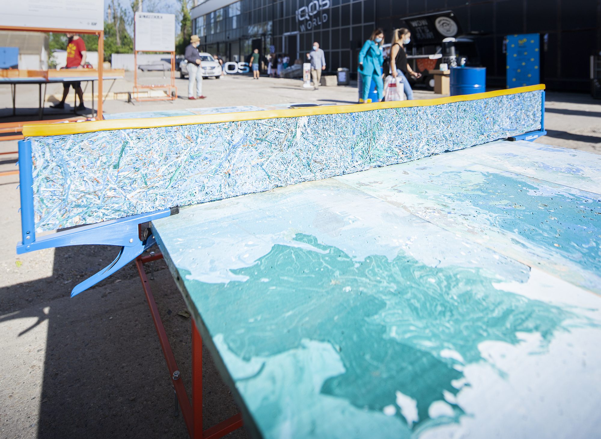 *Pet Pong – Blatul mesei realizat din plastice topite și returnate într-o matriță, apoi asamblate într-un model decorativ.
”Making the table was an experience that surprised us at each stage, as we learned how the material behaved under various physical factors (heat, humidity, drying time, etc.). It took approximately 100 kg of recycled plastic, of which 6200 plastic caps along with other waste such as plastic bottles, plastic bags, recycled plastic granules and even chopped loungers. The steps were: making the casting moulds, chopping and melting the plastic, burring and finishing the resulting plates. The net was made of the surplus material left after sanding the plates.” (The Authors)
Antifragile
text by Constantin Goagea
photo Andrei Mărgulescu
Curatorial concept: Romanian Design Week and Zeppelin Design
Exhibition design: Zeppelin Design
Graphic design : Radu Manelici + Sebastian Pren
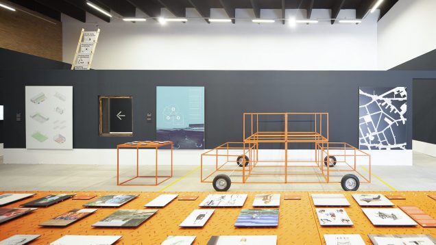
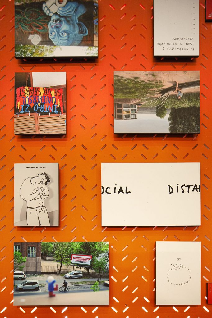
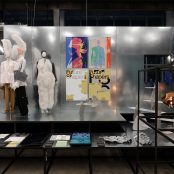
The project brings to light the initiatives and projects of designers, makers, artists, architects, in response to some of the difficult situations during the pandemic period. A few examples include anti-virus protection equipment for health professionals, ambulance workers, the hospital-disinfecting robot, school opening strategies, pedestrian street manifestos, humorous posters or video mappings to raise awareness to distancing measures and the need for isolation, workshops on new design possibilities for workspaces, a manifesto of repairs before any new beginning. This inevitably was a very eclectic selection of mediums – from posters to furniture prototypes or robots, web platforms or virtual reality spaces –, but what they all have in common is this anti-fragility response. Our perfectly imperfect, fictional and non-functional Romanian society is not ready to incorporate the kind of creative thinking into their everyday life, even on its best of days. Even less so in borderline situations, as everything is so blocked that a void of ideas and healthy practices is formed, against which, even more than elsewhere in Europe, conspiracy and reasons for non-action, scenaritis and SF vision have flourished for the worse. Or, the Antifragile is precisely the little good and normal needed, the pragmatism area restarting the generator.
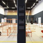
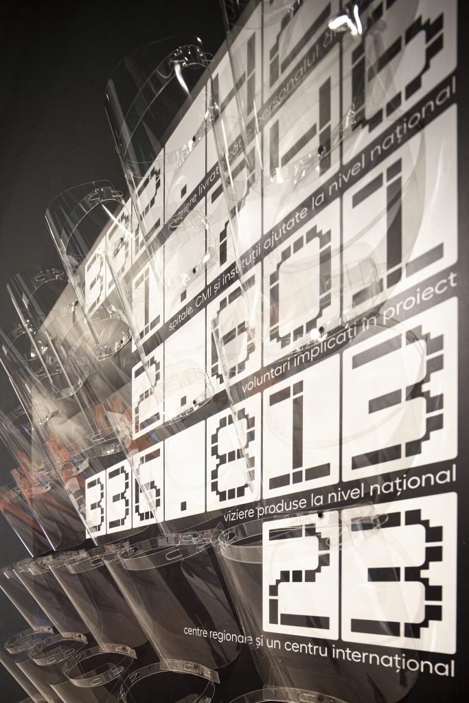
*1,2 – Sector 1 Gallery, Antifragile exhibition
3 – on the left side a Baza project explaining that the space taken by a car parking is as large as a bedroom, on the left of the image the Modulab’s Victor robot disinfects using violet light
4 – White nest – artists during the pandemic
5 – Viziere.ro – over 332,000 visors delivered to hospitals
The name of the exhibition draws on Nassim Nicholas Taleb’s namesake book. Anti-frail is defined not as the opposite of the resistant or of the robust – which would be measurable quantities, resulted from mathematical calculations – but as something that unpredictably, non-linearly gains force, strength, knowledge and capacity of reaction in stressful or attack situations. The reaction of all these people standing behind the anti-fragile objects in this exhibition is one not of resistance but much more, it means a model of anticipation, action and new vision that shifts the paradigm of social practice and self-organization. Antifragile is the project that is now becoming a reference point for seafarers in future crises. May we encounter as few as possible!
Possible Realities
text Maria Neneciu
photo: Roald Aron
Curatorial concept: Maria Neneciu, Cătălina Croitoru
Exhibition design: Attila Kim Architects
Graphic design: Radu Manelici + Sebastian Pren
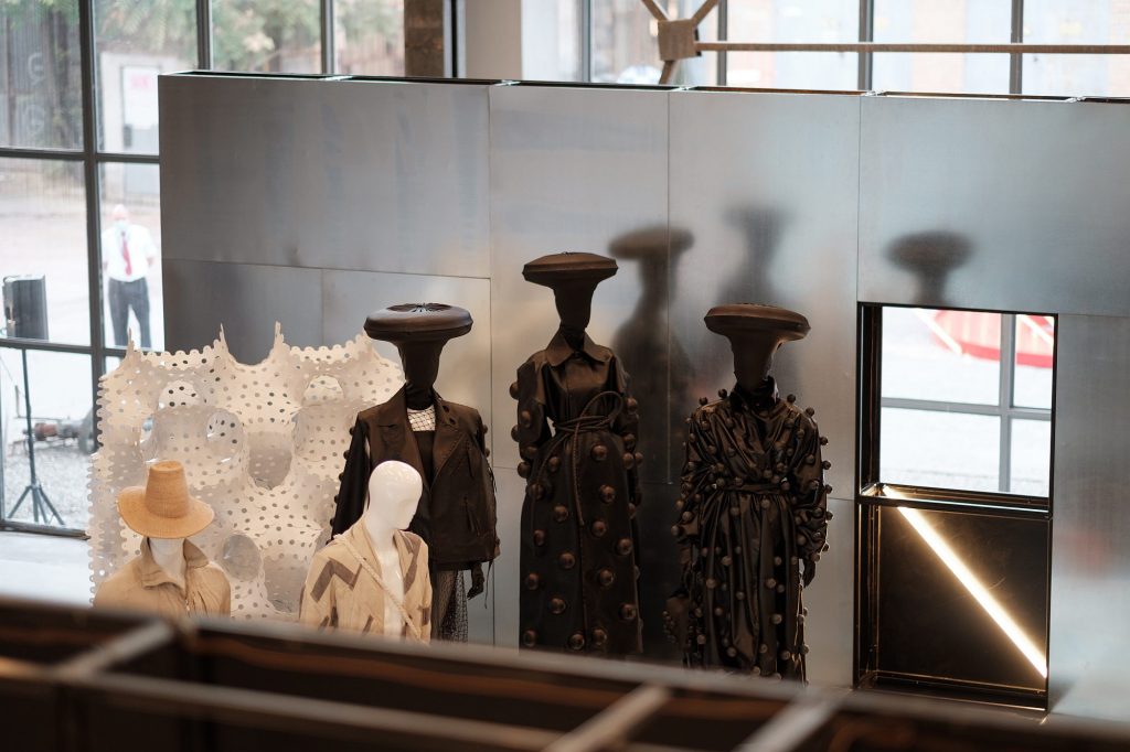
The Possible Realities exhibition undertakes to maintain a great part of the DNA of the exhibition we had prepared for the May RDW edition, an exhibition that would have been showcased in the National Art Museum of Romania, and whose concept had been drafted ever since 2019, when the edition’s topic – CHANGE – had (slightly) different values and meanings to all of us. At the same time, the exhibition has attempted to adapt to the new challenges brought about by the pandemic, and also to the new restrictions relating to traffic, space, etc., by completing projects on the experimental side by a series of interventions from experts in design previsions, and by a series of interviews and editorial materials that we developed in the festival’s digital edition, which we attempted to amplify and increase a lot during this edition, for obvious reasons.
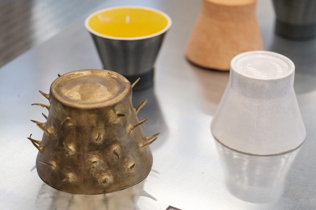
Within the exhibition, we have attempted to focus rather on conceptual design practices, developed around experiment, than on objects themselves, and, respectively, we wished to identify those studios and designers with a consistent concern for creative processes, out of the conviction that it is important that we initiate a discourse on the importance of design, beyond functionalities and aesthetics. This is also because we want Romanian Design Week to become an (even more prominent) platform on local creative industries and on how they can be (and are) essential development resources, whether concerning social, economic, or urban development.
The exhibition has therefore showcased a series of conceptual design projects signed by young emergent designers, whose practices are focused on processes and celebrate experiment, and practices selected for this exhibition are future-oriented, focusing on new forms or materials, as well as on the impact of objects, beyond the end user. Their ability to analyse and use new materials and forms is creatively countered by their freedom of expression and intuitive gestures.
We believe that, to the local design market, which is much smaller and much more `at inception stage` than similar markets in Western or Northern Europe, it holds the chance to being placed earlier in a more conceptual area, to challenge design limits by processes focusing on the impact of design on social equity or the environment. And we believe that Romanian designers and creators, aiming to experiment and innovate, should be promoted and supported as much as possible.
Despite their coming from a design scene where works were not individually credited and creative contribution was very little acknowledged until 30 years ago, the new generation of Romanian designers seems to manage to prove the importance of experiment, but especially to prove the value of collaboration, led, this time around, by shared beliefs and values. In a better future.
This is why we chose that next year’s Topic for the RDW should celebrate shared values and collaboration. This winter will be together!
Projects in the Possible Realities exhibitions are signed by:
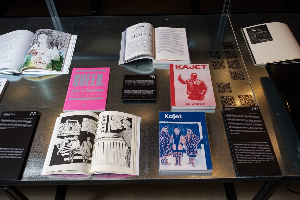
13×14 // Adelina Butnaru & FABER // Agnes Lukacs // Alexandru Floarea // Ana Alexe // Andreea Chirică // Arsene Lucian Alexandru // Atelier Adhoc // Bogdan Ciocodeica // BOGDAN & VAN BROECK // Calup // Carmen Secăreanu // Corizom // Daniel & Andrew // Exhibit Arhitectura/Cumulus // FABRIK // Ferencz Borbala // FOR // Ioana Ciolacu // IOKA Design // Kadna // Kajet // Kristina Dragomir // Lucian Broscățean // Macalik Arnold // Manea Kella studio // Manopera Architecture // Materia // Mădălin Gheorghe // mânadelucru // Megan Dominescu // Nord Arin // Patzaikin // Pluto by Night // Radu Abraham // Radu Manelici // Re-Act Now Architecture // Sounds like a book // Square One // UAU Ceramics // Vlad Țenu // Zeppelin.
Design Flags
text: Constantin Goagea
photo: Andrei Mărgulescu
Exhibition design adaptation: Zeppelin Design
Graphic design: Radu Manelici + Sebastian Pren
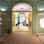
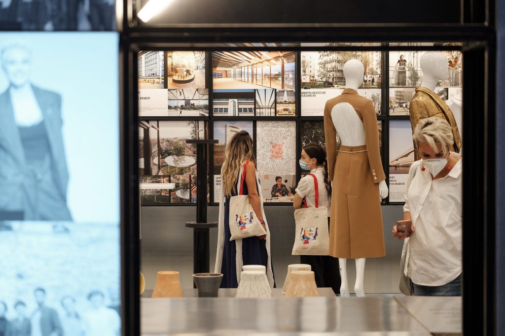
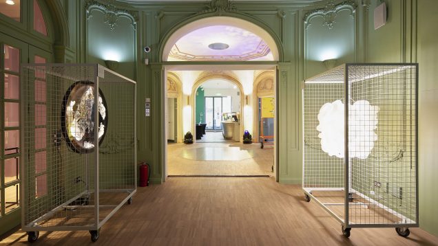
Casa Qreator was a RDW partner. The curatorial collaboration, the downtown location, the house itself – the former Oromolu Villa, with its eclectic details and proportions, now a place for new urban rituals, all brought a significant contribution to the format and success of the event.
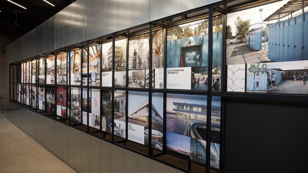
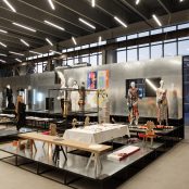
The house was the ideal setting for the 7 exhibitions brought by partner cultural centres, gathered together under the title of Design Flags. Our project was to adapt and exhibit in this very personal and very present context. This is why our strategy was based on an anti-rhetoric exercise, one of neutrality, which we undertook in such a way as to allow the contents of the exhibition to be the most important of all. The same way they speak of non-invasive procedures in medicine, we undertook working with lines and planes, not volumes, so that we could stay as little visible as possible.
We took advantage of the versatility and subtlety of the metal-frame exhibition system, provided by the RDW. We adapted easily to all places, creating a unitary image, which nevertheless observed the variety of projects.
1 – Matters-Rethinking Materials – Northern design projects, rather aimed at processes or cultural attitudes in a conceptual area
2 – Made in CZ/ Found in RO – an exhibition of Communist-era, Czech-made objects discovered in Romania. On the role of a design archive nowadays, from the didactic to the emotional
3 – Portugal Normal – an exhibition on the new rituals and the pleasure of the kitchen, reinterpreting archetypes of domestic objects
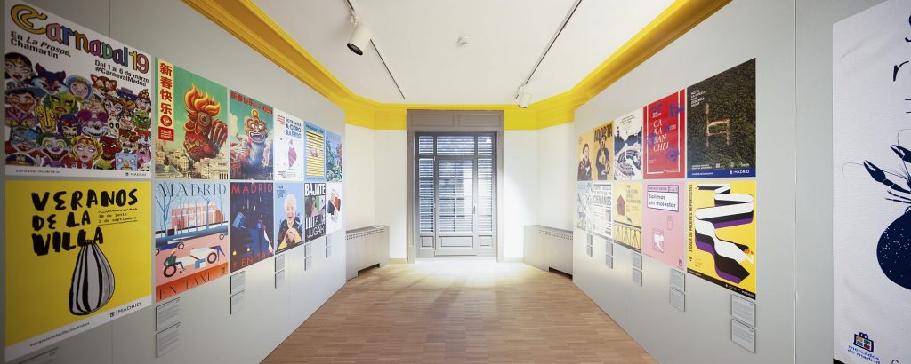
4 – Carteles de Madrid– 24 posters coming from the City Hall of Madrid, an amazing example of poster graphics. The boldest campaigns, made with the best illustrators.
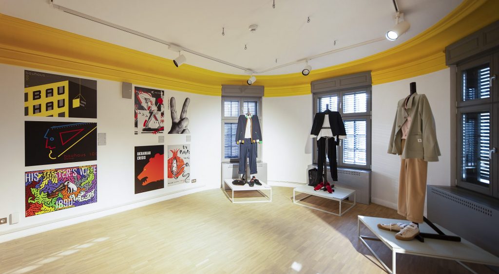
5 – Contemporary Hungarian Poster / Hungarian Olympic Uniforms – an exhibition with posters for various projects and another clothing exhibition, with 6 of the outfits made for the sportspeople who should have represented Hungary in the 2020 Tokyo Olympics.
Credits
Romanian Design Week team : Alina Gavrilă, Alina Șincu, Ana Păun, Andrei Borțun, Andrei Reg, Cătălina Croitoru, Cristina Cautiș, Cristina Mocanu, Cristina Vrabie, Irina Florea, Iulian Fecioru, Iuliana Navlea, Laura Apostol, Luiza Popescu, Maria Neneciu, Marian Apostolescu, Mădălina Mezdrea, Mihaela Tutunaru, Paul Horjea, Raluca Mirel, Teodora Dinu.
Zeppelin design team: Cosmina Goagea, Justin Baroncea, Ioana Naniș, Andrei Angelescu, Emanuel Birtea, Cristina Ginara, Alexandru Ivanof, Iulia Panait, Alexandru Voicu, Anastasia David Limona, Sonia Lascu, Constantin Goagea
Design Grafic/Graphic design team: Radu Manelici + Sebastian Pren

