One should not stay a long time in Venice to notice that the city is not willing to reveal its contemporary face. The reason is quite simple: in the last 300 years, Venicians were not particularly attracted by the “new” architecture, having already a rather dense and coherent place, needing interventions occasionally and, when these became inevitable, they have very quickly taken a local shape. Sporadically, interventions pointed out by architects such as Carlo Scarpa or Vittorio Gregotti brought something “new”, but Venice has no element to mark the present so far.
This situation changed once the decision to build a fourth bridge over “Canal Grande” was taken, into a strategic area of the city. The new bridge is to connect the main access routes, that is Santa Lucia Station and Piazzale Roma (bus terminal and parking). The location of the project raises the importance of that intervention to this space.
The selection of the architect was based on a competition (November 1999), the winner being Santiago Calatrava, worldwide known for its passages and bridges. His solution stirred up a series of controversies (perhaps any other solution would have been followed by endless debates) that made the bridge being launched only in September 2008 (while the construction site started in 2003).
The composition goes along a very tempered line (the project undertook lots of changes, in all its stages) and many fans of the Spanish architect/engineer regretted the spectacular features they got used to.
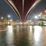
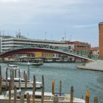
The metallic frame of the bridge is placed on a stone frame, being arched along 100 m and having a maximum width of 9,4 m in its highest section. The materials used do not follow Calatrava’s usual process of displaying a structural expressionism and bold shapes; he rather went for a delicate sculpture, an object carefully placed on the Canal. The glass and stone stairs provide a discreet contemporary view, and the metallic visible frame is not too obvious; the only bold element is the balusters made of glass sheets, having no support except a metallic structure. The decision to amplify the transparency is in line with setting an observation point besides public access. At night, lights placed on the balusters underline the fragility of the glass wall and the floating effect of passengers by.
I have pointed out the controversies around this project. As easily guessed, the main critiques were about preserving the Venetian heritage and the need to build a bridge of such a shape (probably, any else too). Further discussions about funding and construction followed, and were also the reason for the long time to complete the site. The last ones may include the accessibility of the bridge since no access is provided for disabled people. It seems a system to transport wheelchairs will be set up in the future but the debate around this issue is slightly peculiar in a city of 400 bridges out of which only a dozen have no stairs (the public “vaporettos” manage the access of disabled people in Venice). I would also add to this discussion the glass stairs I used when it rained: only a certain sense of balance allowed me to cross the bridge.
Overcoming the issues around this space, the result is a positive one. Despite the lack of an official launch, on the opening evening the bridge was crowded by people coming to see it, surely also because it coincided with the opening of the Architecture Biennale. The next day, this new area of access was quickly adopted by both tourists and Venicians, the traffic between Piazzale Roma and Santa Lucia being impressive. Venice can now be proud of a “contemporary” piece serving its purpose, and acting as an urban landmark and useful product for its people and visitors.
Photo: Stefan Tuchila


