I have been more and more certain lately that that kind of progress able to bestow identity on our local architecture should be sought for in experiments. In contrast to regional or magazine-based opinions mainly defined by relations to form and materials, experimental architecture seems to be the real intellectual innovation and fit to be shown abroad; moreover, its chances rely on middle and long-term tendencies to be built in Hungary. Though it is a long-term process and its success is not necessarily spectacular, we should not fail to emphasize it.
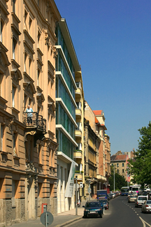
To prove the above mentioned facts, the new 19 Lanchid Street Designhotel building designed by Peter Sugar and Laszlo Benczur, is worth describing. The hotel stands on the upper embankment of the Danube, in Buda, not far from Clark Adam Square. The new building replacing a 19th stable, an annex of a palace, fills in a void within a row of houses, not in the least characteristic, but which offer a quiet view. The owner did not want just a four-star hotel but a so-called “design-hotel”, of which there are 140 around the world; the title had to be approved by a Berlin-based board meant to certify that the building in its tiniest details was conceived according to contemporary and unique designs. The client’s demands made the architects work as if in an experimental lab.
Two buildings
The architects designed two buildings in fact.
The response to vicinities – the surrounding interwar architecture – was a sturdy, serious and rigorous building. The large tamed voids, the sombre fabric of manmade stone panels, the trimmings (slightly overemphasized), the window planes moving into space inconspicuously, the well proportioned portico, they all point to a mature solution doubled by a balanced, solid architecture. An example could be the rear facade (the main one, to the Fortress), overlooking the Ontohaz Street; it is disciplined, aloof and perfect, and it shows a respectful attitude as if it had been built at the time of the neighbouring buildings. The building profile takes over the awkwardness of the site in a refined manner: a buttress (screening the technical annexes) creates a private interior courtyard and skilfully emphasizes the wall from Sigismund of Luxembourg time, discovered in the cellar.
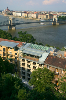
While the joining with the rear pediment seems natural, in the facade facing the Danube the designer (and the critic, as well) had to ask for more boldness: the integration within the row of houses and the landscape of the embankment, or the relationship of its ethos on the Danube riverside can reveal various layers of the concept. In front of the heavy, bulky facade there is a distinct skin. The rear building, which is a sort of secondary layer, sinks into the background. Thus, the bulky ends of the concrete floors become parts of a graphic fabric.
The transparent skin, a glowing advertisement at the same time, is an application of an element of interior architecture (vertical louvers) in the exterior, a skin and a kinetic painting-sculpture of light; equally, it is completely independent from the slightly conservative building at its back, even if the kinetic interplay provided by a computer program intercedes between the already mentioned concrete floors; if the users of the rooms wish to change the program, they can stop or pull the “curtain”. The rows of coloured, multi-layered serigraphic blades operated just like vertical louvers are directed by the weather station on the roof and change their position and light. This light-and-kinetic game is on the one hand a self-advertisement and expresses the building identity, while on the other hand, it is an independent object on the borderline of art and architecture. The kinetic light creations3 of the 20th century define the cultural milieu of this work. Equally, we can associate it with the ray-painting that Dora Berkes projects on walls. If we discuss it from an architectural viewpoint, we can think about Peter Zumthor’s Bregenz Museum (that has, however, fixed facades) or the many serigraphic motifs on Herzog & de Meuron’s buildings (where the surfaces extend just like an unitary skin), or Jean Nouvel’s Institute of Arab World (where the moving skin is the facade, and guiding serves also a functional purpose contributing to getting a spot of shade) or the Hungarocontroll office building designed by Tamas Nagy.
However, I still wonder if ambivalence, this double behaviour of the facade, does not weaken one of the building’s fundamental problems. Don’t the blades slacken the architectural truth of the background voids, that is, doesn’t the layer of the building with an axial structure and (traditional) sills provide with a tall roof shadow the coloured glass (cinemascope-like) facade? As for me, I think there are two options. In one of them, the blades stand for an organic part of the architecture of voids (even functionally, as screening) and are subordinated to the main structure. In the other, the glass scales “cover” the entire building and do not allow the “vulgar” predominance of windowsills and traditional tall roofs come out. Thus, the glazed envelope becomes a sort of visual border vacillating between two kinds of perception.
Ornament and education
The reason why I insist on the coherence of the surface interplay is Peter Sugar’s theory on “ornamental saturation”. As shown in his previous works, Sugar has been attracted to historic architecture where surface (either in the built-in context, facade division or envelope surfaces) enjoys a unitary intensity disregarding the scale. His approach is “justified” by Gottfried Semper’s theory that maintains that the meaning of the surface in an archetypal building (the tent) was inherited in architecture as well, or as Hannes Bohringer points out, “the beginnings of tectonic arts can be effectively and etymologically (tego-texo) found in textiles. Semper saw the origin of ornament in sewing. Sewing means to accept the finitude and fragmentariness of material, textiles, and fabrics. They should be associated and held together.”6
As concerns the contemporary tendencies, this sort of genesis myth proves quite resourceful. Sugar, who in his dissertation stated that “he cannot exist without a personal architectural mythology” confirms his affinity in matters of details and use of historic architectural elements, and grounds his work on this theory. In the aftermath of postmodernism, the existence of ornament in itself – even in its tectonic application – has been regarded with much scepticism. Brick architecture in Hungary in the 1990s skilfully mingled sobriety and ornamentation, simultaneously present in “texture”. Gradually, the application of the model on surface, as it happens worldwide, has spread. In this building, such processes are blended, which testifies to the convergence or divergence of vectors underlying various influences.
For one, the texture of the butterfly pattern sanded on the manmade stone from the base course of the front facade (initially, it was supposed to be applied on all the elements of the same material) is a provoking contemporary gesture. This architectural means could have “sustained” the building by itself, while its level and abstractness scale could have harmonized the rest of details and the fine concrete finishing. This model is related to those applied on the glass blades (here, the models of various sizes overlap and result into a complex image), while an ampler development of resemblance with the building would have soothed the resulting dilemmas seen in the two kinds of architectural attitudes.
The architects composed a narrative7 about the facade stratification and talked about a relation to the Danube given by the static undulation of the serigraphic patterns and the dynamics of the mobile blades. Without questioning their role in the project, I think the result is powerful enough and does not need any further explanation. The richness of details, the solutions – even the ornamental ones – can be decoded even by a layperson and play a major role, if we think of the problems involved by the communication techniques of “high” architecture. This building – and that is an important aspect – takes an essential step towards it: while its gestures can be interpreted within the architectural sphere, it testifies to a much grander opening to the sizes perceived by the city dwellers.
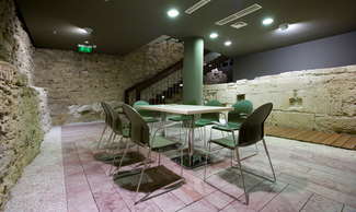
Its interior space is both generous and elegant. To avoid the side corridor, the back access is provided by bridges separated by glass sited laterally to each other. Thus, the viewer gets a surreal architectural feeling, whose elegant and ingenious approach is associated with its sober details. The interior details are related to the exterior world of glass blades. The impression pattern of interior glass bridges prolongs the world of glass panels from the exterior and the approach of ornamental surface is an attempt at enhancing coherence. Besides, the atrium corresponds to the conservative side of the building since it is a logical answer to the houses containing gangways and interior yards. The interior space is important to the extent in which the common section harmonizes the two architectural attitudes at odds. Just like the interior architectural details, the unique, innovative posh furniture pursues the experimental line and is treated individually. In general, this commitment to details – despite the local flaws of execution – gives a feeling of creativity, which is of paramount importance.
What is to be?
This building is a road opener, since it sets the client (we could call him a patron of arts) and the designer’s intention into a new light.
The skin that confers identity is a gesture meant to favour the passer-by and also one of architectural communication. Naturally, this attractiveness, this sort of “conjuror”-like strategy in urban public buildings elicits interesting questions. To what extent can we talk about the “openness” of the building or the added value to townscape, and where can we begin to feel the presence, the influence, and the radiation of one public building”? As I put it in the introduction to this article, I think Sugar and Benczur’s glass and light facade is an interesting experiment that, since it cannot be regarded in its essence as a final architectural solution, cannot give an answer to the previous dilemma; it can only show the importance of these issues and the (unused) in-built possibilities awaiting to be used. Should the trend move towards the glass scale membrane as architectural concept, should we talk about a more active interaction of interior and exterior from the part of the user or should we approach a more architectural view, then we shall find that an experiment has an end, but the process of experimenting has none.
Although our subtitle question is purely rhetorical, we have reasons to be hopeful.
Abridged version
The complete version was published in “Alaprajz”, 2007/4
Photo: Tamas Bujnovszky, authors
English translation: Laszlo-Attila Hubbes