Text: Ştefan Ghenciulescu
Photo: Cosmin Dragomir, Daniel Miro
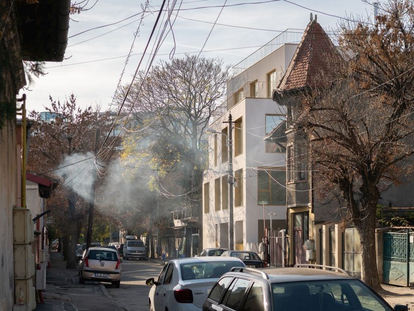
The area defined by the Polonă and Eminescu Streets and Șoseaua Ștefan cel Mare is part of a rather old part of the Romania capital, Bucharest, with quiet streets, and all sorts of architecture, from imposing villas and pretty blocks of flats, to old slum houses. There are many poor people there, although the social structure is rapidly changing. It does not have the prestige and coherence of some of its adjoining neighbourhoods, and, as such, it also hardly contains any protected areas. For this reason, and due to its very central position, it has been submitted to aggressive investments, ever since the ‘90s. G+6, G+10 and even taller blocks take up a lot of the land and, it needs to be said, are often also very ugly, standing out like cliffs out of the sea of rather small houses and vine-laden courtyards.
The already famous development of Urban Spaces – Dogarilor is here, created by the same guys at ADN BA – a building that manages to become a part of the fabric, and which has become a destination of architectural pilgrimage. The new project is not far from Dogarilor Street, but is much smaller in scale. Like the Urban Spaces project, it benefitted from a cooperation with a remarkable client, but it also had to adapt to the new conditions on the Romanian real estate market. We will talk of this aspect later.
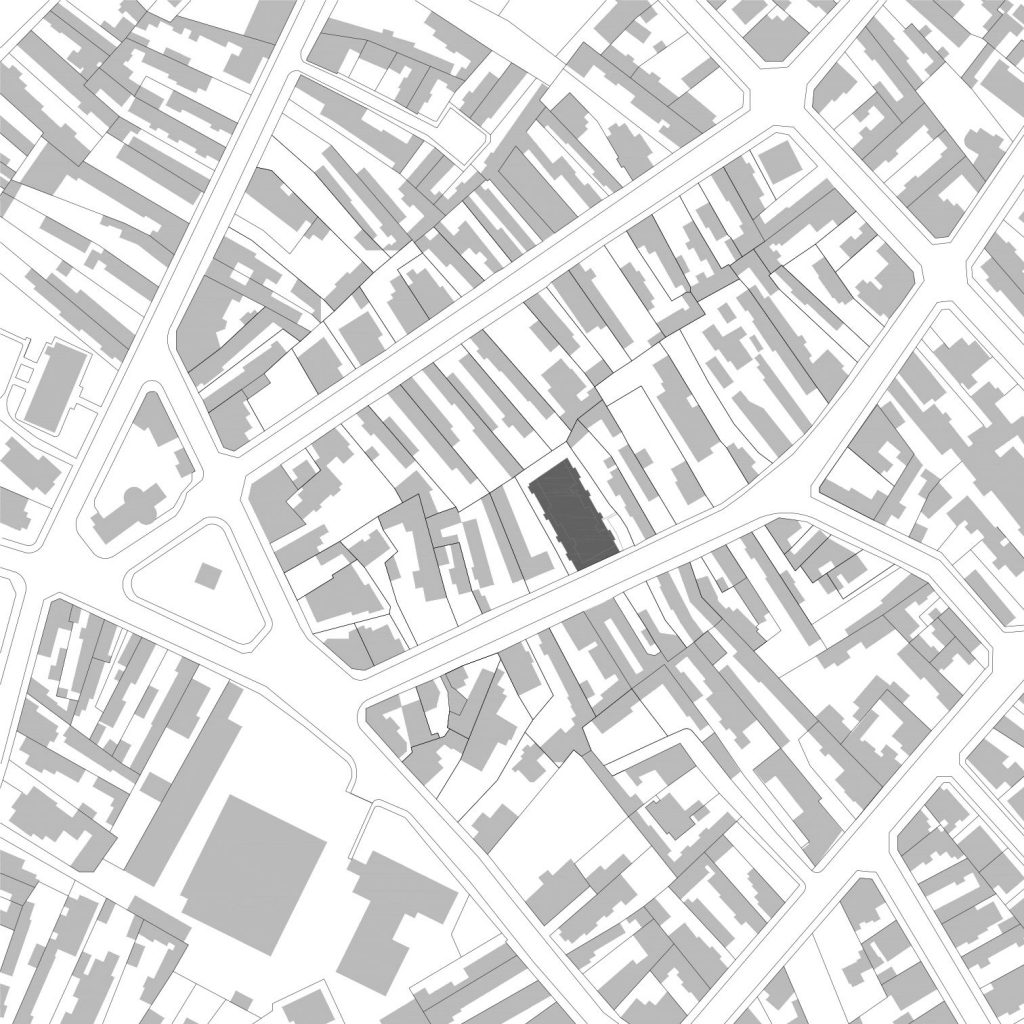 *situation plan
Forced volume, separation, individualization
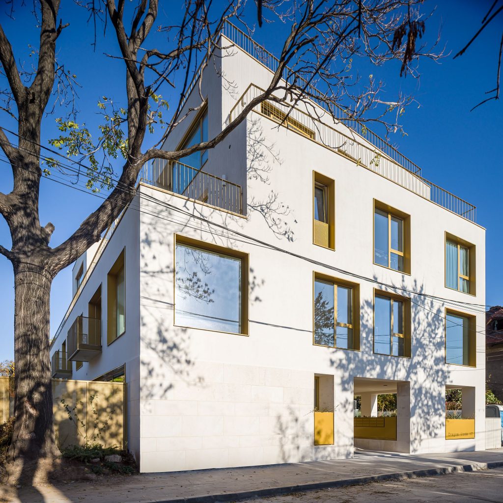
The shape of the building is a result, first and foremost, of urban rules (unlike the typical Romanian development, here no private interest-driven zoning plan was proposed): street alignment and successive and mandatory withdrawals sideways and to the back.
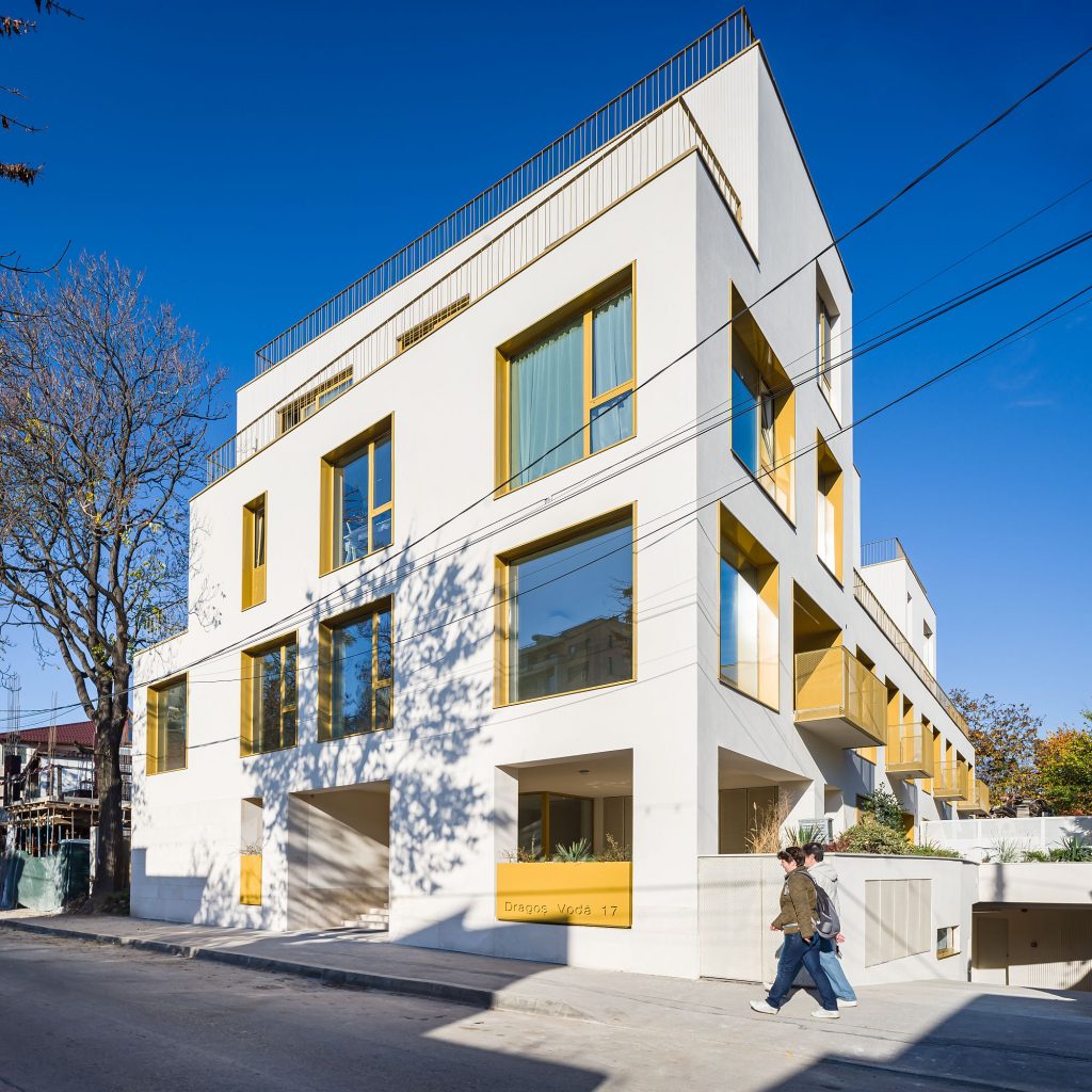
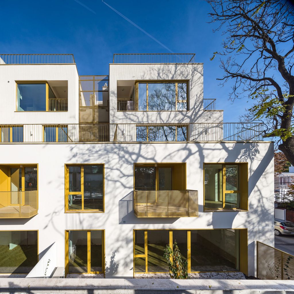
But inside this basic volume there are very different types of apartments, each with its own exterior space or spaces.
On the ground floor, a covered terrace opens towards the street and is designed as a common exterior space (the only one, for that matter).
Then comes a hallway and a corridor creating a true covered street, with natural light from both ends.
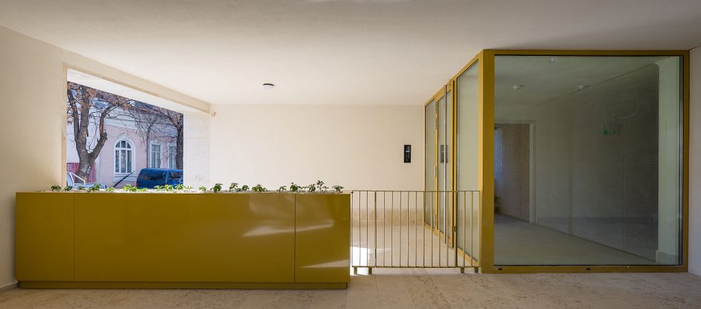
*Common terrace and covered access
From this street, you can take the elevators or the stairs to the upper floors, or you can enter the ground floor apartments. The latter with their own gardens, which gives them a character that is very close to an individual dwelling.
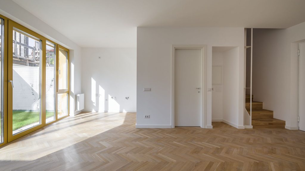
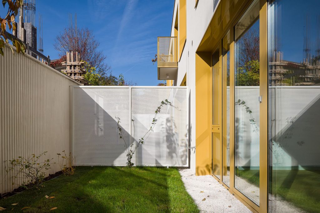 *Duplex, ground floor
The long sides include four duplexes, the ends, two one-level apartments. This formula (duplexes on the sides, one-level apartments at the ends) is also repeated throughout the height of the building.
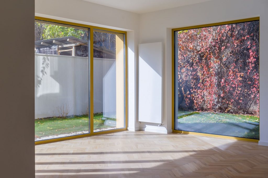 *Ground floor single-level apartment
A lateral access, which would have maybe been closer to a certain Bucharest specificity, would have nevertheless led to the elimination of at least one of the gardens, and to privacy issues for the respective apartment. Thus, the entrance is through the main facade, but, fortunately, it is not quite direct, but through an open and covered space, connected to the common terrace.
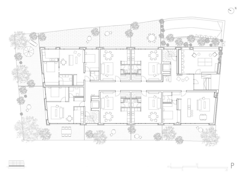 *ground floor plan
The duplex-type formula and the placing of the elevators and staircases allows the disappearance of the interior street, starting with the 1st floor.
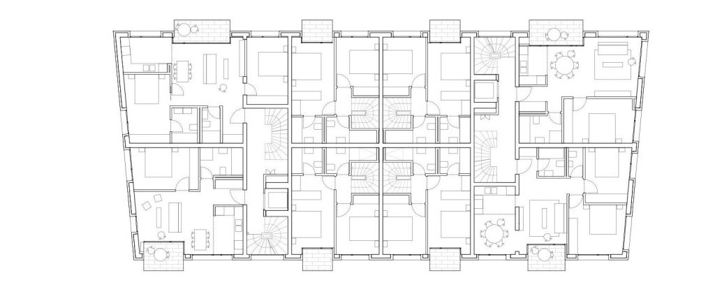 *1st floor plan
Very efficiently, two compact circulation cores remain. Compact, but not homogeneous: the elevators remain the only true fixed elements, because the staircases differ from one floor to the next, which adds complexity and individuality to common spaces and living units.
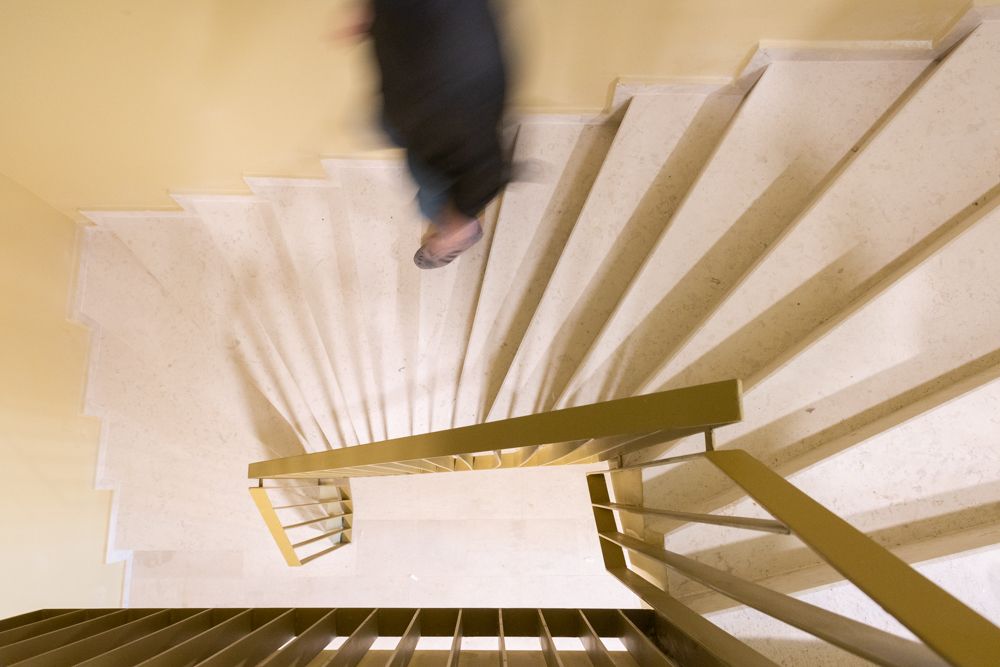 *Common stairway
And even, with the back cores, the staircase completely shifts position, the architects managing an embryo of architectural promenade, despite the very limited surface. The disappearance of the corridor, combined with the withdrawals starting at the 2nd floor, also shift the orientation.
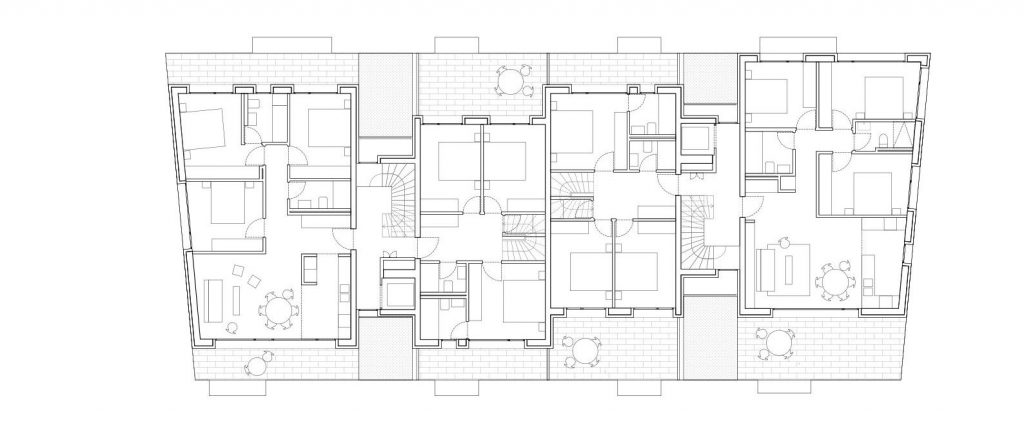 *2nd floor plan
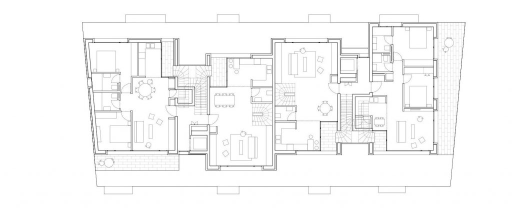 *3rd floor plan
The plan starts to be organised on transversal strips, and the middle duplexes become traversing ones; they lose the garden, but they receive two generous terraces.
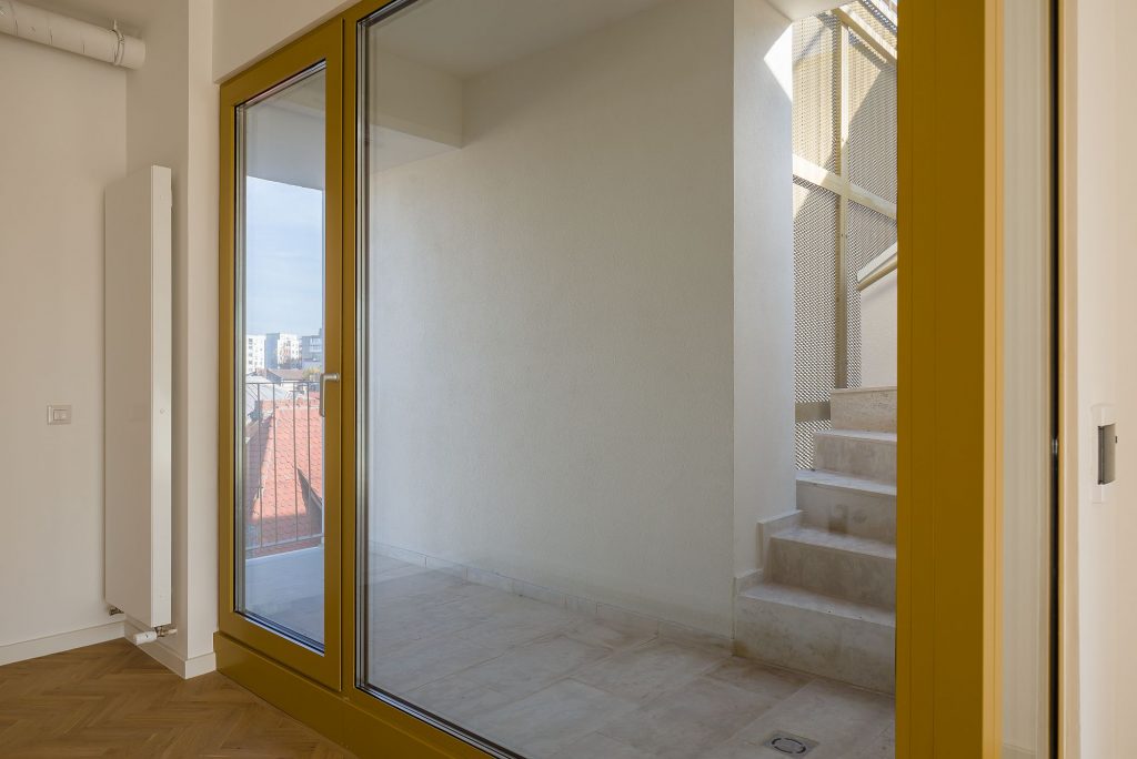 *Duplex, 2nd-3rd floors
Their day and night spaces are reversed from the conventional layout: bedrooms are located on the second level (and receive a secondary access there), while the day spaces and the main entrance are found on the 3rd floor. On one hand, this layout allows for a better lighting and spectacular views for the day space; on the other, the small loggia for each dining space is directly connected, through an exterior staircase, to a private terrace on the roof.
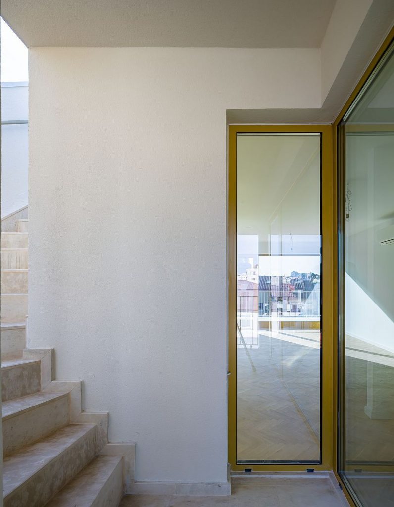 *Duplex, 2nd-3rd floors
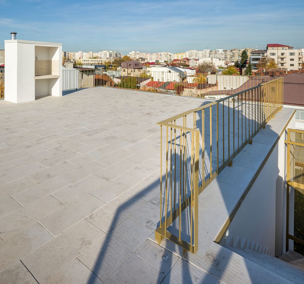 *Terrace over the 3rd floor. The gardens will be realized by the owners
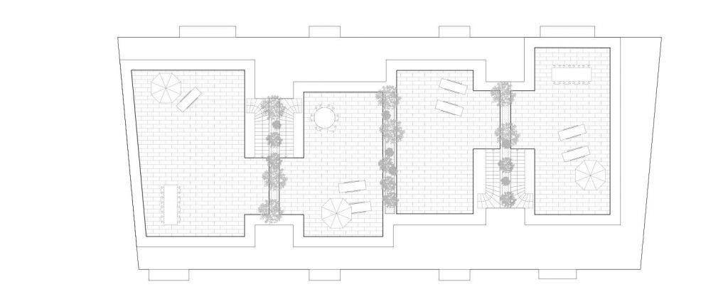 *Terrace plan
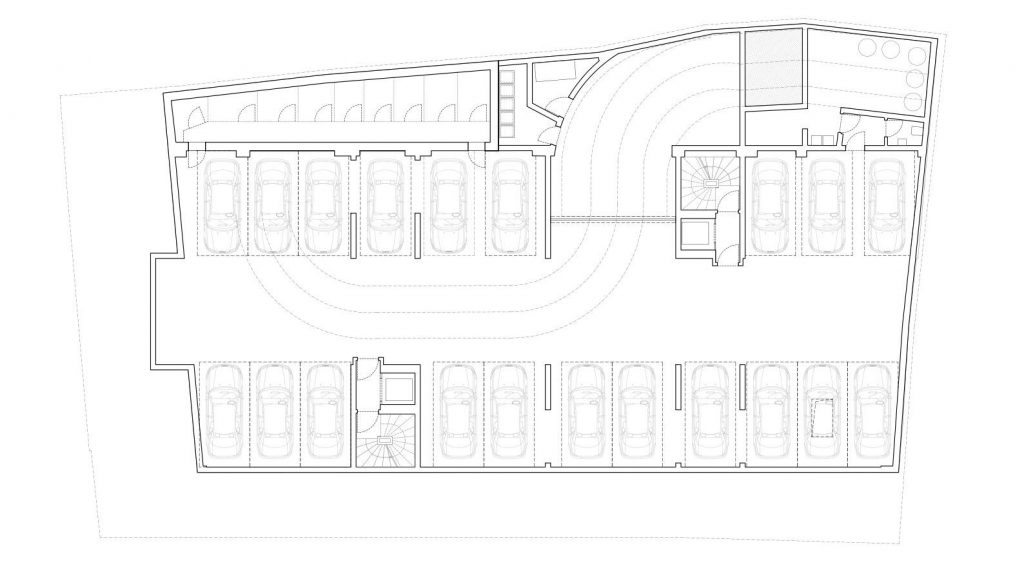 *underground plan
There are 14 apartments, but 10 types of units: a remarkable diversity within a framework that is as compact as they come.
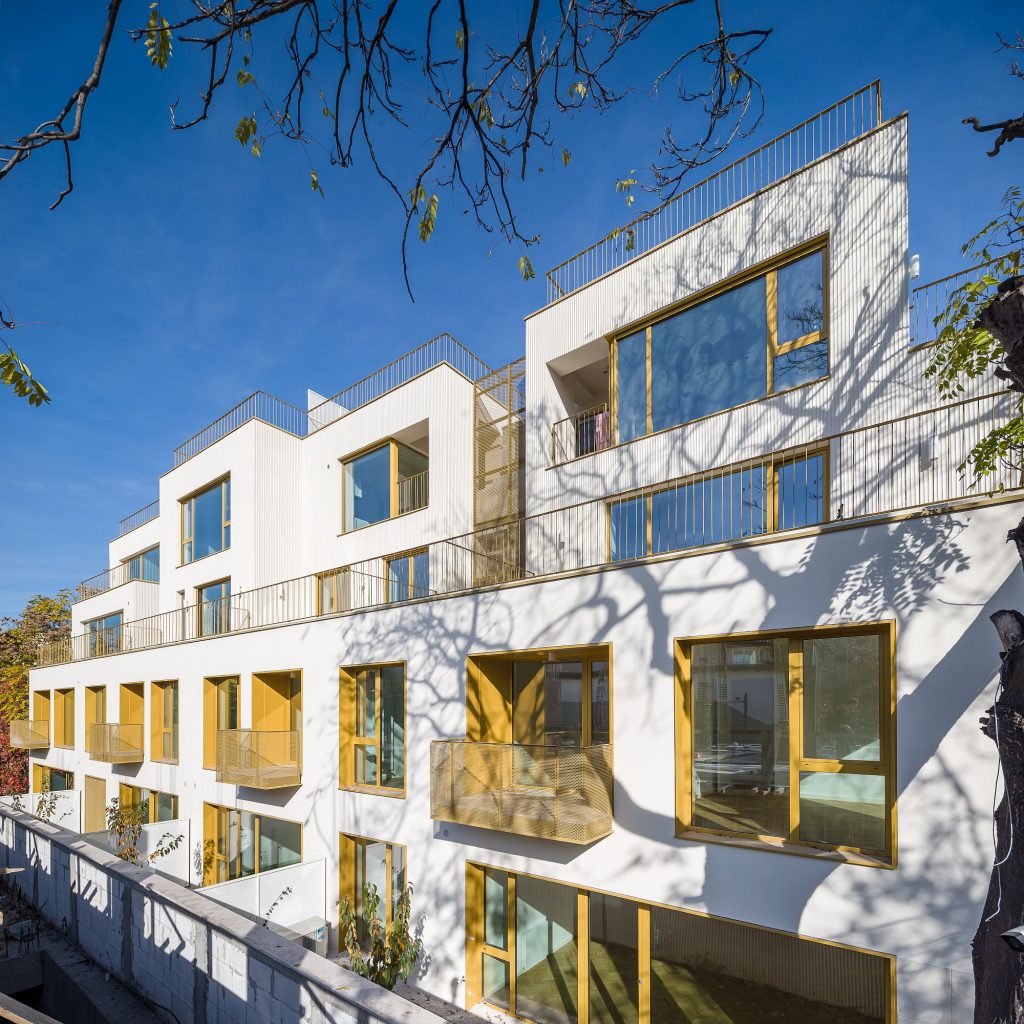
Besides the general recesses, the horizontal sliding of strips on the upper levels, the incisions in the mass of the construction and the cantilevered balconies create movement within the massive volume; they generate rich exterior spaces, and also contribute to bringing it down to a human scale and to reducing the impact on the neighbourhood.
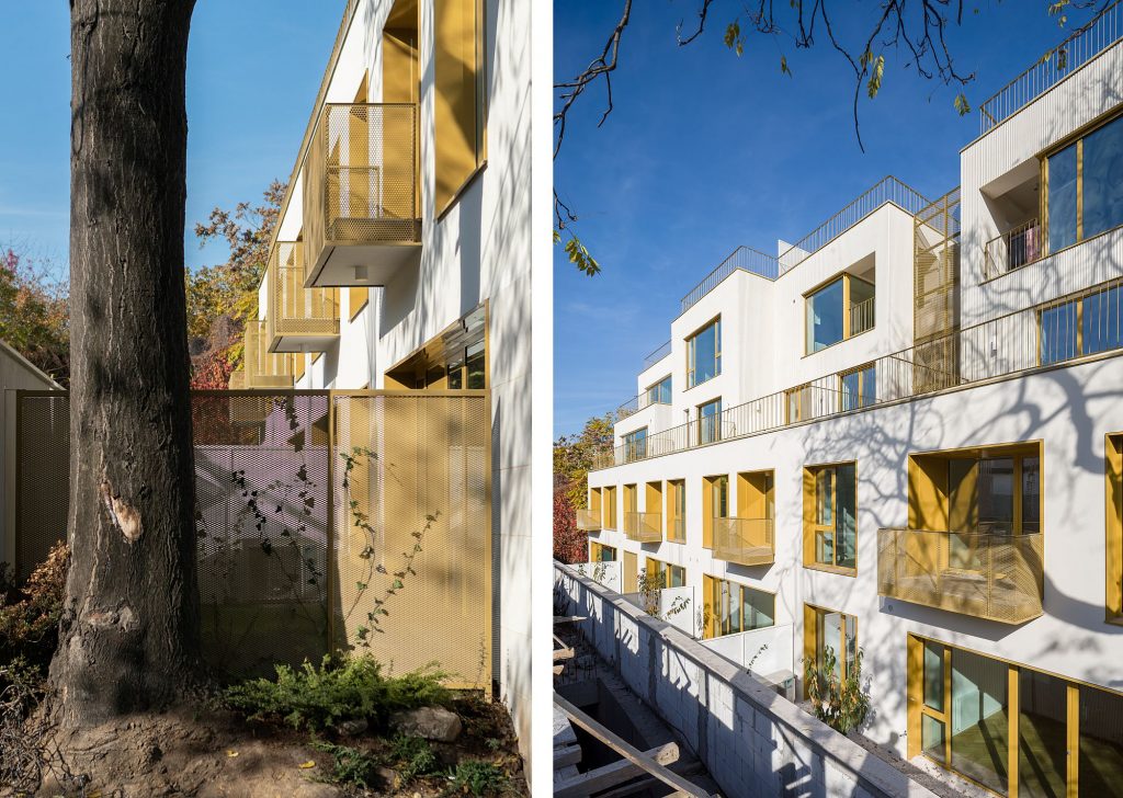
*The saved tree and the succession of layers
These exterior places, as well as the generous gaps, compensate for the relatively small rooms (especially when it comes to bedrooms). It is not only the traversing rooms on the third floor, but also most of those on the corners on all levels, that benefit from two-sided openings, therefore from a lot of light and from an exceptional connection to the exterior. The extruded pyramid-like section is turned into a complex game of perforated slabs.
Materiality, details, the craftmanship issue
ADN BA are known, among other things, for their obsession for details and for the poetic merger of new technological solutions and all types of traditional (or rather tradition-inspired)practice, elements, and materials. It is increasingly more difficult to work like that, as Adrian Untaru, a partner and one of the project managers for Dragos Voda, told us. It is not just the lack of good craftsmen in itself, in fact, of workers able to make more complex things, but also the evolution of the market and of the construction system. Materials that used to be precious are more and more cheap, but any solution that exceeds the very limited standards becomes increasingly more difficult to make and to guarantee, as well as excessively expensive. The banality surrounding us all is also given by the limiting of possibilities. You can choose among hundreds of nuances for the facade, but not how to build said facade.
 *details
In fact, the architect can control an ever smaller number of things and finds it increasingly difficult to convince any type of client that anything out of the conventional boundaries is not a risk of blowing up budgets, deadlines, other parts of the building. One of the solutions is that the architect undertake more – on this project, ADN BA also took care of project management, drastically optimizing every solution and every material.
Then, you can make the choices on what is truly impossible to responsibly leave out, and then focus resources on some essential points. And that even for operations that do not fall in the category of cheap dwellings, as is the case of this project.
Here, wide glazing and aluminium joinery fall under both the categories above – they relate to the quality of living, but also, by the way they are made, to architectural added value. The same-material borders on the lateral and superior sides of the gaps are more related to the ‘small luxury’ gestures. But to the architect, they are very important, providing an otherwise very simple and clean volume with the absolutely necessary precious and elegant accents. This is also about the efficiency in architectural expression.
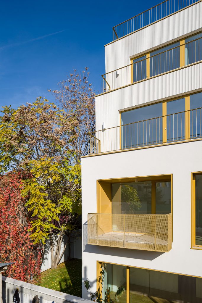
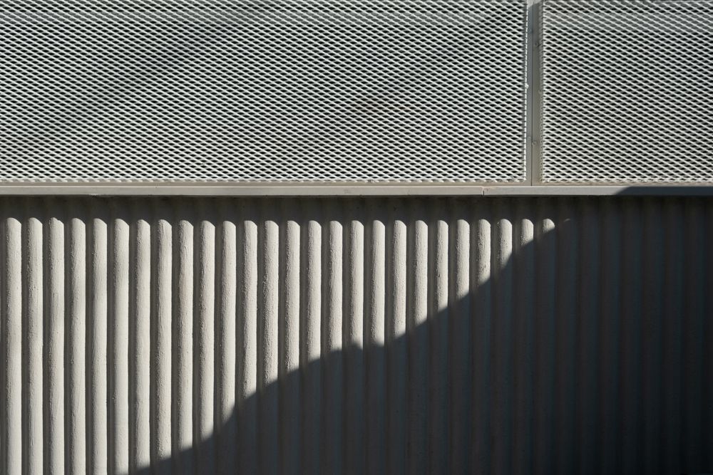
The deep building, flanked by neighbours almost as tall, cannot be actually completely seen from anywhere. Instead, the very lopsided view of the lateral facades maximizes the perception of plating. From the street, the long sides, already attacked by withdrawals, are perceived as an alternance of lighter or darker strips, of plaster and metal. Add to this the semi-transparent layers of balconies. Here as well, Adrian told us, the perforated sheet parapet was in fact more expensive than a glass one would have been (another luxury element that has become rather accessible).
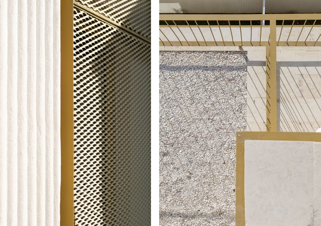
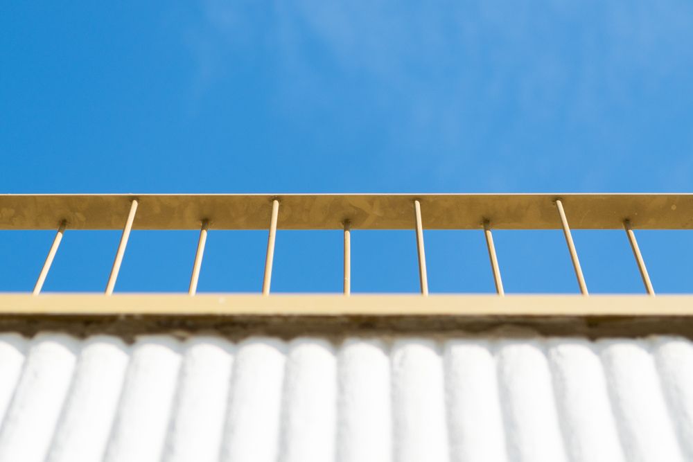
The metal railing on the upper floors is an example of a refined image made with savings. The desire of having profiles that are as fine as possible, but of avoiding, at the same time, intermediary horizontal elements, lead to the idea of double vertical profiles, slightly shifted horizontally – which leads to higher rigidity on the railing plan.
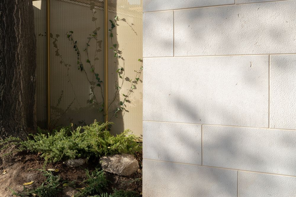
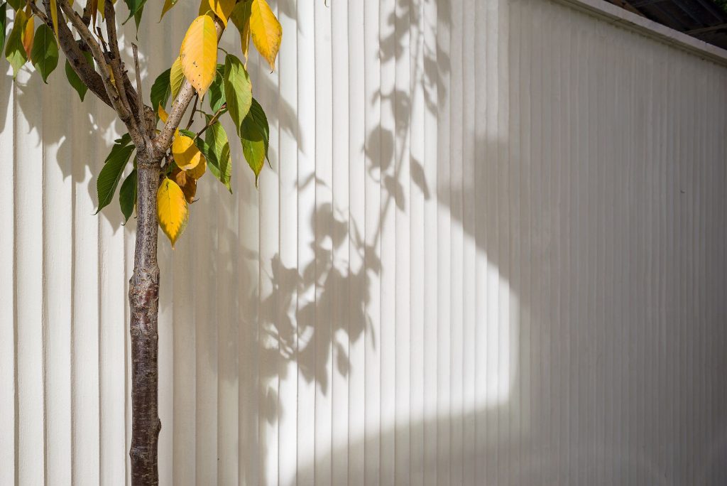
Regarding surfaces, successes are rather related to texture and discreet details: thus, on the outside, the plaster profiles that were so sought-after in the ‘20s and ‘30s make a comeback, providing vibration to the lateral walls and to the interior walls of the fences.
The stone plating of the plinth remains on the same plane as the plaster. The curved transition between the walls and ceiling towards the interior street is also reminiscent of the inter-war period.
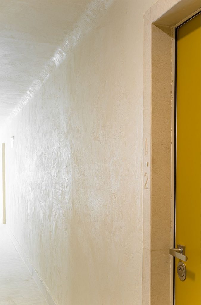 *The interior street at ground floor level. Detail
These are refined, almost invisible gestures, expressing the philosophy of this project (and of ADN BA in general, I would say): the quest for good and civilized living, a temperate rationalism, a balance between a contemporary spirit and a spirit of the place, but also between generosity and pragmatism.
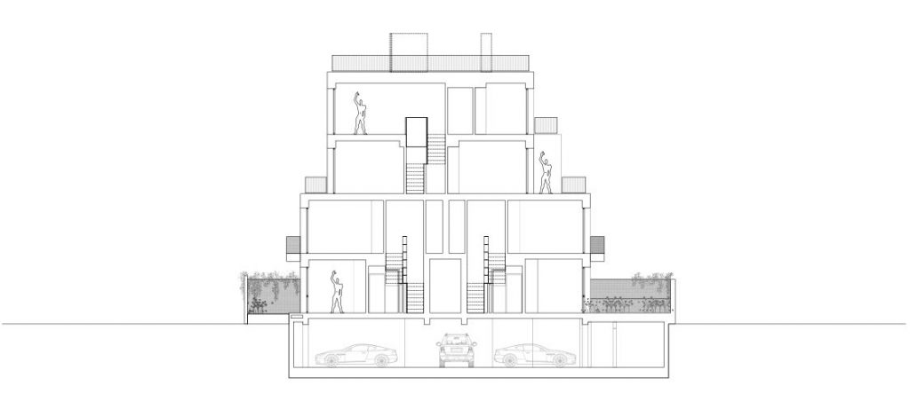
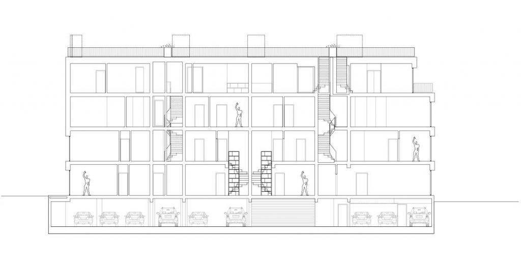 *sections
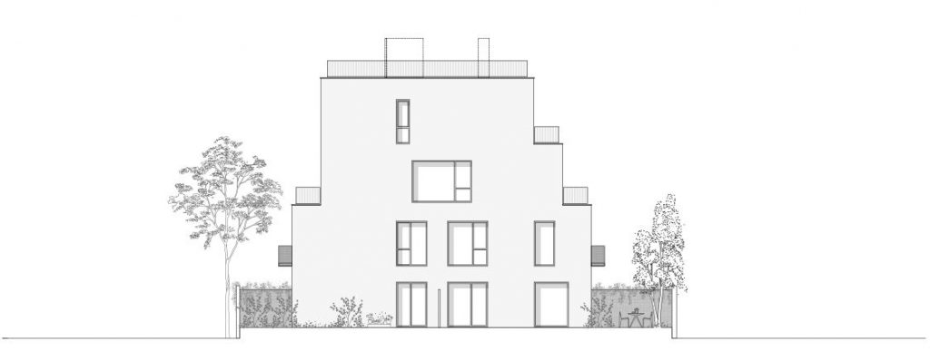 *North facade
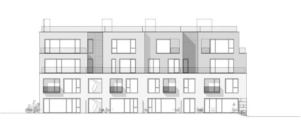 *west
*west
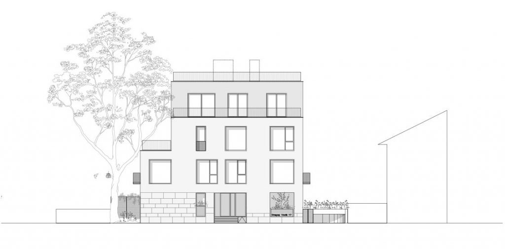 *South
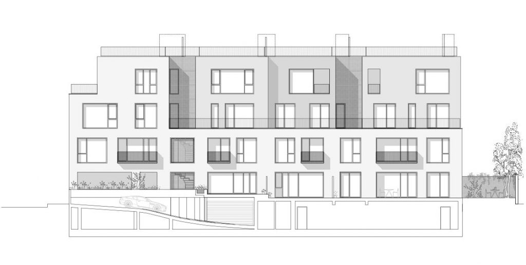 *east
*east
Info & credits
Architecture: ADN BA – Adrian Untaru, Andrei Șerbescu, Bogdan Brădățeanu, Carmen Petrea, Mihaela Dobre, Raluca Raescu
Structure: Incona – Mircea Necșu
Installations: Alma Instal Pro, ADN BPI – Robert Ciubotaru
Developer: Pop Properties
General contractor: ADN BA
Plot area(sqm): 912
Total built area ( sqm): 2153

