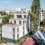
Sfinții Voievozi is a quiet street downtown Bucharest, hidden in a tetragon defined by important boulevards – Calea Victoriei, Buzești-Berzei Bd., Calea Griviței and Dacia Bd. What used to be a semi-urban fabric 150 years ago, with large gardens, buildings that were rather scattered and low, streets and plots with an organic geometry, has transformed, through densification and regularization. Major actions live along parts that still largely preserve some ancient character. This logic of a porous fabric, of overlapping and juxtaposing patriarchal houses and plots with buildings that express the various waves of modernisation, is also very well expressed by the plot and vicinities of the apartment complex we are discussing here.
*Building in the depth of the plot, common space, gardens on the ground and on the roofs
Text: Ștefan Ghenciulescu
Photo: Vlad Pătru, Sabin Prodan
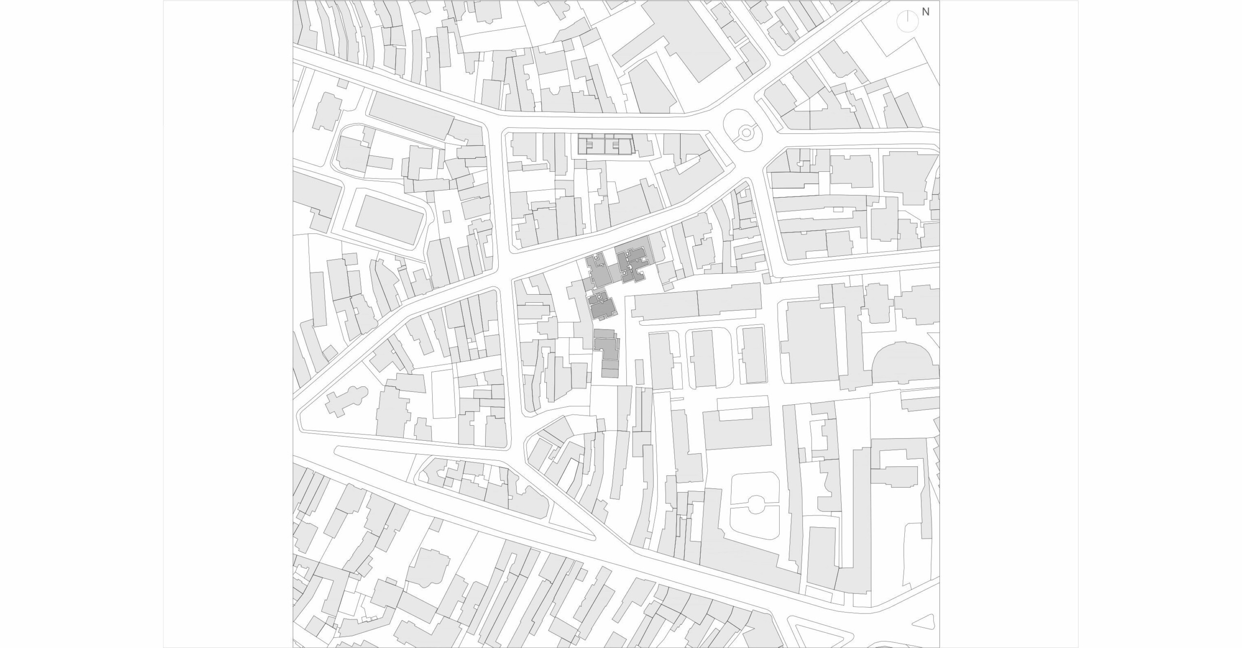
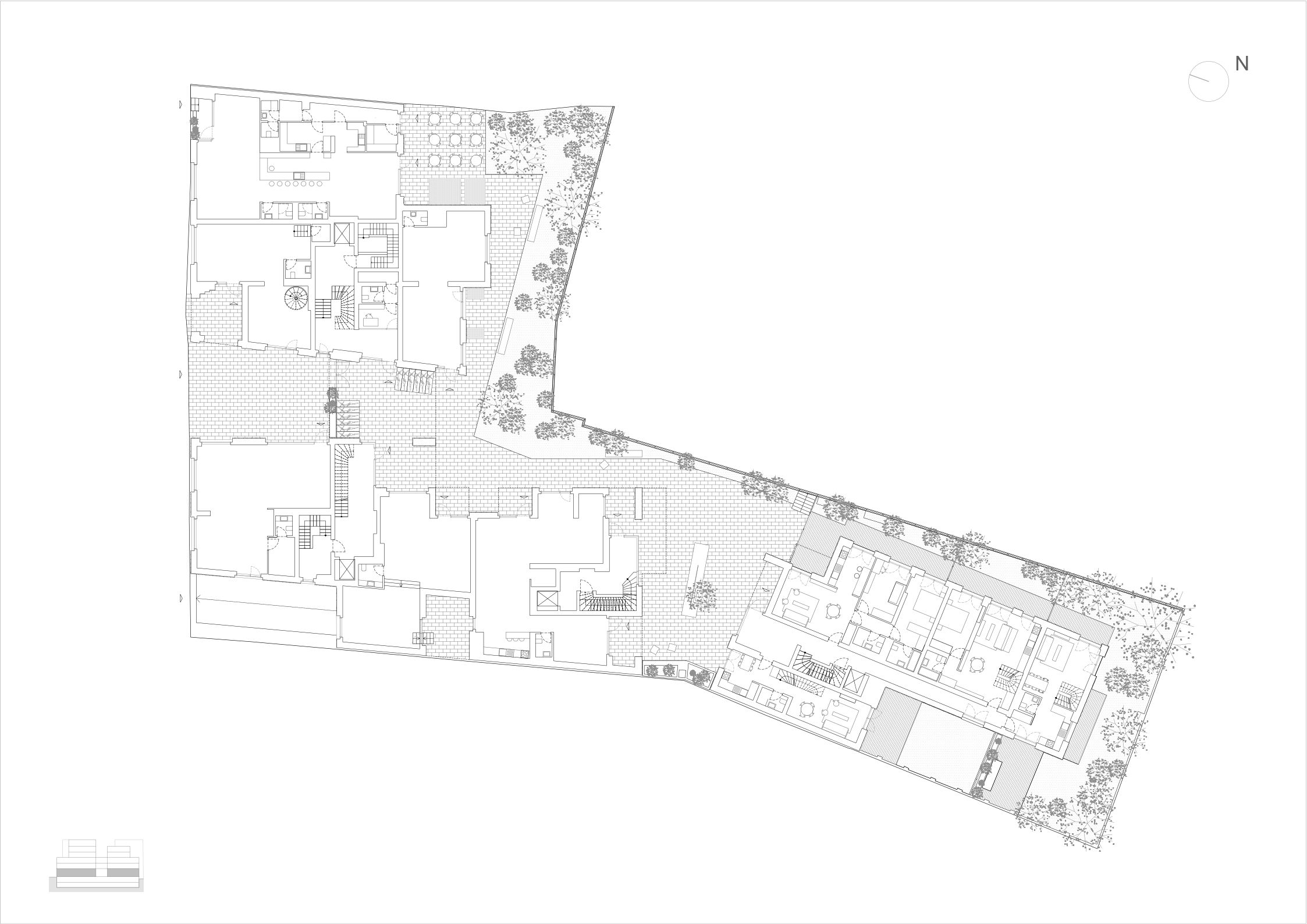
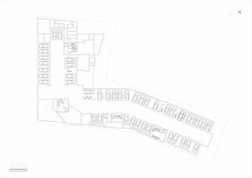
The land is L-shaped, with different angles and widths, resulted from the joining of two plots. It contains a portion aligned to the street and, at the same time, goes deep inside the block. It neighbours lower houses, but also, in the inflection point of the two major parts, a massive and not-so-friendly building – a student dorm of the Academy of Economics.
Very close by, on Occidentului St., visible from many places in the new complex, is a beautiful and innovative ADN BA living project, finished some 5 years ago. But to me, the main reference for the current operation or, if you will, the main element of comparison, is the Urban Spaces development on Dogarilor St., a first collaboration between these investors and architects.
Designed and built during the economic crisis, Urban Spaces Dogarilor simply exploded on the Romanian architecture scene and continues to be very successful with the public. [We wrote about this project in Zeppelin 125/2014, in the book “Dwelling Together. 6 apartment buildings by DNA BA”. The Dogarilor complex was, among others, showcased at the Venice Biennale and nominated for the Mies van de Rohe awards. The apartments, are, to this day, some of the most coveted in Bucharest.] It has become a textbook example of responsible densification and of recovering a spirit of the place, an articulation with a discontinuous urban fabric, one of richness of living units (there, all the about 70 apartments were different, and the types themselves counted in the range of tens), of integrating common spaces, and of brave and fresh architectural expression.
As we will see below, Urban Space Sfinții Voievozi is developing this type of endeavour in a more temperate and more pragmatic manner.
A Piece of Urban Fabric
The plot facing Dogarilor Street was more compact, allowing for the repartition of units in two basic bodies, one extremely fractured towards the street, the other one at the back of the plot, and in-between, a well-defined common yard.
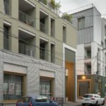
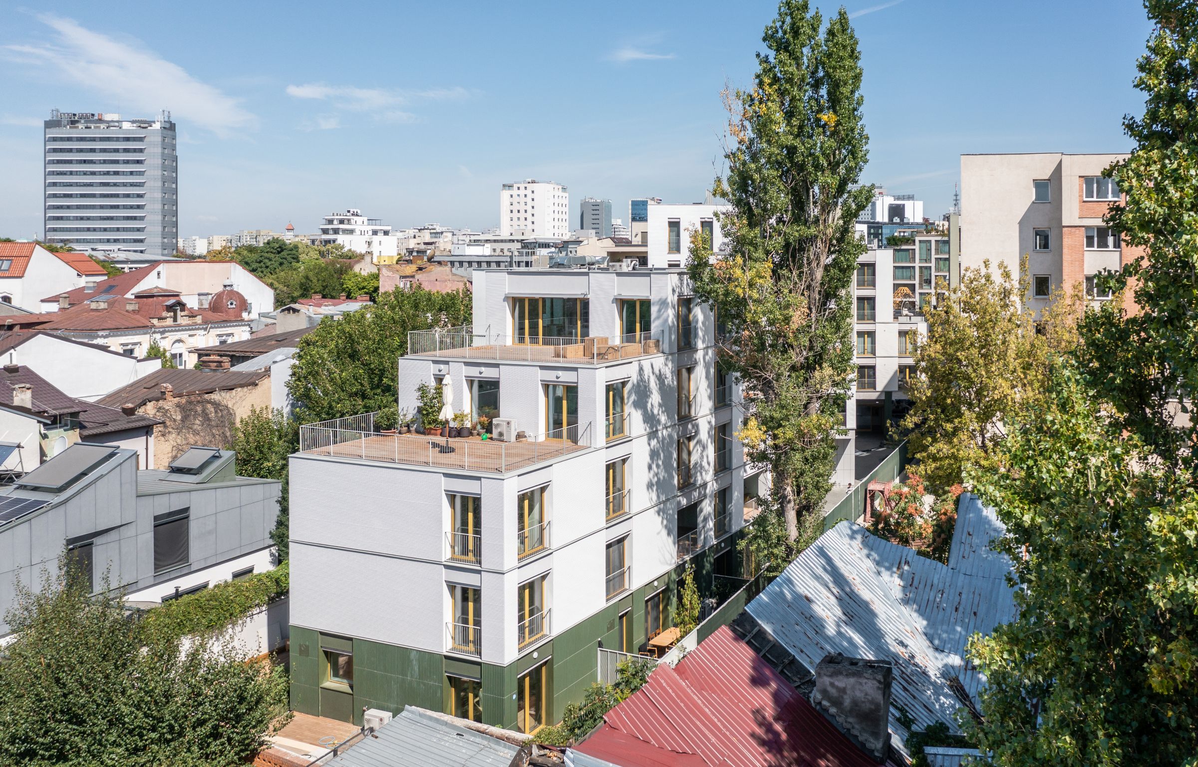
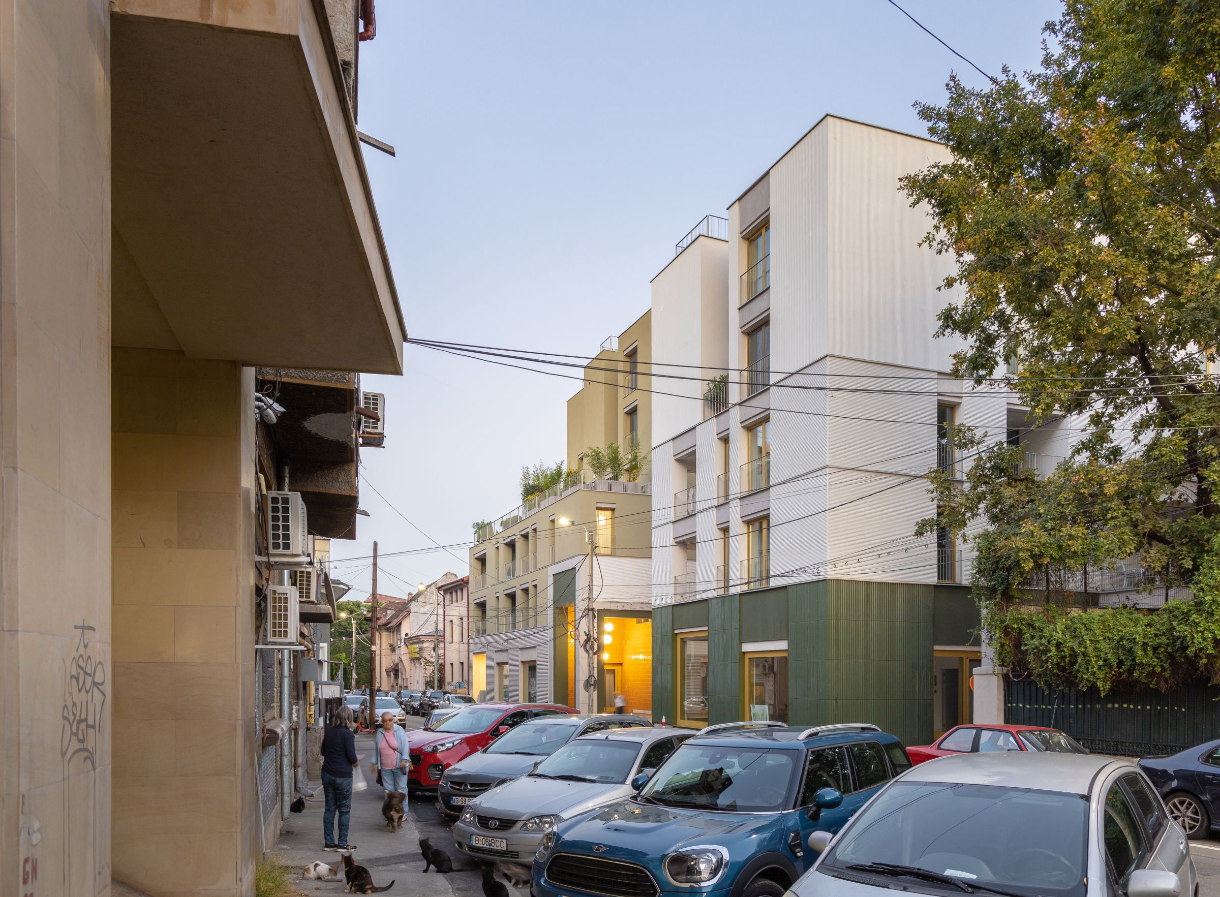
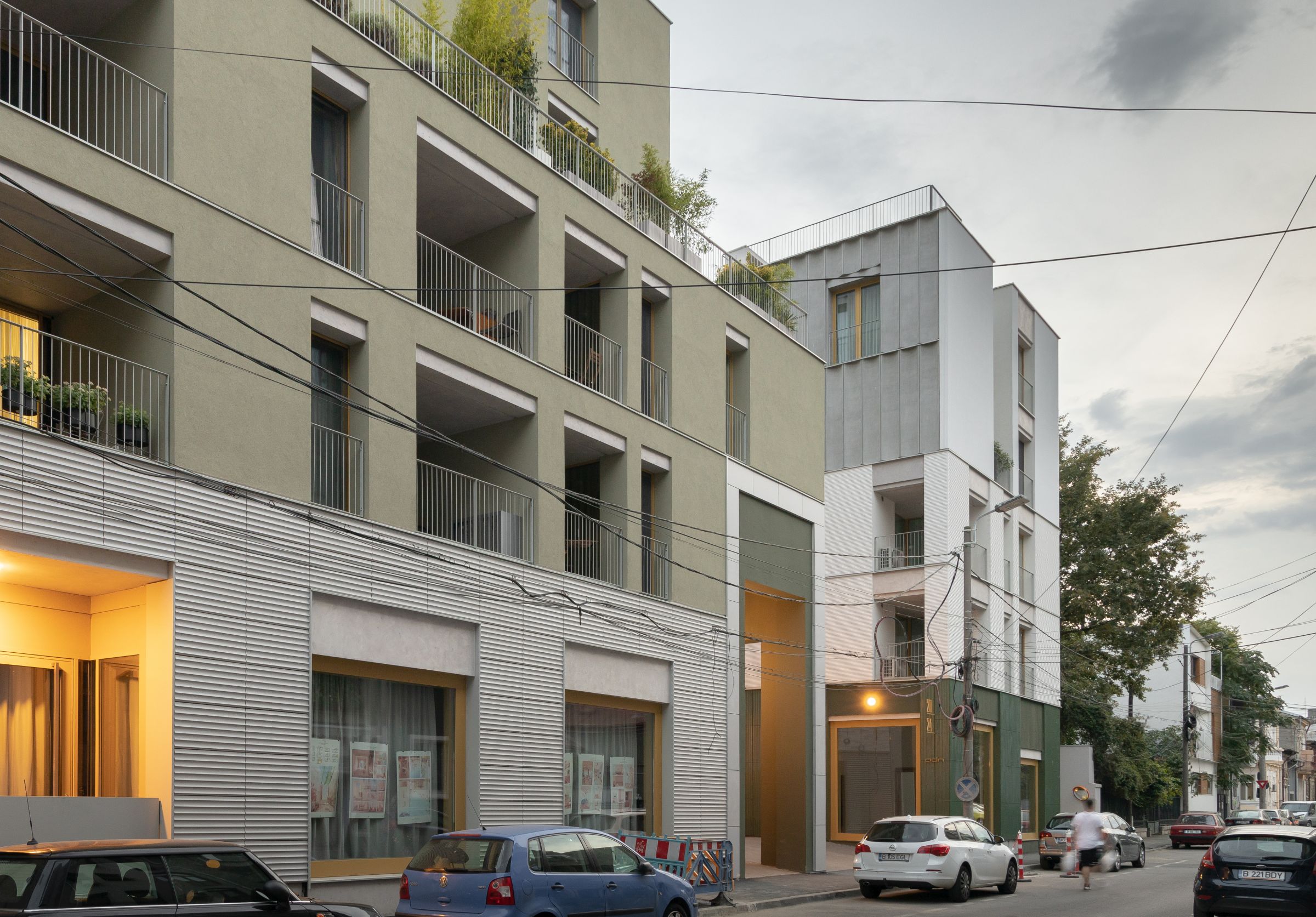
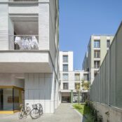
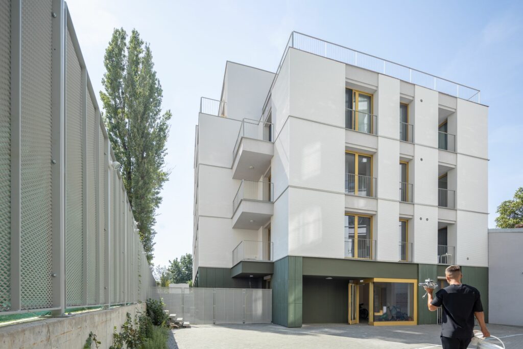
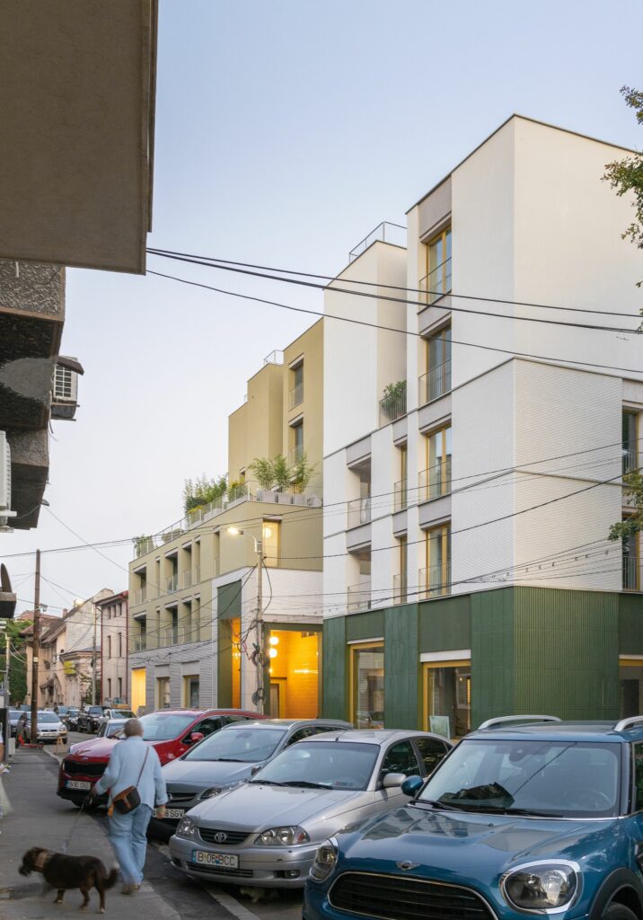
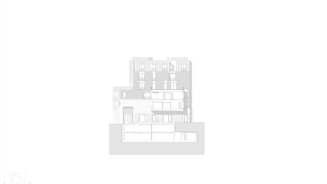
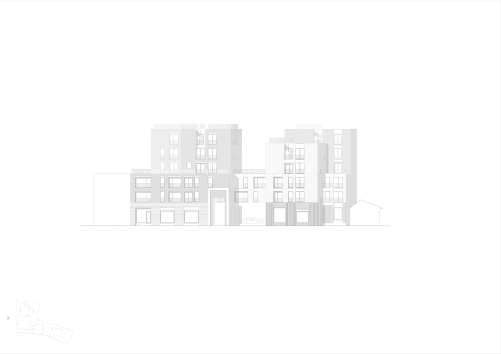
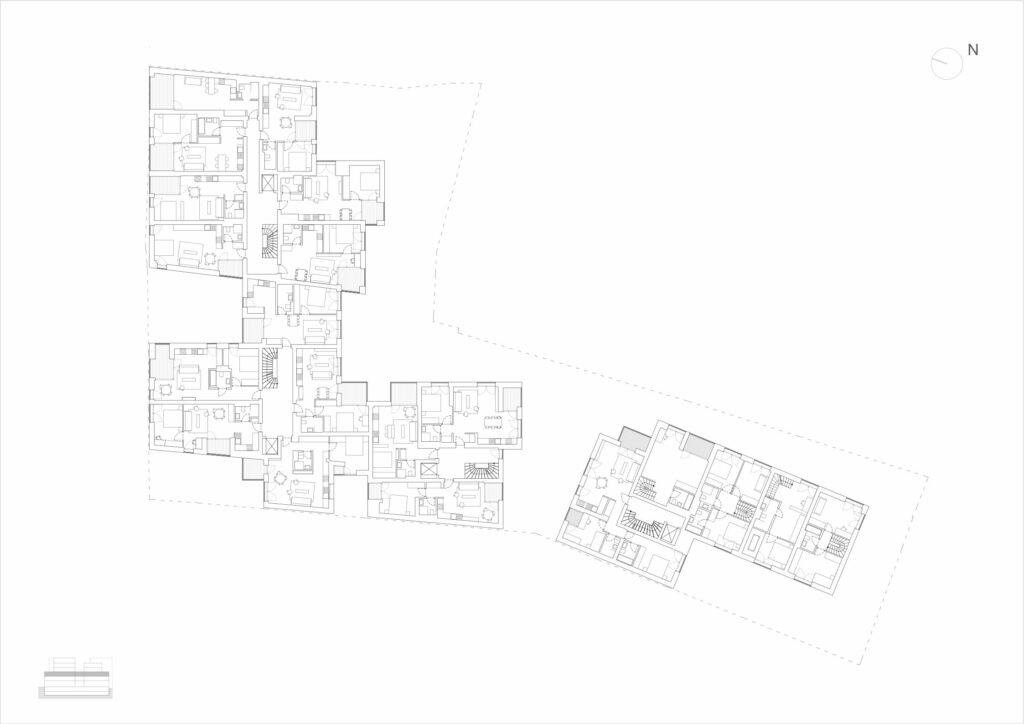
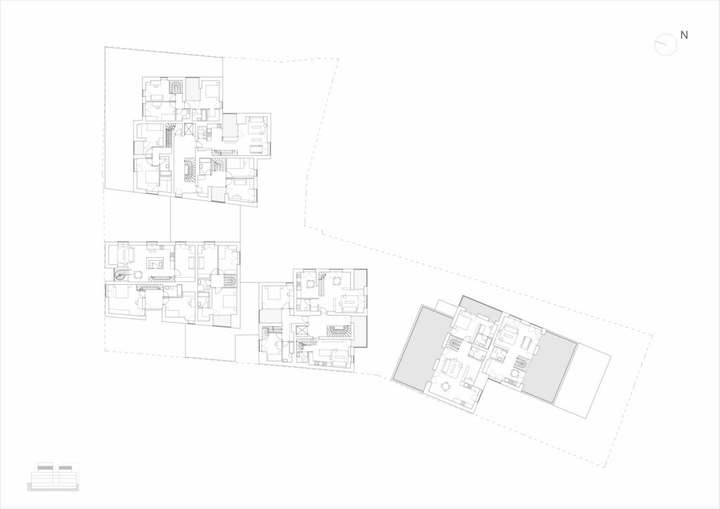
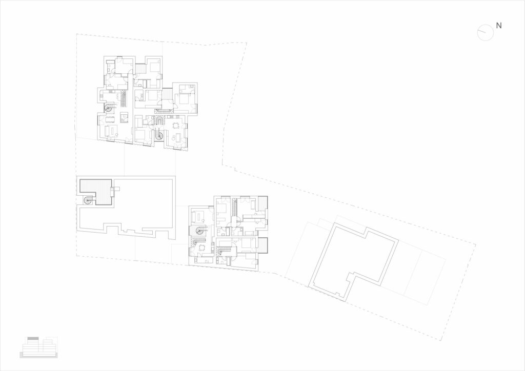
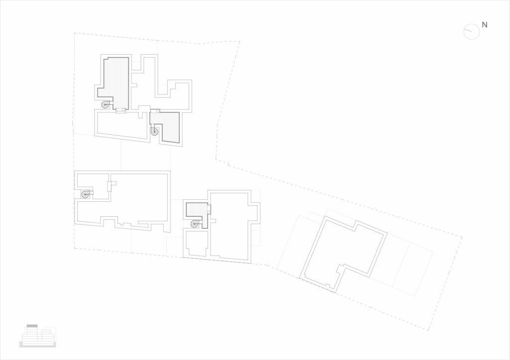
Given the complicated shape of the plot on Sfinții Voievozi St., 4 units were designed. The two facing the street continue the existing alignment. They are strongly connected between themselves and with the third module, creating an assembly whose continuity is interrupted by a generous passage and by various faults, cut-outs, recesses creating terraces and loggias. The last one is separate and placed at the extremity of the plot, but close to the others and participating in the overall dynamics and character. The dead walls are nearly completely covered, the neighbours’ yards are extended by the assembly’ courtyards, it becomes part of the urban fabric.
Due to these conditions, the empty space is therefore rather tentacular, slimming down in certain places, and wider where possible.
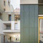
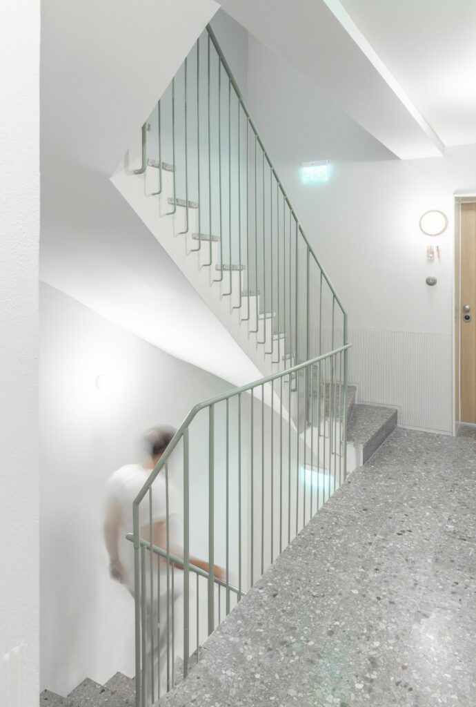
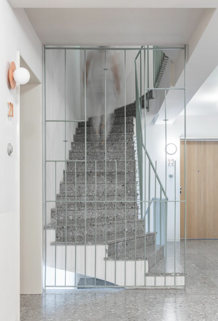
On the other hand, the interior common spaces, with more public functions, are generous. They are completely covering the ground floors of the first three bodies, which also entails a courageous openness towards the city from the interior of the plot, and turns the passage from a way through to a public space during the day. The city is entering the plot and the building.
Living in a Block, Living in a House
The variety of living units is remarkable, although there are fewer types than in the Dogarilor experiment. It also doesn’t quite address the same type of owners: we are no longer dealing with small housing, meant for a middle class largely consisting of members of creative professions, but with high-standing apartments.
Here, the diversity largely derives from the response to different situations. First, it is about essential situations of living. Thus, apartments on the ground floor of body 4 enjoy private gardens.
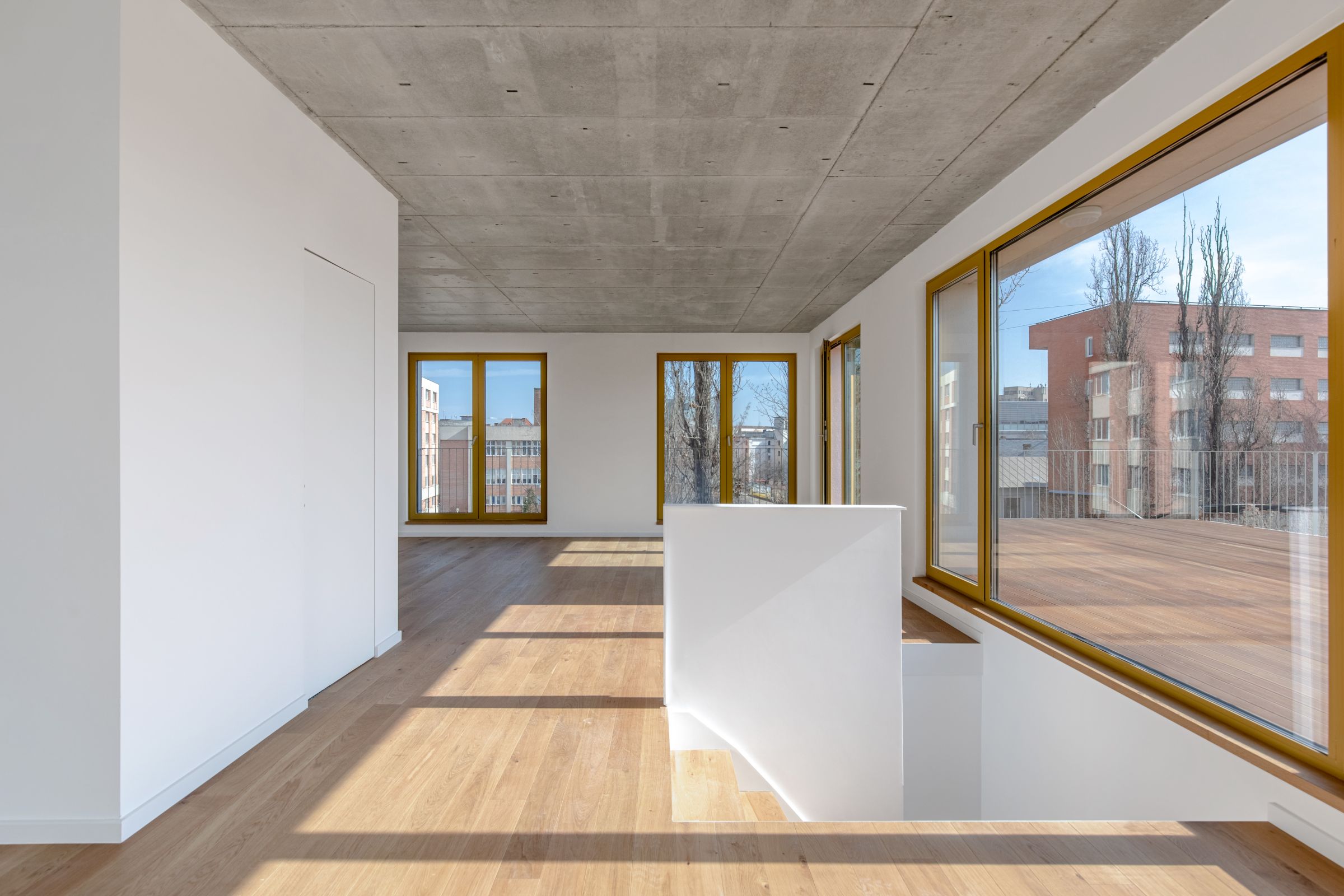
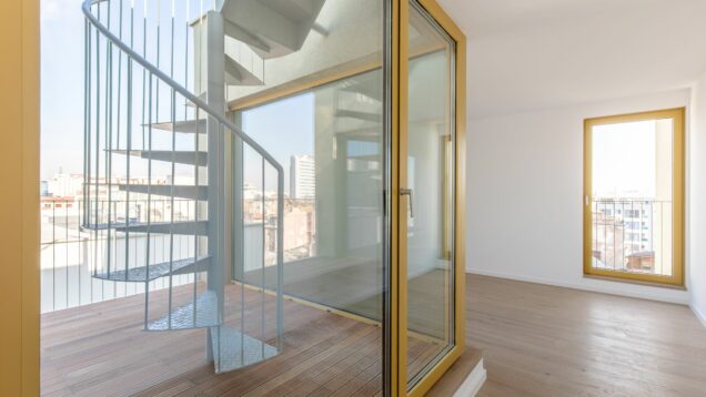
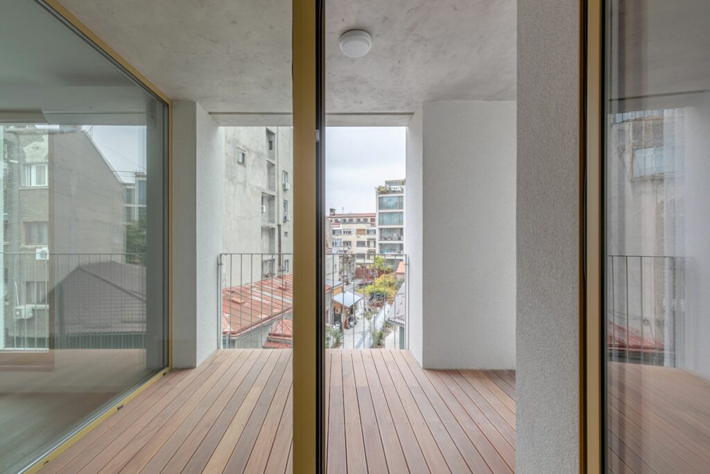
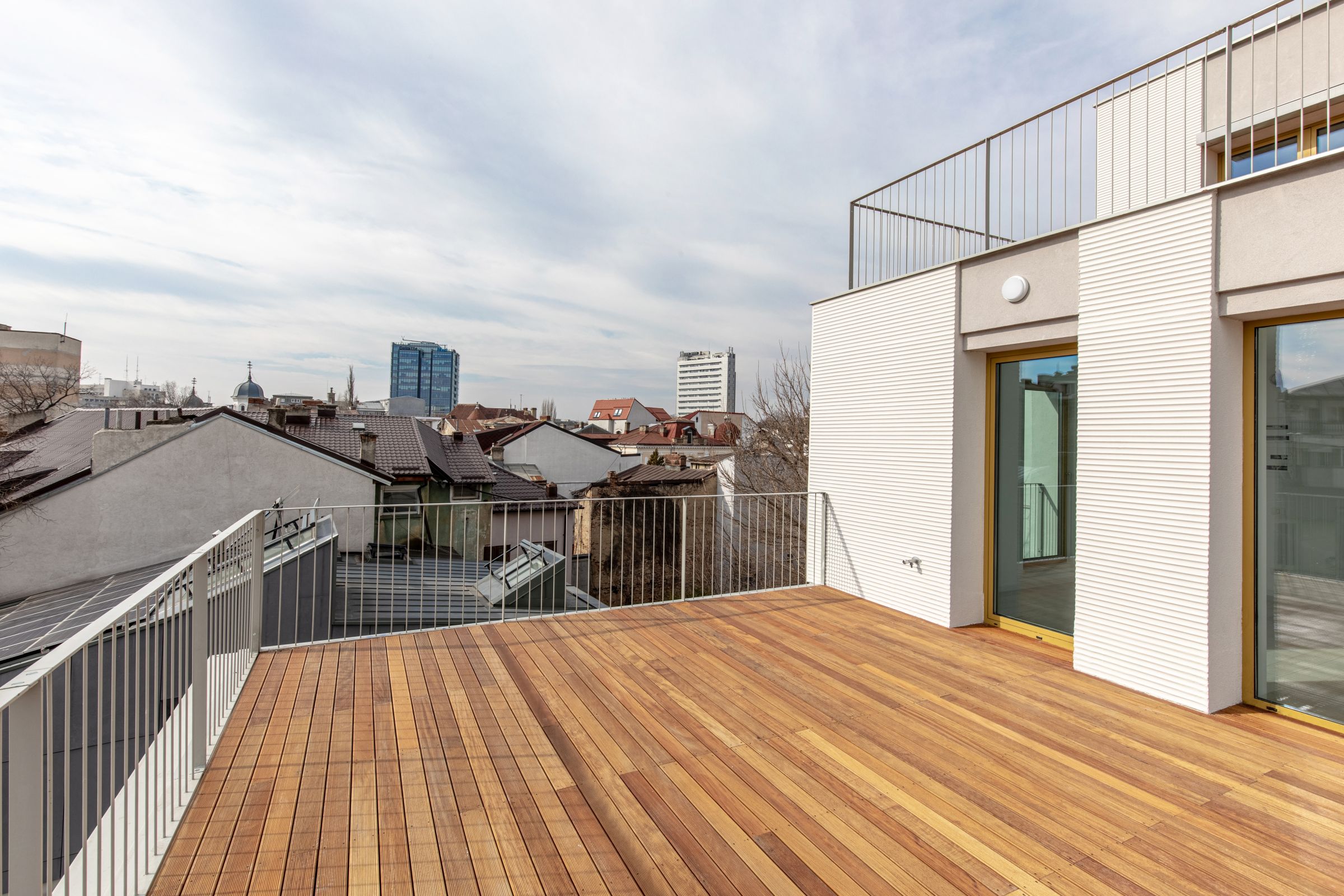
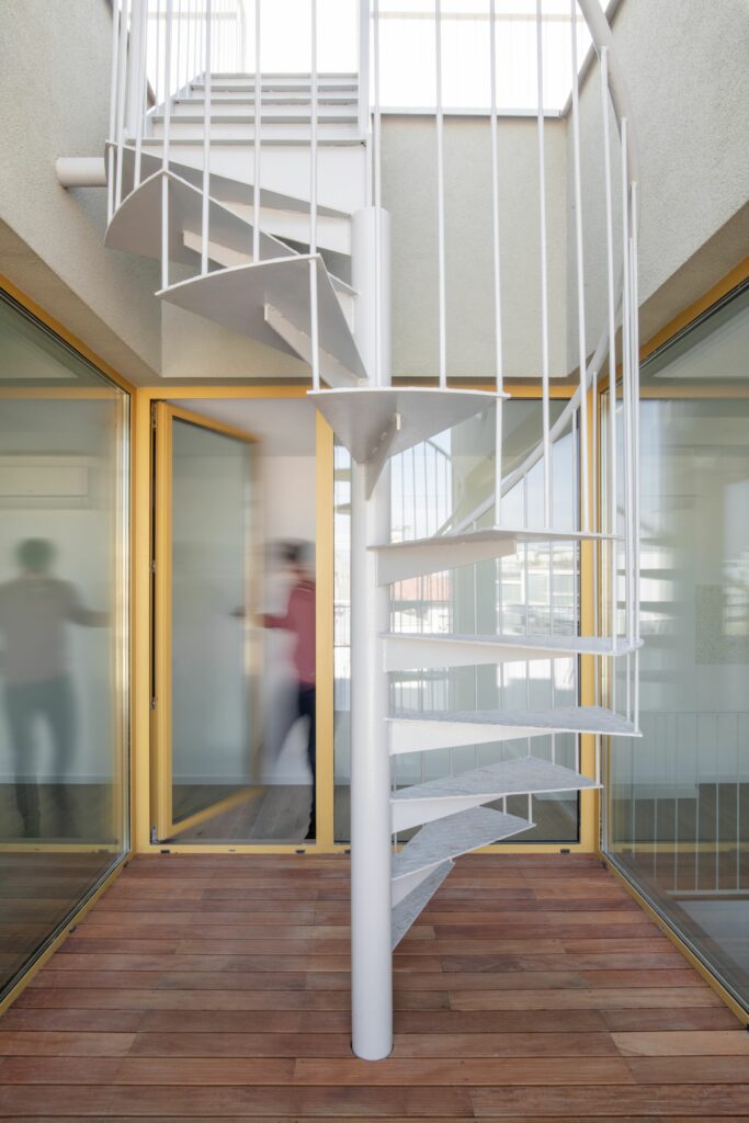
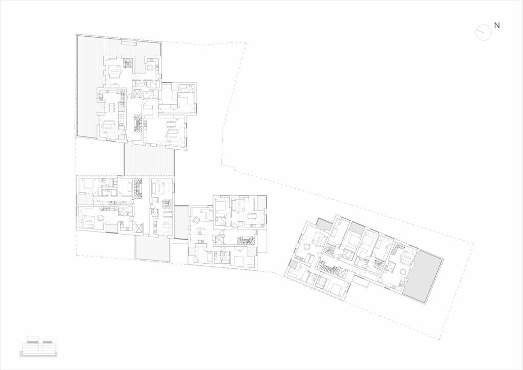
Where the floors recess or where other cut-outs appear, generous walk-through terraces are born, ant that includes the last floor, where the roof becomes truly inhabitable, along the principles of classical Modernism.
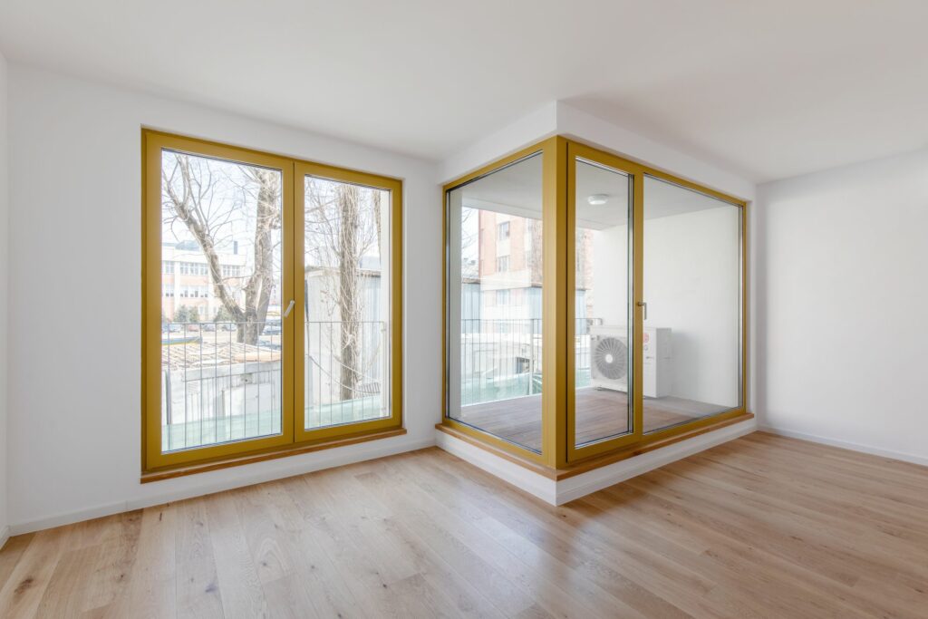
Nevertheless, all the units have a private exterior space, in the form of a balcony or a loggia.
The latter are the more precious, as, although bringing a huge contribution to the quality of living (everyone wants an open-air room), they are quite rare in Romania today. As they cost more and are sold cheaper per square meter than the interiors, most investors systematically refuse them.
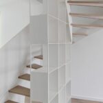
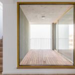
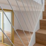
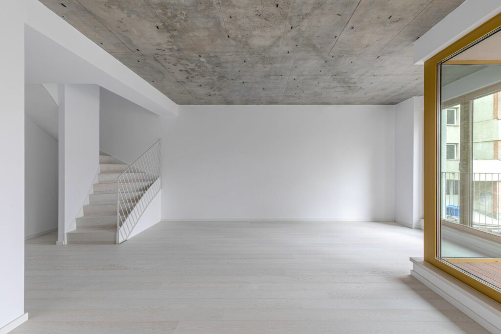
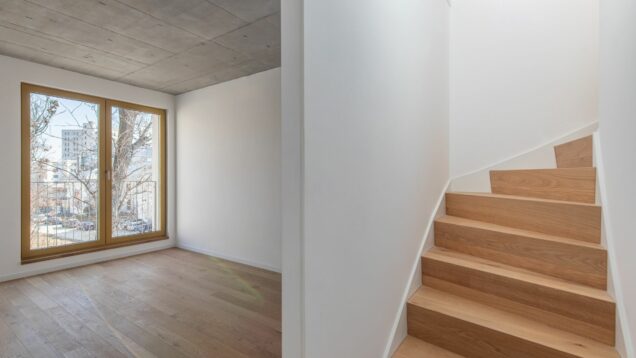
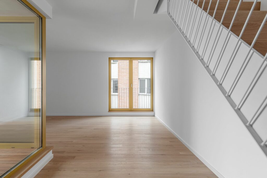
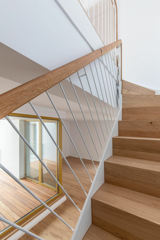
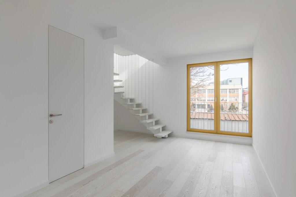
Beyond the vertical position, the differences between the types of apartments occur naturally out of the number of rooms, out of the desire to introduce two-level apartments – one of the main elements that brings an apartment closer to the qualities of a house, as well as from the situation against the context: dead wall connections or other urbanistic rules force the twisting of some spaces, but also the search for natural light and the sun. The result is a joining of modules, a complex system of interior and exterior spaces, a dwelling with lots of light and rich spaces.
Collage and classicism
Within the architectural expression of the Dogarilor St. complex, the tectonic character prevails. A modular grid connects all: the gaps, the facade plating, the delicate elements of the loggias, the semi-transparent railing, all these enter a raster of vertical and horizontal lines.
Here, the approach is different. Of course, there still is modulation (one which starts organically, from the structure and interior compartmentalization). But it is less evident; the organization of facades seems to start rather from the principle of collage. Of course, I do not mean here the rather pejorative and, in my opinion, wrong connotations of the term. Collage, in the good architectural and urban sense, is not the arbitrary juxtaposing of objects, but the articulation of elements which can differ greatly; a dialogue that is freer (and generally more tolerant) than in other design paradigms, based on rules, a coexistence of realities, references, spaces.
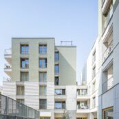
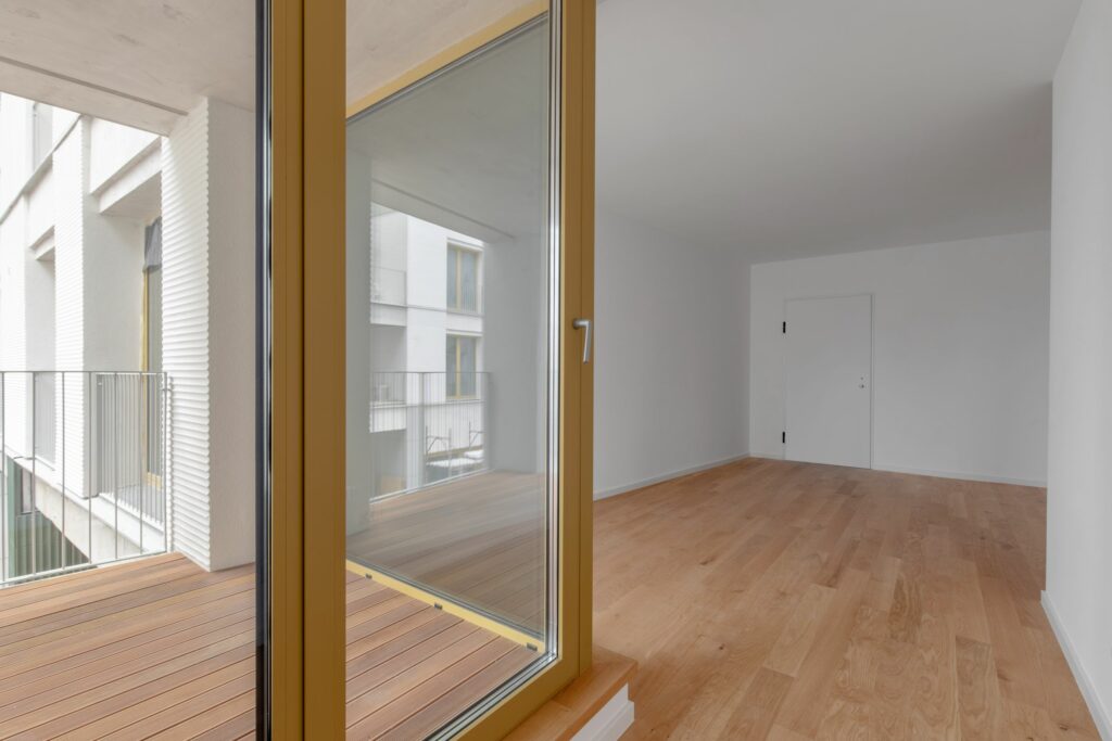
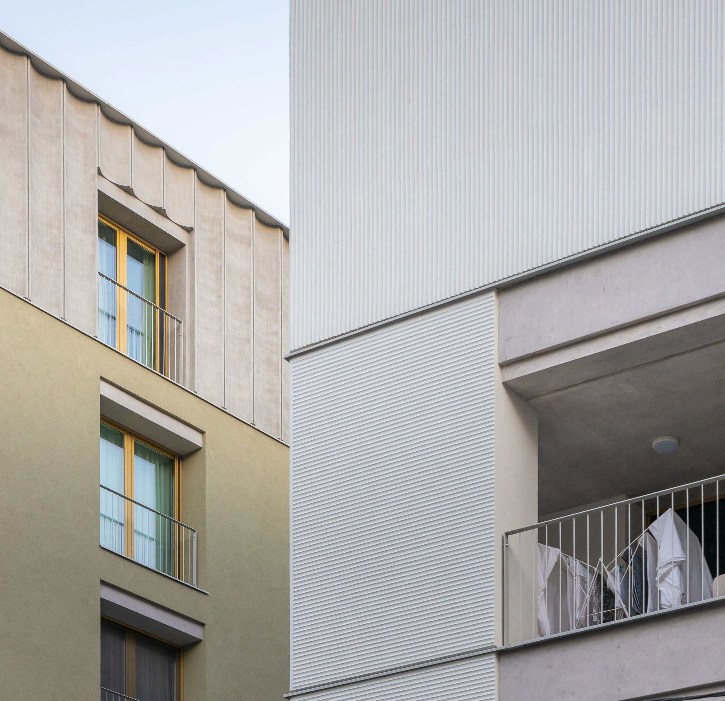
If we look closely, the facade’s energetic composition starts from a reduced set of elements. On the one hand, we have the materials: plastering with varying granulations and ceramic plating; then a French window module, with coloured metal joinery, with individual or multiplied presence, railings and horizontal metal profiles which divide the facade into registers; an ornamental model with edges and concave curves, inflected in several dimensions (from larger waves, visible from afar, to a very narrow rhythm which is more like a texture), which also occurs on the inside and which stands both horizontally, and vertically; and, finally, the colours.
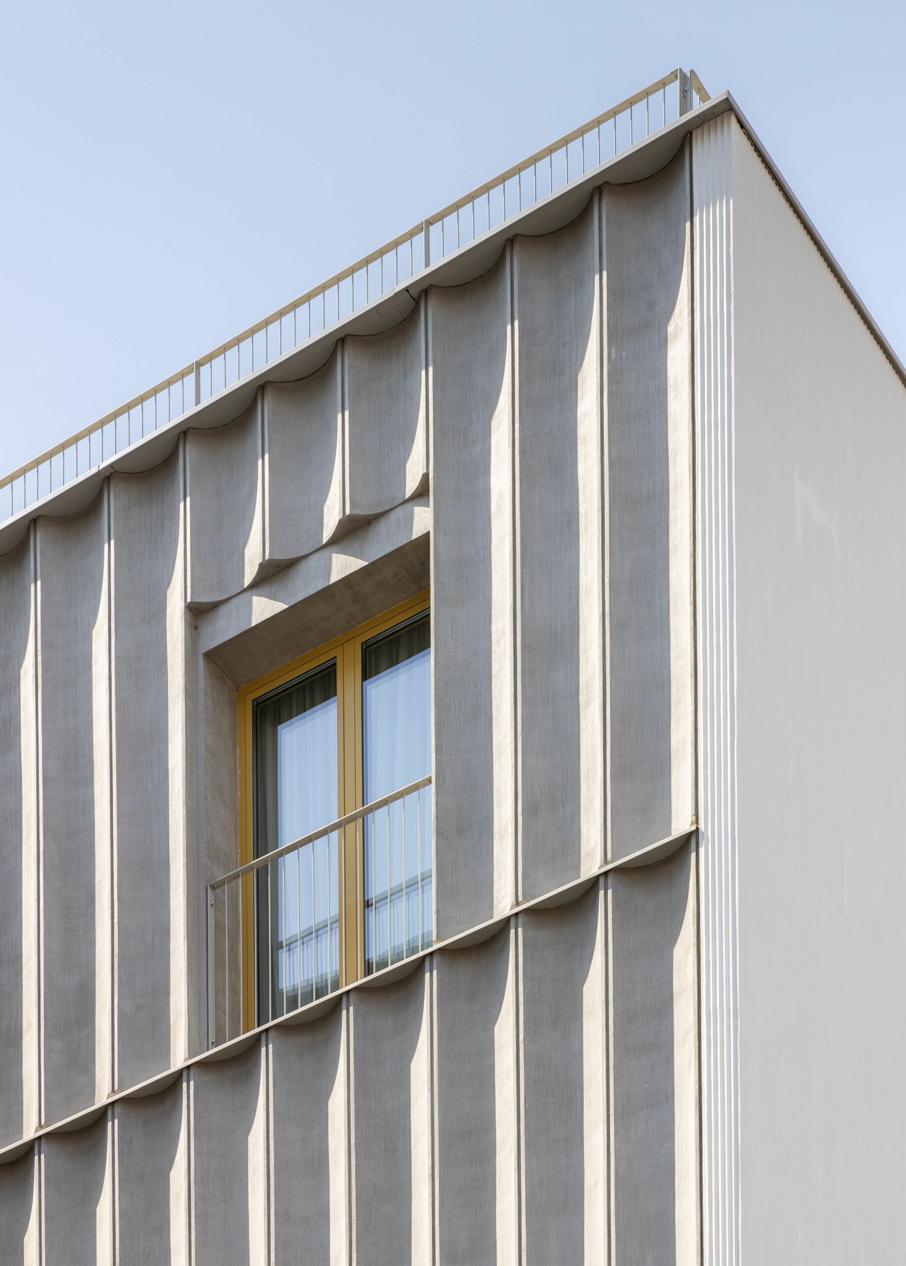 *Detail: Anti-classical pilaster
The joining or overlapping of these categories determine the final expression.
This fragmentation, which continues the one of volumes, is a great help in attenuating the general scale, in the relationship between the new construction and the neighbours or in avoiding the feeling of claustration in the case of parts of the construction that are very close together. The fact that it works and that it does not generate disorder is due to the reduction of elements and to the intelligent way of composing them, but also to the architects’ choice to work with an essentialized and interpreted classical vocabulary. The classicism of various types is so deeply ingrained in our visual culture – and this is in no way just about the architects – that we distinguish and appreciate it even unconsciously. Fortunately, there are absolutely no pastiches or vulgarizations of the classical vocabulary here, ones which are unfortunately so much present in Bucharest, from the Ceausescu-era assemblies to the recent horrors by certain developers. We are in the land of subtle suggestion and normality. The plinth, for instance, materialized here through ceramic plates, is a fundamental architectural element. Likewise, the horizontal registers or the already-mentioned vertical window. The cleaned “pilaster” found in some of the corners expresses quite well the general method: we can also find the original classicism, the mitigation action, but also the playful hijacking– for here the pilaster only appears on one of the adjacent facades. It no longer suggests the embedded pillar, the solidity, but rather the open corner of Modernism, and it assumes the role of mainly covering the construction underneath.
The complex on Sfinții Voievozi Street is ludic, dignified and friendly, it is inscribed in the rule of the street and of the city, and it builds secret places for itself. The apartments are desired, the interior public spaces are nearly done. I am waiting to see how this place will fill with life.
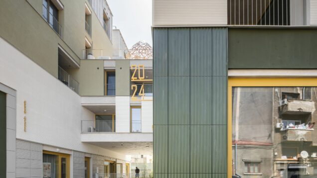
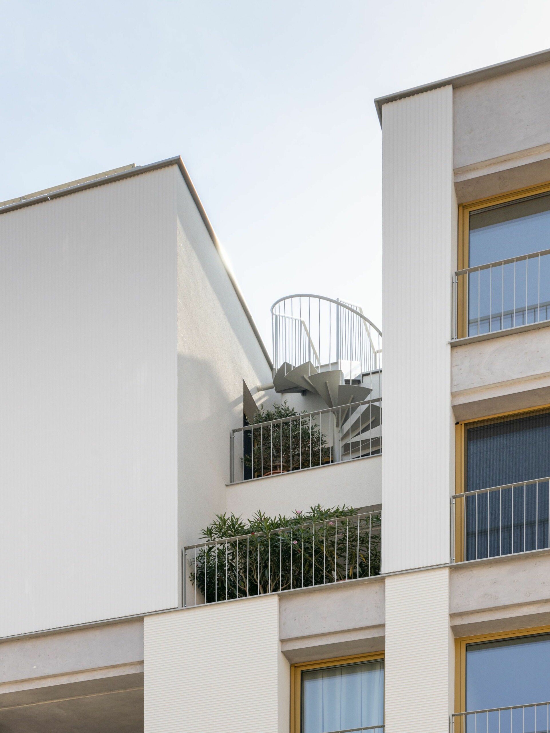 *Detail: fragmentation and the complex interior-exterior relation
Plans
Info & credits
Urban Spaces 5
Adress: Sfinții Voievozi 22-24
Building site: 2018-2022
Plot area (sqm): 2359
Total built area above ground(sqm) : 5972.85
Architecture: ADNBA – Authors:Autori: Andrei Șerbescu, Adrian Untaru, Bogdan Brădățeanu, Petra Bodea, Valentina Țigâră, Elena Zară, Mihail Filipenco, Adrian Bratu
Collaborators: Traian Iacob, Chan-Woo Park, Diana Buță, Ana Băbuș, Radu Constantin
Structure: Incona
Installations: Alma Instal Pro
Landscape architecture: Senzui Atelier de Peisagistică
Project management : Vision Property Partners

