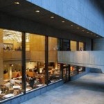
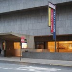
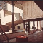
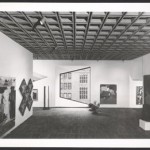
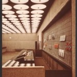
The Whitney Museum – a model for contemporary minimalist architecture – successfully embodies the idea of integrating arts, design, architecture, and the building in a unique conceptual gesture.
The Traveling Master
A major representative of European architectural avant-garde, Marcel Breuer belongs to the generation of Modernist architects trained at the Bauhaus school. His projects successfully manage to develop the Bauhaus principles by integrating functional, social, structural, as well as conceptual and aesthetic aspects. Born in Péch (Hungary) in 1902 – the same year that Arne Jacobsen and José Luis Sert were born – Breuer briefly studied arts in Vienna and then moved on to study architecture at the Bauhaus School in Weimar from 1921 until 1924 under Walter Gropius. In 1924 he made the acquaintance of Le Corbusier in Paris. One year later he returned to the Bauhaus only this time upon Gropius’ invitation as a member of the teaching staff (in the meanwhile the school had moved from Weimar to Dessau). His interior designs and furniture pieces made of stainless steel tubular frames won him an international reputation. The period 1928 to 1937 was marked by great changes in Europe’s politics; Breuer was on a permanent professional quest, traveling extensively through Germany, Hungary Greece, Morocco, Spain, Great Britain, and Switzerland (where he met historian Sigfried Giedion for whom he designed the Dolderthal apartment block in Zürich). Forced by historical circumstances, Breuer joined the long line of eminent European architects who emigrated to the United States: Walter Gropius, Mies van der Rohe, L.L. Rado, José Luis Sert, and Antonin Raymond. In 1937 he was invited to join the academic body at the Harvard School of Architecture. Edward Larrabee Barnes, Ulrich Franzen, Ieoh Ming Pei, Paul Rudolph, and Philip Johnson count among his most notable students there.
From „White Boxes” to „Brutalism”
The Whitney Museum of American Art (1963–1964 in collaboration with Hamilton Smith) and the UNESCO Paris headquarters (1953 in collaboration with Pier Luigi Nervi and Bernard Zehrfuss) are the master’s best-known achievements, emblematic of his mature years, and genuine landmarks of the late Modern Movement’s post-war “Brutalism”. Brutalism as a style took a critical stance with regard to the interwar Modern Movement, being characterized by bold forms, sculptural images, and massive volumes. It relies heavily on new building technologies and “honesty of expression” in the use of raw materials such as concrete, brick, stone, wood and timber, and steel whose roughness or else “brutal” outlook is displayed by Louis I. Kahn and Le Corbusier in their late years, by I.M. Pei and James Stirling in their early years, by Paul Rudolph, Alison & Peter Smithson, Johannes van den Broek & Jacob Bakema, as well as by many others.
The New York museum on the southeast corner of Madison Avenue and Seventy-Fifth Street is totally clad in grey granite; its image takes onlookers by surprise with its opaque surfaces and its totally unusual modeling of volumes which seems to undermine the very structural stability of the building. The insert takes up the entire corner site; the building’s Madison Avenue façade is gradually and unconventionally scaled top to bottom thereby generating the image of an upside-down ziggurat. The same effect is continued at basement level, where a sunken sculpture courtyard separates the museum world from the lively street life outside. A suspended bridge made of raw concrete bridges the sunken garden and sets the tone for the ceremonial entrance into the building’s main lobby by piercing the glazing and giving visitors the impression they enter the building space before actually crossing the doorway.
Reaching a fine balance: context, function, structure, materials, and light
Architecture was forced to take into consideration the constraints set by the site, the museum programme requirements, as well as institutional and cultural representational issues. From the outset Breuer was concerned by how a museum should look in the urban “jungle” of New York, a mere 1200 metres from the Solomon R. Guggenheim Museum, Frank Lloyd Wright’s masterpiece (1943–1959). By detaching the façades from those of the neighbouring buildings, grouping traffic and services towards outer walls and designing a spectacular main entrance on Madison Avenue, Breuer avoided a strictly “contextual” reverential attitude and reinforced the message of the architectural form’s complementarity, independence, and sculptural quality, just like he had argued in the project’s description of 1963. Although ascertained as an “architectural sculpture” the Whitney Museum is no object indifferent to context. Visual linkages to the street are strongly voiced particularly around the entrance area and the sunken courtyard.
The prismatic volumes and opaque façades allowed for a perimetral distribution of the coffered ceilings’ static forces on reinforced concrete frames thus leaving exhibition halls free of supporting posts. The integrity of the concrete box is only slightly undermined in the recess areas where the 24.7 meter-long opening is spanned by girdled beams dissimulated in the width of the outer walls and which rest exclusively on either ends of the diaphragms of opposite façades. Recesses generate exhibition halls whose depth varies between 17.6 and 36 meters, which can be easily divided by movable partitions along the grid system of the concrete ceiling. The upper floor hides the light wells of administrative offices grouped around the core area occupied by the library so as to avoid counter-acting the ziggurat treatment of the main façade.
For functional reasons, Breuer was against using natural light in the upper-floor exhibition halls, afraid that its reflection onto the façades of surrounding high buildings would alter its quality. Furthermore, the high rate of plot usage (1/7) and the reversed storey-recess made the use of skylights impossible. As a result artificial light was used everywhere except the basement sculpture exhibition hall which takes full advantage of natural light coming through the sunken garden. The upper floors façades are randomly pierced by small windows which frame fragments of opposite buildings and turn them into “pictures” among other paintings displayed onto the inner exhibition walls whereas their presence as sculptural elements lends the façades a more dynamic quality. The grey granite façades and the roughness of concrete surfaces enable the building to confront the passage of time with honesty and a touch of noblesse whereas the white façades of the Guggenheim Museum, more sensitive to urban pollution, had to be subjected to a major “rejuvenating” exercise in 2007 to preserve their pure, abstract, intemporal appeal.
The Minimalist Manifesto
To this day the Whitney Museum retained a surprisingly fresh quality that defies aesthetic categories and historic labels. By refining constructive principles and emphasizing the quality of multiple sensorial architectural experiences, Marcel Breuer inspired a variety of contemporary Swiss, Spanish, Scandinavian, British, and Japanese architects who chose to wisely continue the Modern tradition. Among them Rafael Moneo, the Snøhetta group, and the Bearth & Deplazes team deserve special mention. Art, architecture, and design blended almost miraculously in Breuer’s professional practice; the Whitney Museum can be seen as a Minimalist Art object as much as it can be seen as a raw model for the architectural and design ‘minimalism’ of the 1990s – 2000s.
The conclusions drawn by Marcel Breuer in the speech he delivered in December 1963 at the Cornell University are as meaningful for the architectural practice today as they were then. The architect pleaded for the reinstatement of the tactile quality of surfaces characteristic of architectural experiences, a refined understanding of the role light plays in conjunction with the quality of materials, a balancing of opaque – transparent relations in a building’s exterior shell, an in-depth modeling of façades, and a critical and expressive reappraisal of constructive details. According to Breuer, “‘integration’ is not a word to be repeated or some form of good intention, but rather an automatic, instantaneous necessity, a reflex gesture”.
Translation: Codruta Cruceanu
Old photos: Courtesy of the Marcel Breuer papers, 1920–1986, Archives of American Art, Smithsonian Institution
Present situation photos: Cosmin Caciuc

