Text: Ștefan Ghenciulescu
Photo: Vlad Pătru, Sabin Prodan
As in all Romanian large cities (and many of smaller ones), buildings have boomed in Brasov since 2000. Its particular situation has led to some very varied types of increase: limited in the historical centre, extensive on the outskirts, where unused farmland and most industrial areas (where valuable and representative city heritage was erased) were taken up by services, housing developments, even new factories, and densification, in the neighbourhoods right outside the medieval core. Most of the latter had been erected since the 19th century up to World War I, on the more accessible slopes on the hills surrounding the medieval city. As such, new interventions, often brutal, changed not only their immediate context, that of the picturesque streets and houses, but the city skyline as well. A pressure that is hard to resist, and which was also expressed in a few now legendary examples, such as the attempt to get a building permit for buildings as only having a ground floor, an upper floor but then more than ten underground levels, which were, in fact, living levels, situated down slope from the access level.
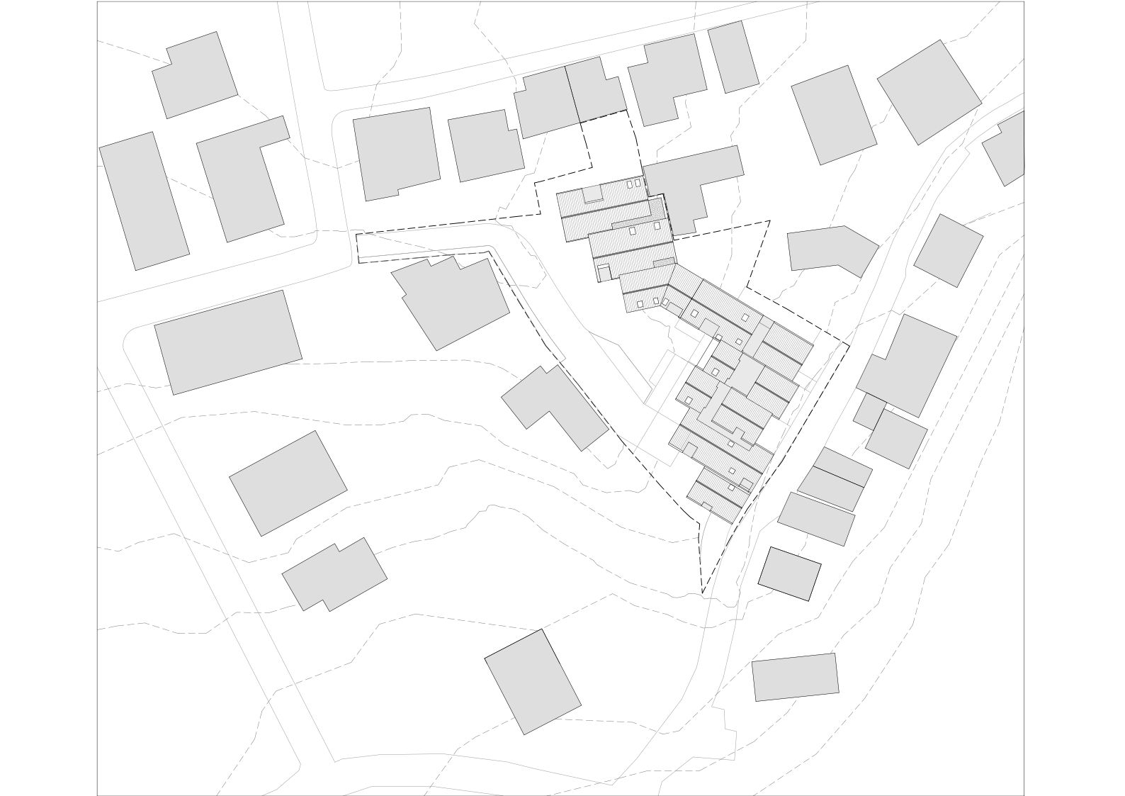
The real estate operation we are discussing here is very much removed from such excesses. It finds its place in a neighbourhood that was already complete prior to 1990, and which fully complies with the local regulations. Nevertheless, the density is still considerable, and it faced the architects with a series of essential issues: how to insert a large volume so as not to assault vicinities, how to create a development of several dozen apartments and garages on a plot with a steep slope, so that everyone should receive air, light, intimacy, and, inasmuch as possible, views, and, finally, how to fall within an urban context (and a natural one, as nature is still very much present on Brasov’s hills).
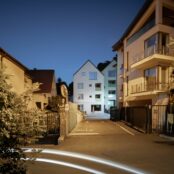
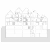
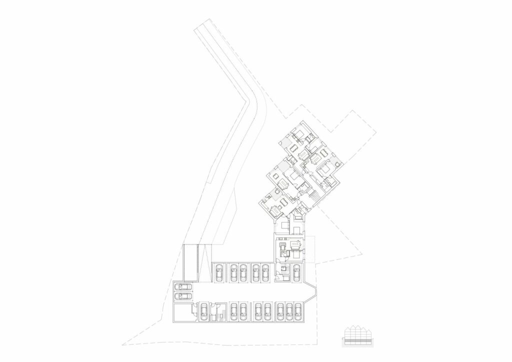
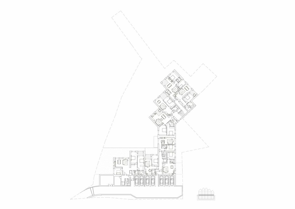
The solution in principle not only solves, but also takes advantage of the slope: the building is partially dug into, partially covering the hill. The parking levels are almost entirely dug into the land. On the other hand, it is the very incline which allows for a level which is underground when compared to the highest elevation to become underground at the lower level. The building’s cornice very correctly and naturally descends with the slope. The development has two main facades and two access points: the upper one, on Olarilor Street, and the lower one, on Neagoe Basarab Street.
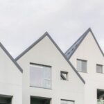
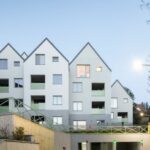
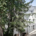
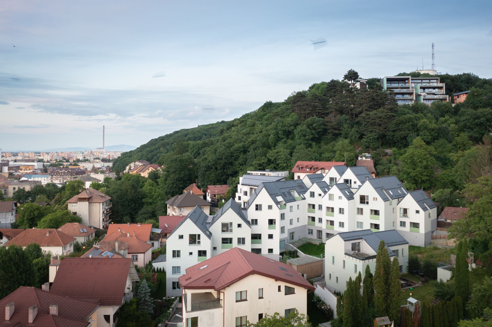
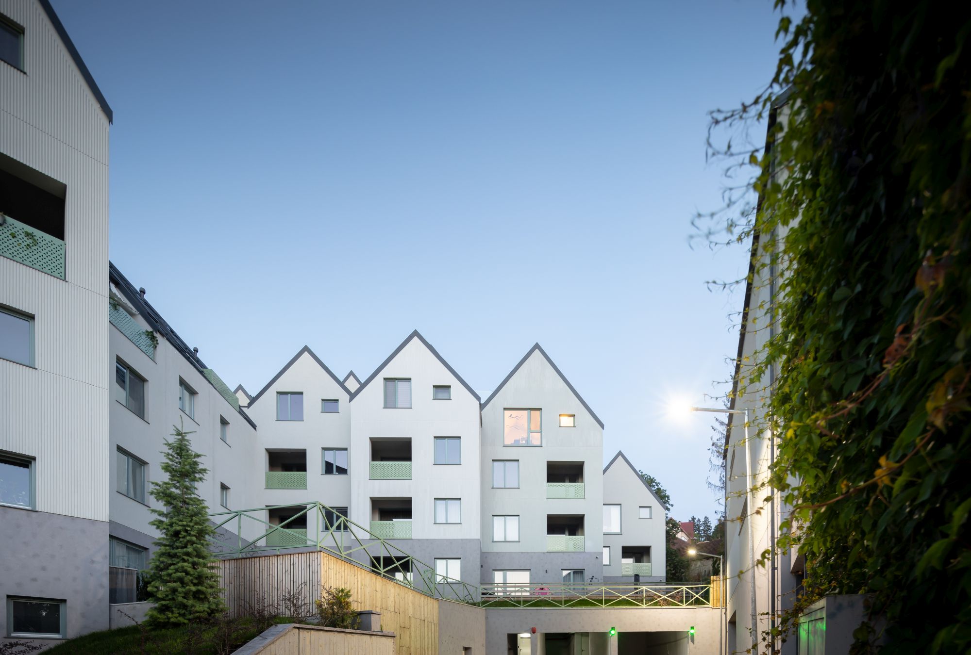
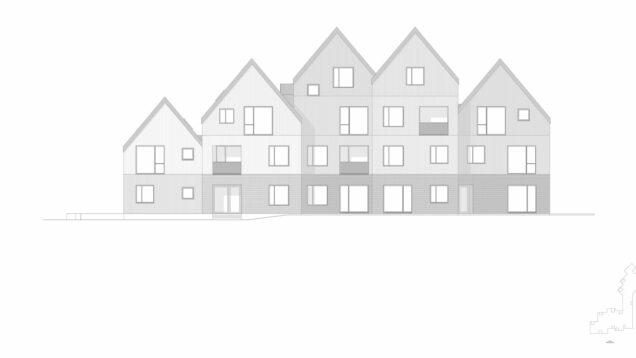
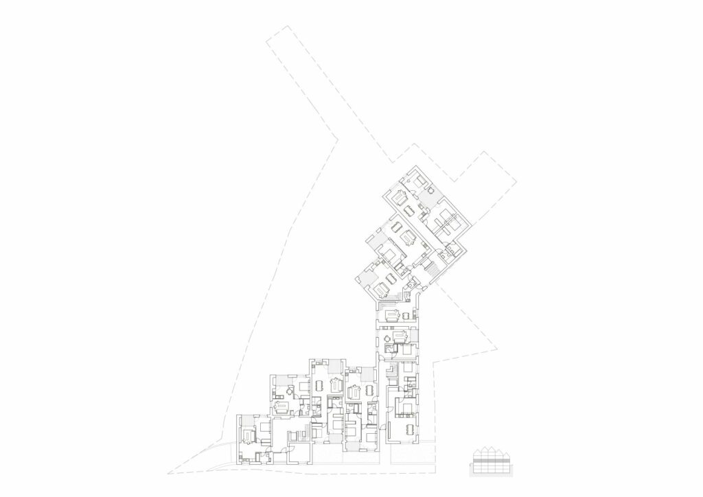
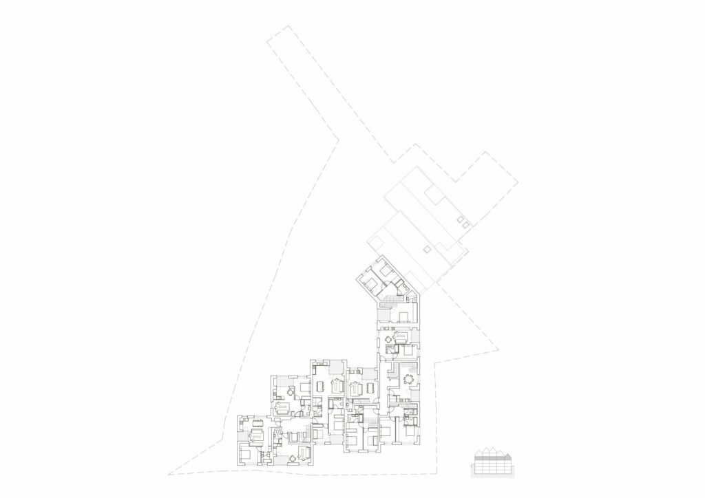
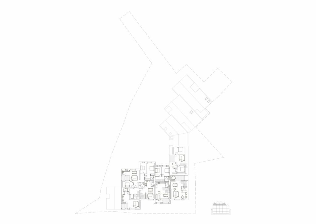
The second strategic gesture is that of breaking the built mass into a series of “houses” – volumes which, both on a plane level, but especially on the vertical, are searching for and expressing their autonomy. This is not just about a volumetric treatment – the interior layout of the living units and of the circulations follows the major gesture. These volumes are covered with a roof truss, which corresponds to the cold climate, not friendly to flat roofs. But the truss also contributes to the individualization of building parts and to the archetypal image of living: you really do not feel like you are living in an apartment building, but in a neighbourhood of larger houses. Besides, the sloped roof means attics, therefore a reduction in volume, as well as a differentiation when section is concerned: instead of identical or quasi-identical floors, there is quite a diversity of dwelling: there is a different type of living on the ground floor, on the intermediary floors, or in the attic.
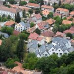
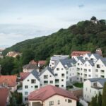
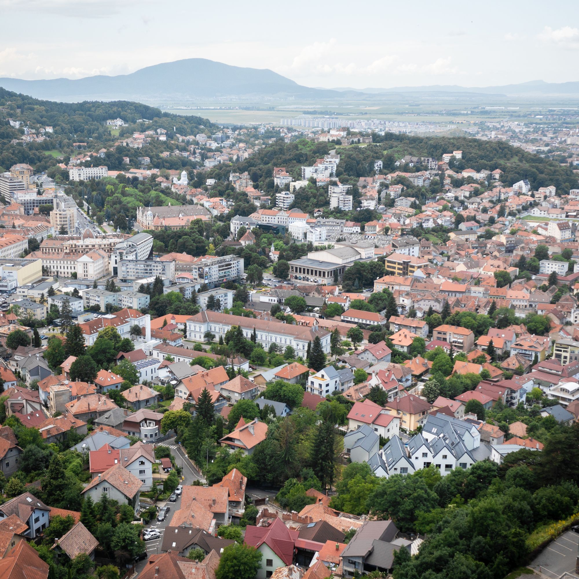
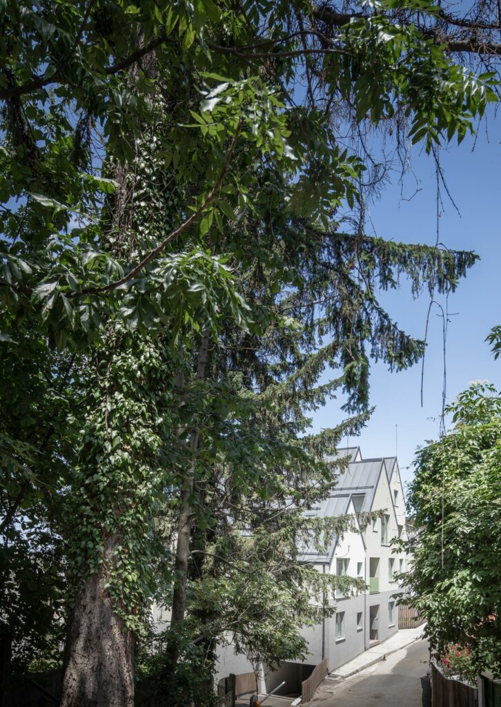
The fragmented collection of roofs and articulated volumes front is much better positioned in the near context, that of small houses and collective buildings in its vicinity, and, most importantly, in the city skyline. At street level, the building is not seen from a greater distance, but is very visible from the hills around the city centre. Seen from above, it merges with the sea of tall roofs, so characteristic for Transylvanian towns.
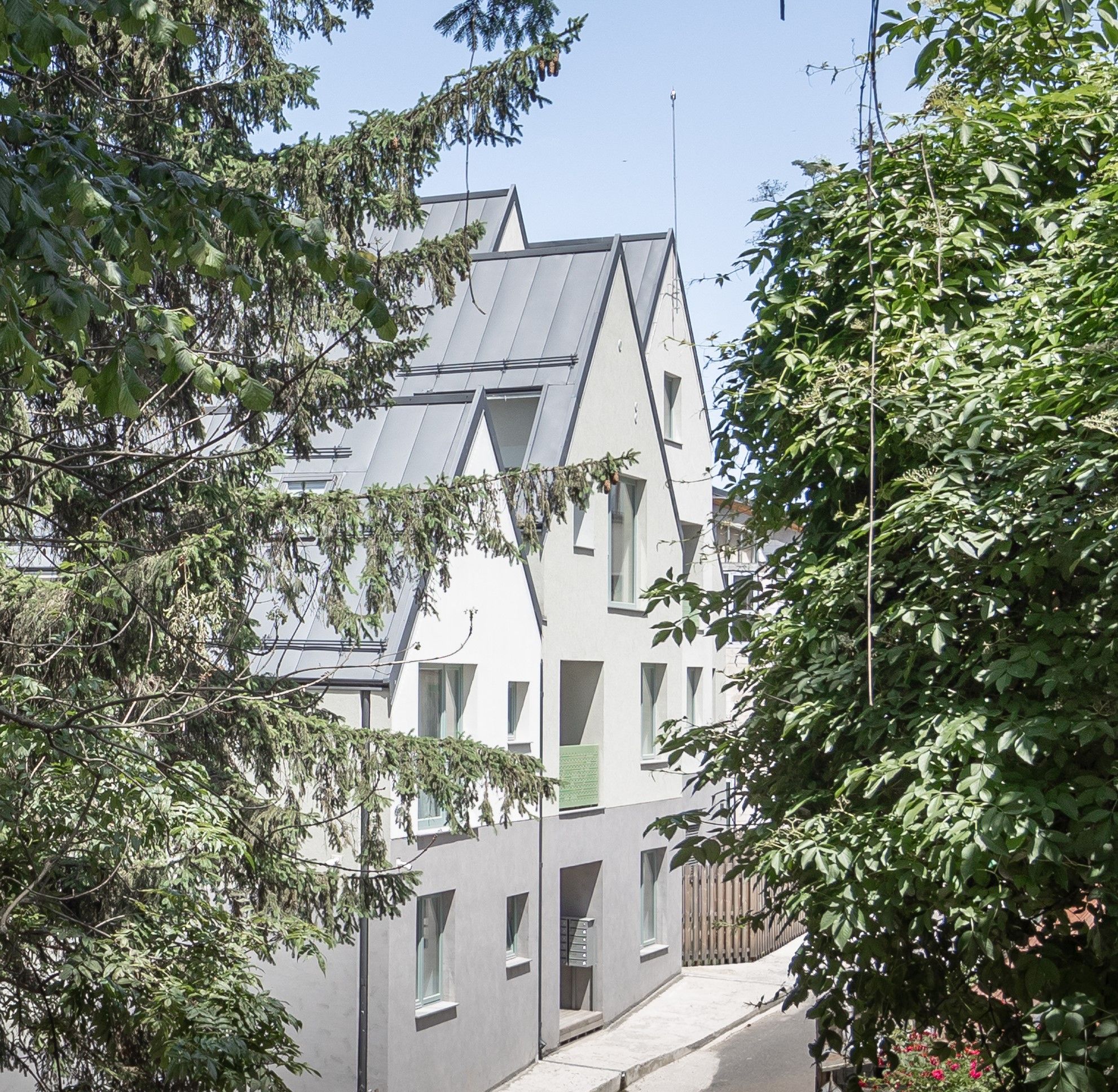
The declivity we were mentioning earlier is not homogenous. On the one hand, the architectural principle allows each house to go down or up as compared to its neighbours, on the other hand, the average slope of the development is easier than that of the terrain. This leads to very different situations against the two streets. Up on the hill, on Olari Street, facing neighbours of lower elevation and the forest, there emerges a front with advancements and withdrawals, consisting of houses with ground floor and attic, ground floor and one or two levels. It certainly is the most favourable part from an urban and architectural point of view. The image is a domestic and charming one.
On the Neagoe Basarab Street, the building unavoidably becomes taller and bigger. It is true that down here the neighbourhood density is also increased, and there are more new buildings. The arrangement of modules slightly diminishes the overall impact, marking a recess and a wider space towards the access path. Truth is, this space is largely occupied by the alley and two-way drive to the parking space. We are dealing not only with an architectural choice, but also with requirements from urban regulations and from the market, which lead to a huge number of cars, therefore, of parking space. Well, the Romanian society still is one favouring large and numerous cars. These being said, I also believe that more vegetation, as much as possible, would diminish the mineral and rather hard image of the empty space.
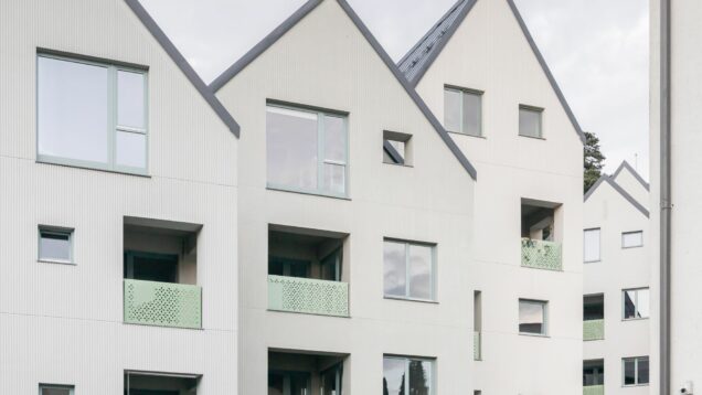
Fortunately, it was not only the architects, but the investor as well who wished for a more powerful presence of intermediary spaces. Most apartments have generous loggias, a rare element in the Romanian real estate landscape, as the loggia is considered when it comes to land occupancy, has the same cost as an interior space, but is sold for less money. Their presence here is beneficial, as is that of the large, glazed surfaces, bringing light and context to the interior.
Even though I was not fully convinced by all the finishing, textures, and details (there are compromises, especially in the entrance halls), the variety of plastering on the facades came out rather well and have the role of subtly differentiating the modules and defining a plinth which fragments and connects the development to the ground rather well. The development itself is interpreting a classical model and, alongside the perforated metal guards, provides the building with human scale and finesse.
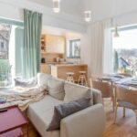
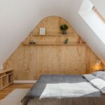
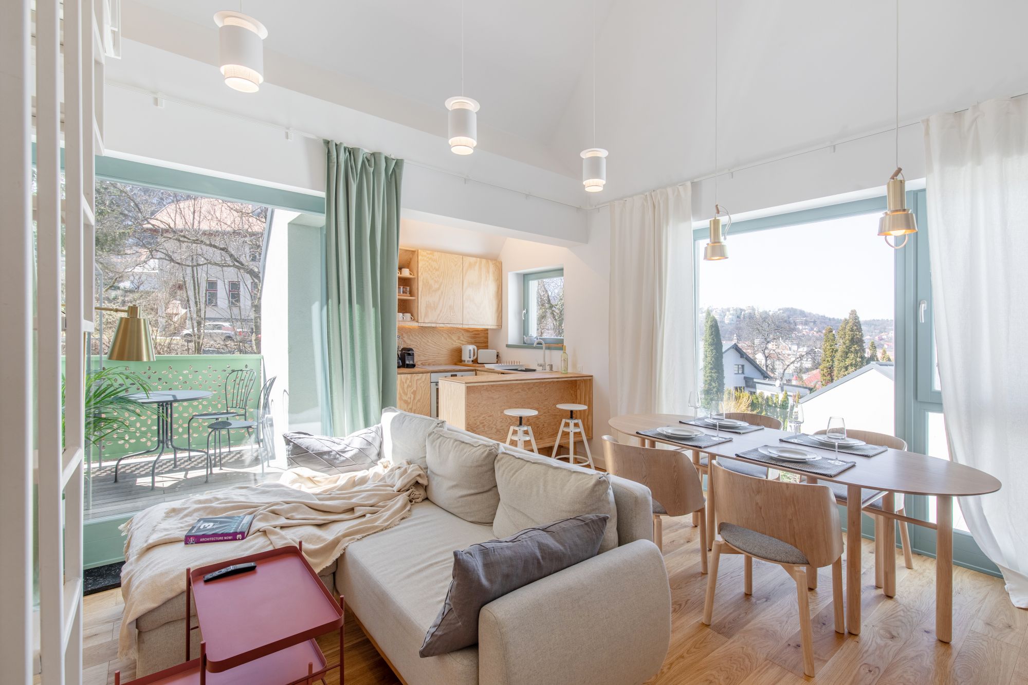
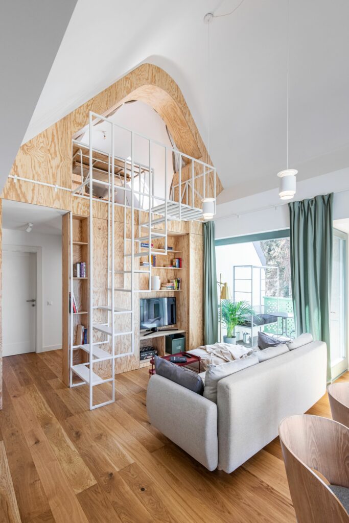
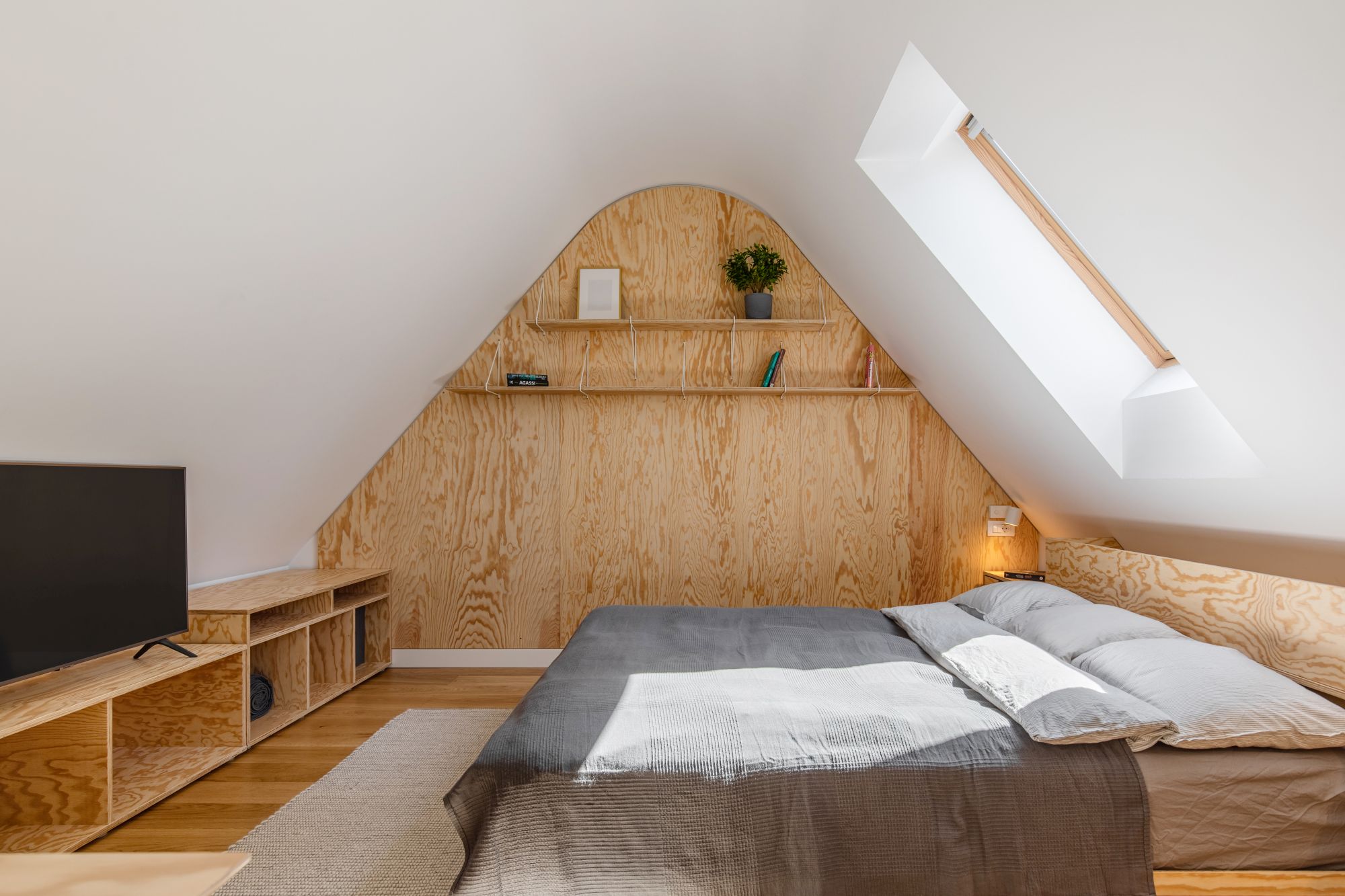
I visited and I enjoyed an attic apartment, set up by the ADNBA. The space is clean and elegant. The large, whitewashed areas, as well as the embedded furniture and the areas covered in plywood, provide the place with warmth and domesticity, avoiding at the same time any type of rustic image.
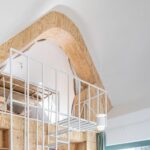
The rounding at the crown and the delicate metal mesh in the staircase and banister to the small split level introduce rhythm and vibration into a simple interior, generously open towards nature and neighbours.
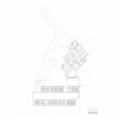
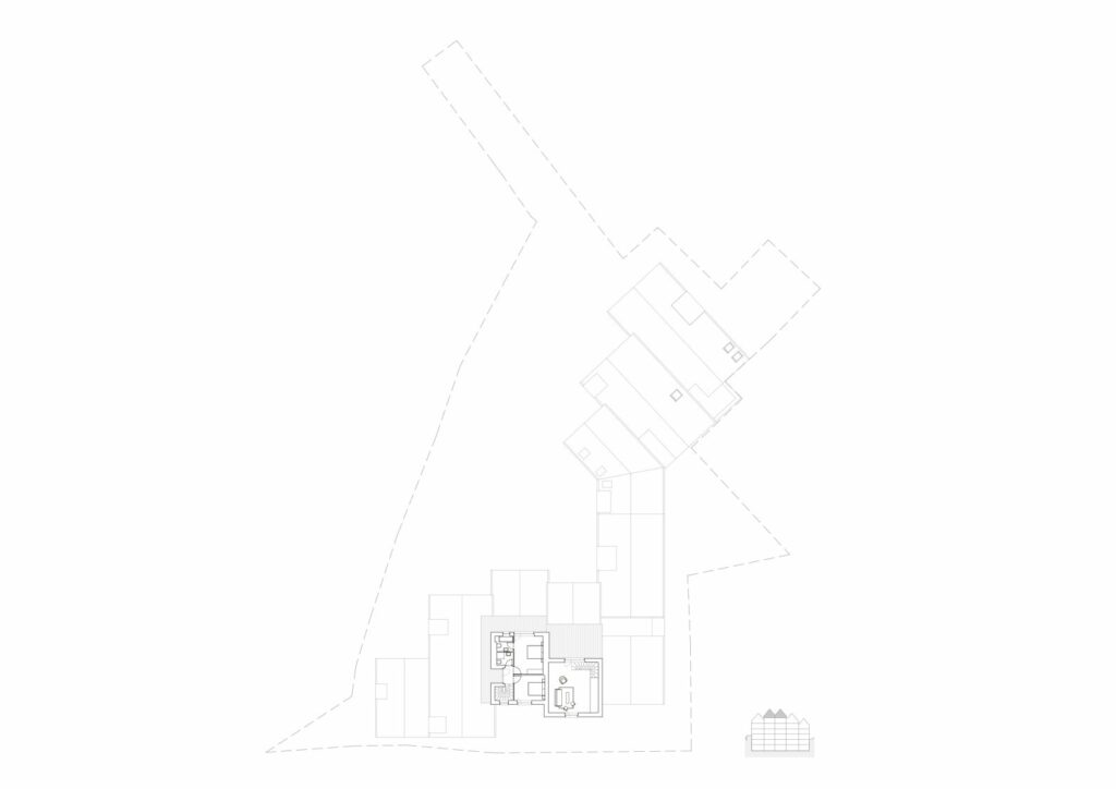
*plans:South-Easdt facade, Section , 2nd basement plan, 1st basement plan, Ground floor plan, 1st floor plan, 2nd floor plan, Attic floor plan
Info & credits
Adress: Str. Neagoe Basarab 59, Brașov, Romania
Client: Bogdan Ciungara
Architecture: Adrian Untaru, Andrei Șerbescu, Bogdan Brădățeanu, Laura Mihalache , Adrian Bratu, Mihaela Dobre
Structure: Plan Expert
Geotechnics: Saidel Engineering
Sanitary installations: Termian
Electrical installations: Romelectro
Plot area: 2546 sqm
Total built area: 3560 sqm
Partner: Caparol

