Two interior designs done in collaboration by SKBD and Lundi et Demi prove the value of hybridization of architecture and object design.
The transfers between architecture and object design might be extremely fertile for both disciplines. The history of modern architecture has counted many architects who have also designed furniture. In many cases, such objects resulted from an obsession with total design: the harmony between the architectural space and furniture. However, Corbu, Mies, Saarinen’s armchairs have become autonomous and classical pieces. Equally, there are some modernist personalities who started as designers such as Breuer and Rietveld, first of all, and of course, Pierre Chareau and his glass house in Paris, and Eileen Grey who are also rated among the most famous.
For great creators, this smooth transfer from one scale to the other makes us forget that the two domains work, in fact, differently. We, the architects, are obsessed with wholeness – the glorious synthesis, absolute coherence and a great idea of the project that should come out in all its components and stages, while the designers think in terms of functionality, of achievability, technical and market effi ciency. Th ey think indeed less in ideological or theoretical terms. When things are carried too far, the architects’ way of designing will run the risk of becoming formal (as it happens nowadays with the products of certain starchitects).
Moreover, the designers and architects have diff erent perceptions of time; the former long for eternal works (even if they do not admit it), while the latter accept the perishable character of their products. Th is relaxed attitude towards moral perishbility could result in shallowness sometimes, even more obvious in design than in architecture. In this article, I am going to discuss about two projects on which an architectural office and a design office worked together with excellent results. Both start from an interior arrangement proposal. However, the fi rst – the arrangement of Carturesti Bookstore within the French Cultural Institute from Bucharest – is closer to an architectural project, even if just a temporary one. The second – the project of Paul Morand exhibition in the lobby of the National Archives – is especially interesting from the viewpoint of exhibition systems and their recuperation once the event is over.
ARCHITECTURE AT A SMALLER SCALE
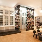
The operation results from a partnership between the Carturesti Bookstores and the French Cultural Institute. Since it was to promote only French books, the space did not have to be only one in which books are sold but one where one could read, meet, chat (the sofas and the little bar becoming key elements of the arrangement) and for launching books.
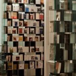
Obviously, the design proposal for a space directly connected with the monumental lobby was not to aggress the existing building, one of the best-preserved example of Academic Romanticism of late 19th century in Bucharest. Th us, the whole arrangement is extremely restrained, and there are but few elements and materials used; the forms are simple and, there is, in fact, mostly one color, black, while the sofas, bar top and the little pedestal on which books are displayed are manufactured for this operation only, being parts of the global project. However, the keynote of the whole arrangement is the bookshelves. They rise from floor to ceiling, being articulated as to both and are meant to hold volumes directly accessed from the lower shelves, while the other copies are placed on the upper ones. In fact, these shelves make up a system of extremely fragile and transparent walls that, without ruining the existing space, divide it into various and more or less open areas. Although Attila Kim from SKBD talks about influences of the 1960s lattices in the perforated walls, the most important transfer comes from architecture as organized system of construction.
I am not talking about an almost ad litteram borrowing of house shapes into the furniture design, as it happened with some famous examples of the 1980s. Here, architecture is not just metaphor (“floors of a building for books”) but as structural inspiration from a tectonic perspective of design. The “structural” system is quite simple: the horizontal elements are shaped like tin plates with two rows of perforations. The mullions are thick wooden blocks that are fastened to the plates in the simplest possible way, through the perforated holes. Thus, the vertical unevenness of mullions is not done at random but fi ts into the chosen system that, obviously, does not allow for two mullions to be fastened to the same perforation. Meanwhile this unevenness allows books to be arranged according to various categories, and the basic grid of partition takes over the design of the interior glazed doors of the lobby. Th is is an example of light architecture respectfully adding a new layer in an existing fabric.
“PAUL MORAND, L’EUROPÉEN”. DESIGN AS RESOURCE
The exhibition dedicated to Paul Morand, a writer, diplomat, globetrotter, poet, author of both highly appreciated and contested books about Bucharest, is displayed in the main lobby of the venerable headquarters of the National Archives. Rather than with interior design, we deal here here with the placement of certain freestanding devices that all create the limits of an independent place within the lobby. Both the panels and showcases try to enhance the exhibits (many of them original and valuable documents) without competing with them.
In this case, design is a resource reaching beyond its primary function. On the one hand, spaces that had been eliminated from the lobby space were retrieved (the niches on both sides and the monumental staircase that has not been part of the general space for a long time). On the other hand, the exhibition devices were designed to be reused by the French Embassy in Bucharest. Being made of modular elements, they could be put together in two ways: tall and narrower elements (bookshelves) or shorter and deeper ones that will include the current showcases. This is indeed an elegant and responsible solution that goes beyond an exhibition space and meets an essential extra-aesthetical demand for both design and architecture.


