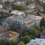
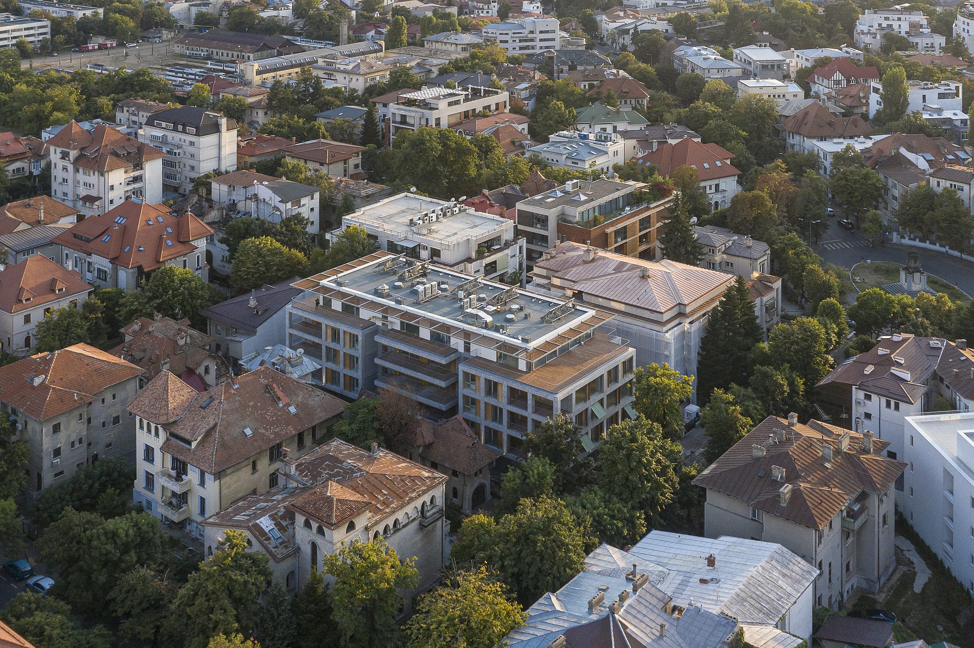
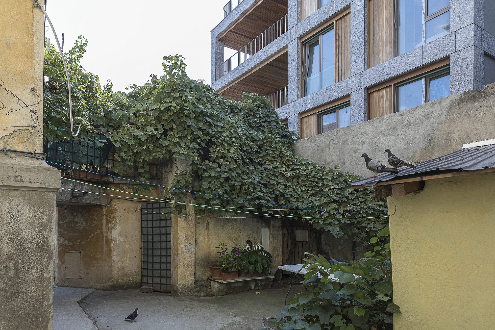
This is one of the most coveted areas in Bucharest: north from the central ring, there is a chain of the perfectly structured luxurious garden-neighbourhoods, with the beautiful villas and blocks of flats of the interwar elite. A territory that was taken up by the Communist nomenclature after the war, and around which all the post-1990 speculative waves revolved. There are hardly any free plots up there so, in recent years, new buildings have needed the demolition of old and precious ones. Radical “rehabilitations” have also intensified lately, usually still entailing the demolition of old houses, with the preservation, at times, of some parts of the facades. An interesting, but sad, phenomenon, is also the recourse to the usually coarse imitation of old styles – as if integration were a matter of style.
Text: Ștefan Ghenciulescu
Photo: Laurian Ghinițoiu
This project starts from an average-sized plot of land and from an already-authorized global volume. From my point of view, the density allowed here is a bit too high, considering the general scale of the area and its vicinities. But it had to be taken as such by the architects, whose mission was that of not producing just a financially efficient and beautiful building, but also an insertion that would be as peaceful and appropriate as possible for the spirit of the place, including in respect to the way of living. 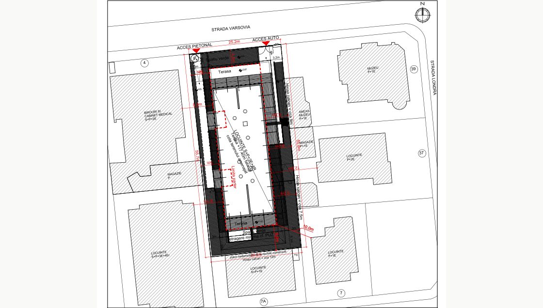
*Situation plan
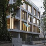
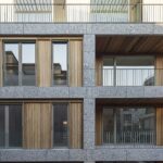
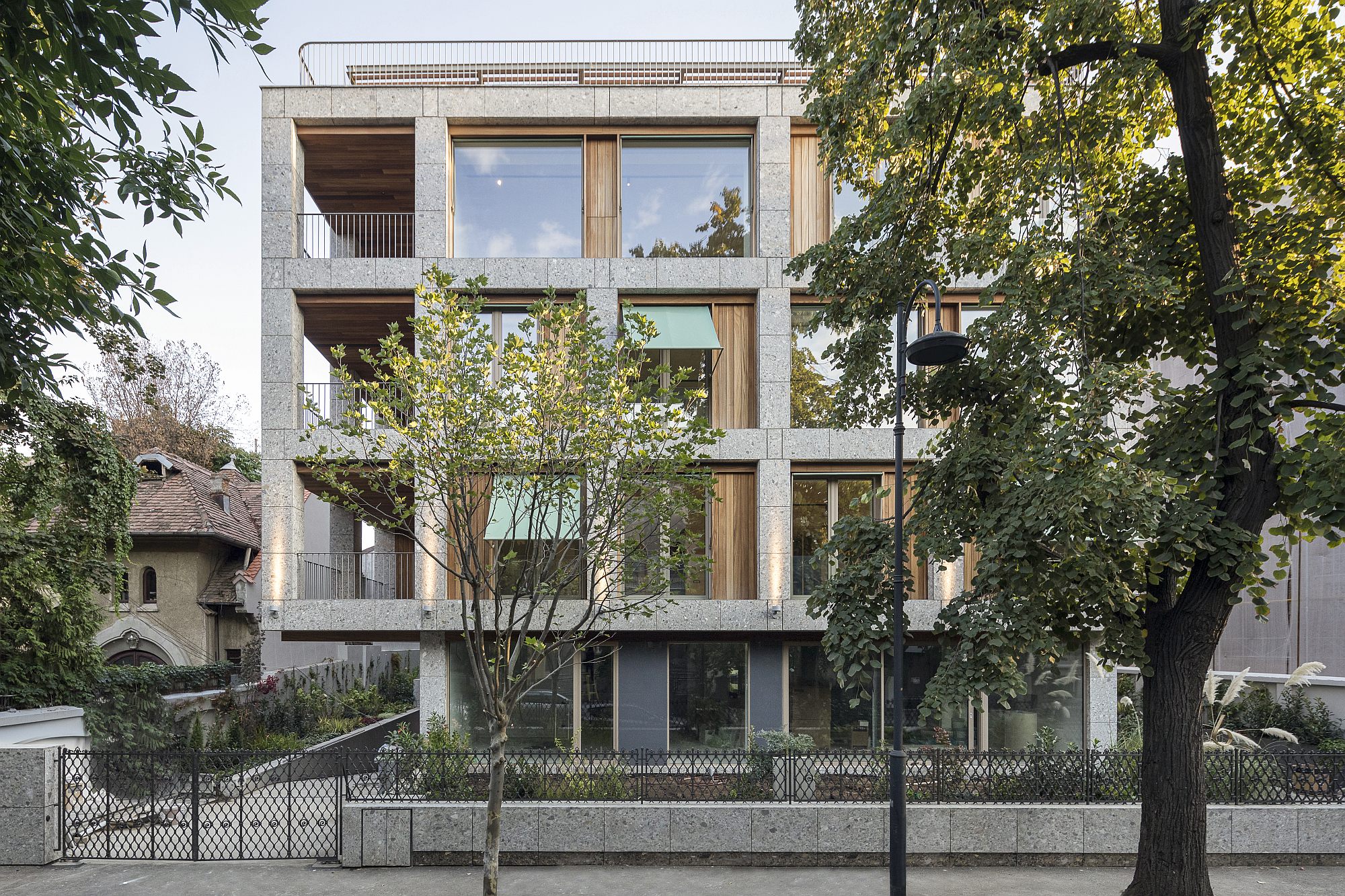
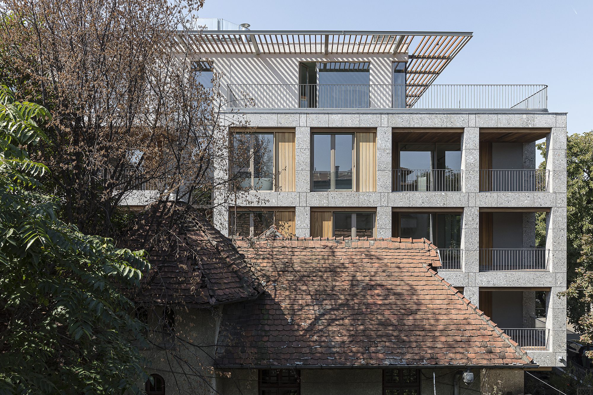
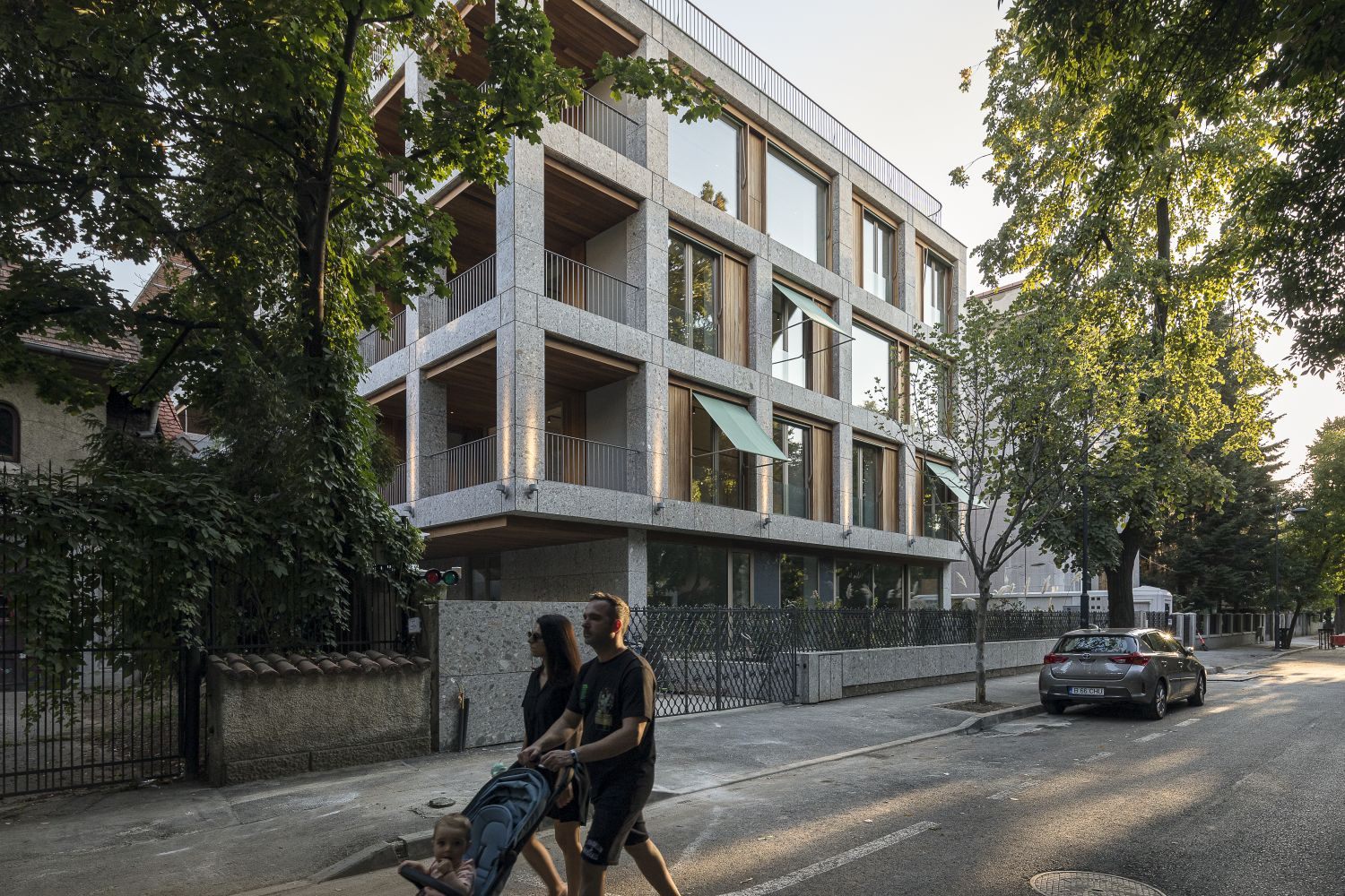
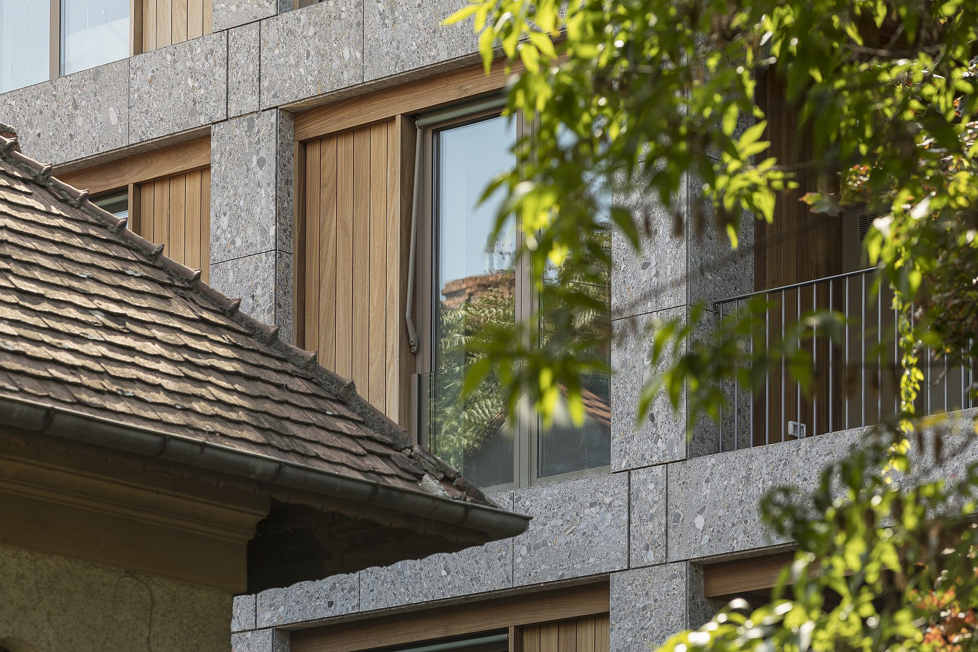
At a first glance, the new building is extremely simple: a rather massive prism, out of which several parts were cut out, as well as a network of vertical and horizontal elements, which create both the interior spaces, and the facades.
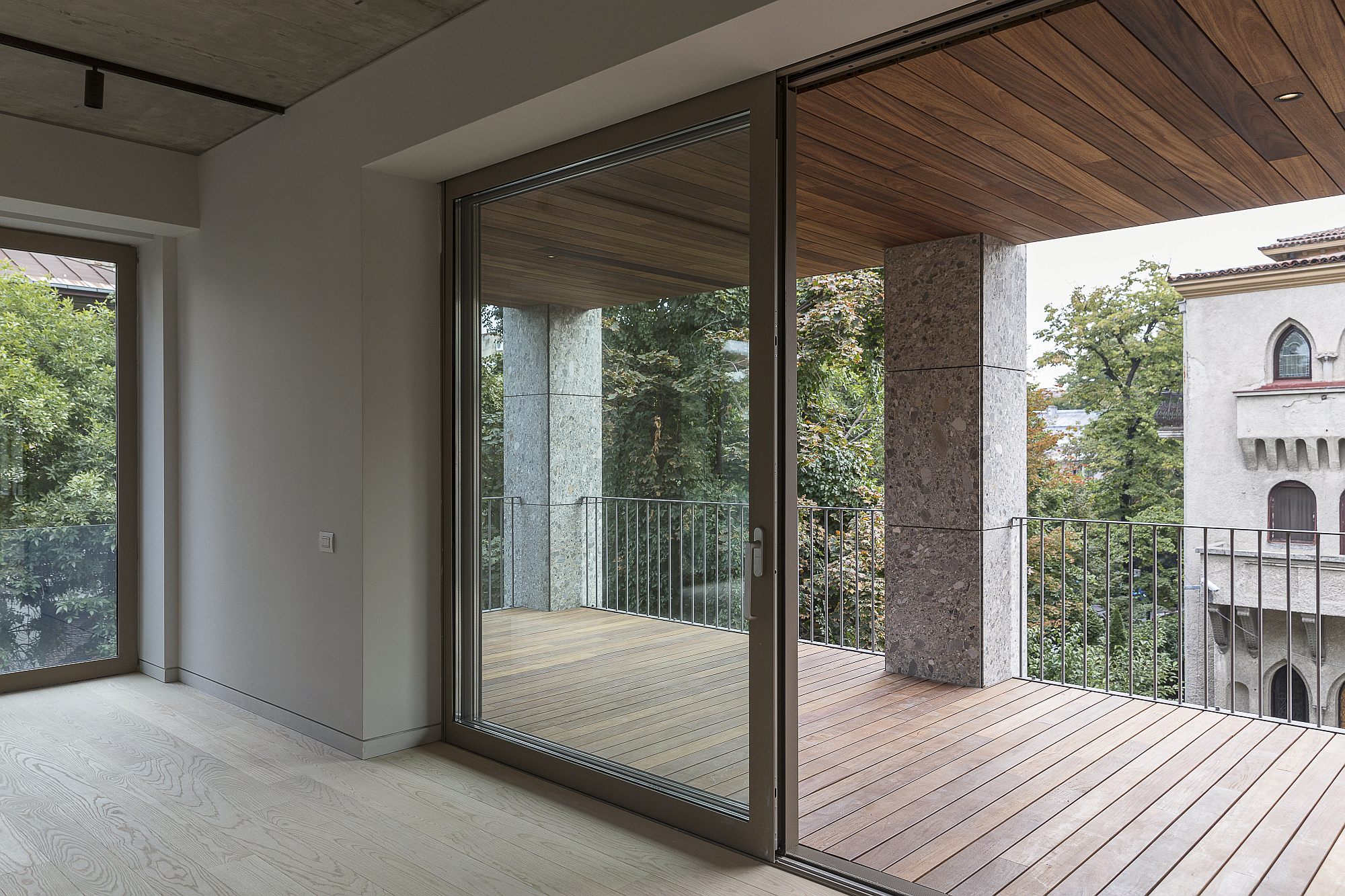
Besides these stone-plated elements, the envelope is nearly completely transparent (except for some full wooden panels) and is withdrawn in several places.
This transparency, which is otherwise absolutely necessary for a deep building, is a first step in mitigating the new presence in a sensitive place.
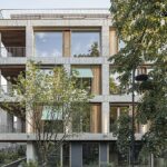
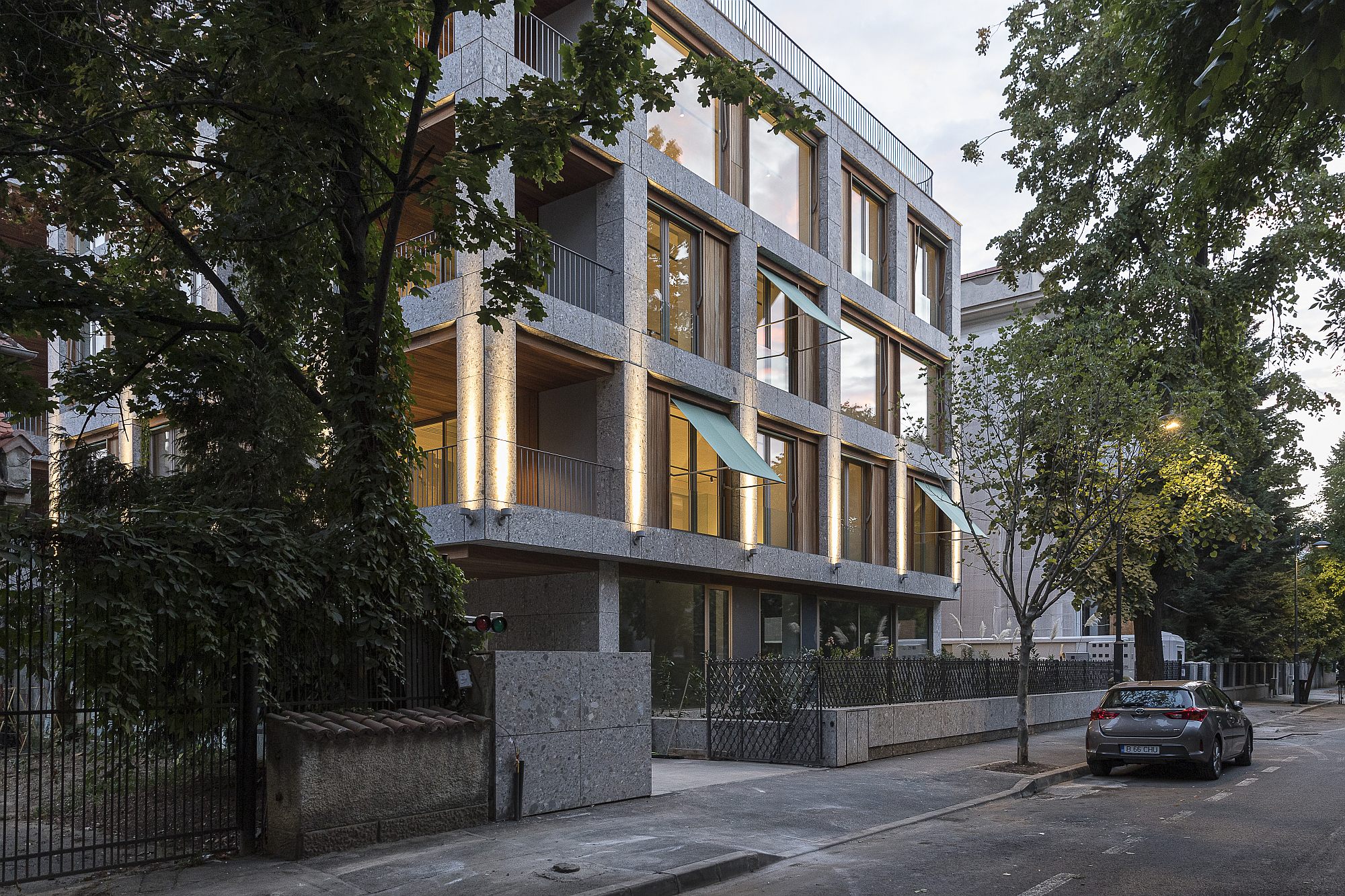
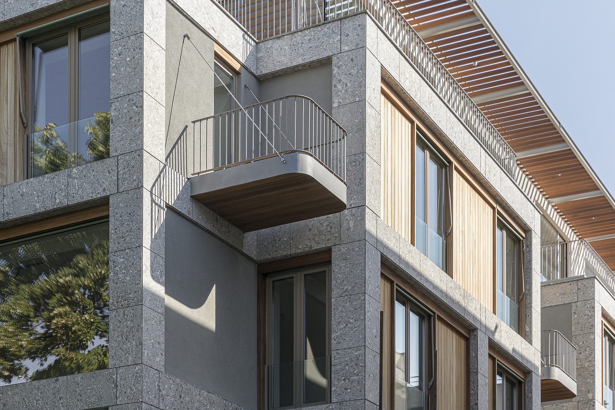
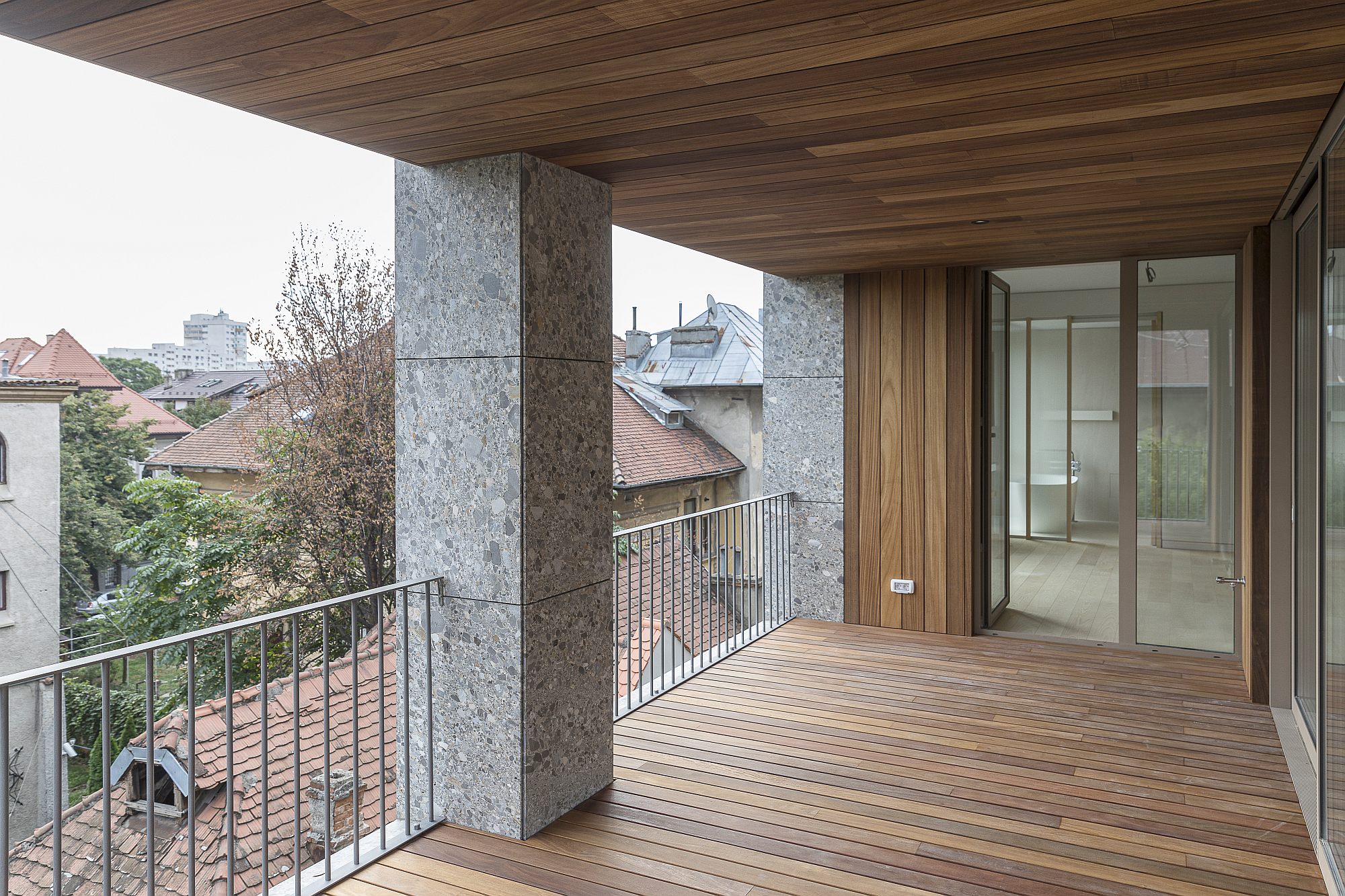
On a closer look, you discover that this order is altered in several places. Corners which seem structurally solid are in fact cantilevered, with pillars which are evidently not supported by anything.
The same way, pillars disappear at some point within the facades. The elementary rigor of a structural network seems thus voluntarily overthrown. According to Corvin Cristian, these contradictions are not decorative, but part of a complex of architectural operations, meant to dilute the presence of the building, to alter its integrity, to smooth its relationship to the onlooker and to its neighbours.
For that matter, it is not an arbitrary and decorative gesture. The position of the pillars on the facade actually corresponds to the building’s structural axes, as well as to the main making of the apartments.
A series of other gestures also aim at a controlled ambiguity and a fragmentation and enrichment of living. Besides the loggias and the terraces – of which we will speak later– there is also a series of intermediary spaces between the inside and the outside, such as the top-level terrace, covered with a light pergola – a crown the building really needed, or the balconies with rounded corners, coming out of the building’s orthogonality.
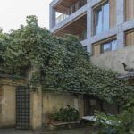
The entrance fence falls within the same category. Instead of the bunker walls which have infested the city and the country over the last 30 years, this one has a very low plinth, and is transparent above that. This is a gesture of urban civilization and reverence to the neighbourhood (whose inter-war urbanistic rules actually and explicitly demanded it). But it is also a salvaging of a bit of the place’s history. In order to make the new metal fence, elements of the property’s old wrought iron fence were recovered, and the completions were adaptations of the original model. This is a completely different language, but the spirit is the same and I feel it matches quite well.
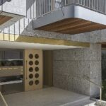
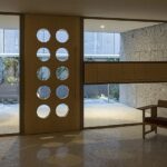
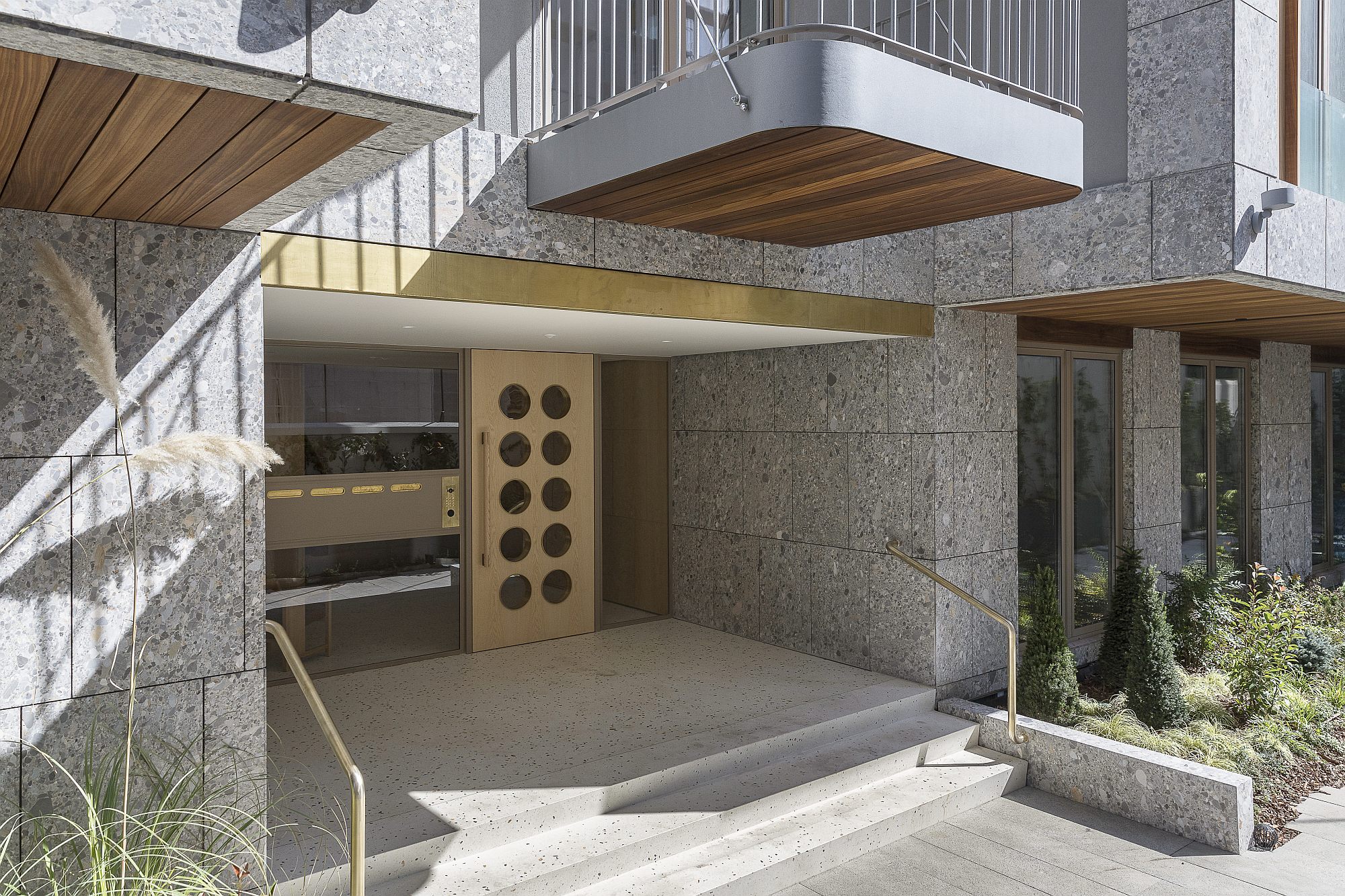
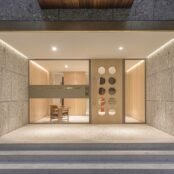
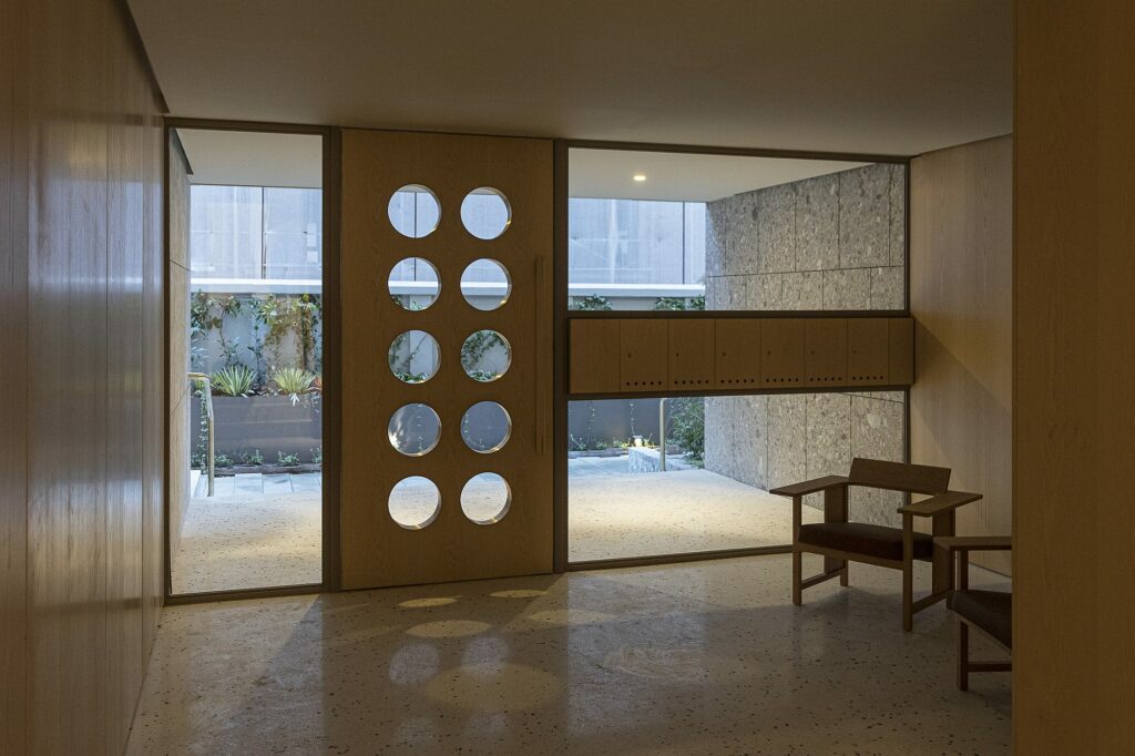
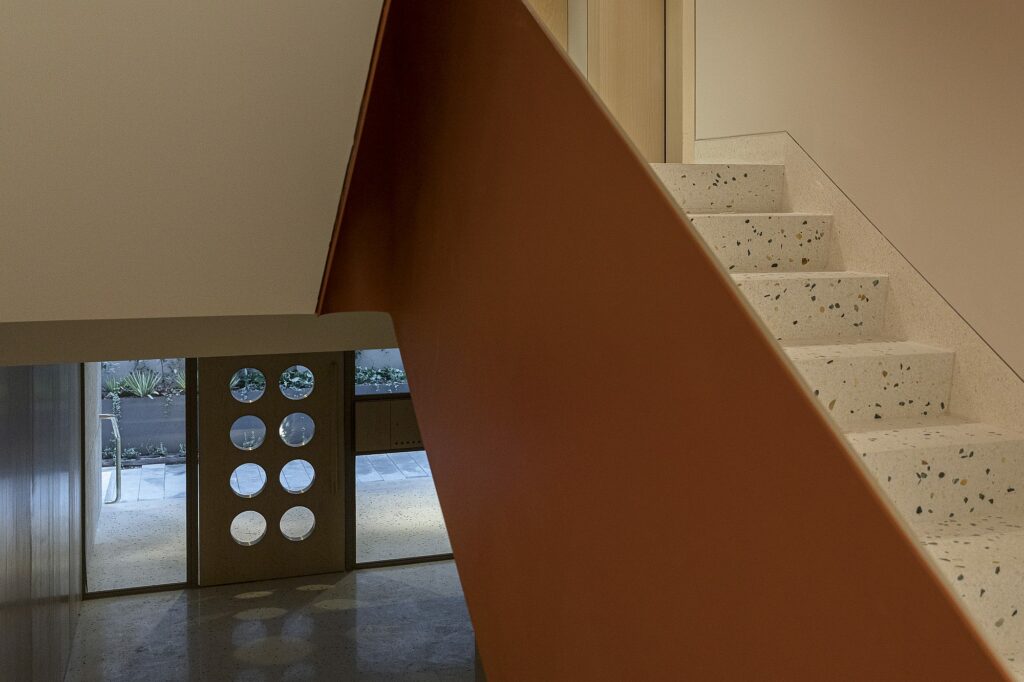
Going inside, through the garden, via an open and covered space, then continued by the entrance hallway and the staircase, is a delight.
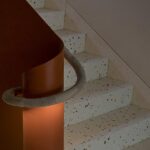
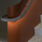
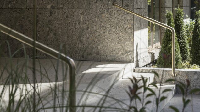
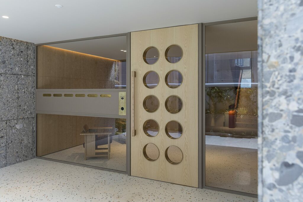
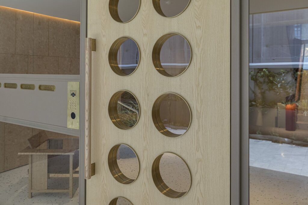
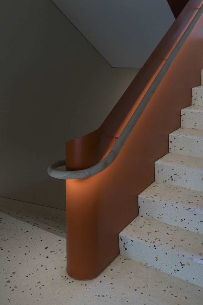
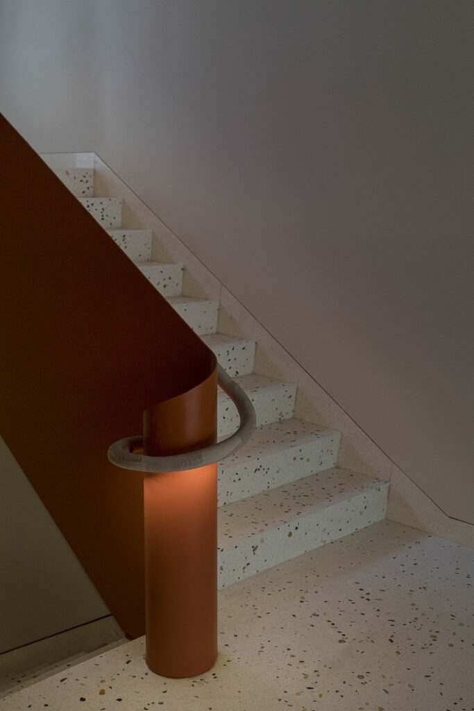
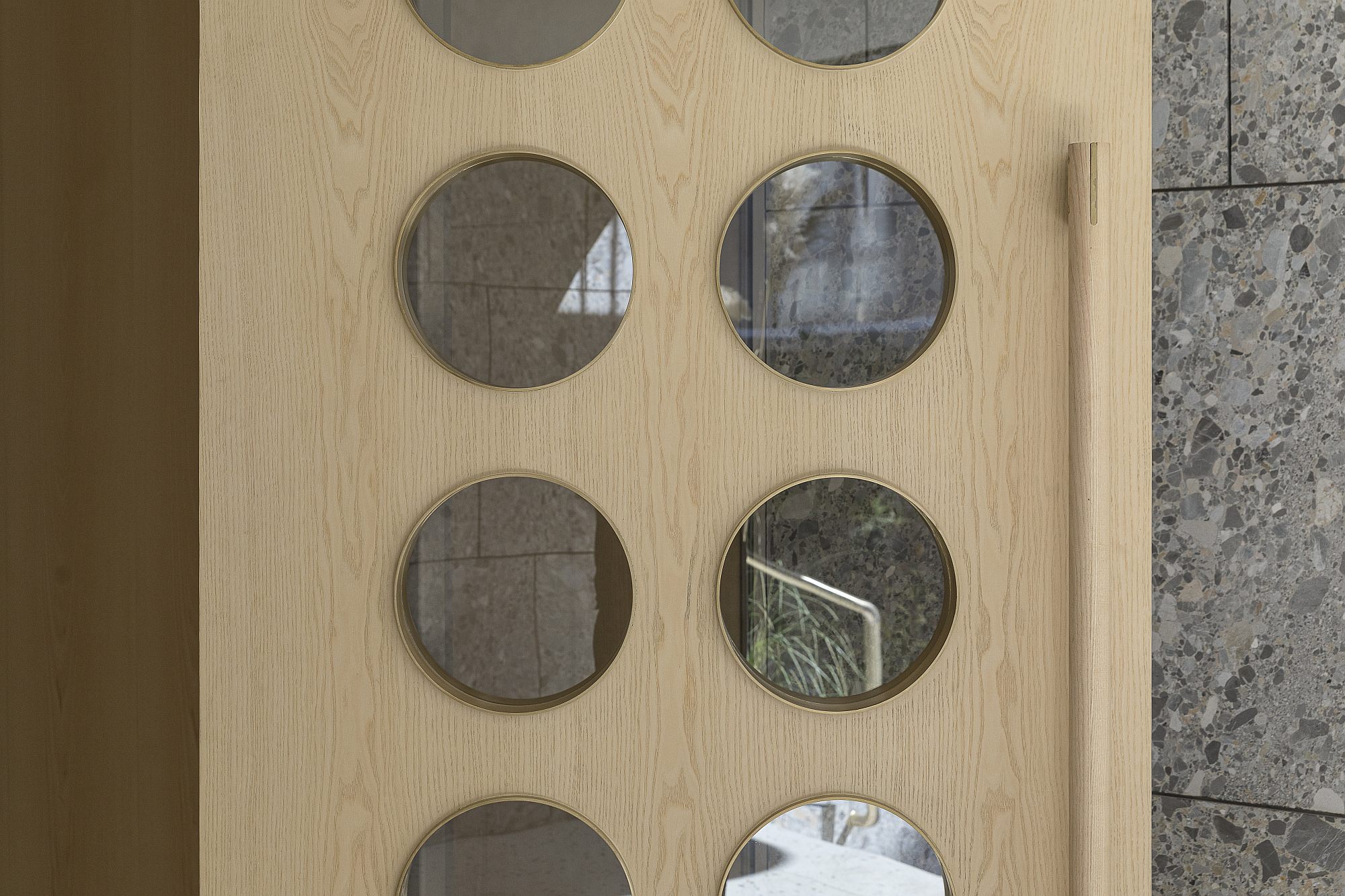
The entrance device and the staircase themselves are sensible design projects. The round perforations in the door, the mailboxes and the staircase with a metal guard and wooden handrail, are evident interpretations, but not copies, of the entrance hallways in inter-war blocks of flats, where the common spaces themselves were part of the prestige and generosity of living.
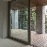
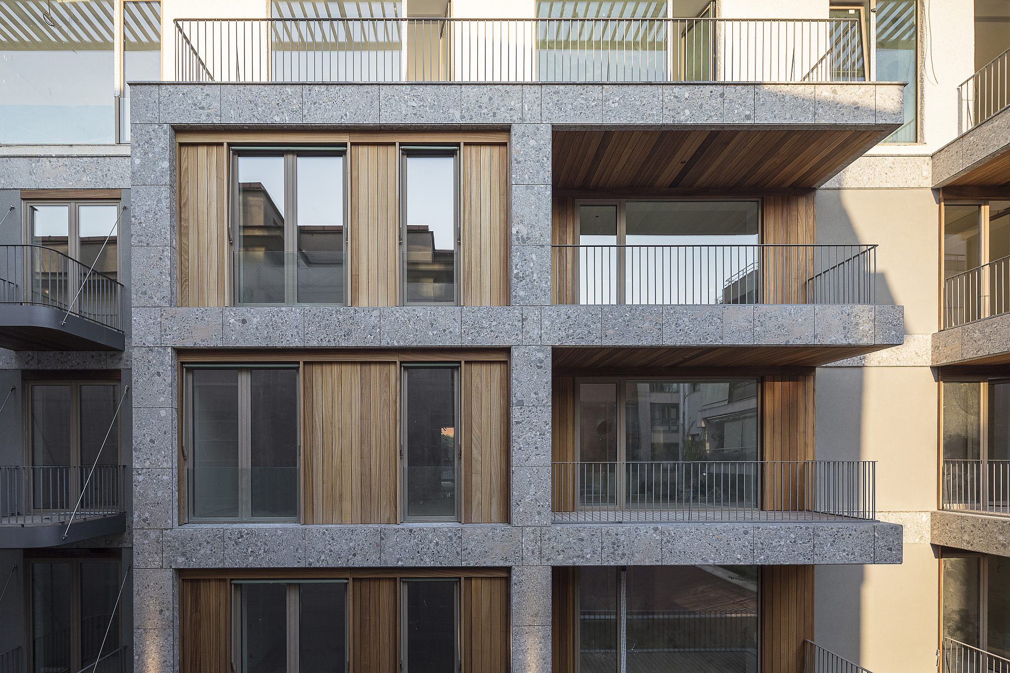
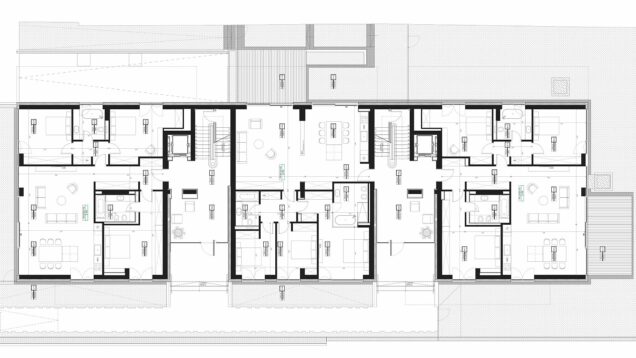
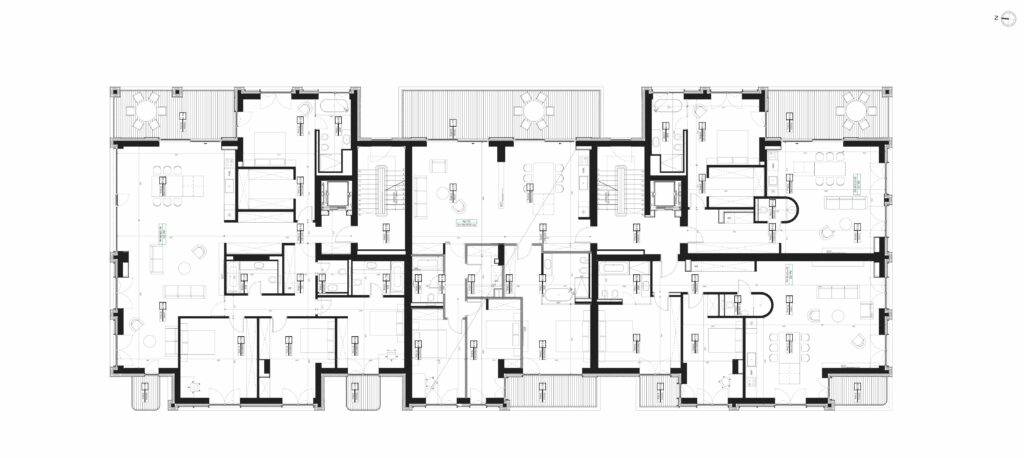
The space organization is rigorous and efficient, with circulation nodes and services towards the centre, and the noble spaces almost completely open towards the exterior. You live in calm, sun-facing spaces, and, on the higher levels, your view includes the beautiful houses around. With the loggias, the presence of filled vertical elements is very important: even if the gap is clearly predominant, the impression is not that of an open terrace, but rather that of clearly defined exterior rooms, of the same family with the interior spaces.
The free height in the dwellings is also important, as it exceeds the meagre standard we can find even in many of the recent “luxury” complexes.
The materials contribute to the preciousness of living and of the presence in the neighbourhood. The stone plating on the exterior surfaces is a coarse-grain warm grey which becomes golden when caressed by the sun. It is an important choice, as the building thus acquires scale, vibration, like its neighbours, but without the need for ornaments as well.
In the end, a word about the wood: the veneer on the loggias’ and balconies’ ceilings, but especially the mobile or fixed wooden panels, are among the most visible and finer elements, both on the outside, and from the inside. They define a delicate skin for the building: they are well harmonized with the stone, glass and metal, and have a great contribution to the domestic character and to reducing the impact on the vicinity.
As a matter of fact, of all the discussions we have had lately, this has stood out and has very quickly become (not only to architects) one of the most recognizable and admired architectural gestures within the project.
Plans
ground, 1st, 2nd & 3d floor
Info & credits
Architecture: Corvin Cristian Studio
In collaboration with: AIM Studio, WRA
Authors: Corvin Cristian, Alina Stoica, Iulian Ungureanu, Serban Rosca
Team: Ana Malaianu, Alia Al-Jabbari, Petru Lalut
Visuals: Vlad Hani
Client: Andrei Iușut, Luxury Interiors
Architecture & interior design construction: Zenith Engineering
Installations: ACE Tech Consulting
Structure: Incona
Stone plating – facade: Zenith Engineering
Partners:
Alukönigstahl, Floors4You, Terpan, Punto Casa, Arcade

