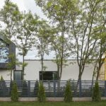
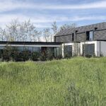
An L shaped house with hidden pockets and green perspectives – extroverted, transparent, it opens itself to nature: from the courtyard, an exhibition of spaces, solid and void among which one may feel like hiding; from the street an elegant object, quite different from its built context, whose effervescence often generates a stop, inviting people to interact with it (neighbors told us).
Project: Citrus Studio
Text: Lorena Brează
Photo: Citrus Studio
The L House is the result of a 4 year communication process between the architect and the client, one that many constructions in Romania could benefit from. I talked to Claudia, the architect who designed its story. This house represents was for her a sparkling beginning as an independent architect, an opportunity to give her best, but also a great process to learn from.
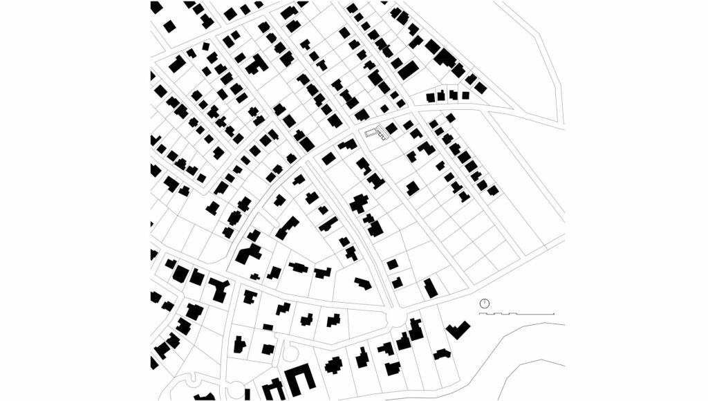
As I said, the house is the result of a good client-architect relationship; the latter was involved from the very beginning, until the completion of the worksite. The house responds to the needs of a mother and her 11-year-old son, being a series of private and common spaces, spots for interaction and retreat. The corner plot is located in a suburb in the north of Bucharest – Corbeanca commune, Romania – and benefits from a row of acacia trees planted towards the main street.
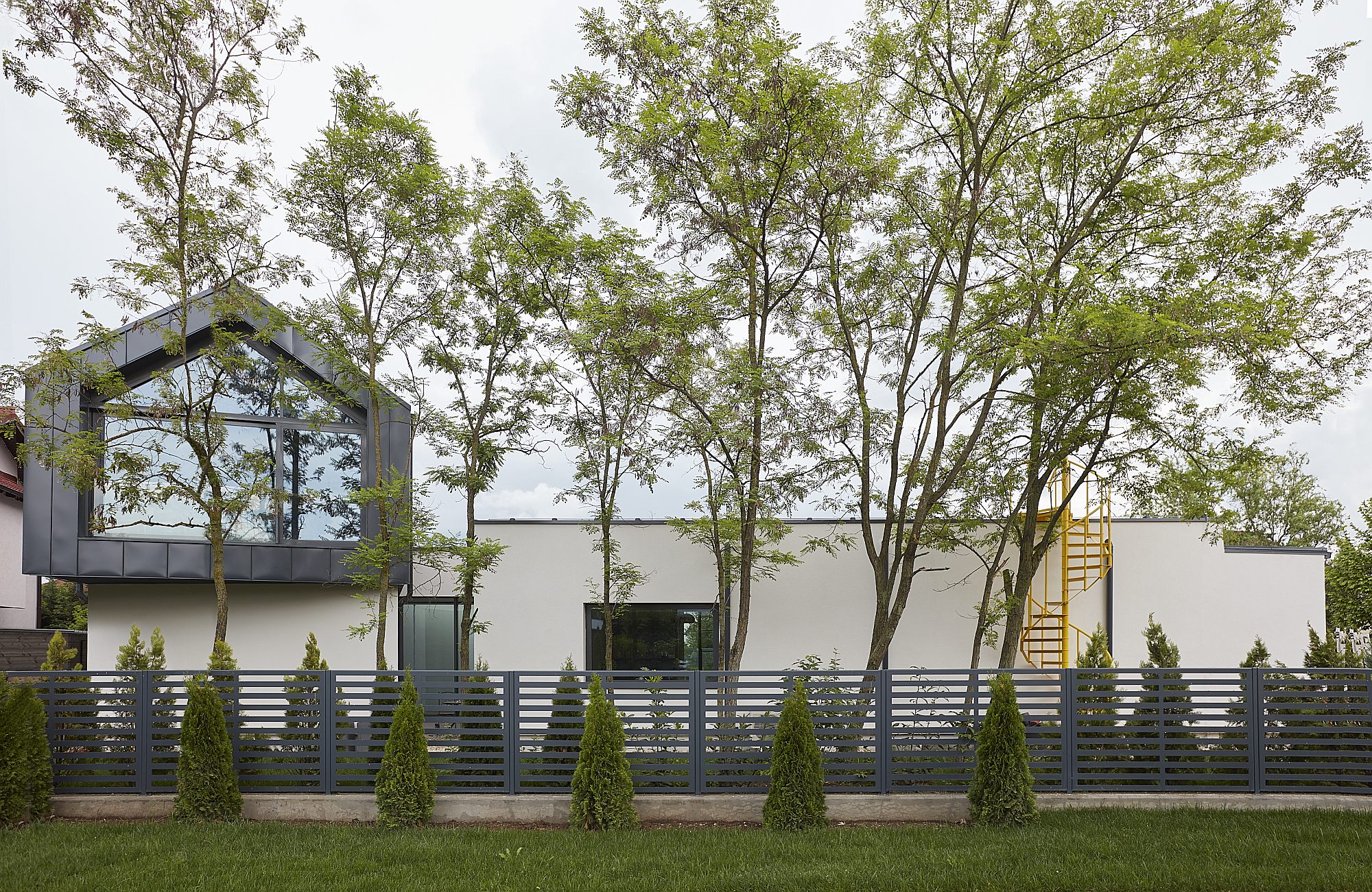
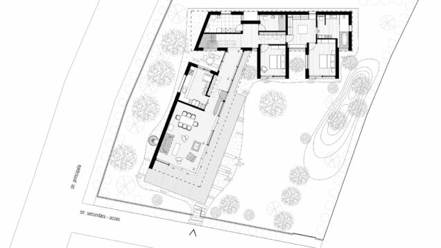
This row preceded the house. It remained unaltered and influenced the design of the house, that seems to get a high natural fence. The orientation of the house is atypical because it does not seek intimacy behind high and opaque barriers, as most new houses in and around Bucharest now do. The courtyard generated by the L-shaped geometry of the house opens onto the access street, and the fence made of perforated metal panels does not constitute a strong visual barrier.
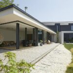
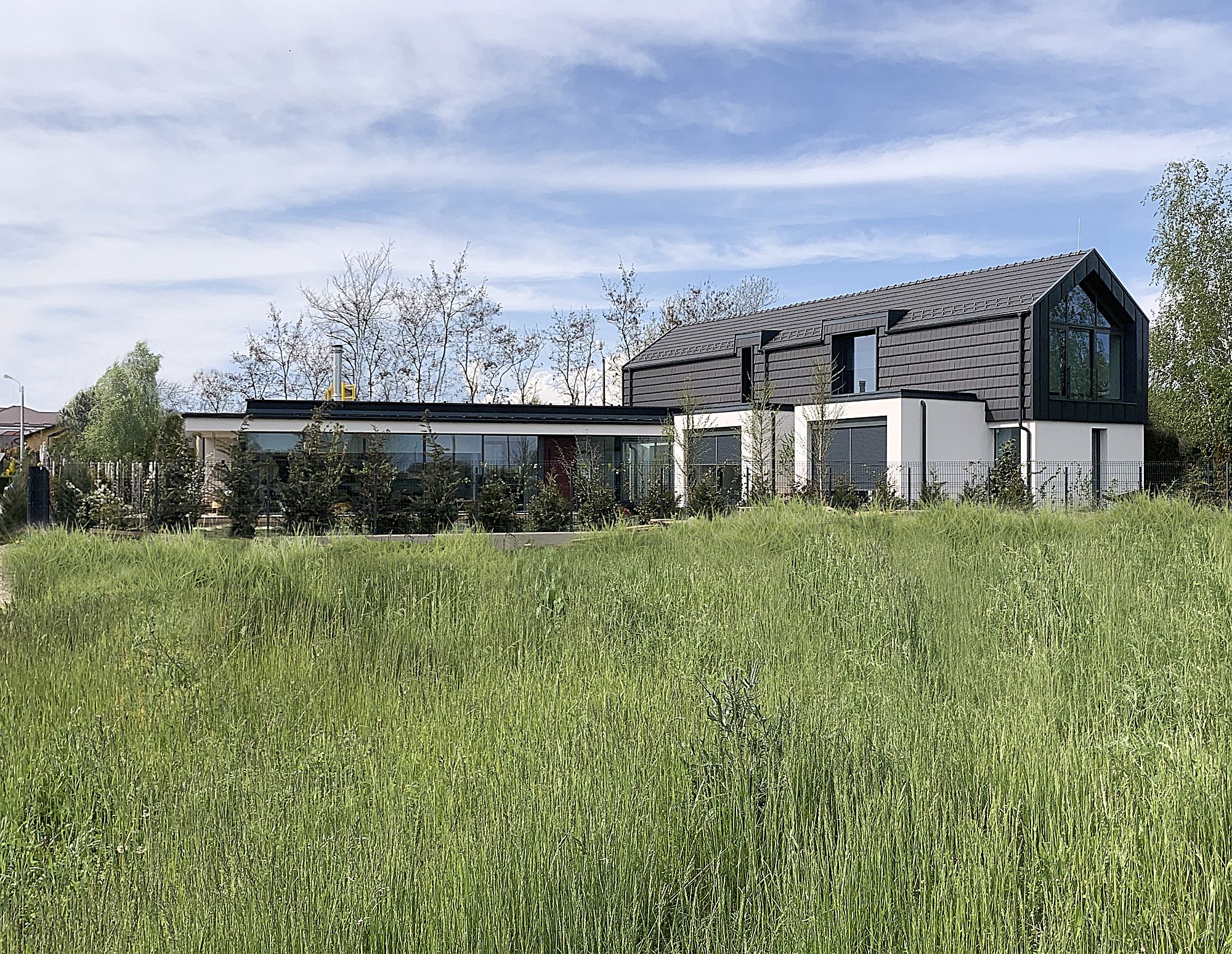
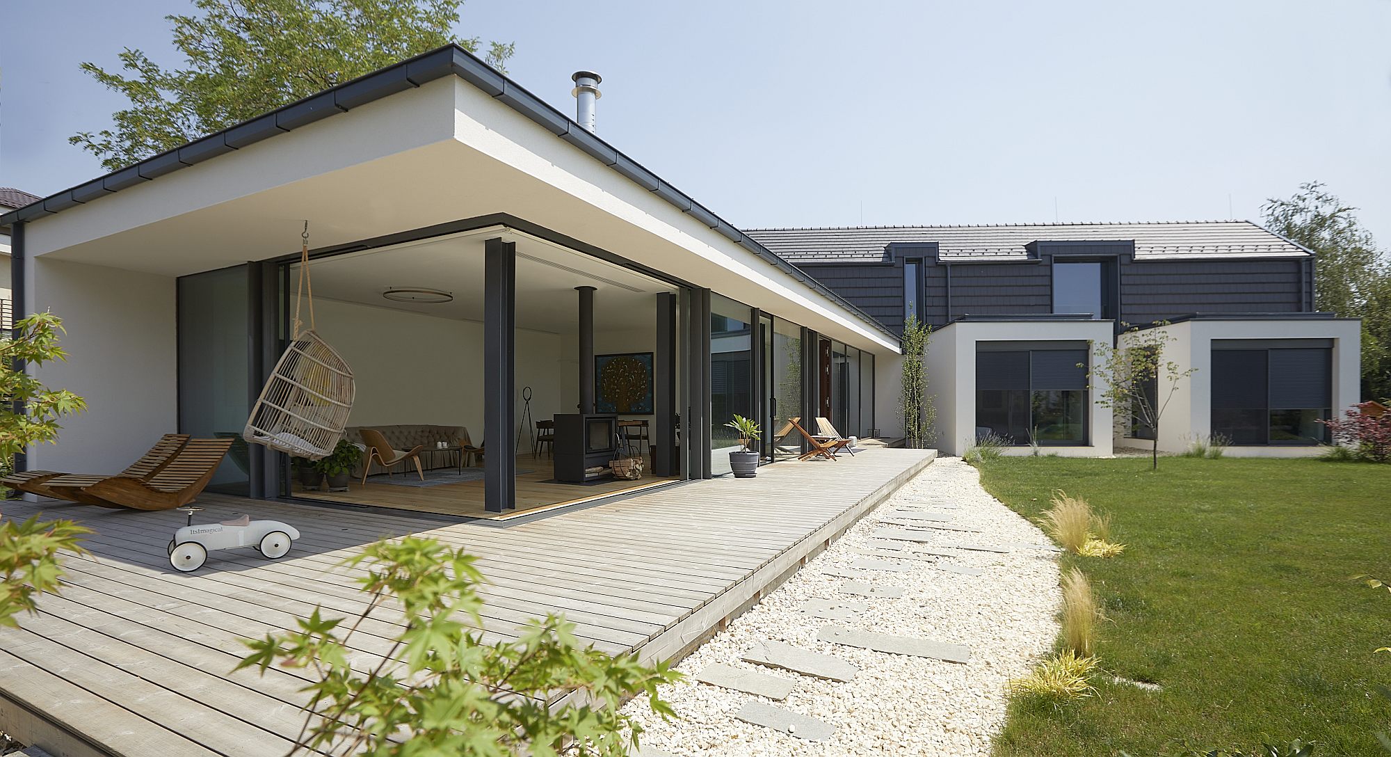
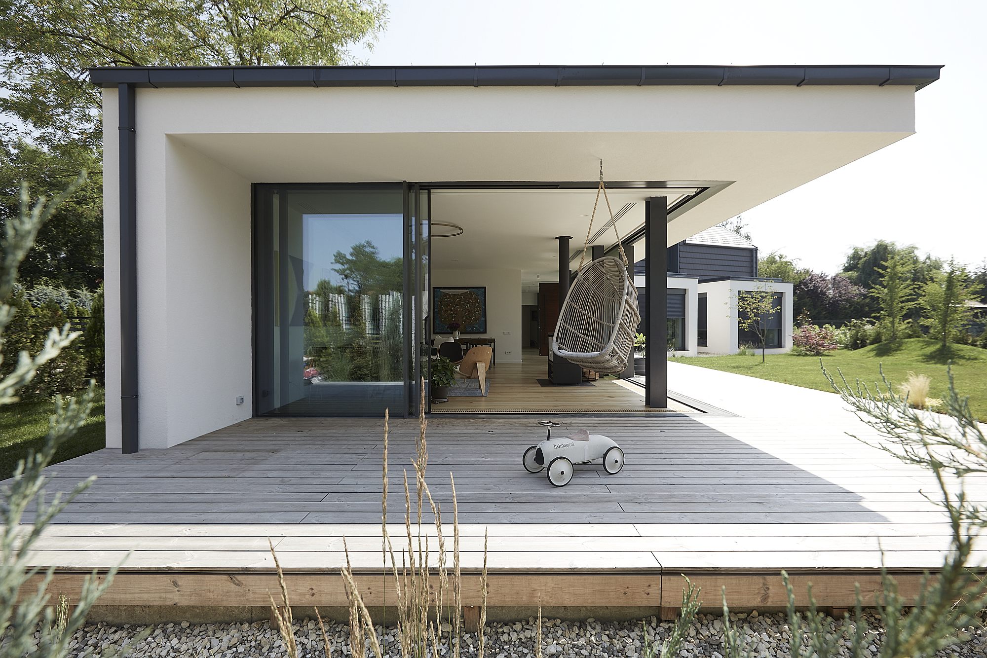
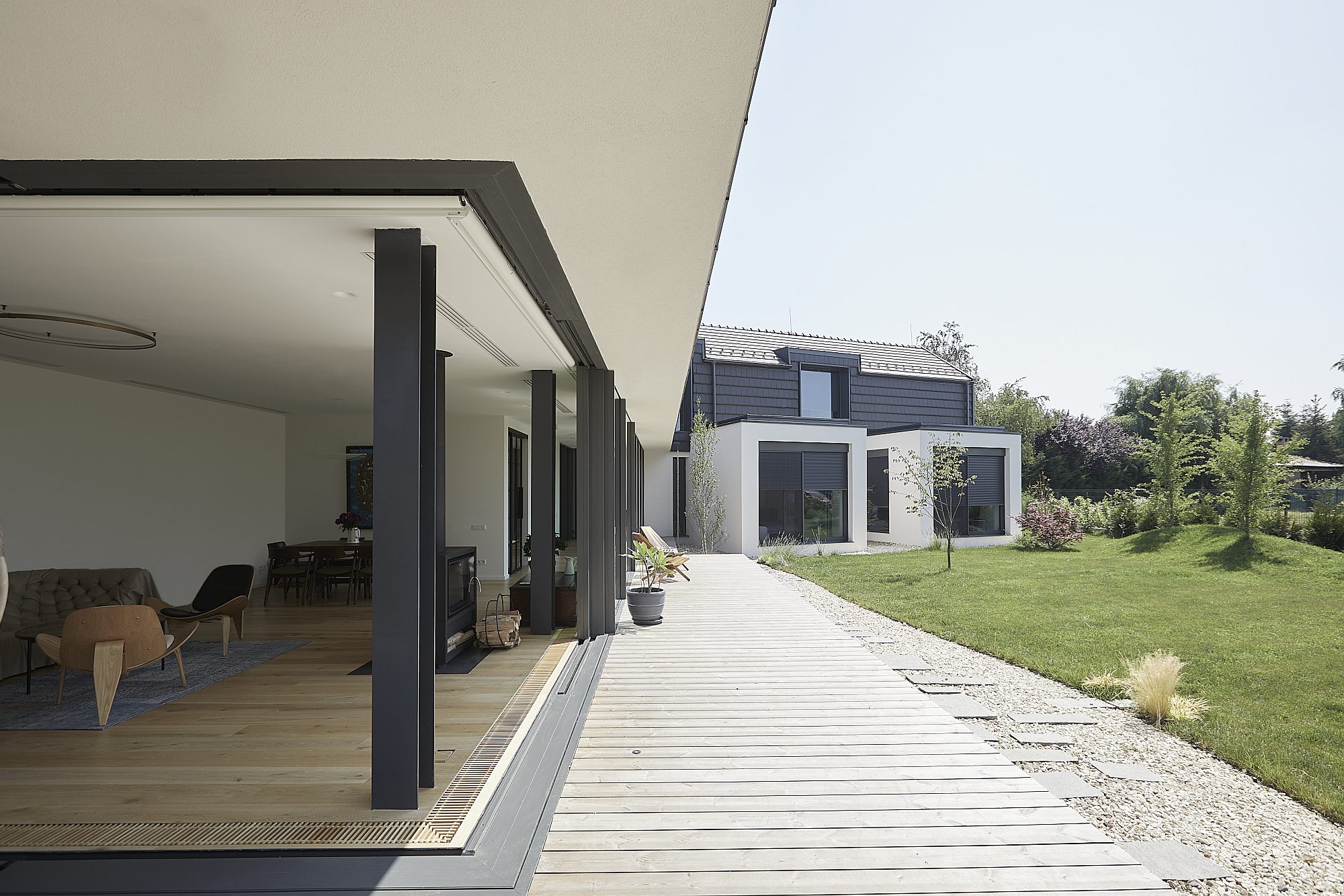
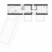
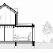
The construction consists of a large, L-shaped ground floor and a simple, rectangular body upstairs. The ground floor borders the courtyard on two sides and it is almost entirely transparent to it.
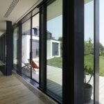
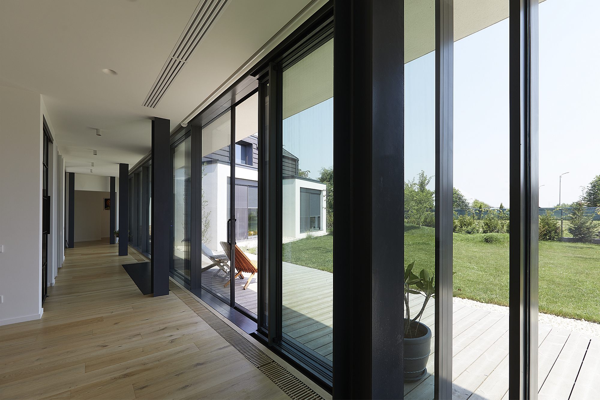
In fact, one of the main design themes was the opening and brightness of the spaces, the glazed surfaces making almost half of the total vertical closure.
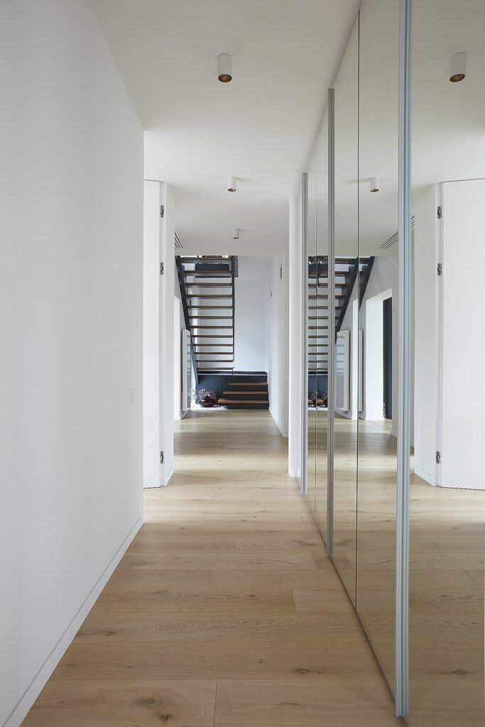
Inside, the (almost entirely white) spaces are designed to offer views towards the yard, to the outside, but also towards each other, communicating and looking at each other. The use of mirrors, whose presence enhances the visibility of angles, also contributes to this.
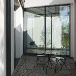
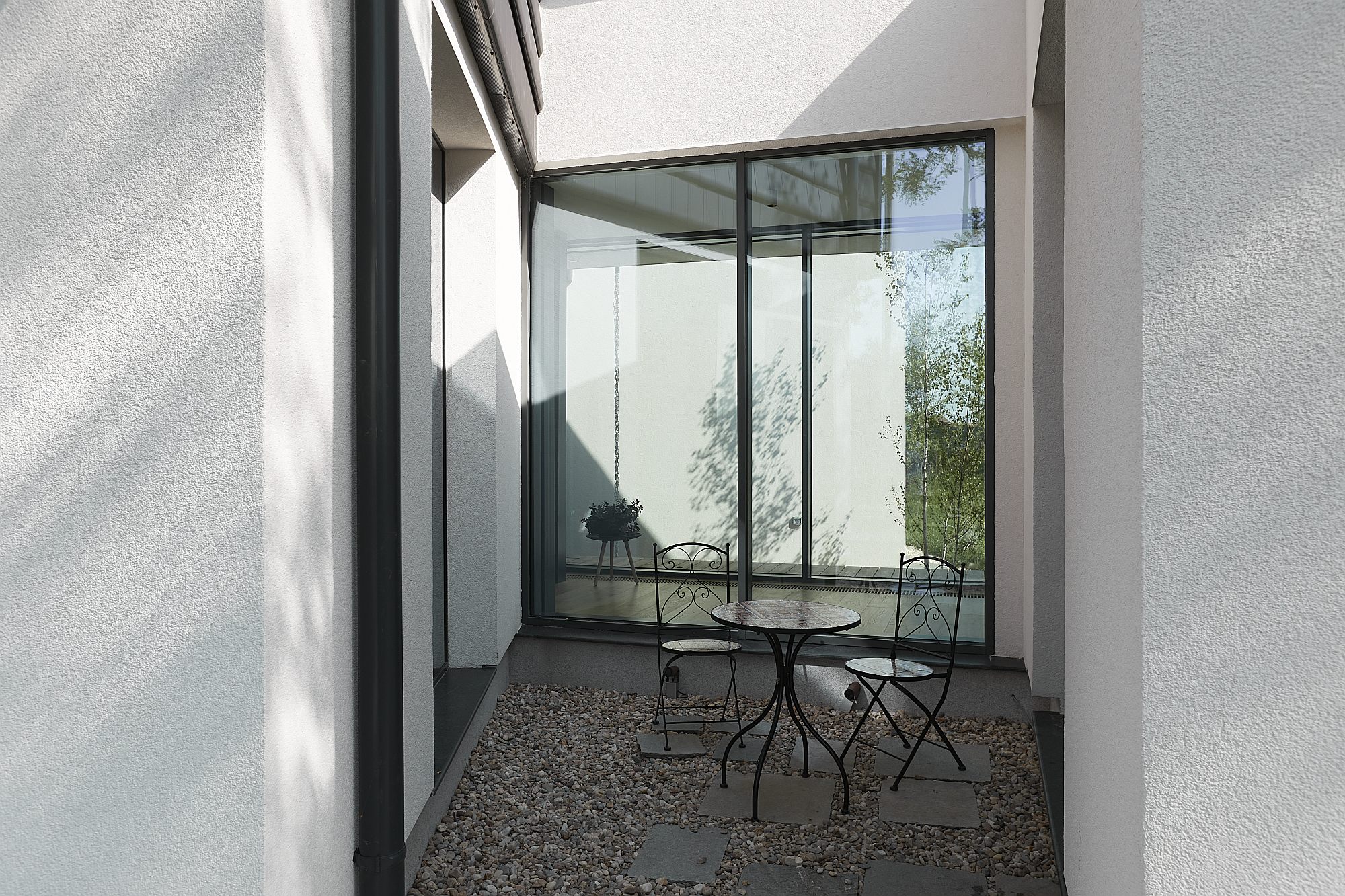
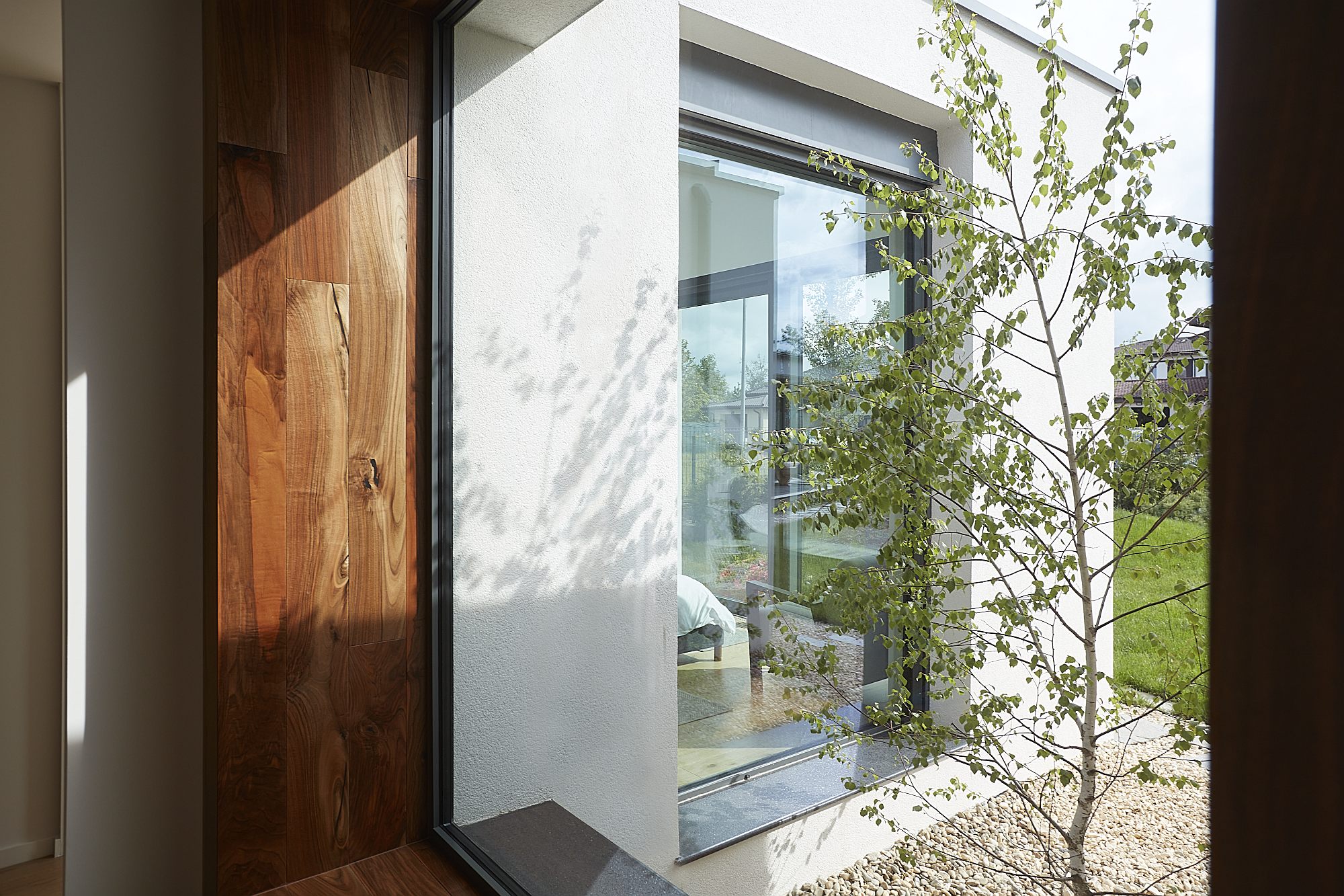
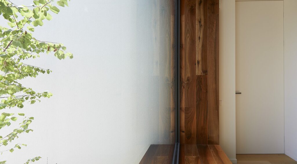
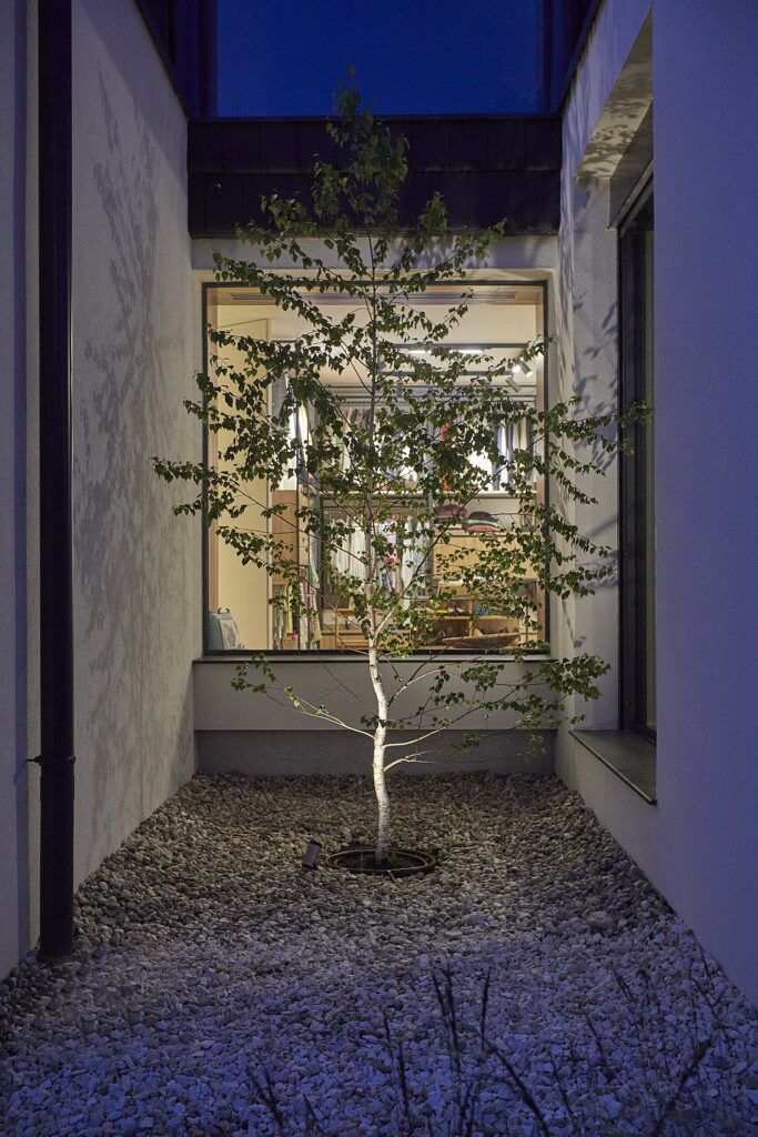
A series of deep cuts in the ground floor generate some intimate courtyards. The living spaces are developed and oriented along the main courtyard. The technical spaces and the complementary spaces are located in the back areas. In contrast, the living area is arranged in the ground floor volume, being the closest to the access gate; the very small base and the windows sliding completely in summer, make this area become part of the garden.
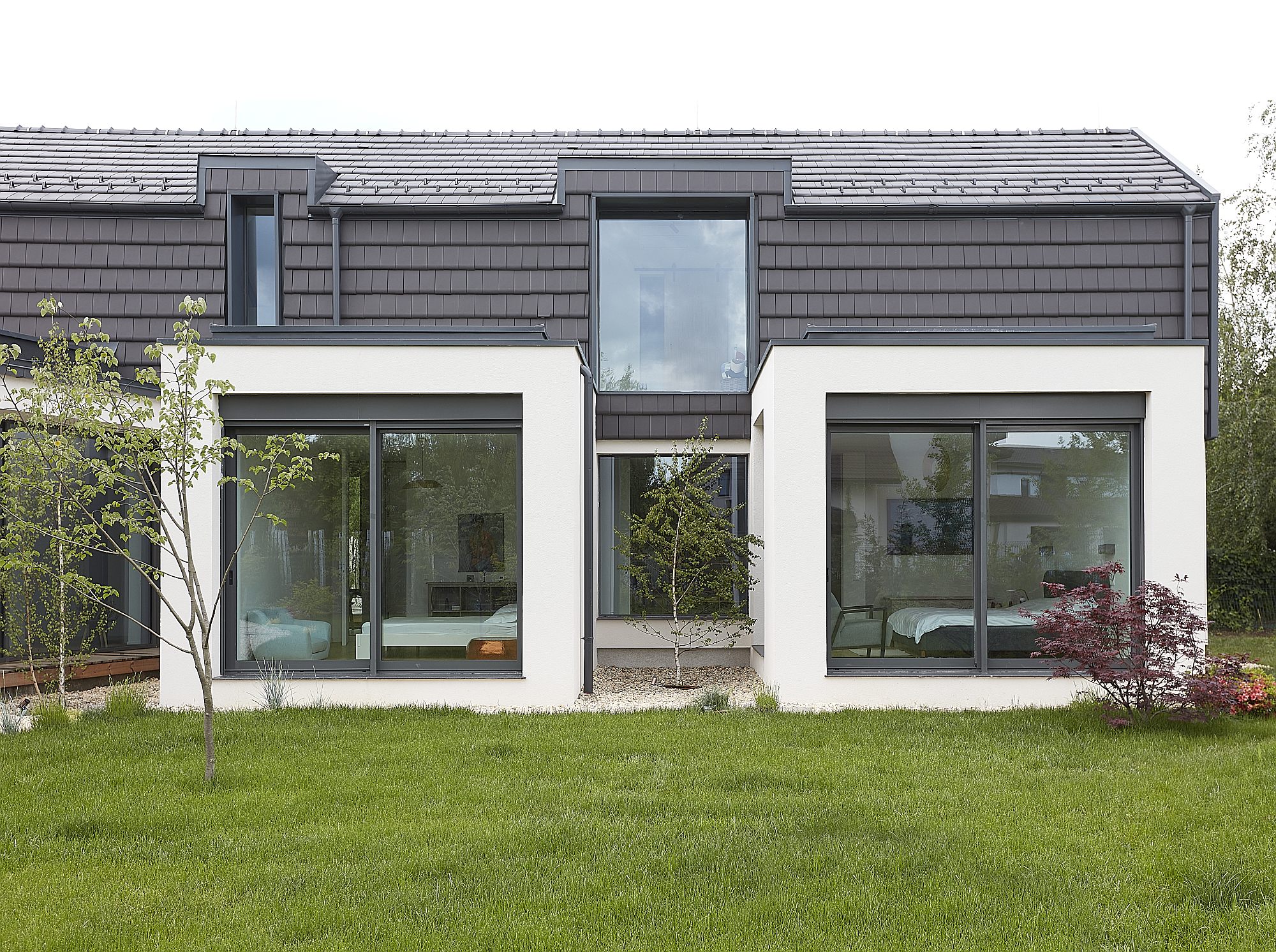
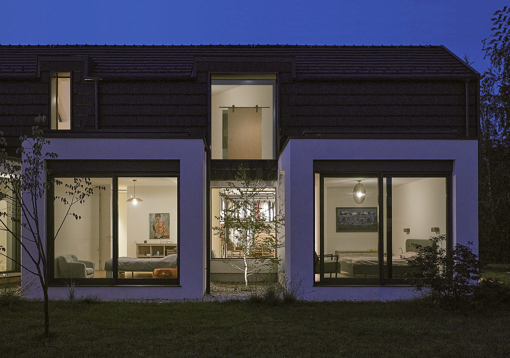
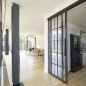
The night area on the ground floor is connected to the living area by a fully glazed corridor, which visually links the outdoor garden and the main courtyard. Each of the bedrooms on the ground floor has its own “box”. The entire ground floor relies on a perfect transparency and a communication with the garden, emphasizing the sensation of uninhibited spaces.
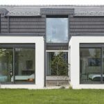
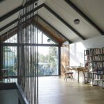
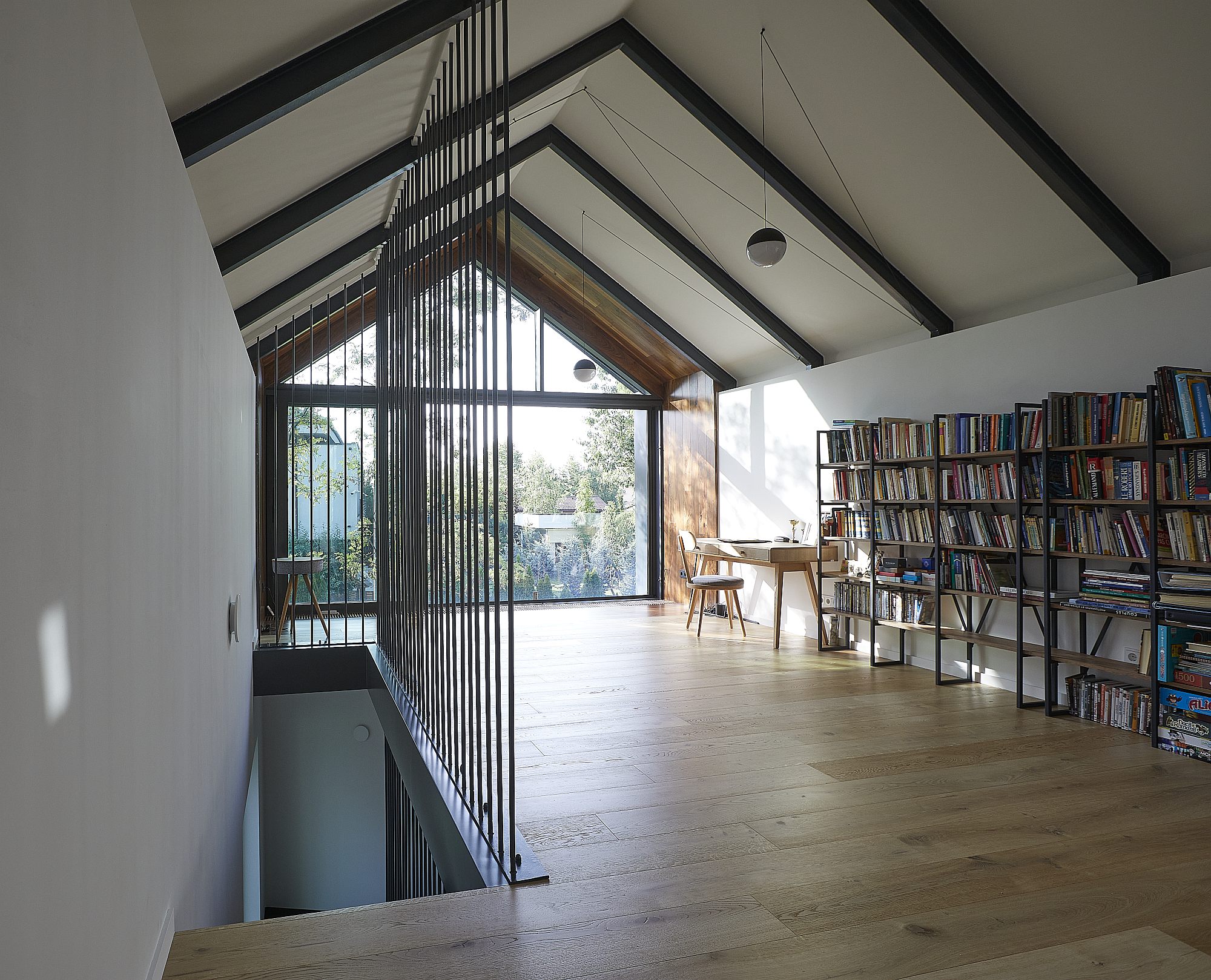
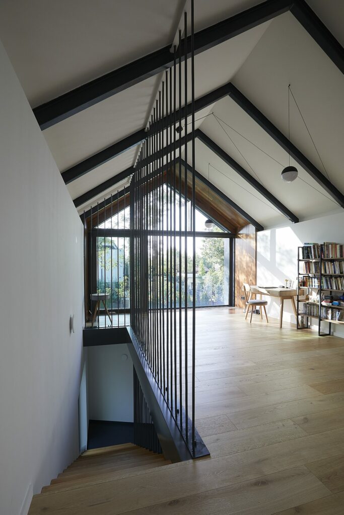
The first floor is partly dedicated to a work area – the library, the office, the media space and partly to the child’s bedroom. Upstairs spaces have a different perspective to the outside; the main windows on the first floor close the rectangular volume on the small sides and receive light at sunrise and sunset. The office is a kind of observation point to the quiet main street, with a view filtered by trees, to the spectacular sunsets.
The volume of the first floor has a gable roof; it is covered with ceramic plates for a better insulation; its expression is so different from that off the ground floor that it appears like a small house sitting atop a larger one.
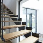
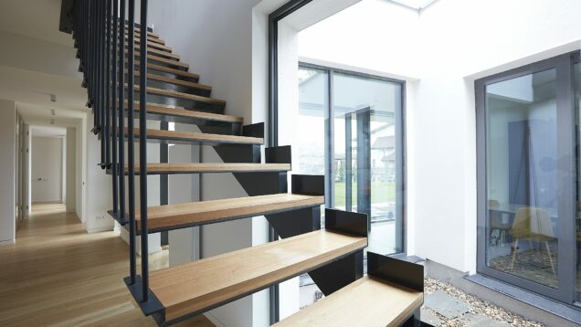
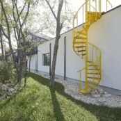
When it comes to the building materials, both the architect and the client’s preferences were towards the industrial, and this is quite visible in various details – exposed metal pillars and beams, metal inserts in the floor, interior staircase. An exterior yellow staircase that accesses the elevated terrace is added to the facade from the street, as in a minimalist collage, this being the only color on this view of the house.
Built in steel – rather atypical for small-scaled dwellings, the L house emphasizes the horizontal, trying is made out of an atypical material, placed rather horizontally and tries to get the best out of its site and surroundings (whether we are talking about light, perspective or nature). It’s both an example of quality architecture and healthy client-architect communication, as well as a reference point for the community. It offers a different image of neighborhoods and generates a series of interesting discussions started by the community – and this is perhaps one of the best things an architectural object may obtain.
Plans
*ground floor & garden, first floor, cross section, situation plan
Info & credits:
Adress: comuna Corbeanca, Ilfov
Architecture: Citrus Studio – Claudia Trufaș
Collaborators:Daniela Crăciunoiu, Nicolae Petrencu
Structure: Ovidiu Bogdan
Installations: Horia Crețu
Construction supervisor: Petre Ilie

