Text: Ștefan Ghenciulescu
Photo: Andrei Mărgulescu, Cosmin Dragomir, Daniel Miroțoi, Mihai Rotaru
The word steampunk conjures a mixture of Sci-Fi and nineteenth-century aesthetics: goggles over high hats, ladies’ hoop skirts and gentlemen’s frock coats matched with mechanic limbs, etc. The Neo-Victorian imagery aside, there is something more important to the notion, namely the building of alternative worlds by developing the state-of-the-art technologies of a bygone age while preserving many of its social and cultural elements. Dominated by the steam engine, populated by people flying in Zeppelins (oh, yes) instead of planes, tailored to the visions of Jules Verne and H. G. Wells, the architecture of these worlds would follow from the mixture of tradition and progress visible in the large public buildings of the 1850s-1900s—with metal and glass vaults and stone capitals. Whether gloomy or joyful, steampunk works are unmistakably nurtured by nostalgia while being obsessed with progress.
I admit that, to me, most of AND BA recent projects evoke a type of discreet Bucharest steampunk, as they all echo programmatically elements of local urban and architectural culture, from the casa-vagon (“train car house,” a typical Bucharest semi-detached house) to the Modernist villa and the small-size Art-Deco block, from gardens to special plasters. The old models are reinterpreted, elaborated upon to accommodate contemporary trends, materials and technologies. The buildings can be seen as contemporary works that fit into a local culture, as well as an open-ended and sympathetic continuation of a history of the place.
Urban Spaces 2 on Mumuleanu Street is one of the architectural office’s recently completed projects. Having started work on it in 2014—shortly after finishing Urban Spaces 1, the complex located nearby on Dogarilor Street—it was completed in 2019. The longer project duration makes it possible to follow the evolution of AND BA through the years, as history became increasingly important for them. Spatially complex, Urban Spaces 2 is made up of an assortment of housing types, entrances, and exterior spaces. The mot d’ordre seems to be adaptation, individuality, and also the use of modular elements, of structural and spatial networks reminiscent of Dogarilor Street Urban Spaces 1. Many of the details and textures also speak about the materiality of Bucharest dwelling. The result is a masterful collage of oppositions.
Place, layout, organization
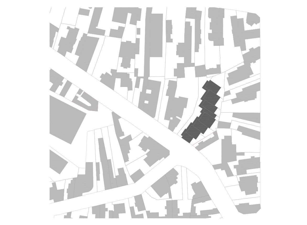
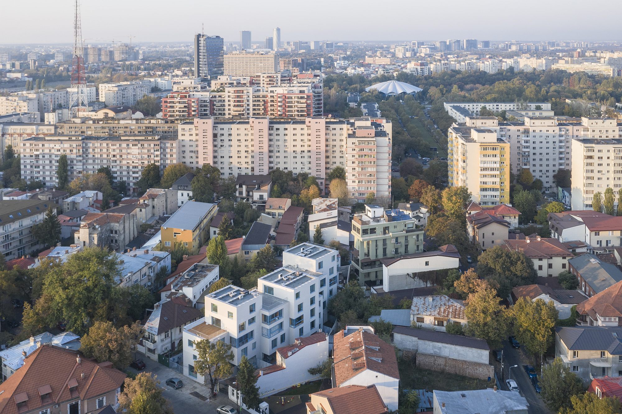
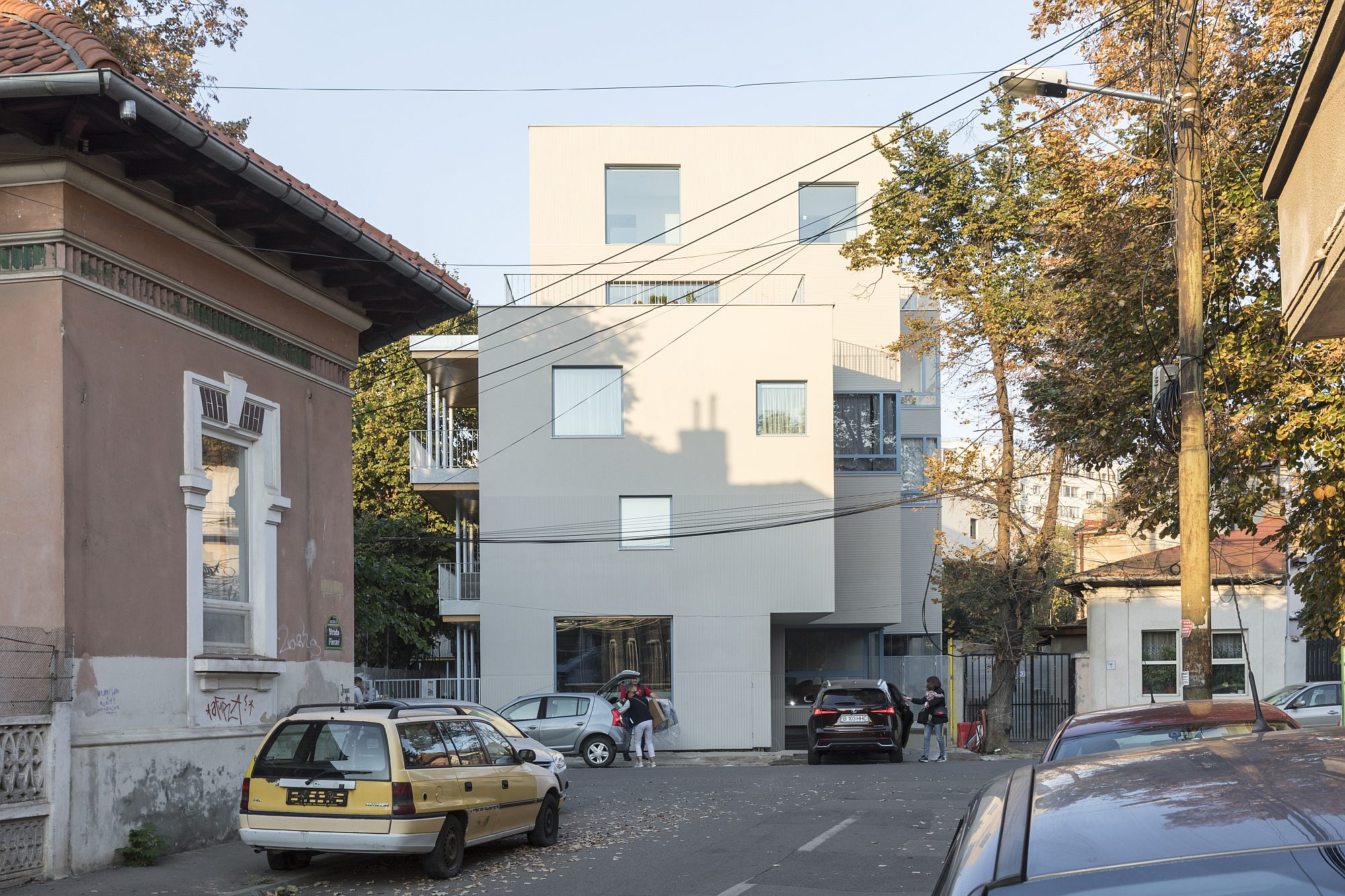
A bent plot on a central street of Bucharest, in a mixed neighborhood: a former mahala (poor peripheric neighborhood) that underwent densification over a span of 150 years, it has survived the large-scale demolitions under Ceaușescu’s regime, being nonetheless encircled by the “curtain” of communist high-rise buildings. Surviving “train car houses”, villas and small Modernist and Neo-Romanian blocks, gardens with grapevine arbors can still be seen here. Post-1990, since it was not included on any protected areas list, the area developed as a series of increasingly aggressive individual interventions. From the highest terraces of the Mumuleanu Street building, you can see both the high-rise concrete belt from the 80s and the recent monoliths rising from the sea of low-rise buildings.
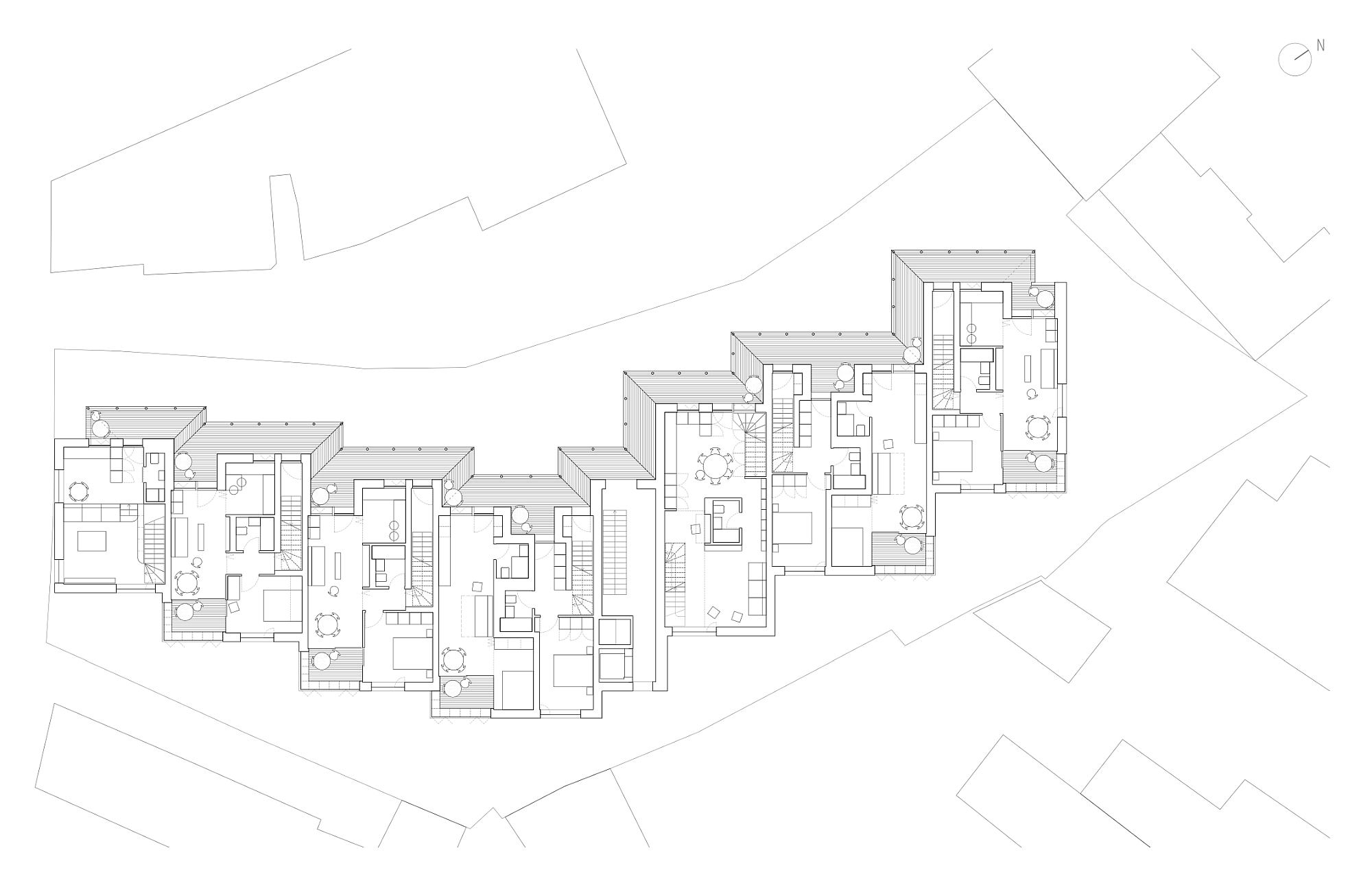
A first rational step in the project was to divide the complex into staggered structural units, a geometrical approximation of the lines of the plot. The sliding modules and the play on heights also soften the impact on the area, providing a human scale to an otherwise bulky volume.
The type of dwelling afforded is intermediary or semi-collective. It combines the traditional Modernist typologies—the two-and three floor apartment—with those of interwar Bucharest: maximum autonomy of the apartment (including entrances), recognizable units within the ensemble, density while affording living conditions similar to the detached house with garden.
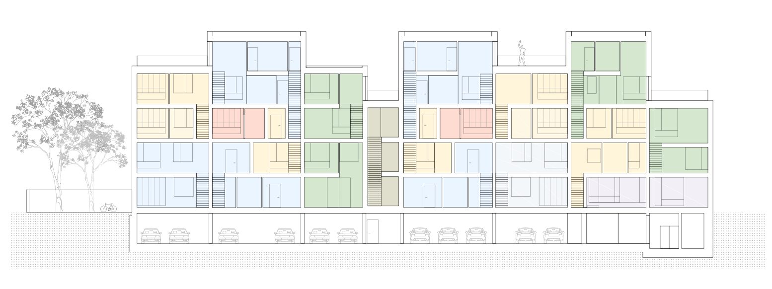
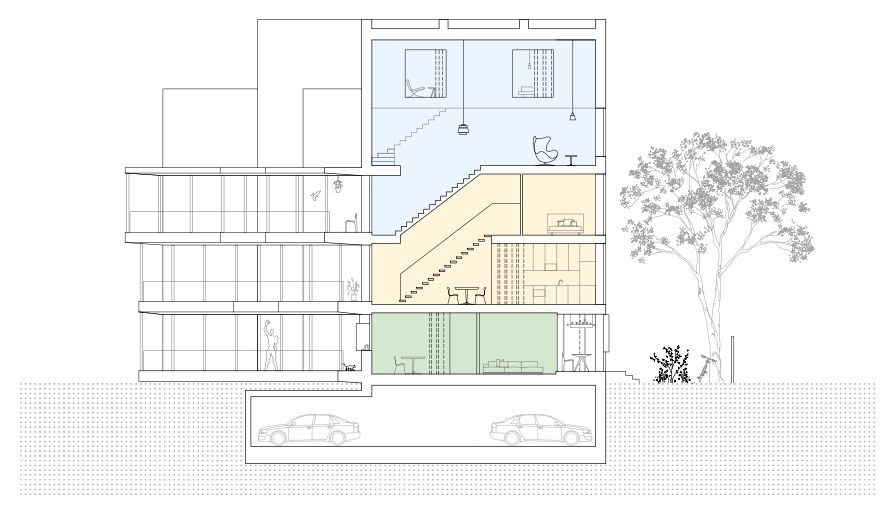
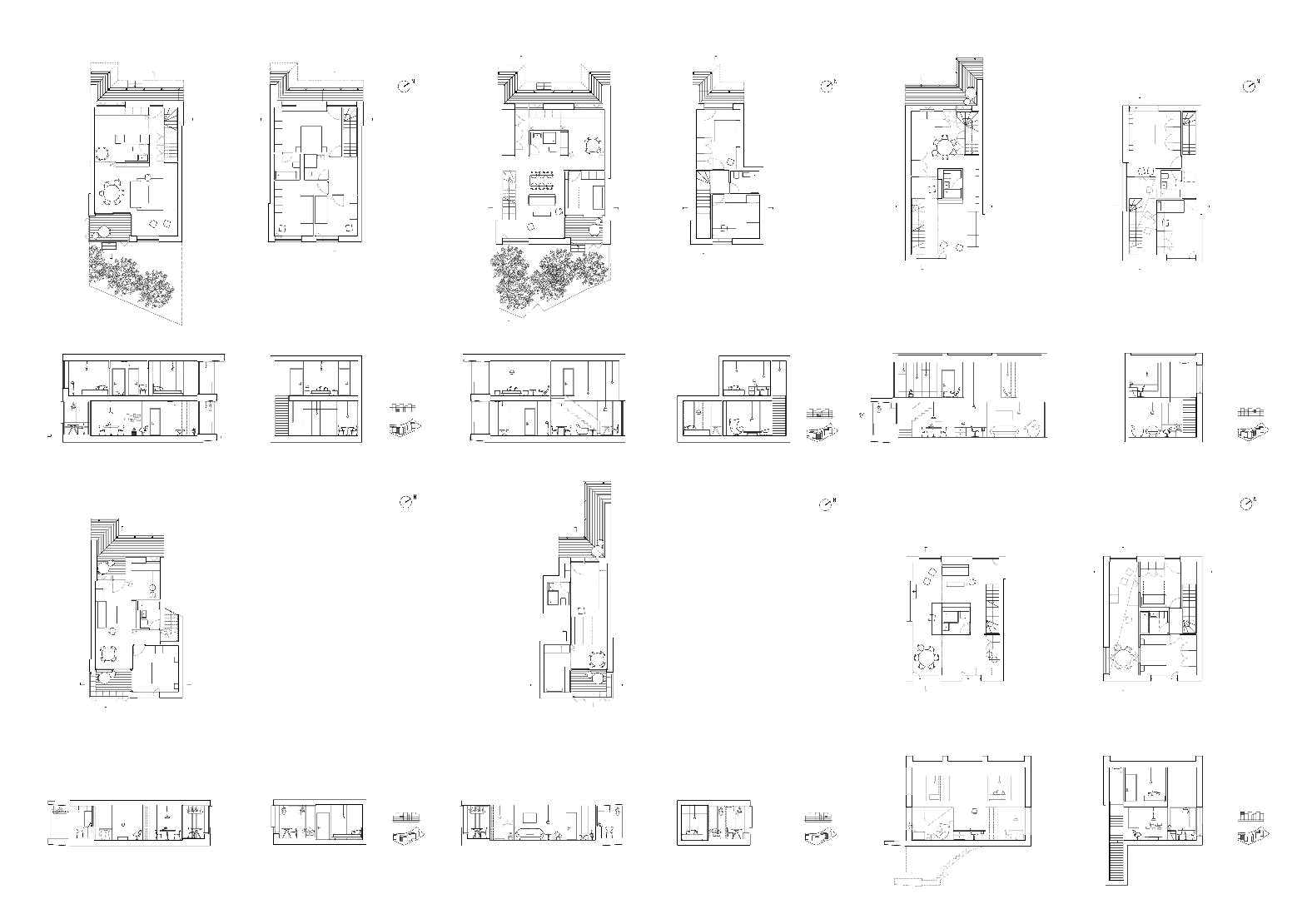
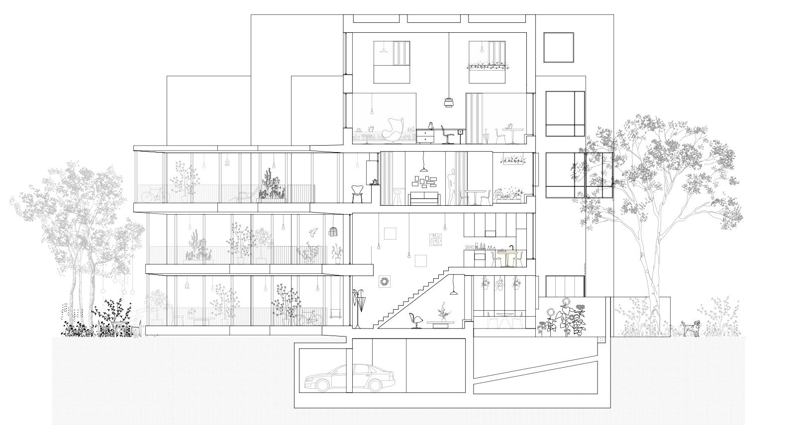
The principles of dwelling are best seen in the section view. There are eighteen housing units and a space for offices/workshops naturally facing the street. Almost all of the apartments are 2-or 3 floors high triplexes, but apart from that, they are quite different. One group of units work as houses with two floors: the entrance is in the courtyard, on the ground floor, and they come each with its private garden on the south-east side of the plot. On the first floor, private balconies open to the opposite side (west).
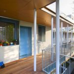
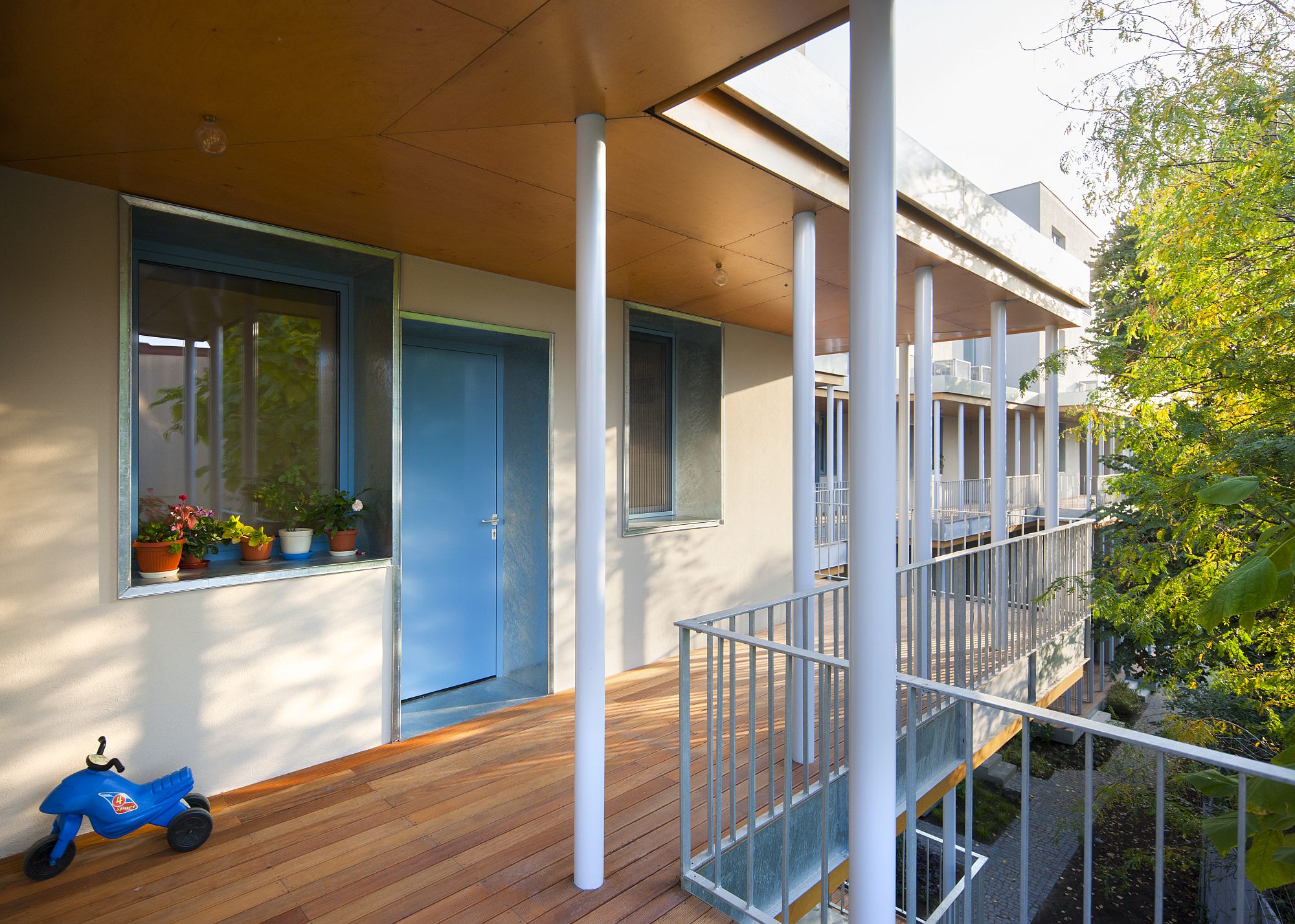
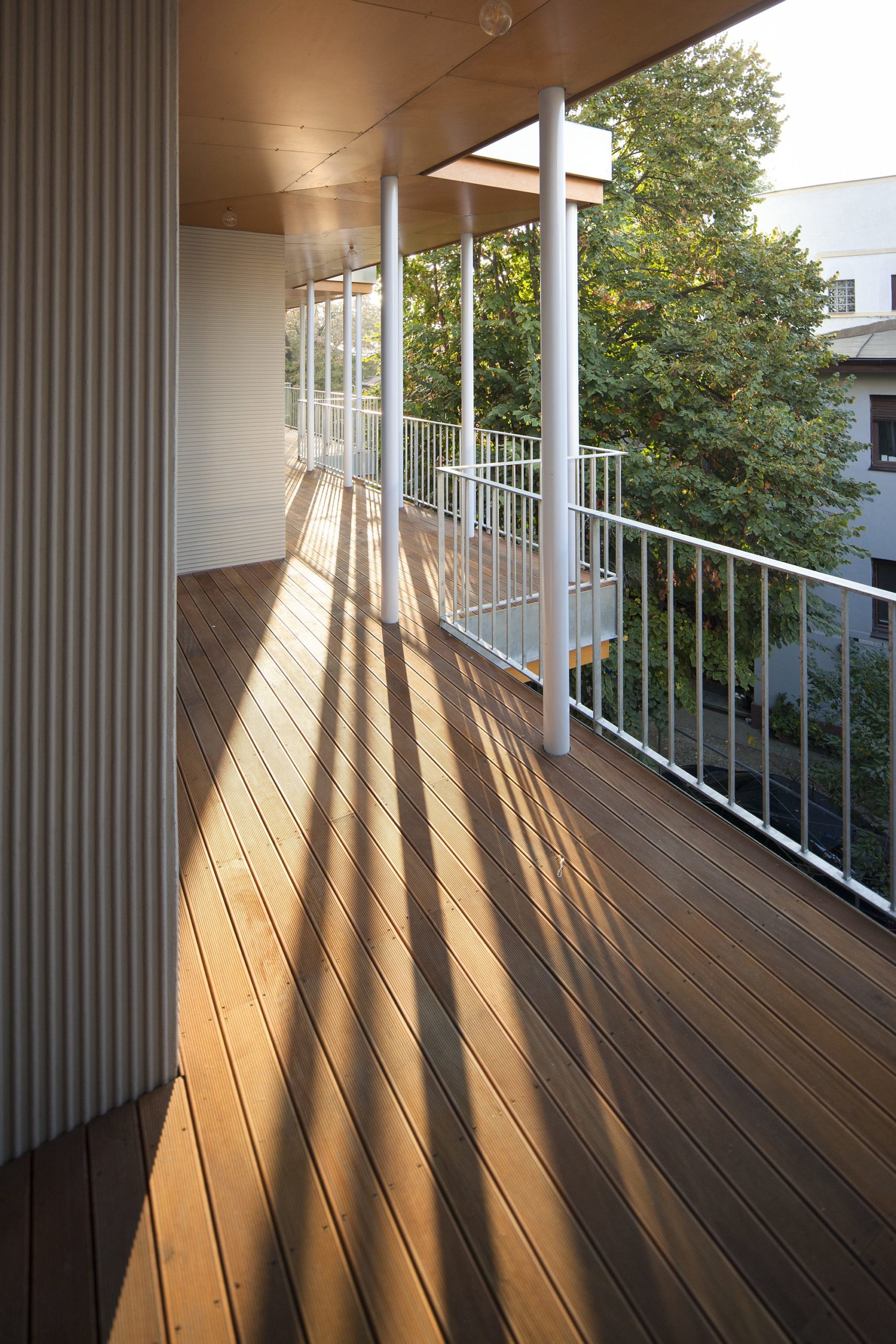
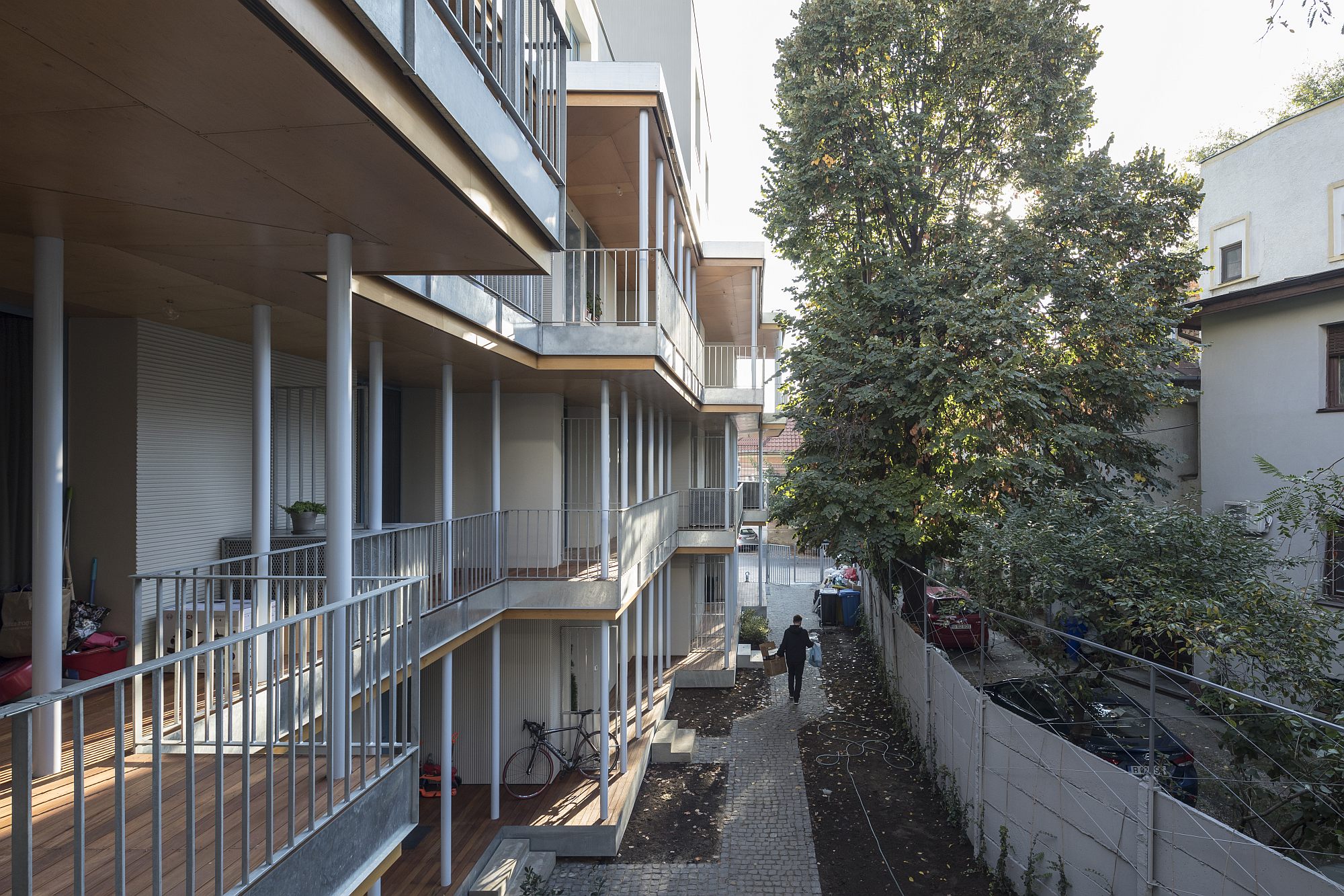
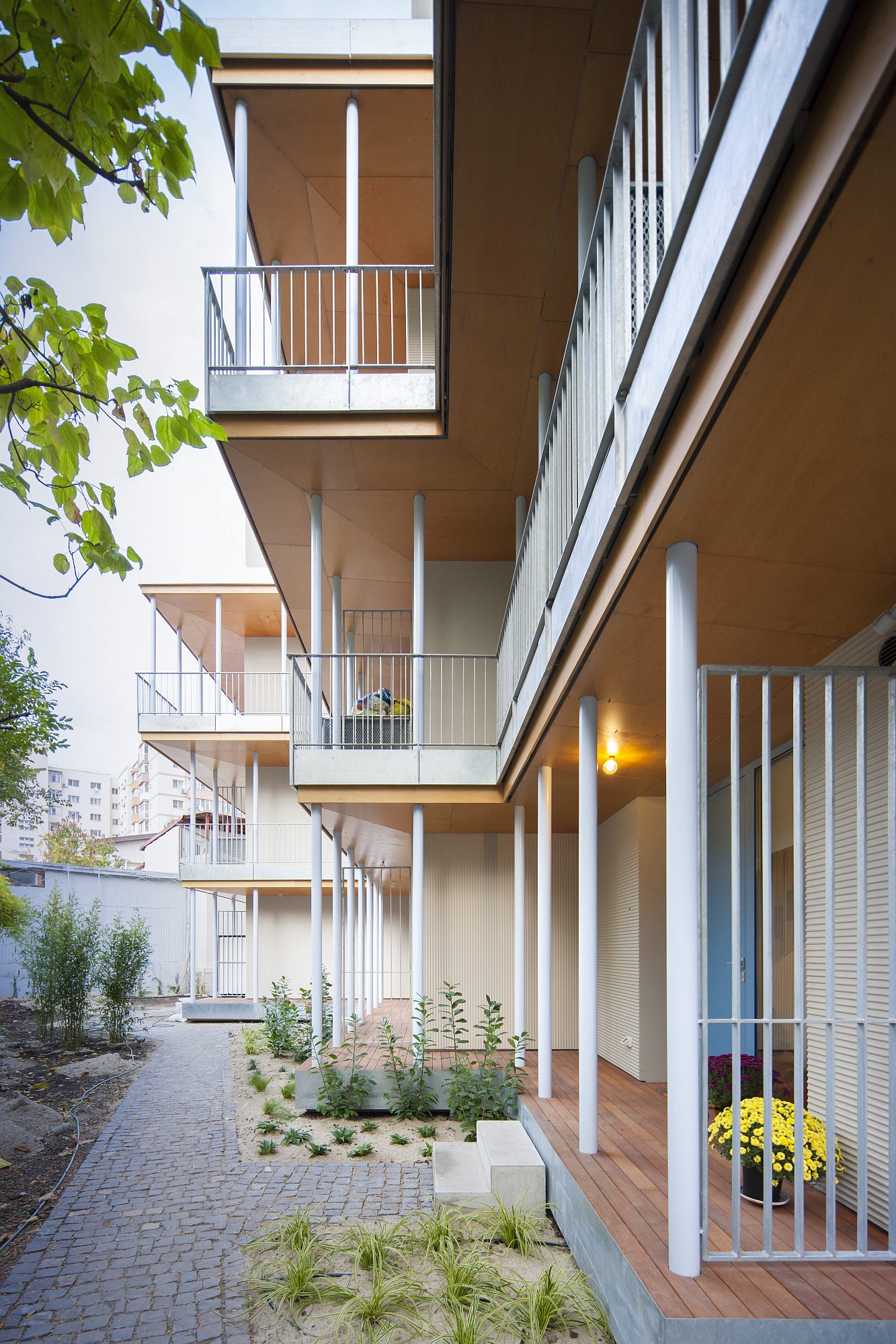
Still to the west, a gallery runs the whole length of the first floor. The block of flats on Mumuleanu Street thus becomes one of the few examples of houses with an open-air gallery in Bucharest. Traditional ones, such as nineteenth-century inns or other buildings with a porch (cerdac) or a glazed porch with steel lattice (geamlâc), have almost entirely disappeared as both liberal and totalitarian modernities did not seem to appreciate them.
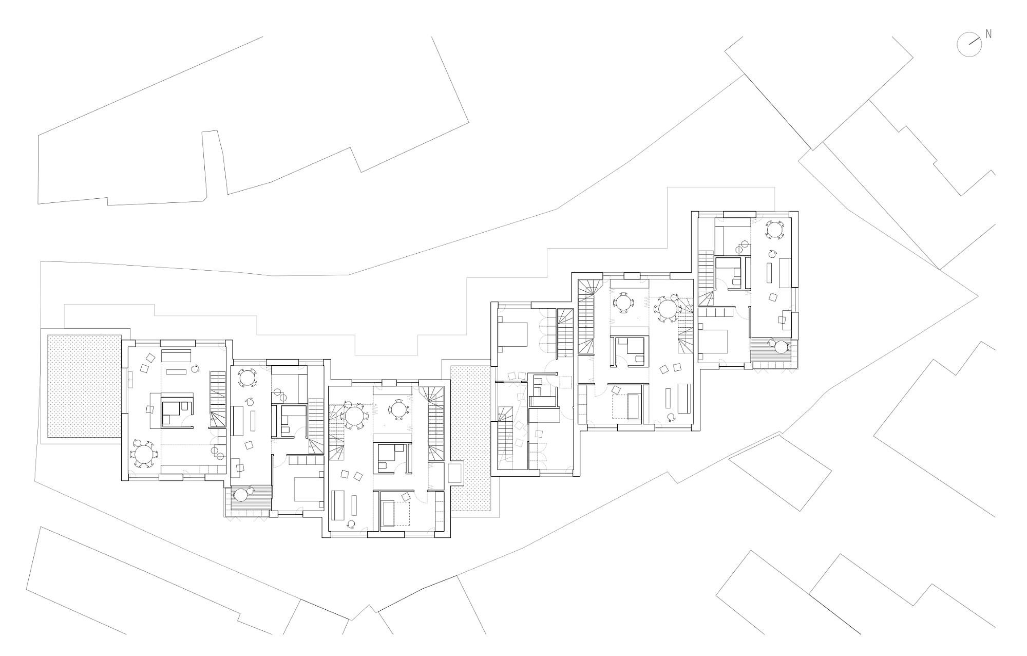
In this case, the gallery is used both for efficiency and a little extra quality of living. It is resource-efficient because it makes it possible to use only one interior circulation core (staircase + elevator) in a long building which would otherwise have required at least two nodes; hence an economy of expensive devices and more apartment space. What makes it even more architecturally interesting is its width, which it preserves along its whole length, even extending in some areas. The point is therefore not so much to allow open-air traffic as to generate free spaces for each apartment—overhanging courtyards and buffers between the shared spaces and the private interior space.
The individual entrances on the ground floor, the vertical core and the gallery solve the access to all of the units, adding to the complexity and individualization of dwelling. The gallery thus provides access to all apartments that start on the second floor (duplexes and triplexes on a single level), as well as to the units that go down towards the lower floors—duplexes mixed with the „houses” on the ground floor.
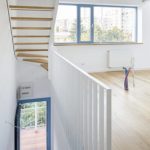
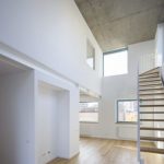
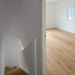
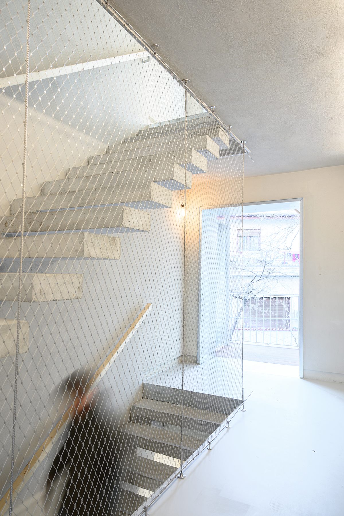
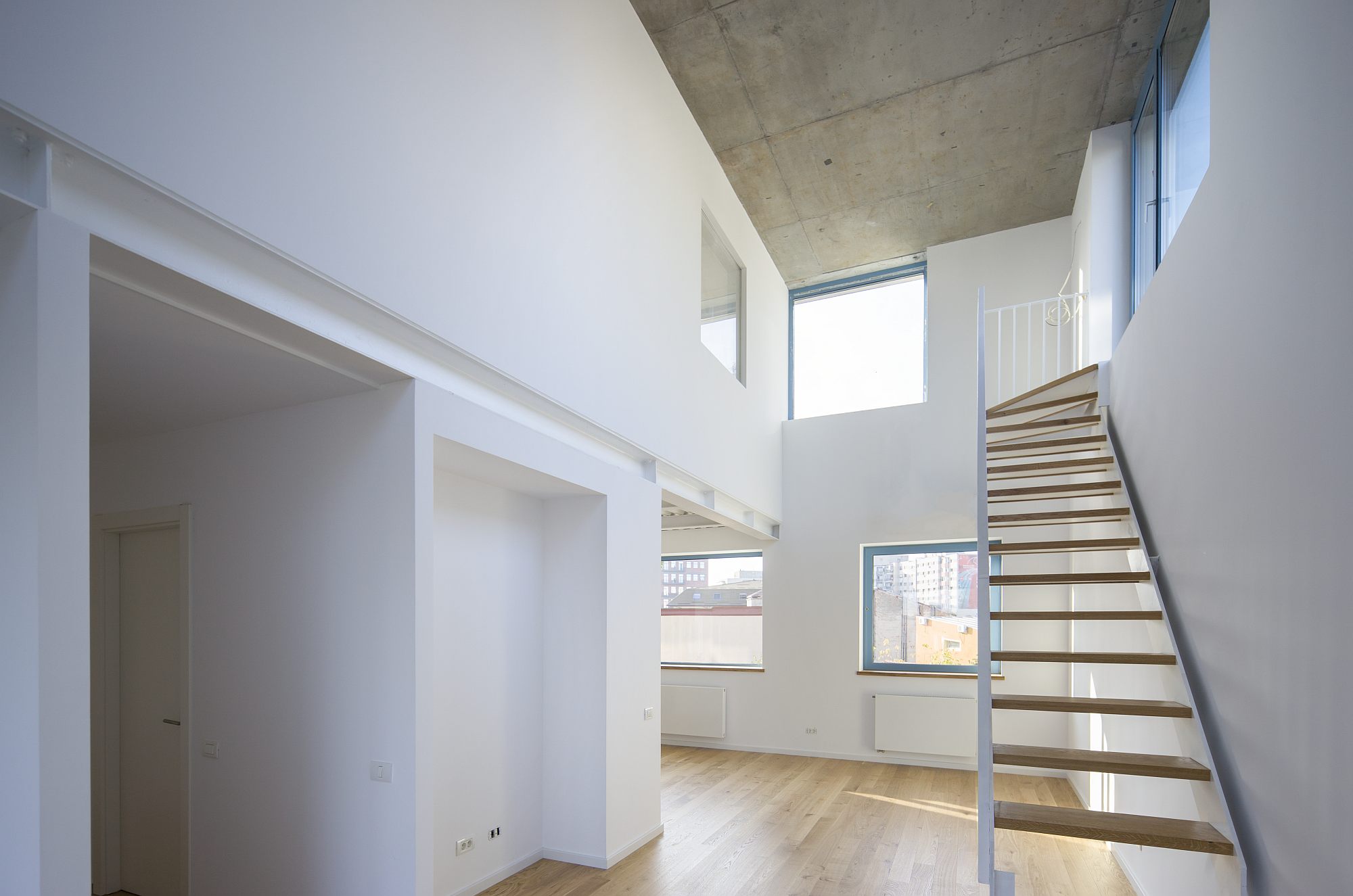
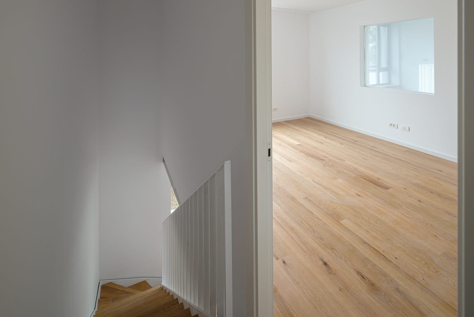
The staircases of the housing units are laid out crosswise. The annexes are either in line with the walls or create functional cors, which usually also divide the apartment into daytime and nighttime areas. You go up and down the stairs a lot in these apartments. The reward for that is however generous indoor areas, double-height spaces, visual communication between the various rooms, as well as ample, friendly private outdoor or intermediary spaces.
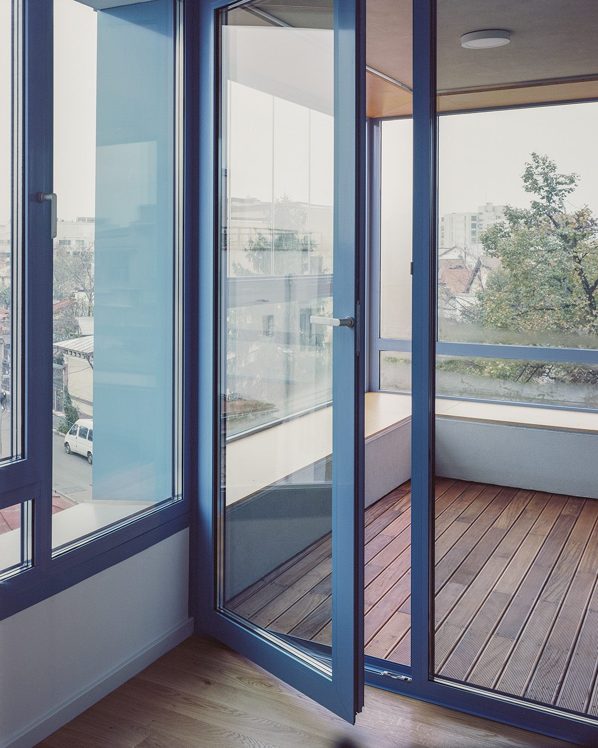
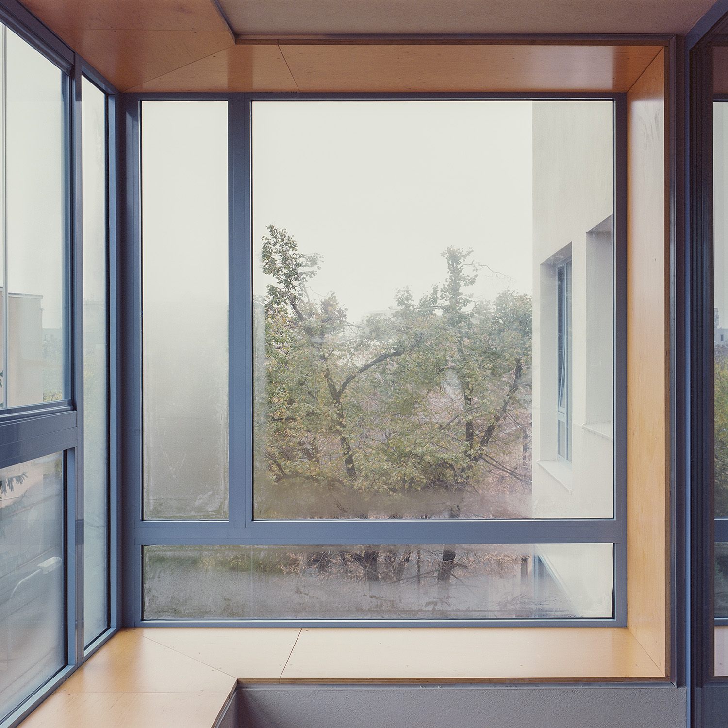
Depending on the orientation of the façades, the intermediary spaces fall into two broad categories. On the south-west façade, an in-depth skin is born from the overlapping of first-floor balconies, the gallery and its roof. In the winter, it lets in the sunlight, and in summer, it offers some protection. The north-east façade features glazed balconies, or corner bay windows, if you wish, a thermic buffer during the cold season.
Materiality. Tension and cohabitation
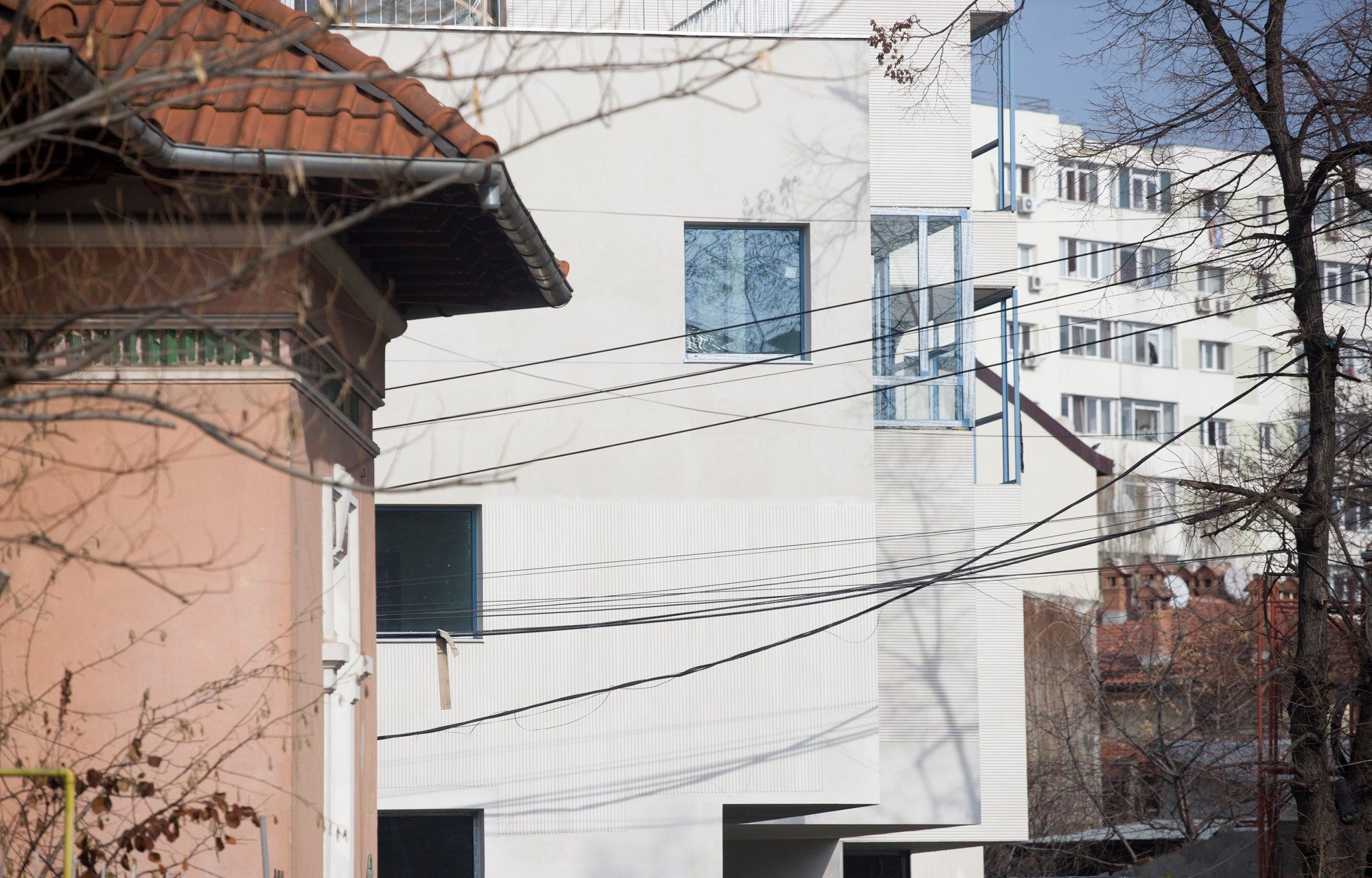
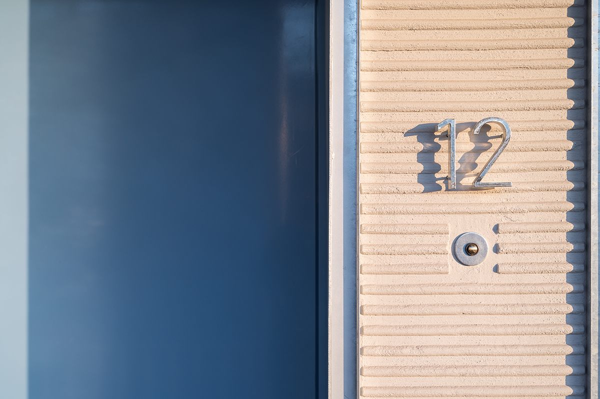
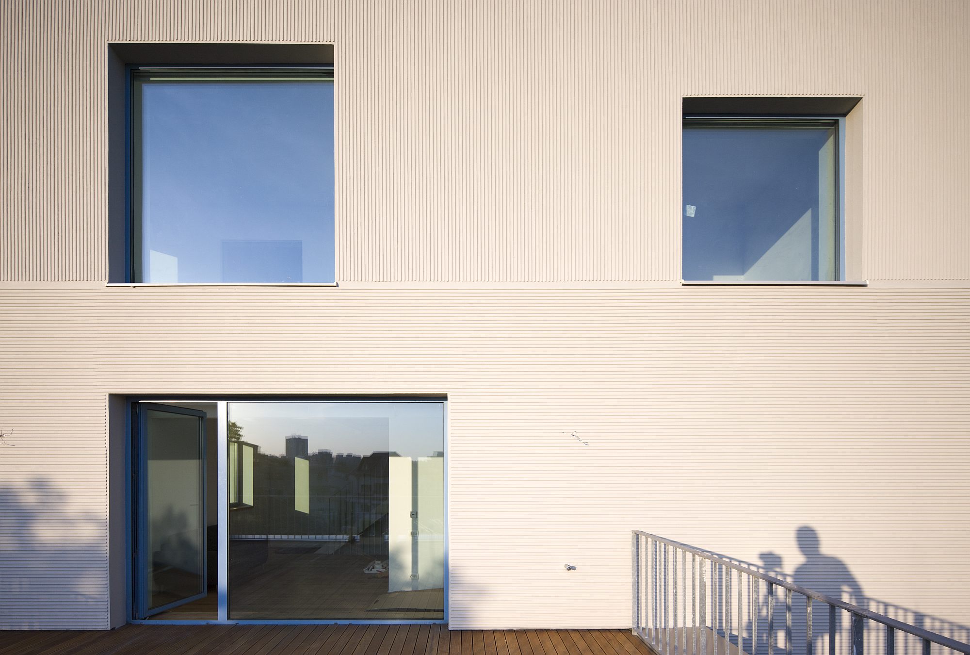
The main building itself is rather closed: an architecture of walls and cut-outy apertures. The textures of the wall plaster vary, making the walls vibrate in the sunlight and visually softening the general scale. This is an architectural statement, a clear reference back to interwar wall rendenrings and profiles. It’s also a type of finishing a lot more difficult to achieve today compared to the those times, when the craftsmanship required was widely available.
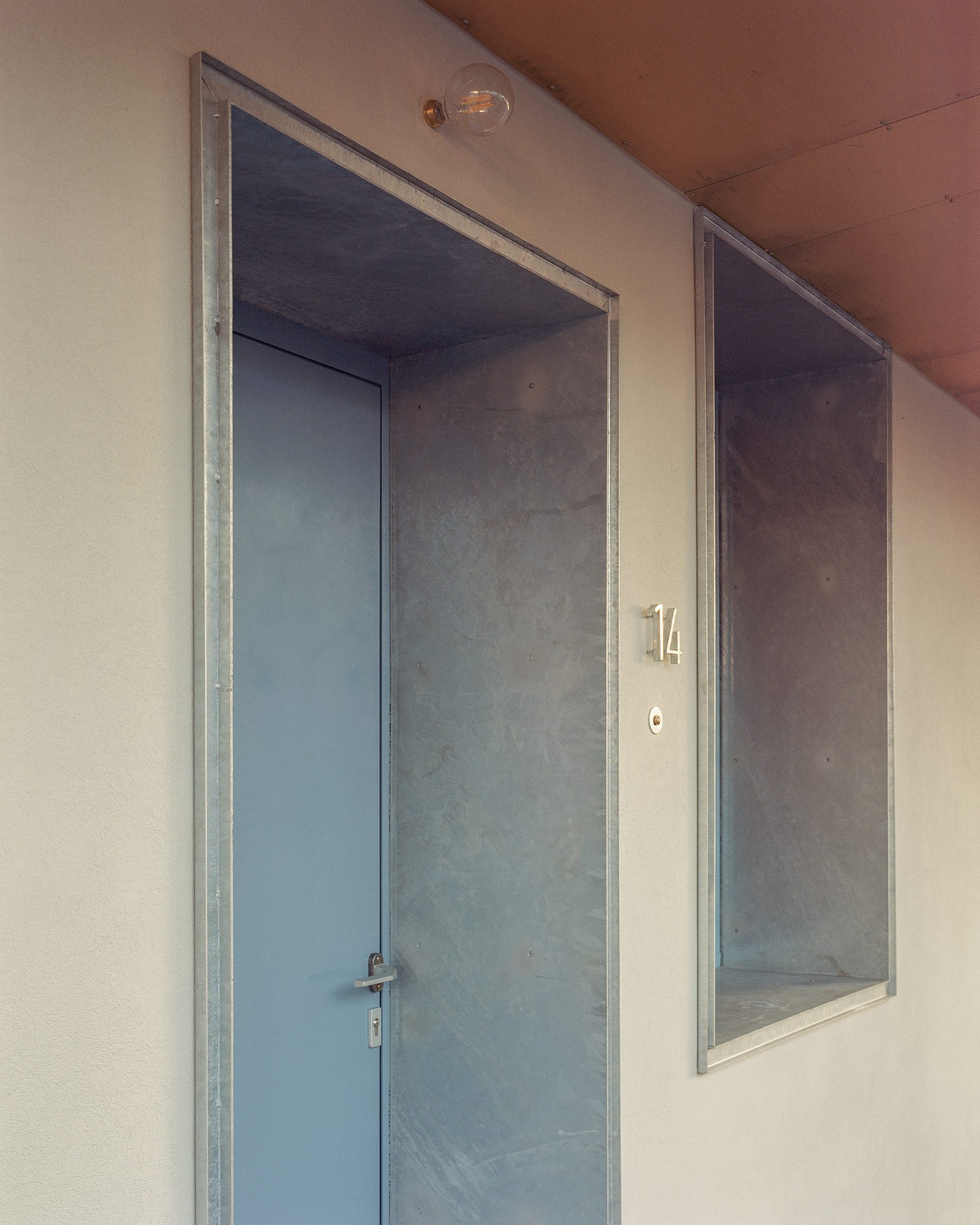
The gallery starts, also structurally, from the building’s bulky volume: the ceilings are thick slabs supported by cross-beams. On the outward edge, the slabs are supported by posts in a crisscross pattern. The posts and the metal banisters, the wood and the galvanized-iron plating produce however an entirely different kind of architecture—light, airy, transparent. The cohabitation, the fertile collision between tradition and modernity that I mentioned early in this article thus becomes apparent. In an artistic context, collage implies not just juxtaposition but also a cross-fertilizing aspect. Thus, while the series of west-facing platforms is clearly contemporary, it can also be read as a reinterpretation of archetypes: the cerdac (superposed ones in this case), for sure, as well as the porticos and galleries of classical ancient architecture; ancient models, but broken, stripped-off and updated. Similarly, there is a subtle contradiction between the main building’s bulkiness and the traditional rhythm of the wall coating, on the one hand, and the anti-classic layout of the openings, flush with the outside face of the wall. Not to mention that the window frames are blue and made of sheet iron too instead of wood.
© Mihai Rotaru
The expression of the building is the result of this permanent oscillation between traditional elements (or historical modernity) and new ones, the swinging back and forth between yesterday’s and today’s worlds. This is serious and playful architecture at the same time. I liked it, and not only because of my soft spot for quality steampunk.
The future
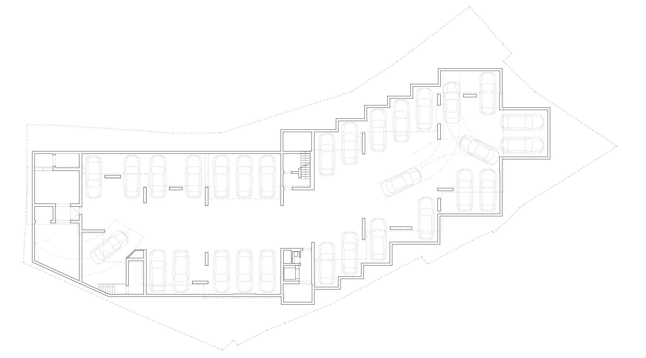
There would be more to say—for instance, about the importance of the garden. The genuinely green area, i.e., the soil area, was maximized using technical solutions. As founding partner Andrei Șerbescu told me, the basement surface area could have been more compact. Replicating the crisscross pattern on the ground floor was more difficult and costly, but it allowed creating actual gardens.
And then there were parts where resource-efficiency prevailed. The widths of the rooms seem slightly problematic. There is no strong feeling of being cramped, because of the generous gaps and double-height spaces, but furnishing the rooms is likely to be a challenge—a few dozen extra centimeters would have come in handy (but at the expense of reducing the number of units). This might not be such a problem in the end—but this will only be ascertainable later, after the building will have been lived in for a while. I am very curious about what the building will look like in a copule of years, with plants and terrace furniture; how cohabitation and sharing some spaces will be negotiated by the residents; what the garden will look like with the plants all grown. We will come back.
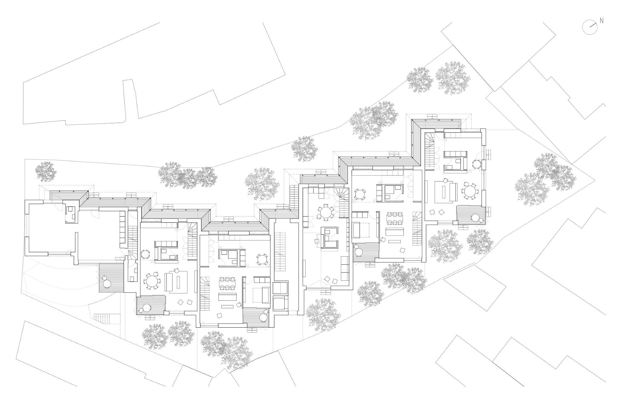 *Ground floor plan
 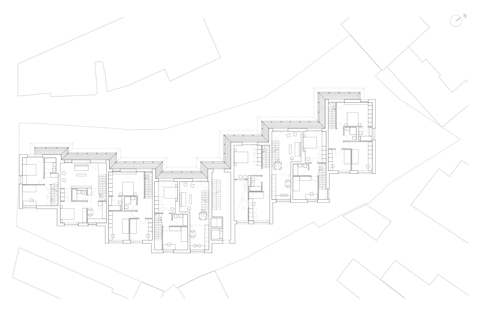 *1st floor plan
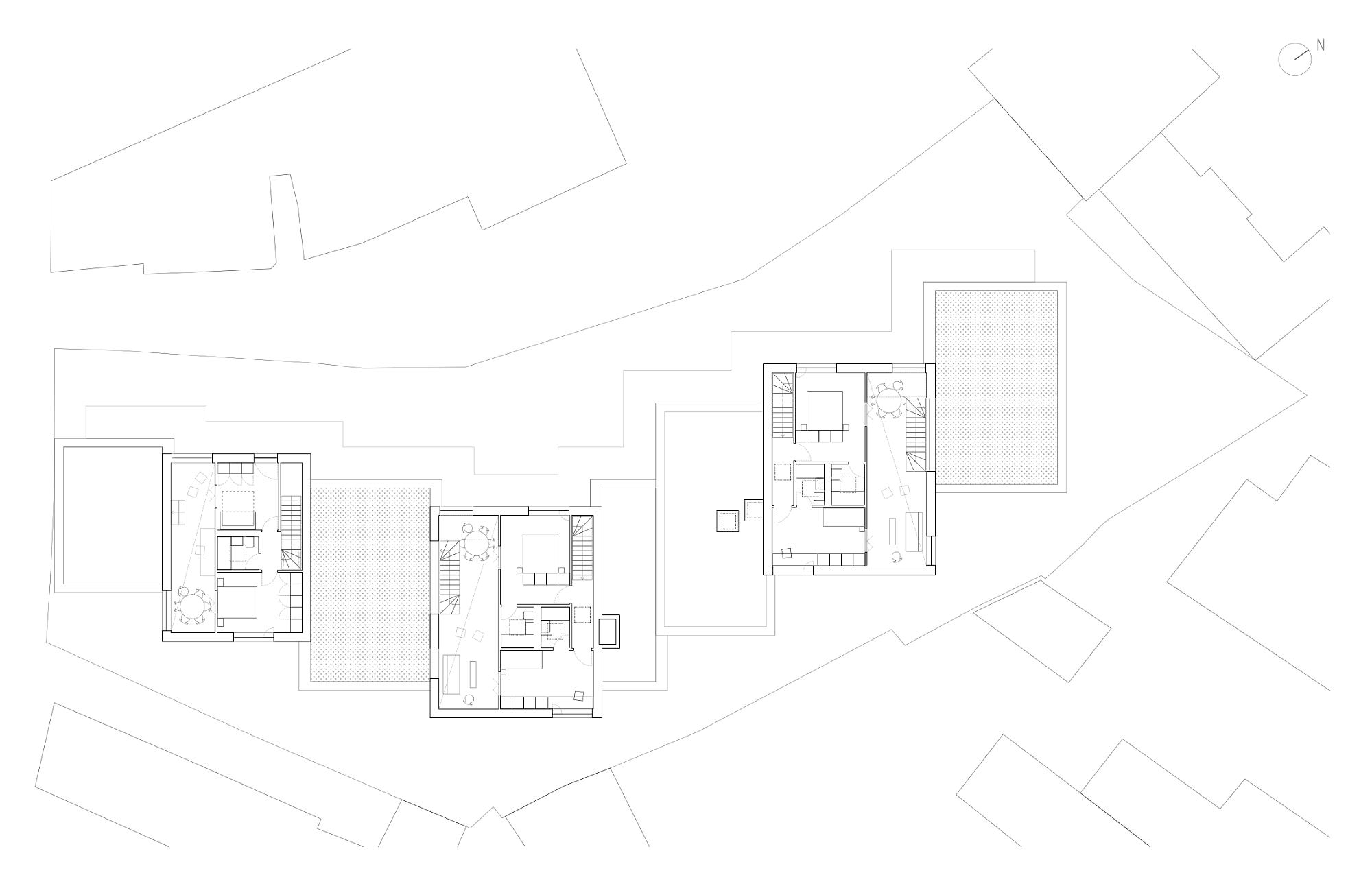
*3rd floor plan
Info & credits
Architecture: ADN BA – Andrei Şerbescu, Adrian Untaru, Bogdan Brădăţeanu, Petra Bodea, Mihail
Filipenco – adnba.ro
Structure: Popp & Asociaţii – Vlad Dinu, Ionel Badea/www.popp‑si‑asociatii.ro
Installations: M.C. General Construct Engineering;
Sanitary: Mihai Vasiliu
Heating‑hvac: Robert Ciubotaru, Marcel Vasile; ELECTRICE/ELECTRICAL: Valeriu Mavrodin;
Cosmin Grozdea
General contractor: Ro Company Construct – Cătălin Savu (site supervisor), Sorin Stroian
Contractors:
Structure: Petcu Construct, site supervisor: Cătălin Sîrbu
Electrical installations: Triac Inst 96 – Moga Vasile
Hvac/sanitary, hvac: Insaterm – Cătălin Ion
Plot area: 1.216 m2
Ground floor built area: 526 m2
Total built area: 1.924 m2
Developer: Urban Spaces
Construction: 2017–2019

