Text: Ștefan Ghenciulescu
Photo: Cosmin Dragomir
Romania suffers from a terrible lack of museums. Not only are there few museums made, if any; more than 100 museums or memorial houses have disappeared over the twenty-something years, especially through retrocessions (and out of the authorities’ lack of interest in purchasing them). Under these conditions, a new museum, especially a museum of modern and contemporary art, is an event. Should true architecture also show up there, so much the better.
The recently-inaugurated Museum of Recent Art has aroused much enthusiasm, and, one needs to say, also many controversies. This is a private museum, modest in size, but with strong ambitions, including architectural ones. The ‘recent’ part first refers to the collection’s temporal coverage: Romanian art, since the post-Stalinist period until today. International art is however also present, mainly through temporary exhibitions. The museum is much more open and accessible than most old-type museums in Romania, and includes a library, as well as other spaces for culture and the city.
Place and attitude
The museum’s location is significant: on the Primăverii Boulevard, in Bucharest’s luxury area, replacing an inter-war villa. The owners have obviously steered clear from cool places, industrial buildings or neighbourhoods, or other areas with issues but with a development potential. They preferred a ‘good’, well-known neighbourhood, with established prestige. Leaving the scale aside, the model seems to be rather that of the Guggenheim (the old one, in New York), or the buildings of the Pinault Foundation in Venice, than the new Whitney or Tate Modern.
The Primăverii Boulevard is more than simply a sought-after area of the garden-city in the ‘20s and ‘30s in the northern central area. Pretty much all of the communist nomenclature took over the villas seized from their owners after the establishment of the regime, but the Primăverii area focused the peak of the power; Ceausescu’s villa is here, for instance. After the revolution in 1989, the combination of huge attractiveness and weak protection lead to a fulminating development. Nearly all the old houses were replaced by huge, crammed blocks of flats and, it needs to be said, most of them also extremely ugly.
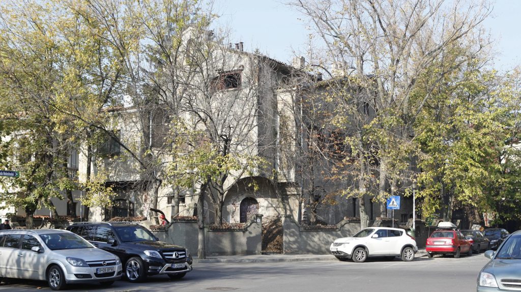
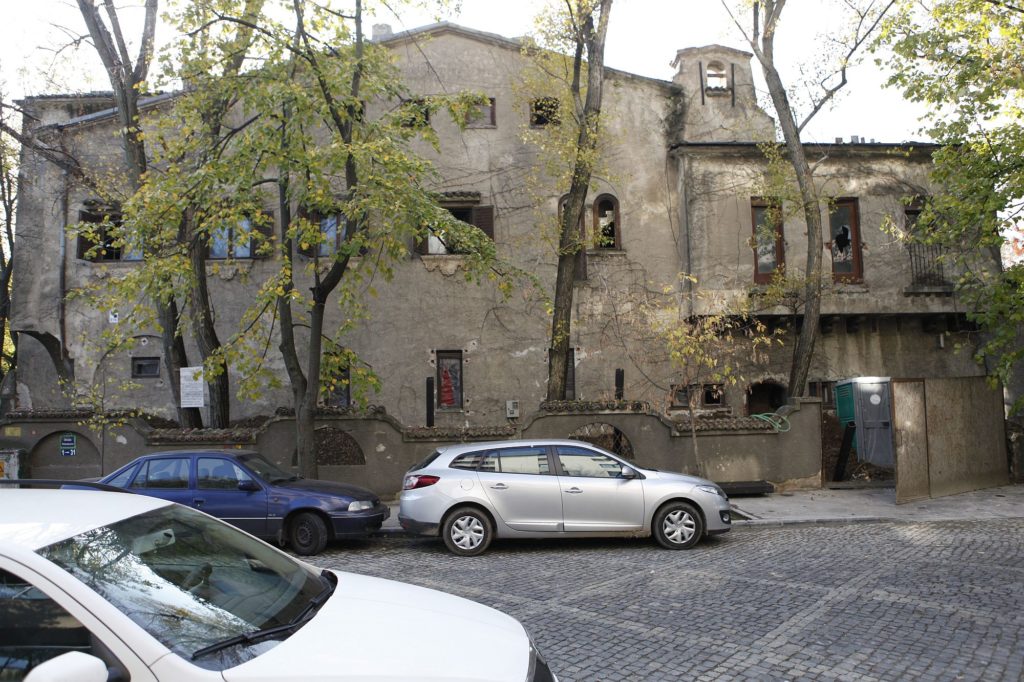
On the museum plot there used to be a villa in the strange but lovely Neo-Florentine/Neo-Venetian/Neo-Moorish style (the terminology was never established) which, in the ‘30s, was a contemporary of Modernism, Art Deco, or the last of the Mohicans of the Neo-Romanian style. The house with a troubled history was also inhabited by the dreaded Ana Pauker, a character in the highest leading echelons of the Communist Party.
The decision was made to demolish the house and to erect a new building. I must admit that, especially in today’s Bucharest, I am personally not a big fan of demolishing buildings with architectural and/or historic value. Even when I hate them. At the beginning of the ‘90s, I would desperately wish for the demolition of the House of the People, while today I believe that history should not be annulled, and that most of the built fund can and deserves to be rehabilitated, transformed, invented.
I can understand the fact that, once the place chosen, accommodating a museum (which turned out small, anyway) in such a house would have been nearly impossible. And still… I wonder if a significant part of it could have been preserved, of some extensions could have been dealt with, if part of the functions could have been crammed in old spaces (as we can see in some materials in this issue).
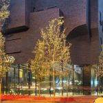
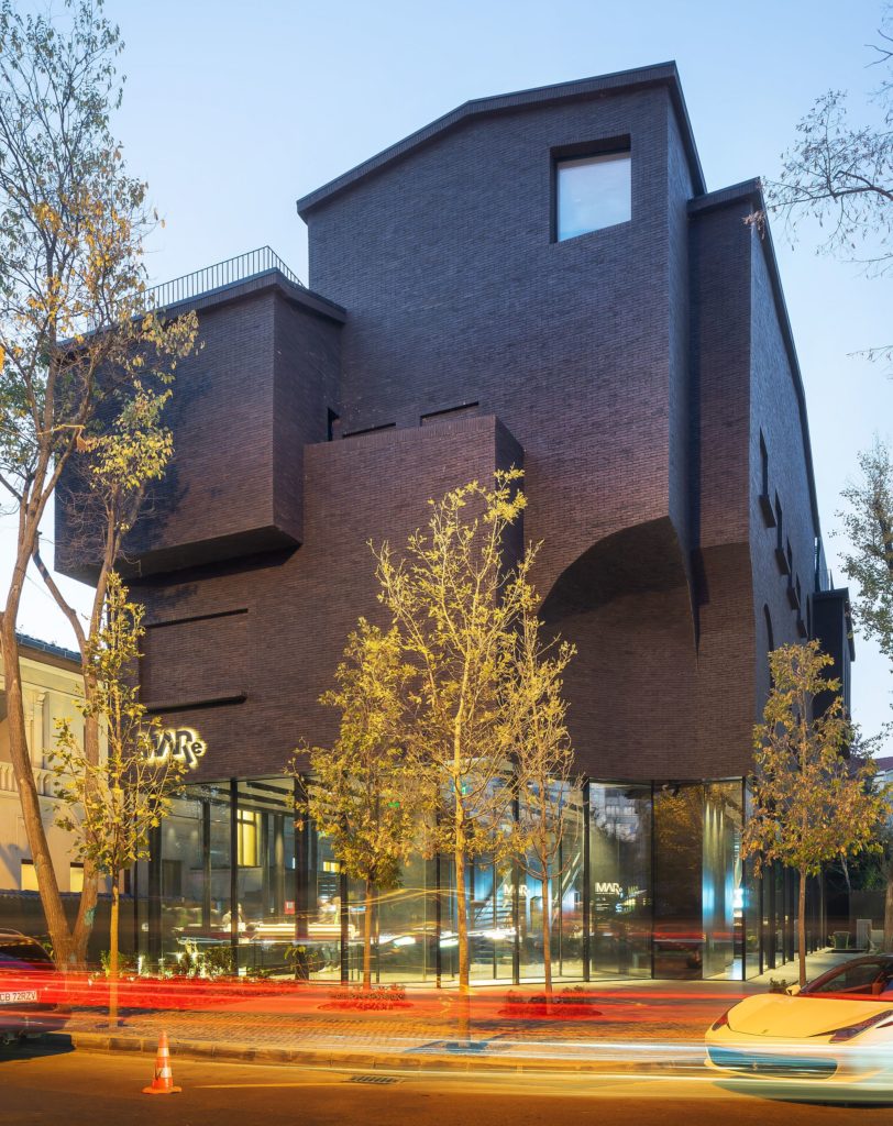
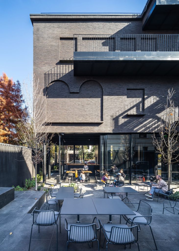
From the point of view of complete replacement, I find the choice not to keep just the old façade while demolishing the rest, which has almost become the official doctrine these parts, to be somewhat more honest: I do not believe that concealing a modern building behind an original shell would have been a good idea. YTAA (an international office established in Lebanon – speaking of which, I believe it is a good thing to have foreign architecture coming to Romania) preferred to remember the old house through a ‘ghost’, namely the abstracted, single material and reproduction of the volume with almost no voids, and to elevate it on a glass pedestal.
Ghosts are also present elsewhere in contemporary architecture: but usually these are limited and critical reconstructions of already extinct buildings or parts of buildings, and not the replacement of an existing building with its own ghost. The architect speaks of “ a museum piece and a shout to the city, to confrontation, to culture (..) “a form of resistance to the tabula rasa and the globalization that particularly affects young democracies, the preservation and reinterpretation of this familiar morphology to house a museum makes it possible to introduce another very important dimension of the project: the space of everyday life, of the individual, of subjectivity.”
This is evidently about the desire for a powerful gesture – a true “museum piece”, as powerful as possible for such a small building. One can nevertheless wonder the extent to which preserving the historical substance, rather than the take-over of the image, would have perhaps better expressed the troubled history, the fight against the tabula rasa but also the idea of a domestic morphology for a contemporary museum.
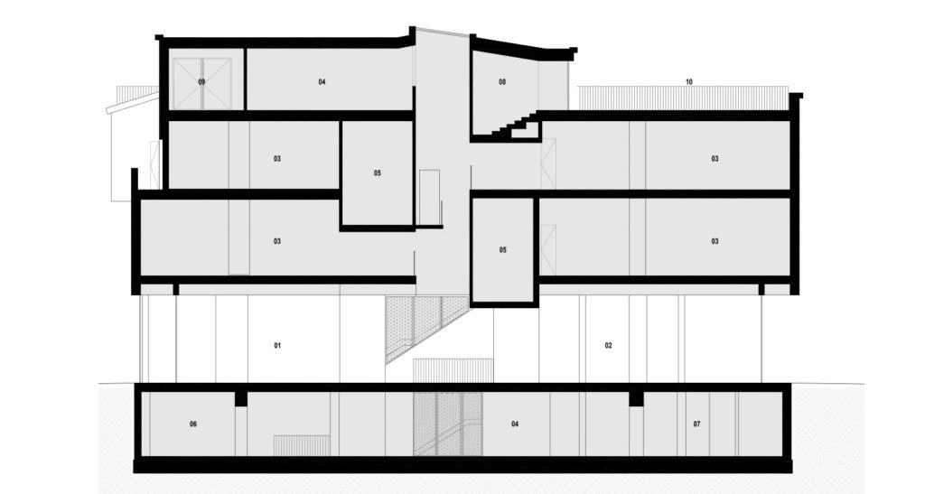
*Longitudinal section: 01. Entrance hall. 02. Cafe. 03. Permanent exhibitions. 04. Temporary exhibitions. 05. Black box. 06. Auditorium. 07. Storage. 08. Reading area. 09. Office. 10. Public terrace
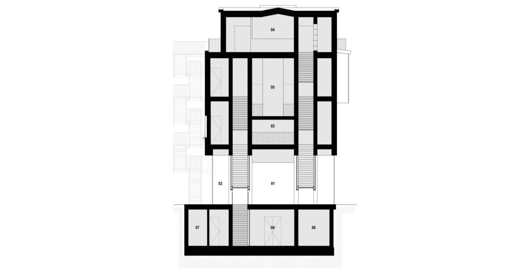 *Cross section: 01. Entrance hall. 02. Cloak area. 03. Permanent exhibitions. 04. Temporary exhibitions. 05. Black box. 06. Public lockers. 07. Technical.
The house…
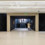
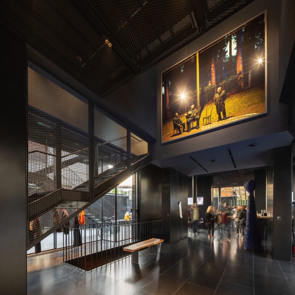
… is therefore a black brick monolith, placed over a fully glazed space. The generous hallway, open to the street and to the neighbours, seems to me one of the project’s great qualities. It functions as a unitary space, alongside the remaining unoccupied land, transforming the latter from a series of useless strips, to a public space. The base, which also includes the cafeteria and the shop, is truly a place for the city, and I hope that the functioning of the museum will prove it.
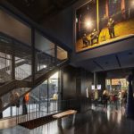
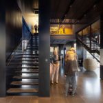
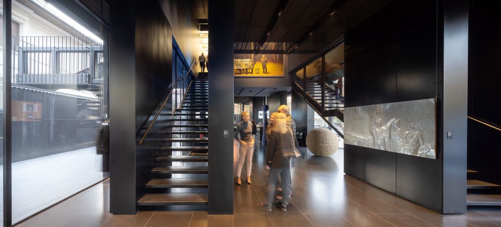
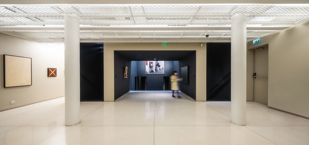
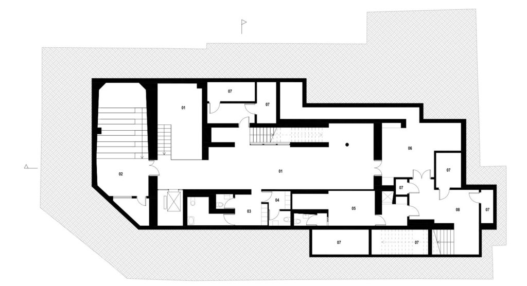
From this ground floor, one can go down to the underground area which includes the technical functions and the public wardrobe, and also the hall for temporary exhibitions. Or one can go up, using either the see-through elevator, or a system of stairs which assures the main visiting circuit.
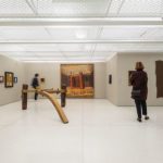
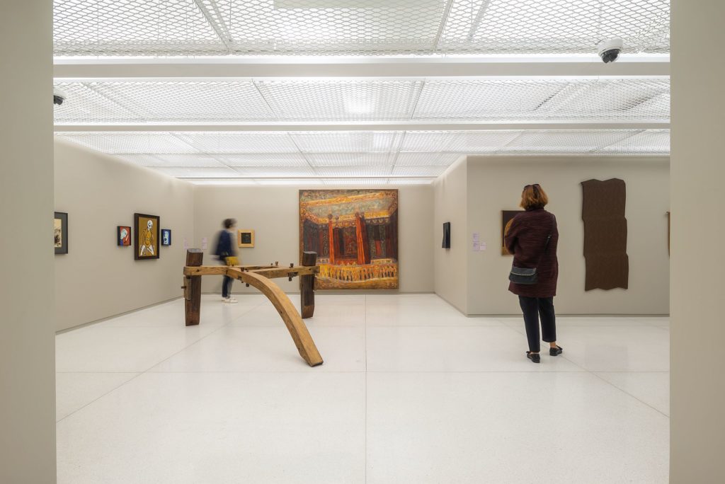
The upper floors are designed as an alternative to the white cube – the very uniform and neutral space of modern museums. Both in the vision of curator Erwin Kessler, and that of the architect, the museum is an assembly of very different places and with a strong personality, allowing a different type of approach to the work of art, a dialogue between exhibits and between the latter and the space.
First of all, the museum space is unravelled on three larger plateaus.
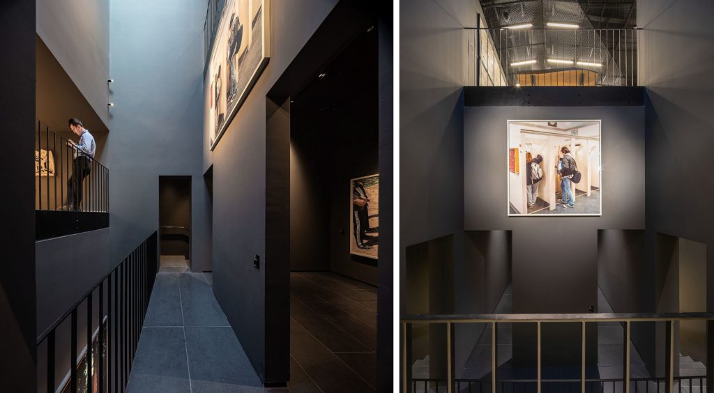
The staircases are interposed between these plateaus, being in fact two large empty spaces where the extremely transparent stairs are floating.
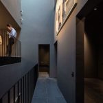
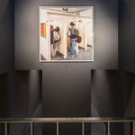
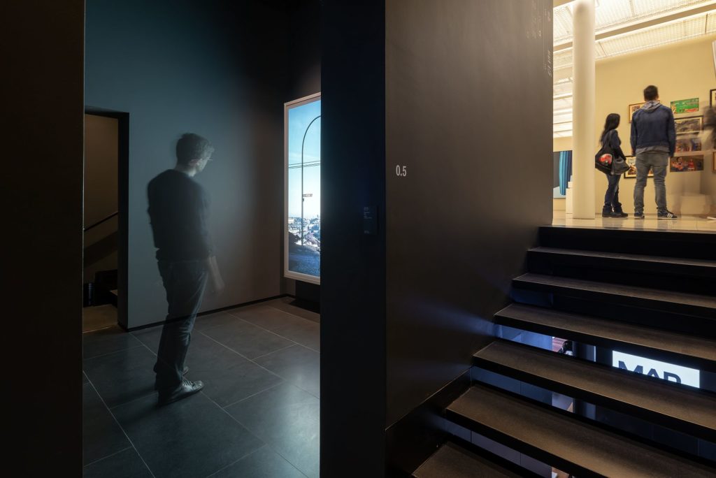
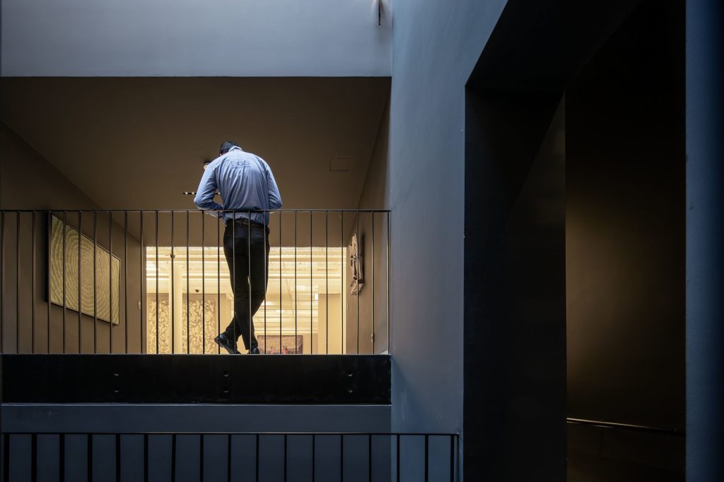
They are overlapped by a third system – two large black boxes, hosting works by international artists, literally inserted in to the permanent Romanian exhibition. A very dynamic space results, activated even more by the interior openings of the various spaces, by the galleries, recesses and other instruments which allow a line of sight from one place to another, which permanently surprise you and which transform a small space in a complex place. It is, in fact, one of the things to appreciate in this project, the fact that it works with spaces, not just with the envelope.
I also liked the way it holds back on materials and colours (black and shades of grey), another issue in Romanian architecture, where many good projects become sinful in terms of excesses.
And the art here? I will make no comment on the selection and the curatorial discourse, though. I can say I found a lot of admirable works here. Yet there is a feeling of insufficient space and crowding. The complexity of articulation and of the type of spaces also leads to some rooms seeming too small, and, in some cases, too low. The punctual interior voids help the feeling of claustrophobia, but not the visitor’s focusing on the works. It seems that, at some point, the idea of friction, of intimacy also imposed by the assembly of many rooms (a reminiscence of the old house?), the architecture and the concept, therefore, start being more powerful than the works themselves. Which is, in fact, reproached to many museums (some of them famous) of the last decades.
Perhaps fewer permanent exhibits and a system of looping them wouldn’t hurt; the same for a contextualization through bigger texts, to help you a little while on a very energetic track. At least in the corridors popping up at some point towards the exterior wall, my impression is that nothing should be exhibited there, or just site-specific works.
*Basement plan: 01. Temporary exhibition. 02. Auditorium. 03. Public lockers. 04. Staff lockers. 05. Kitchen. 06. Storage. 07. Technical. 08. Loading area.
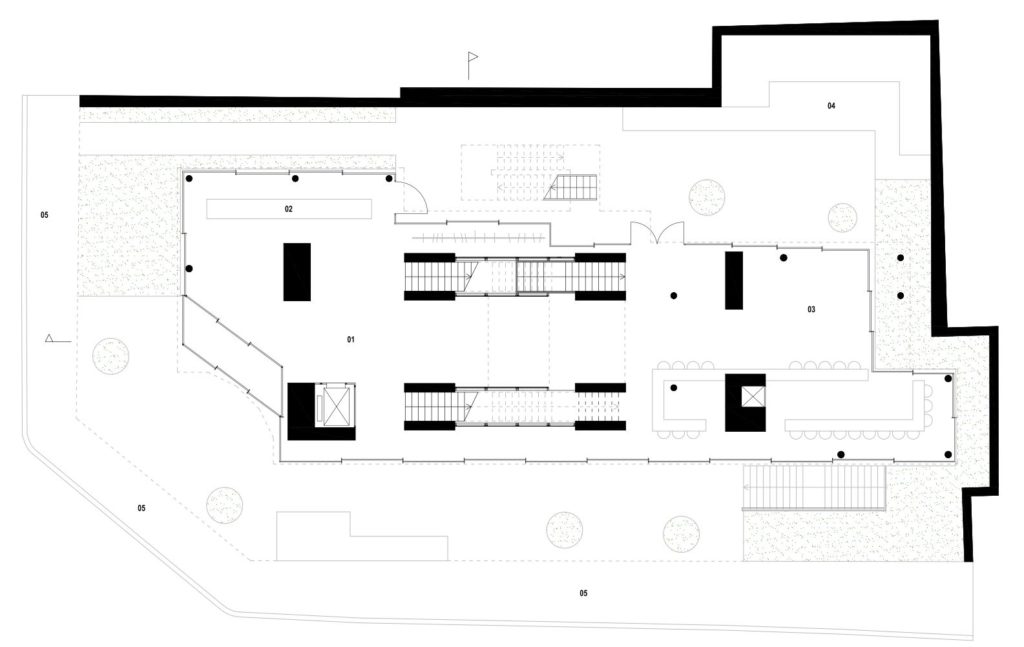 *Ground floor plan: 01. Entrance hall. 02. Reception and boutique. 03. Cafe. 04. Open air theatre. 05. Public sidewalk.
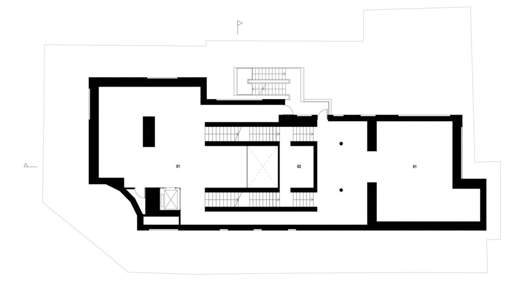 *First floor plan: 01. Permanent exhibition. 02. Black box.
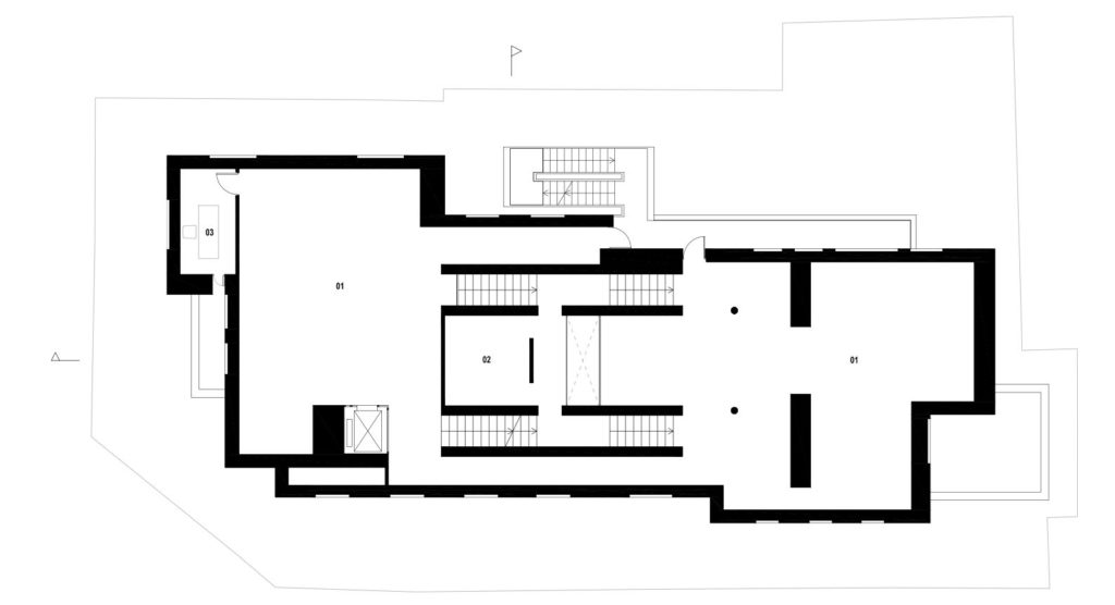 *Second floor : 01. Permanent exhibition. 02. Black box. 03. Office.
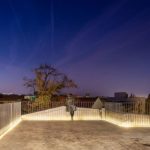
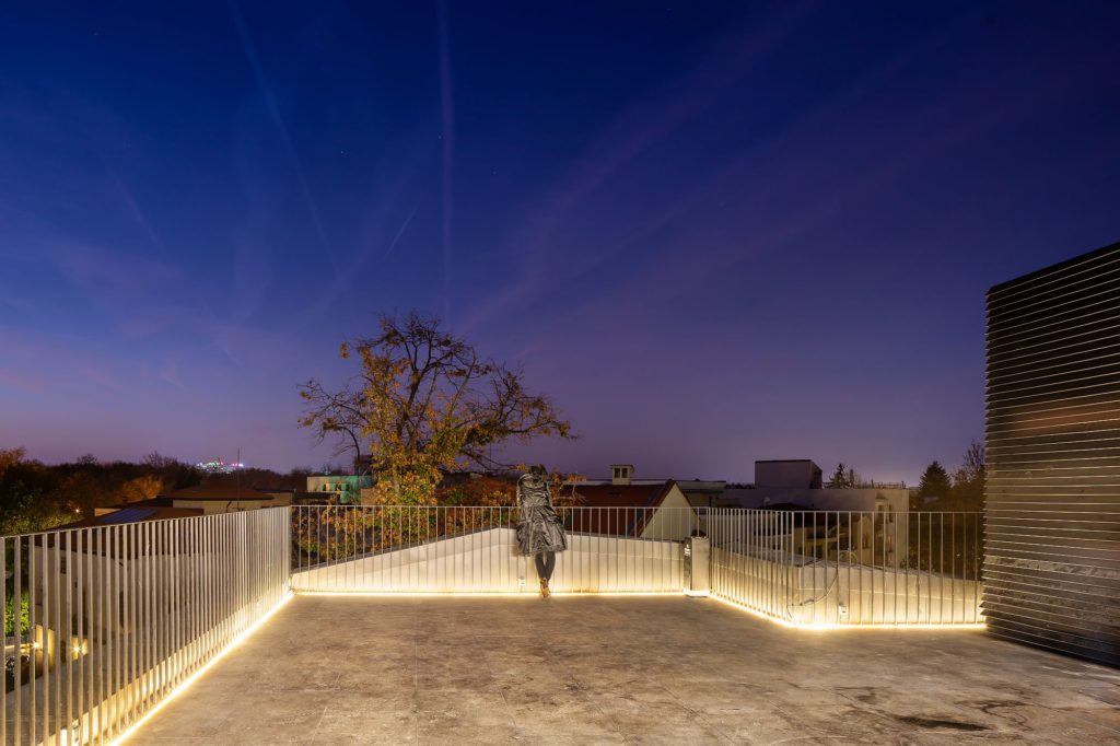
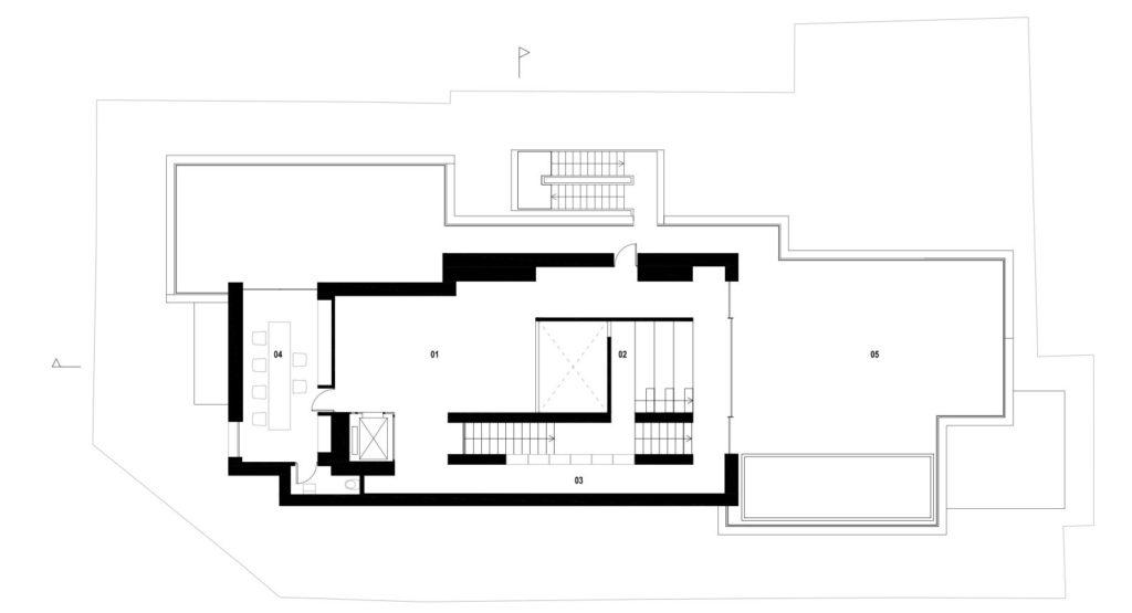 *Attic plan : 01. Temporary exhibition. 02. Reading area. 03. Library space. 04. Office. 05. Public terrace.
That’s it, for now. I am very curious about how the museum will operate and about how Bucharest-dwellers will receive it, and, perhaps, even gain pride in it. It was about time this happened to more contemporary buildings.
Info & credits
Project Name: MARe – Muzeul de Artă Recentă
Opened: 2018
Architecture: Youssef Tohme Architects & Associates
Area : 1580 m²
General Contractor: Colina Development SRL
Consulting MEP Engineer: Wissam Tawil & Associates / MEP engineers S.A.L
Consulting Structural Engineer: Ductil Tech
Local Architect: PZP Arhitectura
Lightning design: PSLab
Landscape Architect: Marti-Baron + Miething, Landscape Architecture
Museum curator: Erwin Kessler

