How does one build nowadays, in a central, tethered and characteristic historical fabric, a new public building? The FKM project of Oradea started precisely from this question, and by modelling the morphology against the city’s neighbouring spaces was the first step.
Project: Atelier FKM
Text, Photo: Andrei Mărgulescu
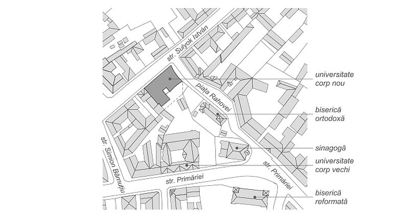 *site plan: 1. University – extension. 2. Orthodox church. 3. Sinagogue. 4. University – old building. 5. Protestant church
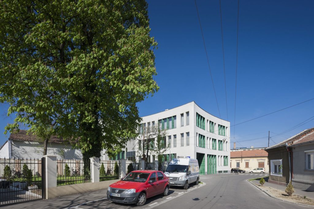
Located at the crossroads of two different types of streets, the new building fills in the front of the main street by a horizontal and neutral volume with roes of regular apertures, and towards the secondary street it displays two distinct and articulated bodies, which no longer sport a pediment, but fragment the scale of the built object.
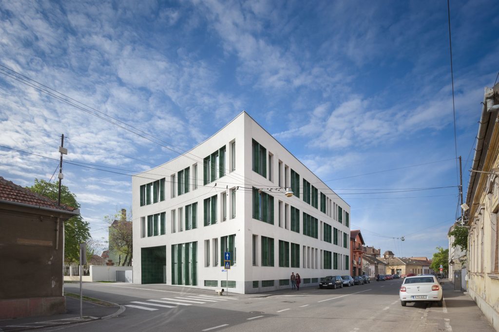
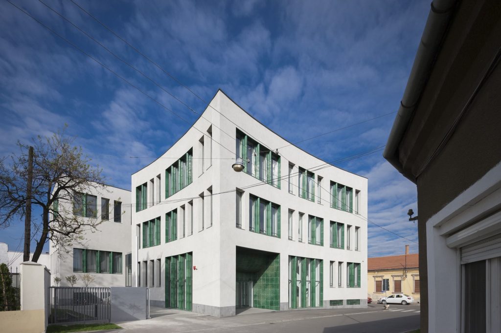
The geometry of the public space, firm and linear towards the main street, curved towards the secondary one, is also taken over in the modelling of the facades’ plan. The volume becomes concave and welcoming to the small street, also the access place to the building.
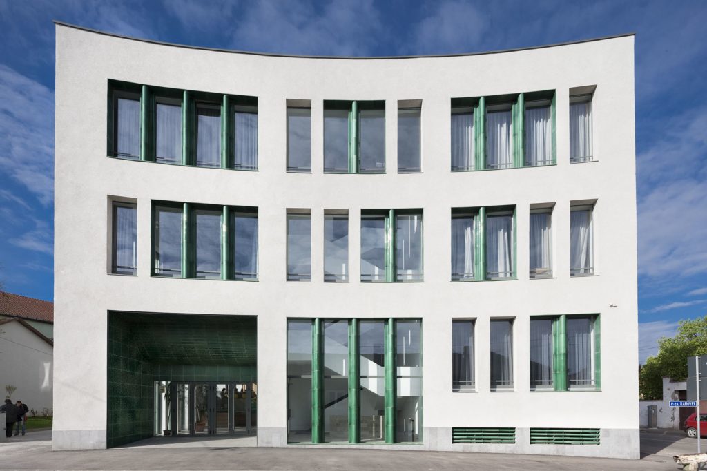
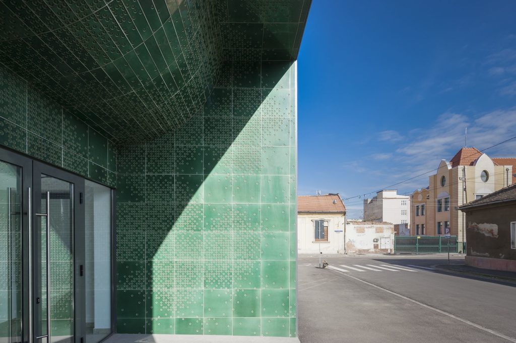
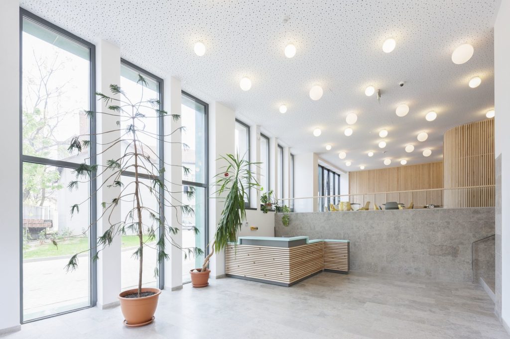
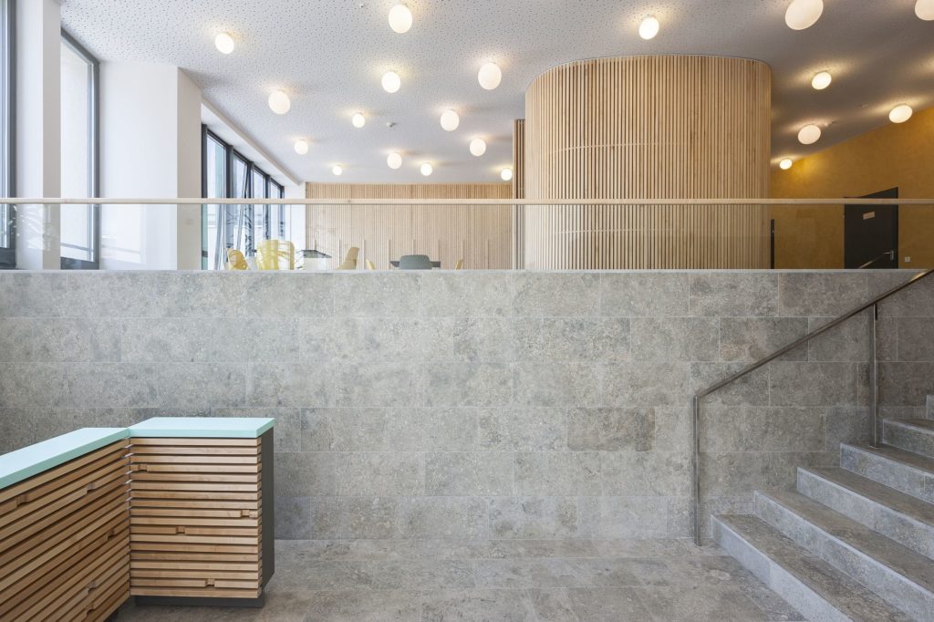
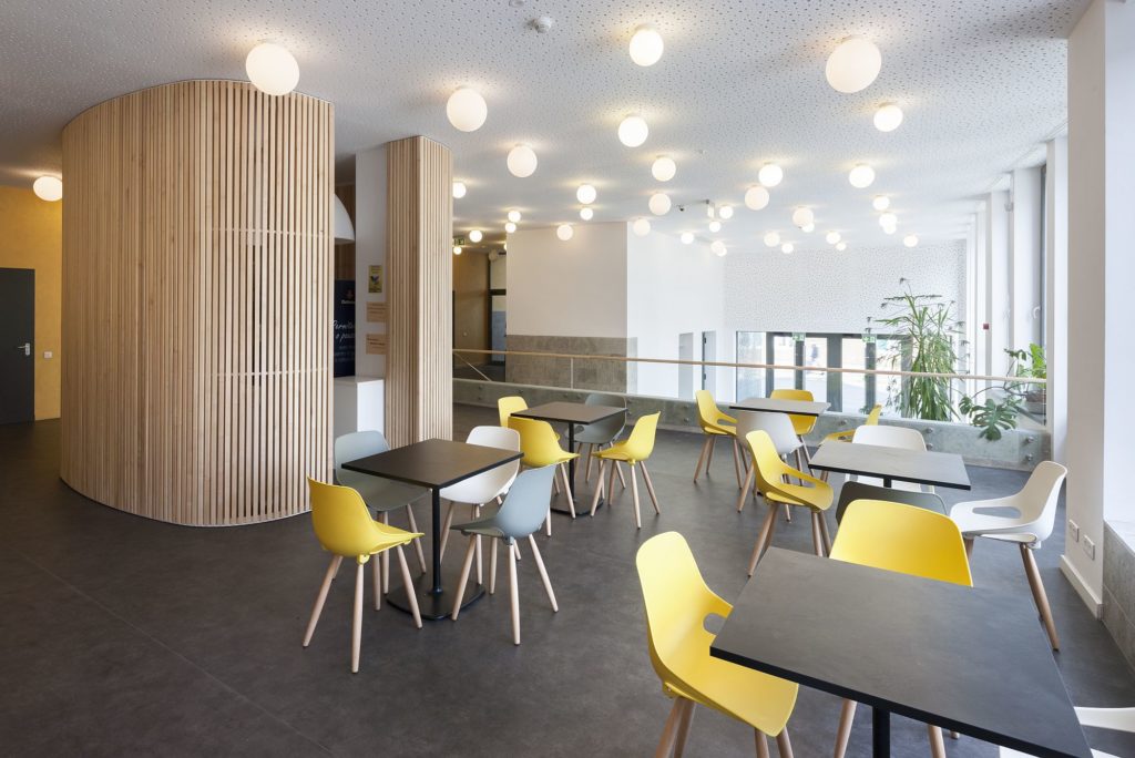
Very adequate to the central location and to the program, the public space penetrates and shapes the interior. The entrance hall is more than just a ‘reception’; it has various heights and receives spaces for waiting, meeting, learning together.
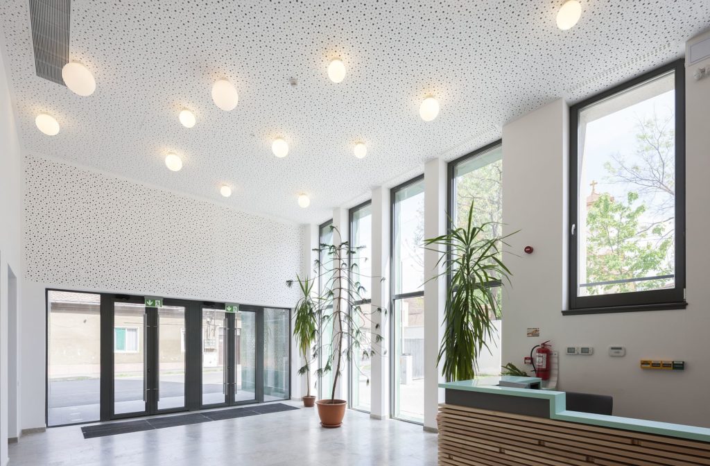
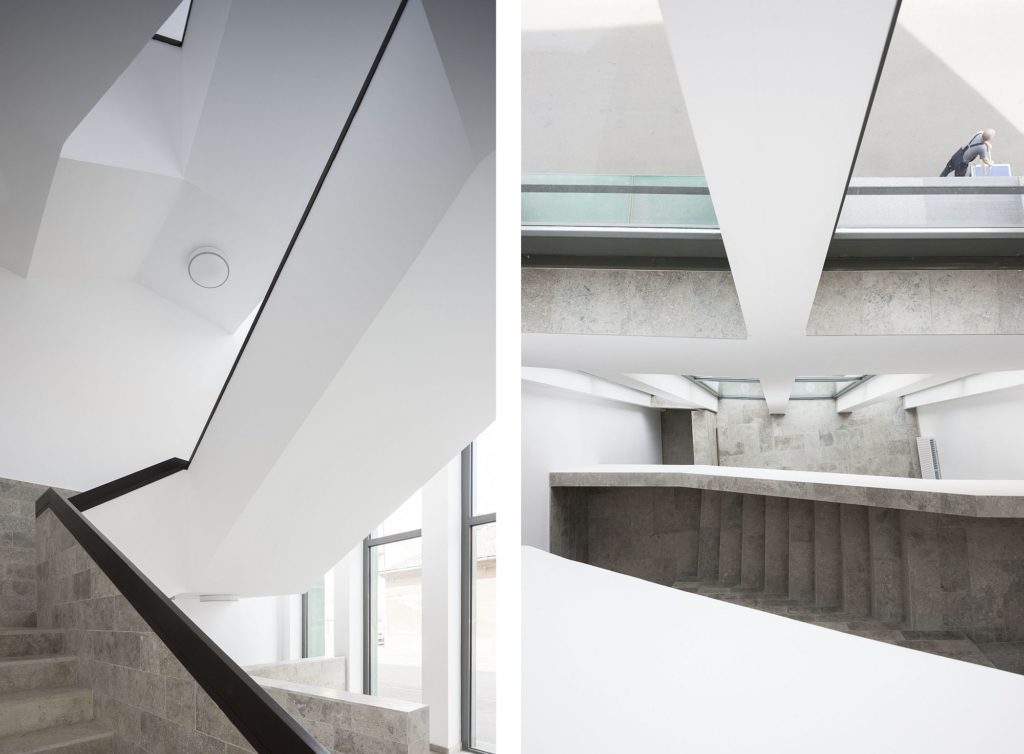
The stairs are not hidden in the core of the plan, but has contact with the facade, honouring the view towards the cityscape through a high interior opening.
And at the level of each floor, the unavoidable “corridor with classrooms”-type scheme gets additional meeting spaces, connected to terraces.
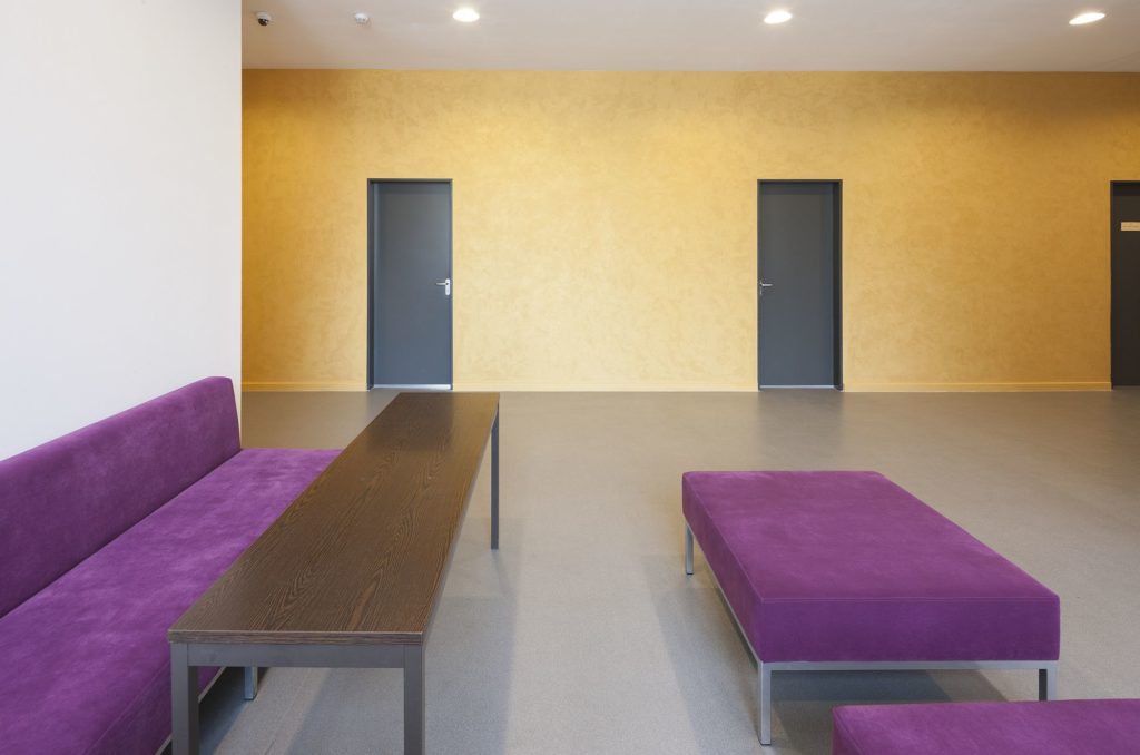
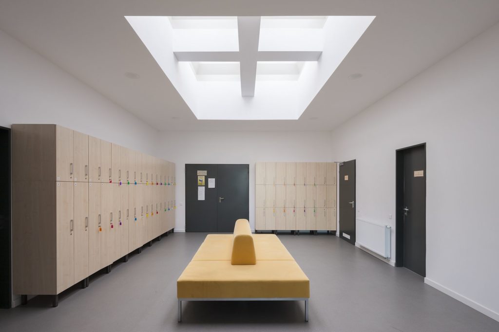
This way, the public space of the city resonates with an entire network of common interior places, modelled on several scales, and the transition between the city world and the one of studying together is mediated and agreeable. In many of today’s Romanian education buildings, at the inside there is a sudden loss of the quality of surfaces, which become expressionless and flat. Here, in Oradea, a sensory and tactile continuity of the track inside, is ensured.
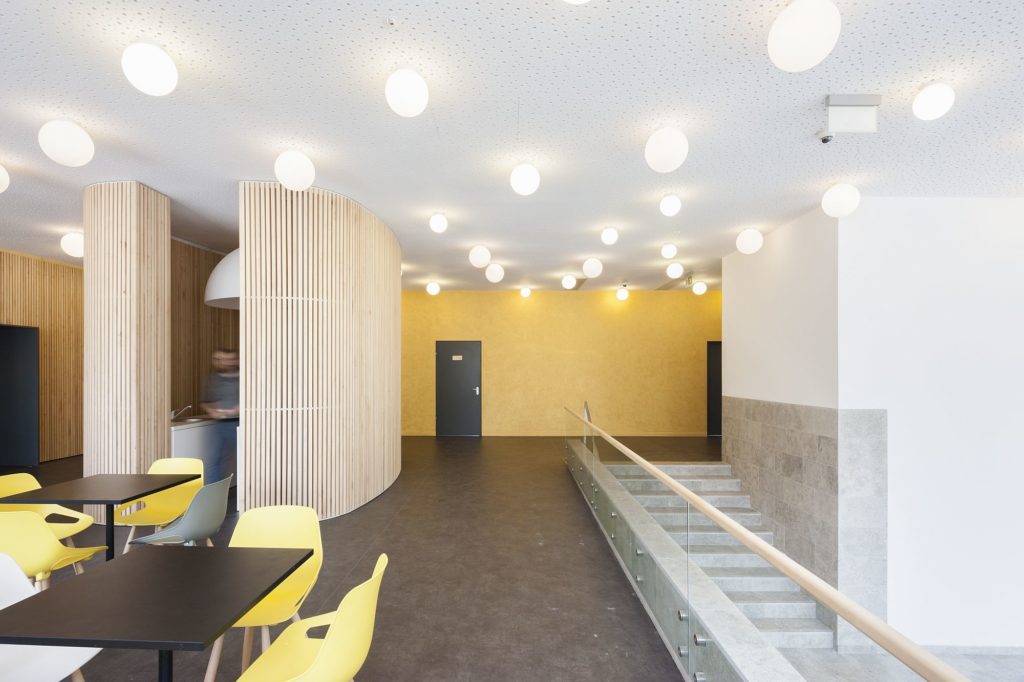
But what is the shell that a new building may assume in a historical centre? The extension of university is, first and foremost, austere. Its composition is based on repetitive openings which continue the traditional orderly way of defining the limits of public space.
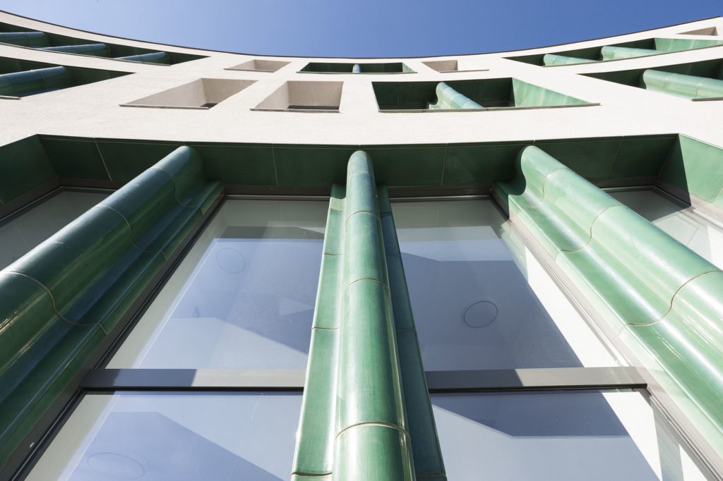
This essential order is then enriched by refined materials and details, such as the discrete glittering of a slightly textured plaster , or the strong materiality and the colours of the frames around windows and the main entrance.
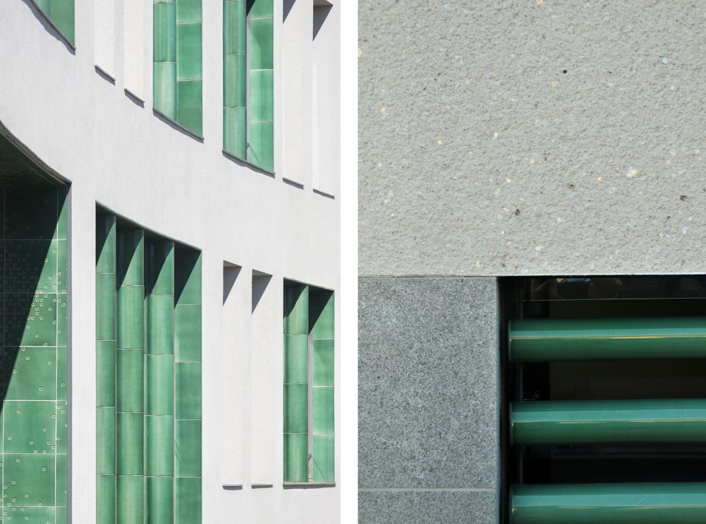
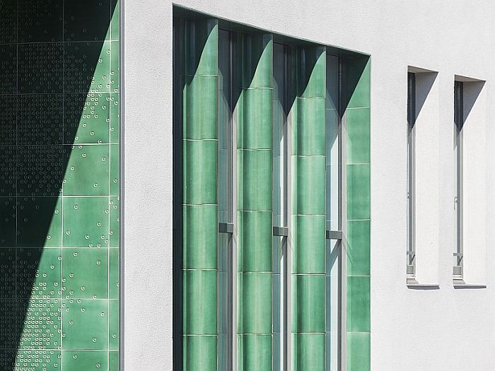
The semi-transparent glazed artisanal ceramic loads the austere volume with tactile vibration, nuances the uniform repetition of openings and introduces an ever-changing relation to the variations of light and the reflections of the skies.
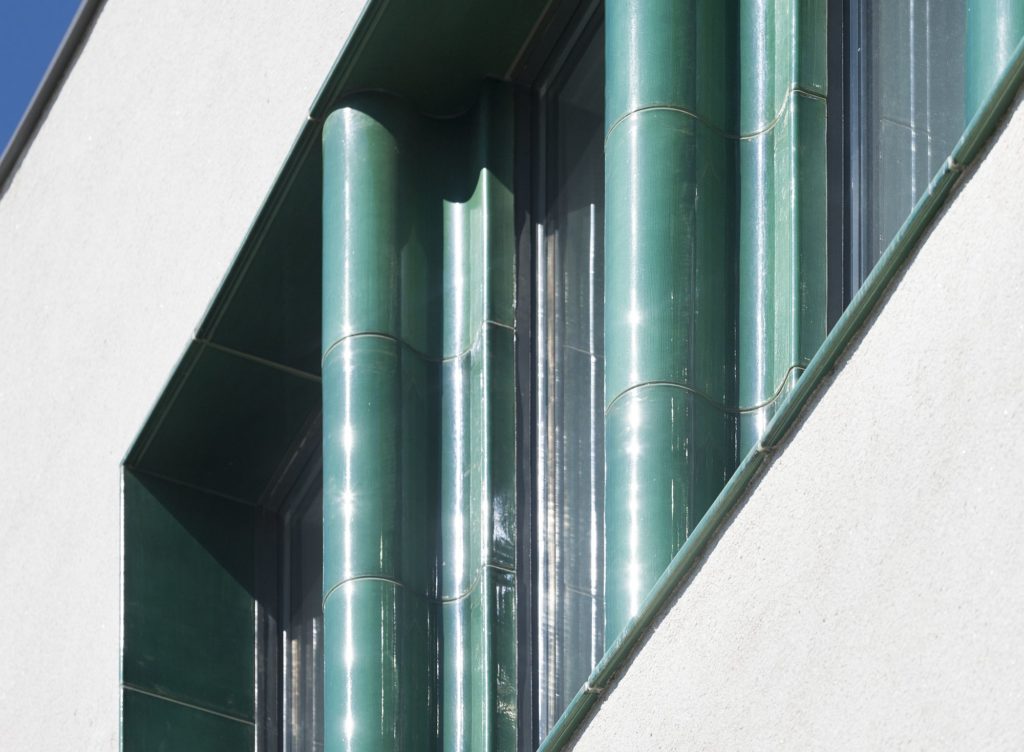
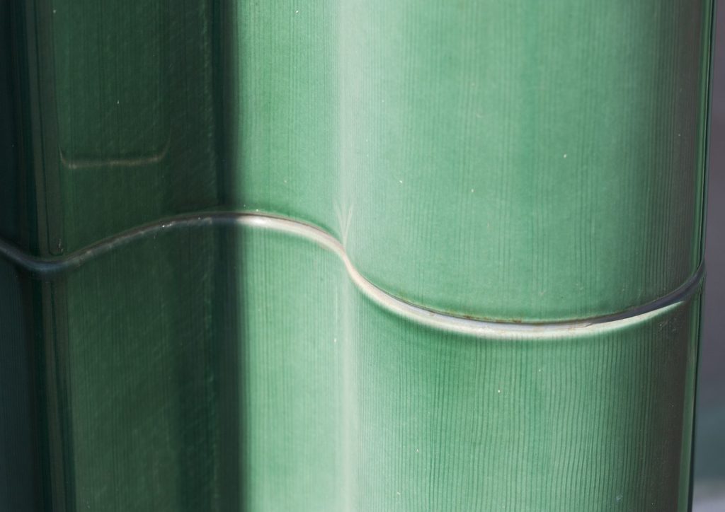
The city’s architectural history is intensely present, but also, at the same time, nuanced in this building. Oradea’s Hungarian Secession architecture is truly extraordinary. The ceramics we spoke of earlier may be considered a direct reference to that period, and it is also important by reintroducing a material which has become extinct over the past decades.
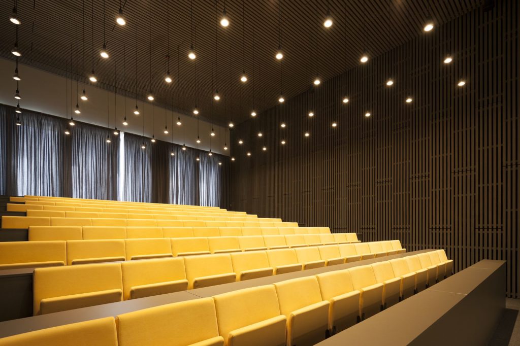
Discreet reminders, not only of the 1900s, but also of a timeless classicism, are found in interior details, from the stone-plated wall bases to the slim balustrades. One also feels some Scandinavian influences, especially in the wooden latice in the hall and auditorium – very adequately for an education institution wishing to be friendly, as well as cultural. On the other hand, this si also also a discreet historical reference – the Scandinavian model being very strong in the movement of reinventing the Hungarian architecture of over a hundred years ago.
In Oradea, Atelier FKM has primarily designed an urban place. At the crossroads of two central streets, the new building mediates not only between scales, but also between an ordering tradition and a permeable novelty.
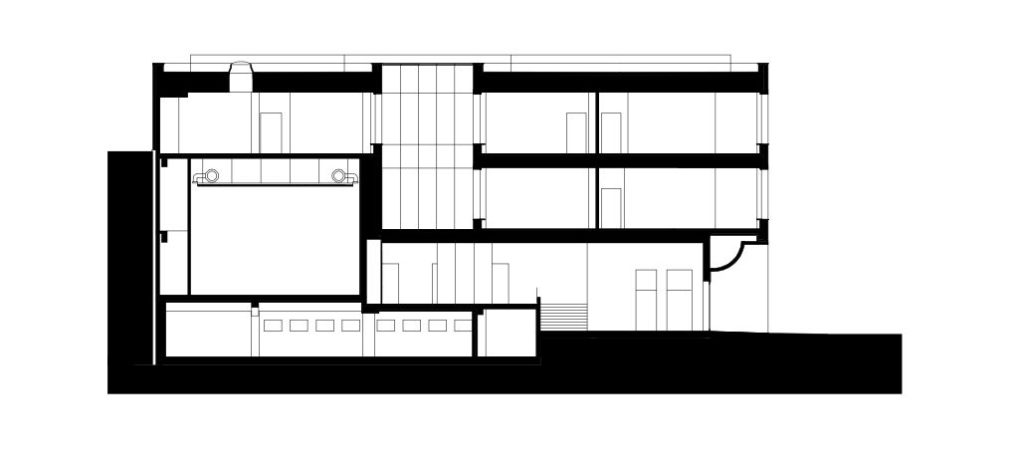
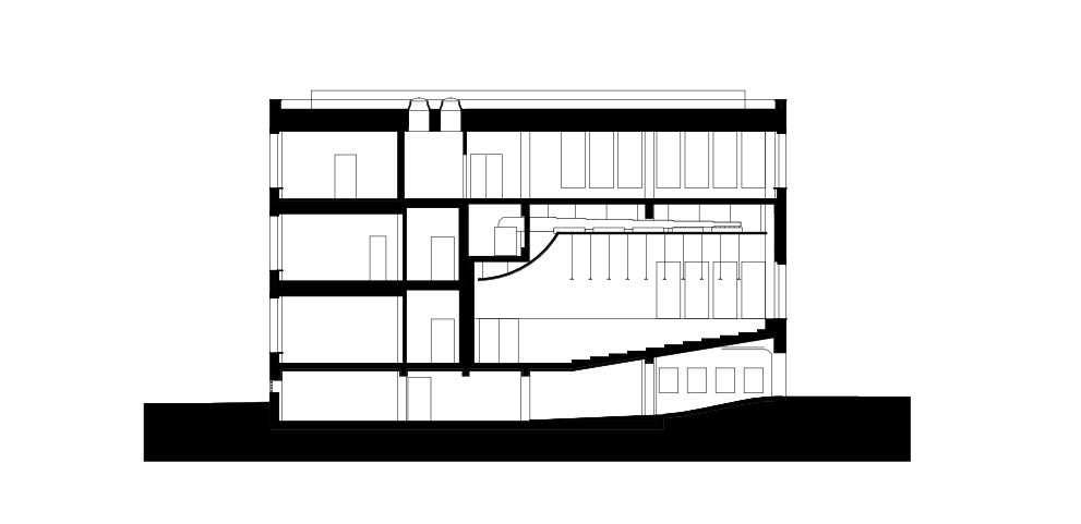 *sections
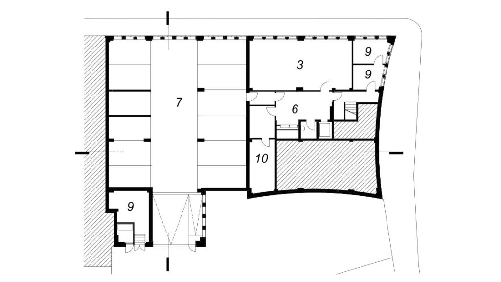
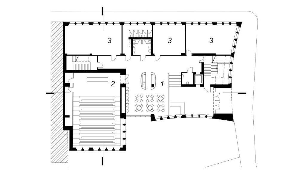
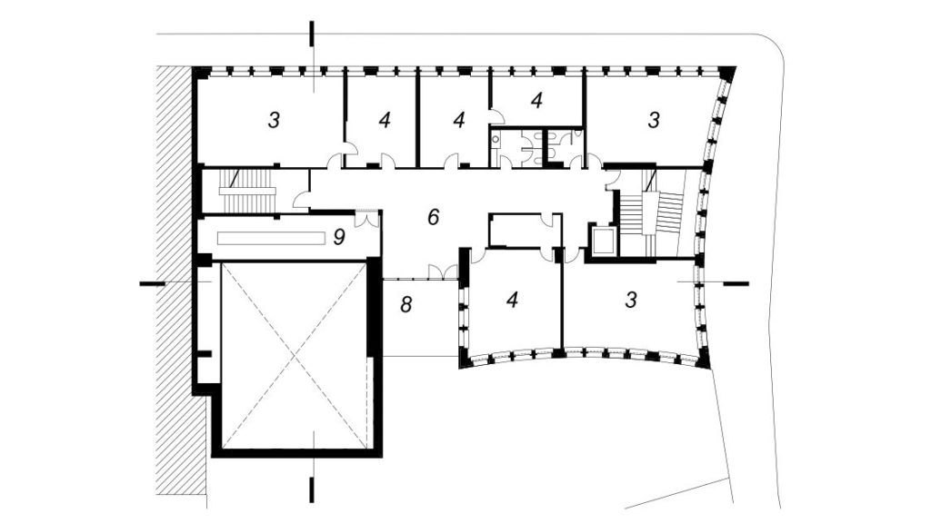
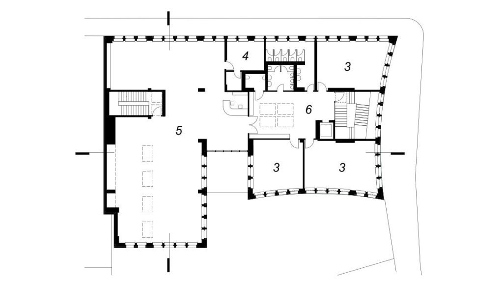
*plans: 1. Entrance hall and pantry. 2. Lecture hall. 3. Seminar rooms . 4. Administration. 5. Library . 6. Hall. 7. Garage. 8. Terrace. 9. Technical. 10. Depot
Info & credits
Work title: Extension of Partium Christian University
Adress: Str. Sulyok István nr. 14-16, Oradea – Romania
Design and construction: 2015/2016
Authors: Atelier FKM – Bogdan Fodor, Kozma Zsolt, Sebastian Bota, Gagyi Zsófia, Nagy András
Structure: Lamina -Virág Jácint
Installations: Instal Utilities -Florin Popa, Kristian Kiss
Graphic design: Miklósi Dénes
Ceramist: Sápy László
General contractor: Decorint -Konti Tibor, Emil Lefter

