This is a small house with a big interior, one that’s cheap in cost an rich in spaces. We get to hear not just form the architects, but also from the clients: about climbing stairs all day, about getting some time together at home, about how the house and the family grow together
Project: Adriana Gheorghiescu, Alexandra Berdan
Text: Adriana Gheorghiescu
Photo: Laurian Ghinițoiu
The project of a house at the crossroads between the needs of the family to inhabit it, the blessing of the land it will be built upon, and the architect’s dream.
The same family’s house will differ on two different plots – the orientation, the slope, the opening to the landscape, are the great influencers. On the same piece of land, two families will be designing different houses, because the needs of each of us focus on areas or spaces which previous experiences have deeply ingrained in our soul. The architect’s own references and ways of creating space constantly evolve and they will create, for the same family, different houses at different stages of life.
This is why the first step in building the house is the building of the design brief. A well-made brief deals with the three above-mentioned elements: the need, the land, the visual references.
For the House of Ants, the design theme was made when the first child had just arrived in the family. At this stage of life, couples still relate to their needs back in the “golden” age, the one without constraints, the needs of an exclusively adult life. One aspect I have learned from the interaction with over 20 couples was that a family are really ready to plan their house when their children are older than 4-5. Before that time, it is too soon, the family is not formed yet, and therefore its needs are not clear.
The Furnică (furnică means ant in Romanian) family wanted protection from a neighbourhood assaulted by aggressive building practices, next to a cemetery wall. 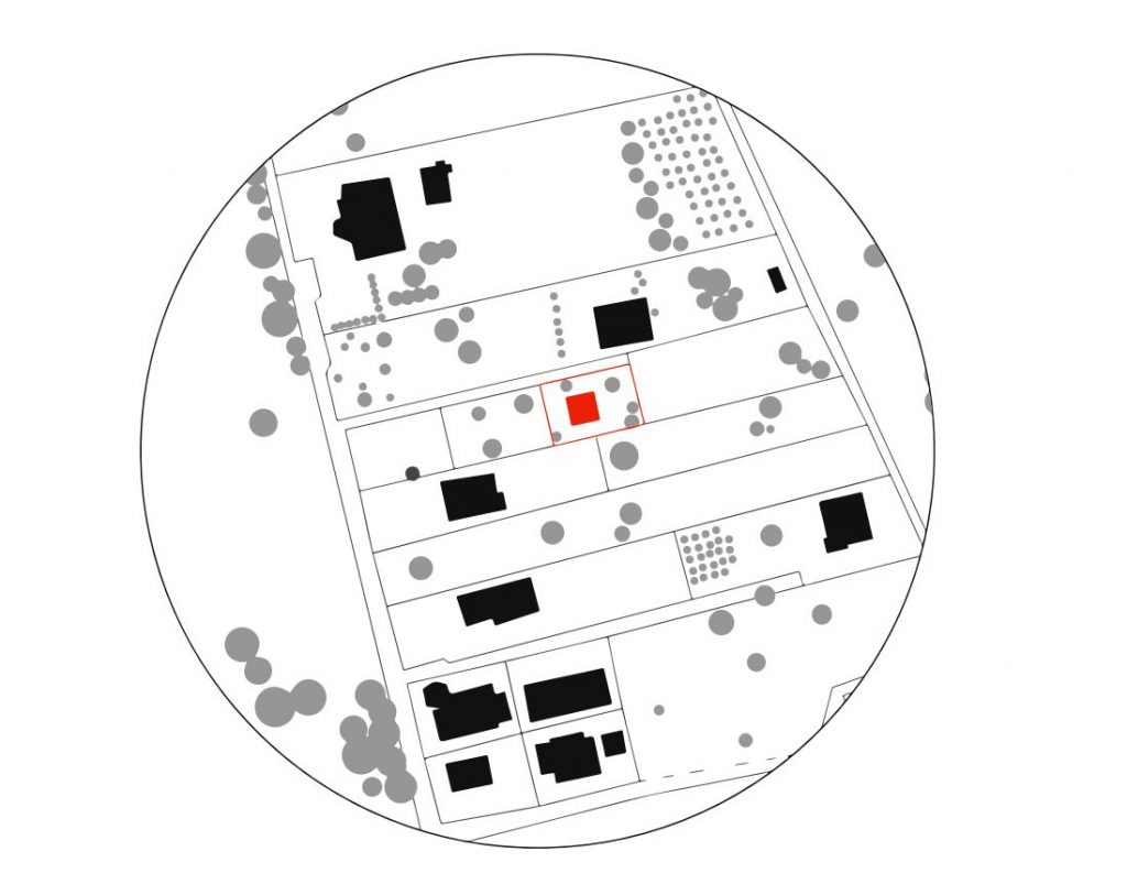
*situation plan
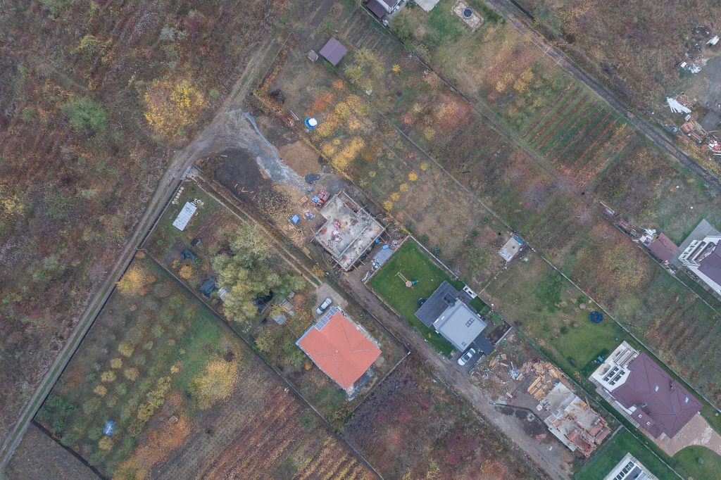 *Aerial view
They asked for a house which should look like a bunker on the outside, and where the master bedroom would be placed as high as possible. At the same time, they had a very intense social life. Their spare time was always spent with their friends. Hence the key word for the house: TOGETHER.
The sloped land, overlooking the city from its highest point, and the hillside access to the north, left us with just two options for organizing the plan: a house with an upper living area, , level with the access (where it would have the best view), and the sleeping area lower, level with the garden, where they could enjoy maximum intimacy from the neighbourhoods; or having the living area downhill, continued with the garden, and a spread of half-levels towards the sleeping area. In the process of composing the design theme, the Furnică family preferred the second choice.
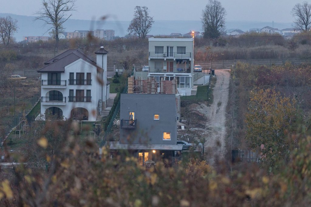
The data collected from our interaction with the family provided the perfect setting for a project that follows 4 points that seemed essential to us: family cohesion, the verticality of the interior space, scandalously small surfaces and a low budget.

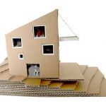
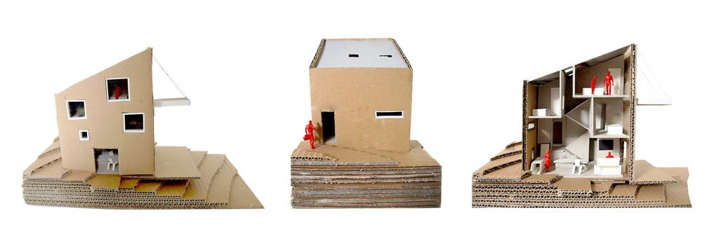 *Study and discussion model
Many of us are children to parents who departed rather early from the orderly village life, where families lived together, many times in the same room. These new city people raised their children in apartments where parents had their room, and the children their room or rooms. They would go to work and to school, and they would see each other at night or at the weekends. Until the 1990s, there was still one item bringing them together: the TV set – there was only one, in the living room; that, and the home-hosted meals with relatives. Afterwards, each bedroom started having its TV set, occupants carrying out their lives independently from that of the family. And thus, members of the same family have come to only meet down hallways and in the kitchen… The living room is left empty. As for the rest, growing up inside the family is independent. Parents and children feel awkward to find themselves in the same room. They have little left to talk about – each with their own concerns.
The House of Ants wanted to be a nest for a family that will grow together.
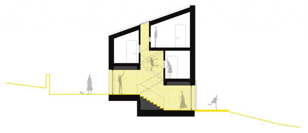
*section
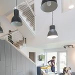
The living area is the major space, like an open piazza overlooked by the windows of the bungalow-bedrooms on the slope. The superposed bedrooms cubes, distanced from the centre, allow the zenithal light to travel the volume vertically, until it reaches the top of the dining area.
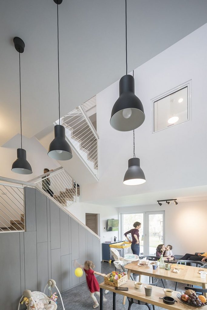
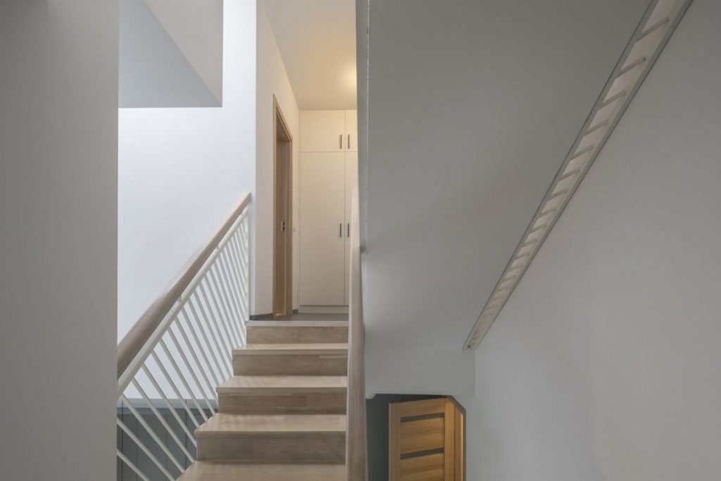
The interior staircase is an ascendant journey, connecting several panoramic spots looking at the family’s piazza-nest.
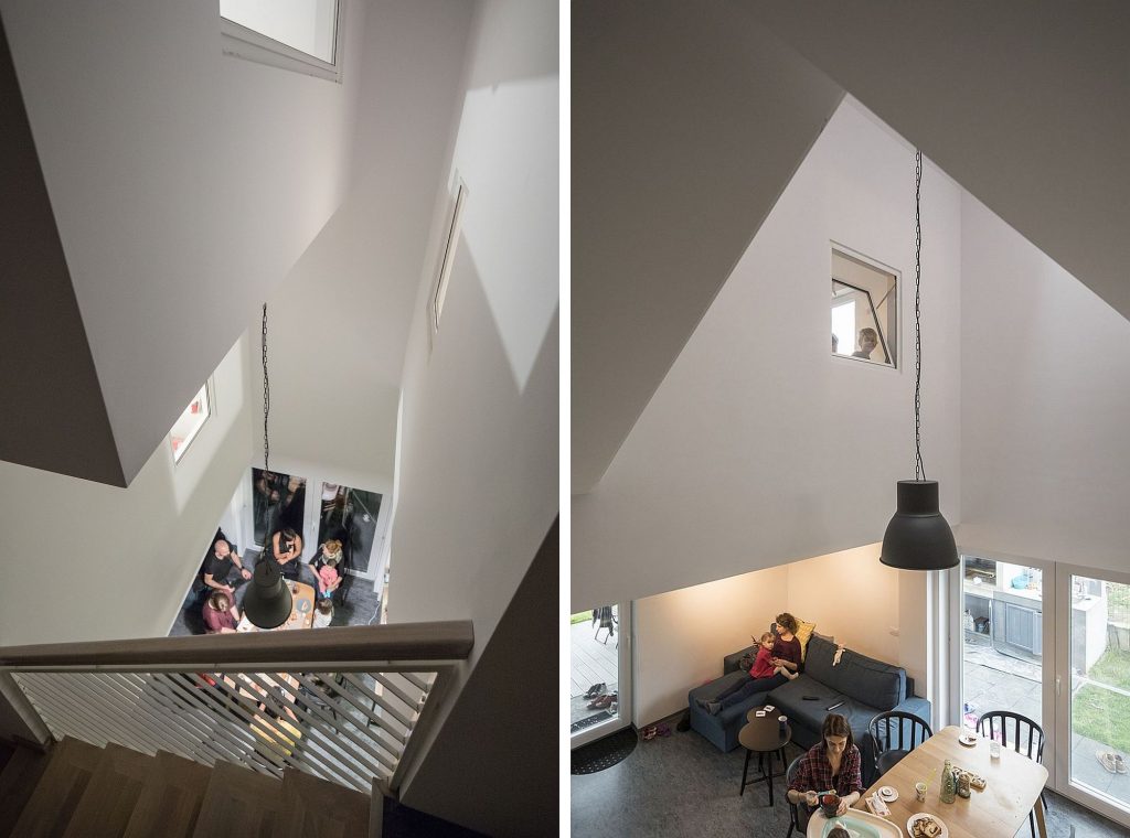
They family listen to music together, they welcome guests together, they play together, they cook together – even if they are on different levels, they can hear and see where the others are, what they are up to, and thus the family are in permanent contact. This “togetherness” comes with its drawbacks: children have more trouble going to sleep, because there’s noise when guests are around; if cooking is underway, everyone knows it from the sound of clanging dishes; the light is lowered throughout the house when sleeping time arrives, etc. But this family have decided that the small compromises are preferable for growing up together. Besides, they have learned that there is a great capacity of adaptation in children: they get used to the noises, babies soon learn to climb down stairs carefully.
However, when “together” is too much, there are the cells of the house (the bedrooms), where they can isolate themselves, feeding the need of intimacy when it arises. The common space is expanded and contracted according to the number of closed doors.
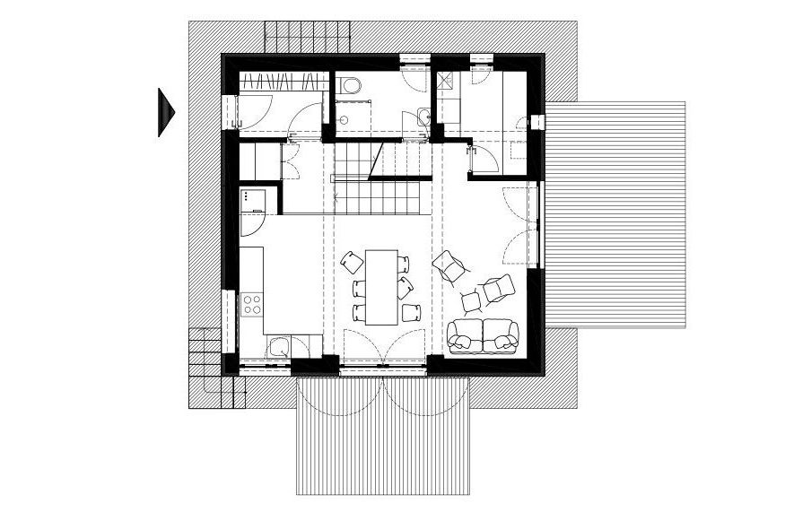 *ground floor plan
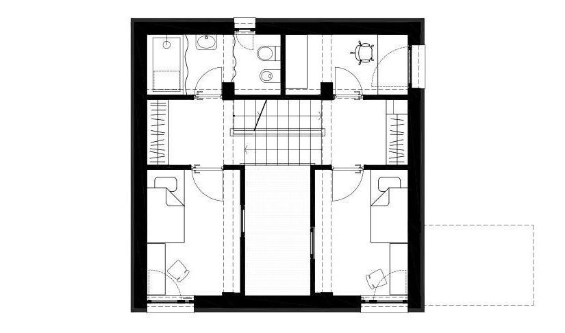
*1st floor plan
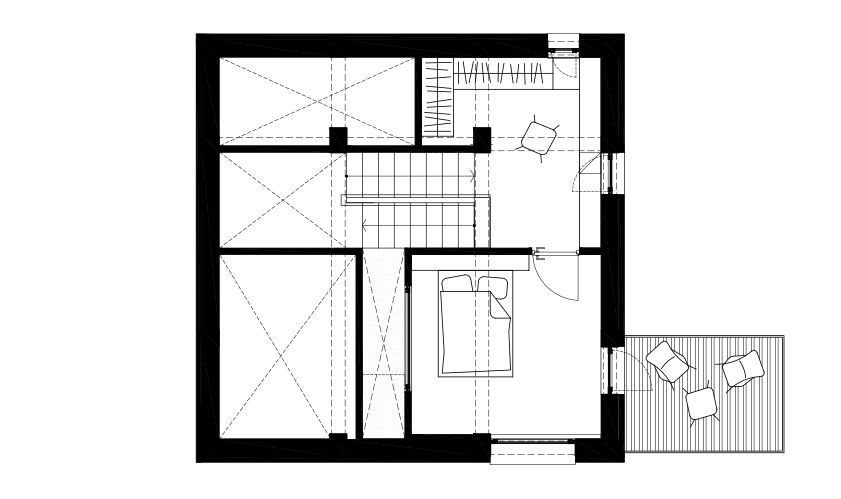 *attic plan
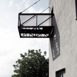
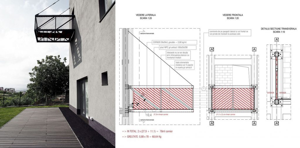 * Detail of the prefab balcony
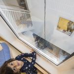
Another aspect related to formation is the house’s vertical dimension. Children growing up here develop a three-dimensional view of their nest: they can see the kitchen from above, from their play room window, or from below, trying to reach the kitchen top, they can look at the carrot on their plate and change their blouse while climbing stairs: they can see the light washing down or up the walls of the house, depending on the time of day. It is fun and liberating… Especially in wintertime, when they spend a lot of time indoors.
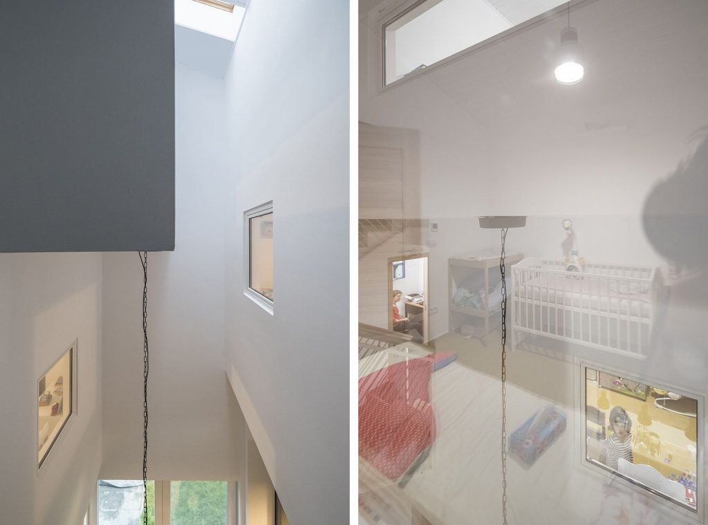
Another instrument for freedom is the permeable space. With a footprint of 8mx8m, the interior of the house retracts to the exterior limit of the volume, leaving the core open for light and for the visual interpenetration of the rooms. The House of Ants talks the brain into contradicting the square meters. The interior and the exterior windows overlap, always making one look outside, providing directions for visual escape. Thus, those on the inside of the house see the exterior, not the interior walls, as the limit.
The exterior space is very much present in the family’s life.

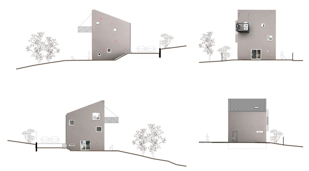
The House of Ants is built on a plot of 400 sqm. A family can find plenty of space, both on the inside, and on the outside, if the proportion and the relations of spaces are rigorously done. We handled the exterior as a negative of the interior: there is a virtual plan, a separation of flows, and an arrangement of places, function of the sun’s orientation. The volume of the house is the main axis of the land, the one towards which the garden spaces migrate, the same as the interior is oriented towards the yard of light: the vegetable garden is to the south, directly linked to the kitchen, the playground takes the place in front of the living area, and the parking and the exterior shed are to the north, connected to the access and to the vegetable garden.
It was all built with absolutely ordinary materials purchased in national hypermarkets of building materials. The only atypical material was the linoleum in the living room. A material which, two winters of living on, proved very pleasant: warm to the touch for the children playing mostly on the ground, easy to clean, as it is seamless – a material that was very well adopted by the Furnică family.
Now, the spatial footprint of this house is strongly carved into the daily realities of the family, therefore the Furnică say that, from any beautiful spot, they always return longingly to their vertical world.
About our home
Text: Daniel Furnică
When we started work, I think it was very important that we approached the relationship with the architecture office wholeheartedly. We trusted them completely, and I think this is very important. Well, what was nice was that the method of this office brought us in a sort of confession area, and from there a connection started out, which allowed us to rely on each other throughout the project. I guarantee this is paramount.
I think it’s important to know that we did not want, as a family, a beautiful house. We did not set out to make the most beautiful house in the world. In fact, I believe the architect’s role is precisely that: to help you make a house not for others, not for the eyes of others, but for your needs and for who you are.
We started with a so-called “knowledge pack”. During the confession endeavour, both I and my wife made ourselves known: what we eat, what music we listen to, what we read, how we interact with light, with heat, with people. We loved confessing, and the result was ”wow”. With the first version, in model format, it blew our mind. We just loved it. Then, we had, together with the architect and with the structural engineer, an assessment of concept versus budget. This is how that second model version emerged, the one I have now: that was it.
Let me get something straight: we had this little plot (500m) and, having grown up in blocks of flats and having travelled the elevator all our lives to the tile-floored apartment, we wanted to have an experience where the house would allow us to breathe. Hence the small footprint, which increased the potential of the garden, hence the vertical, high-elevation development, hence the tiny, cosy bedrooms, inviting you to sleep and then driving you away to the living room or outside. Each bedroom overlooks the living area through its interior windows, reminding you of how fun it is to be together.
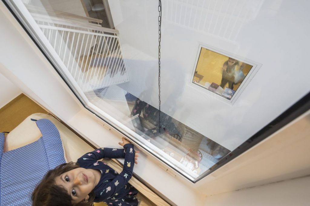
The house has many stairs, and over the first months it was difficult to give a warm answer to my little daughter’s requests to go downstairs a few times before bed, from the top floor, to get, for instance, the forgotten favourite toy, then the other one, more favoured, then the one which is in fact the most favoured one: “Daddy, I can’t sleep without!!”.
After losing 8 kg in just a few months, the stair challenge became a pleasure. The stairs are a fun place in themselves and, as our physical therapist pointed out, are our great luck to keep us young. I don’t regret the stairs to this day although, I must confess, in the beginning I kept on thinking of “how things will get, man, when we are old”.
In approx. 120 net meters, the house managed to comprise many functions, very well dosed against our needs. Cellar, living room, toilet, boiler room, office, 3 bedrooms, dressing. All of these without the least feeling of choking for breath. On the contrary: you have a lot of breathing air, because the air is exactly where you need it, where it matters – and it is not left enclosed in some bedroom, sentenced to night life.
Ever since we moved, our lives have changed. We are on holiday and we keep inviting our friends over, or we welcome them gladly when they invite themselves over on our holiday.
What I would have done differently? Well, there are only very small and non-essential things I would change. They are super-picky – for instance I would have had more HDMI cables through the wall in the TV area, I wouldn’t have spent the money on the “backup network”, hidden in the walls “just in case radiators are needed – if the floor heating is not enough”, I wouldn’t have invested anything in the area of audio cables: smart multi-room sound solutions are very accessible now, and they are all wi-fi. Oh, I know: above the bathtub in the master bathroom, there is a skylight. It is smaller than it should have been; I would have made it waaaaay bigger.
Now, what can I say… If we were to complete the ritual we started with the confession to the architect, it is now that I would take a bow and turn on the lamp in my reading area, for the everlasting liberty of feeling HOME.
Info & credits
Project: Ants House, Iași, Romania
Authors: Adriana Gheorghiescu, Alexandra Berdan
Structure: dr. ing. Andrei Bobu
Furniture execution: Mobiera
Clients: Furnică Daniel și Cătălina
Total built area: 170 m2
Design: 2014
End of construction: 2017

