Something small has appeared opposite the marvellous mass of Granada cathedral -perhaps the most beautiful of all those in Andalusia- as if it were a David opposing a Goliath. Besides challenging it on equal terms, its architecture is based on total respect and admiration for the historic structure.
There was a building here previously, called the Patria, with some value, which the city had got quite used to as it was part of the usual landscape. It seems that the old building, after turning it inside out like a sock, has been revived with an excellent end result.
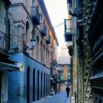
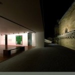
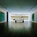
The original spatial structure, formed of two boxes, one outside and the other inside, which was a courtyard, has been reinterpreted in an ingenious way. The outside box has been manipulated without any essential changes, and the now enclosed inside box has been used as a central exhibition space on each floor. The circulation and services areas have been placed in the inner space. It is dominated and organised by a wide open staircase and the lighting is suitably controlled in the enclosed central box for displaying Guerrero’s large paintings, which have a certain air of Rothko about them. At the base of the building the architect has resisted the temptation to create a larger entrance. He has managed to understand the system of the series of arcades on that narrow street and he has strengthened the panels by lining them with stone. There are some very intentional details, such as the bevelling on the corners only up to the first floor.
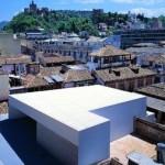
The building is therefore designed with a clear strategy of upward movement around the central box. As if it were a vertical architectural promenade. An itinerary in crescendo through spaces filled with light around an enclosed central space. But the very best comes at the end, as it should, at the very top. Just when you were thinking that it was all over, a stone landscape appears up above, bathed in an explosion of light, in contrast to the truly abstract work on the museum. The Cathedral with its cresting of stone lacework is right there within our reach. The lesson learnt from Le Corbusier about the box open to the sky, the Andalusian lesson of the terrace roof, have taken the shape here of an opening towards the sky to one side, as that is where the magnificent landscape of the Cathedral is. This formal solution of focusing the last element on the Cathedral in a totally transparent manner is a masterstroke.
I am reminded of the bright image of the Transparente by Narcisco Tomé in Toledo Cathedral. People may have thought that it was very daring, which indeed it was, to insert a Baroque element into a majestic Gothic space. The splendour of that piece of sky dazzling the Transparente with light is so great that it is in all Art and Architecture History Books. Here in Granada, a top-class architect has dared to work with a modern element opposite the great Renaissance monument. History is alive, and time is beating away. In this case at a very good rate. Especially considering that the key to this magnificent architectural performance is precisely that correct, wise reading of History. The raison d’être of Antonio Jiménez Torrecillas’ modern feature lies in looking admiringly at the renaissance building, whose value is even further increased, if possible, by this new first-rate architecture.
Having walked calmly through the rooms in the Guerrero Centre, when you arrive at that area right at the top, which is like a piece of heaven in the sky, you will never want to leave.

