Some decades ago any attempt at visiting Almere would have ended up in a fiasco. This is so because the Mecca of architecture, where architects rush to see the first SANAA building in the Netherlands or “the last Christian de Portzamparc” was just an expanse of water, fishermen, and fishing facilities. According to statistics, Almere is the eighth city in the Netherlands in matters of population.
As part of Flevoland province, Almere emerged after the terrain was reclaimed, which happened in early 1968. One of the goals of the new settlement was to create a new urban centre by designing residential areas to release the pressure on Amsterdam and Utrecht, located quite close to it.
Not long afterwards, it was perceived as being a “dormitory town” meant to cover the necessary living space of the neighbouring towns (the Dutch railway system is a sort of mixture between typical European suburban transport and subway trains running on a very precise timetable, which any commuter would enjoy).
The intention to build the new town was also doubled by the planners’ desire to avoid mono-functionality, and thus they created new job opportunities, retail and cultural centres in order to eliminate migration to big cities in search for a job.
They started to build it up some thirty years ago (the first house was completed in 1976) designing it as a poly-nuclear structure, more entities that could develop differently and in parallel but would contribute together to the town and its urban line. In 2000, Almere had 150,000 inhabitants, with a medium growth pace of 6,000 inhabitants per year. The estimates show that the town will soon reach 300,000 inhabitants, a figure proposed from the beginning. Being close to the already mentioned towns and to Holland’s largest airport, “Schiphol”, the large areas of water and greens helped this major growth. For a long time, Almere was famous for its peaceful, private atmosphere, closeness to nature while preserving an urban lifestyle. So, the locality was quite successful among families with many children.
Consequently, the possible expansion of the city is still debated. In parallel to this project though, another caught the authorities’ attention: the development of the city centre. Although Almere had its own spatial cohesion and structure, the possibility to widen its limits and a change of territorial relations were a steady source of concern because of the danger to dilute its urban identity.
The 1994 competition was won by OMA (Office of Metropolitan Architecture), probably the most influential architecture and planning firm in the last decades in Holland and, why not, in Western Europe. They started to build the first buildings and infrastructures in 1998. In 2007, the centre and its functions have been opened to general public. The operation was divided among several architectural offices by competition or direct commission (depending on the investor).
The OMA proposal consists of a series of layers: parking lots, traffic routes, pedestrian circulation, retail, residences, and offices. The plan organization generates possible relations among all points of the intervention perimeter, yet two are privileged: the promenade along the Weerwater (the lake bordering the southern side of the town) and the connection to the railway station.
The promenade plays a central role in the life of the new centre, being both a nightlife spot and a cultural area; it takes advantage of water and several cultural facilities (theatre + the cultural centre designed by SANAA) and generated “urban life”. The white and pure volume of SANAA’s “De Kunstlinie” follows the well-known logic of the famous Japanese team: simple functionality, spatial continuity and shocking openings, an “airy” expression defying the laws of gravity. The theatre is “anchored” in the square adjacent to the lake thus creating a necessary cultural area of the city that will be completed by the museum to be built in the vicinity.
The overlapping of functions, already mentioned above, is strictly obeyed and thus the intersections of different plateaux are avoided. The two-floor huge parking lot sited right in the centre of the intervention creates a split level of about 6 meters, an artificial landscape from which benefits the ensemble created by Christian de Portzamparc. The landscape turns into a raised ground, on which several homes are inserted. Consequently, the intervention scale creates contrasts between the retail shops on the ground floor and the individual houses strung together in the airy park. That leads to an interesting effect because the individual homes are erected on a large planted area enhanced by the lake that borders the lawn expanse. The density is completed by a high riser sited at the junction of the two main routes that flood in the ground floor shops and divide the intervention in four parts of almost equal size. There are other “accidents” here like footbridges, splits in the ground, a cantilevered terrace looking over the terrace-park; they all bring in life to the space vertical.
A similar approach (mixture of retail and residences) was taken by Map Architects (Josep Lluis Mateo) in an intervention in the north part of the downtown: a line of shops underlining the row of houses. However, in this project the common space is quite reduced in favour of density. Similarly, the building is treated more unitarily: a skin of glass blades wraps the residences being at the same time advertisement panels for the ground floor shops.
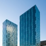
The most efficient intervention in real estate terms has been done by the Dutch office De Architekten Cie; it consists of two high risers emerging from the lake. The simple prisms of identical planes, yet 900 to each other, share a special materiality due to the facades covered in glass. The glass profiles, a rare choice for collective housing, wrap the entire building and create surfaces that respond to water and sun in a particular manner. Sometimes, the two buildings are one with their context, while in other instances they deny it by contrasts and brightness in a sort of interplay generated by the reflecting light.
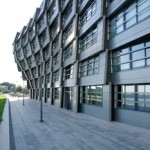
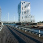
Among the buildings worth mentioning there is a public equipment by William Alsop that, unfortunately, does not go beyond the already established pattern of the British architect. Again, form is more stressed to the detriment of other aspects in “The Wave” created by Rene van Zuuk, an apartment building covered in metal skin that gives the impression implied by its name but also a sudden reddening of the one passing by its western facade. Another successful apartment building is the one designed by the architects from S333; it is interesting both in its simple plastic and plane typology generated by the main circulation stretching all over the length of the building (150 m) resulting from one’s need of acoustical protection against the traffic at the entrance into the underground parking lot. The building stands for the limit between the new centre and existing buildings; at the same time, it is a mixture of retail and residential functions. The volume successfully adjusts to generate the transparencies or protection demanded by the program.
Now, let us pick up again the urban plan designed by OMA and consider it from the point of view of the functions. The scheme might seem classical: activities, retail, and offices to attract and reinforce the idea of being an urban centre. However, Almere is more ambitious: it badly needs urban coherence due to the rapid growth of the town and the danger of dispersion of urban living. The intervention does not envisage its concentration in a single place but the creation of one place, a centre able to provide for the town functionally and render an idea of unity.
The diversity of buildings, their whole scale but, most of all, their architectural quality brings for a “landmark”, a basic element in people’s consciousness. The ample spaces, the attention paid to cultural facilities and the transformation of the promenade into a cultural site are all part of the planner’s intention to increase the downtown attractiveness and inspire the young population of the town. The diversity of “objects” and the public space scale, however, arise some reticence in the eyes of some people. Many are scared by what they perceive as a come-back of the modernist utopia, which results so many cities try to get rid off. Maybe the density of famous names of architects is too high and the solitary object tends to put the urban space in the background; but one should not forget that failure in many planning operations was caused by the lack of anticipation of users’ needs or long-term effects.
In my opinion, it is hard to comment on or analyze the impact of this sweeping operation on the town, because everything was done with a view of the future expansion of the city. We are to find in 20 years from now, when the population is quite numerous, if the downtown will activate the city and vice versa. Streets will be more crowded maybe, there will be more frequent cultural events, and the large squares filled with urban life. Until then, Almere downtown is a successful example of a sweeping intervention within a mixed and difficult context, one that offers quality architecture to architecture lovers and its inhabitants.
English Translation: Magda Teodorescu


