Kentish Town Health Centre (KTHC) is a new health building in central London, housing a large GP practice and a wide range of health facilities.
The project champion, Dr. Roy Macgregor, initiated an RIBA competition for the building won by AHMM. Dr Macgregor’s vision was to create a wonderful building where not only medicine but health and art came together for the community. Ideas of transparency and connectivity were embraced by the architects and the whole team worked collaboratively to create a building that expresses a new, holistic approach and sets a new standard for modern health care provision.
KTHC creates a bold civic presence that responds to its environment. Referencing the brick and stucco, and architectural repetition, scale and forms of the surrounding housing, the ground floor is articulated as a brick plinth, with the rendered forms of the upper floors floating above. Cantilevered rooms at first and second floor provide substantially larger floorplates whilst allowing a small ground floor footprint and reducing the overall mass of the building.
The building houses a large GP practice, paediatric, dental services, children’s services, breast screening and diagnostic imaging, plus supporting office space, staff facilities, library and meeting rooms. Inspired by the game Jenga, the very complex inter-relationships of these uses were rigorously adjusted to create a very flexible internal space where staff and users feel connected and part of a whole. Fully accessible ground and first floors accommodate all public and clinical space, whilst the second floor is a private space for use by staff with teaching rooms. Some areas and rooms on the ground floor have been designed to be used out of clinic hours so have their own, discrete routes of access and security.
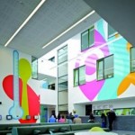
Circulation and waiting areas visually connect the different floors and spaces. Generous staff accommodation, special tea points and break out areas mean that different staff groups can easily meet to discuss and liaise about clients to avoid replication and unnecessary appointments. People using the building have commented on the fact that as they wait they can see all the different services in action – making it feel very friendly and lively and unlike most other large scale health buildings.
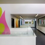
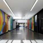
Internally, the building has been designed around the concept of a street – a generous public/private space that welcomes users and leads them to the reception at the heart of the building from where all services are accessed. This double or triple-height space is enlivened by bridges, views, colourful graphics and a bold signage system by Studio Myerscough that creates a stimulating internal streetscape whilst providing ease of use for the diverse needs of the many users. Arts Council funding has been secured to deliver a programme of art throughout the building.
The materials and fit-out elements of the building have been selected to be both robust and highly flexible. Within all rooms a hanging rail system allows everyone to customize their space from a wide selection of fixtures. Interchangeable IPS panels allow the switch from clinical to counselling use with green, black and white selected to provide a calming, neutral environment. Similarly, three modes of lighting can be selected by the GP or the counsellor to best suit the needs of the patient. Within communal areas a cost-effective lighting strategy has been designed to reinforce the linearity and volumetric nature of the spaces.
A number of sustainable features have been incorporated within the design of the building, including use of recycled materials and low energy options wherever possible. The ventilation is a combination of mechanical and natural, with all rooms having specially-designed opening windows that can be left open at night to take advantage of night time cooling. The atrium creates a stack effect within the main street, drawing fresh air throughout the building assisted by wind catchers, and temperature-responsive openers on the rooflights. Grey water harvesting is used for irrigation and electric car charging points and bike racks have been provided.
With the landscaping, as many existing trees as possible were retained including London Planes, Ash, Lime and a Damson. New landscape elements relate to the residential scale of gardens and pockets of green in surrounding streets. A series of small, private gardens and terraces were carved into the built form with a more formal, public garden connecting to the main waiting room at ground floor where a café will also be located.


