A precious place
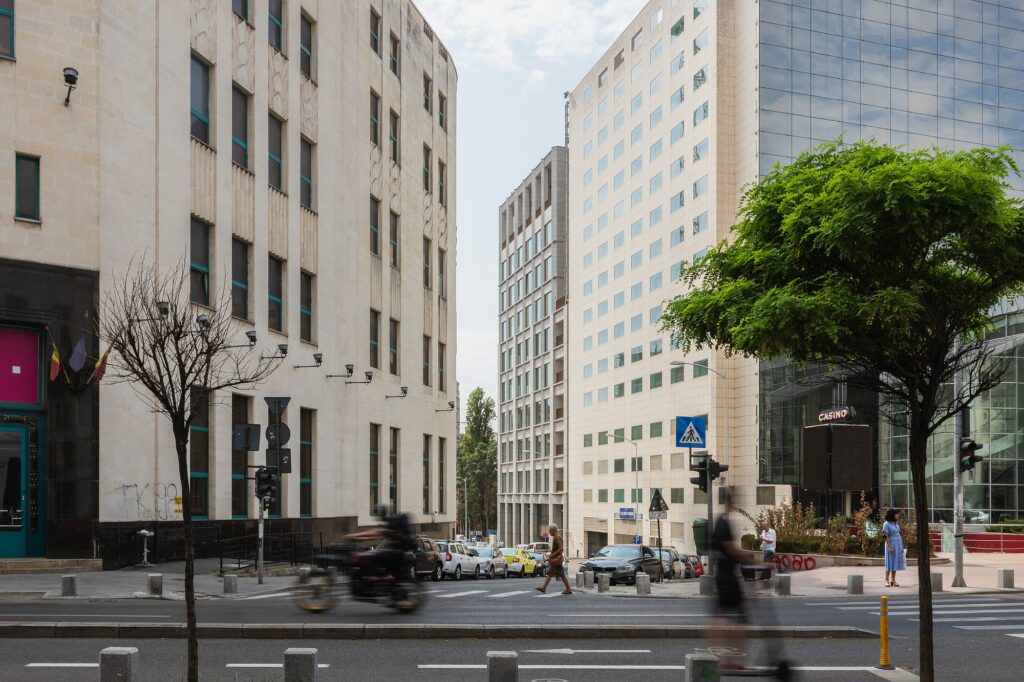
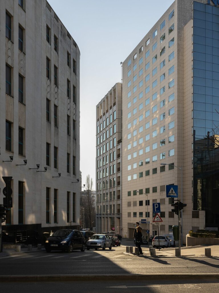
… and a complicated one. Around the Calea Victoriei area, between the Revoluției Square and the Elisabeta Boulevard, most historical streets are overlapping, from the sinuous, typically Balkan route of Calea Victoriei and the wonderful Kretzulescu church, to the eclecticism of late 19th-century public buildings and houses and then to the flamboyant Neo-Romanian and the Modernist Art-Deco elegance of the 1930s. The post-war period gave us, first and foremost, the Palace Hall and Square complex, an urban operation which entailed significant destructions and difficult relationships with the urban fabric beyond it, but holding genuine urban and architectural qualities.
Text: Ștefan Ghenciulescu
Photo: Ştefan Tuchilă, Laurian Ghiniţoiu, Adrien Guitard
Until recently, the latest intervention had been nowadays’ Novotel, a commercial architecture implanted during the mid-2000s where the old National Theatre once reigned. This building, loved by Bucharest dwellers, was part of a wider assembly, together with the small platform in front of it, the Telephone Palace miniature skyscraper (an American-Romanian project), and the Adriatica Modernist building. Severely damaged by the 1944 German bombardments, the theatre could have been restored. But the Communist regime decided to eliminate it, leaving behind a huge gap right in the heart of the city.
After 1990, instead of a public building or space, it was preferred, typical of our savage capitalism, to surrender the land to private investment. In exchange, the city received a false ruin, a light material reconstruction of the original portico: the reinvented past became a decor within a commercial architecture.
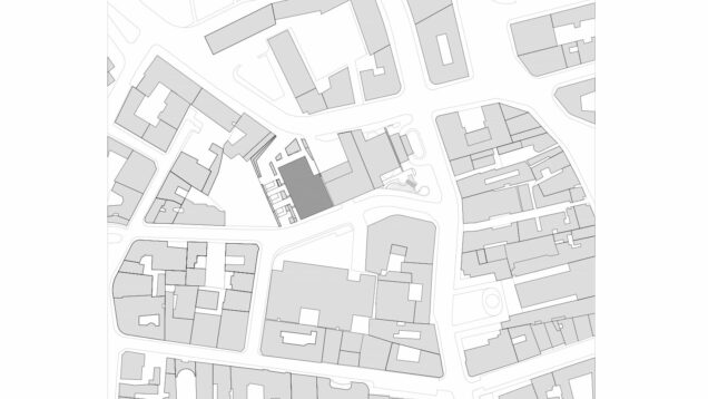
Millo Office is the first intervention on a larger scale in this area many years later. The other side of the Matei Millo street hosts the building site of the Tandem office building, a project by the same investor and by the same architects.
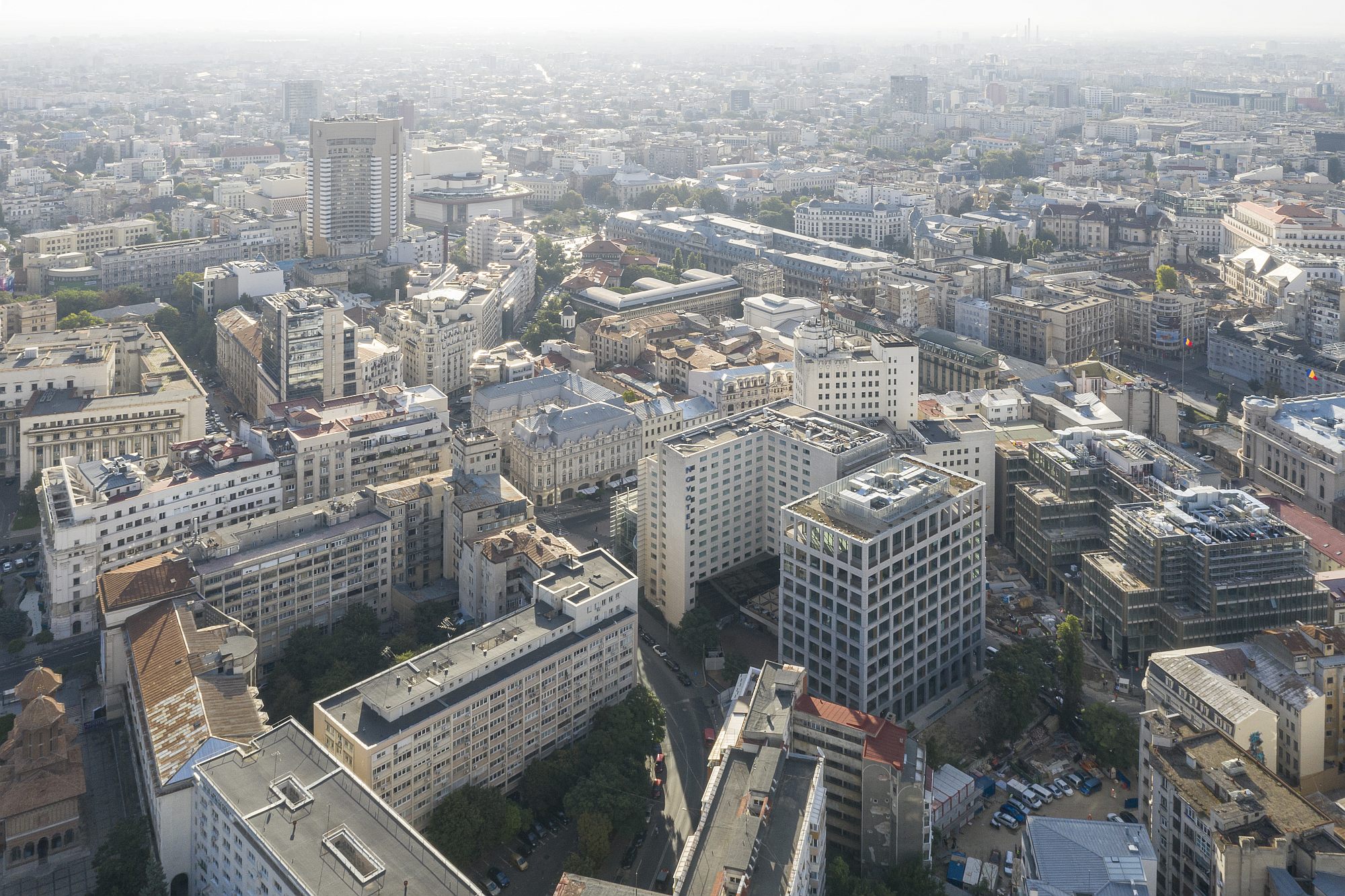 *Aerial view of much of the central area in Bucharest. Right from Millo Office, the Tandem building, under construction ©Laurian Ghiniţoiu
A large building and a different type of function
Personally, I am not convinced the area is in need of densification. But the pressure is high, as is everywhere downtown, and, perhaps, high yet civilized insertions on free land are better than demolitions which, as we can see, have intensified, even in the vicinity of the new building. On the other hand, I believe that situations should be considered individually. Here, we are not dealing with a homogenous, low-rise fabric, but, as we were discussing above, with an energetic overlay of landmarks and layers. Unity is provided mainly by the public space – the changes in direction and the respites on Calea Victoriei, the contrast between the urban intensity of the main historical axis and the relative quietness of nearby streets – and by the architectural value of most existing buildings.
In this case, I believe that a good insertion entails a few qualities, beyond the discussion about square meters. These qualities include human scale and discretion. Here, architecture should not yell, should be friendly to its older neighbours and to the city dwellers, should avoid the monolith image, should include details to be discovered upon closer inspection. The urban offer is just as important – how open and active the building is, what the city receives as public spaces and energy. Connected to these, and rarely mentioned, are functional structure and richness. Calea Victoriei hosts mainly culture and commerce, a fragile commerce as, in Romania, malls, and not prestigious shopping streets, are attracting prestigious shops. I believe that if a massive shopping centre were built here, it would prove deadly to the small traders and city life. But there is great need for complementary functions: while housing can only be a luxury one, and difficult to insert,work could be quite welcome. We could thus populate downtown with the active people who would otherwise occupy the business areas which have packed the Bucharest outskirts – areas which are obviously prone to freezing out once working hours are over.
Finally, and more difficult to quantify, an insertion should not only be discreet, but also valuable as architecture, from shape and spaces to construction, materials, details. Architectural quality is an essential requirement when granting building permits in such areas in European metropolises, it is non-existent in our legislation, and less important to most investors.
I will discuss this project mainly according to these criteria.
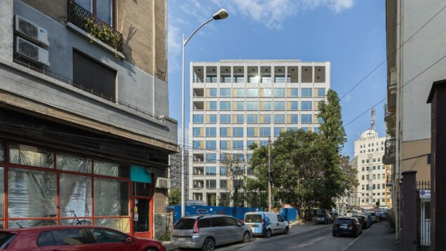
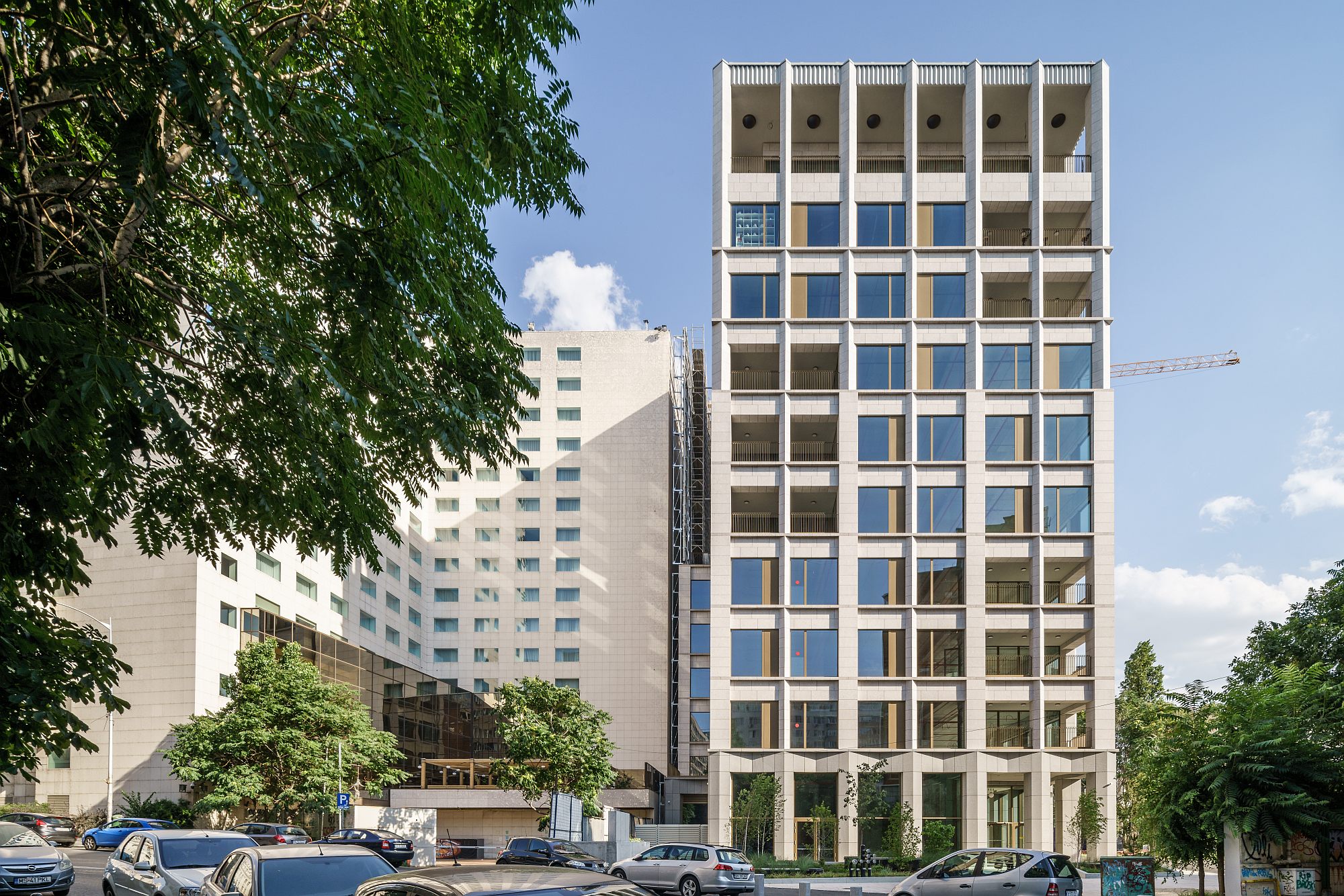 *View from Ion Câmpineanu Street ©Ştefan Tuchilă
The building and the city
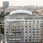
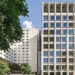
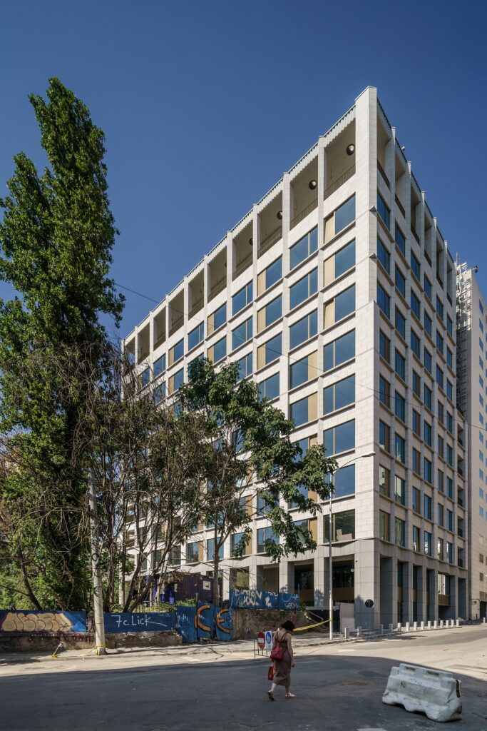
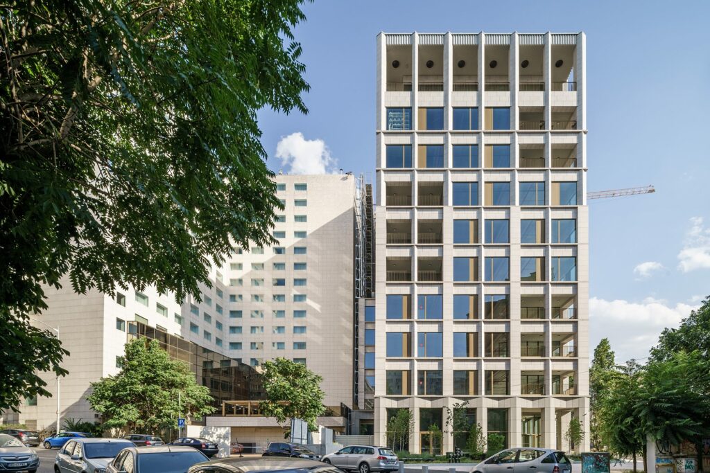
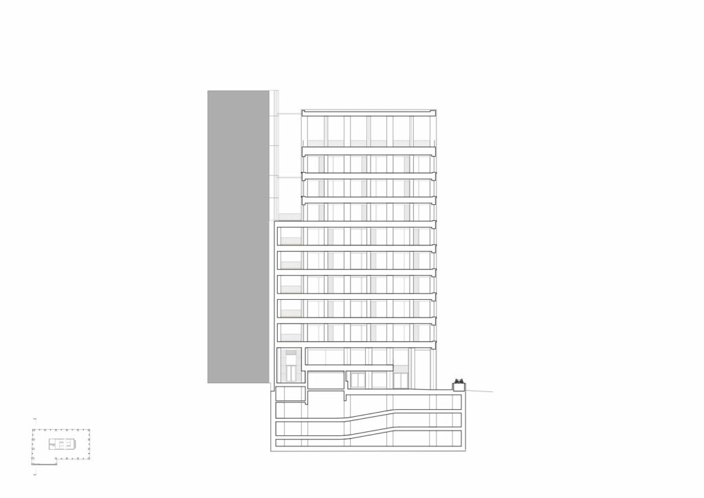
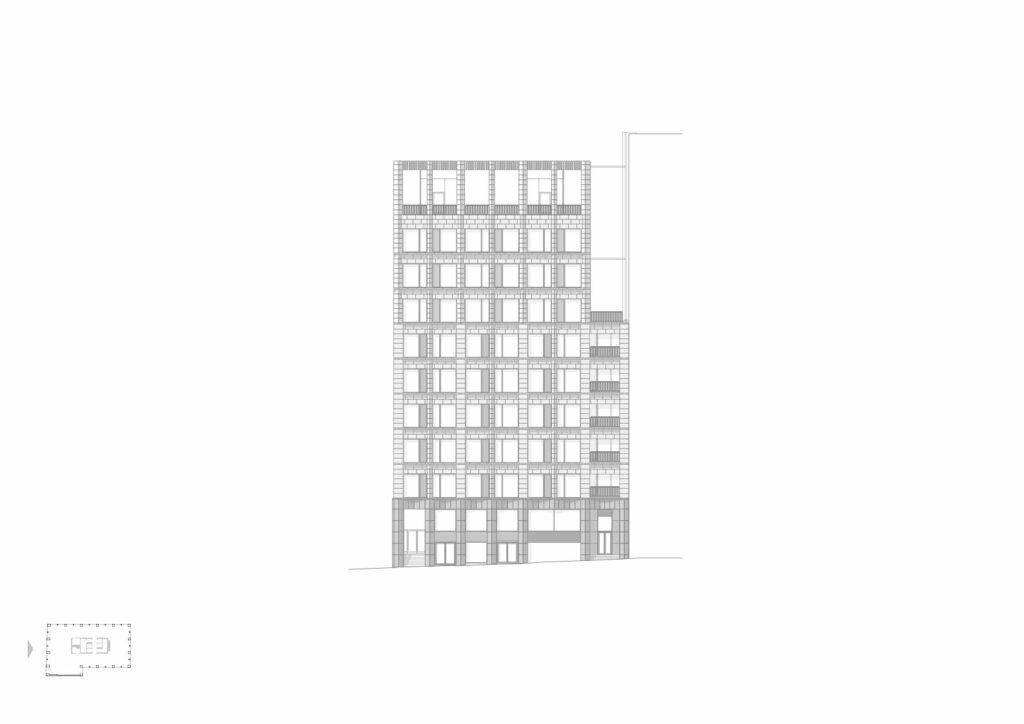
The new building connects, as it should, to Novotel’s blind wall. A first, apparently minor, gesture, is the withdrawal after the 6th floor. This creates a welcome break in a massive common volume, also allowing illumination on all 4 facades. The light metal structure mounted on the dead wall will support a vertical garden. This cutout also shapes an image that fluctuates between the well-behaved completion of a building front and the isolated landmark. Especially seen from Câmpineanu Street, this urban landmark is quite welcome.
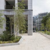
The recess on the opposite side of the land clears a public access passage, which connects the Matei Millo and Ion Câmpineanu streets.
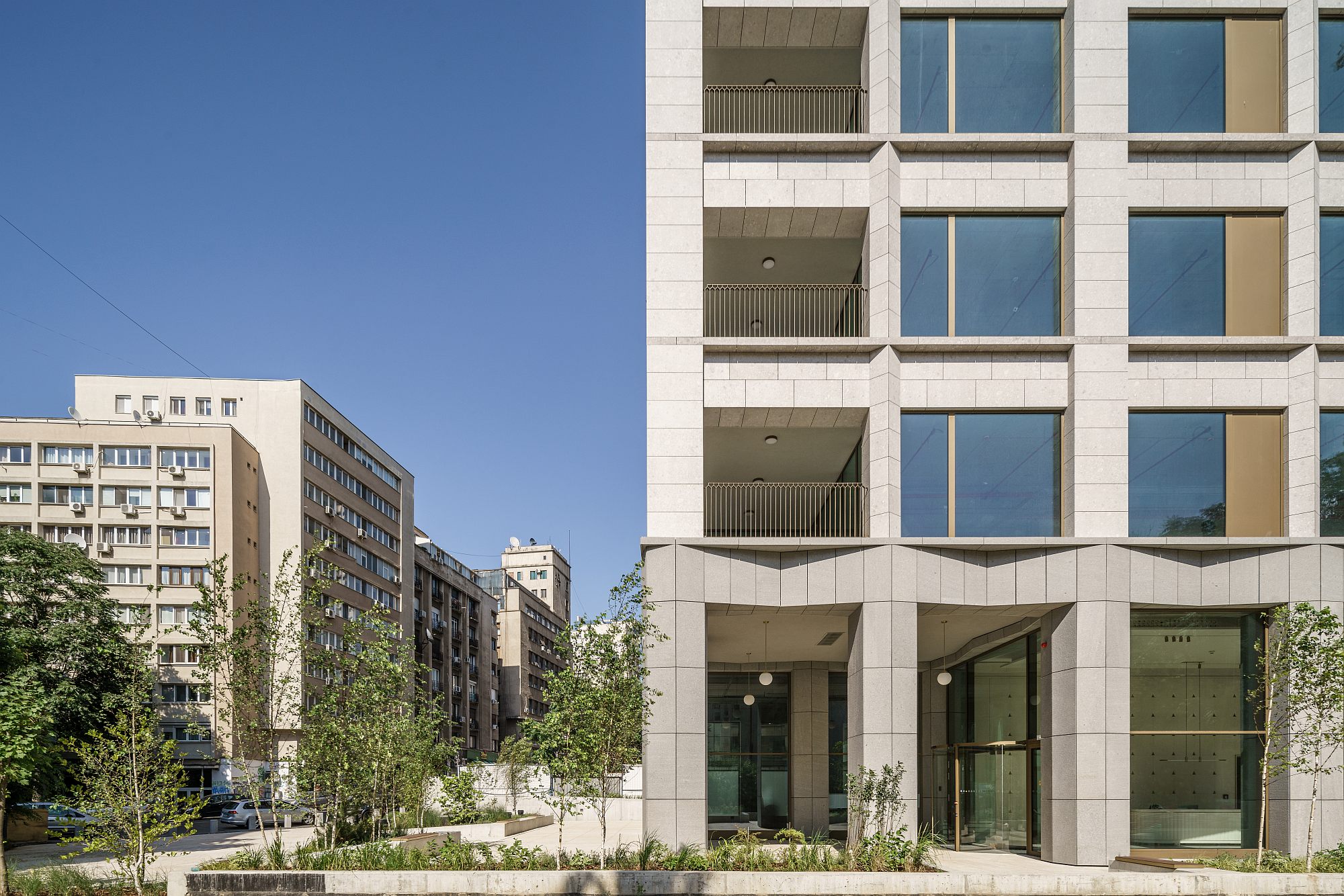 *View from the new pedestrian passage between the streets Câmpineanu (left) and Matei Millo ©Ştefan Tuchilă
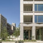
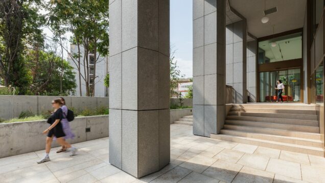
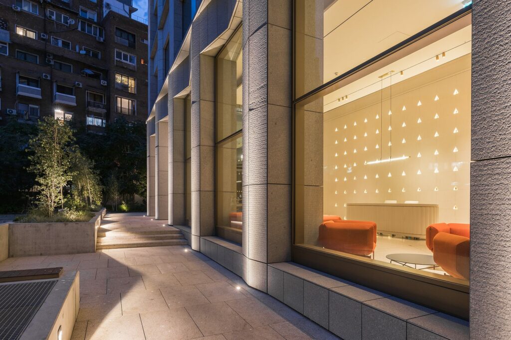
It is a very good gesture, but is in fact just a beginning: the architects’ and owner’s hope is that the construction to be erected on the neighbouring land should also be withdrawn, and that the resulting, much more generous space, should be laid out as a unitary passage-piazza. For now, the terraced landscape is only continued on the inside, through the two ground floor porticoes and the very transparent entry hall. This in itself is a gesture of urban civilisation that is quite rare in Bucharest, but I think it is also important how it continues, and perhaps interprets, the rows of Câmpineanu street porticos.
An expansion of the Palace Square towards the Matei Millo Street is thus created, which, once extended on the neighbouring plot (see above), would allow the creation of a remarkable piazza. The integrated layout of the piazza will have to include ramp-type portions, to make it accessible to all population categories.
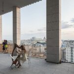
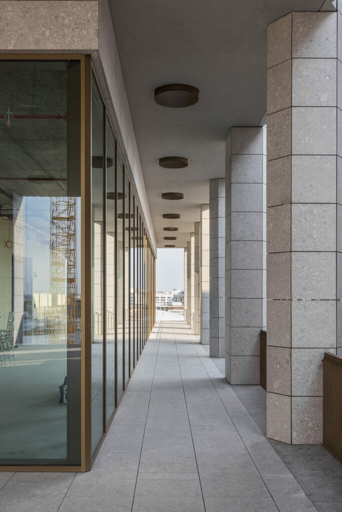
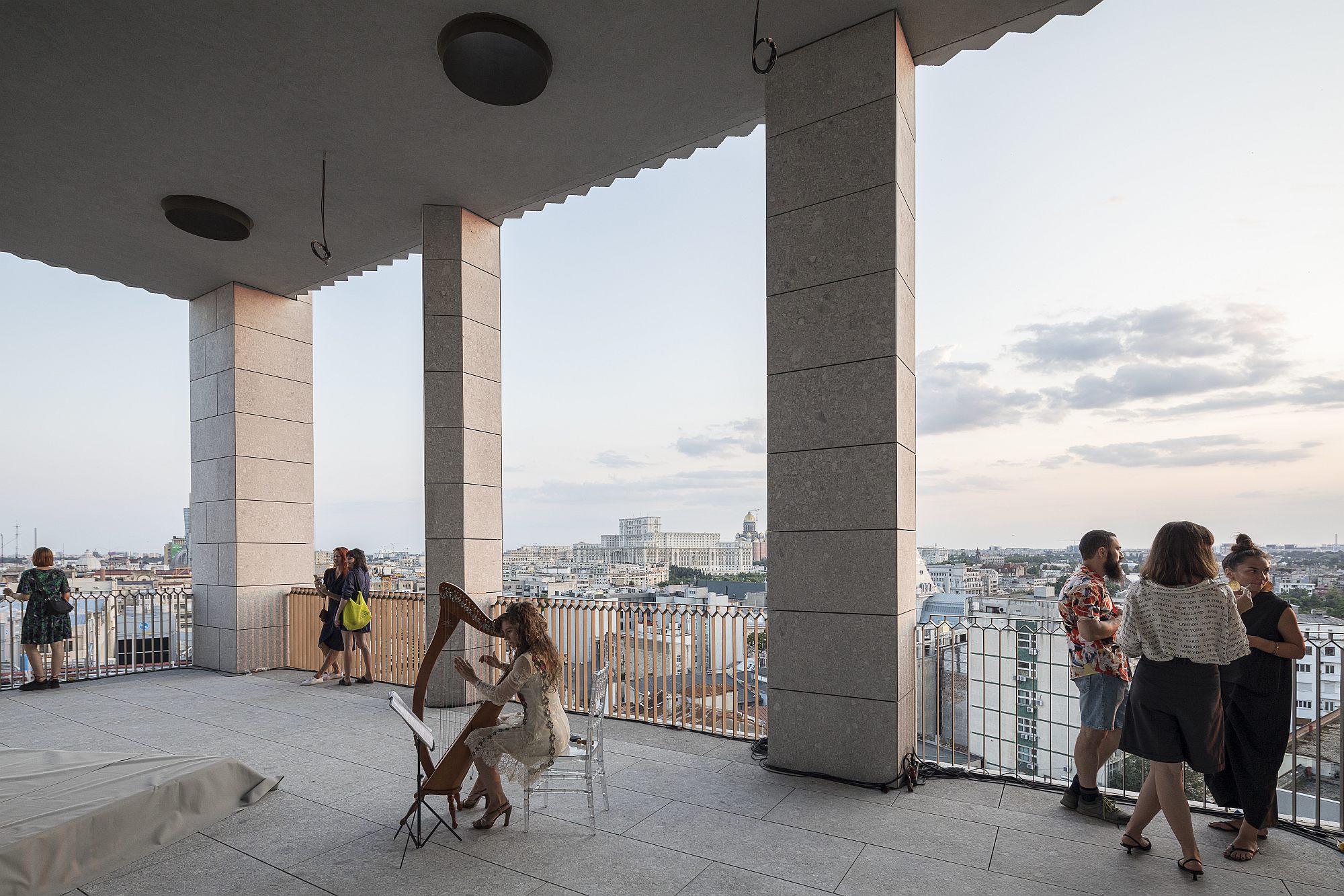
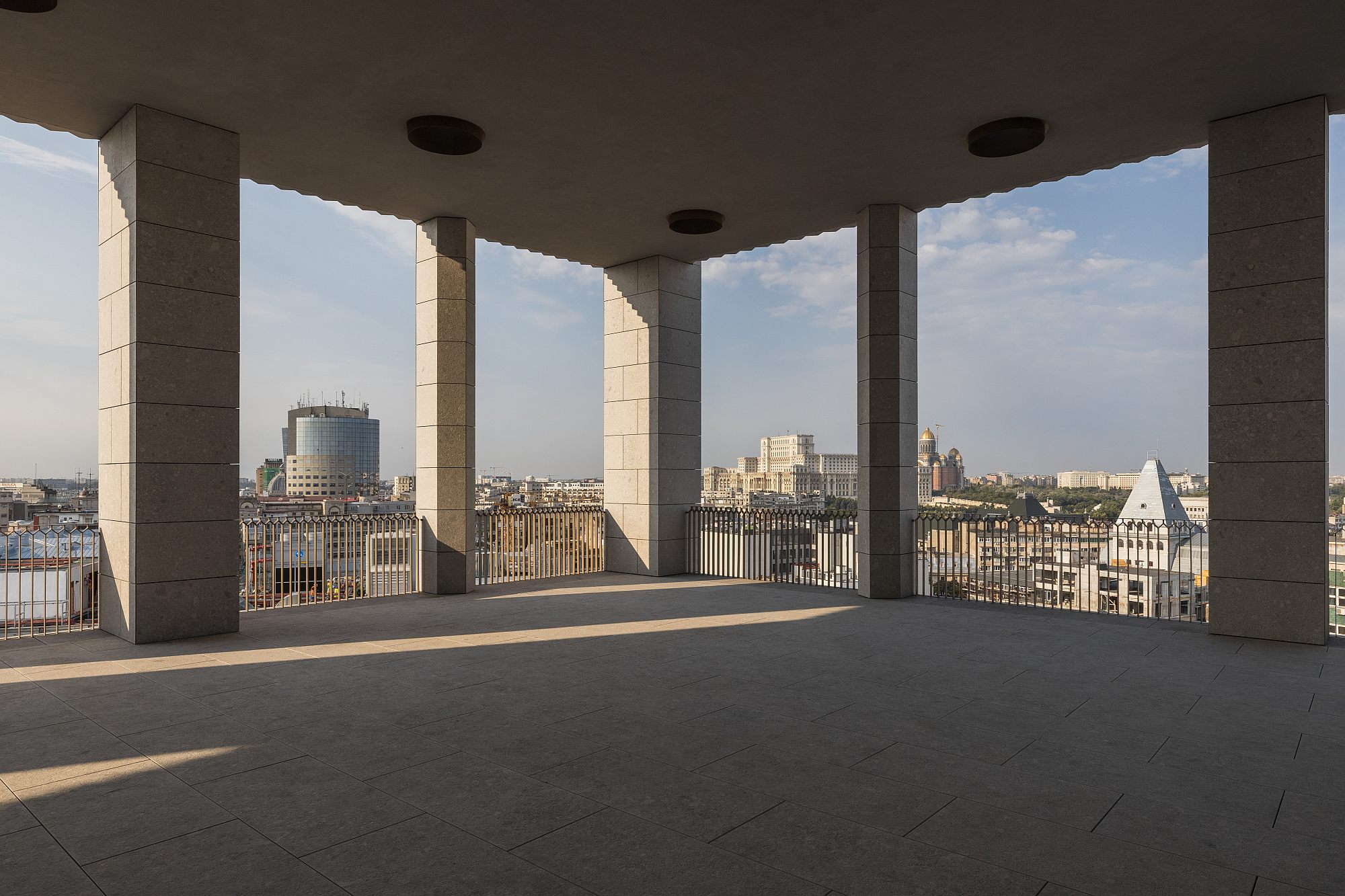
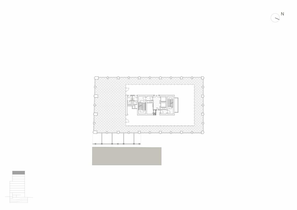
The final important decoupage is on the last level. The covered terrace is a magnificent space, open on all sides towards the Bucharest landscape. 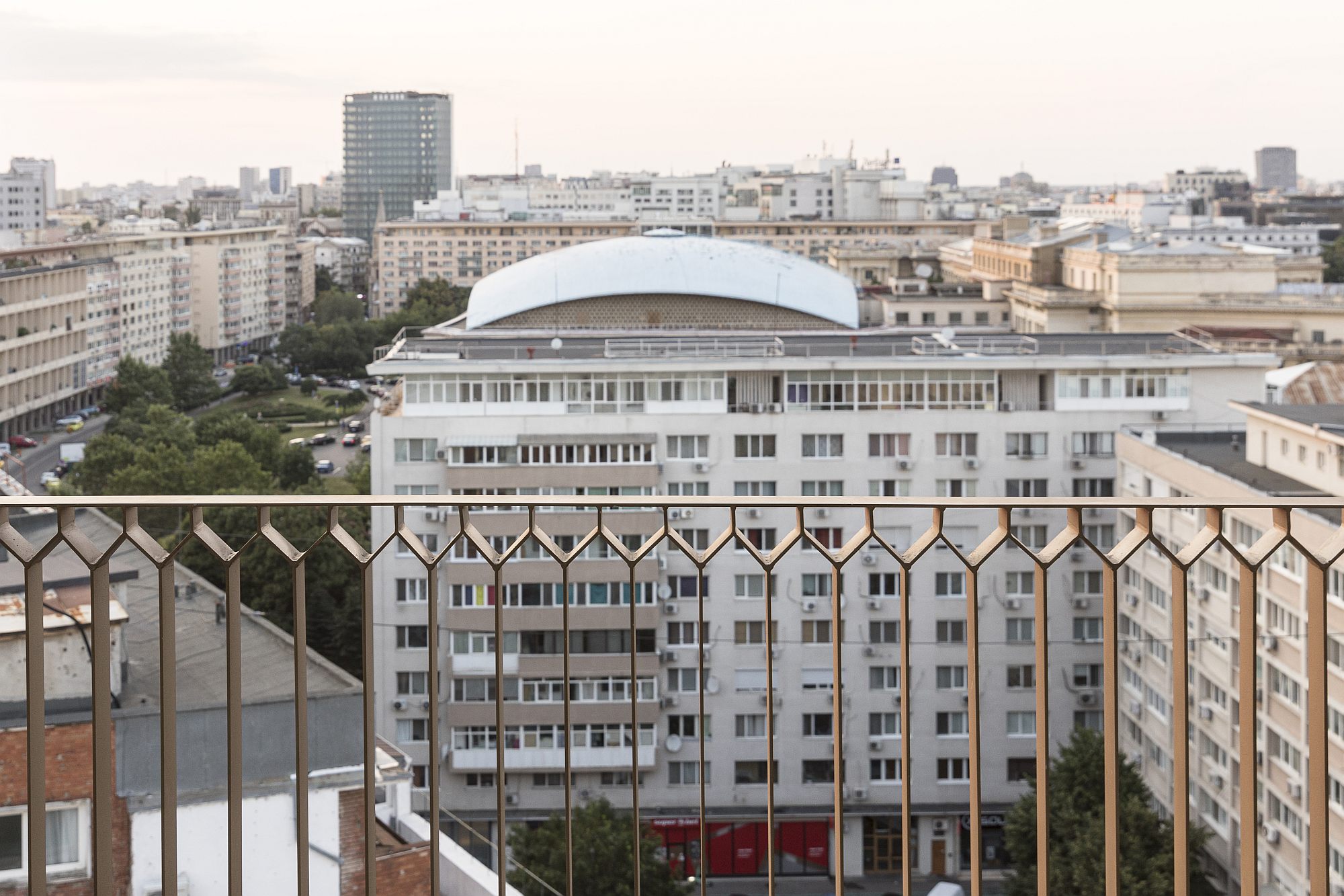 *Aerial view of much of the central area in Bucharest. Right from Millo Office, the Tandem building, under construction ©Laurian Ghiniţoiu
In fact, it started to function for cultural events (concerts, poetry reading nights) even before the building was completed. It seems this last level will be occupied by a restaurant and its terrace; we can only hope that public (and non-commercial) activities will still find their place here.
Inside and out
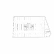
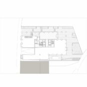
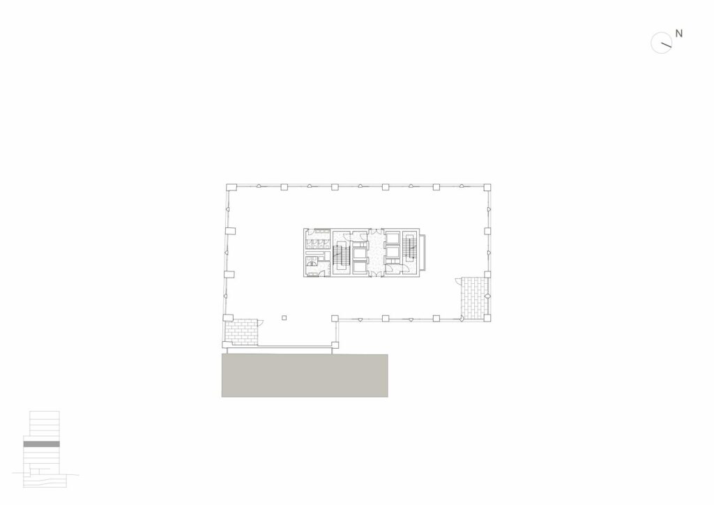
The building’s architecture is rational and rigorous. The concrete structural frame defines both the partitioning, and the facade. Level plans are simple and efficient, with a central nucleus of circulations and services (in fact, slightly off the geometrical centre, responding to the urban situation, access situation, etc.), surrounded by free spaces which allow for modular partitions. Some of these levels receive loggias or terraces, which highly increase the space usage quality. Two “wide”beams – actually widened and post tensioned parts of the floor slabs – cross the lenght of the building on each floor, thus eliminating the need for suplementary pillars between the facade and the core.
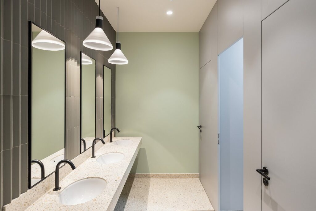
The design of each floor lies with the tenants. The interior spaces laid out under the ADN BA control are the entrance, the main hallways and the circulations.
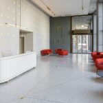
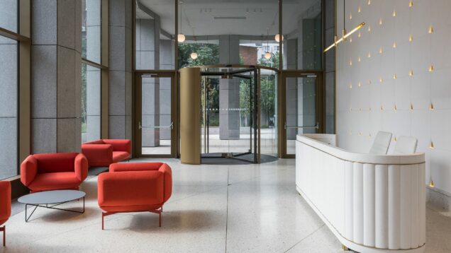
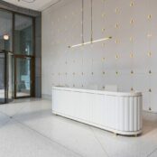
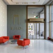
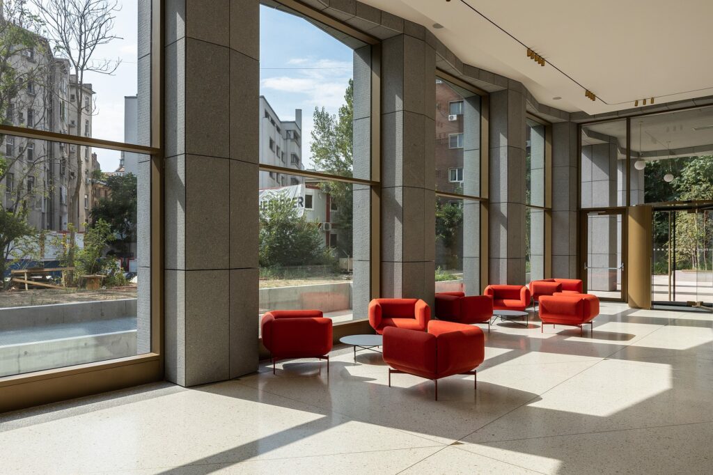
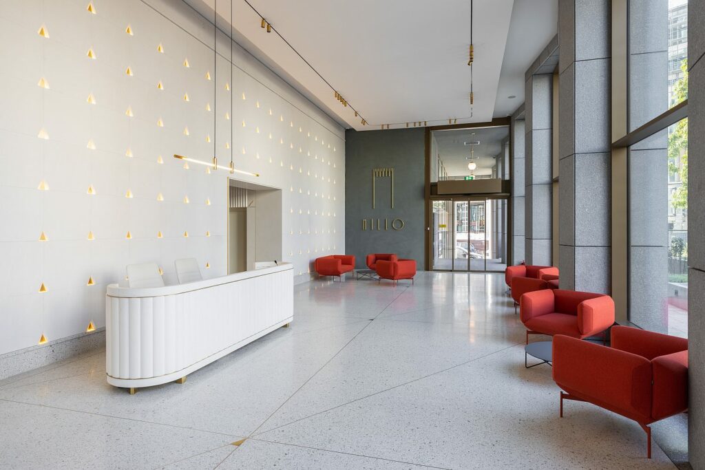
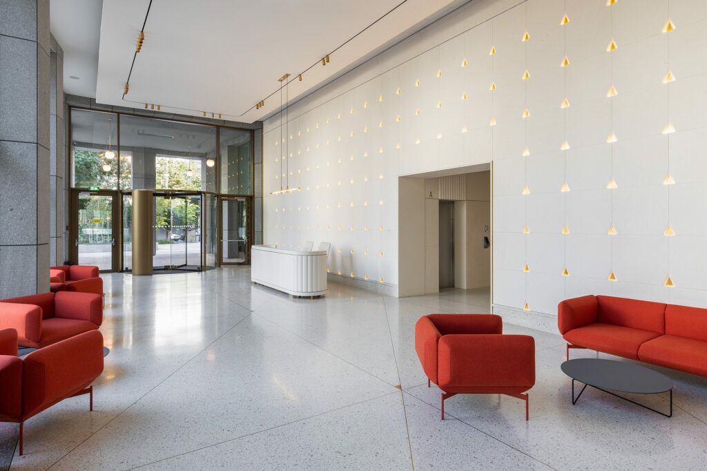
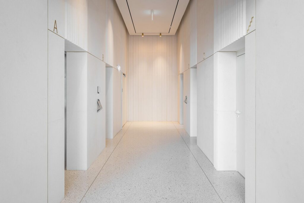
*Entrance hall / Floor hallway
The architects present the architectural expression as a reverence to the 1930s’ American metropolis and, of course, to its ambassador to Bucharest, the Telephone Palace we were mentioning above.
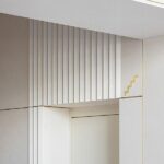
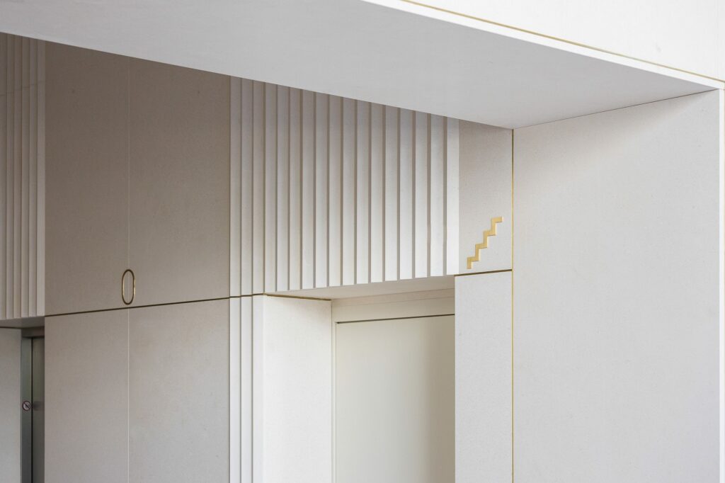
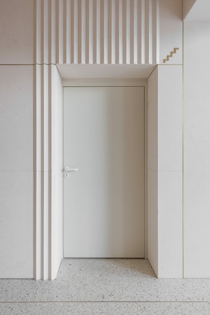
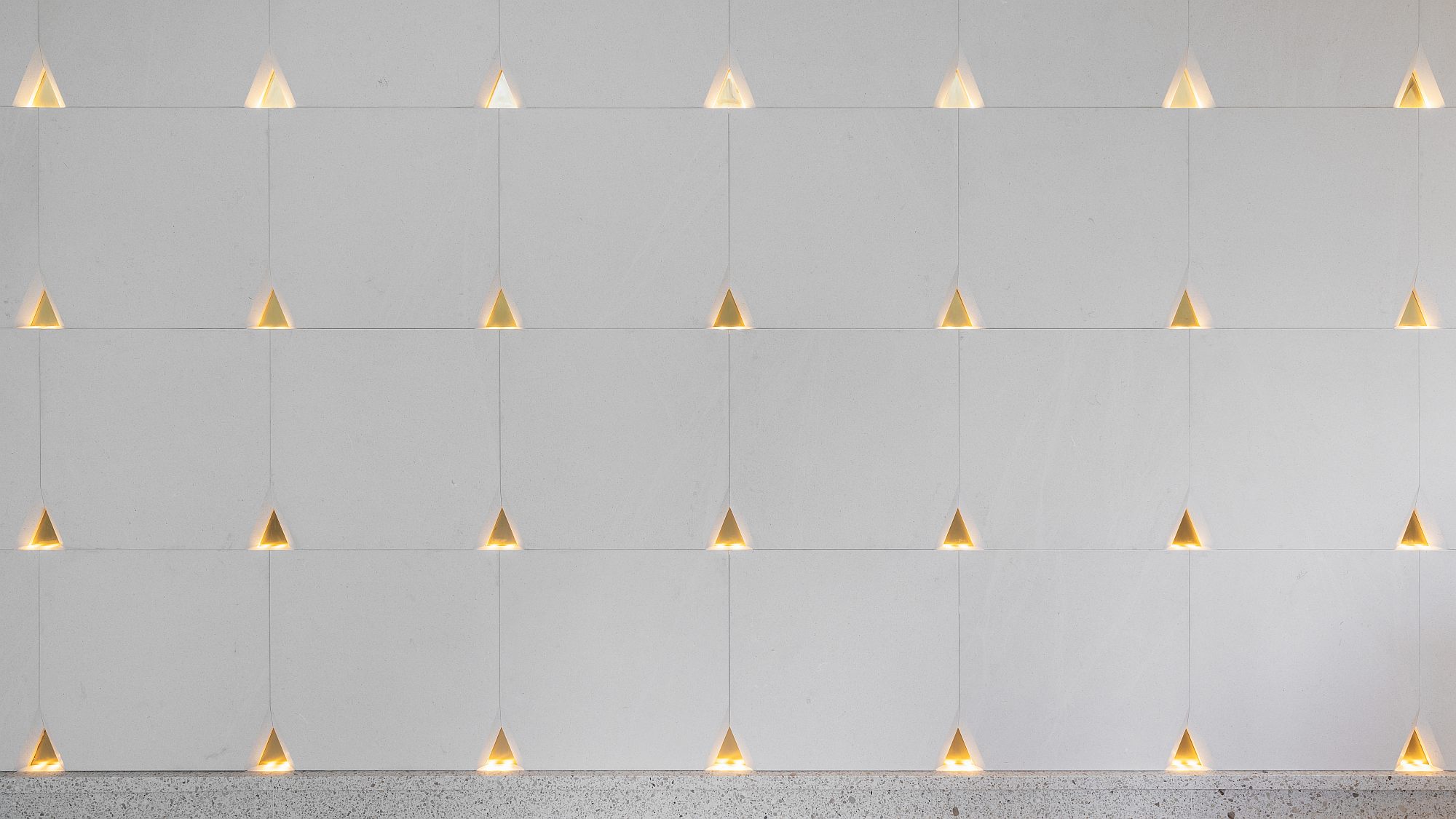
Most of the references are also rather visible. But fortunately, the ornamentation is here much more sedate than the original model or than the various types of post-Modernist revivals. The entrance hallway is perhaps the most literal interpretation, with stone as a nearly exclusive material, with its different-type profiles, or with the geometric pattern of the wall behind the reception desk.
A very beautiful detail is the extension of the stone flooring inside the elevator. It becomes part of the hallway, subsequently transported to the various levels of the building.
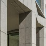
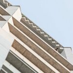
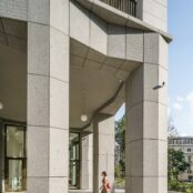
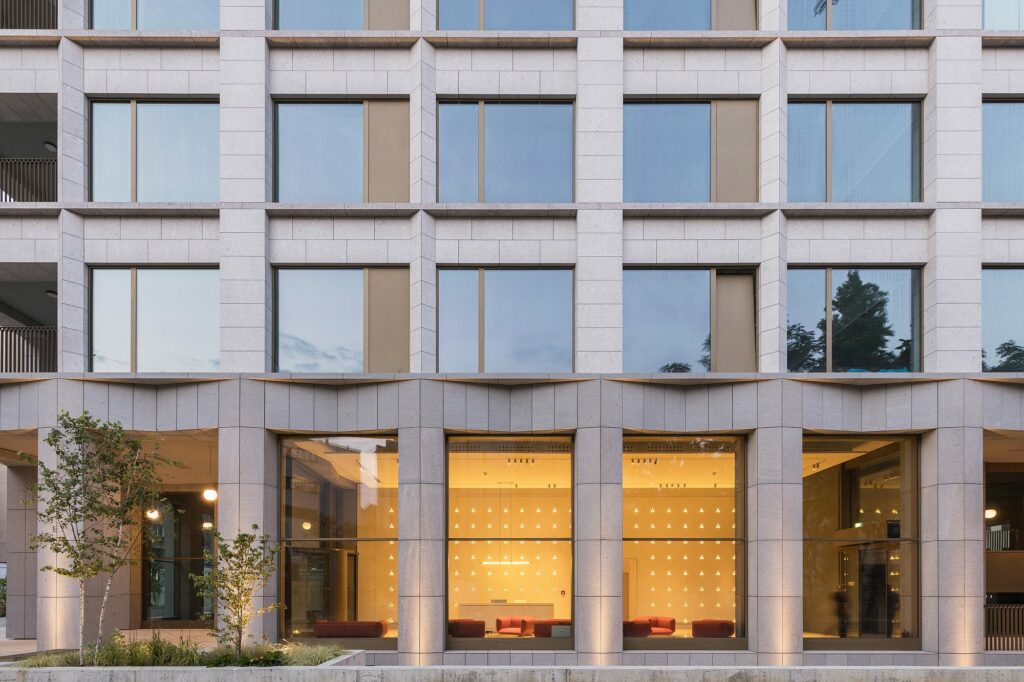
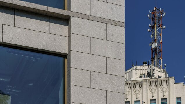
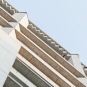
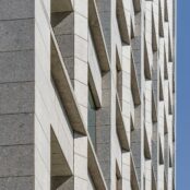
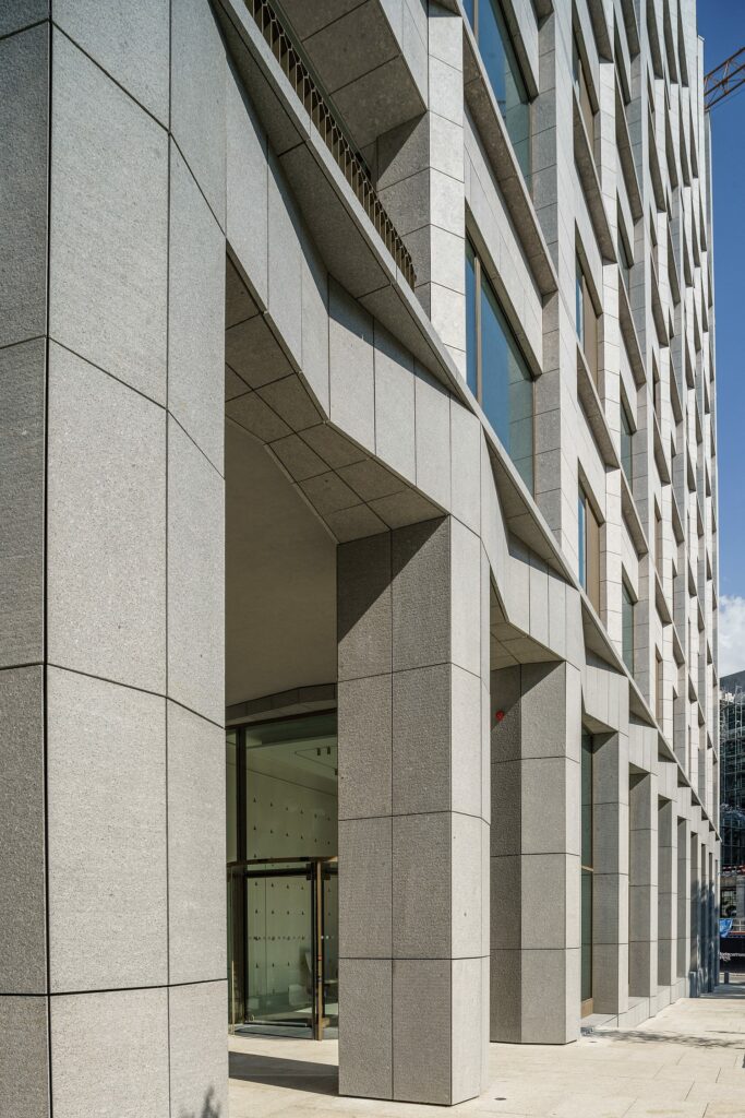
We must admit, the lighting (in the walls or on the ceiling), the furniture and a lot of details show you that you are not on the set of a 1920s-30s themed film. This happens, in fact, inside the entire building. Thus, facades result from a subtle play between an orthogonal grid and modular triangular elements, diminishing in size from the ground floor, treated as a socle, to the pillars (of which only half receive this plating on the first levels), and then to the cornice panels. The outlining of verticality, achieved through the emergence of pillars in front of horizontal elements, is highlighted through this geometric treatment. The change in the triangular module introduces a slight ambiguity of scale and an ambiguity that is good for the image. For the corniche, the ornamental panel is no longer a stone ornament, but a series of in-situ concrete panels – a wilful departure from the inter-war model. Unfortunately, the ceiling over the upper terrace, which should have been left apparent, had to be painted after all, because of some construction issues.
The dry-stone plating, the joinery design and the mobile aluminium windows are just as many clearly contemporary elements, while the delicate metal bannisters are balancing the bulkiness of the main elements.
Classical
Perhaps this Art Deco model should be discussed a bit. First, this is not a pastiche – a catastrophe now starting to spread all around Bucharest. Second, beyond the recognizable and more specific elements, I for one find that with the Millo Office it is more about regaining a certain spirit. Art Deco aimed to merge the classical tradition and 20th century Modernism, and a style accessible to a alleger audience, but it is much more than that: a still-enthusiastic modernity, more relaxed, anti-radical and urban and, at the same time, referring to a simplified yet common sense classicism, with a considerable playful component. Well, the building we are talking about has the openness, the human scale and the transformation of detail into ornament which we normally associate with Art Deco, but what is perhaps more important is its participation in a much wider architectural category, that of a classicism reduced to its essence – axes, construction, fundamental vocabulary elements, balance, harmony, proportions, and so on. This is a prestigious tradition, which can be tracked back to Italian Mannerism, including some of Palladio’s villas, but also including late Scandinavian classicism and Asplund and Lewerencz’s work, and obviously the good Italian examples of Mussolini, Perret, Pouillon, and, closer to home, Rossi, Grassi, nowadays, David Chipperfield or Caruso-Saint John. A spirit which is otherwise quite present in Bucharest; more famous being Duiliu Marcus’s official architecture, GM Cantacuzino’s or Octav Doicescu’s searches; but some of the most remarkable buildings in this family emerged during the transition period between Stalinism and neo-Modernism. The high rises built by Doicescu and his disciples on Magheru, the Gioconda block and tower at the end of Calea Victoriei, but also the entire assembly of the Palace Square we have been mentioning here, all illustrate this. It is a dignified and at the same time reserved architecture, a singular object architecture, but also an architecture that is part of the urban fabric. The Matei Millo building is very well placed in the proximity of these examples and is not far from the historical architecture around it, be it inter-war Modernism, academic eclecticism, or neo-Romanian (which is, in fact, considered on academic principles, as well). To give only one example, treating the facade as a base/plinth, main portion and cornice complies perfectly with atemporal classical principles.
We could perhaps still make a note on the proportions – I think they are good, or qualities unrelated to style, such as the generous height of the entrance hallway and of the terrace on the top floor, or the complexity of the envelope, which is no longer a box, but a strongly articulated succession of spatial planes, defined by horizontal and vertical elements of varying depths.
*Details. According to the point of view, the large windows are more or less visible. The deep skin is one of the remarkable features of the building
The porous façade also gives some solar protection to the glazed facades, as well as screening it from non-frontal viewpoints. Wer should note that this depth that benefits both the architecture and the city was achieved through some economic sacrifice, as it led to less square meters to let; this is also the case for the ground floor porticoes and the loggias on the upper floors. This was accepted and supported by the investor and not a demand from the city authorities.
Another – now, still premature – discussion will be needed on how the building will truly function as an urban attraction (and track), if it creates good pedestrian flows and not too much vehicle traffic and, especially, on how it will function in space and as use, together with its pair, the still unfinished Tandem building. The project for the latter appeared after the onje for Millo, but completes through an urban square – a much too rare and needed element in Bucharest and that would coonect to the above-discussed passage. We’ll talk about all these in a future piece.
Plans
Info & credits
Architecture:
Concept, Building Permit, Construction Project Supervising, Technical Assistance: ADNBA – Andrei Şerbescu, Adrian Untaru, Horia Munteanu, Esenghiul Abdul, Bogdan Brădăţeanu, Tiberius Tudor, Adrian Bratu, Laura Oniga, Cristina Budan
Construction Project Project: DECO Architects
Structure: Concept Structure
Installations: DD Eurocom
Landscape Architecture: Beros Abdul Arhitecţi Asociaţi
Developer: Forte Partners
Address: Str. Matei Millo 6, Sector 1, Bucharest
Period: 2017–2021
Plot Area: 1.783 sqm
Total built area: 8.915 sqm

