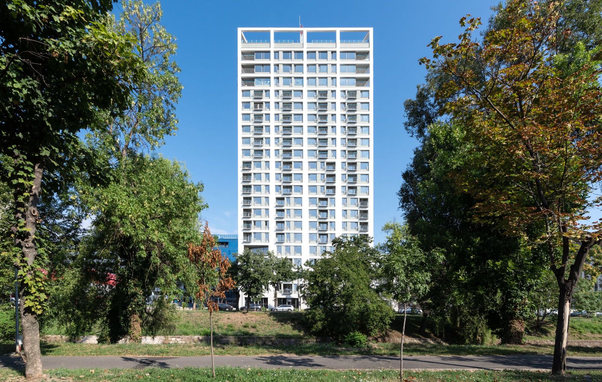
Restrained monumentalitaty and delicate grain: this high-rise apartment building elegantly balances the various scales and urban situations.
Text: Rodica Dina
Photo: Ovidiu Micșa
By the river, along a street, between urban worlds
For the city, the Bega Channel is a living artery. Ever since the beginning of the 18th century, when works started on it, upon the initiative of the Habsburg Empire, the channel was not only a means of transport, but also a power source for the crafting activities, and then for the industrial ones, that were taking place along its banks, as well as a source of drinking water for the inhabitants. Vintage photographs also speak of the river’s role as a place of leisure. In this light, the process of rehabilitating and laying out the banks, which was initiated in the last decade, was not only welcome, but also a needed act of revitalizing the water stream. Today, alongside the Unirii Square, the banks are one of the main landmarks of social coagulation for the Timisoara community of all ages.
Therefore, if you haven’t been to Timisoara yet, a bike ride along Bega’s banks is the best way to enter an unmediated dialogue with the city. Starting from the Waterworks, passing by the Fabric industrial platforms, going on through the string of parks which edge, to the south, the city’s central nucleus, and then through Iosefin, by the Water Tower and the industrial platform of the western outskirts, the banks will lead you all the way down to the Serbian border. From the height of bike riding, steadily, the banks will calmly string out in your memory a few of the city’s main landmarks. They are visually composed, in successive or overlapping plans, always filtered by vegetation, through a series of characteristic details: the Seccession elegance of the Waterworks, designed by László Székely on the water course; the Symbolism-imbibed spires, which announce Imre Macovecz’s presence in the city, through the Reformed Church; the two Romanesque Revival towers of the Millennium Church, seen in the background; the monumental silhouette of the Neptun Baths and the Decebal Bridge, works by the same László Székely; the simple and clearly cut volumes of the West University – a remarkable complex, signed in the ’60s by Hans Fackelmann (a “key” presence in the Romanian professional landscape of the last century, still insufficiently studied and known); the Iosefin Iron Bridge and Water Tower, both examples of early 20th century engineering mastery.
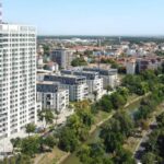
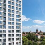
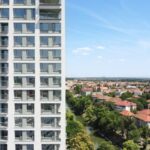
Starting with 2019, this string also includes, at least as a visual landmark, the tower towards the river, from the ISHO complex. It is for time and city life to measure the place and purpose of the new building in the inhabitants’ collective mental.
ISHO neighbourhood
The general project was announced in the early 2000s, when an urbanistic study was made, with the purpose of analysing the development potential, but also the necessary limits for the area that had housed, until the ‘90s of the past century, the development of manufacturing units belonging to the wool processing industry – the ILSA industrial platform. This study was followed, in 2017, by the drafting of a Zonal Urban Plan, aimed at suggesting a densification of the area connecting the city centre and the eastern limits, by creating a “continuous structure on a problem site”. Other objectives of the project aimed to “regenerate and re-operationalize the former industrial site and to reinsert it in the urban circuit, transforming the intervention area in an active one, with mixed functions” and to “define a network of spaces with an urban character”. [PUZ ILSA Timişoara, Memoriu general, Andreescu&Gaivoronschi SRL, 2017]
The study area is delimited to the north by the Take Ionescu Boulevard (a main circulation artery, connecting the airport and the train station), and, to the south, by the Bega River – two completely different aspects of the city, in terms of the natural component, circulation speed and building scale. On the east-west axis, the location is situated between two historical neighbourhoods in the city, old and very coherent urban nuclei, both from an urbanistic perspective, and as a way of living, supported by communities with their own identity: the Cetate neighbourhood (the historic core) and the Fabric neighbourhood. The area is generous enough, both in terms of surface, and as urban relationships, to be able to support, in turn, a community. This was the premise of the general project.
The development includes housing and office buildings, as well as a variety of related support functions: trade, public catering, medical services, leisure area (swimming pool and gym), as well as a cultural space for events and exhibitions. From a planning perspective, the development also proposes the closure of the circulation ring – awaited for decades – through a street crossing the area and that will be completed by a car-bridge over the river, and that will link the north and the south of the city.
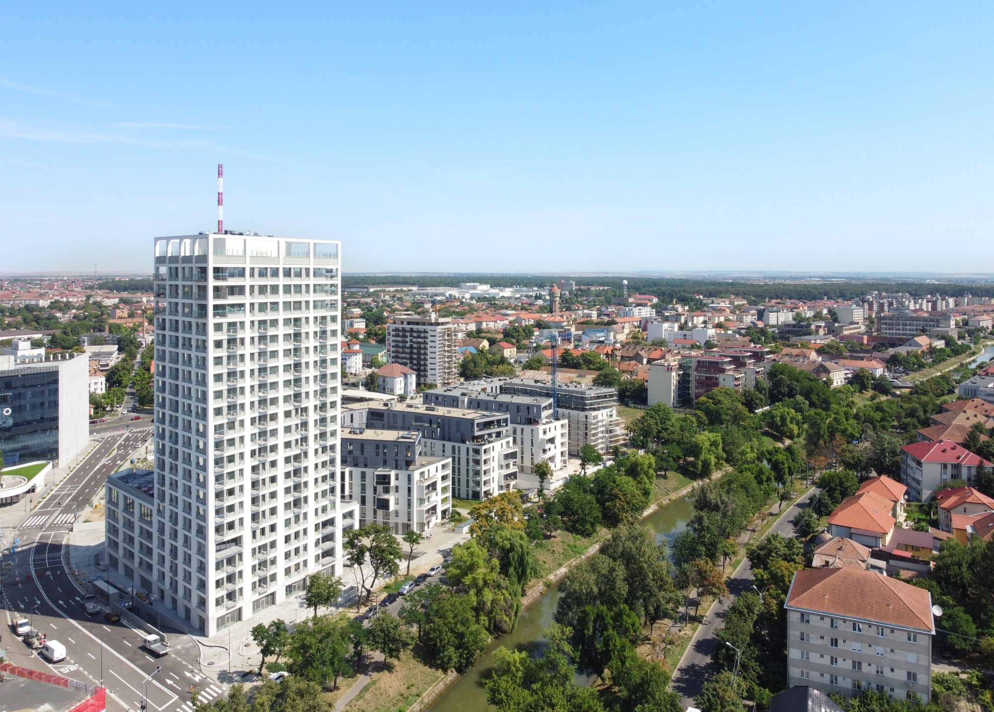 *A metropolitan model: urban block, closed street fronts, density and functional complexity, tower, deep building skin, structure and facade grid
Landmark, block, mix
The urban design completes the natural neighbouring area (the Bega River and its banks), suggesting a pedestrian bridge over the river and a park with resting spaces and children’s playgrounds. The building that our office was invited to design was imagined, ever since the urbanistic study, as a visual landmark, both in terms of position, and of height.
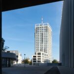
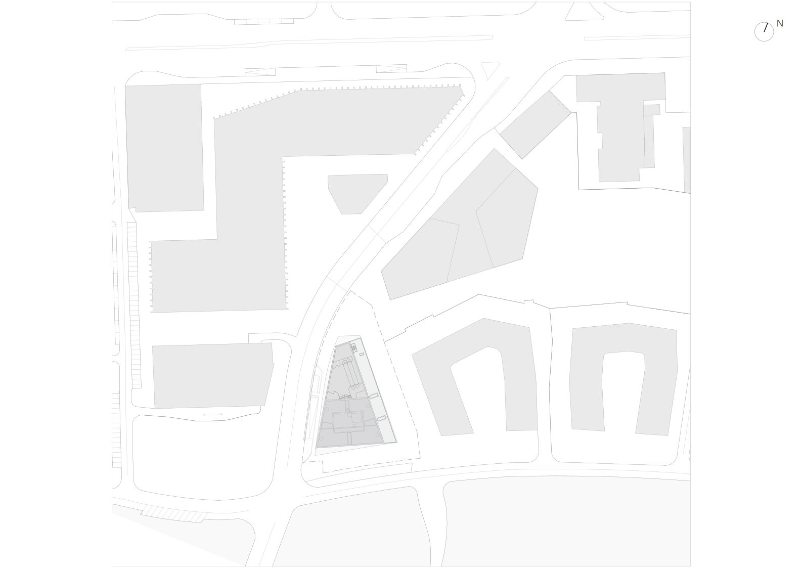
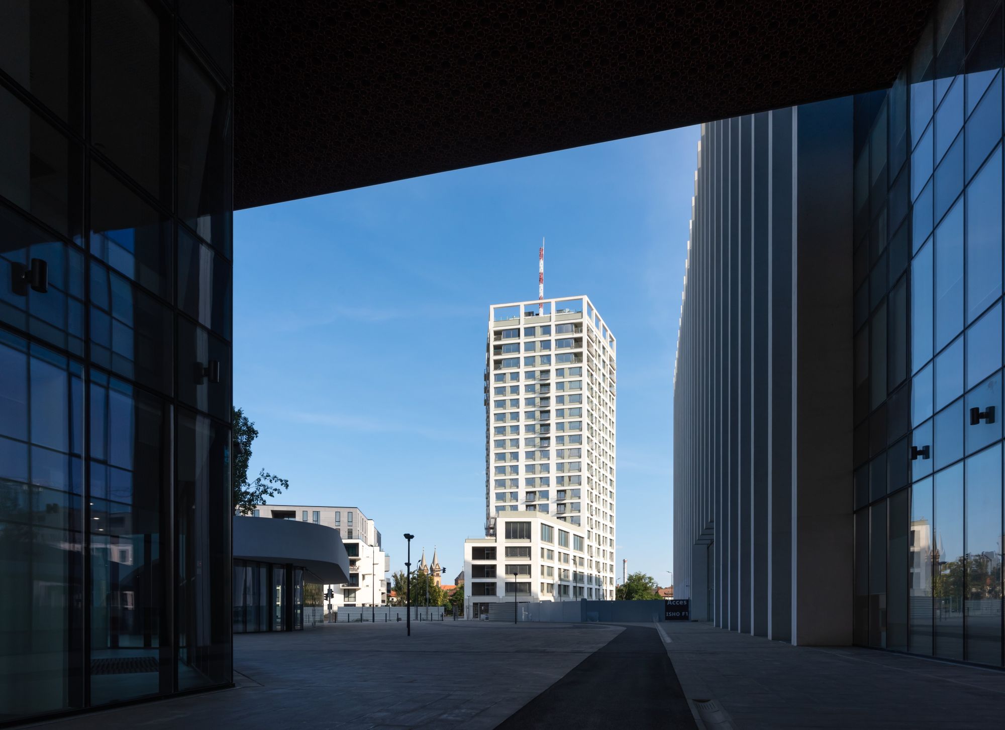
It defines on one of the corners of the plot, placed next to the new traffic ring and opening directly towards the Bega River. It also holds a privileged position as it sits along the walkway which visually connects the access portal to the ISHO development, and the contour of the Millennium Church, a walkway which extends over the river through the pedestrian bridge.
*View from the access portal of the ISHO neighborhood. The pedestrain path to the left of the ADN BA building is oriented towards the Millenium Church
The project has brought a welcome change of scale in our office, as the first really tall building to be designed. This involved a careful study of the relationships to the (existing and PUZ-suggested) urban context, from both directions: from the building to the city, and from privileged city areas to the building, with the analysis of the new visual angles to be created.
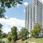
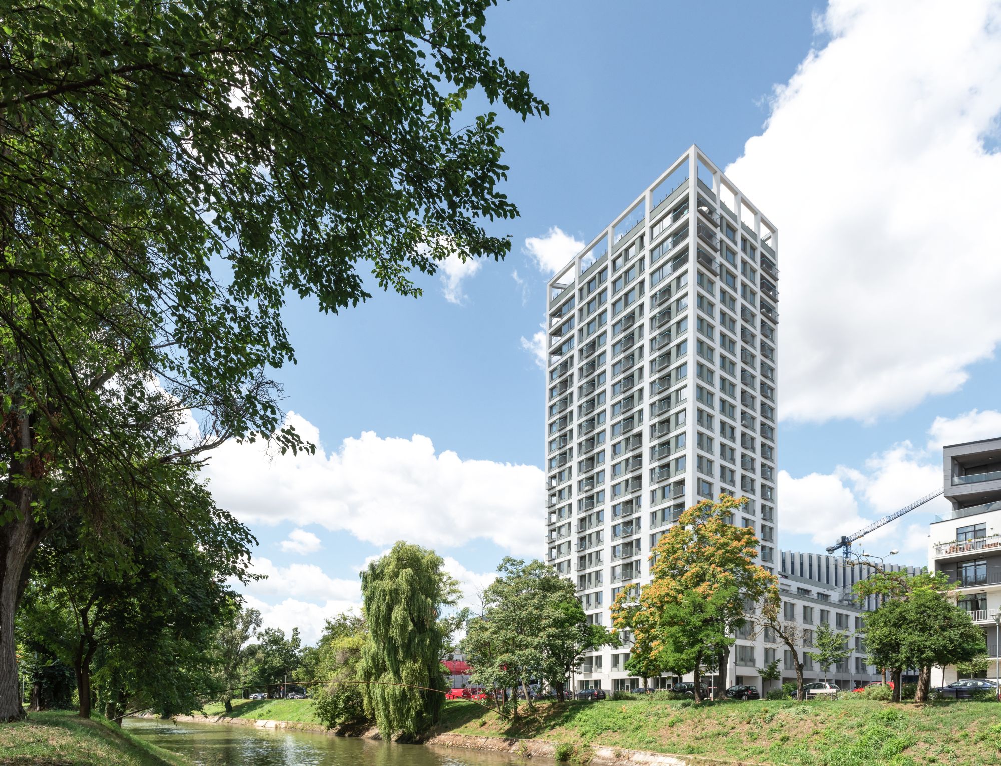 *View from the southern shore of the Bega river
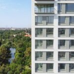
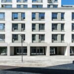
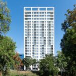
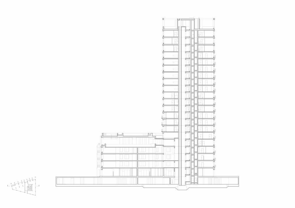
The simple and clearly cut volume aims to fulfil this landmark potential. The structural frame is subordinated, following the same principle of simplicity, and it works with the architecture, becoming its component. The building’s skeleton, built around a central nucleus stingily designed (according to the design theme requirements), is defined by a series of structural piers, marking the plane of the facades and narrowing towards the tour’s peak, indirectly signalling the decrease in apartment density. The tower’s structure is designed without central beams or additional pillars, to allow, in time, maximum flexibility in the interior layout of apartments. The development consists of a main volume, with a compact plan, which accommodates living, a graceful silhouette, launched on 20 levels, and a secondary and adjacent volume, which stops on the fourth floor and includes office spaces and a leisure area (spaces for sporting events and an interior swimming pool). The two volumes have separate entrances at ground level and are functionally unified by a common plinth, the ground floor, where there are public commercial spaces, but also through an unified drawing of the façade, that emphasizes the cut-out image.
The building almost completely fills out its aproximatively trapezoidal plot. The lower and slimmer body looks towards the interior of the ensemble, respecting the lower scale of the neighboring buildings. It also helps a better framing of the pedestrian alley which visually connects the ISHO access portal and the silhouette of the Millennium Church, with both building fronts getting bout the same height, in aquite beneficial way for the urban character of the street. On the contrary, towards the river and the south, the high body gets its maximum width. However, this façade is perceived frontally from just a few points; most perspectives along the river are rather more dynamic.
Along the building and parallel to the pedestrian alley, the ground floor gets a portico, which brings the building to a familiar scale and creates an intermediary space. Here, the building’s structural frame changes the rules of the game on the upper levels, locally turning (by the kind intervention of our structural engineer) the structural piers at a 90° angle. This gesture outlines the volume’s gracefulness and contributes, at the same time, to creating the rhythm of surfaces inside the portico, through a powerful contrast of shadow and light in the early morning hours.
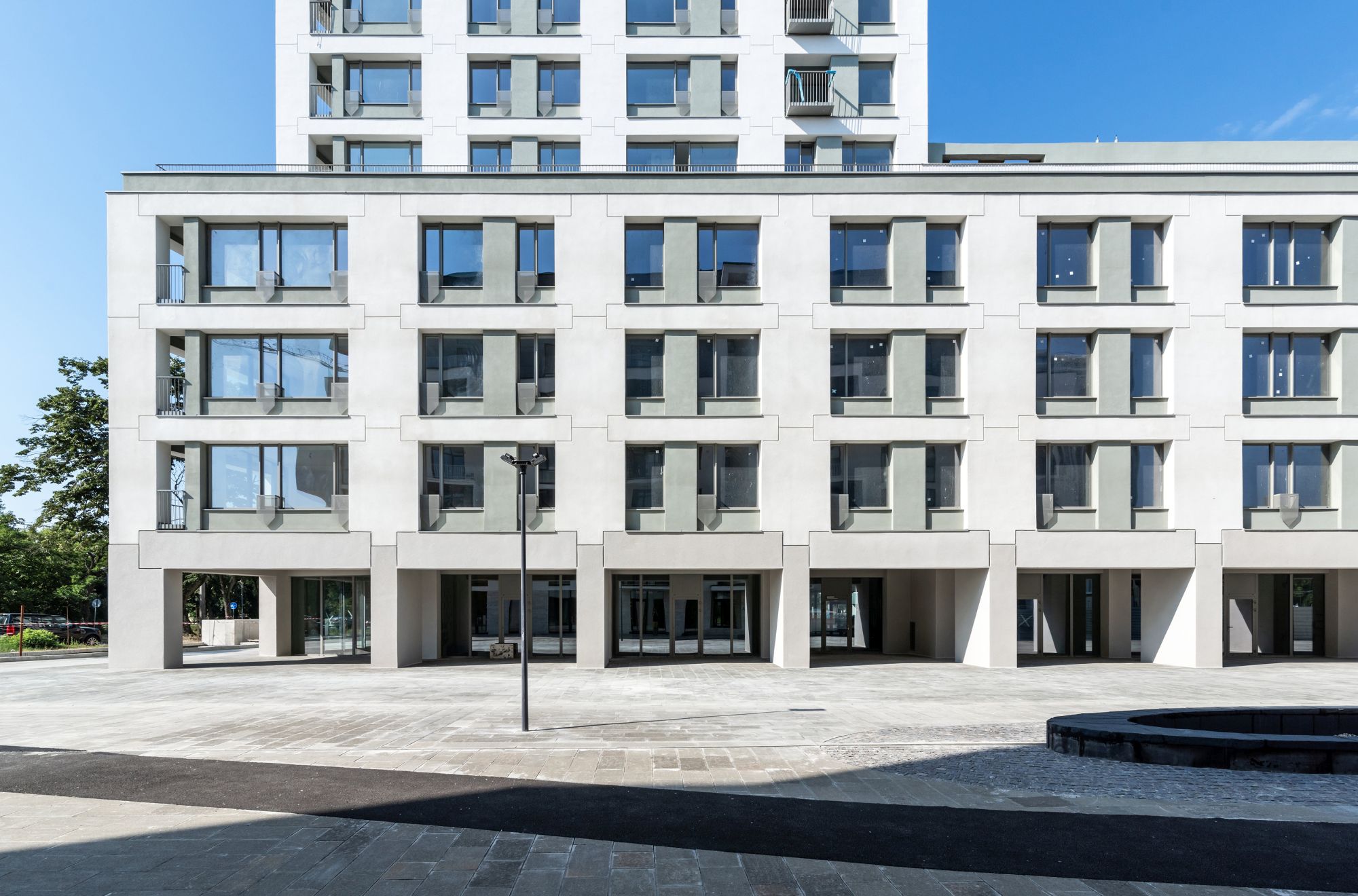 *Opening-up and taming the scale. The lower body and the portico
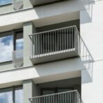
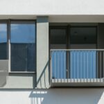
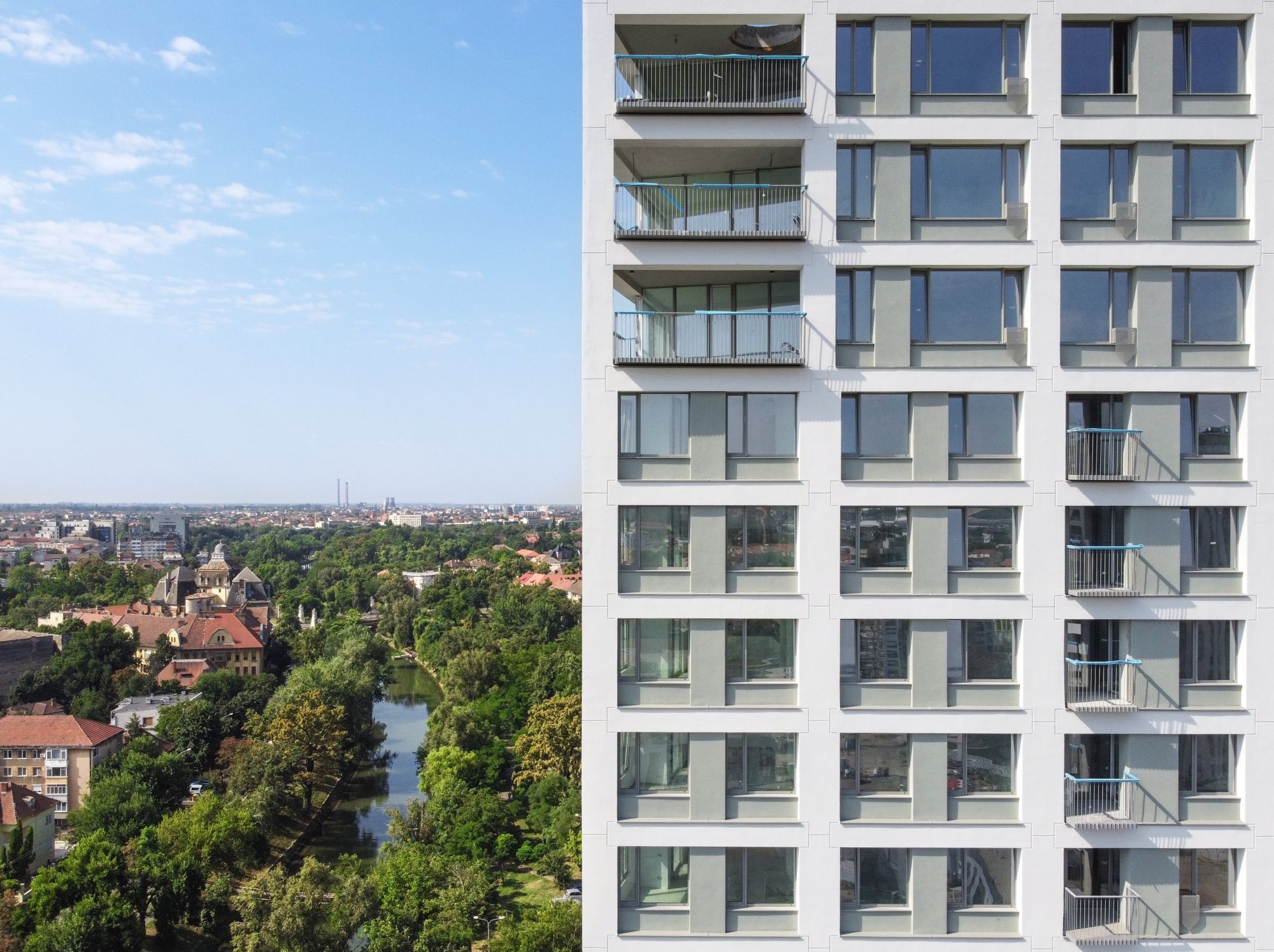
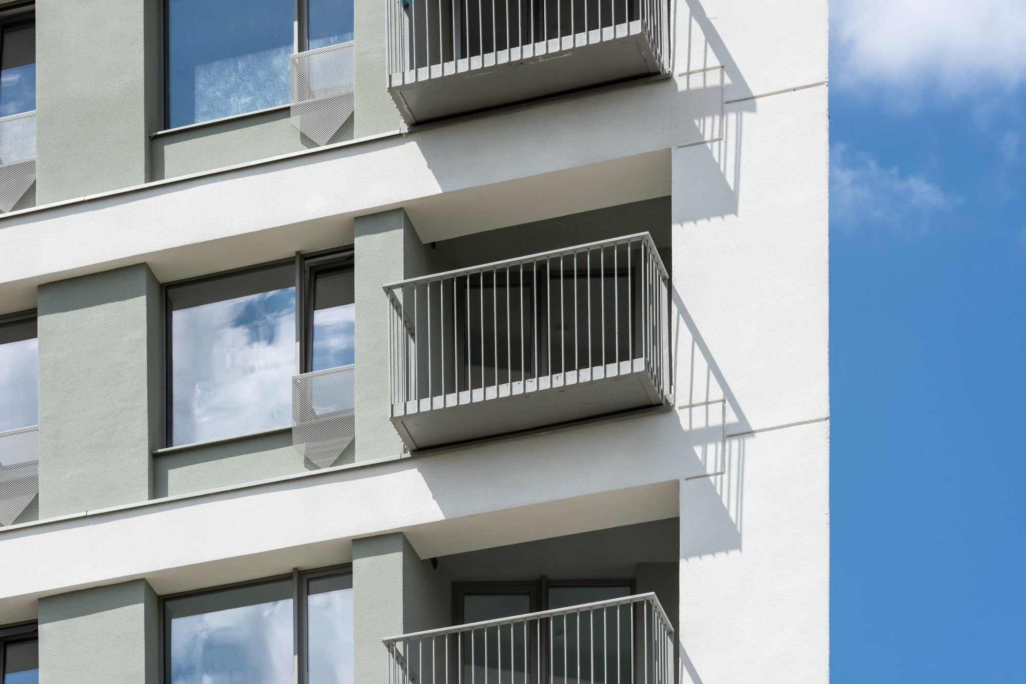
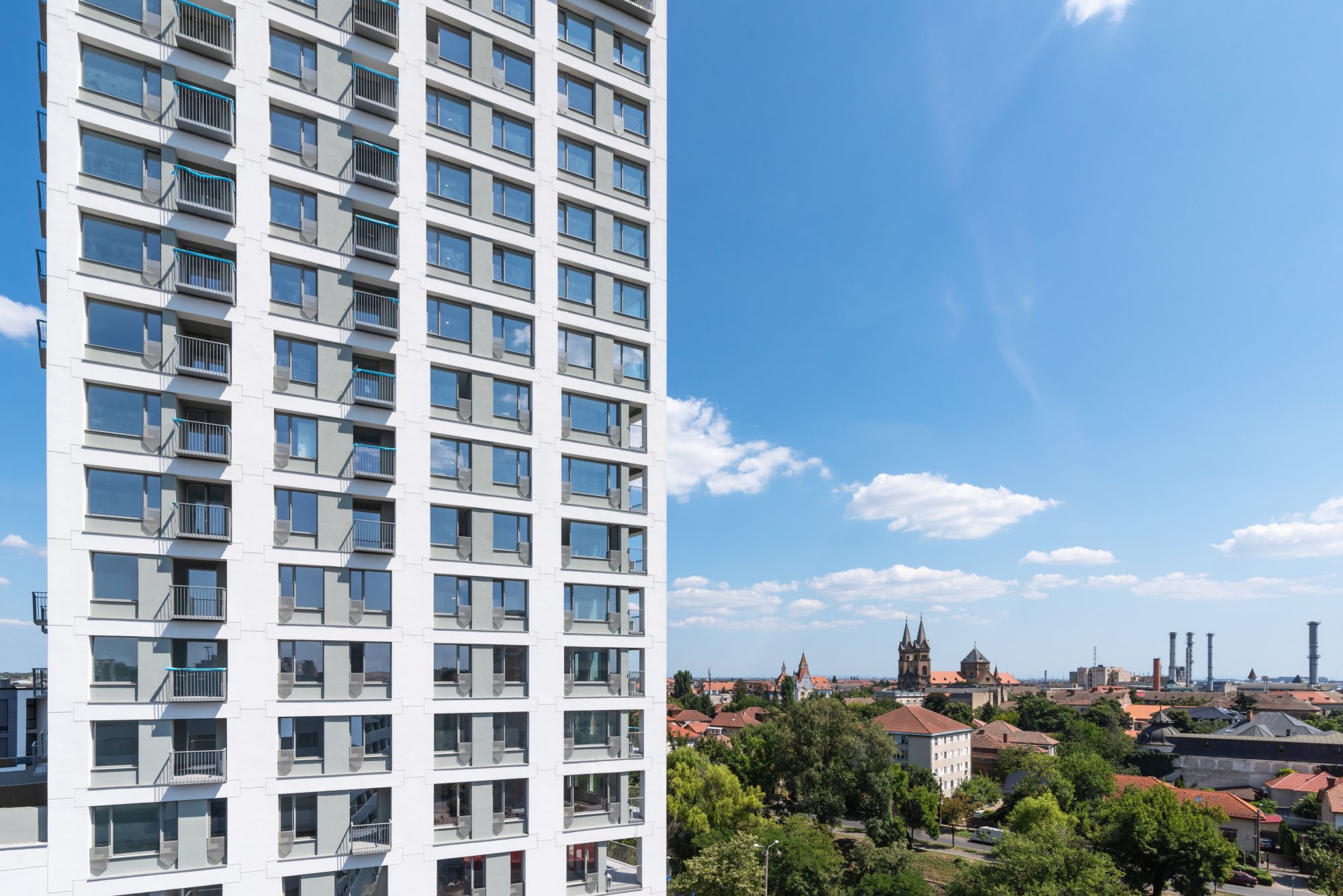
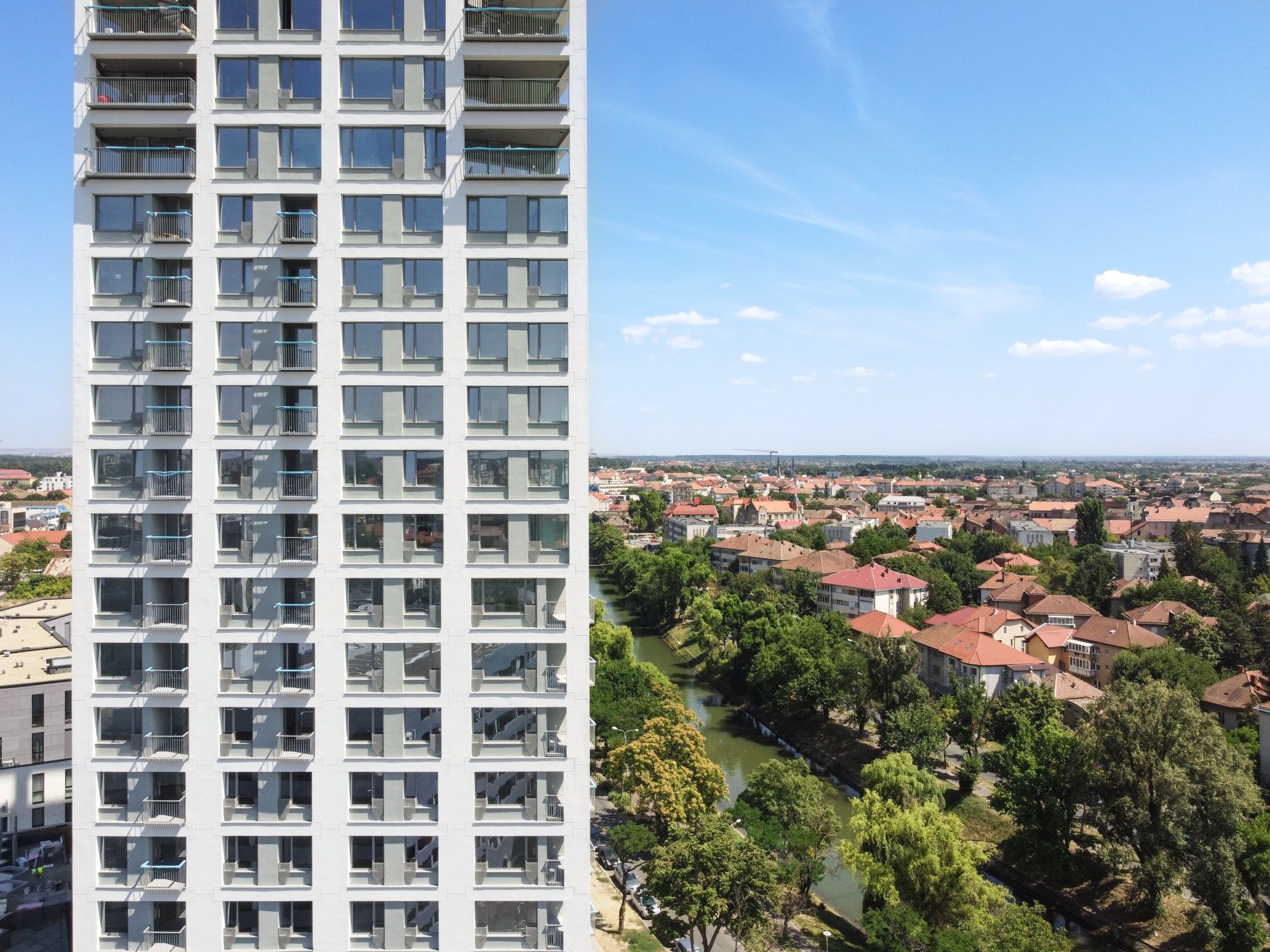
The volume’s simplicity is balanced by the work with the facade’s depth. On the one hand, there was a differentiation between the structure plan, that of the closures, and that of the protection parapets. On the other hand, a series of loggias were suggested, with varying sizes and positions, following the logic of the apartments’ interior distribution. Each apartment has a loggia.
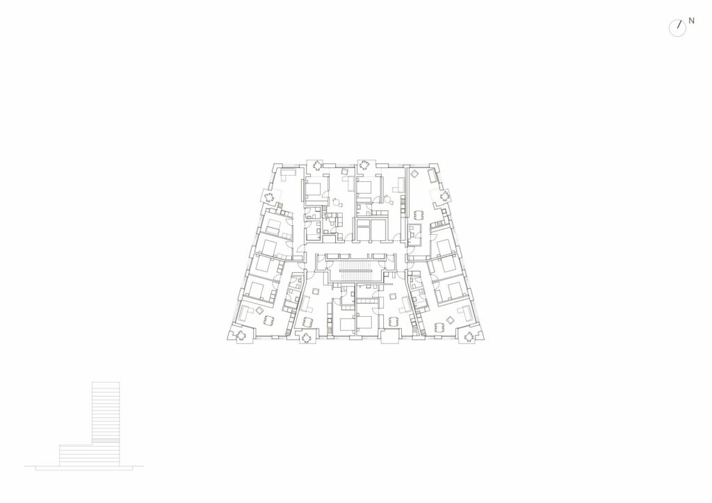
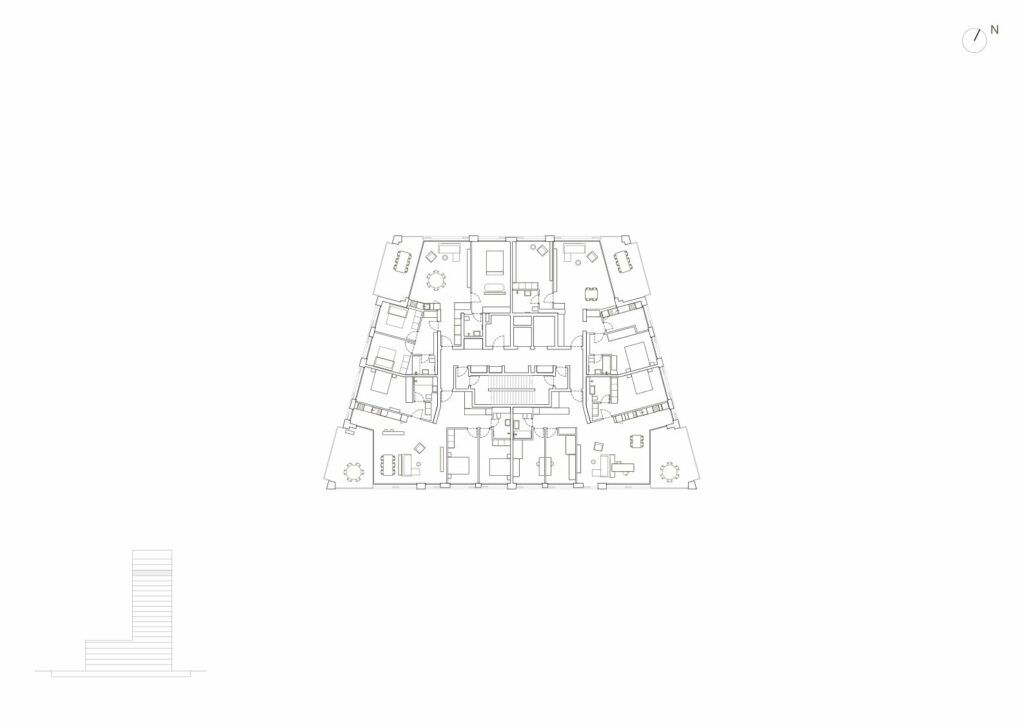
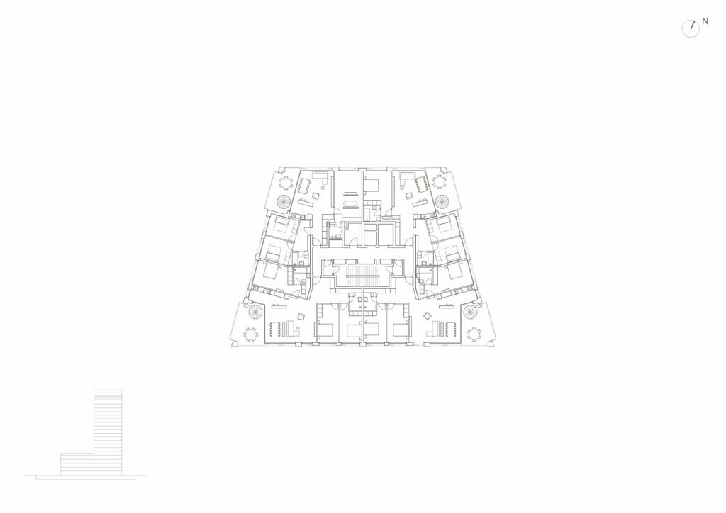
The 140 apartments are split into 30 types and are organised so as to avoid the scheme of a building with a current floor. This is visible on the facades through the irregular play of balconies and of joinery elements. The structure of balconies, although visually simple, has been one of the greatest challenges, both in design, and for execution.
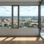
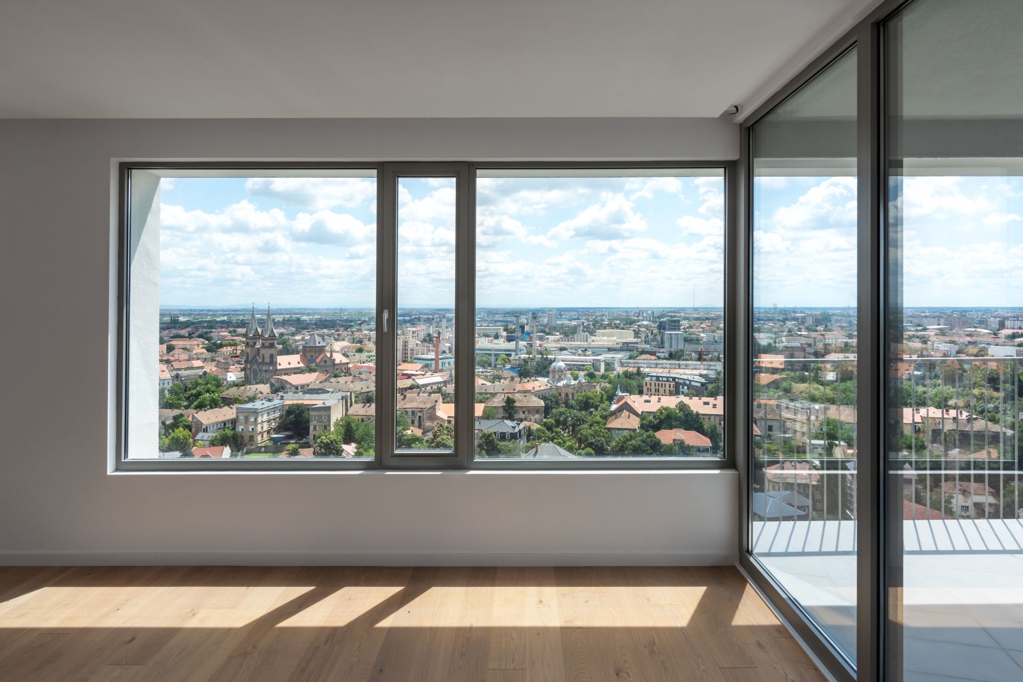
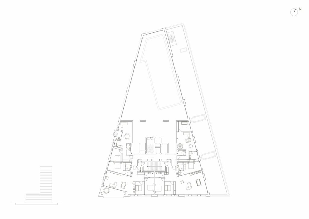
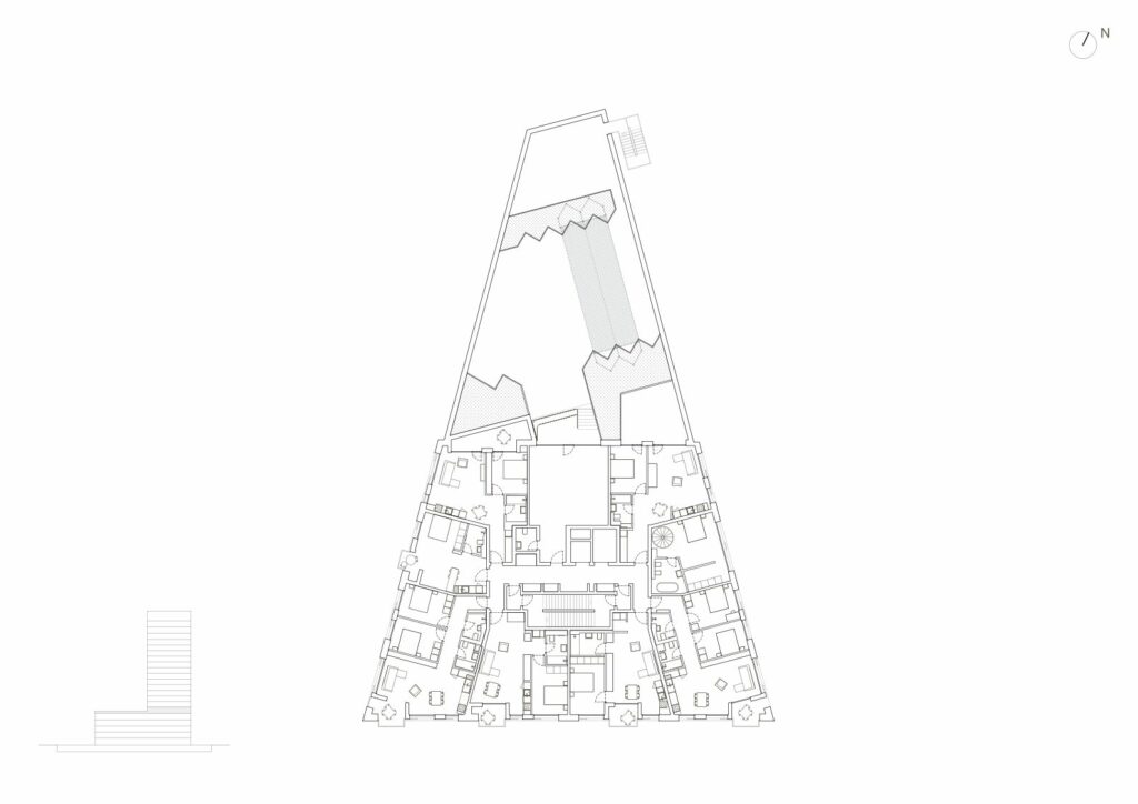
For living, the design theme required a mix of differently sized apartments (from one to four rooms), which would test the needs of the local market. Of these, the two- and three-room apartments prevail. The building’s privileged positions received the four-room apartments. There is only one two-level apartment, located on the fourth and fifth floor, near the pool and having a generous terrace. Although very popular inn Bucharest, this type of vertically developed apartment did not raise local interest. Nevertheless, consistent in our intention of providing the inhabitants with a meeting space, which should help coagulate the community, we insisted on creating a community space. It is located on the fifth floor, directly connected to the common terrace, laid out on top of the extended volume. The terrace has a generous area and receives increased visibility towards the exterior spaces of the development and towards the city. It is designed as a suspended garden, visually enriching the landscape available to north-facing apartments, those which do not have the visual relationship with the river and its adjacent green corridor. The first volumetric recess, suggested on the fourth floor along the entire eastern facade, is in a visual dialogue with the ground floor portico, and stimulates the layout of two private terraces (belonging to the tower apartments) and a public terrace (connected to the pool). These three terraces also benefit visually from the nearness to the urban slab and its conventionality, but also to the crowns of the trees along the Bega, fit for a way of living that is more open to the community. As a contrast, the open terraces on the last floor (21st) are the house’s most privileged places, providing spectacular perspectives of the city and its surroundings, until far away, to the Retezat Mountains.
These terraces, which are currently only accessible to their owners and, looking back, to the designers and builder, are perhaps most mystery-filled place in the building. At the same time, they are the place from which, when seen from above, the ISHO development reveals its role as a transformation instrument, both as an area-structuring urban operation, and as a social mediator, revealing the investor’s generous vision for his native city. Besides being a very respected investor in Western Romania’s business environment, the project beneficiary is also a very apt negotiator. It is why the building site period was to us, as project authors, a constant challenge, and a good exercise in negotiation; some tests were passed, others – were not.
To the north, on the greenfield leading to the Take Ionescu Boulevard and surrounding the future enclosure to be defined by housing buildings, a new construction is being prepared, with a larger footprint, a lower height, and a different silhouette. But we will talk about it in a few years.
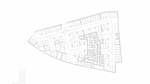
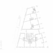
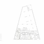
Plans
*1: Basement plan / 2: Ground floor plan / 3: 1st floor plan / 4: 4th floor plan / 5: 5th floor plan / 6: 6th floor plan / 7: 18th floor plan / 8: 20th floor plan / 9: Section
Info & credits
Developer: Mulberry Development
Plot area (sqm): 3619
Total built area (sqm): 17449.5
Building site: 2017-2021
Adress: Bd. Take Ionescu nr 46B Timișoara
Architecture: ADN BA – Andrei Șerbescu, Adrian Untaru , Bogdan Brădățeanu, Rodica Dina , Cristina Lupu, Horia Munteanu , Anca Teslevici, Romina Pasculovici, Alexandru Barbu
Structure: Alpin Consulting
Installations: ALMA INSTAL PRO
Facade design: LIPOPLAST
Signalistics: Ovidiu Hrin
PARTNERS:
Developer: Mulberry Development
Lobby furniture: COS

