Photo: Jan Liégeois
An unsual investor – the art collector and dealer Axel Vervoordt. Art and real estate. A former peripheric industrial site. Recovery, densification and urbanizatiopn as an antidote to urban sprawl. A mix of functions and typologies. Vision, masterplan, three architecture and one landscape office. And well, a work by a great artist as a sign and first action of the project
An interview with Dick Vervoordt – Director of the Kanaal real estate project
Ștefan Ghenciulescu: Let’s talk about what kind of operation Kanaal represents. There is, as we well know, standard business – investment in order to get out a profit; then you have, at the other end, bottom-up development, based on creative industries, cultural entrepreneurship, collaboration, low budgets and gradual growth. Kanaal seems to me quite different from both his models. Could you define this projects in terms of entrepreneurship?
Dick Vervoordt: Well, we are a business, so we have to make sure that everything we start becomes economically viable. The Kanaal project is about the discovery of a former industrial site and the will to honour its potential but also to breathe new life into it. And we think that the best way to do this is by developing the ensemble into a small village: a place where you can buy bread from your baker, foods from various shops, where people work and live. The existing structures – the beautiful industrial buildings – give a good foundation to start from. We are also art dealers, and art is a good common ground and instrument for communication. In a very symbolic way, the first thing we did was to install a work by Anish Kapoor. It served as a sign for the project and also proved to the city that with a single big movement you can change the image and pereived value of a place.
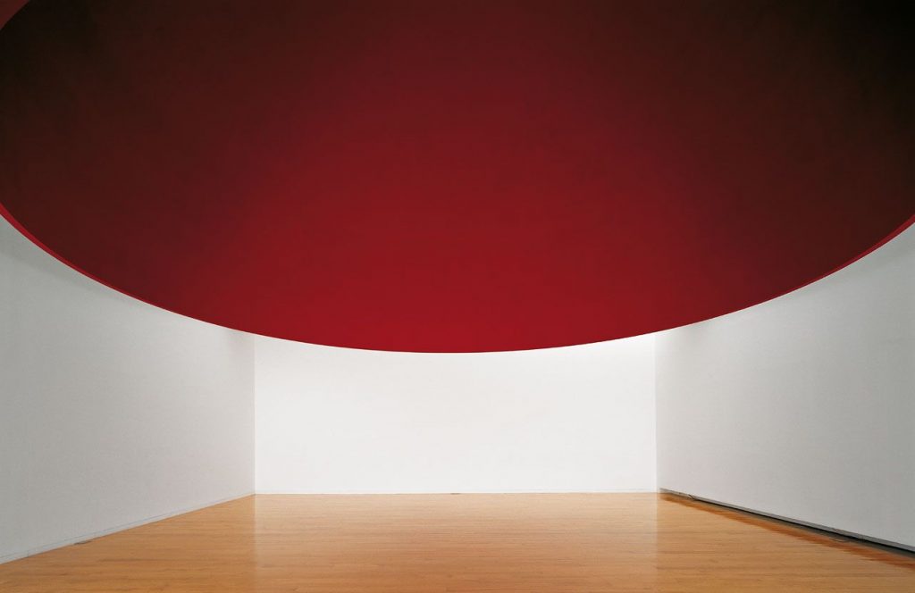 *Permanent art installation – Anish Kapoor: ‘At the Edge of the World’
If you look at numbers, to make an operation viable, you need a lot of space to sell, therefore a dense development. But you can balance densification and the preservation of an industrial heritage, if you find good ways to reuse the latter.
SG: In my country, most owners and investors hate industrial heritage: it usually costs more to rehabilitate such buildings than tear them down and build something new. Is it the added value of heritage that makes it worth in Belgium to reuse instead of destroying?
DV: Yes. In Belgium, too, reusing is at least as expensive as replacing. On the other hand, these old buildings have a soul, qualities which are not easy to define but that become very attractive for a certain public. There a lot of things – for instance, that some of this heritage is built on a scale that new developments do not meet anymore, especially here in Belgium. That is very interesting for us. How can we take over this scale, this magnificence, and adapt them for contemporary living? And then, we have to say that here there aren’t a lot of these places around anymore, which makes such operations even more important. When we started working on this industrial site, people were not really interested, now it is a trend, yet opportunities become scarce.
In general, we believe that the idea of densifying instead of sprawling, of making more people live in the exisiting cities and to transform existing buildings for this strategy is of essential importance for our time.
SG: Speaking of the terrritory, of densification and countryside-city: how do you think your project will impact the development of the area?
DV: When we came, the city was actually starting to think how to develop the area. Not many options were available, and most wanted to start by taking everything down, and I think we were the first ones that proposed to keep almost everything and build around and within it. In time, the operation will probably represent an example of reimagining a place. We call it a city in the countryside because the woodlands actually start here. We are at the edge of the city, but in a place quite accesible through the urban networks. I imagine there will be more development of some former industrial sites – we are actually ourselves looking for other operations in the same philosophy.
SG: So what is the actual stage of the process?
DV: We will open the first gallery very soon and, by the end of the year, all projects will be finished. A lot of the people are already moving in and the neighborhood starts to live. It is very much about density, like I said, but also about the mix: old and new buildings, each with its own identity but also responding to the others, dwelling but also a lot of public functions, a varied public space: they all compose a ”city-feeling” that is extremely important for the dynamics of the whole process. If you try to create a really urban place, and you don’t get enough initial dynamics, the process never gets underway. It’s interaction, and not just buildings, that creates a neighborhood.
General credits
Client: Vervoordt r.e, 2110 Wijnegem, BE
Place: Stokerijstraat, 2110 Wijnegem, BE
Masterplan: Jens Aerts
Budget: 15.673.387 euro, VAT and fees excluded
www.kanaal.be
Masterplan
Text: Jens Aerts, – ‘BUUR’, the Bureau for Urbanism
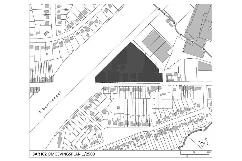
The site is sharply defined by three surrounding spatial features: the strong linear presence of the Albert Canal; the Groot Schijn Valley as a green connector belt between Antwerp and the suburban district; a residential neighbourhood with detached homes.
Hence, the development of the site is not confined to merely enhancing its internal value but extends also beyond its boundaries in that it reinforces the location’s relationship with its surroundings. Because of its new functionality, improved access and renewed contact with
the waterway, the site is fated to play a strategic role as a focal point for development within the existing community.
The special nature of the existing buildings, their typology, and the site’s industrial configuration are accepted as a directive for the design.
By erecting private homes on the site and opening up the location for access to the existing neighbourhood, contact between the residential district of Wijnegem and the waterway is restored, thus giving Stokerij street a more residential character. The communal areas are
established as structural spaces.
New additional features occupying 30 000 m2 of space (including parking) complement the current functions of the Axel Vervoordt enterprise, partially located inside the existing and inside the new buildings. Private homes transform the site into a high quality living and professional environment.
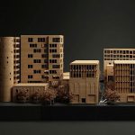
The urban development plan identifies the sub-projects and delineates both the brick-and-mortar elements and the design aspects of the various outdoor areas. In order to work out the plan with quality architecture, we appointed three architects and one landscape architect for the outdoor design. A design team was put together with the assignment to jointly engage in critical reflections and deliberations about the Detail Urban Plan, but ws also was given the necessary autonomy to work out individually a personal aspect of the plan.
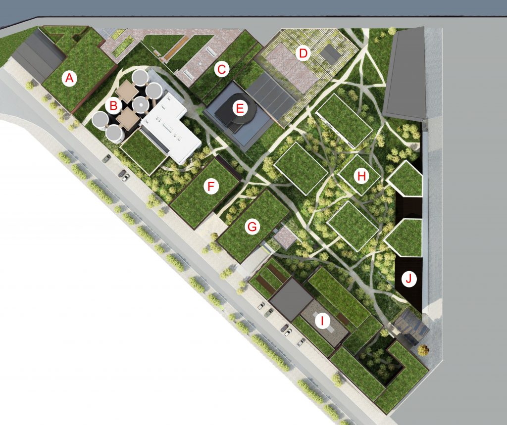 *General plan: A. Depot, exhibition spaces. B .Silo’s (design: Stéphane Beel): dwelling, art installation – Axel & May Vervoordt Foundation, offices Axel Vervoordt nv. C. Axel & May Vervoordt Foundation, Axel Vervoordt Gallery, Secret Garden (design: Axel Vervoordt & Miki Tatsuro). D. Restaurant. E. Permanent art installation – Anish Kapoor: ‘At the Edge of the World’. F. Escher (design: Coussée & Goris): dwelling, reception – Vervoordt nv. G. Waterhouse (design: Coussée & Goris): dwelling, Poilâne bakery. H. Cubes (design: BOGDAN & VAN BROECK): dwellings, office space. I. Warehouses (design: Coussée & Goris): dwelling, artist ateliers, offices. J. Depot and restauration, Axel Vervoordt nv (design: BOGDAN & VAN BROECK)
On-site facilities – diversity
The site serves primarily as a cultural and residential focal point. Supporting functions
will enhance the living environment of both its local residents and users and neighbouring home owners. The focus is placed on nutrition: catering services, restaurant, baker and grocer; as well as on health: doctor, dentist, wellness.
Additional functions will adequately address the inconveniences of living outside of an immediate urban environment: e.g., full service superintendent supervision, dry cleaning facilities, and child day care.
Landscaping
Text: Michel Desvigne
The project draws a distinction between a more public space around the workshops and the offices and a more private section around the residential quarters.
The private homes are surrounded by small trees and grassy fields covered with tall plants and bushes intended to protect the privacy of the neighbourhood residents.
The most public sections of the project are located amidst these greens and together create an interconnected network. One can find there apronsized orchards that will form lively places for meetings and encounters for the local residents. A large body of water surrounds the artistic installation by Anish Kapoor, turning this particular spot into the central focus of the new neighbourhood district.
With the image of nature trails, the size of the numerous pathways that crisscross the site varies depending on the frequency of their use. The ground vegetation conceals the wider pathways, thus avoiding the visual impression of fragmentation within the garden.
A very simple and transparent barrier encloses the site and allows people a look at the terrain’s interior, and vice-versa. A few trees have ‘escaped’ the grasp of the site and managed to make their way into the street.
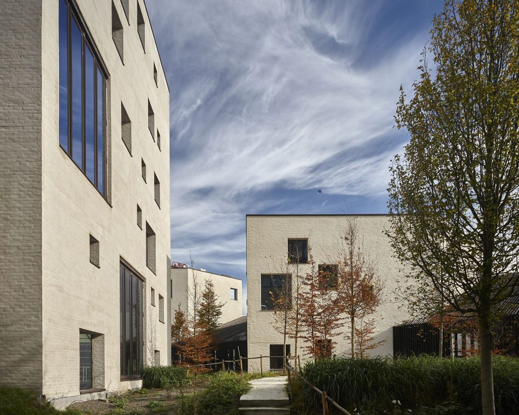
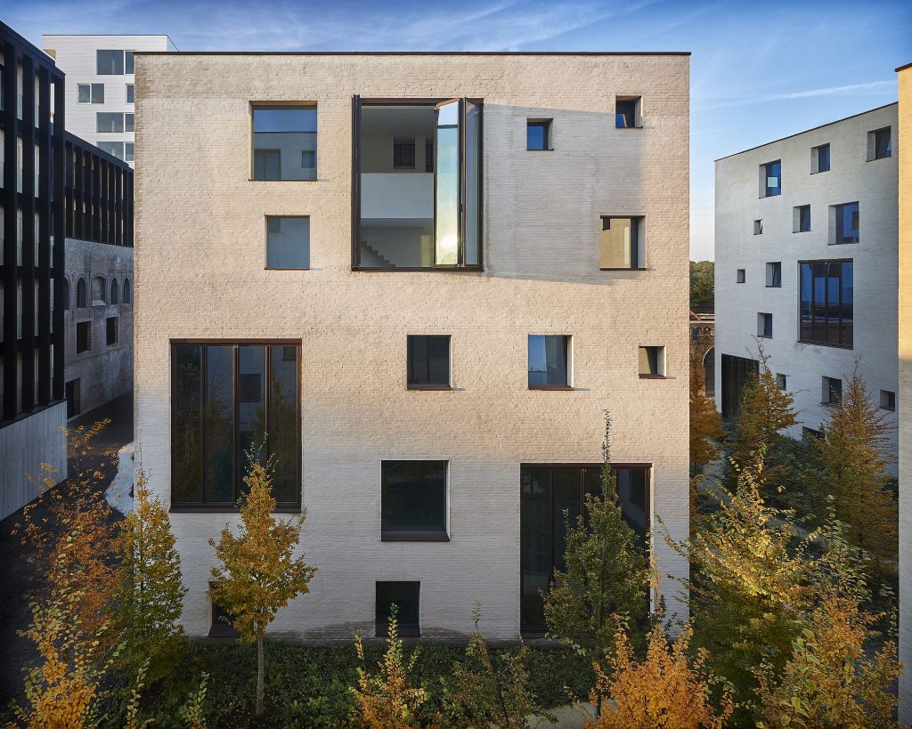
Cubes
Text: Bogdan &Van Broeck
The residences offer a standard of excellence in quality of habitation and, simply, in the general quality of life.
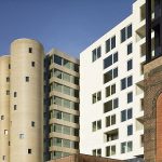
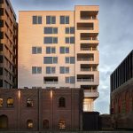
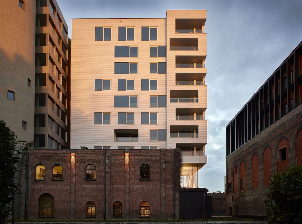
Every cube is a three-dimensional puzzle made of stacked homes. Each home has two levels, at least three facades and features a loggia that functions as an outdoor space, accessible from within the entire dwelling.
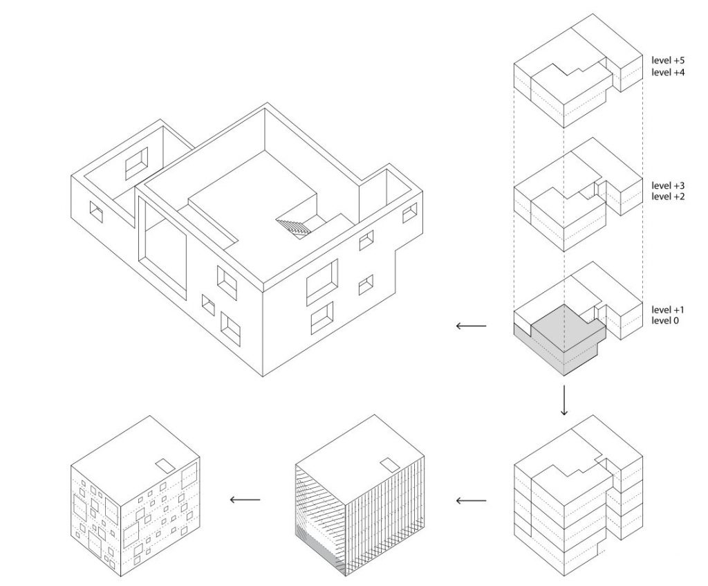 *Cubes. Dwelling typology: three-dimensional puzzle made out of stacked homes.
The project takes maximum advantage of the location by the waterway and the relationship with the industrial constructions on the site, and this by resorting to well-considered visual axis-lines. At the same time, a harmonious relationship between the private and public spaces is diligently pursued. To that effect, carefully selected open spaces have been retained in between and amongst the homes that allow a clear unimpeded view upon the existing buildings, to the silos, to the watercourse, and to the interspersed clearings.
Architecture is here conceived of as a window on the world. This notion is applied at various scale levels. The spaces amongst and between the buildings are conceived as outdoor rooms with through-views upon one another and on the environment.
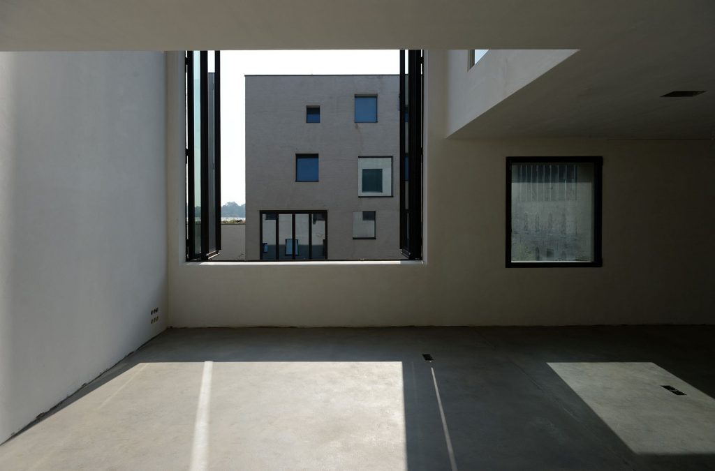
The distribution of interior features inside the homes and window openings have been designed in such a manner that, here also, optimum advantage is taken of the view to the outside and of the natural lighting, and yet with retention of individual privacy.
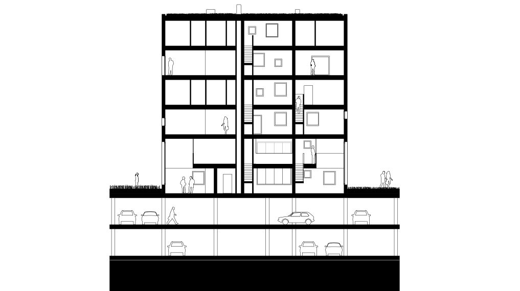 * section
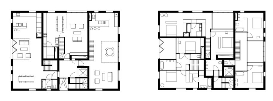 *Ground floor plan (left), 1st floor plan (right)
Large, tall glazed loggias, 6 meters high, ensure for each home the possibility of a spacious collection of winter plants and the availability of abundant natural light. Through variations in forms and types of planning, and through the individual realisation of the facades for each home, every Cube is seen as a unique and recognisable element within one larger cohesive unit.
Credits
Architecture: BOGDAN & VAN BROECK
Team: Bown, K. Burssens, M. Czvek, Z. Nelessen, M. Steel Lebre, A. Sümeghy, P. Thibaut, C. Truwant, M. Van Rossen, M. Valério
Structure : Studieburo Mouton
Installations : Botec
The Warehouses — rehabilitation & ectension
Text: Coussée & Goris
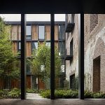
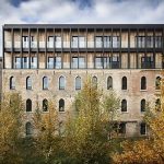
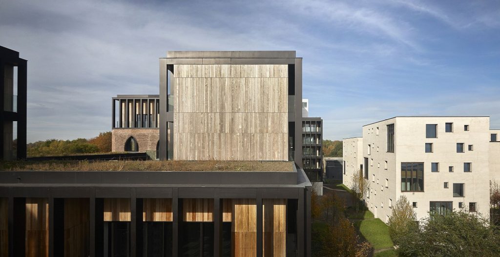
The prime operative aim for the reconversion of the warehouses was to find a function that would revitalize their purpose. The choice fell on converting them into residential units on the upper levels, while preparing them to serve professional function son the groundfloor.
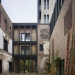
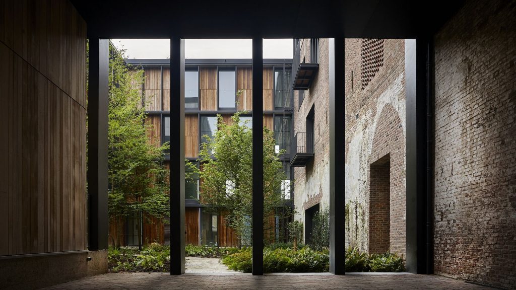
The preservation of the important sections is the primary starting point for the renovation of the warehouses. However,throughout the years, quite a number of reconstructions and, particularly, annexes, were added to the original buildings. These are being removed, which once again opens up and frees the view upon the old facades.The open character of the existing spaces is being retained. We opted for the largest feasible dimensions in our distribution of the spaces in order to restrict the number of interfering open areas, e.g., staircases.
As a result of the removal of some buildings, a number of inner spaces have been freed up, leading to the creation of small open clearings that provide the original buildings with added light and air, as was planned for the original constructions. These small clearings, or squares, re- connect the buildings and, together with the short-cut passages, and pathways have now become part and parcel of the already existing structures and, likewise, of the newly constructed additions. Everything flows into everything else as a continuum, thus turning the site into an active region of great diversity.
We reinforced the massive character of the brick buildings by incorporating the original apertures, still visible, into the new functionality of the complexes. The existing masonry work is preserved masse and sets the tone all along Stokerijstraat.
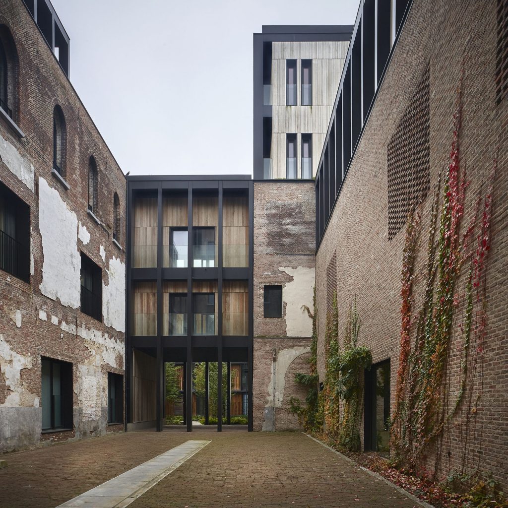
In order to introduce new freshness and character, new constructions are erected on top of the massive substructures. The steel structures are made to appear as closely placed loggias of columns and in that way create a fascinating chiaroscuro play, in sharp contrast to the monolithic character of the substructure.
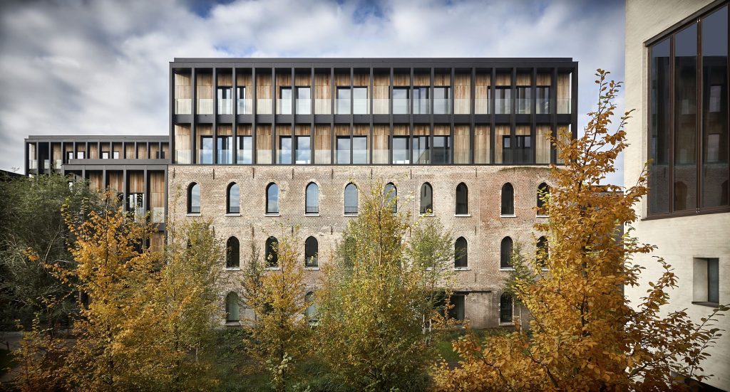
Through the addition of new elements, the appearance of the existing constructions is being enhanced while, at the same time, the project assumes a kind of dynamic of its own, a sense of interest in the past and also in the future, a reconversion to its intrinsec nature in the true sense of the word rather than just a restoration of its exterior being.
Credits
Architecture: BOGDAN & VAN BROECK
Team: L. Bown, K. Burssens, M. Czvek, Z. Nelessen, M. Steel Lebre, A. Sümeghy, P. Thibaut, C. Truwant, M. Van Rossen, M. Valério
Structure : Studieburo Mouton
Installations : Botec
Silos
Text: Stéphane Beel
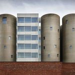
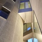
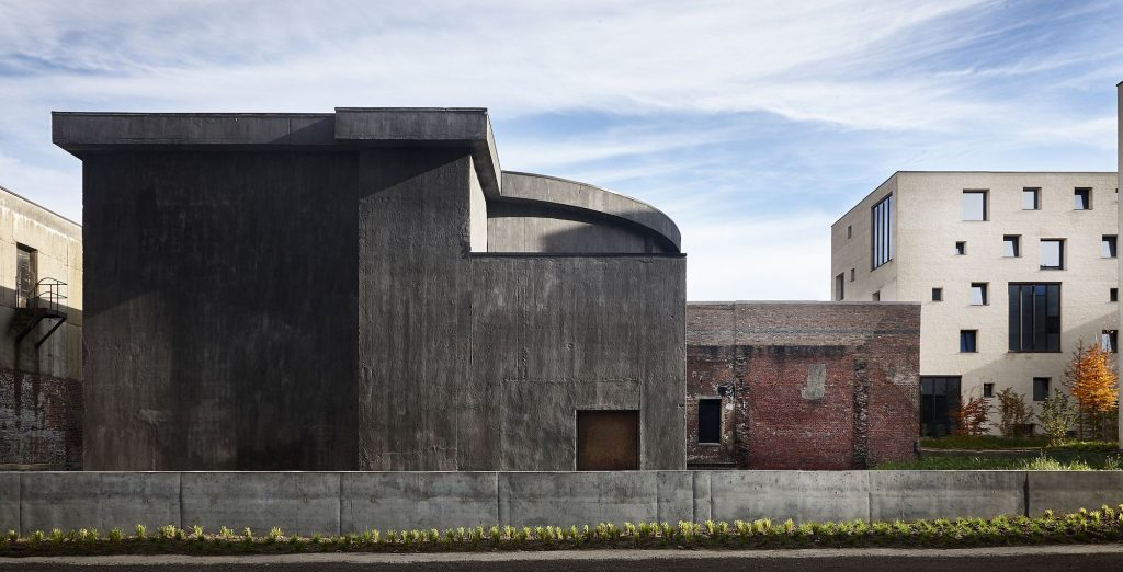
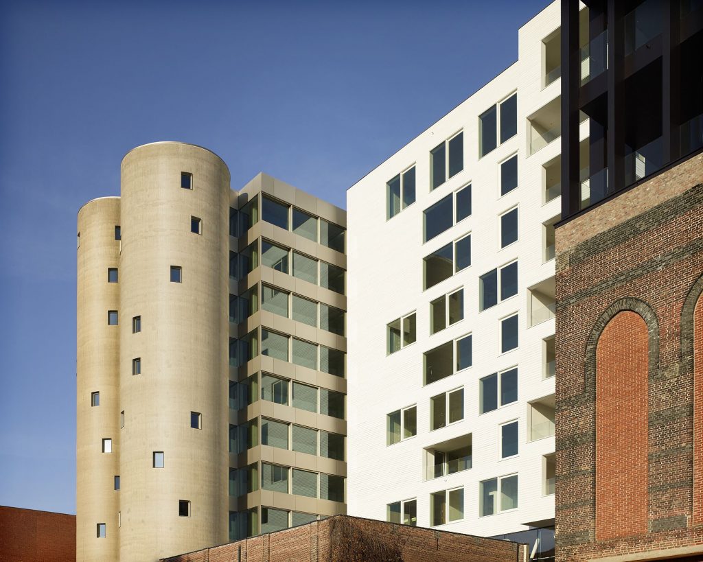
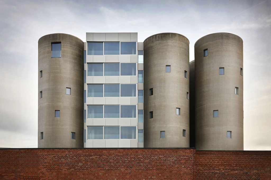
The task of refashioning the shape of a silo is a very delicate one. On the one hand, it ws important to retain the grey silos in their functionality as beacons in the environment and not detract from their massive impact; on the other, it was also necessary that apertures be created from the inside in order to create and generate vistas and light from the outside.
For the two silos least visible from the outside, in other words, the central cylinders, it was decided to remove part of their bodies, to a height of 31 and 28 meters respectively. The sections thus removed are be replaced by new transparent additions, this time square in form.
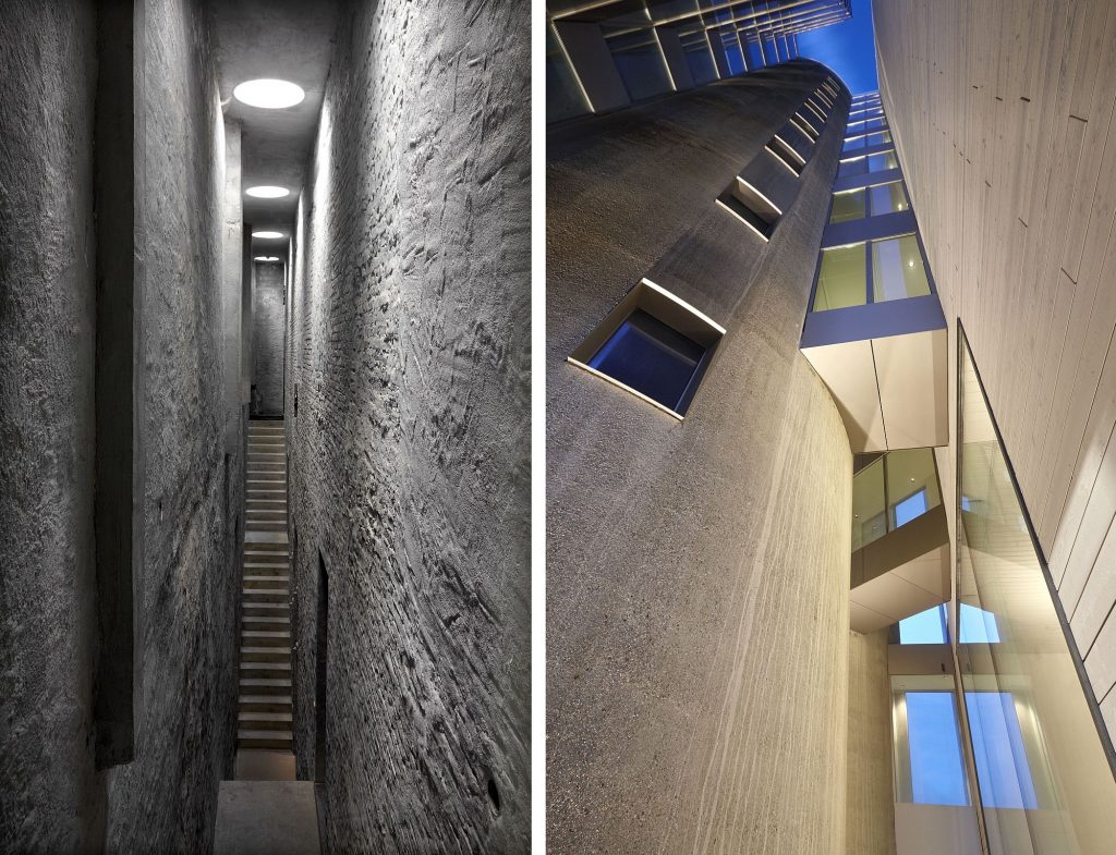
The six remaining silos remain intact and are be fitted with smaller openings in the walls. We thus create a number of living units, each with 3 closed rooms of circular configuration (the original shape of the silos), plus one open transparent and square-shaped space (the addition).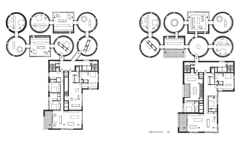
The open character of this square space, centrally located inside the living quarters and serving as a living room and/or kitchen, for instance, allowed us to preserve the massive silos in place. The added window openings cut into the existing silos follow a structural logic
and frame specific distant views.
The new constructions and renovations fulfil today’s safety and comfort requirements, improve the interior lighting, and make for an interesting contrast with the existing buildings. By means of such interventions, the appearance of the silos has not been compromised and their unique character remains intact.
Credits
Architecture: Stéphane Beel Architect bvba
Team:Stéphane Beel, Bram Seghers (project architect), Sophie Meersseman, Line Lambrechts, Jan Van Loven, Philippe Morel, Jeroen Jonckheere
Structure: Studiebureau Mouton
Installation: Botec

