An atrium for books
The National Technical Library in Prague shows a sustainable approach, of a will to create public space and also of a collaboration between Projektil architekti and invited artists.
Text: Projektil architekti
Photo: Andrea Thiel Lhotakova
Many different sources inspired the architectural concept for the National Technical Library in Prague. First, there is a spatial context influence, which involves the historical urban plans for the whole area as well as its present significance. Second, the concept is our answer to the idea of the institution and especially to the role of the library in today’s society.
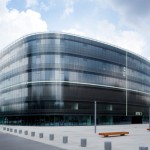
That is why the ground floor reserves a minimum of space for the library itself, supporting instead public services such as cafeteria, exhibition and congress hall. Next, the chosen shape and material should resolve one of crucial question of how to be modern and monumental at the same time. Moreover, the building configuration expresses a complex strategy of saving energy. Part of this concept is using the area around the building as a valid social space, on the west side, and as a green park, on the east. Finally, the building was designed to include the interior and the graphic design, following “the technological schoolbook” concept, and consequently many things (for example installations) are knowingly shown for better understanding of how the building was designed and functions.
The building has three underground levels (reserved for book storage, technological devices, supply and parking lot) and six above ground floors. At the ground and second floors the visitor can find all complementary facilities – conference hall, exhibition hall, cafeteria, bookshop and cloak room. All of them are around the entry hall, which constitutes the main place for meeting people from around the whole university campus. That is the reason why the building has four entrances to all sides. The idea was to offer the campus not just a library, but a coherent public place as well, where all the students could meet together. The entry hall doubles as a square for bad weather days (in summer the campus is empty). Additionally, there is a night study room on the ground floor, thus the building can provide 24 hours service without needing to open all the building during the night.
Many interesting technological solutions were involved during the construction process. Some of them help the flexibility; the others help the demands of saving energy. Columns arranged within a 15-meter grid in both directions and connected by pre-stress concrete slabs made the whole structure. The statics deflation diagram for floor slabs pre-stressing was used for designing the floor, in order to imagine how the strength in the construction goes.
The concrete core activation system was also used for the heating and cooling. There are plastic pipes fitted directly in construction slabs with a medium whose temperature is changing according to demands during the year. This system perfectly suits the open space of the library. In addition, there is an easy system for pre-cooling the building during summer nights just by natural ventilation via opening windows.
The main façade is divided into glass and blind parts within a surface ratio close to 50% in order to optimize the amount of energy necessary for heating. Air recuperation and sun blinds are standard solutions, here thanks to an external double facade, wherein the sun blinds are sheltered from the wind. The green roof creates the fifth facade of the building, slowing down draining in case of heavy rain.
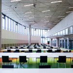
The interior is very open and friendly in order to express the character of the contemporary institution. The main elements are the power-colored floor and the orientation of all lighting, which point to the very middle point of the building. Some furniture was developed especially for the library – they are movable pieces, thus the students can build their own constellations from them. The main principle of interior design is about collaboration and reciprocal influence, including with the graphic design and the artworks curated by the group PAS.
Perjovschi in Prague
Since quite a while, Dan Perjovschi’s world evaded the sheet of paper in order to invade gallery and museum walls and finally public spaces. But his intervention inside the National Technical Library in Prague becomes the first permanent one of an artist that programatically refuses The Grand Eternal Work of Art. Perjovschi accepted the invition from PAS group mainly because this was about a public –and cultural –building, and not a museum; he trusted that his art could start a fertile relationship with this temple of scientific knowledge and avoid a semantic degeneration.
The themes of the marker drawings on the exposed concrete strips are in no way adapted to the function, but they were chosen among his more general ones, strongly connected to contemporary reality but less to the actual moment: he admits he would like the works keep some meaning even after most of today’s gadgets and events will become obsolete. (Stefan Ghenciulescu)
Credits & info:
Amplasament: Prague-Dejvice, campusul scolii tehnice
Arhitectura: Projektil architekti s.r.o.
Echipa de proiectare: Roman Brychta, Adam Halír, Ondrej Hofmeister, Petr Lešek
Autorii proiectului de concurs: R. Brychta, A. Halír, V. Králícek, P. Lešek
Coautor amenajari interioare: Hipposdesign, R.Babák, O.Tobola
Designer grafic: Laborator, P.Babák
Lucrari principale de arta: Dan Perjovschi, PAS
Planificare: Helika a.s.
Concept energetic: Jan Žemlicka
Dezvoltator: Sekyra Group a.s.
Constructor general: Sdružení Metrostav a.s., OHL ŽS a.s.
Client: Státní technická knihovna, Ministerstvo školství, mládeže a telovýchovy
Suprafata totala desfasurata: 51.434 mp
Concurs: 2000
Perioada de proiectare: 2004–2006


