Edito: Falling with the plaster
Text: Ştefan Ghenciulescu
confess that this editorial was initially supposed to be about Ukraine. Obviously, whether we speak of architecture or any other part of culture, we have no right to just go on with our activity and concerns and ignore the terrible tragedy close to us. I wanted to write about war and architecture, about the cities destroyed, about the blocks of flats and public buildings, similar to ours, that were levelled to the ground, about how the underground in Kyiv was turned into a sleeping space and about much more.
However, we have decided to do so in a more thorough and continuous manner, with informed articles, on the website and in the following issues. Not war-porn, not ruin-porn, but respectful, in-context presentations. In fact, we are starting right now (…)
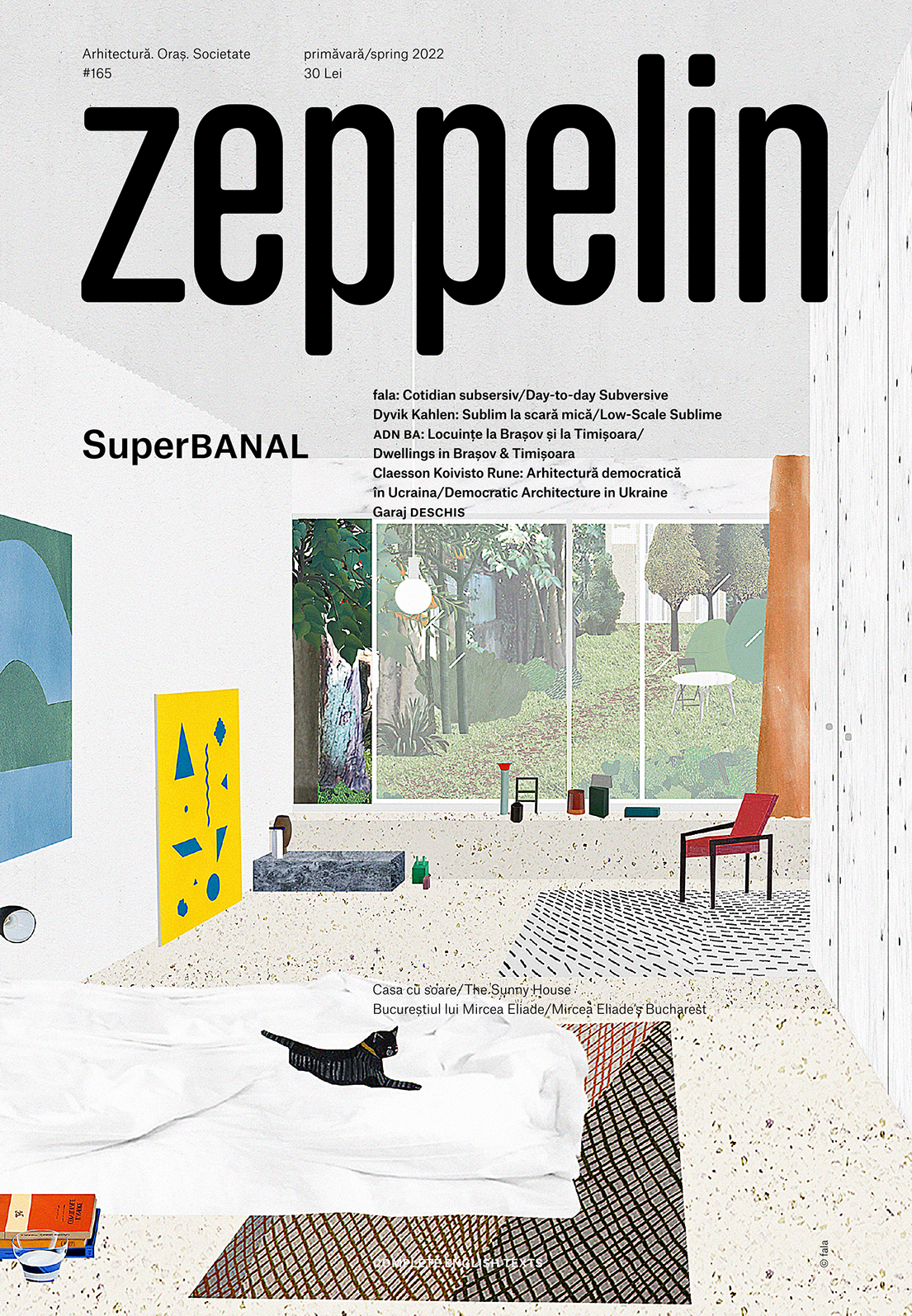
DOSSIER: SuperBANAL
Introduction
Text: Ștefan Ghenciulescu
This dossier’s working title has oscillated between “discrete architecture”, “silent architecture”, and “invisible architecture”. Since the beginning, we were considering less spectacular projects, at least at a first glance, projects that should be quiet and elegant, less picturesque, but with more depth. But we were not just interested in refined simplicity, but in the type of architecture that is very difficult to define, which, at a first glance seems banal, mundane, part of the large mass of constructions, whose value is more difficult to discover; an architecture which is at the same time tolerant, and which undertakes subtle contradictions, and which allows for multiple levels of reading. (…)
Banal, irritating, charming Fala Atelier: six recent projects
Intro: Ștefan Ghenciulescu
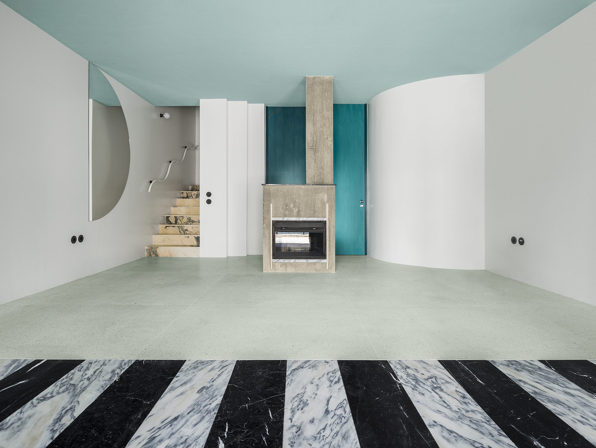
Round mirrors… um… sort of banal, but we’ll take them. You can, of course, easily take them down and get a cleaner space. Geometric pattern decorations on the interior and exterior walls: debatable. Yes, we also saw this abstract panel split in De Stijl’s work, but they wouldn’t have added ornamental elements (the horror!). A strong concrete column which, on the ground floor, is cut right above the flooring: this is not good at all, because joking around is dangerous in architecture, we don’t do decorations with (pseudo)structure, where we have to be serious and all that seems to bear must actually do so. But perhaps the most scandalous of all are the winding bannisters, a supreme symbol of kitsch and of architect-less layouts.
The results should be terrible, if we were to consider lists such as the one above, and, undoubtedly, they definitely are to the purist architects. There is an apparent and deep relaxation in how Fala Atelier make use in their projects of motifs from the modern urban and architectural vernacular or from the pop culture. I said “apparent”, because this is not some yielding to customer pressure or commercial architecture – a field which, if we were to be honest, is nowadays also swallowing up and regurgitating Modernist, minimalist, parametric and other themes. (…)
- fala 050
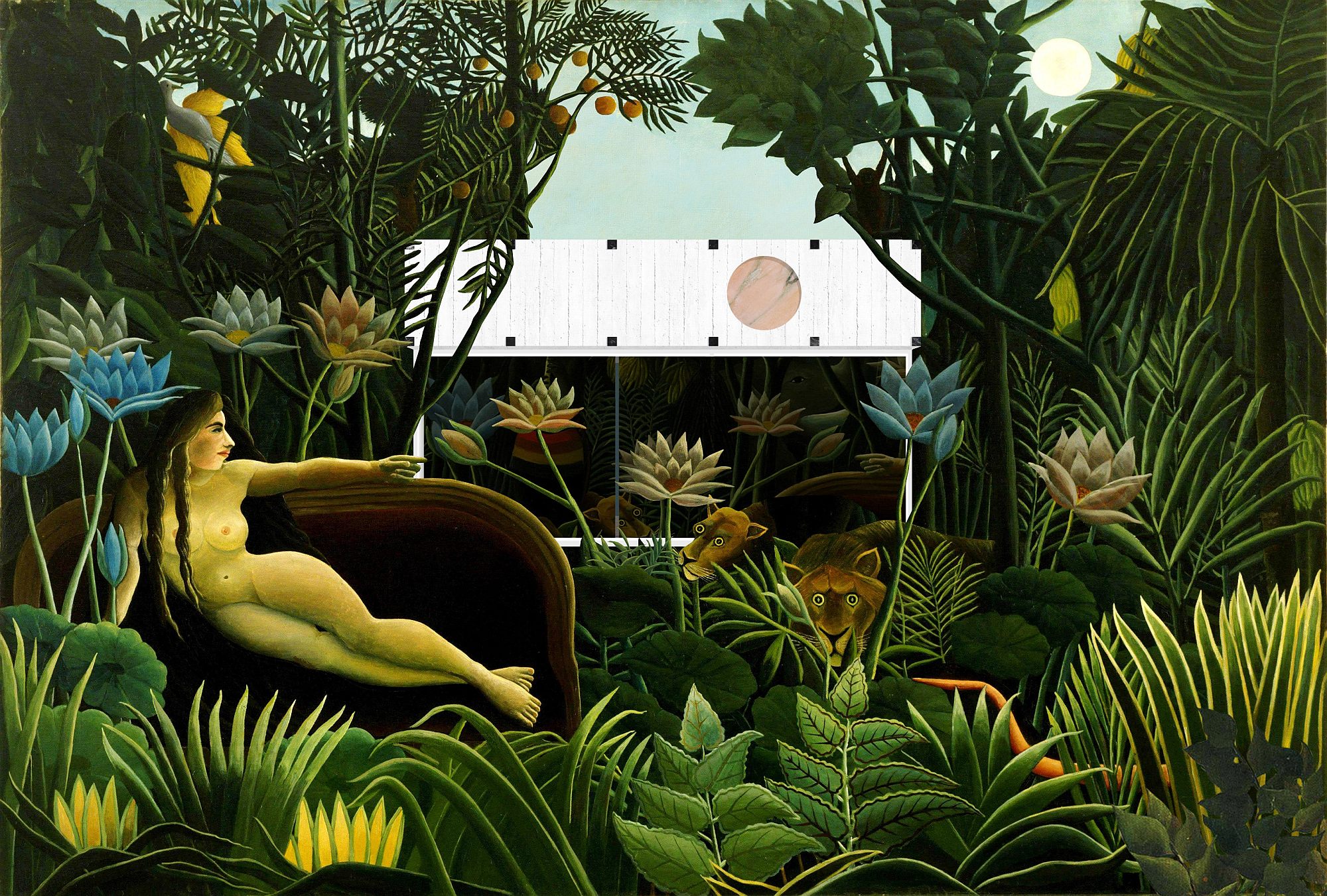
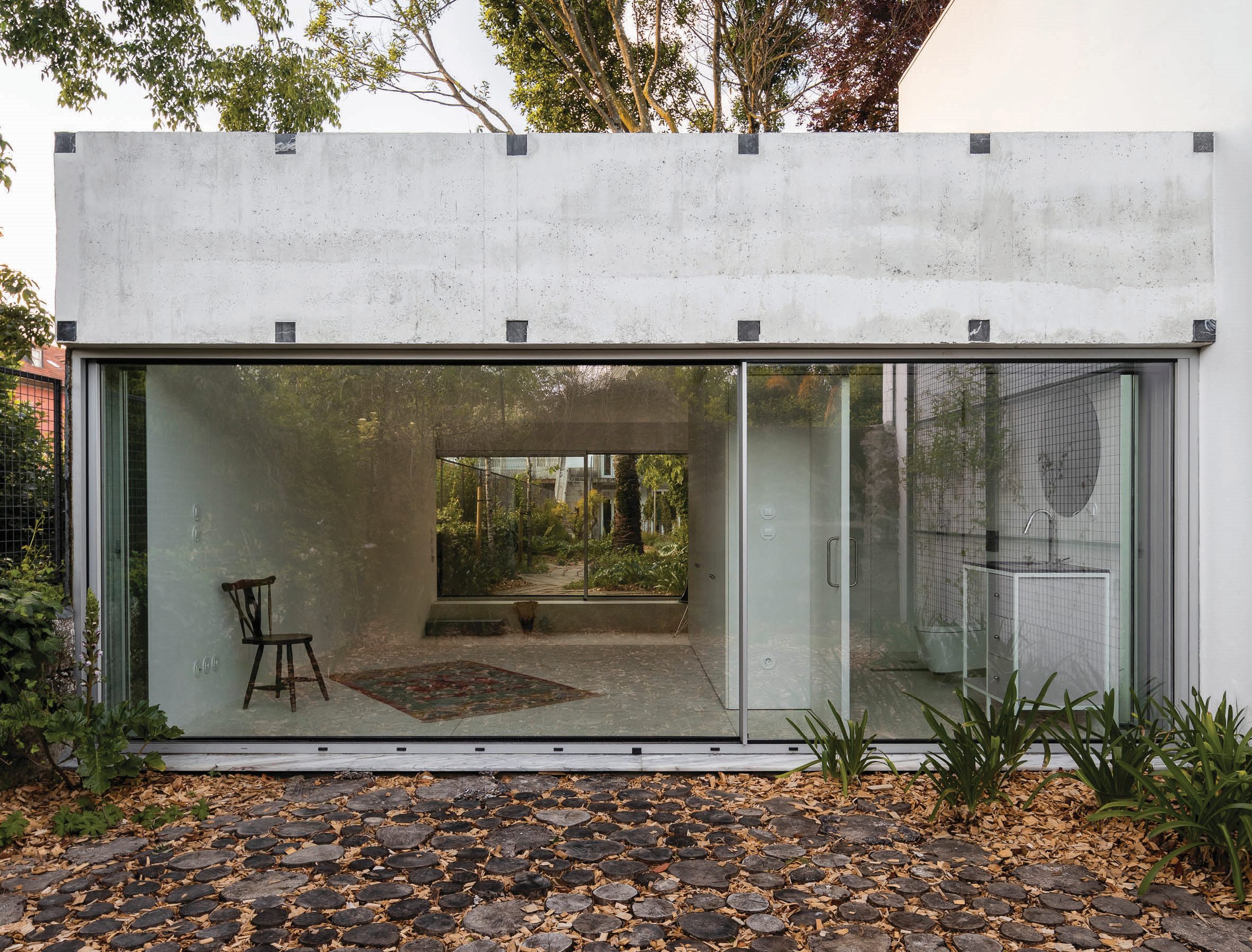
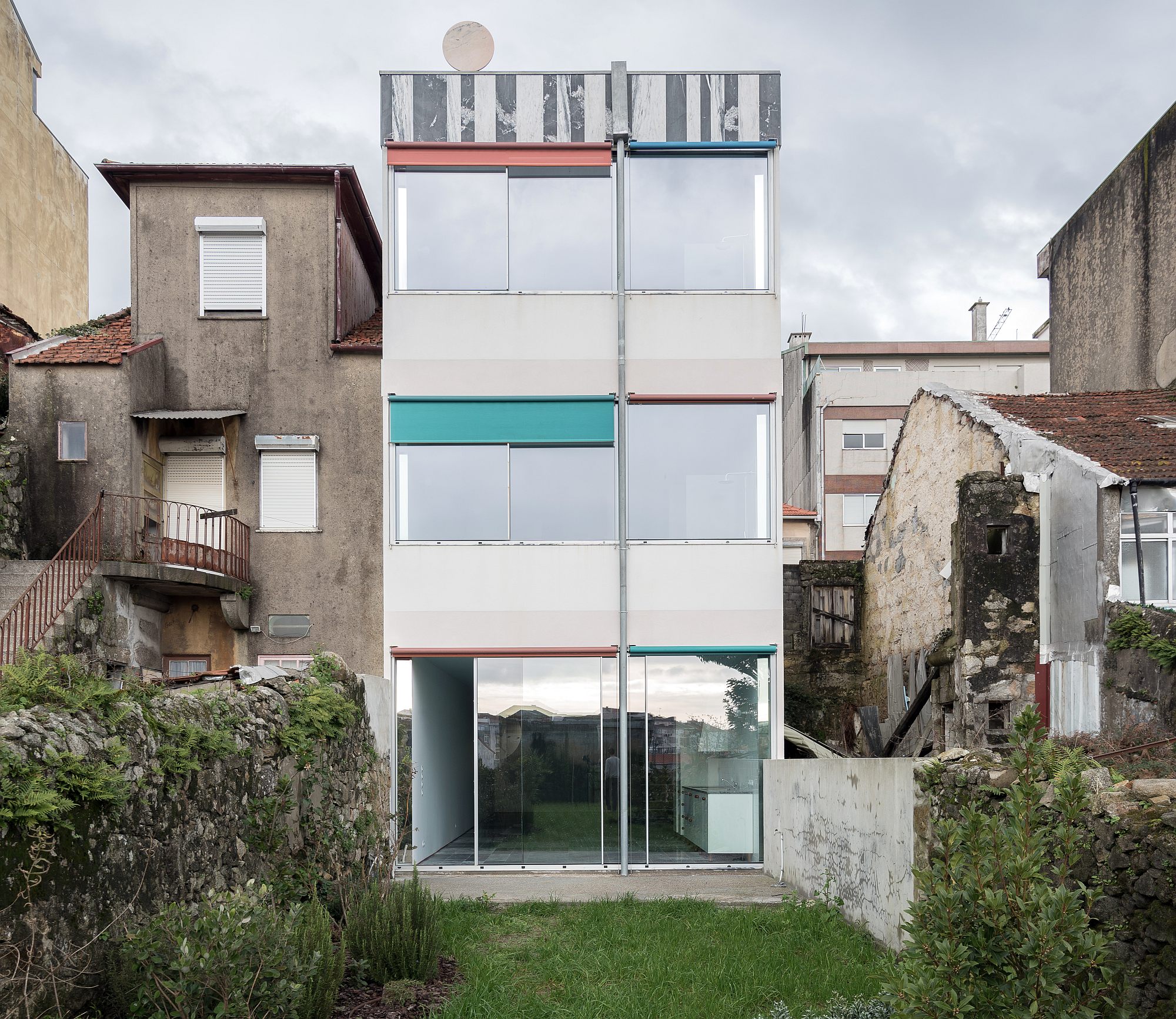
very tiny palazzo, porto
A tiny palace in a narrow garden. The luxuriant environment suggested an ambivalent approach to the architectural object. At human height, the palace is transparent, but its crown is proud, adorned with precious stones, and spanning across the perimeter walls.
- fala 077
house around a chimney, amarante, 2020
Some say that renovations of beautiful buildings should be respectful and polite. Some say that they should be assertive or bear a punk attitude. Not choosing would be tepid. Here is an attempt at doing both.
- fala 079
suspended house, porto
In an artery connecting the city centre to its suburbs, where individual houses are being demolished daily to leave place for bigger housing developments, conceiving a new individual house is a delicate task. The façades of the project stemmed from a rough conjugation of both building types, sitting in a fragile ambiguity. A rational order, following the logic of the plans is superimposed with a set of seemingly inordinate elements: row windows, erratic marble frontons, seemingly arbitrary drainpipes and pink marble discs unbalancing the composition. The house is an exercise on uniqueness as much as it is an exercise on banality.
- fala 097
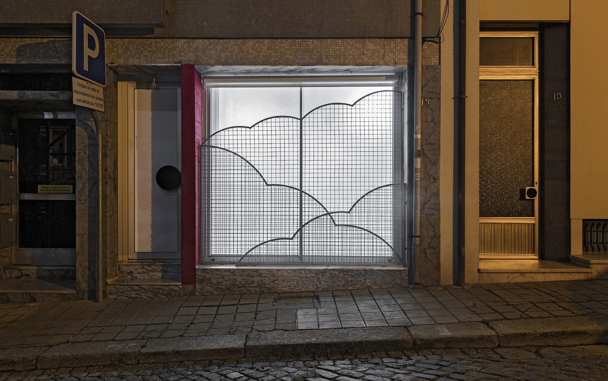
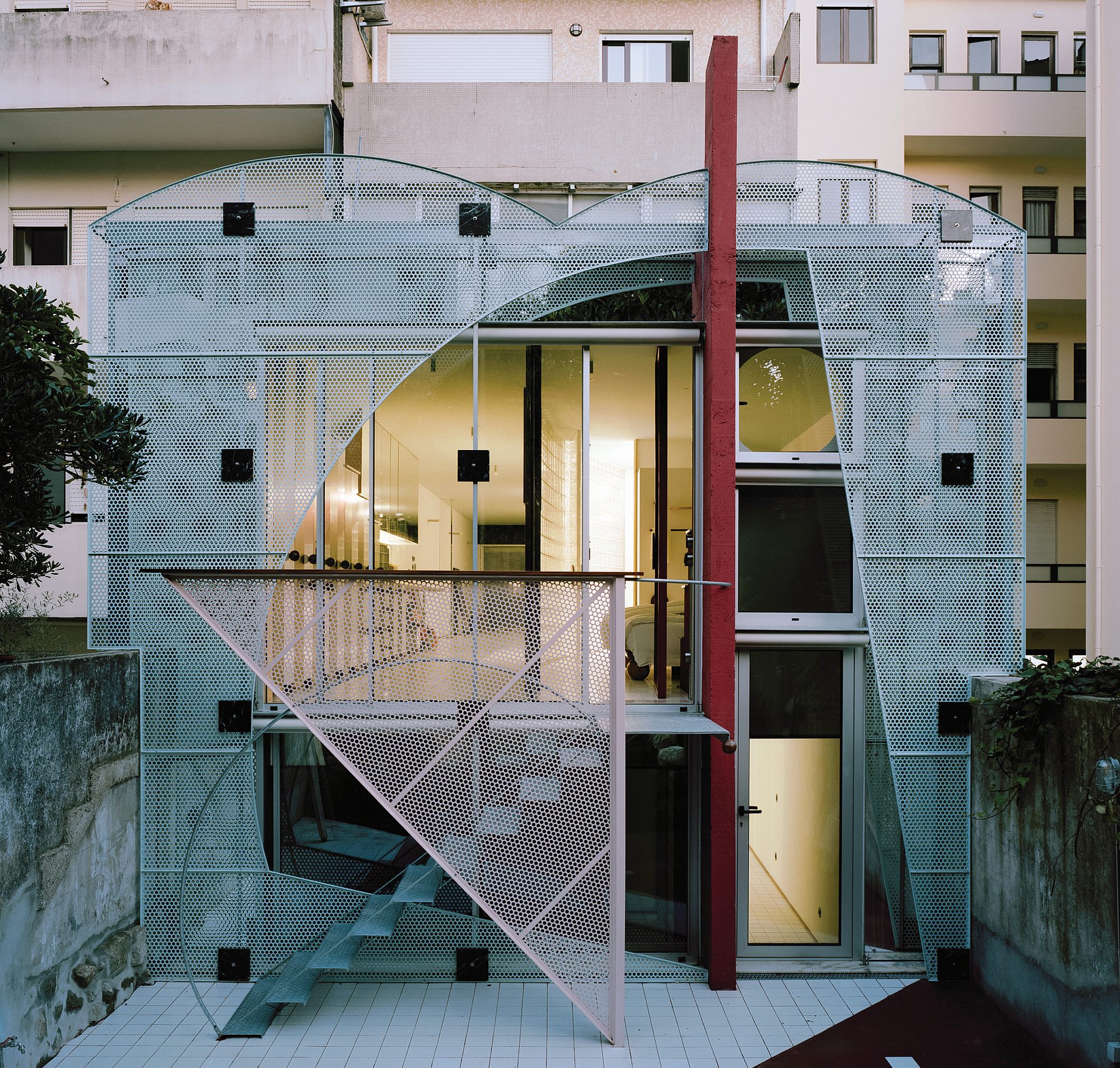
apartment. waves of glass brick and clouds of metal mesh, porto
A ground floor shop in a banal and narrow 70’s housing block was to be transformed into an apartment for two. The program is clear, the layout not so much. Waves of glass brick and clouds of metal mesh solve a non domestic space that could remain as such. The project is a spectacular answer to a non spectacular question.
- fala 098
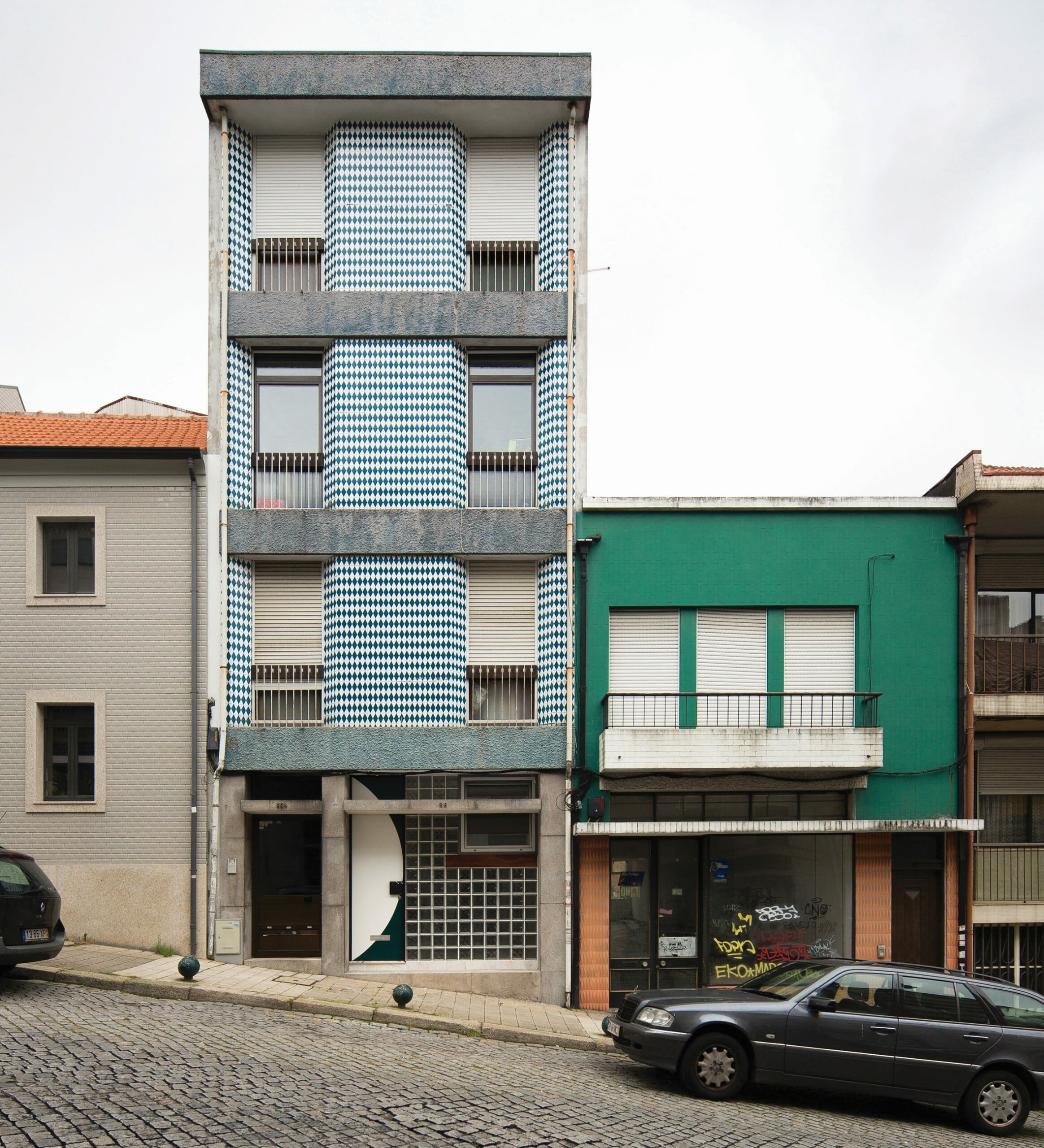
fireworks in white, porto
Almost pure interior, the space is an elaborate composition of fearless geometries. A grand entry and a sly glass brick window become a plinth of an ugly duckling, finishing the timid yet intricate composition of the entire building.
- fala 101
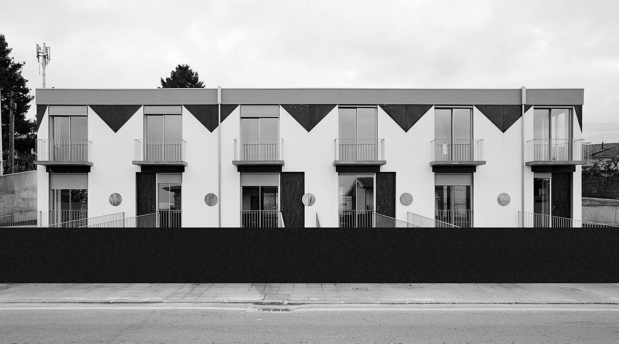
houses of cards, tuias, porto, 2021
The maximum buildable volume was found to be a distorted box, two-storeys high. Refusing the fragmentation prevalent in the surroundings, the five houses pretend to be one. An object in tension between the collective and the private – a plural wedding cake.
Eight Large Houses
ADN BA: Apartment Building, Brasov
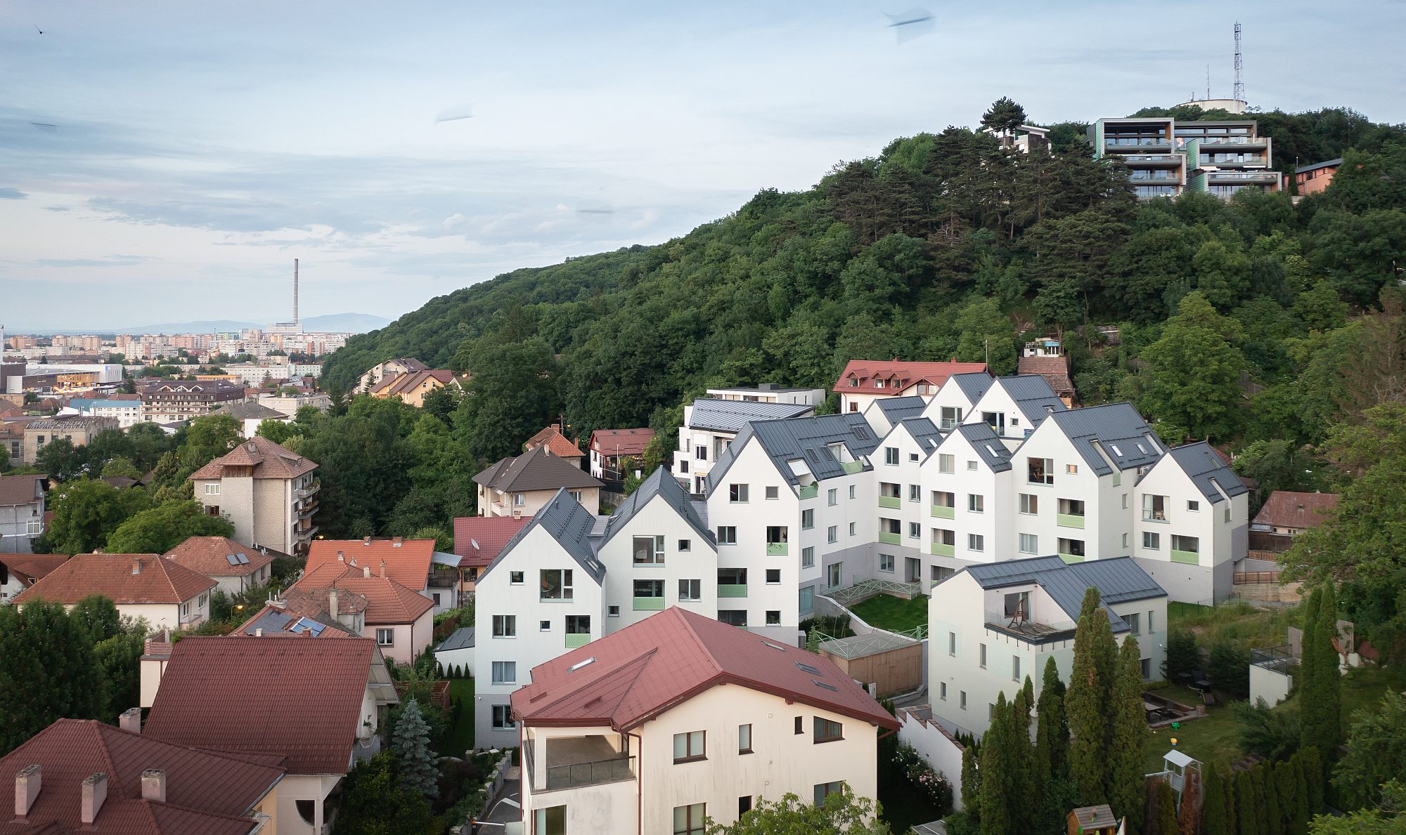
The real estate operation we are discussing here finds its place in a neighbourhood that was already complete prior to 1990, and which fully complies with the local regulations. Nevertheless, the density is still considerable, and it faced the architects with a series of essential issues: how to insert a large volume so as not to assault vicinities, how to create a development of several dozen apartments and garages on a plot with a steep slope, so that everyone should receive air, light, intimacy, and, inasmuch as possible, views, and, finally, how to fall within an urban context (and a natural one, as nature is still very much present on Brasov’s hills).
The solution in principle not only solves, but also takes advantage of the slope: the building is partially dug into, partially covering the hill.
ADN BA: ISHO A, Timişoara
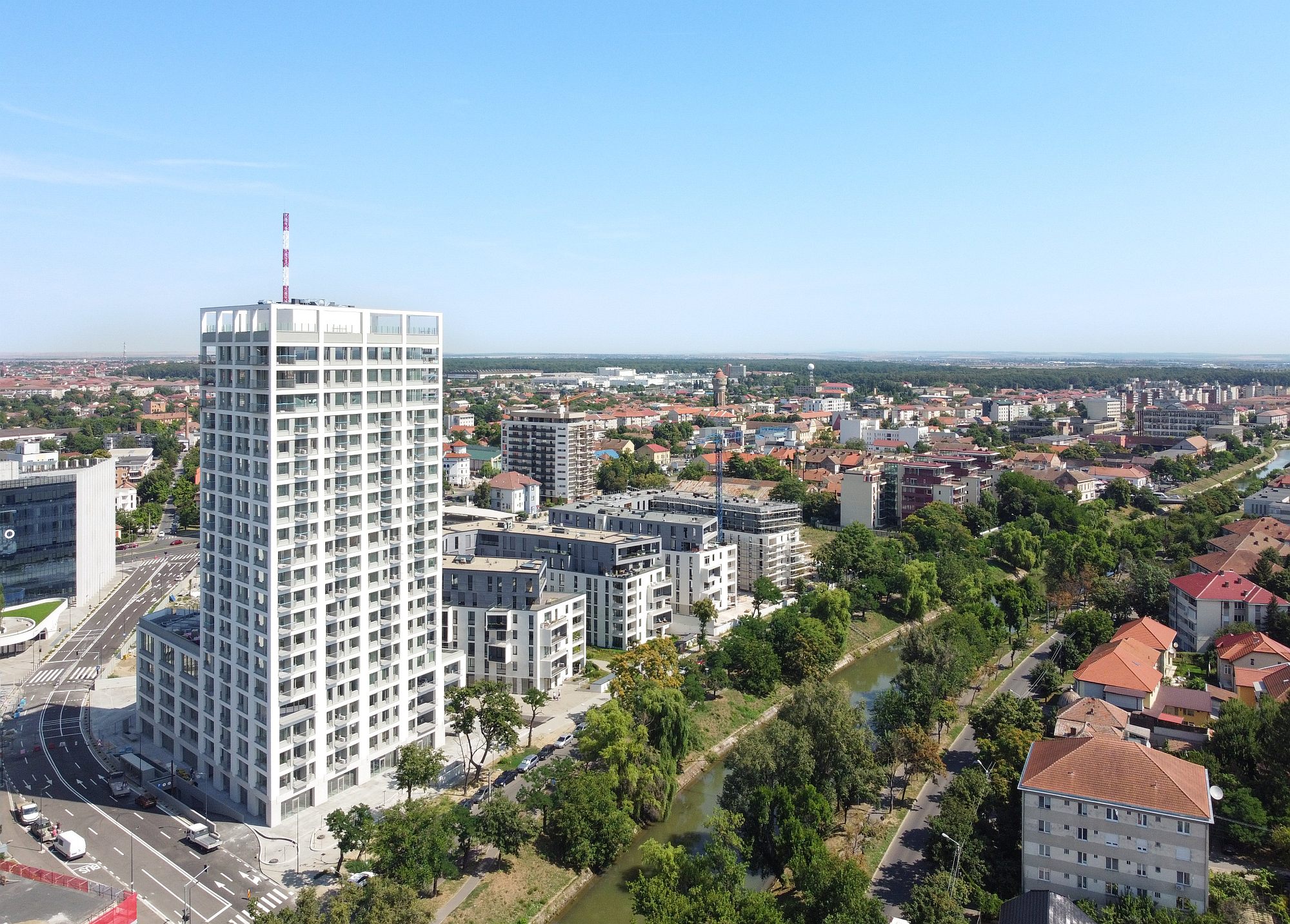
Restrained monumentalitaty and delicate grain: this high-rise apartment building elegantly balances the various scales and urban situations. The project has brought a welcome change of scale in ADN BA’s office, as the first really tall building to be designed. This involved a careful study of the relationships to the (existing and PUZ-suggested) urban context, from both directions: from the building to the city, and from privileged city areas to the building, with the analysis of the new visual angles to be created.
OPEN Garage.
An Extra Room in the Loop
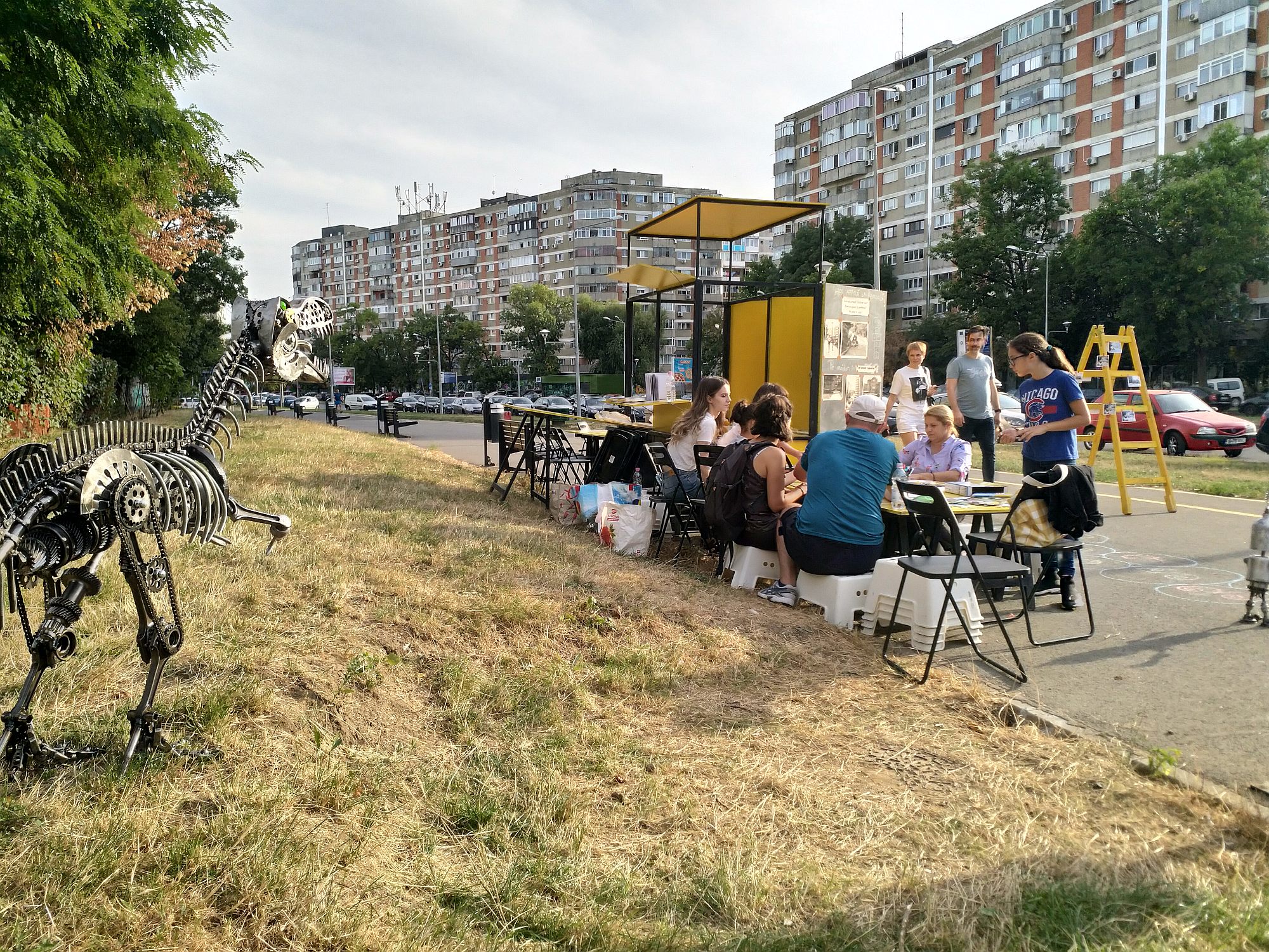
Authority, rationalism, utopia and the wild energy of tens of thousands of individual transformations. The Drumul Taberei neighbourhood, mostly designed and built in the 60s, is almost a city in itself, with its about 300,000 inhabitants. The project below is a bout a mapping and a series of interventions that highlight the needs, but also the wealth of places, activities and urban values from a territory usually seen as a symbol of uniformity.
142 m2 and Eleven Doors
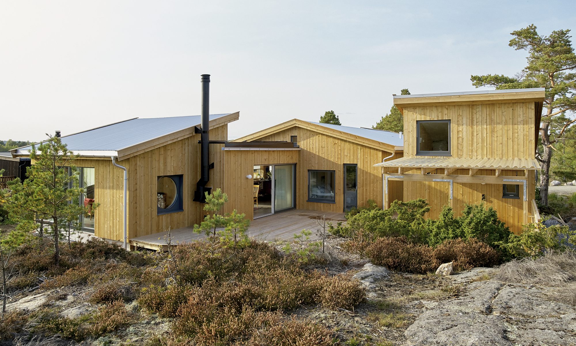
SPEED Architects: House 1
SPEED is an architectural practice based in Oslo, founded in 2020 by Espen Robstad Hegger-tveit and Eirik Stokke, after receiving the DOGA Newcomer award. This was the office’s first private commission, triggering the translation of artistic practices and paper projects to built matter. Building a house became building a practice, and the project worked as a testing ground for developing an architectural position and approach..
Transition Buildings, Joints
2 projects by Dyvik Kahlen
Intro: Cătălina Frâncu
A young team, with less than 10 years’ experience, Dyvik Kahlen succeeded the integration of practice with academic life in the form of the ADS5 Graduate Master’s Degree at the Royal College of Art.
The two projects are built in the same universe and use the same language. Although the materials used are cross‑laminatedtimber and, respectively, concrete, the projects present stilistical unity and are easily recognisable as works of Dyvik Kahlen. However, they are not at all out of context and avoid being pure sculptural statements as it too often happens. In both of them, references to classic architecture and interwar modernism are lightly twisted and sublimed in a harmonious and playful whole.
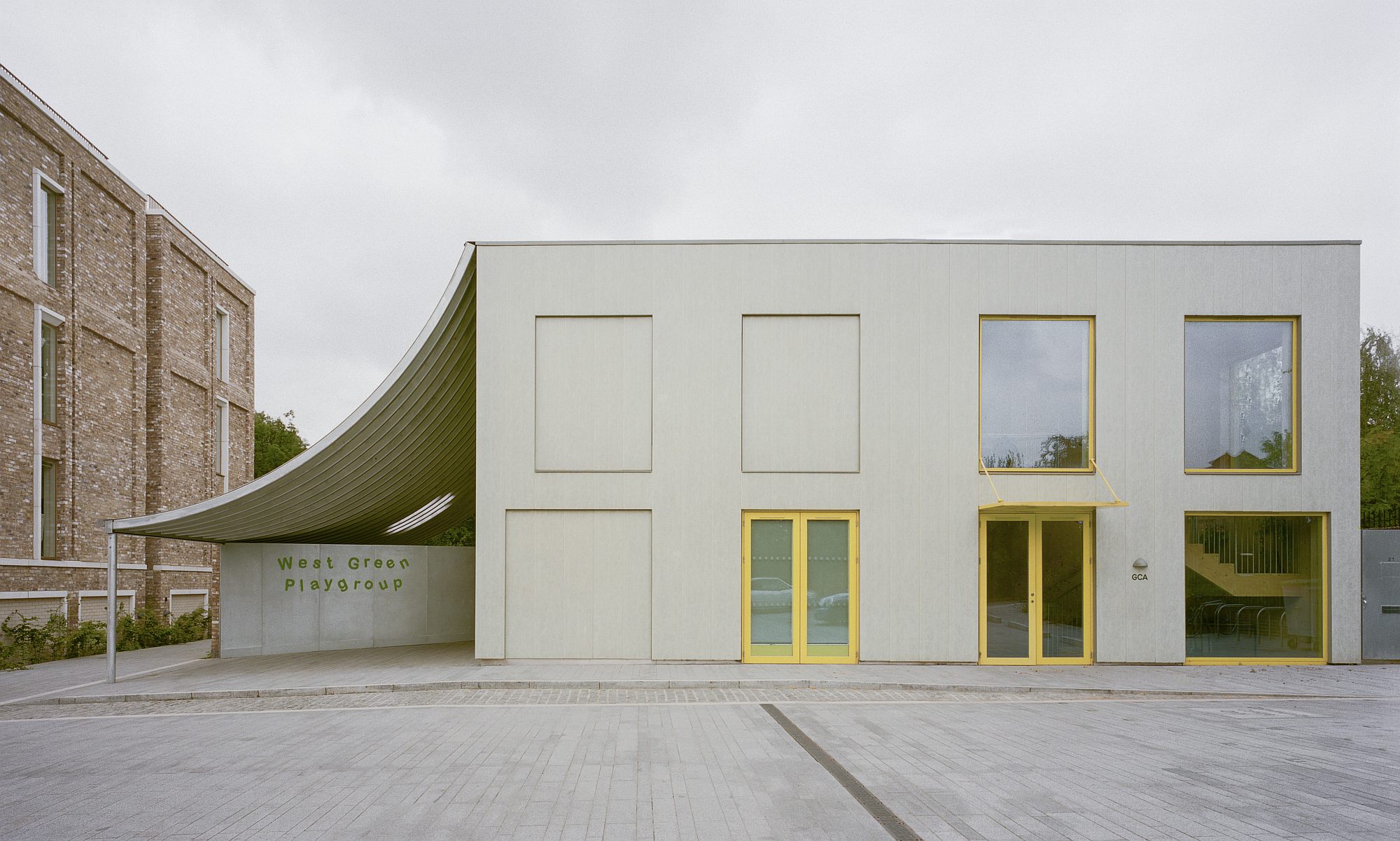
- WGP Nursery & Community Centre
The Nursery & Community Centre marks the entrance to the West Green Place housing community in Haringey, London, developed by Pocket Living. The building is a link between the entrance square to the community on the east side, the end of the terraced housing on the South and Downhill Park on the Western and Northern parts.
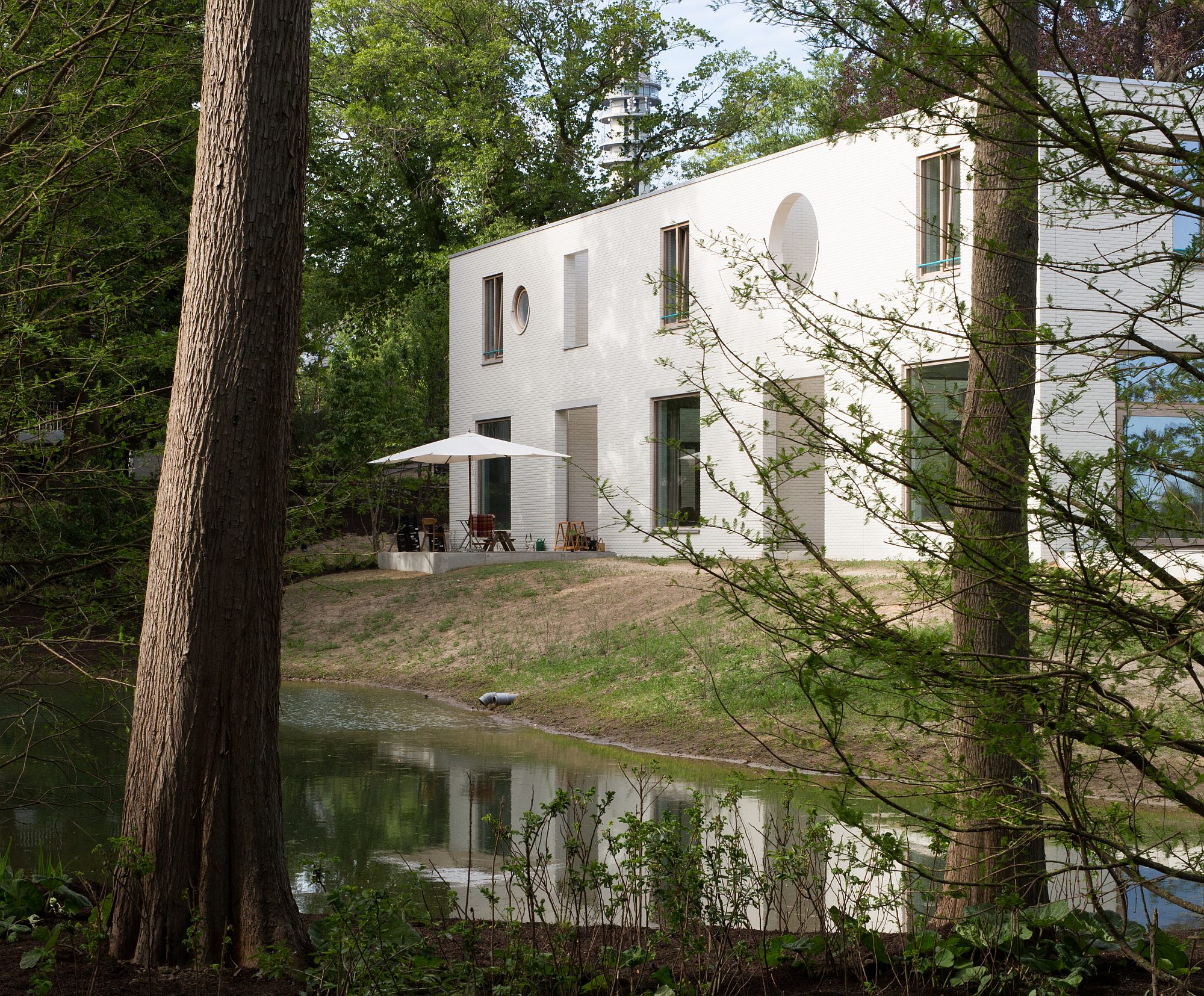
- Building 2, Residential Project in Klingelbeek, Holland
Building 2 is the second of eight buildings that Dyvik Kahlen designed for ‘Klingelbeek’, a park with a stately villa on the outskirts of Arnheim in Holland. The park is oriented towards the Rhine and wetlands on the other side of the river bank. At the beginning of the twentieth century, the villa was transformed into a monastery with allotment garden and pond, both now parts of the project’s new landscape. The architects designed a master plan that consists in a series of buildings placed around two squares, a new courtyard around the allotment garden, and one by the existing villa, as well as an apartment building that rises from between the large oak trees and the pond. The project is a mixture of terraced houses, apartments, a villa, a bathhouse, a workshop and a restaurant. Its main goal is to allow for community life to develop at all times of day. The park is shared by all residents and there are no fences between the housing units.
The Museum of Collectivization
Second Phase
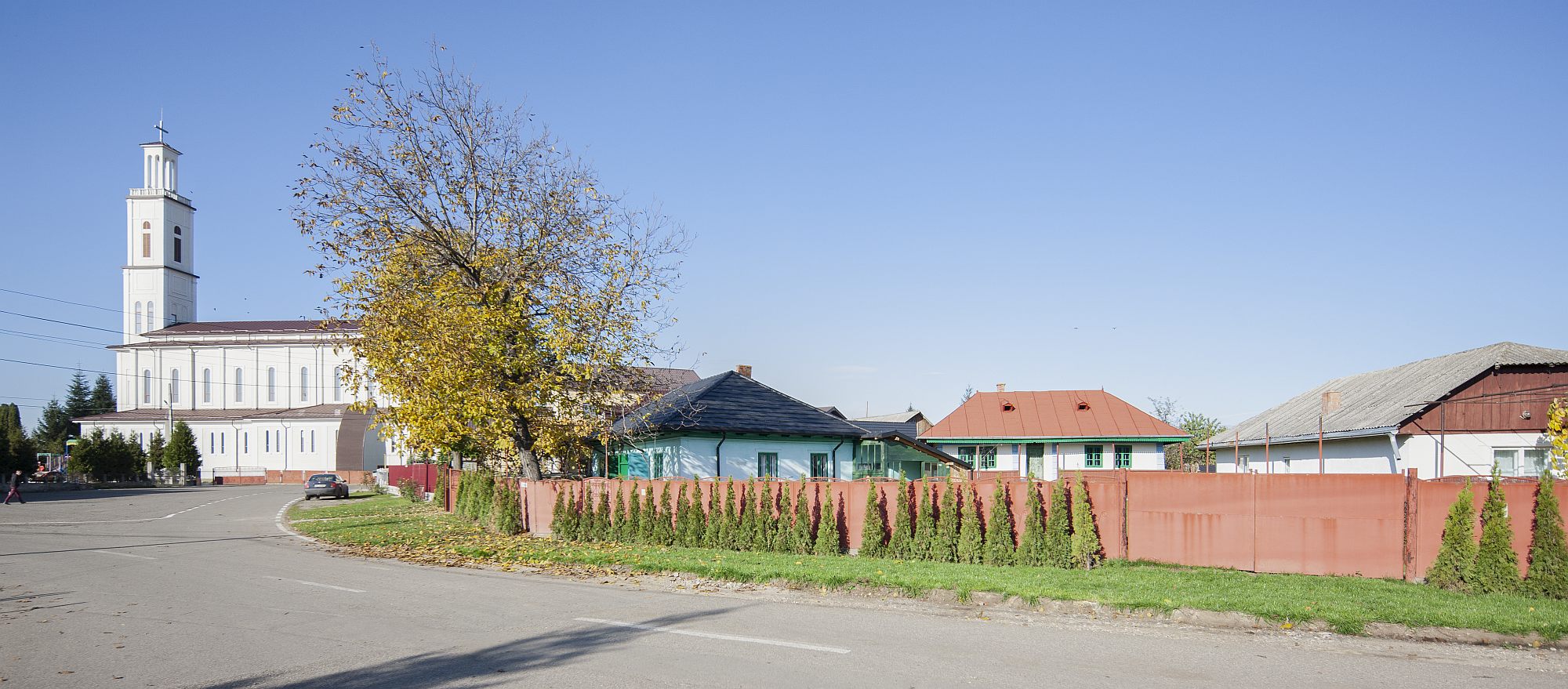
Started in the autumn of 2019, by the initiative of a group of history fans and entrepreneurs in the village of Tămășeni, the museum quickly became a reality, and its exhibition opened in the first three rooms a year later. Between 2020-2021, the Museum of Collectivization had a quick evolution, and managed to finish its exhibition in another four rooms and to open an entire circuit in the street-facing house. In 2021, the project was nominated for the Bucharest Architecture Annual award, the section for exhibition, stands and scenography.We published in the 160 issue of Zeppelin an extensive article on the first part of the project. The present article focuses on the second stage, while still looking at it as a part of a coeherent and long-term project.
Resilience
Claesson Koivisto Rune: ASC Center for Administrative Services in Novi Sanzhary, Ukraine
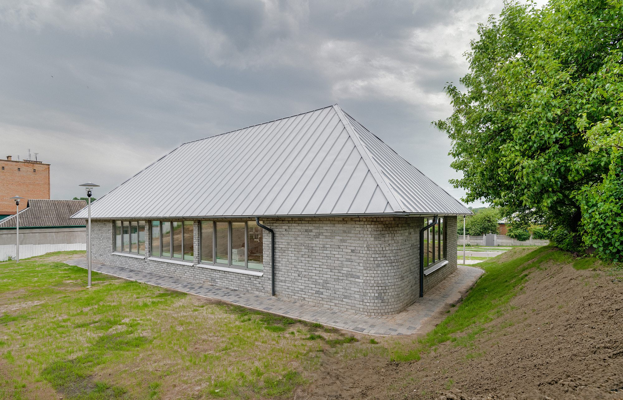
The prestigious Swedish architecture and design office Claesson Koivisto Rune has designed pro bono a standardized project for a center for administrative services in Ukraine, considering that each of us has at some point the duty to provide free services in support of a noble cause. The ASC in Novi Sanzhary seems to be one of their best projects.
ZOOM
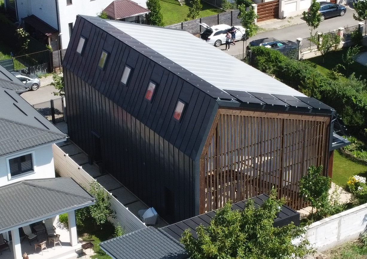
The Sunny House, the Passive House, the Twins’ House
Raluca Munteanu: Passive Housing, Otopeni
This is a story of cooperation and patience, of team and trust, all started from an ambitious idea. The sunny house was born out of a beautiful dream – a house that uses the sun, a house built of wood, in the midst of an edible garden. It was lucky to be created out of the clients’ passion, supported by a non-formal association (Cooperativa de Case), and with the dedication of many professionals. Here is a short story about ideas, persistence, leniency, and friends, as told by the team involved.
Barracks, Gallery, Exhibition
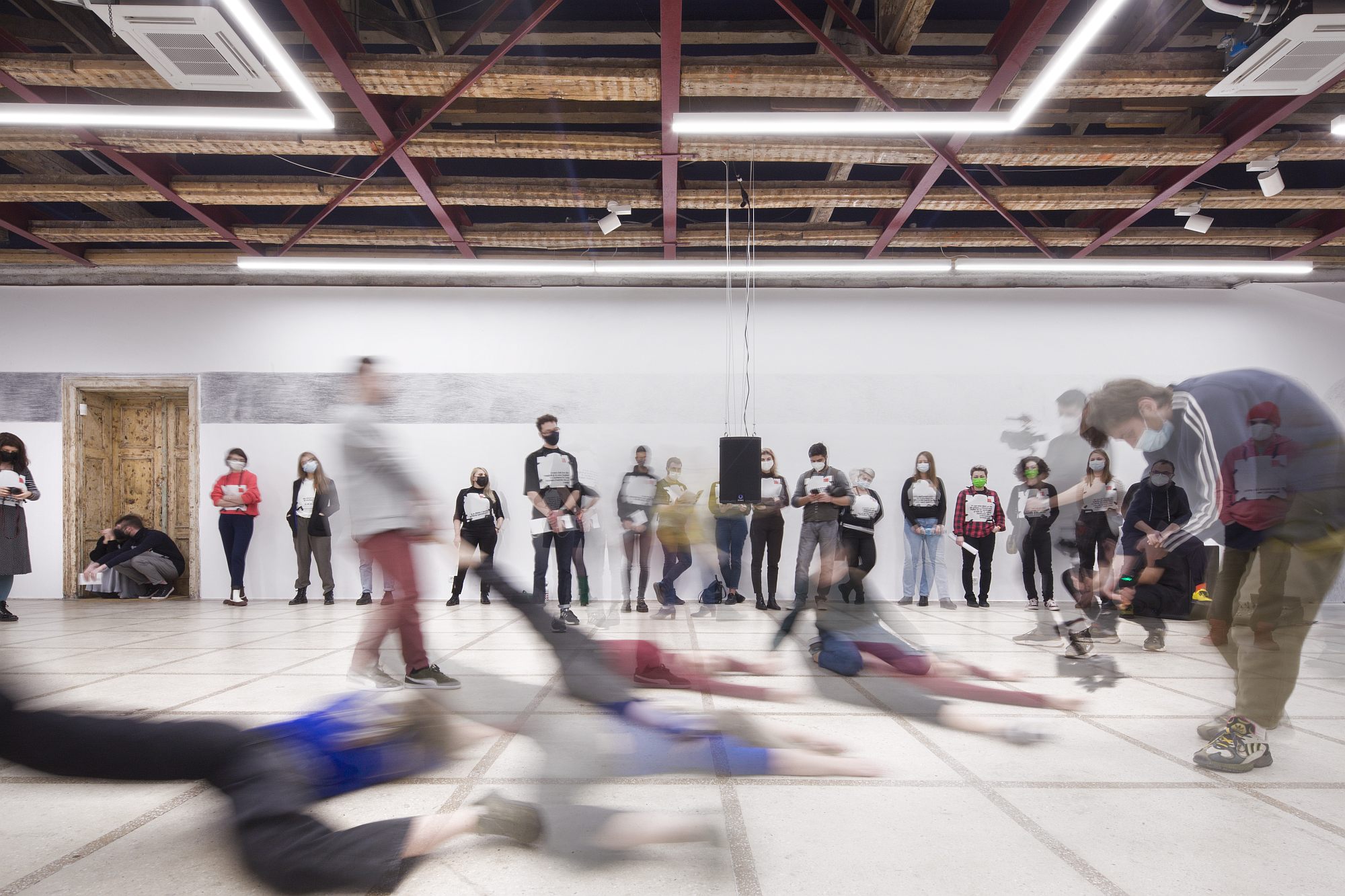
The two-part article describes the development of the /SAC @ MALMAISON gallery and the first public project there – “Isolation in a series of liminal states”. Three spatial orders have come together here: a permanent and heavy historical architecture (heavy from all points of view), a light set-up based on archaeology and a cohabitation of the layers of the place, and a temporary intervention starting from historical and current corporal experiences in the former Malmaison barracks.
Mircea Eliade’s Bucharest
An Exhibition in the Attic of the Literature Museum
Text> Constantin Goagea
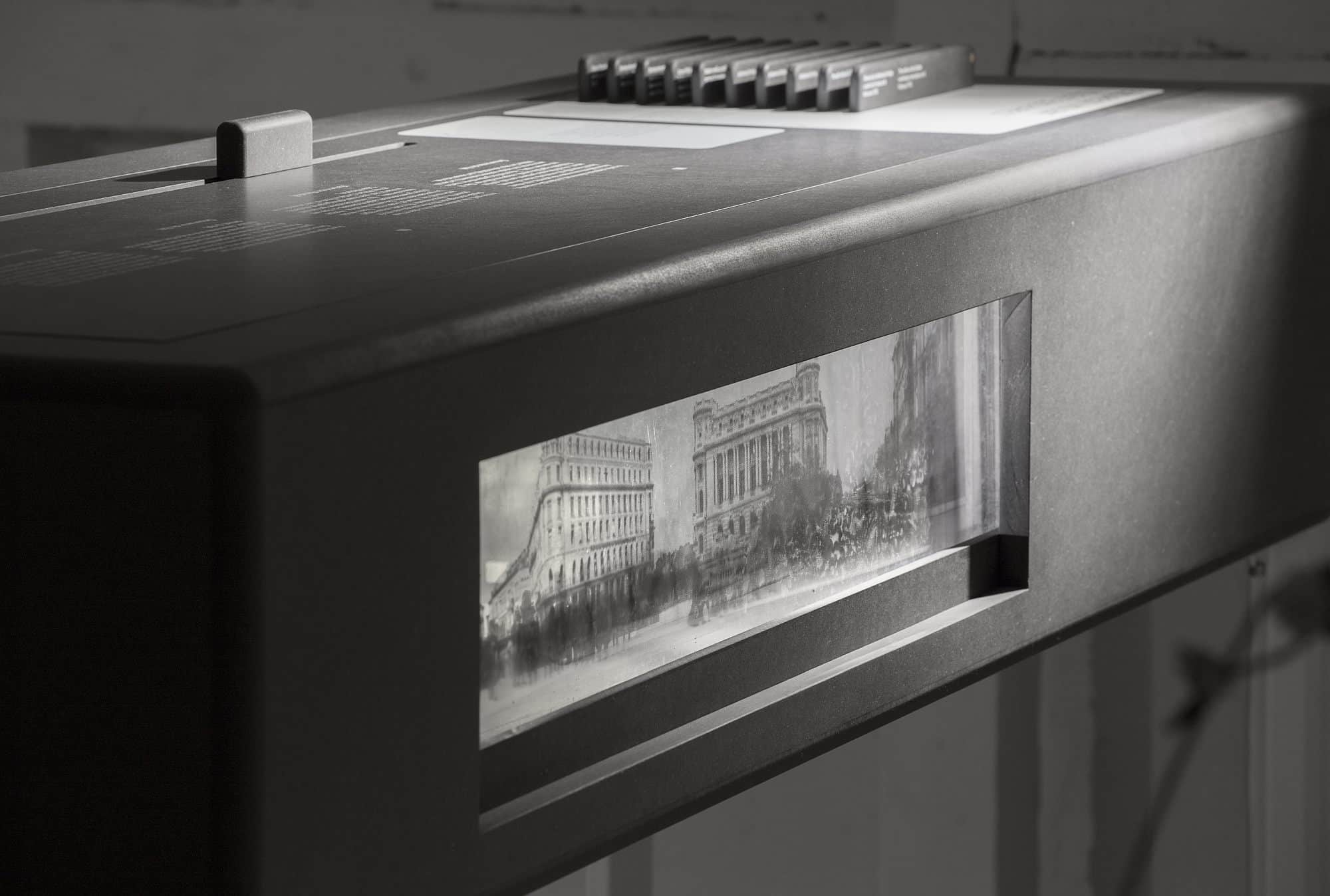
Starting from Andreea Răsuceanu’s book, which provides the title for this exhibition, we have undertaken to build a virtual tour of the actual inter-war city, and at the same time of fictional Bucharest as it appears in Mircea Eliade’s writings. A literary geography of Bucharest, viewed on maps from 1914, 1928, 1938, where we have marked real places, houses and streets, which actually existed, and which are largely preserved to this day. On the maps, we have marked not only the actual streets and buildings, but also characters and narrative moments or literary quotes which give significance to the respective street or house.
A Twist on Institution Building
TRIUMF AMIRIA. The Museum of Queer Culture
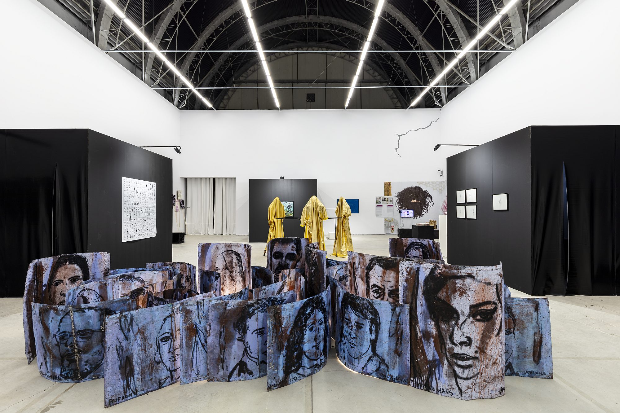
The imagination and staging of a new institution proved to be a fascinating process in the case of TRIUMF AMIRIA. The Museum of Queer Culture – humorously and realistically described as the most possible~impossible~fantastic recent art institution in Romania. To talk about exhibition design, local context and utopian energy, queering, institutional architecture and brave decision, Zeppelin invited the ones responsible for the You Feel ~ And Drift ~ And Sing series of exhibitions, showcased in Bucharest by TRIUMF AMIRIA in partnership with the MNAC: the KILOBASE BUCHAREST curatorial duo (Sandra Demetrescu, Dragoș Olea), and architect Laura Paraschiv / CIRCA 1703- 3071.
PLANS

